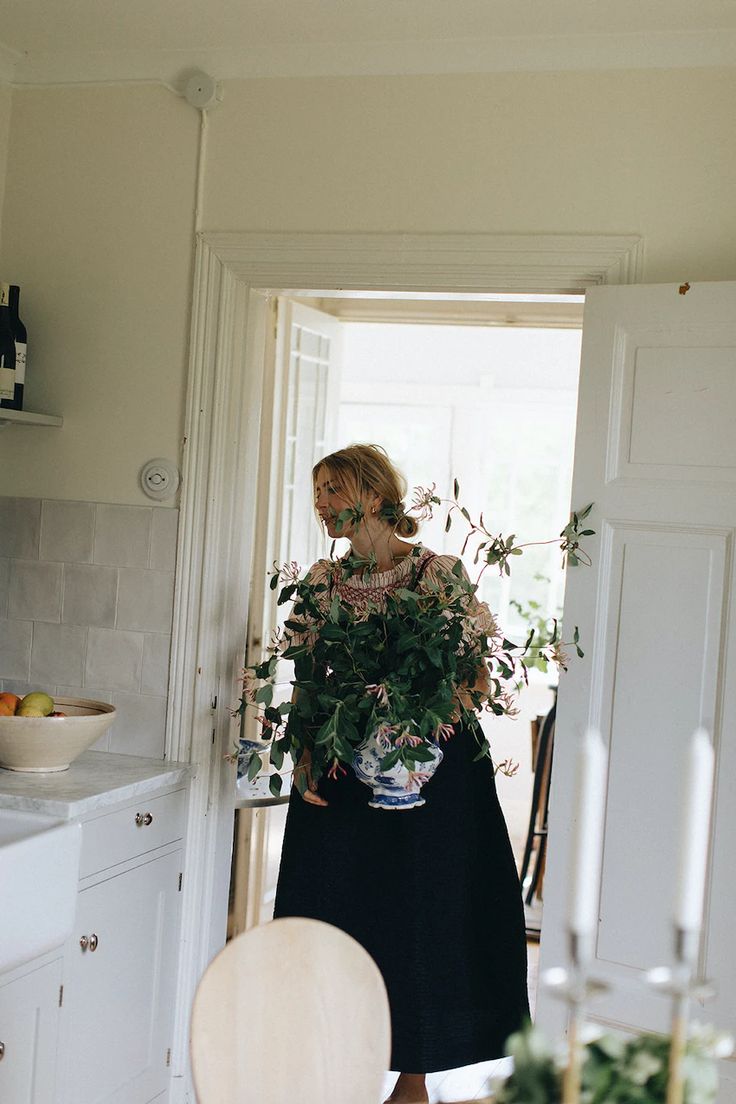
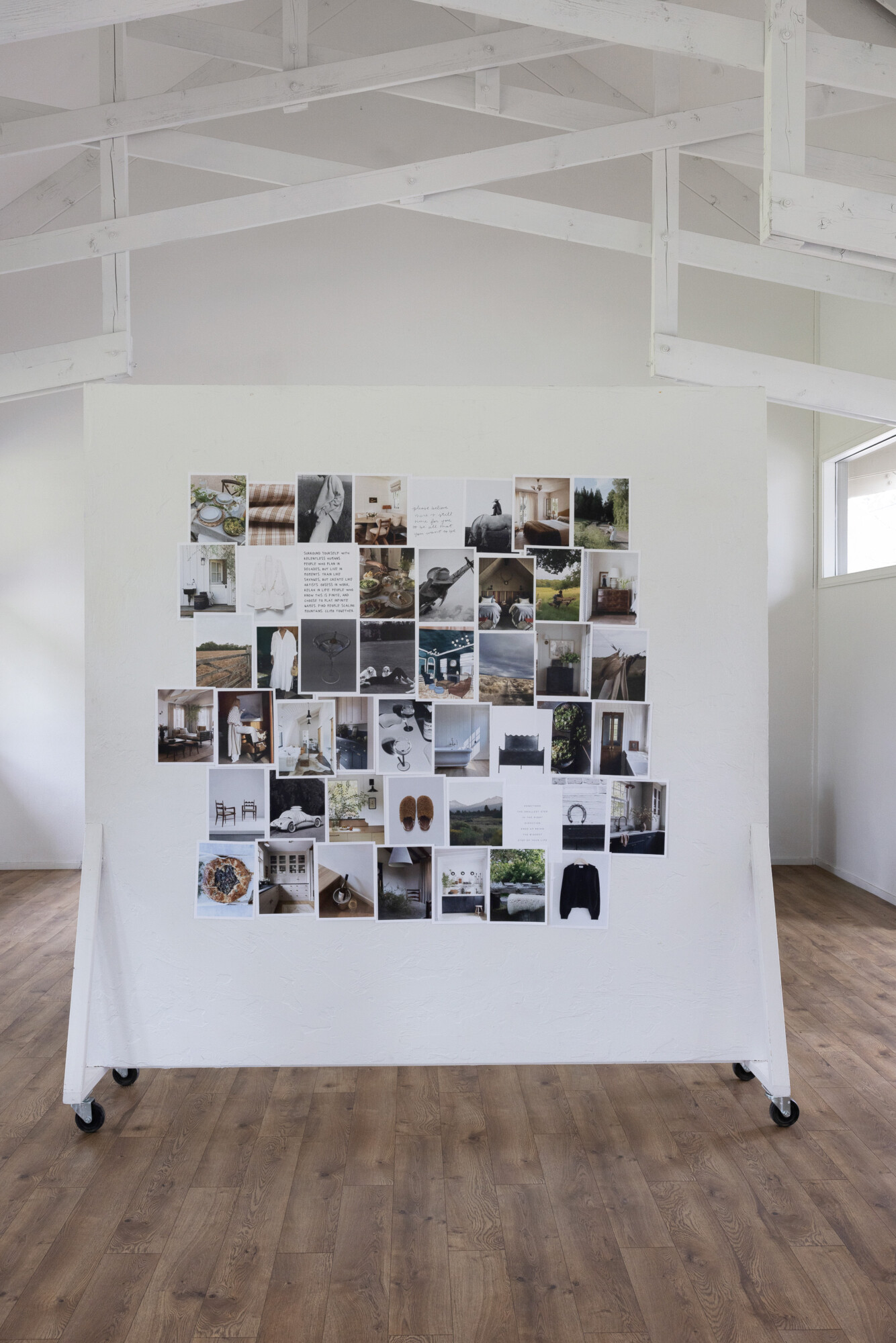
October is an exciting month for CH. Queue travel, project photoshoots, publication features, and continued growth—it’s going to be a whirlwind month as we look ahead. With so many cool business and personal projects on the horizon, we’re feeling deeply inspired by all the cozy, autumnal touches around us. October is truly a transformative and accomplishment-filled month.
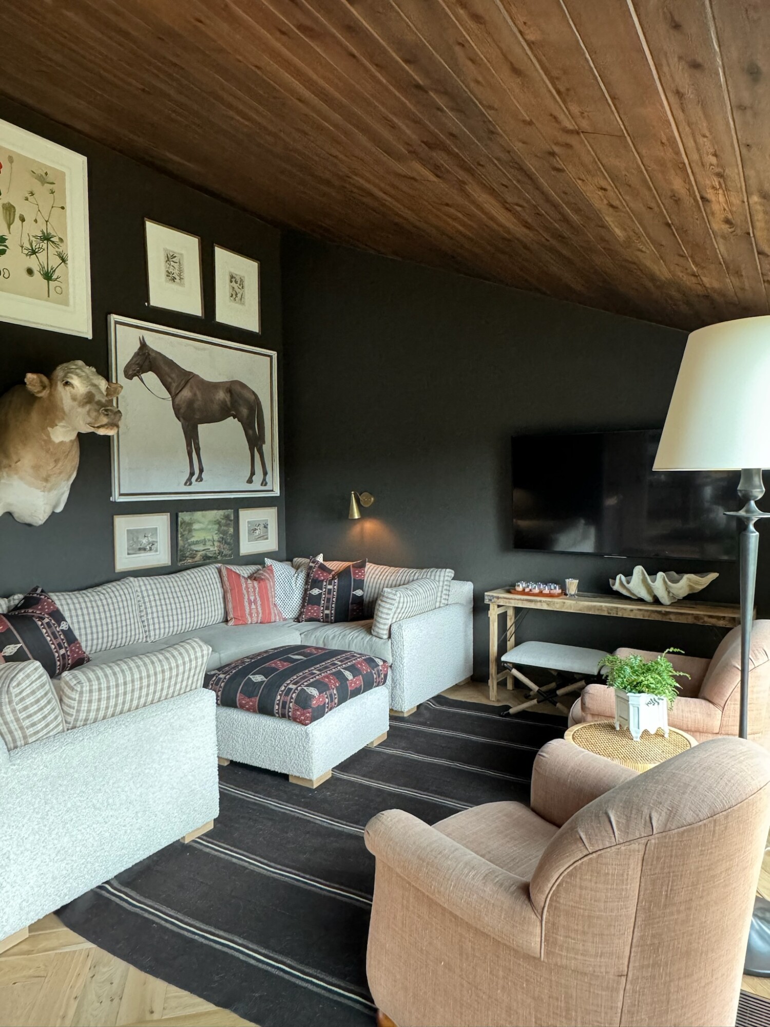
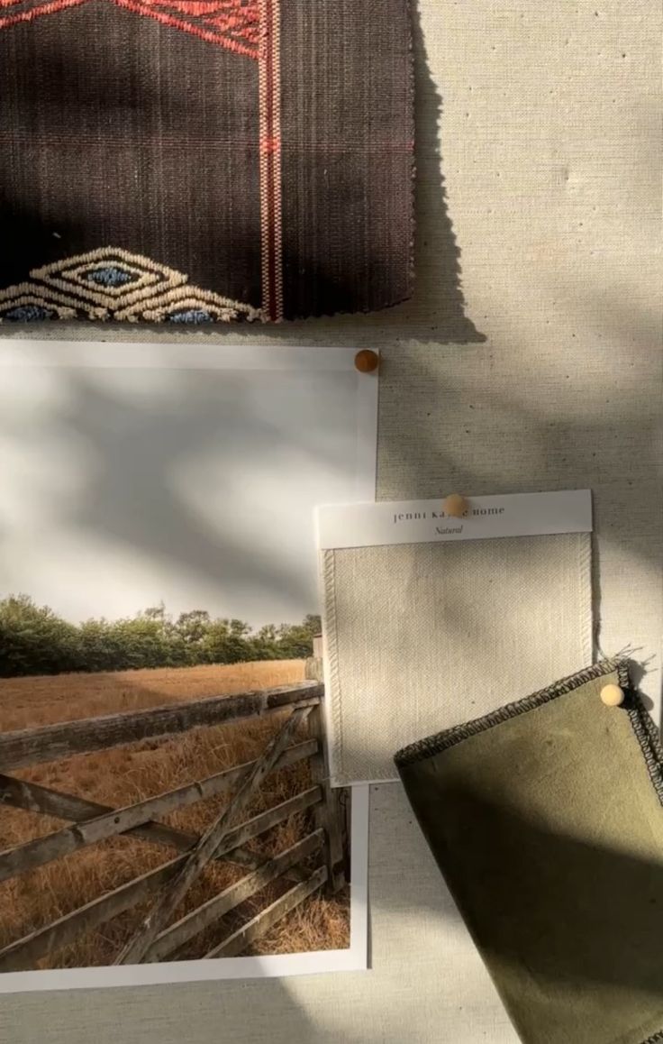
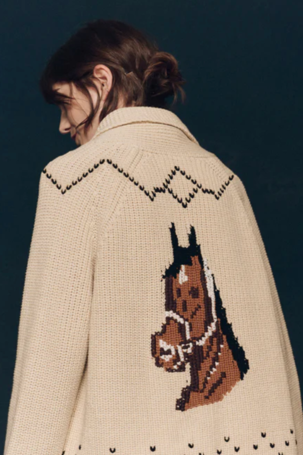
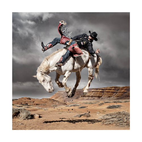
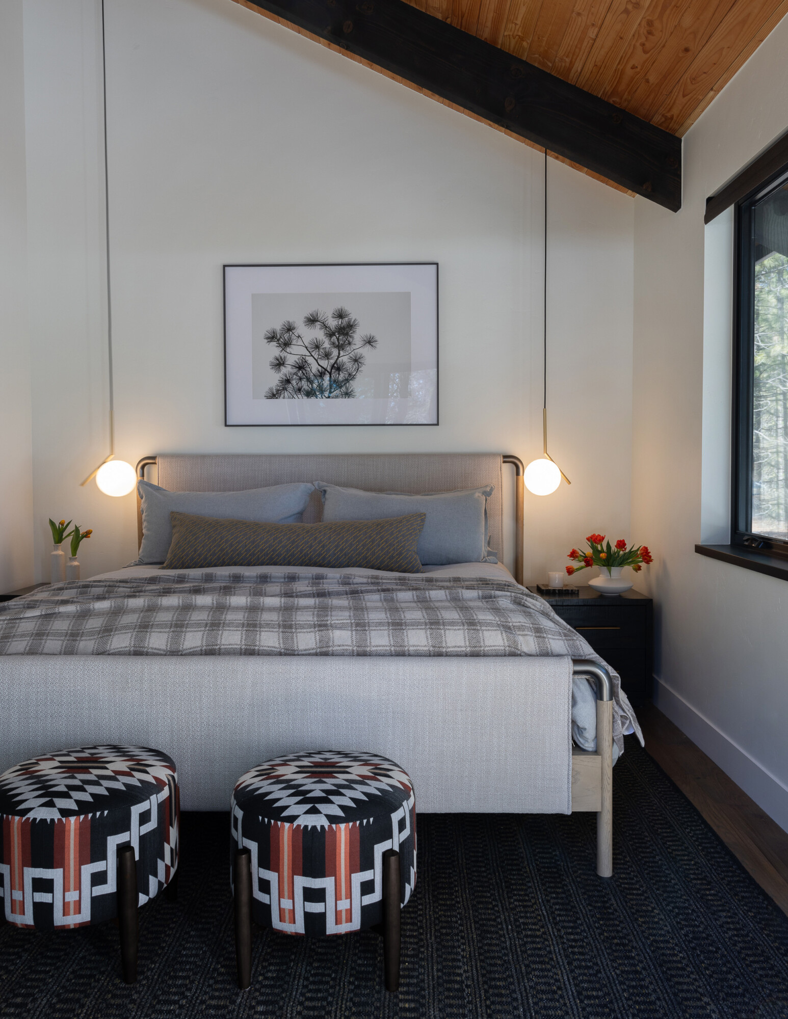
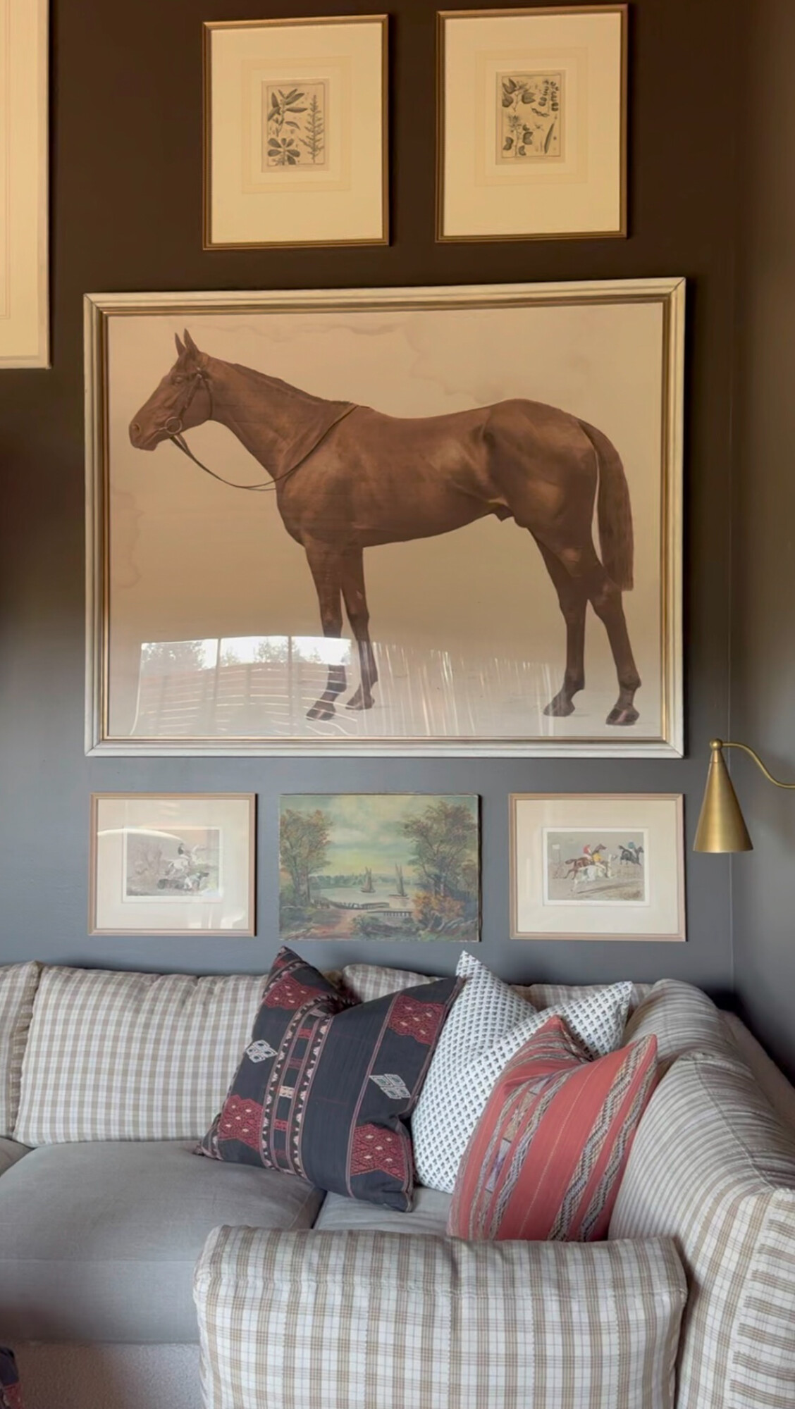
When it comes to both fall fashion and interiors, there’s a major shift happening. Rich, moody tones like espresso browns and cozy textiles are everywhere. We’ve also been noticing a lingering Western flair that blends seamlessly into fall—a nod to our love for country living and Ralph Lauren. Western elements have become our bread and butter, grounding our designs with classic prints and timeless styles. There’s just something about the warmth and charm of the West that makes everything feel like home.
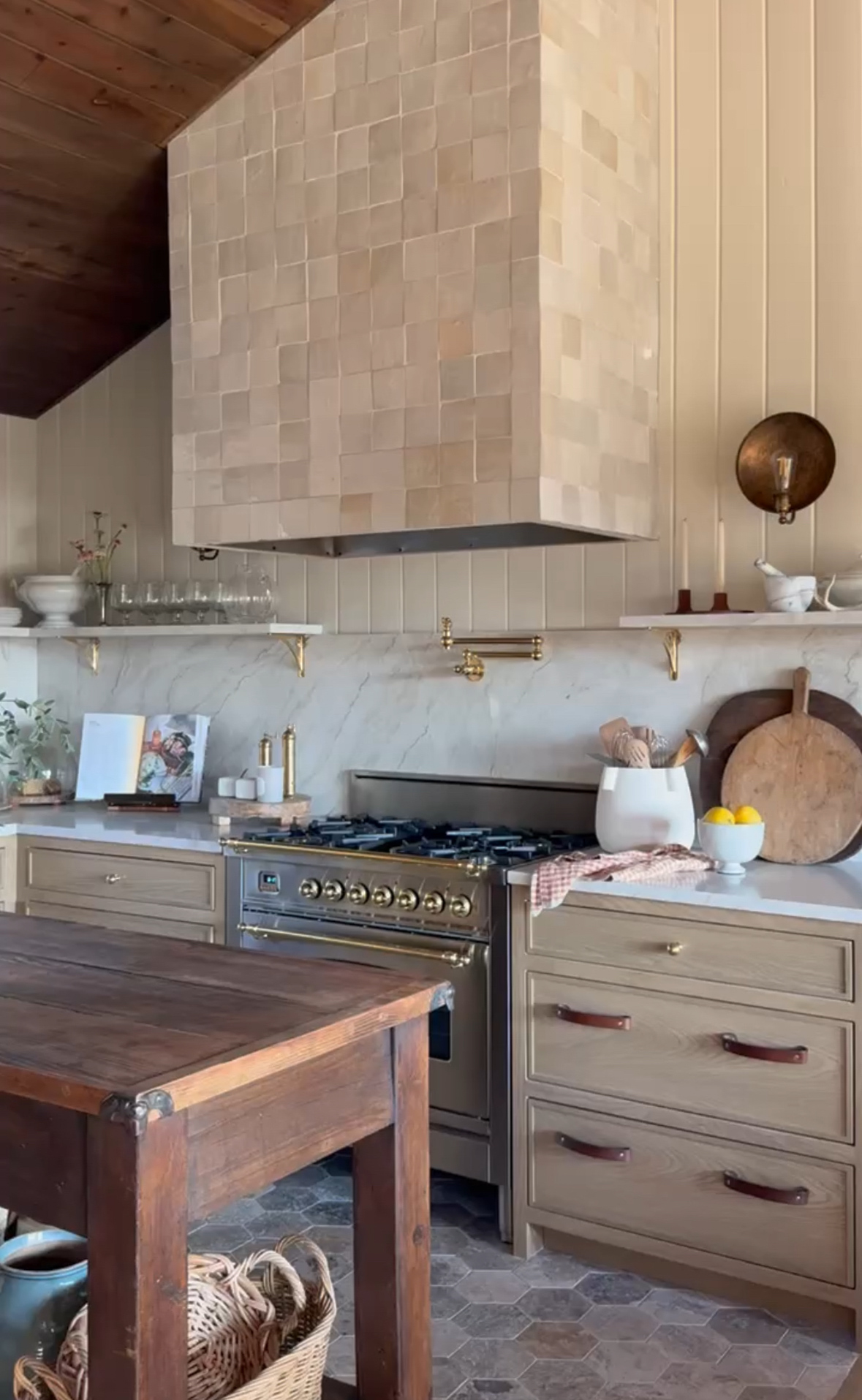
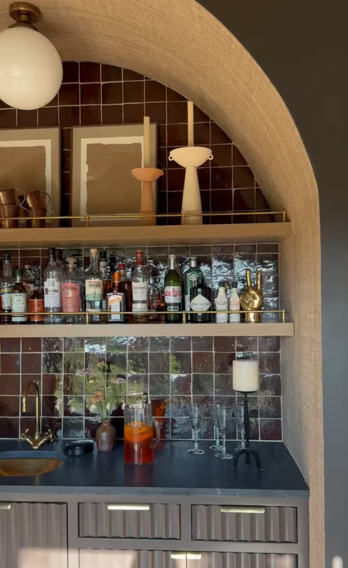
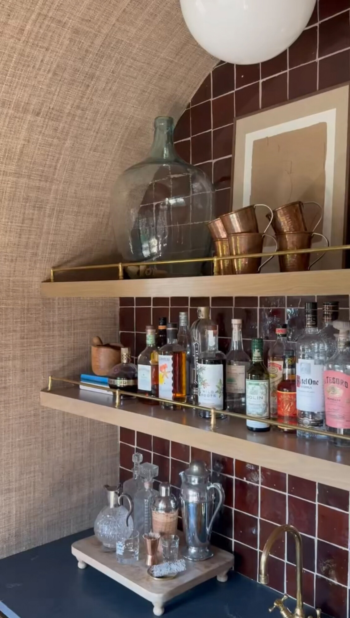
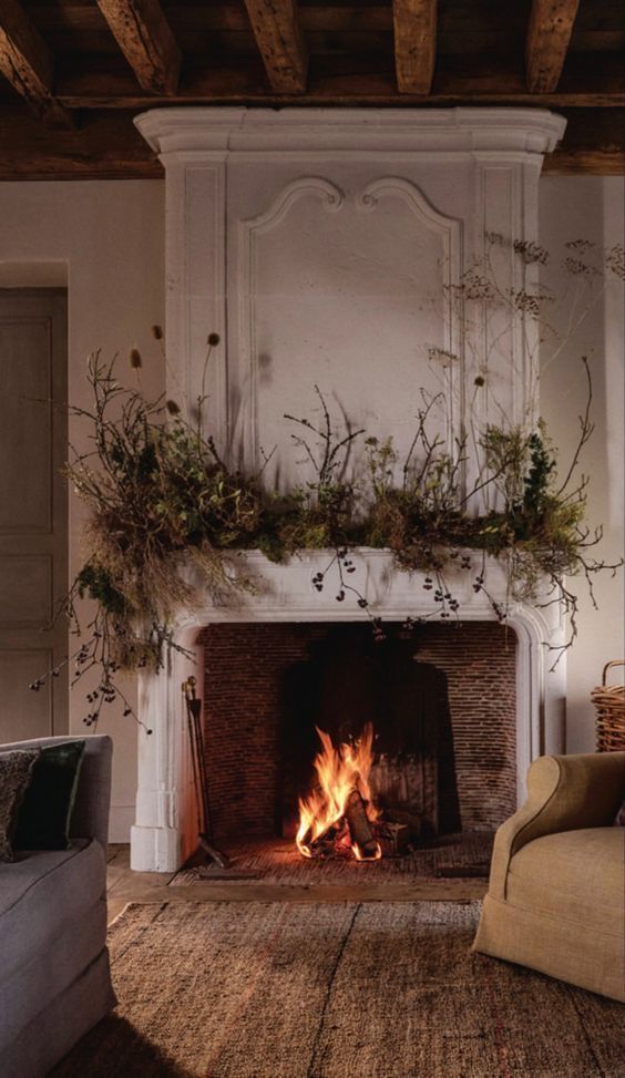
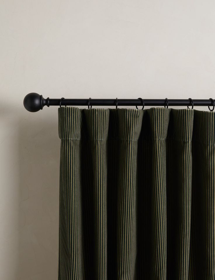
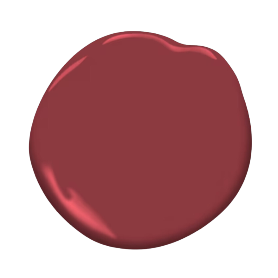
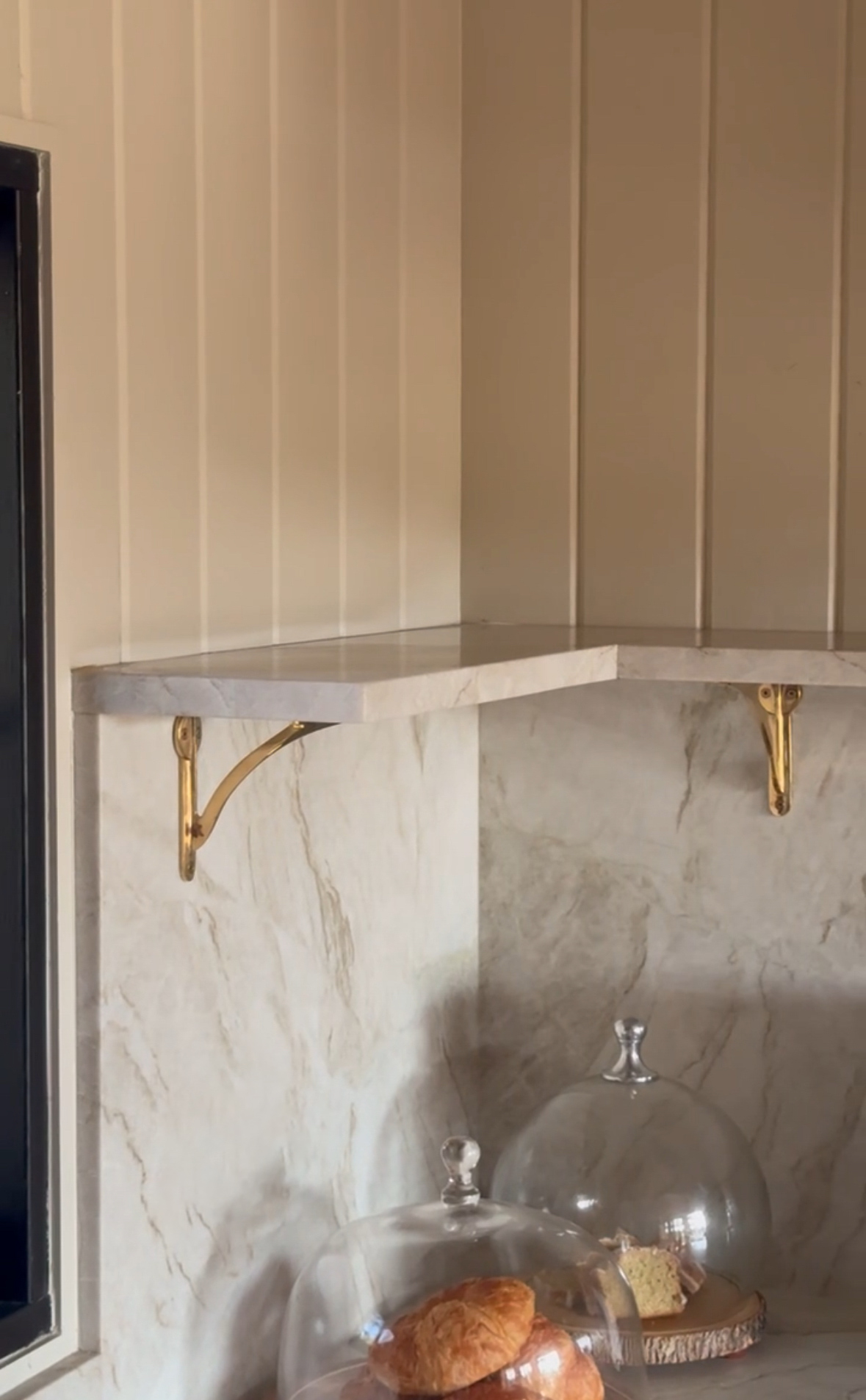
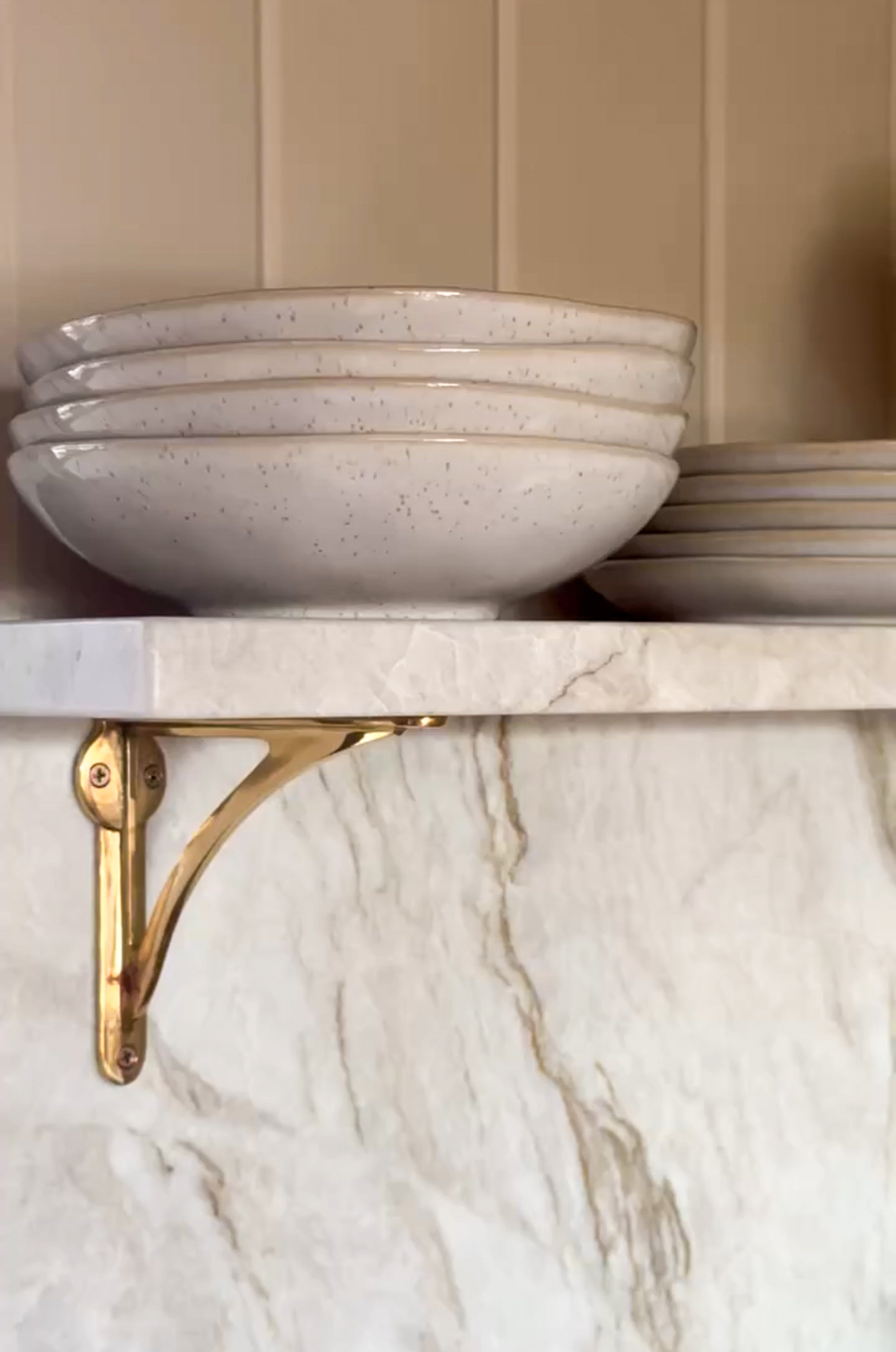
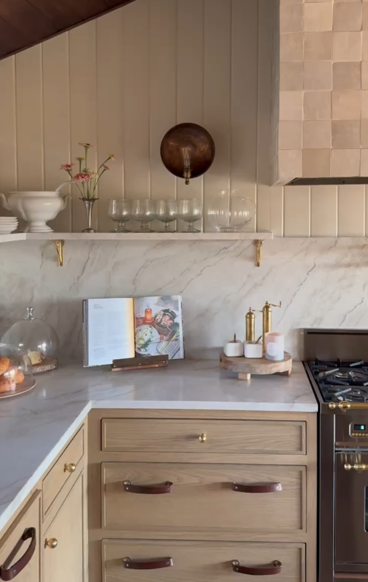
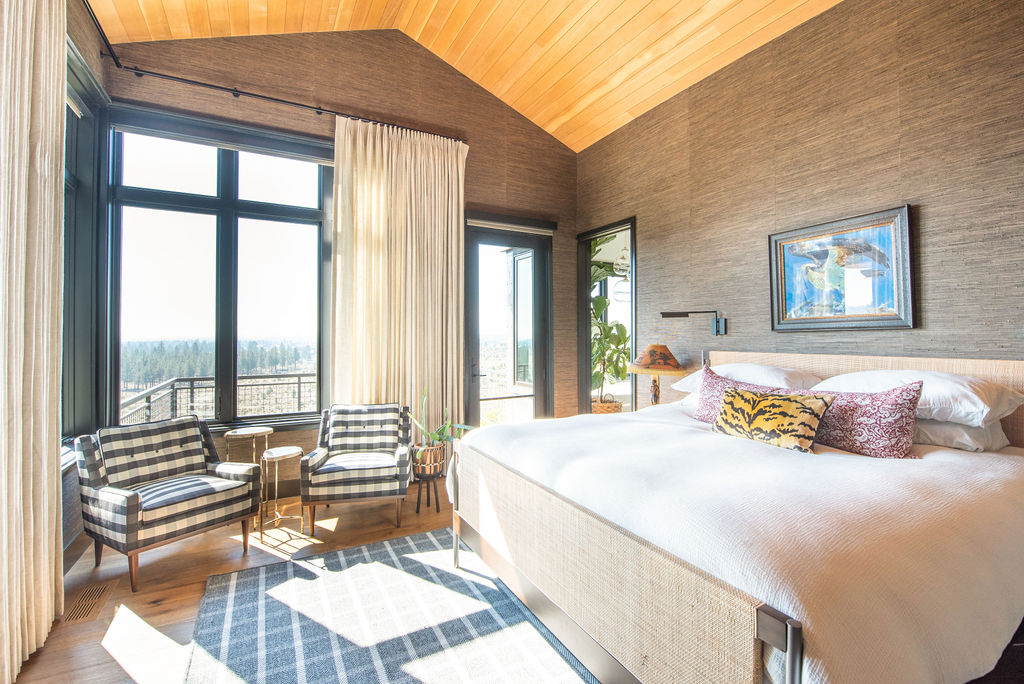
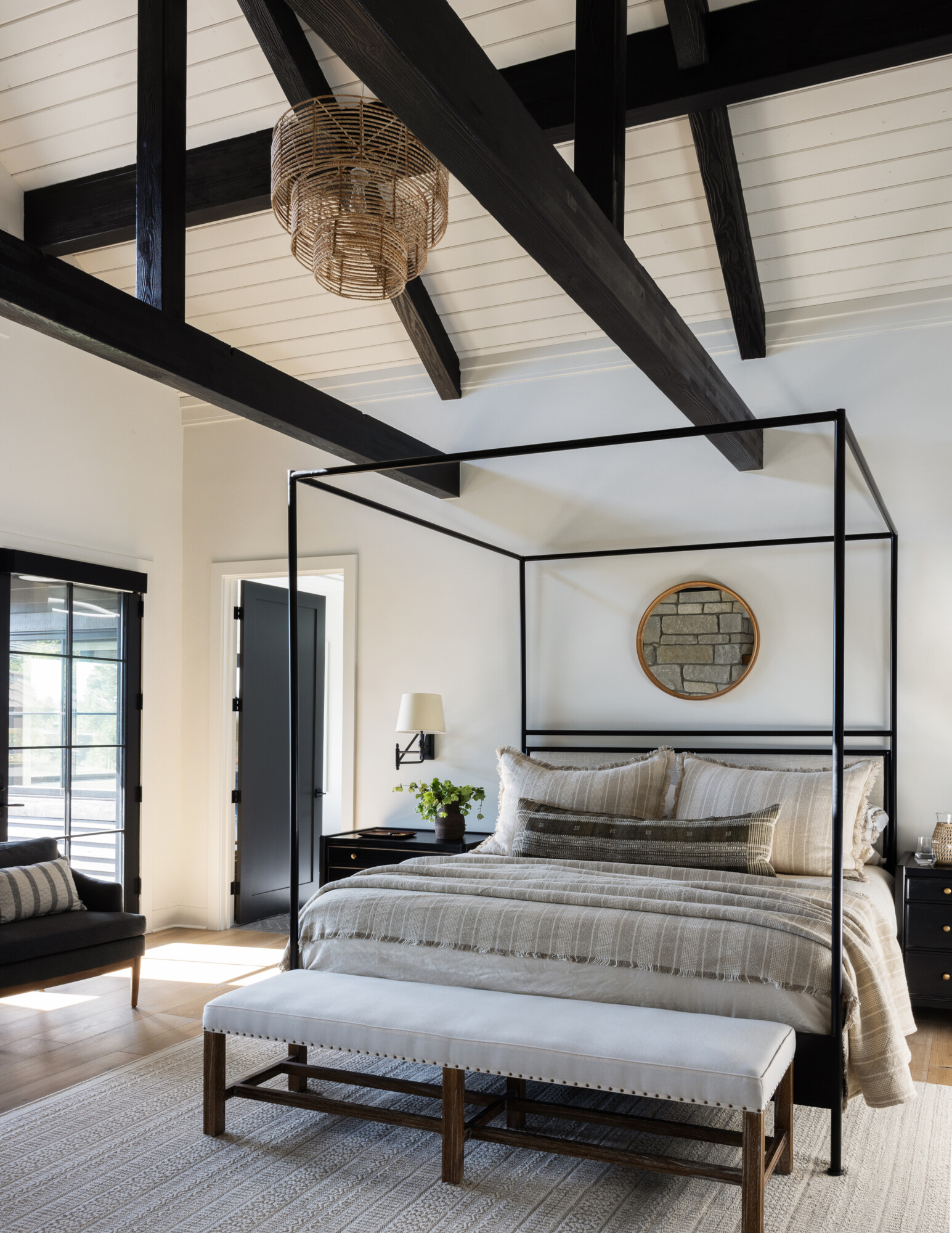
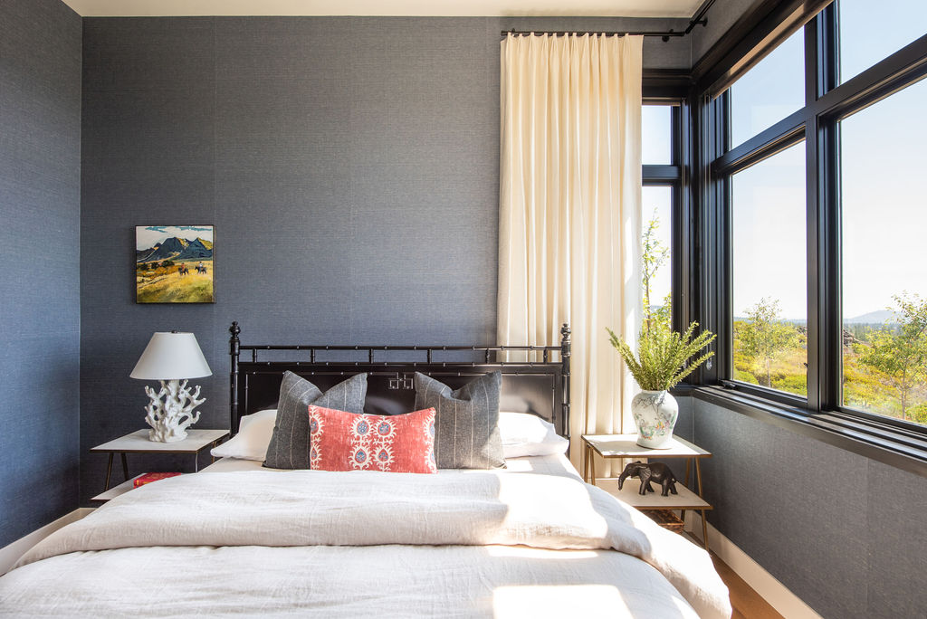
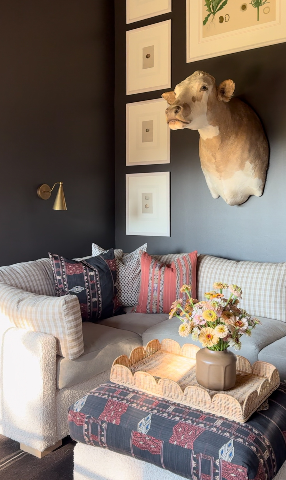
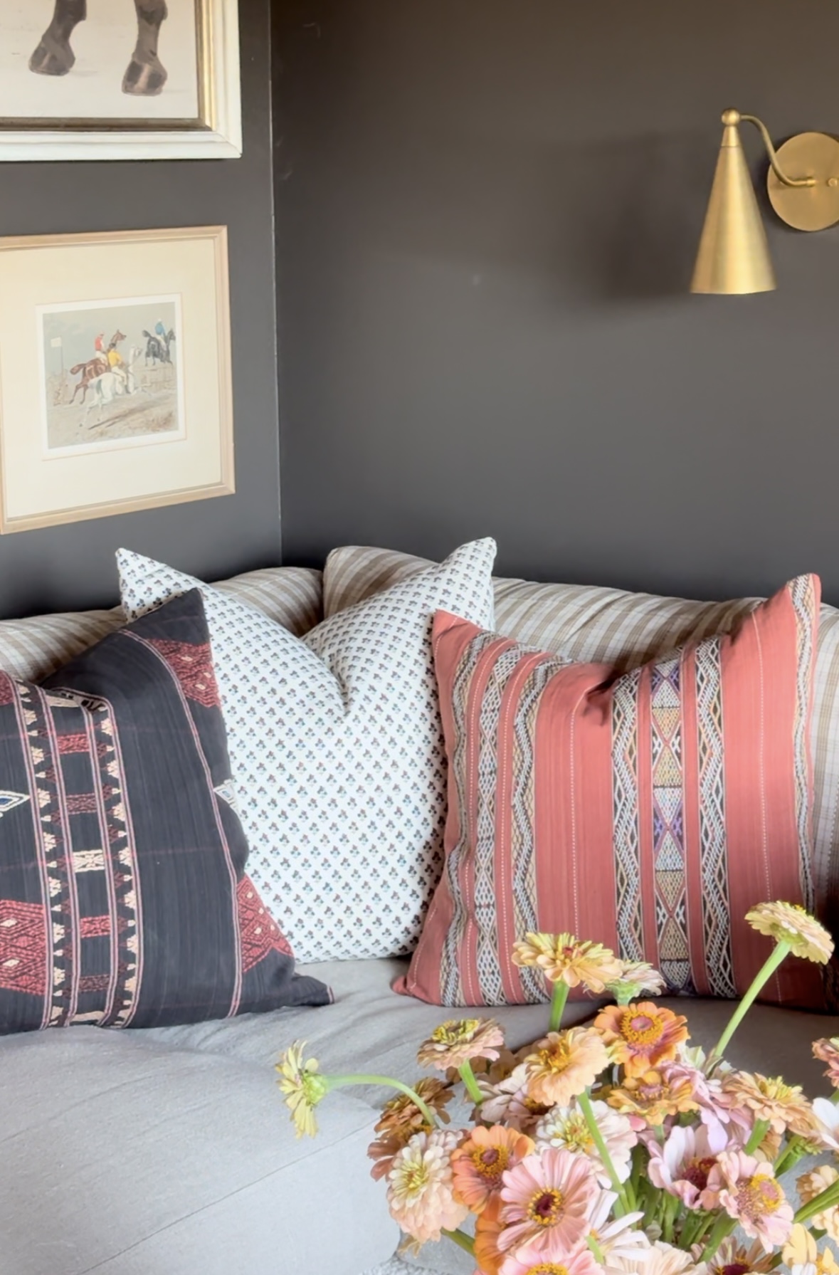
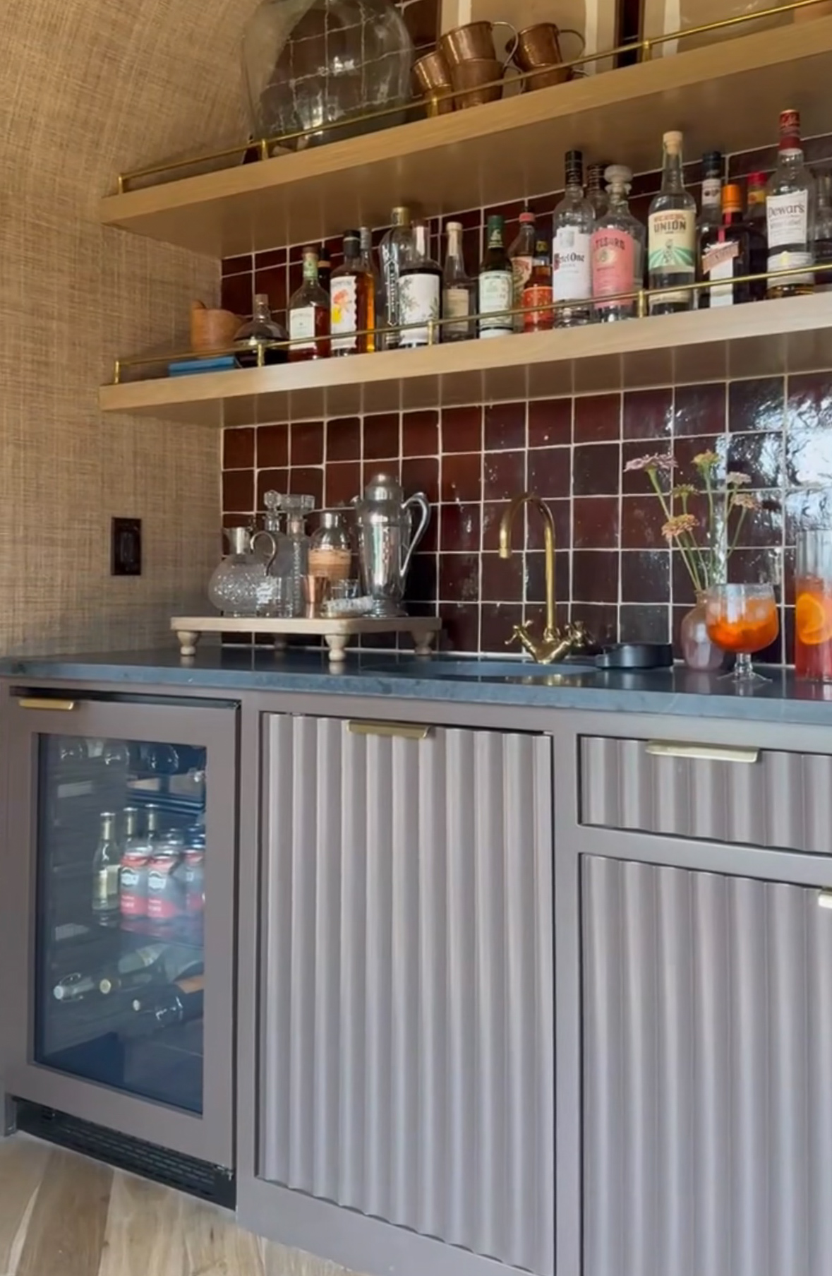
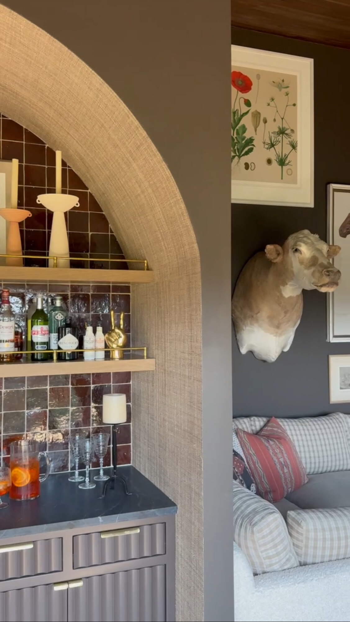
Color of the Month: Espresso—rich, deep, and full of warmth. We’re embracing all things espresso this October, from moody walls to accent pieces in various textures. Think luxurious velvet, cozy wool, and sleek leather, all in this dark, earthy hue. And speaking of texture, grasscloth is making a major comeback! It’s a classic I’ve loved for years, and it’s the perfect way to add warmth and dimension to any space. Whether on an accent wall or lining a cabinet, grasscloth’s organic texture brings a timeless, elevated feel.
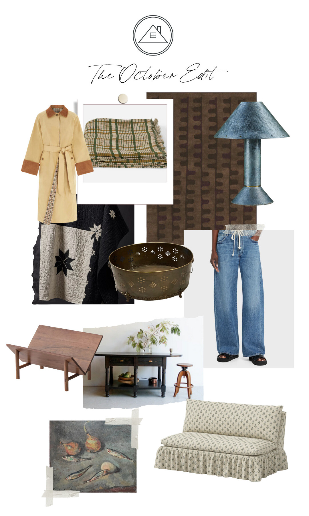
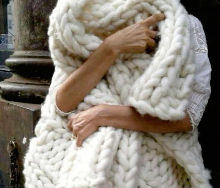
This collection speaks to the heart of fall—a season that invites us to embrace layers, textures, and timeless classics both in our homes and wardrobes. As the weather cools during October and the days get shorter, these pieces help create warmth and style that feel effortlessly inviting.
For the Home
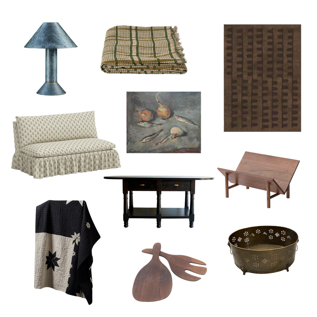
Plaid Patterns: RL is having a major moment again, and honestly, it’s about time. Their collections feel so true to Clouz Houz style, especially when it comes to cozy, equestrian vibes. A plaid throw is an easy way to bring that look into your home. Toss it over the couch or your favorite chair for a warm, rustic feel.
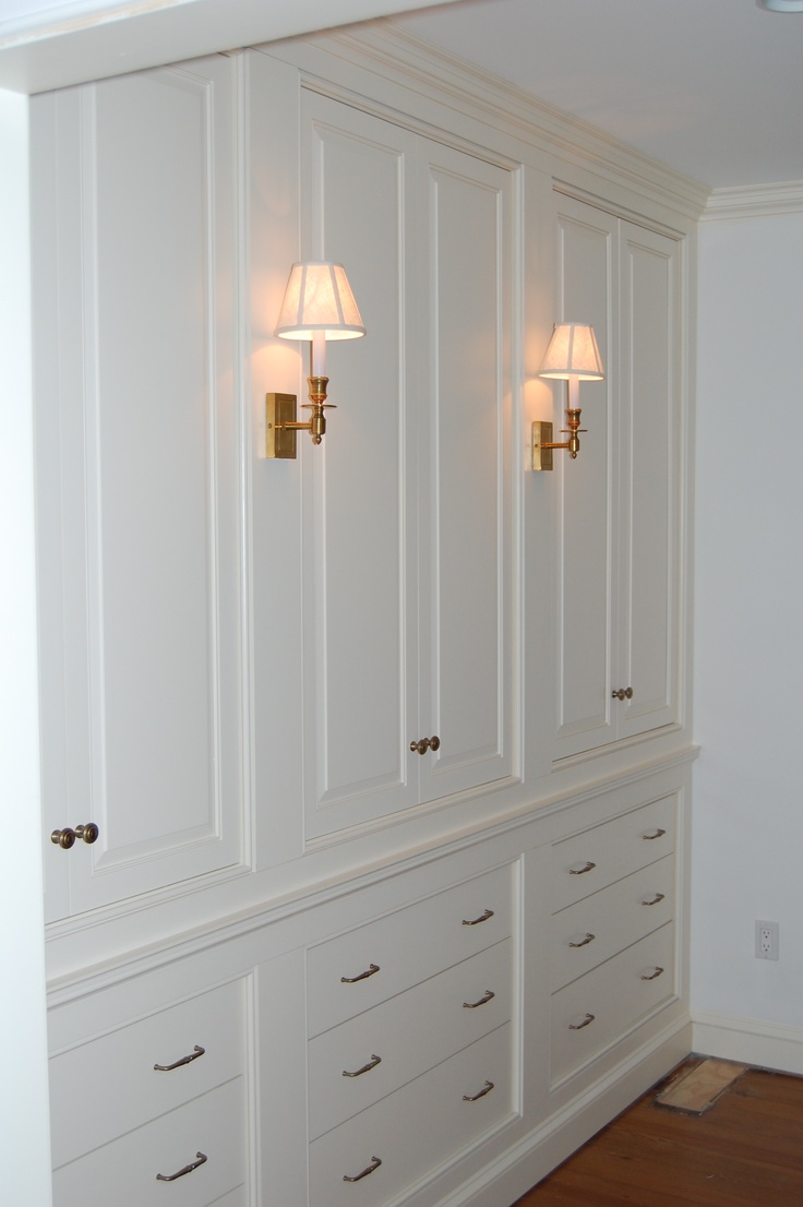
Galvanized & Brass Accents: This fall, I’m swapping out all other forms of lighting and going all in on table lamps. They create the perfect cozy, moody glow and make any room feel more romantic. I love this industrial lamp for its unexpected touch—it adds a little something different to the space. Perfect for a bedside or reading nook!
This brass planter is ideal for adding a seasonal touch to your space. Use it for a beautiful display of moss, squash, or pumpkins. I could also see it used as a beautiful way to display kindling next to your fireplace. Did you notice the lion head handles?? Ummm, yes please!
Upholstered Loveseat: Blending modern shapes with nostalgic prints feels so timeless. This loveseat is such a great piece—it’s versatile and classic without trying too hard.
Still Life Artwork: There’s something about fall that makes me crave vintage art. This still life of sardines might seem quirky, but it’s the kind of piece that adds layers to your space. It’s a fun conversation starter and gives the room a little more personality. I neeeeed to see this on someone’s gallery wall ASAP!
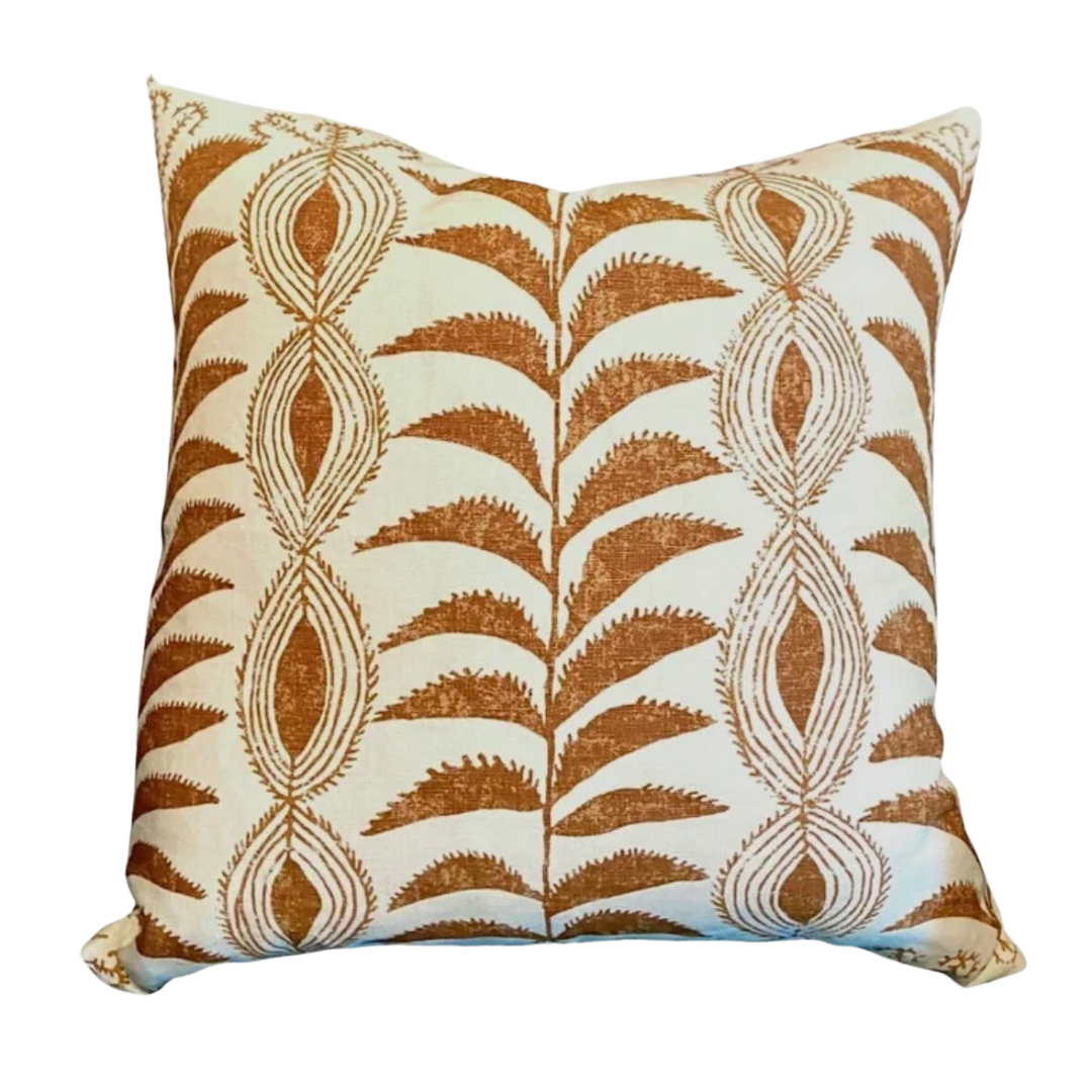
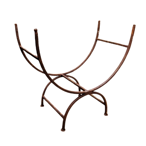
More beautiful items for your home …
Quilted Blanket: This one feels like a modern take on the traditional. The star pattern has that vintage charm we love, but the black and white palette gives it a fresh twist. It’s the perfect layer for your bed or draped over the couch for when you want to cozy up with a movie.
Earthy Area Rug: I did warn you I was all about espresso tones this season, right? This deep, rich brown is seriously grounding. And, paired with this edgy pattern, it’s the kind of rug that instantly elevates a room without trying too hard. You’ll love the earthy vibes it brings!
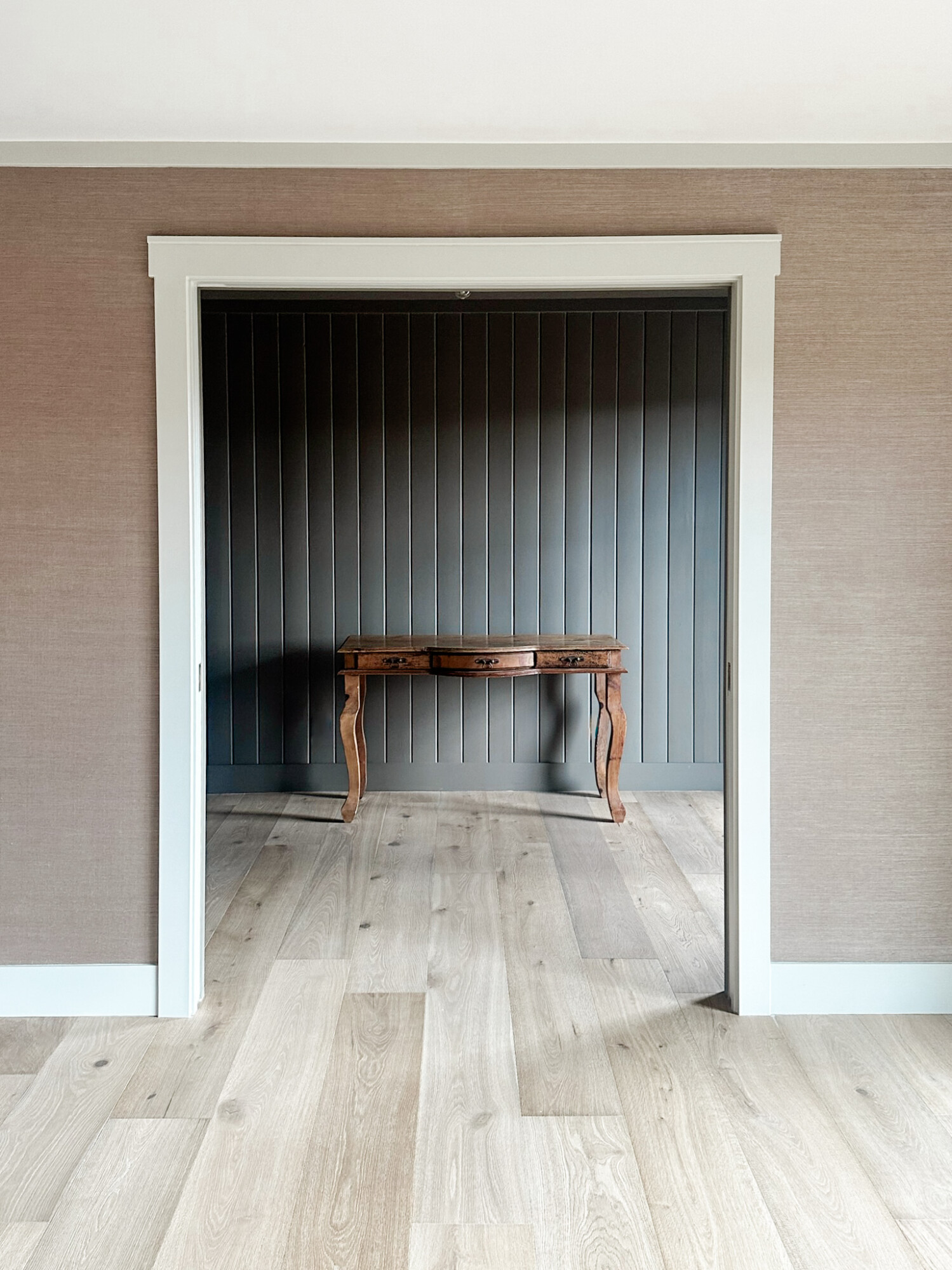
Vintage-Inspired Console Table: I’m obsessed with how versatile this blackwood console is. It’s the ideal statement piece for an entryway or behind a sofa, adding just the right amount of drama. It’s one of those pieces that works year-round but feels especially moody and luxe this season.
Hand-Carved Salad Set: These wooden servers bring natural elements to your kitchen. They’re perfect for fall entertaining, giving your table an organic, handmade touch. Make your dinner feel intentional yet simple.
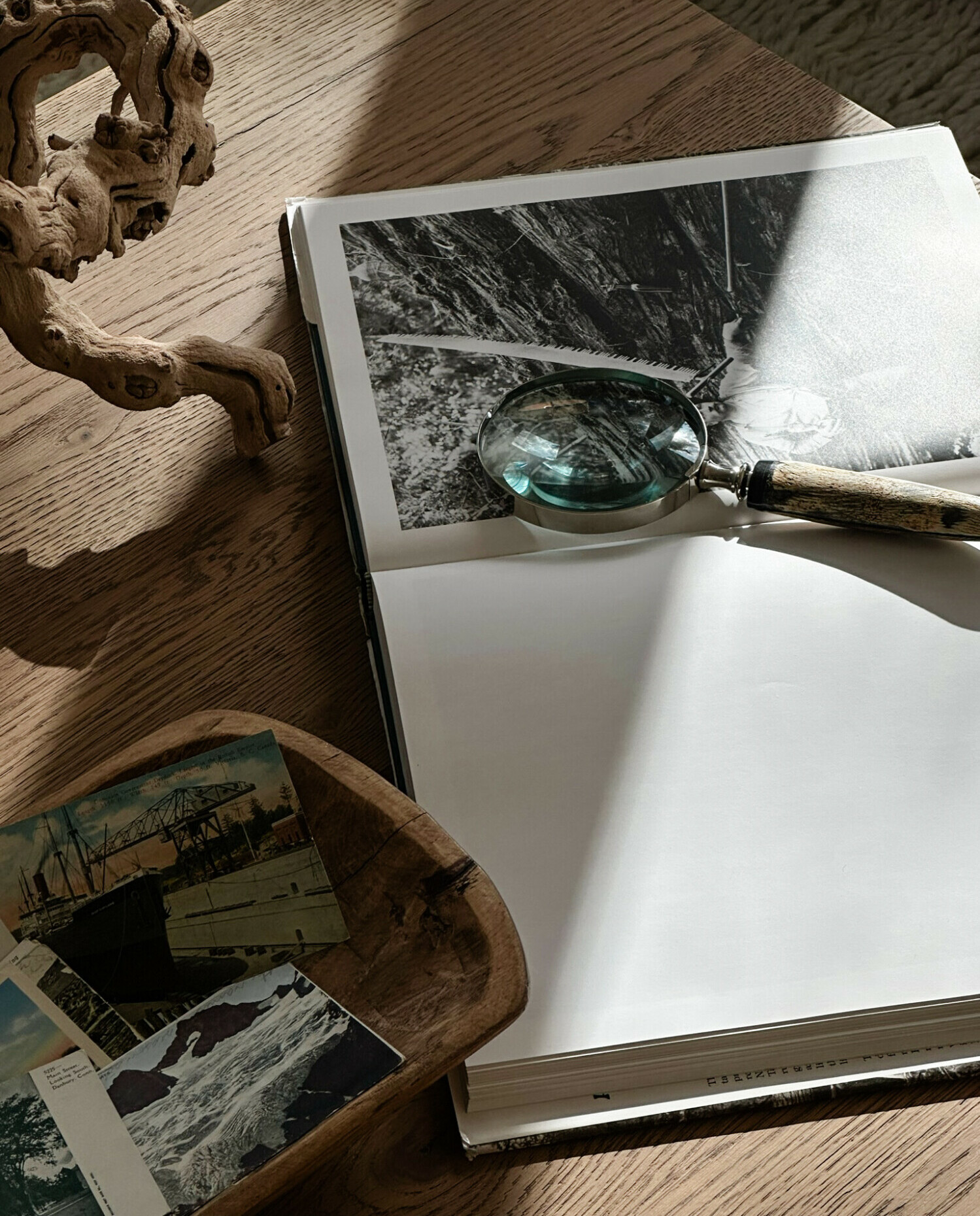
Bookstand: Yet another way in which I am trying to get people to start displaying the photography in their coffee table books! It feels so artistic, and it truly is inspiring for guests. Also, it lets them in on your style a bit more!
Wardrobe Highlights
On the fashion side of things:
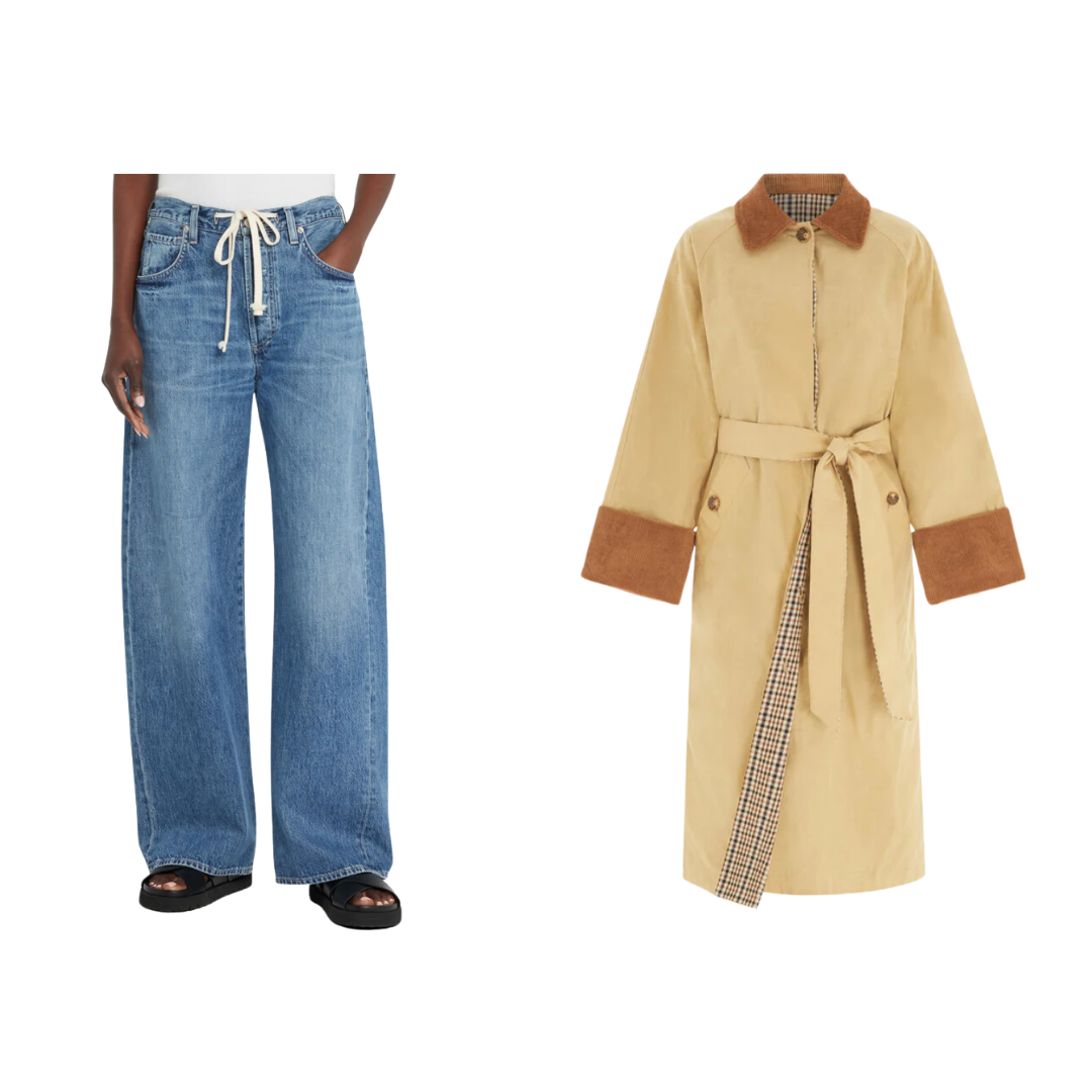
- Wide-Leg Jeans: Can we talk about how these jeans are the perfect fall staple? They’re comfy and laid-back, but still feel polished enough to dress up with a cute top or chunky sweater. The barrel-leg silhouette is super flattering and the adjustable tie waste makes it a very forgiving option as we approach holiday dinner parties 😉
- Classic Barn Jacket: A good trench coat is a fall essential, and this one is giving cozy, vintage vibes with a modern twist. The plaid accents? So chic. It’s that perfect layering piece you can throw on over anything—instantly elevating your look while keeping it effortless and cool. October is the perfect month to add this jacket to your wardrobe!
Each piece in this edit feels so special for fall! From adding texture and warmth to your home to curating those must-have wardrobe staples, this roundup captures everything I love about the season—layered, cozy, a little bit Western, and totally timeless.


