Staring at paint chips and seeing 12 different whites? Here’s how to pick one that actually looks good in your light.
If there is one decision that seems simple (but almost always spirals), it’s choosing a white paint … especially for cabinets. What looks “clean” on a swatch can turn gray, yellow, pink, or oddly flat once it’s covering an entire kitchen. And, suddenly you’re standing in the paint aisle holding five samples that all look identical — until they’re not.
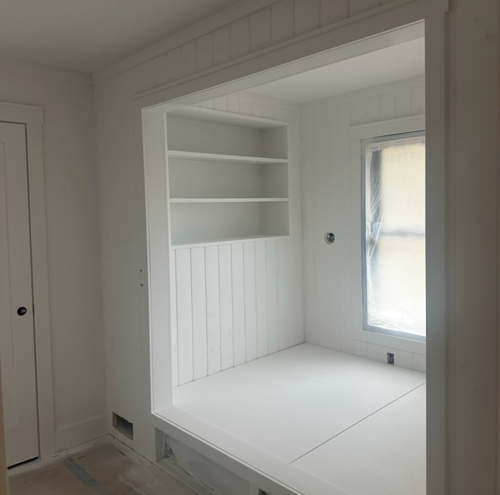
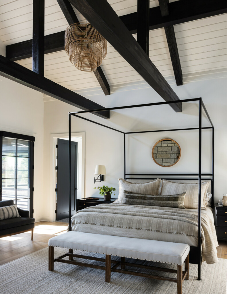
We’re living this in real time at The Sixth Street Bungalow. As part of our kitchen renovation, we landed on ‘Shoji White’ by Sherwin-Williams for the cabinets, a choice that came after testing, re-testing, and watching how the color behaved throughout the day. I wanted something warm but not creamy, soft but not dull, and flexible enough to work with natural wood, brick flooring, and evolving finishes. Shoji White checked all of those boxes in a way that felt calm and intentional, not trendy or risky.
Before we get into why Shoji White won for our space (and the other whites I always come back to), let’s talk about how to actually choose a white without regretting it six months later.
Why White Is So Hard (And Why Most People Choose It the Wrong Way)
Here’s the thing most people don’t realize: white paint is never just white. Every white has an undertone, and that undertone reacts to:
- natural light vs. artificial light
- time of day
- surrounding materials (floors, counters, backsplash, hardware)
- even what direction your windows face
The biggest mistake I see? Choosing a white based on:
- a tiny paint chip
- how it looked in someone else’s house
- how it photographed online
Paint chips lie. They’re too small, too isolated, and they don’t give you enough context to understand how the color will actually live in your space.
The Whites I Trust (And Why They Work)
These are the whites I come back to again and again (for clients and for my own homes) because they’re reliable, flexible, and proven.
One thing to understand about looking at white paint (or any color for that matter) is the Light Reflectance Value (LRV).
What that means:
-
Scale: LRV runs from 0 to 100: 0 reflects almost no light (very dark), and 100 reflects all light (very bright).
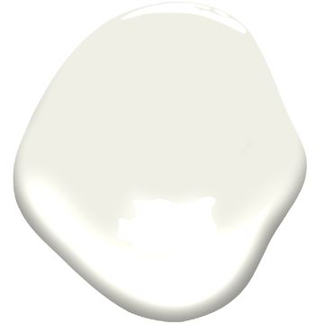
‘Shoji White’ by Sherwin-Williams
Soft, balanced, and slightly warm without reading creamy. This is what we chose for our Sixth Street Bungalow cabinets because it plays beautifully with natural materials and doesn’t swing too yellow or too gray throughout the day. In this kitchen, the main factor we are dealing with is … lots of natural light! Don’t get me wrong — I’m here for all the natural light I can get, but sometimes warm undertone whites will read too yellow, especially in a southern facing room, like our kitchen. I have been so pleased with this color. It’s my first time trying it personally, and it’s going in my “top 10” for sure!

For our cabinets, we were looking for a white that would:
- Soften the space, not flatten it
- Work with the warm tones of the brick and the cool tones in the carrara marble countertop (my new obsession is mixing warm whites with cool tones)
- Feel timeless but not boring
- Hold up in both bright daylight and evening lighting
‘Swiss Coffee’ Benjamin Moore
My longtime ride-or-die. Swiss Coffee is a warm, creamy off-white that’s one of Benjamin Moore’s most beloved neutrals. It’s often described as a soft white that avoids the starkness of high-contrast whites, while still feeling bright and airy, making it extremely versatile for interiors. I’ve used this in countless projects, including in my own homes. It’s warm, forgiving, and almost impossible to mess up. If someone wants a white that feels cozy but still elevated, this is usually my first suggestion. With a brown undertone, it’s exciting when a client wants something with a little more depth to it. It’s LRV is 81.9.
‘Simply White’ Benjamin Moore
Is a clean, bright off-white with just a slight hint of warmth that keeps it from feeling too stark or cold. Its LRV is about 89.5. Crisp and bright with just enough warmth. Great if you want a cleaner look without going stark. A true “white” (out of all of these) is also ideal for spaces with amazing artwork.
‘White Dove’ Benjamin Moore
A classic for a reason. What makes it special is its versatility. It reads as a clean, neutral white in many lighting conditions, while still feeling welcoming and soft. This is thanks to very subtle warm and gray undertones that avoid overt yellowing. It’s slightly softer than Simply White, very livable, and works well across different lighting conditions. It’s has a LRV of 83.
‘Greek Villa’ Sherwin-Williams
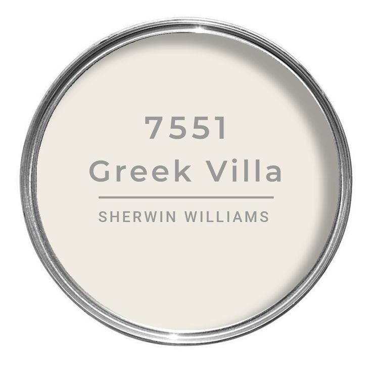
Greek Villa is another fave, with subtle yellow-beige undertones. In a south-facing room the warmth can become quite noticeable with a beautiful glow, without going too yellow. At 84 LRV, it is very light and reflective — close to a bright white, but with just enough pigment to keep it soft and warm rather than stark.
‘Shadow White’ Farrow & Ball
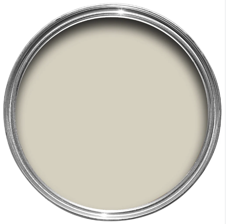
Subtle, complex, and quietly sophisticated. This one really shines in homes with character and layered finishes. What makes it especially pretty is that it has just enough gray-leaning tone to feel crisp and elegant without ever reading cold or sterile. We used this on the walls at our Tumalo kitchen and I absolutely loved it. I was going to use it on the cabinets here too, but decided to go for something a bit brighter. It has a LRV of 72, so it’s the lowest on the scale amongst all of these. But, I do love the richness it brings. And, it’s a perfect example of how different spaces can take whites. When I held up the sample here in the new kitchen, it looked way darker then it did in our Bend home!
A Few Resources Before You Decide (Because White Deserves Backup)
If this post made you realize you’re not crazy (and white really is that nuanced), here are a few tools we genuinely recommend (and actually use).
Want our Paint Guide?
When you subscribe to our newsletter, you’ll send our complimentary Clouz Houz Paint Guide straight to your inbox. It includes two fully built palettes (one neutral, one bold) so you’re not just picking a color, you’re seeing how it lives alongside other finishes. Several of the whites mentioned here are included, plus combinations we use regularly for clients. It’s meant to take the guesswork out of the process and give you real direction, not overwhelm.
Skip the tiny paint chips. Use Samplize.
Truly the only “paint chip” I trust anymore. Samplize uses large, peel-and-stick samples that are affordable, mess-free, and easy to move around your space. Get a few options. Test them on different walls. Live with them for a few days. You’ll be shocked how quickly the “wrong ones” reveal themselves, and how obvious the right one becomes once you see it in your light.
And, if after all of that you’re still second-guessing yourself … you’re not alone.
That’s where we come in.
Our hourly consultation service (virtual or in-person) is perfect if you:
- Already know what you like but want a professional gut-check
- Are stuck between two whites and can’t tell which one’s lying to you
- Want one-off guidance without committing to a full design package
We’re happy to help answer specific questions, give honest feedback, and steer you in the right direction (especially if you value expertise and want clarity, not chaos). However, if you’re looking for confirmation bias or want to override every recommendation, we’re probably not your people ?
You don’t have to do this alone. And you definitely don’t have to guess! Reach out, and we’ll figure it out together.

