Between the Layers | Design Guide Series
SUBSCRIBE
Design

The Best Blue Paint Colors I’ve Ever Used

Blue is one of the most requested colors in our projects, and also one of the trickiest to get right.

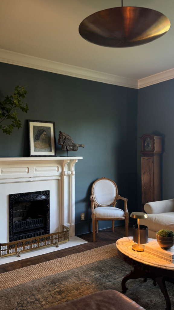
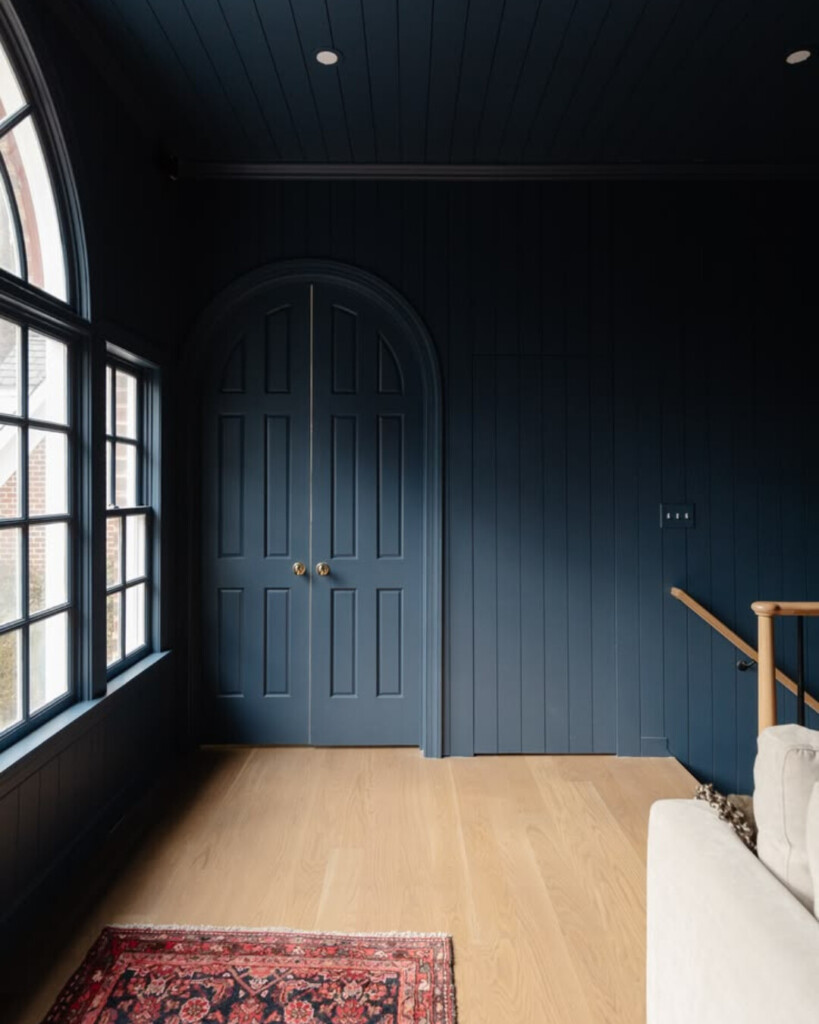
We used 2 parts De Nimes by Farrow & Ball  with one part Off-Black by Farrow & Ball for our den at the Sixth Street bungalow, and it’s a perfect example of how a blue can feel grounded, layered, and livable when chosen intentionally. It’s not just about liking a color chip. In fact, in this case I wanted something “in- between.” De Nimes just wasn’t reading as rich as I wanted, whereas Off-Black was a bit too dark … so, we custom mixed! It’s about how that color shows up in a real space, at different times of day, against real materials.

A moody, refined living room with deep blue-green walls, a classic white fireplace mantel, antique wood furniture, and warm brass accents, layered with soft textiles and vintage artwork for a timeless, collected feel.

What Most People Don’t Think About When Choosing Blue Paint

1. Blue shifts more than almost any other color

Blue is extremely reactive to light.

It can read:

  • gray in low light
  • green in natural light
  • almost navy at night

A color you love on a swatch can feel completely different on your walls.

Designer note: Always test blue on multiple walls and look at it morning, afternoon, and night. This is non-negotiable with blue. The Sampilize paint swatches make this so easy to do!

A light-filled kitchen with soft sage cabinetry, a large paneled island, white countertops, and brass fixtures, styled with fresh greenery and produce for a layered, inviting, and lived-in feel.
Design: Clouz Houz | Photography: Emily Kennedy

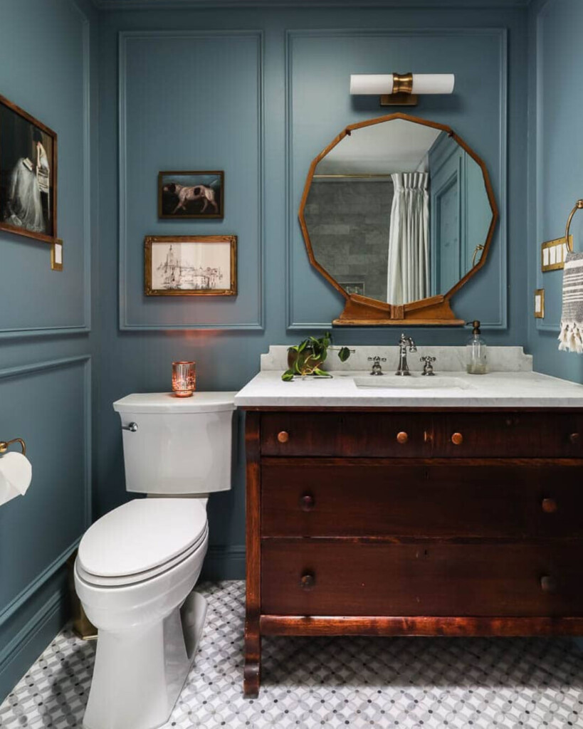
2. Your fixed finishes will pull the undertone

This is where most people miss the mark. Your flooring, countertops, tile, and even hardware will influence how your blue reads.

  • Warm woods → can make blue feel slightly green
  • Cool marble → can make blue feel crisp or flat
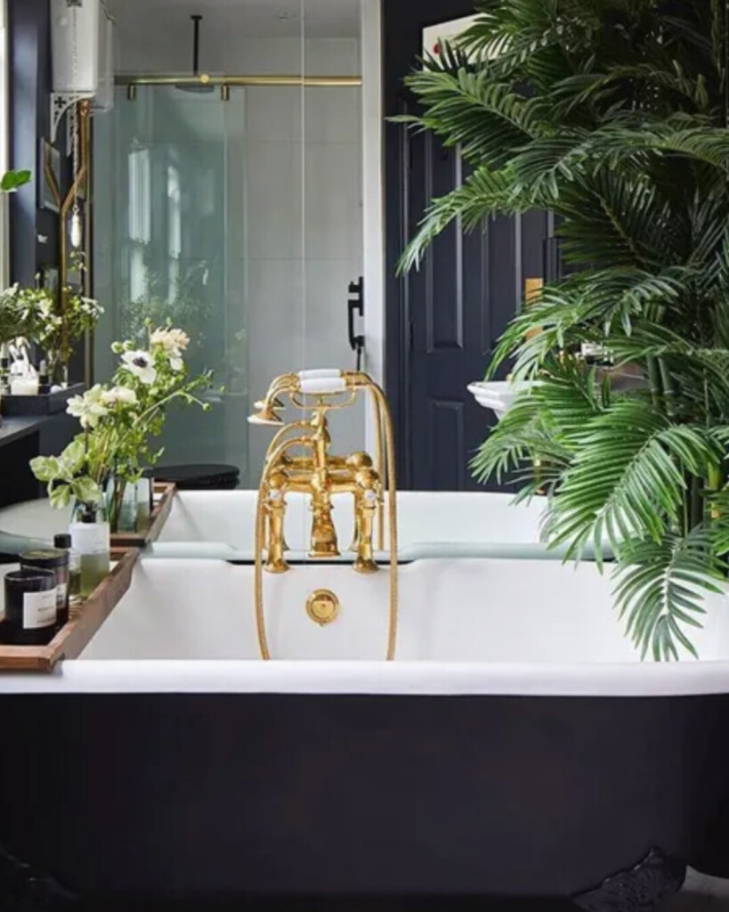
  • Brass → softens and warms a blue
  • Chrome/nickel → sharpens it

You’re not picking a blue in isolation … you’re picking a blue that’s in conversation with everything else.

A tailored kitchen with deep blue cabinetry, a dramatic marble slab backsplash, warm wood shelving, and a large stainless steel range, layered with natural textures and brass accents for a refined, functional space.
Design: Clouz Houz

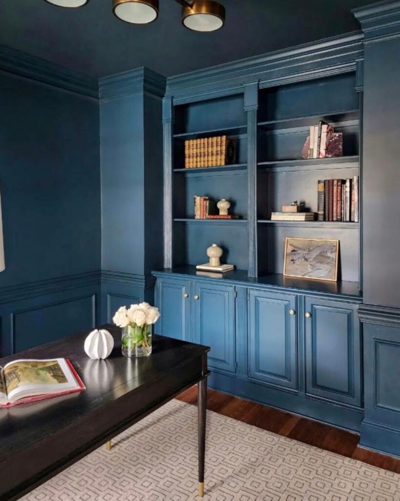
3. Depth matters more than color

People focus on “which blue” when they should be asking “how deep.” We often choose depth based on how we want the room to feel, not just the color itself.

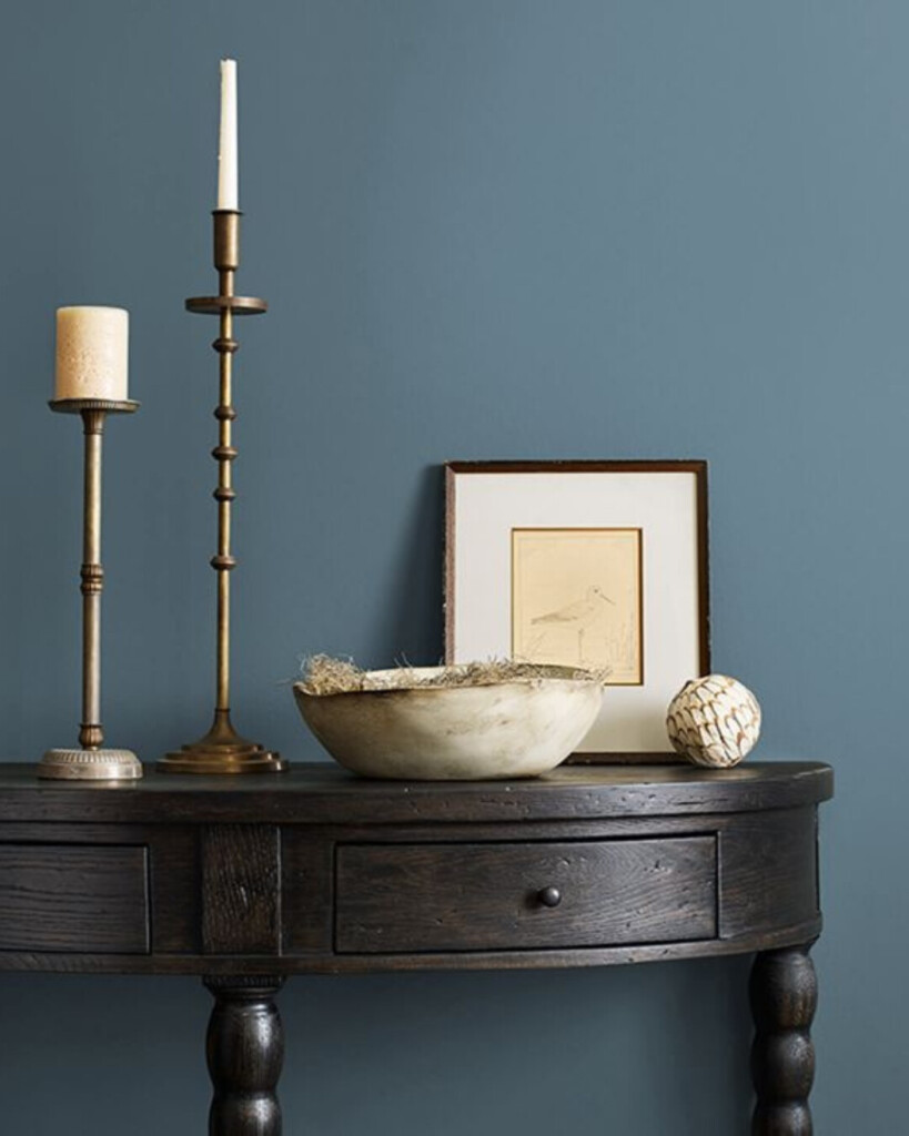
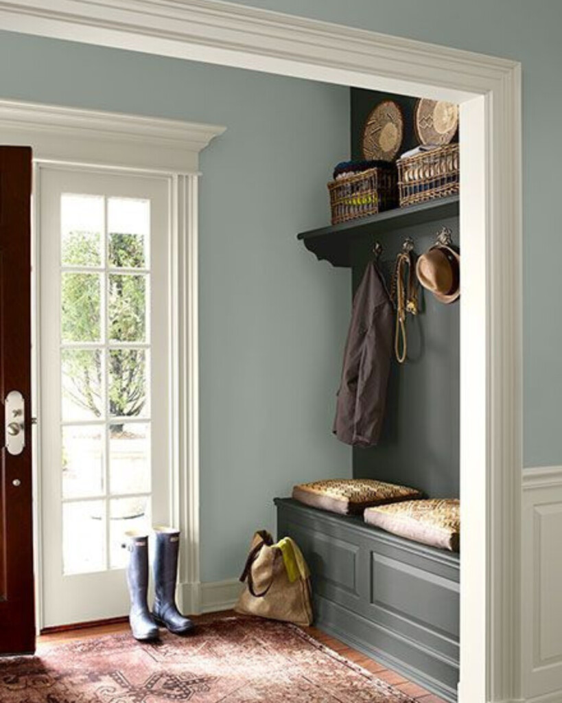
  • Lighter blues = airy, casual, sometimes coastal
  • Mid-tones = soft, livable, easiest to work with
  • Deep blues = dramatic, grounding, but need balance

The Best Blue Paint Colors I’ve Used

De Nimes – Farrow & Ball

A paneled room painted in a muted blue-gray with detailed wall molding, brass hardware, warm wood floors, and a traditional framed artwork creating a layered, classic feel.
Design: @aglassofbovino

Smoky Blue – Sherwin Williams

A styled vignette with a deep dusty blue wall, dark wood console table, brass candlesticks, and neutral decor highlighting the richness of the paint color.

Morning at Sea – Sherwin Williams

A bathroom with blue paneled walls, a warm wood vanity, brass fixtures, and a geometric tile floor, balancing classic materials with a bold color choice.
Design: Maison De Pax

Wedgwood Gray – Benjamin Moore

A light, airy entryway with soft blue walls, a darker built-in bench, woven textures, and natural light creating contrast between tones.

Hague Blue – Farrow & Ball

A deep navy built-in office with cabinetry, warm wood desk, brass lighting, and layered textures for a tailored, sophisticated look.
Design: Elizabeth Reich

Off Black – Farrow & Ball

Stiffkey Blue – Farrow & Ball

A dark, moody blue hallway with paneled walls, arched doorway, and natural light creating contrast against the deep color.
Design: Chris Loves Julia

Light Blue – Farrow & Ball

A soft, pale blue bedroom with classic wall molding, warm wood door, brass sconces, and layered neutral bedding for a calm, timeless feel.

Closing Thoughts

I used to think paint was a finishing touch. Now, it’s often where we start. The right blue can carry a room more than any furniture ever could, but only if it’s chosen with intention.

If you’ve ever picked a color you loved and it still felt off, it’s not you. It’s the layers behind it.

That’s where we come in. If you’re ready for a space that actually feels right, we’d love to help. Explore our services here!

Join the Conversation

get inspired
#clouzhouz
follow along
@clouz_houz
I’m going to be honest... when I first started in this business even I was intimidated.

I would walk into showrooms and wonder how their pricing worked and if you really must know there was a lot of ambiguity around how designers worked.

I have never wanted our clients to feel that way. We keep our process really streamlined, transparent and unintimidating. It starts with a quick questionnaire: budget, goals, how you live, etc. From there, we hop on a 15-minute discovery call to make sure we’re aligned. We want to be sure both parties are a good fit for each other!

Once everyone is agreed this feels “right” we dive into your first full conceptual design and walk you through layouts, materials, and selections in a way that we think brings the space to life.

You’ll have time for edits, and then from there we finalize everything so you can move forward with confidence. We follow through with executing the vision.

Our goal is always to make the process feel approachable and comprehensive. If you’ve been thinking about working with a designer but didn’t know what to expect... this is your sign.

Link in bio or head to our ‘work with us’ page to get started!
Enjoy a minute and a half walkthrough of the main level of our 6th Street Bungalow project. I’ve been having so much fun finally starting to style some of these finished spaces and wanted to share a little update.

This is also your reminder that life actually happens in our homes. Notice the hallway that still hasn’t been wallpapered, the moving boxes stacked in the corner of the dining room, or the empty shelves in the hutch that have quickly become our family’s catchall. Don’t get me wrong, I love a clean and tidy home, but as things usually get put back by the end of the day, a new mess unfolds the next morning. That’s just the reality of living through a renovation. But the mess is also a good sign. It means things are changing, construction is moving, and we’re getting closer to a home that finally feels like ours without people constantly in and out working.

While it’s fun to share the final reveals, this is your reminder that Instagram is a highlight reel. Try not to compare your home to someone else’s on its best.
This voiceover is from an interview with Ina Garten, and it stopped me in my tracks.

My parents still tell the story how they’d leave for a dinner out while I babysat my little sister and brother, and by the time they got home, the entire living room would be completely reworked. Not asked for.... but I just had to see if it could feel better. I had recruited my sister and brother to help me move the furniture in an entire new layout!

I didn’t know it then, but that instinct was the beginning of everything.

Fast forward 35 years... I went from being a stay-at-home mom to starting my own business, taking on real clients (not just my parents, who truly didn’t sign up for the redesigns😂 and building something that genuinely fills my cup.

There were so many moments of doubt in between, like starting later, wondering if it was too late, if I’d missed my window. But here’s the thing. It’s never too late to start. To pivot. To build something around what you naturally love.

Sometimes the thing you’re meant to do has been quietly following you your whole life.
Hey, I’m Allison:))

If you’re new here: I’m a self-taught designer with 20+ years of experience. What began as renovating our own homes has grown into a business helping clients coast to coast reimagine their spaces.

Lately I’ve been re-evaluating who we are and what we do best. I have lots of big ideas (dreams, really), but somewhere along the way things got a little muddled. So I’m getting back to the heart of it:

I make homes feel personal. Whether it’s a full renovation or just a few rooms, I help spaces reflect the people who live in them. A skill I’m most proud of? Knowing how to allocate your budget to deliver an elevated design that’s not only beautiful but lasting.

I’m also deeply committed to listening. I take your vision seriously, guide you through the overwhelm, and help turn those ideas into a reality, because I know how hard decisions can feel alone.

This is what clients come to us for. If this resonates, welcome and glad the algorithm brought you here!
Thanks for being here🫶🏻
I say this all the time, but drapery really is one of the most important layers in a room. We had just finished styling this space and it still felt like something was missing... adding these from @onequince was what finally pulled it together.

They add privacy but still let the light come through, and I always look for a bit of texture so things don’t fall flat. These hit that balance really well.

We’re actually planning to layer in bamboo shades here too, but I almost always like to double up on panels like this first. It gives the windows a fuller, more finished look even if they’re mostly decorative.

Also, small tip... these technically aren’t meant for drapery pins, but I pinned them along the back at the pole tabs to get a more tailored feel. Not perfect, but it works and makes them read a bit more custom.

Comment SHOP and we’ll send the link.

Direct link: https://liketk.it/6ciTA
#QuincePartner, @shop.ltk, #liketki