
Between the Layers | Design Guide Series
SUBSCRIBE
Design

How We Updated This Kitchen Without Replacing Cabinets

Tetherow Timber House | Bend, Oregon

Overview

Not every kitchen needs to be gutted to feel brand new.

At our Tetherow Timber House project in Bend, Oregon, our clients (who use this as their vacation home) loved the layout, the bones, and the overall architecture of the space. What wasn’t working? The heaviness.
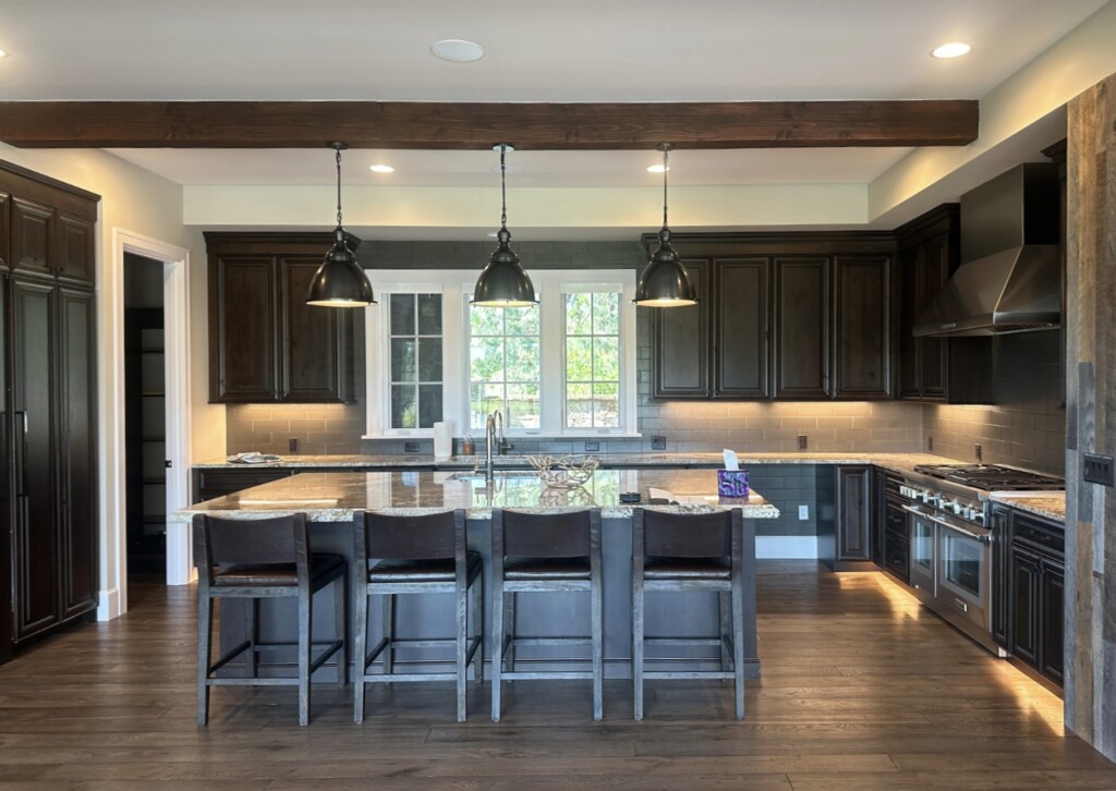
Wide view of a dark mahogany kitchen in a timber home with large island, granite countertops, black pendant lights, and exposed wood beam ceiling in Bend, Oregon.

The original cabinetry was a very dark mahogany with large knots throughout. Beautiful wood, actually (very rustic and very fitting for a mountain home). But, in this particular kitchen, it made the space feel darker than they wanted it to be.

Instead of starting over, we made strategic updates. We kept what worked, refreshed what didn’t, and focused on the details that would create the biggest visual shift.

Working With What’s Already There

The original lower cabinets are staying.

They’re dark, rich, knotty mahogany, and I actually love the character they bring. It grounds the space and ties it into the architecture. But, when everything at eye level is also dark, it can start to feel heavy and quite honestly, lacking in character.
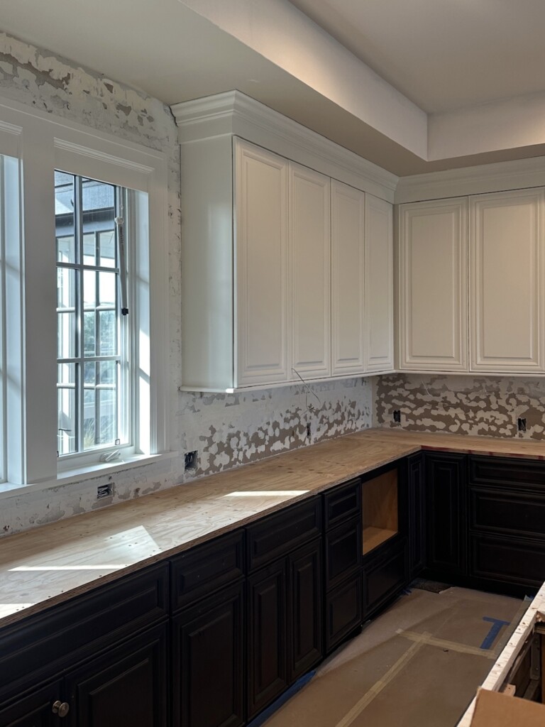
Kitchen renovation in progress with freshly painted white upper cabinets, original dark mahogany lower cabinets, and countertops removed for upgrade.

So, instead of replacing everything, we sanded and repainted the upper cabinets (Benjamin Moore ‘Swiss Coffee’) to brighten the space around eye level. This instantly lifted the room. Your eye now hits something lighter first, which changes the entire feeling of the kitchen.

It’s such a good reminder: you don’t always have to replace everything to create impact!

This approach also allowed us to allocate budget more strategically. By saving on full cabinet replacement, we were able to invest in other areas that really matter — like hardware (more on that in a second) and new surfaces.

The Power of Hardware

If you take one thing from this post, let it be this:

New hardware is the easiest way to make a space feel fresh again.
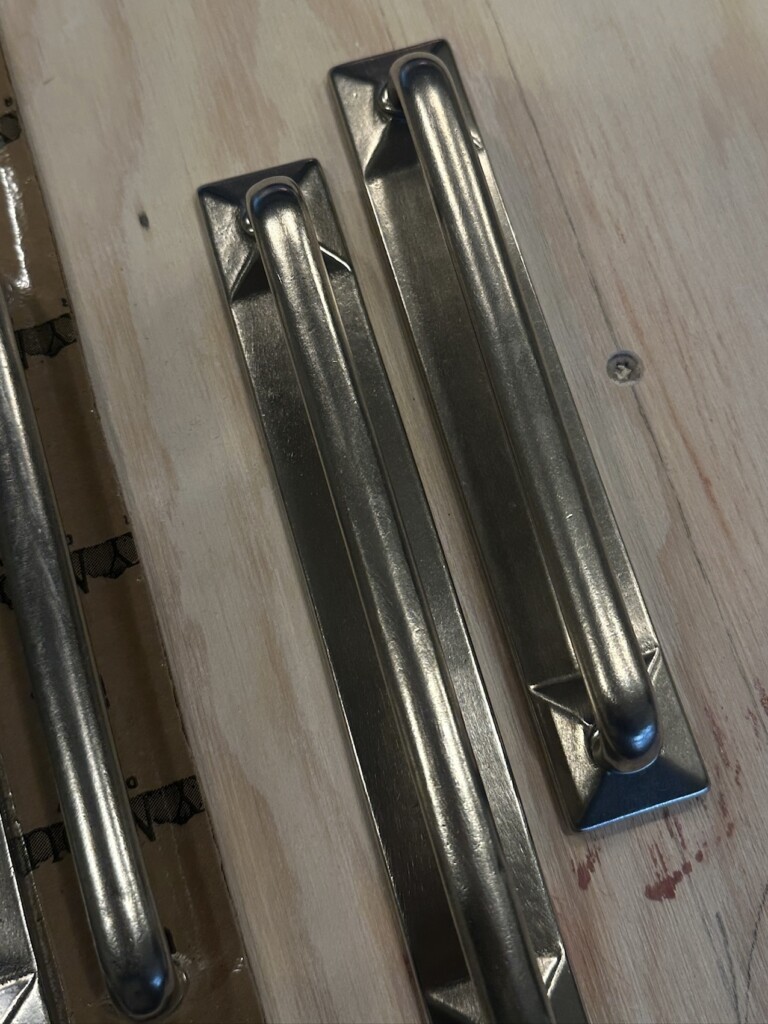
Close-up of Rocky Mountain Hardware cabinet pulls in a brushed metal finish displayed on a wood surface before installation.

We’re installing Rocky Mountain Hardware throughout, and I absolutely adore this brand. The weight, the finish, the craftsmanship … it elevates everything around it.

New Backsplash: Zellige Tile

Again, the dark backsplash tile wasn’t helping the goal to make the space feel lighter and brighter, so we replaced it with the most beautiful zellige tile. If you’ve been here for a while you know how much I love this tile! The character and texture it adds to any space is just amazing. We love how it added more rustic vibes to the space as well.

What’s Coming Next

We’re also replacing the countertops (which I truly cannot wait to reveal once installed). Those updates, layered with the lighter uppers and elevated hardware, are going to transform this kitchen without losing its soul.
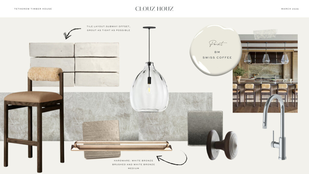
Our clients didn’t need a full renovation. They needed the space to feel more like theirs. Lighter. Fresher. More aligned with how they want to enjoy it.

Follow along for more BTS over on our Instagram!

Join the Conversation

get inspired
#clouzhouz
follow along
@clouz_houz
I think one of the biggest mistakes we make is assuming we’re supposed to have everything figured out before we begin. Looking back, there were so many clues pointing me in this direction. I just didn’t recognize them because they felt... ordinary. The things that come most naturally to us are often the things we overlook. We assume everyone thinks that way. Sees the world that way. Enjoys those same things. It took years before I realized that what felt effortless to me wasn’t effortless to everyone else. Maybe that’s why I have such a soft spot for old houses. Sometimes they don’t need to become something entirely different. They just need someone to recognize what was there all along. I think people are a little like that, too.

I’m curious... have you ever looked back and realized the signs were there all along?
Part 1 of our Sixth Street den is finally here.

This room is a little different than the rest of our home, and honestly... that’s what I love about it. One of my design philosophies has always been knowing where to save and where to splurge. Not every room needs the same investment, especially when you understand how it’s going to be used.

This is our family den. It’s where we unwind at the end of the day, watch a movie, read a book, or curl up with the dogs. When we’re entertaining, everyone naturally gathers in the kitchen, dining room, or living room, so I gave myself permission to be a little more creative here.
That meant mixing old with new, incorporating a few vintage finds, and investing in the pieces that would have the biggest impact. It was less about buying everything new and more about creating the feeling I wanted. The room isn’t finished yet (are they ever?), but it’s already become one of our favorite places to land at the end of the day.

I can’t wait to show you Part 2 and walk through some of the other decisions that brought this room together. It’s full of personality, and I think those details are what make it feel like us.

Part 2 coming soon!
Well, this was fun!!

For those of you who are new around here and want to get to know a little more about Clouz Houz (and me), consider this the rapid-fire version.

I’m Allison-the principal designer/owner behind Clouz Houz. These answers are a pretty honest glimpse into how I approach design, what I believe makes a home feel good, and the little things I think matter most.

At the end of the day, every project is different, but my philosophy is always the same: create homes that are meant to be lived in, not just looked at.

Now I’d love to hear from you. Which answer resonated most? Or better yet... what’s a design opinion you’ll defend forever? Leave it in the comments!