Just when you think you’ve finally come to a decision on what color to paint your walls, the afterthought of the trim suddenly comes to mind! Selecting your wall color is stressful enough, then add trim, and — it can be challenging. Our clients often ask us how we pick colors that balance well together. I always tell them to have fun with it, and not put too much pressure on themselves … or hire a designer to help. ?
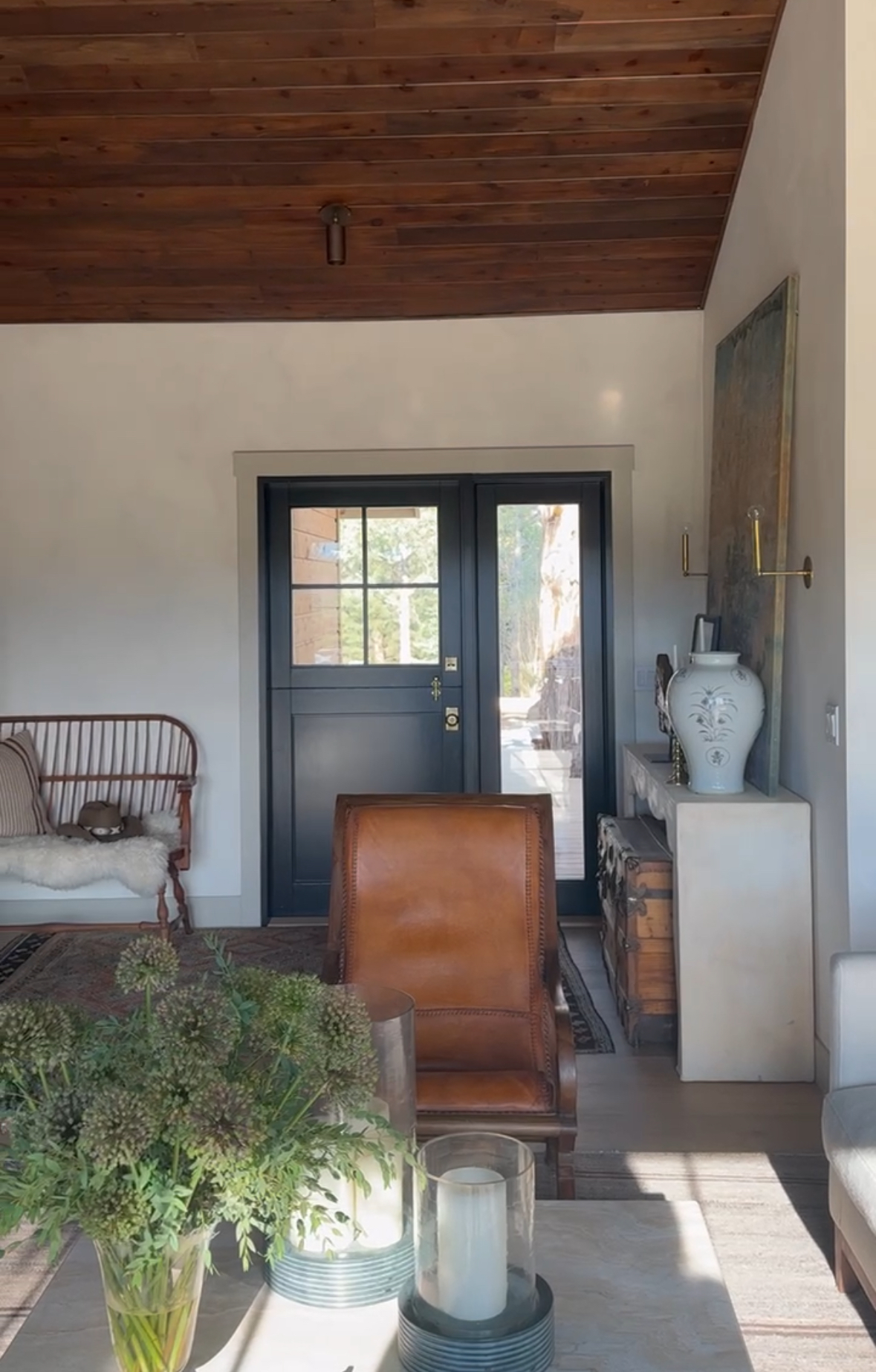
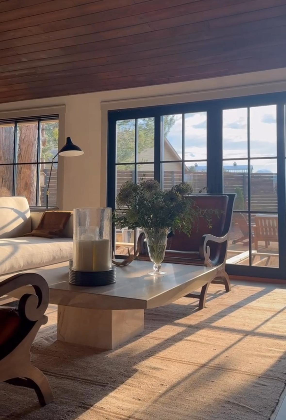
When it comes to picking out wall and trim colors, the possibilities are endless! But, a little inspiration can go a long way. For our latest project at the Tumalo house, we went with Farrow & Ball’s ‘Dropcloth’ for the accent trim. It’s a super creative, subtle way to jazz up neutral walls and add a bit of interest without going overboard. It’s the kind of thing you’ll see all over Pinterest if you need some visual inspiration. Also, it will call attention to any architectural points of interest in the space, and help the design and details of your room stand out more prominently.
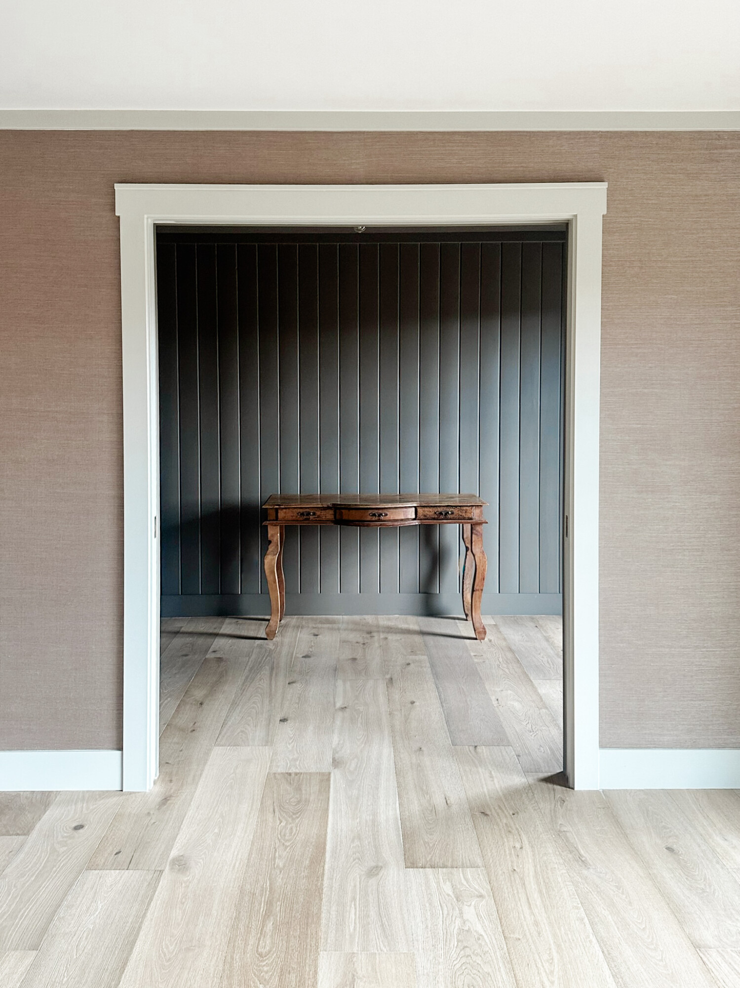
If you’re into lighter walls, pairing them with a darker trim can create a gorgeous contrast that really makes the room pop. It’s like giving your space a little extra definition. But hey, if you’re feeling bold, you can totally go for a rich, deep wall color with lighter trim to make a statement.
Here’s a little trick I’m loving lately: if you’re using an accent color on your trim, consider carrying that color throughout your home for a cohesive look. It’s a great way to create flow from room to room. But, if you’re going all-in with a color-drenched room (where you bathe the room in a single color), you can break the rules a bit. Use the same color on the trim in that room, then switch back to your regular trim color for the rest of the house. It makes that room feel like its own special experience, while keeping everything else nicely coordinated.
Mixing Sheens
Here’s a fun tip to help make your colors pop: mix different sheens to keep things interesting. If your walls are painted in an eggshell finish, consider going for a satin or semi-gloss sheen on your trim. This little switch not only adds visual contrast, but also gives you a bit more durability. This is super useful for high-traffic areas, like window and door frames, where scuffs are more likely to happen.
And, if you’re looking for some fresh trim color ideas, here are a few I’d love to see more of:
- Sherwin Williams “Accessible Beige”: A warm, versatile shade that pairs beautifully with many wall colors
- Sherwin Williams “Natural Linen”: A soft, neutral hue that’s perfect for creating a calming vibe
- Benjamin Moore “Gray Owl”: A sophisticated gray with just the right amount of warmth
***
Still have questions about choosing the right paints for your home? Read our blog ‘Creating A Color Palette For Your Home’ or feel free to reach out or comment!


