Setting the Scene
(And What This Room Taught Me About Light)
For a while now, this room has quietly worn a lot of hats.
It’s been our makeshift TV room, our default hangout space at the end of the day, and (somehow) also our dining room when the rest of the house was in flux.
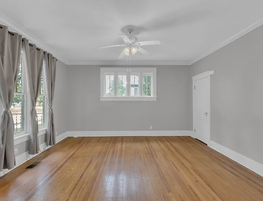
But, as the Sixth Street Bungalow continues to take shape, it finally feels like the right time to give this room a clear purpose. I’m officially turning it into my office! I want it to be a space that feels creative, collected, and functional, without losing the warmth and character that made it a place we naturally gravitated toward in the first place.
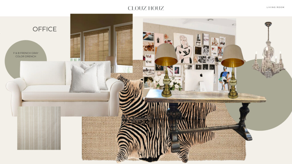
This office will be layered and lived-in: a proper desk for workdays, a sofa for reading or taking calls, bulletin boards for pinning inspiration, and finishes that feel timeless rather than trendy. Step one? Clearing everything out and starting fresh with paint—specifically, a subtle, yet very grounding green that sets the tone for the entire room.
Paint as the Foundation (Color Drenching the Room)
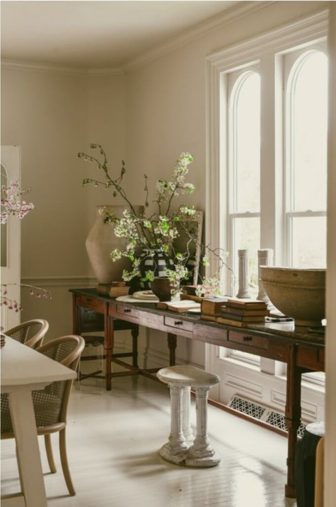
Green felt like the right choice almost immediately. I’ve always gravitated toward it in my own spaces—it’s grounding, classic, and works beautifully in older homes. Because this house was built in the late 1920s, I wanted something that felt a little retro, a little earthy, and like it could have always been there.
We initially landed on Farrow & Ball Vert de Terre, a grounding color that I’ve used before. On paper, it felt perfect: soft, muted, and mossy without being heavy. The kind of green that adds character quietly and lets the layers do the talking.
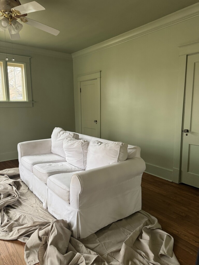
We decided to fully color drench the space (walls, trim, and ceiling) to create that wrapped, cocooned feeling I love in an office.
But, once we started living with it, something interesting happened.
This room is north-facing, and when you color drench a space like that, the color doesn’t just live on the walls. It reflects off everything. Ceiling, trim, light bounce… it all intensifies. And in north-facing light, Vert de Terre started pulling cooler and bluer than I was expecting.
Not bad—just different.
And, it was a good reminder of something I’m always talking to clients about: light changes everything.
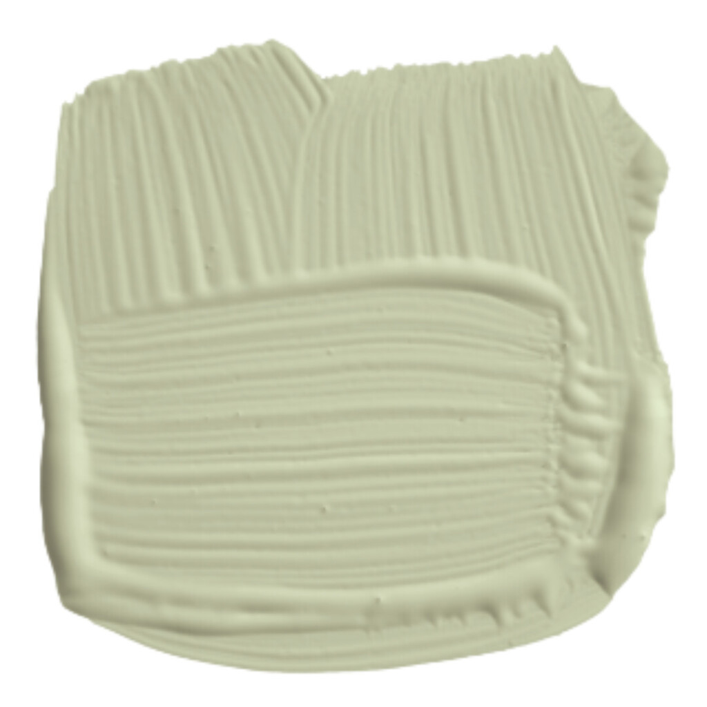
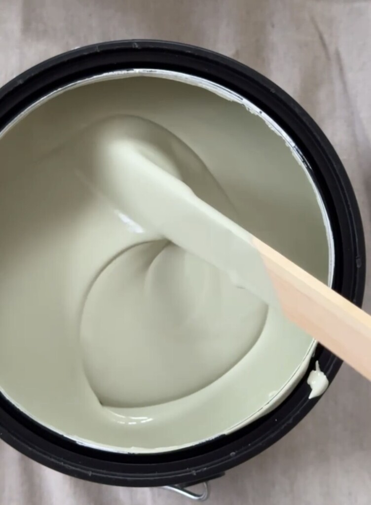
That’s what led us to Farrow & Ball French Gray.
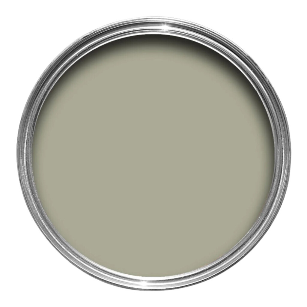
Despite the name, French Gray reads as a gentle green with a subtle warmth to it. Where Vert de Terre has punch with blue undertones, French Gray feels richer (I always say lean into what you are dealing with — no or little natural light spaces can go richer and darker) and a bit more neutral. If you’re searching for a true mid-tone green (one that isn’t overwhelmingly green or underwhelmingly gray) this might be the one.
It still gives me that timeless, lived-in look that’s perfect for this house, but without the cooler undertones taking over. It feels calmer, more balanced, and better suited for a room I’ll be working in every day.
Not a full pivot, just a thoughtful refinement.
Clouz Houz Tip: When I color drench, I use three different sheens: eggshell for walls, satin for trim and flat or matte for the ceiling.
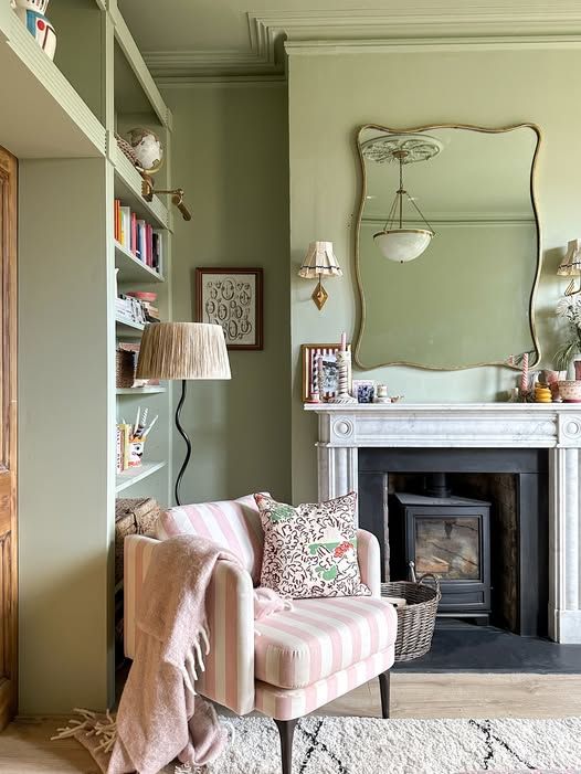
How French Gray Reads in Different Facing Rooms
Paint colors will always look different from one home (and even one wall) to the next. Natural light, what’s outside your windows, floor tones, and room direction all play a major role. While testing samples in your actual space is always best, here’s a general guide for how French Gray behaves depending on exposure:
South-Facing Rooms
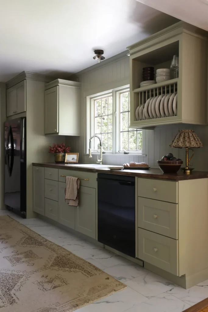
South-facing rooms receive warm, consistent light throughout the day, which enhances French Gray’s warmer undertones. In these spaces, it often reads as a vibrant green with golden olive notes, though it can soften into a duller gray-green depending on the time of day.
North-Facing Rooms
North-facing rooms receive cooler, indirect light, which amplifies green and blue undertones. In these spaces, French Gray can lean more subdued—sometimes reading as a cooler green, a darker gray-green, or even slightly blue-green.
For reference, our office is north-facing, which is why this color felt calm and grounding, but also very honest—nothing overly warm or yellowed.
East-Facing Rooms
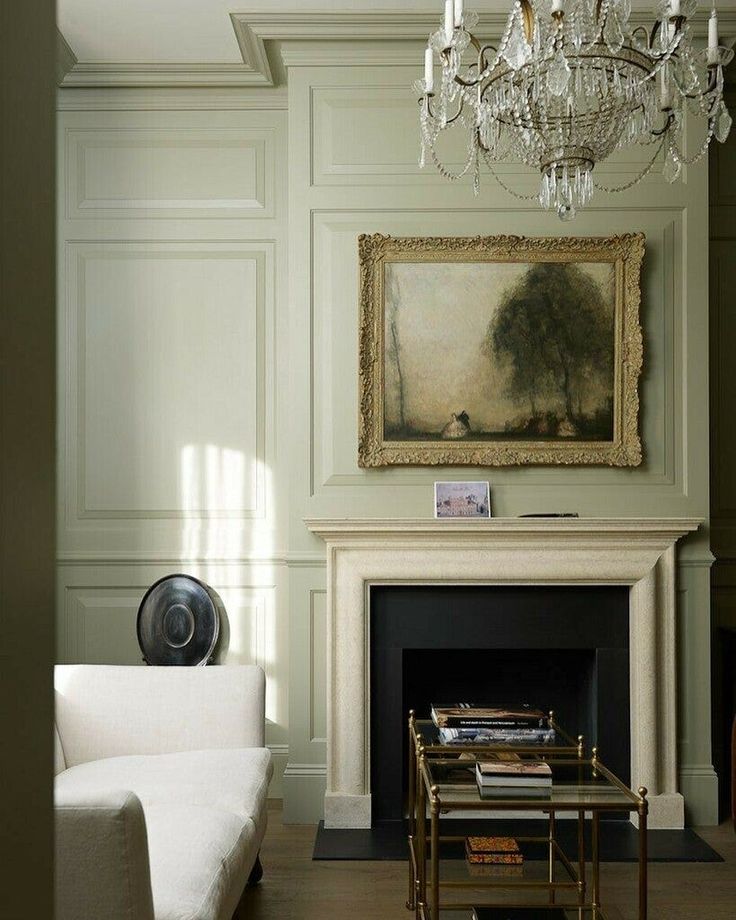
East-facing rooms get warm morning light and cooler light for the rest of the day. French Gray may appear warmer and more olive in the morning, then shift toward a gray-green or blue-green as the day goes on.
West-Facing Rooms
West-facing rooms receive cooler light most of the day, followed by warm, golden light in the evening. French Gray often reads as a muted gray-green during the day, then comes alive as a warmer, richer green at sunset.
A Standout Moment: The Zebra Hide Rug
Early on, I knew that I wanted to bring some form of animal print into this house. It breaks up all the softness and keeps a space from feeling too polite. For me, animal print always reads more classic than trendy when it’s used intentionally, and a hide felt like the right entry point.

What’s so interesting about using a zebra hide is that it feels like a layer, not a lifetime commitment. It’s bold, yes—but it’s also flexible. Laid over this larger jute or wool rug, it adds movement and contrast without overwhelming the room..
A little insider tip: hides work best when they don’t try to be perfect. Let the edges feel organic. Let it overlap furniture slightly. That relaxed placement is what makes it feel like it’s always been there.
Window Treatments: Softening the Space
Window treatments were all about balance in this room. With the walls fully color drenched, I wanted the windows to add warmth and texture without pulling focus. That’s where the combination of woven bamboo roman shades and linen drapery panels really shines.
The bamboo shades bring in that grounded, natural layer that is welcome in most any room. They filter the light just enough and add a subtle texture that keeps the room from feeling flat.
Layered with pleated linen drapery panels, the space softens instantly. The drapes add height and a sense of ease, especially when they’re hung high and allowed to puddle slightly. It’s a simple move, but one that makes the room feel taller, calmer, and more finished.
A Creative Corner
Bulletin boards are one of those things that instantly make a space feel alive to me. They’re practical, yes … but more than that, they’re inspiring. It’s fun to be able to pin things up, move them around, layer images, and let ideas live out in the open instead of tucked away in a folder on my computer.
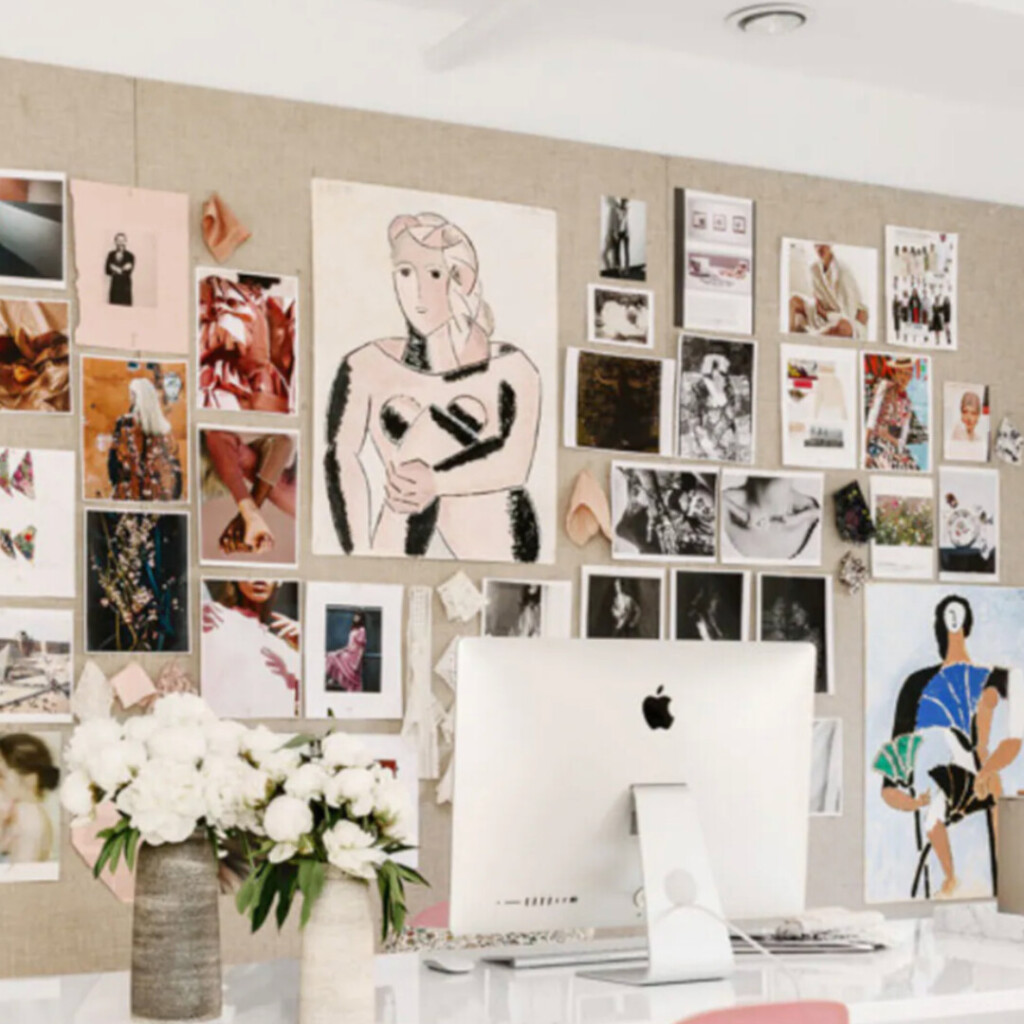
This office is meant to be a working space, not just a pretty one, and bulletin boards feel essential for that reason. Paint samples, fabric swatches, tear sheets, handwritten notes, photos I’m drawn to lately—it all deserves a place where I can see it every day. There’s something about that visual clutter (the good kind) that sparks creativity in a way nothing else does.
I’ve made my own bulletin boards in the past, and it’s surprisingly simple to do. Get to choose exactly how it looks and functions for your space. If I end up going the DIY route again here, I’ll definitely share the process over on Instagram.
What’s Coming Next
Now that the direction is clear and the vision is set, this is where the room really starts to come to life. Paint was first on the list and everything else is building off of that foundation.
For seating, I found a cozy white, sleeper sofa (because this room has two roles- office and guest room when needed!)—something comfortable and inviting, not overly formal. Layered with these pillows (I’ve used these before at our last home and loved them so much decided to order again), it’ll feel collected and personal. This room needs to work hard, but it also needs to feel like a place I actually want to spend time in.
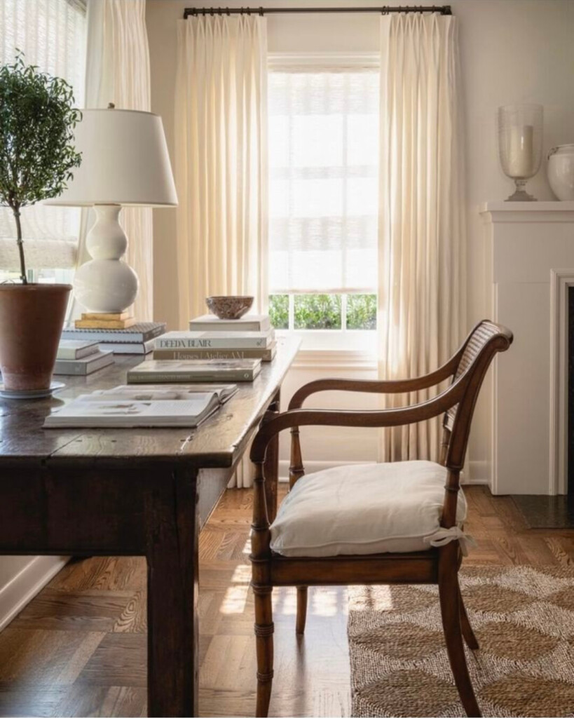
Then there’s the desk, which might be my favorite piece so far. I found a vintage wooden dining table on Facebook Marketplace that’s the perfect size to float in the center of the room. Using a table as a desk instantly makes the space feel warmer and less like a traditional office—more lived-in, more creative.
More to come as I layer in the final details to make this an intentional, inspiring workspace.
xx
Allison

