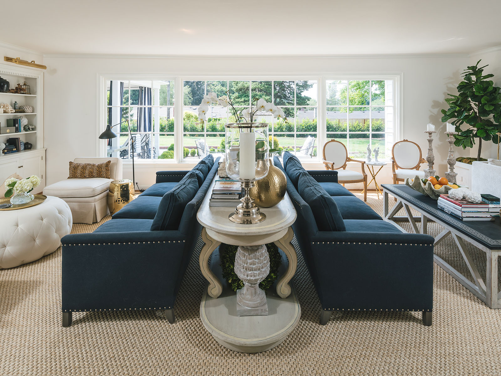
A Thoughtful List of Our Tride and True Shades
Let’s chat about something we’ve all got on our walls but might not have thought much about– white paint. These white paint colors are ones that we have used time and time again. I’ve used them in client projects and even in our own investments. But here’s the kicker – not all whites are created equal.
It’s kinda like trying to find the perfect pair of jeans. You know, they may all look the same, but once you’ve found “the one,” you get it! It sets the mood, and trust me, it’s not as straightforward as you’d think. So, let’s talk about why choosing the right white paint is so important.

“Simply White”
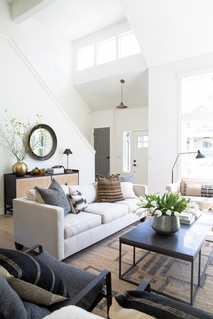
We’ll kick things off with an absolute classic: Benjamin Moore’s “Simply White.” This one holds a special place in my heart. I mean, I first dipped my brush into this beauty when it snagged the “Color of the Year” in 2016.
And let me tell you, it lives up to its name — it’s simple (no pun intended), clean, and oh-so-versatile. This shade of white isn’t too bright, but it’s not drifting off into the yellow sunset either. It’s that sweet spot right in the middle.
What’s so great about “Simply White” is that it can adapt to any situation. Seriously, it can swing from modern to traditional. That’s why I keep it in my back pocket for just about everything – trim, cabinetry, doors, ceilings – you name it!

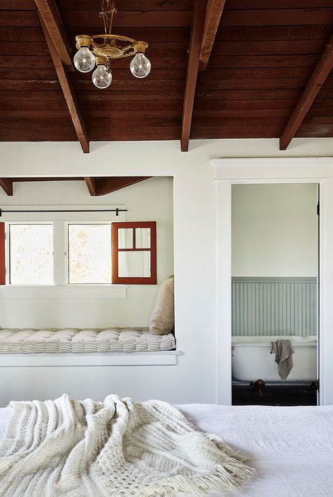
“Swiss Coffee”
 This is another gem from Benjamin Moore – “Swiss Coffee.” This one’s got a little secret – a touch of brown in the mix. And it’s right there in the name, so no surprises there. Think of a super creamy, frothy cup of your favorite coffee.
But here’s where it gets interesting – I like to have the paint store mix it at half strength. Yep, we’re talking 50% of the usual strength they’d use for a gallon of paint. This little tweak does wonders; it cuts down on some of the brown but still leaves you with this beautiful warm white.
We went all-in with “Swiss Coffee” in our old home, and let me tell you, it was a game-changer, especially in those sun-drenched bedrooms. It’s like a warm, cozy hug from your wall paint, especially when you’re working with more traditional or transitional home vibes. This shade pairs best with warm, natural materials, so if you’re into that organic, inviting feel, “Swiss Coffee” might just become your new best friend.

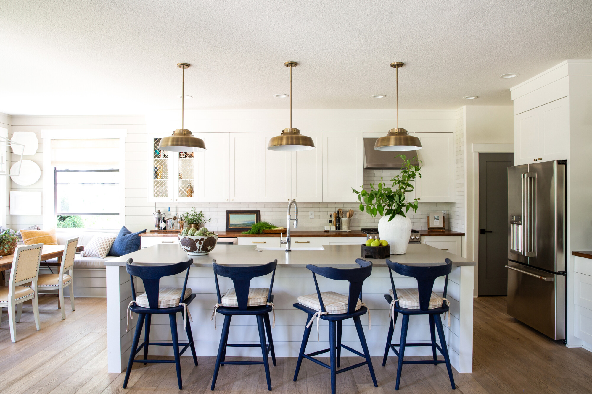
“Chantilly Lace”
Alright, buckle up, because we’re about to explore Benjamin Moore’s “Chantilly Lace,” and this one’s a real game-changer! If you’ve been on the prowl for that perfect, clean, and bright white, with not a hint of pink or blue in sight, then you’re in for a treat. In my books, it’s not just any white; it’s one of the “purest” whites out there. The name itself hints at its elegance – picture that crisp, delicate lace you might’ve inherited from your grandma.
When it comes to achieving that modern aesthetic, “Chantilly Lace” is the unsung hero – cool, suave, and always in style. However, it’s not just limited to modern settings. This shade can effortlessly dance with black, neutrals, and those cozy, earthy tones, creating a visual contrast that’s simply stunning. So, here’s the inside scoop: I highly recommend it for bathrooms and kitchens, where its pristine, clean look works like a charm.

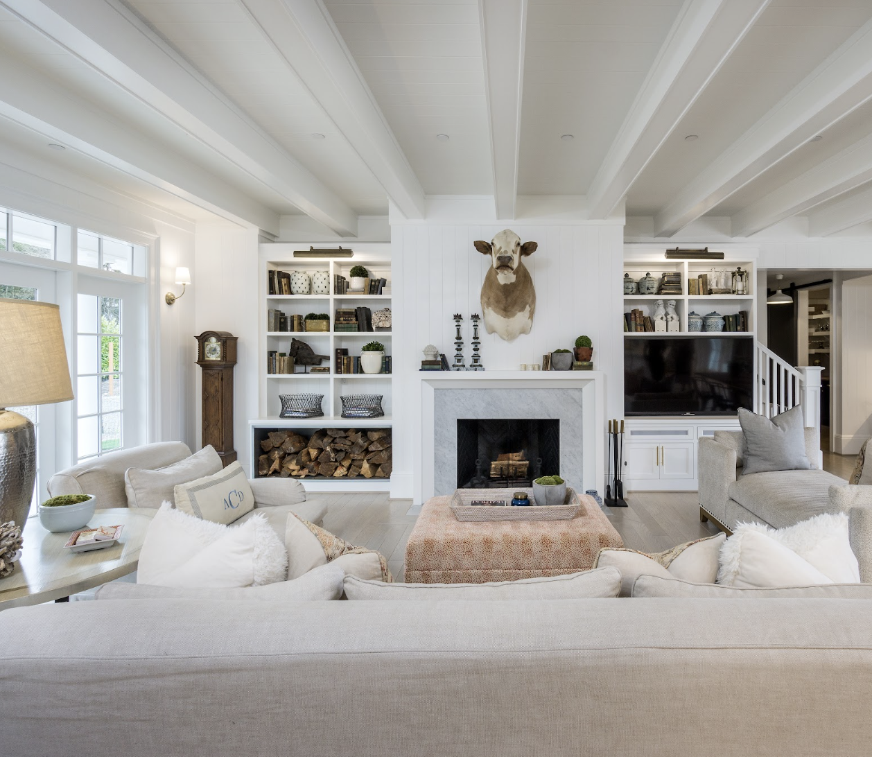
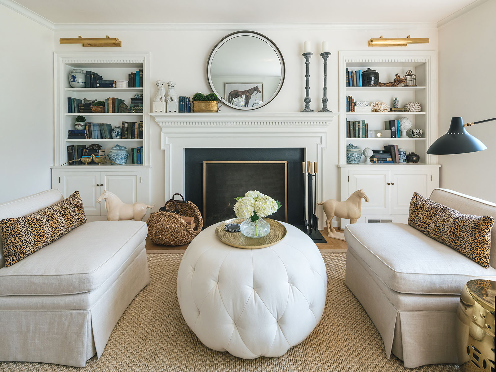
“White Dove”
And now, for the grand finale, we’ve got Benjamin Moore’s “White Dove.” This one’s an absolute favorite, especially in rooms that bask in the glory of abundant natural light. It’s got these warm, creamy, almost gray-ish undertones that create a serene and cozy atmosphere, making it the go-to choice for a dreamy bedroom. I mean, if you’re all about those soothing, calming vibes, “White Dove” is your wingman (pun totally intended).
So, if your space is blessed with sunshine aplenty and you’re looking for a paint color that radiates tranquility, “White Dove” is the answer. It’s the white paint equivalent of a good night’s sleep. You won’t want to hit the snooze button on this one!
![]() Clouz Houz tip #1:
Clouz Houz tip #1:
Every white paint can have its own little personality in each home. So, here’s the deal – before you dive headfirst into a sea of white paint cans, take a breath and consider this. It’s worth every penny and a bit of your time to grab some samples! You can either purchase those little paint sample pots or opt for a nifty solution like sheets from Samplize. These babies come with a sticky backing, so you can peel and place them in your desired room – no mess, no fuss!
Now, here’s the real secret: live with the paint color for at least a day. Give it some time to shine, or not, in different lighting scenarios. Observe it in the morning sun, the daytime glow, and the cozy evening light. You’d be surprised how a color can change its tune and you want to make sure that you’re in love with that white paint in all its moods.
![]() Clouz Houz tip #2:
Clouz Houz tip #2:
And here’s our last piece of advice: if you’re aiming for that super sleek and streamlined palette in your space, here’s a trick we swear by: keep the same white for both your walls and trim. Now, I know what you’re thinking, “Won’t that be too much white?” Well, believe it or not, by playing around with different sheens, you can work wonders. Picture this – matte or eggshell for the walls and satin for the trim. What you end up with is a beautifully complimentary look with the added bonus of gorgeous shadow lines where the two meet. So, if you’re all about keeping things crisp, clean, and elegant, consider this white-on-white strategy.
I hope this guide has lightened the load and empowered you to confidently choose the ideal shade of white for your home. Remember, the right paint cant transform your living spaces, creating the atmosphere your desire. So go ahead and paint your world with the color that truly feels like home!
***

