We just moved in—and Tennessee is already changing how I see houses.
Every drive feels like a crush: white columns in buttery morning light, long porches that look grand from the street and then feel like a hug up close. Tall ceilings, soft brass, and old brick that’s seen things. It’s formal and friendly—my favorite combo.
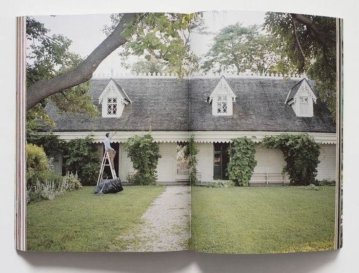
I’ve been collecting moments like souvenirs: a milky paint color on a courthouse door, café curtains lifting in the breeze, a checkerboard floor scuffed in all the right places. Those snapshots are steering this month’s concept—Greek Revival, but easy.
What we’re leaning into
- Porches that earn their keep (fans, lanterns, and a table for peach pie and laptop days).
- Pretty millwork with a light touch.
- Materials that age well—soapstone, warm woods, unlacquered brass, a hint of pewter.
- Pattern as a whisper—stripes, toile, and washed florals layered, not loud.
This isn’t a big reveal; it’s a first pass at what we’d do in a Tennessee Greek Revival. We’re playing with color, mixing old and new, and keeping it livable. If you’re into homes with history and rooms that don’t take themselves too seriously, pull up a rocker. The columns got us here; the charm is why we’re staying.
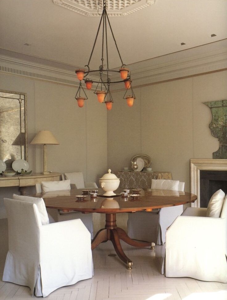
The Vision: Heritage with Heart
We wanted to reinterpret the Greek Revival style for a modern family—one that respects the home’s architectural bones, but leans into comfort and function. Think antique heart pine, worn marble, faded florals, and unpolished metals. Every detail should feel storied yet effortlessly approachable.
These homes were originally built to impress … but our goal is to make them feel lived in. Less “museum house,” more “come in, stay awhile.”
Color Story: Classic Meets Warmth
Tennessee’s natural palette inspired this concept: moss greens, buttermilk creams, and muted ochres that glow at golden hour. We love pairing crisp architectural whites with muddy yellows or grayed blues for contrast. Unlacquered brass and aged pewter give the right patina, while vintage art (portraits, pastoral scenes, still lifes) layers in depth and character.
Our muse? A home that’s beautiful in every season—inviting in winter, fresh and light come spring.
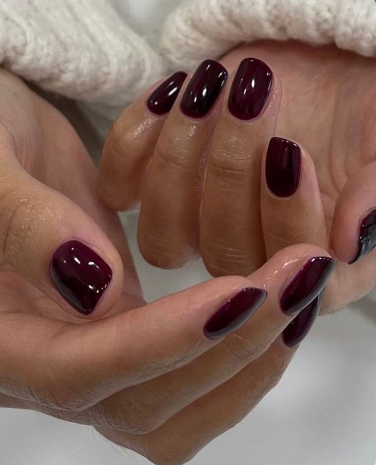
Color of the Month (a fun detour): I usually share paint, but this time it’s a nail shade I can’t quit—OPI Lincoln Park After Dark. It’s a deep, moody purple-brown that reads chic in daylight and extra polished at night. Perfect for fall/winter and the holidays, and it doesn’t wash me out the way some dark berries do. Consider it the wearable version of our palette: cozy, sophisticated, and quietly dramatic.
Room by Room: The Tennessee Greek Revival Mood
Pewter Table | Gold Clock | Globe Pendant | Vintage Amber Highball Glasses | Antique High Back Chair |
Marble Table | Velvet Sofa | Ornate Wooden Chair | Checked Wool Rug
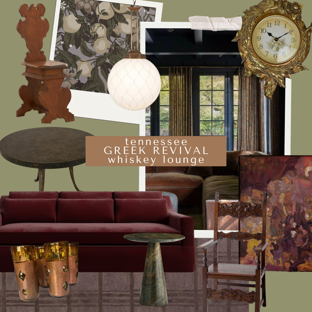
Whiskey Lounge
This room was our chance to lean into the moodier side of Greek Revival—the kind of space that feels equally right for a late-night pour or a quiet morning scroll.
The burgundy velvet sofa anchors the room; it’s bold but classic, and looks better the more lived-in it gets. I paired it with an antique wood armchair (here is another ornate option) that has the best carved detail—mixing polished and patina is where the character comes from.
> A round stone-top table softens all the straight architectural lines, and a mottled brass side table ties in that old-world warmth. I’m obsessed with this floral art print—it adds just enough romance without feeling precious.
> And if you know me, you know I can’t resist a little bar moment: copper whiskey tumblers or a champagne bucket (like this triple brass one), a vintage wall clock, and a globe pendant overhead for that cozy, amber light that makes everyone look good.
Of course, the entire lounge would be drenched in this Zak + Fox wallpaper!
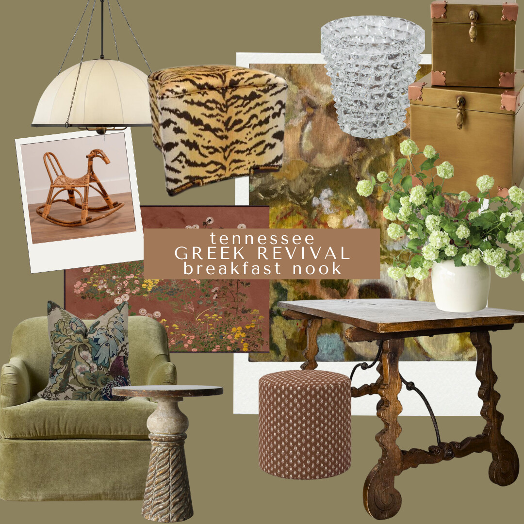
Dome Pendant | Tiger Ottoman | Glass Vase | Brass Boxes | Artwork | Wicker Horse | Floral Pillow |
Accent Table | Vintage Spanish Desk | Printed Ottoman | Faux Stems
Breakfast Nook
The breakfast nook feels like a love letter to Tennessee mornings—coffee, sunlight, and a little bit of pattern play.
A tiger-print ottoman adds personality without screaming for attention, and the olive green swivel chair is just… everything. It’s soft, structured, and has that “sink-in but still look put-together” quality. A couple of floral throw pillows and a pedestal accent table finish the space with a mix of modern silhouettes with old-world charm!
I mixed in a rustic wood table and petite patterned stool—together they make the space feel grounded but not fussy. For lighting, the ivory pendant gives a soft glow that makes early mornings less painful.
The glass vase filled with fresh greenery or flowering branches keeps it from feeling too heavy. And, I’m loving vintage-inspired floral artwork layered behind the chairs for warmth and depth. This is where color feels alive without trying too hard.
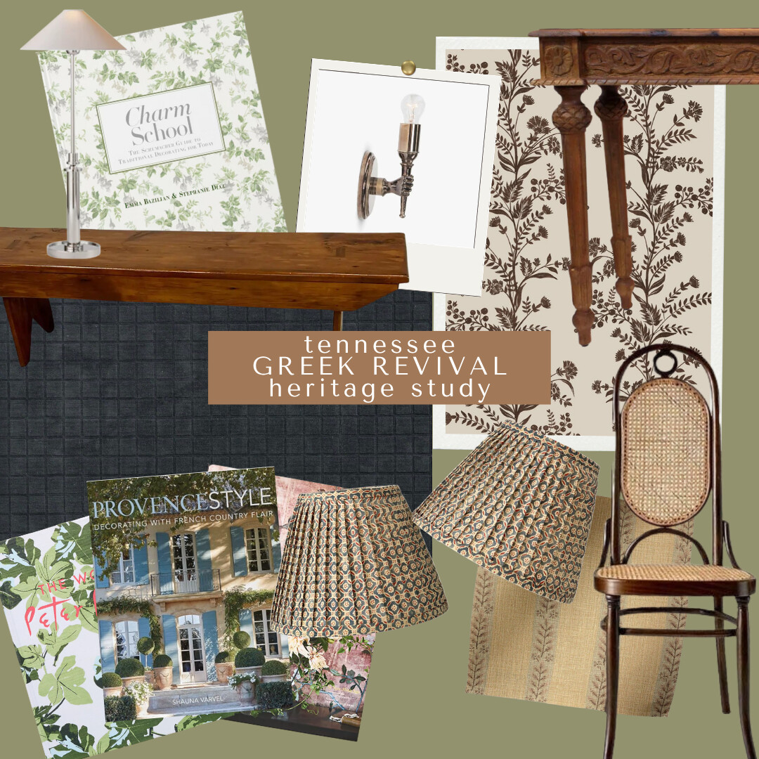
Rattan Dining Chairs | Lampshades | Wooden Console | Provence Style | Peter Durham Coffee Book | Charm School
Bringing Nature Home | Geometric Rug | Chrome Lamp
Heritage Study
This is the quiet one—the thinking room, the reading room, the “pretend I’m working but really scrolling Pinterest” room.
The bones are simple: a solid wood desk that looks like it’s seen decades of drafts, paired with a cane-back chair that keeps the look airy. The block-print lampshade and floral wallpaper bring in pattern in a way that feels collected, not coordinated.
I picked a bronze wall sconce or this chrome lamp for light that flatters everything (including late-night laptop glow), and stacked a few favorite books—“Provence Style” and “Charm School”—for inspiration.
The wool geometric rug and antique pew are the finishing touches that make the space feel storied—like it’s always been there, even if we just designed it.
Want More?
If you’re into this mix, you can shop all the pieces from this post (and more of my current finds) over on our LTK.
LTK is where I share everything from home styling favorites to my go-to fashion staples—because let’s be real, a good outfit and a good room are kind of the same thing! Both are about textures, layers, and finding that balance between effort and ease.
So, if you want to keep browsing, shop my LTK here for everything I’ve been saving lately—across home, style, and all the pretty in-between moments.
Why It Matters
We share these conceptual homes not just as design exercises, but as inspiration for how to live beautifully—to layer the old with the new, to honor what came before without feeling bound by it.
As designers, our expertise lies in finding that balance. We want to ground spaces in history while making them feel entirely of the present. Each concept starts as a creative outlet, but ends up shaping how we think about real homes—ours, our clients’, and hopefully yours too.
Do you guys like these location-based designs? Let me know in the comments if there are specific places or styles you’d want to see next. Maybe you have a vacation home that needs direction, or a project of your own you’re stuck on? Well, I love to sit down and design freely like this. It’s a chance to explore, take risks, and follow an idea wherever it leads.
We approach these just like we do our client work—intentional sourcing, thoughtful layering, and a clear story behind every piece. It’s the fun part of design for me, that creative spark where anything feels possible.
Would you like to refresh your home?
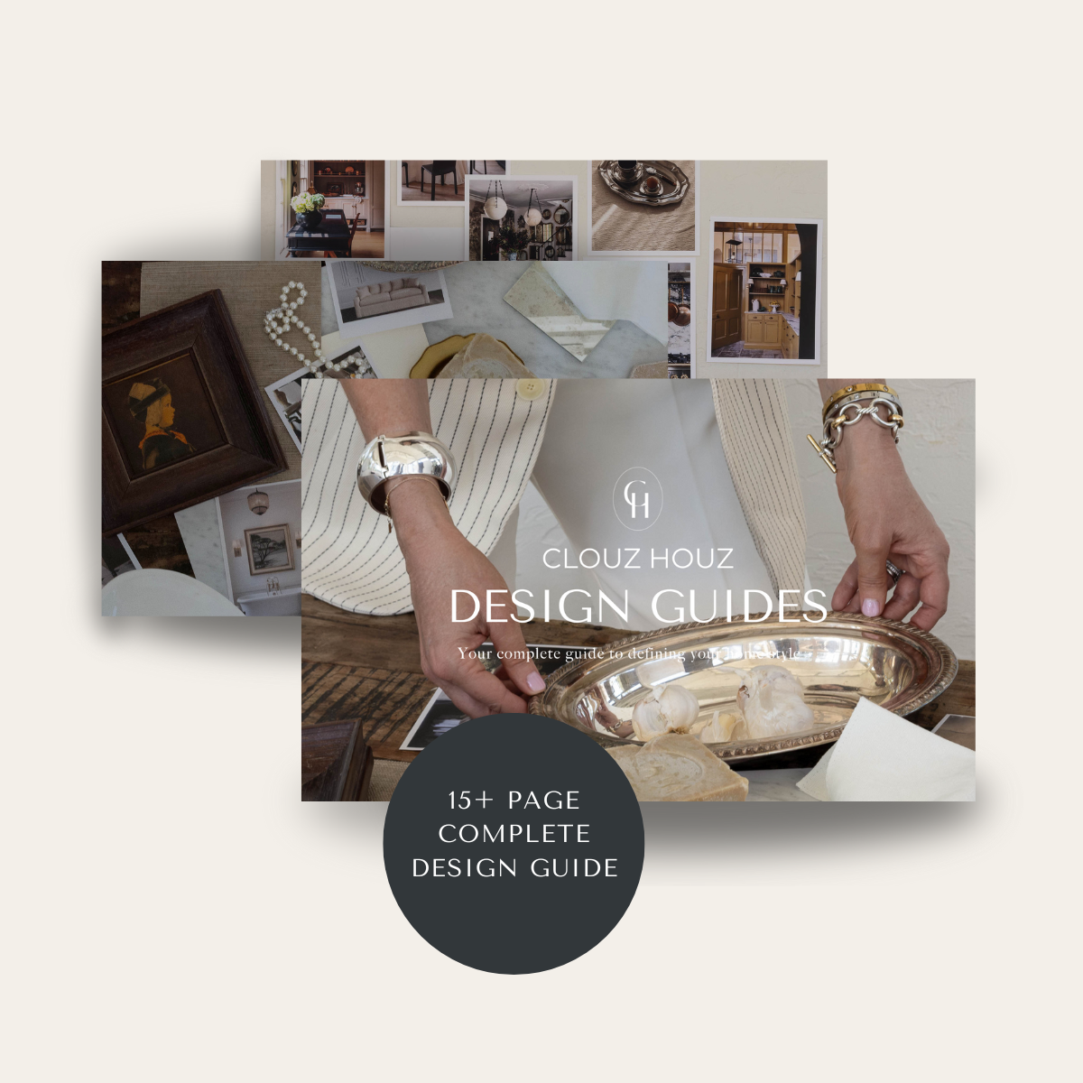
Are you struggling to define your style or figure out how to pull your space together? That’s exactly why we created our Clouz Houz Design Guides. They’ll help you design a space that feels cohesive, elevated, and personal — without hiring a designer.
Click here to explore the five curated styles, complete with inspiration boards, designer tips, and product links that make sourcing simple.
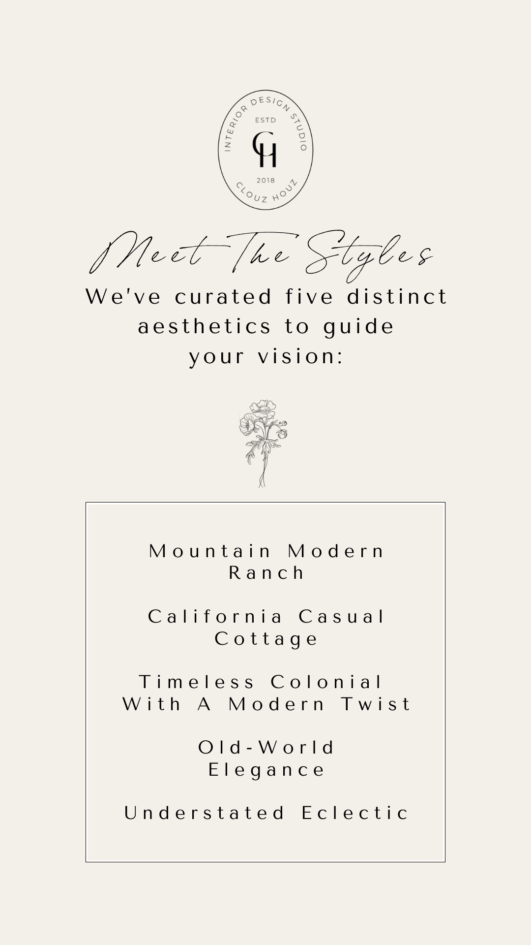
Not sure which one’s for you? Take our free quiz to discover which aesthetic best suits your space.
We’re here to help you move forward with confidence, and create a home that truly feels like yours.
P.S. If you’re new to Clouz Houz and want to be in the know on all things home, design and lifestyle, subscribe now so you never miss a post! As a bonus, you’ll receive our exclusive 42-page Paint Guide, which will help you select the perfect shades for your home. And, you’ll also receive our weekly newsletter, including special finds not on the blog that are only for subscribers. 🤍
Life is short. Make it beautiful!

