Pink paint doesn’t have to feel girly.
And if that sentence alone makes you nervous, you’re not alone 😉
When most people picture pink walls, they’re thinking of something sweet, bright, or overly playful. But, that version of pink is only one small corner of a much bigger spectrum. The reality is, pink is one of the most nuanced, complex paint families out there — and when you understand what you’re actually looking at, it can behave more like a neutral than a statement.
The key is undertone. Pink paint isn’t just “pink.” It’s a mix of red plus something else — brown, beige, gray, even a touch of green — and that secondary color is what determines whether a pink feels soft and grounding or sugary and loud. The pinks I’m drawn to (and the ones I use in client projects) are dusty, muted, and slightly earthy. They often read as warm plaster, aged stone, or sun-faded clay once they’re on the wall. Not precious. Not juvenile. And definitely not just for little girls’ rooms.
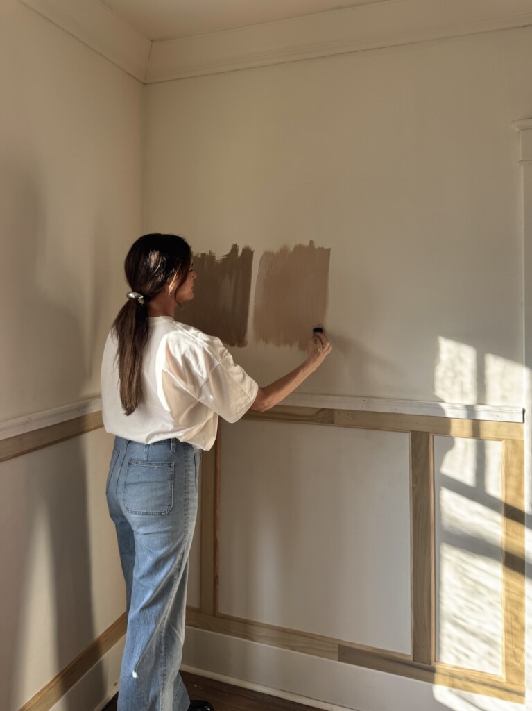
In honor of Valentine’s Day, I pulled together a roundup of my favorite pink paint colors — some I’ve loved for years, and a few I’m seriously considering for our dining room at the Sixth Street Bungalow. These are the shades that hold up in real homes, in changing light, and alongside natural materials. If you’ve ever been curious about pink paint but didn’t know where to start (or what to avoid), this is for you.
The Three I’m Considering for Our Dining Room
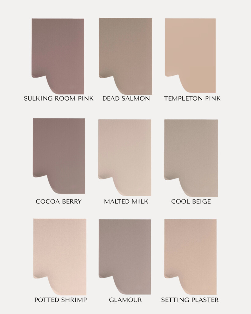
Right now, the three pinks I keep coming back to for our dining room are all by Farrow & Ball: Dead Salmon, Setting Plaster or Potted Shrimp. I’ve wanted to use Dead Salmon for years in my own home, but it never worked with what I was scheming in the past. So, I’m attempting it again. Stay tuned to see which I go with!
I’ll be honest — when I first floated this idea, Derrick was … surprised. “Pink dining room” was not on his 2026 bingo card 😂 But this is exactly why I love these shades. They’re pinks in the most technical sense only.
Potted Shrimp has a muted, earthy quality to it. Almost like a clay or terracotta that’s been softened over time. This is the kind of pink that plays really well with wood tones, vintage furniture, and candlelight — which is why I keep picturing it in a dining room setting. I mean, can you imagine candlelight in this room — what a beautiful glow it would provide? Buy a peel-and-stick sample here.
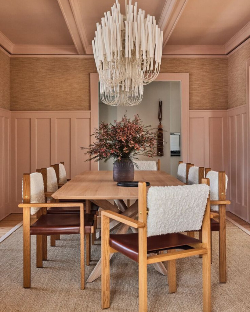
Setting Plaster, on the other hand, is even more subtle. It’s lighter, airier, and sits right on the edge between pink and neutral. If you didn’t tell someone it was pink, they might never guess. It has that sun-washed, European feel. It would be the prettiest too for my complexion. A win win!
My Goal With These Shades
The goal is to make pink feel less daunting, especially to the men in the household. This isn’t about making a statement — it’s about creating a space that feels inviting, lived-in, and a little unexpected … in the best way! Buy a peel-and-stick sample here.
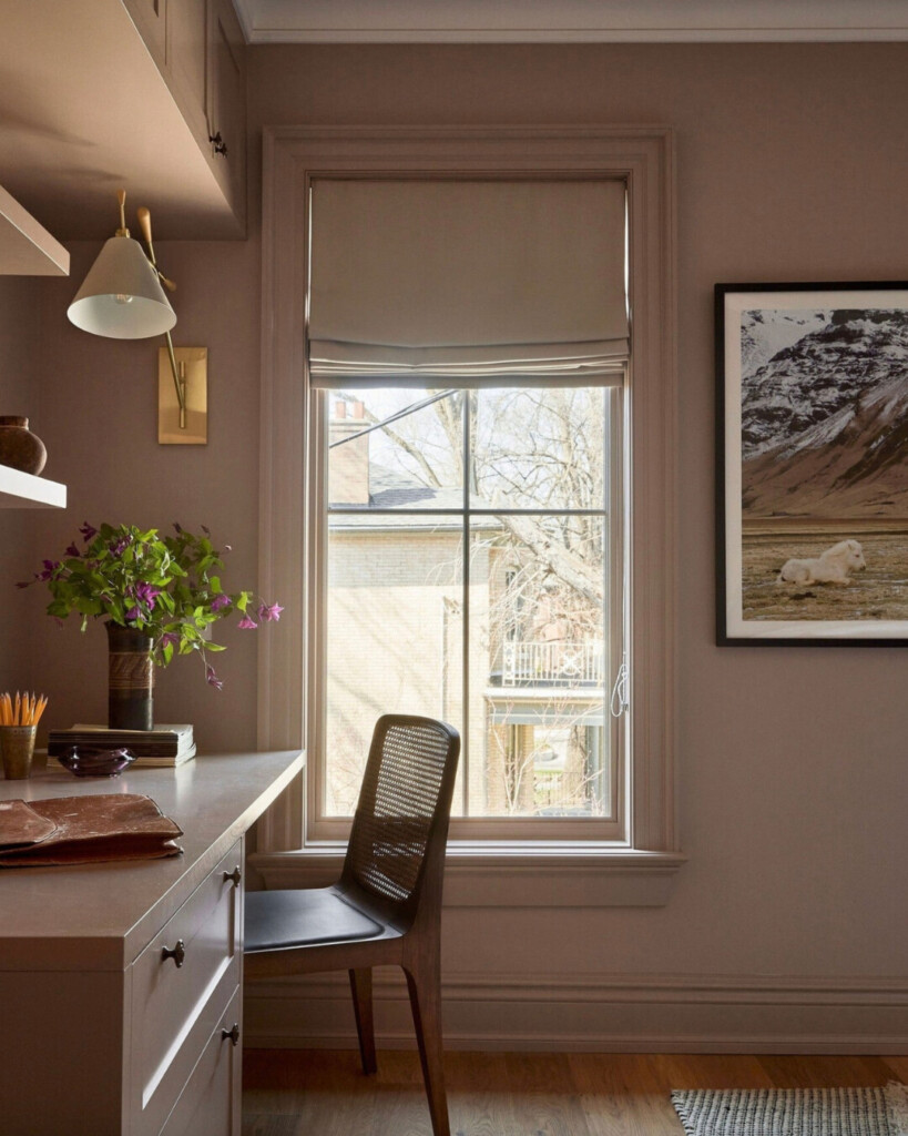
Dead Salmon is a color people debate … and that’s exactly why it works so well. Everyone sees it slightly differently: sometimes mushroom, sometimes buff, sometimes a deep salmon steeped in history. It has a magical, candlelit quality that makes spaces feel serene. This is a longtime favorite for a reason! It’s deeply forgiving, especially in older homes or rooms with texture like plaster, beams, or stone. If you want subtle drama without contrast, this one never fails. Buy a peel-and-stick sample here.
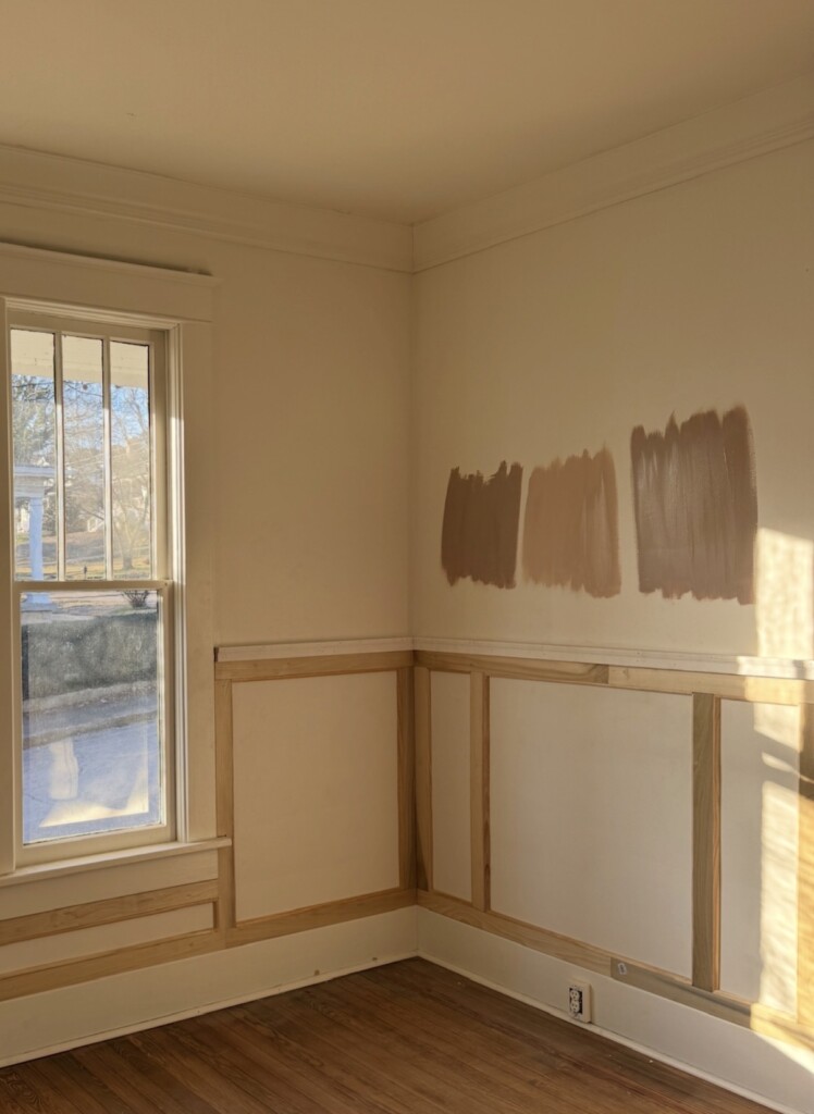
Middle: Setting Plaster
Right: Potted Shrimp
A few more honorable mentions …
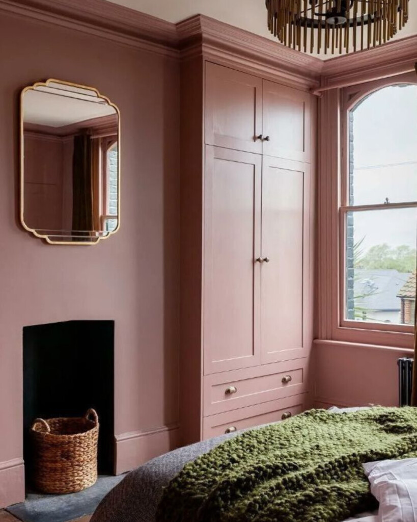
Sulking Room Pink
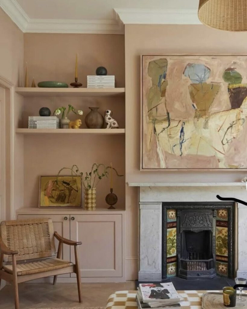
This is not a “pink” in the way most people fear. It reads more like a muted rose with a powdery, almost velvety softness that brings enormous warmth without sweetness. That makes it feel intimate and enveloping, rather than decorative. On the wall, it shifts between plum, taupe, and dusty mauve depending on light, which makes it incredibly easy to layer with antique woods, brass, stone, and aged textiles. This is a color that feels lived-in from day one. Buy a peel-and-stick sample here.
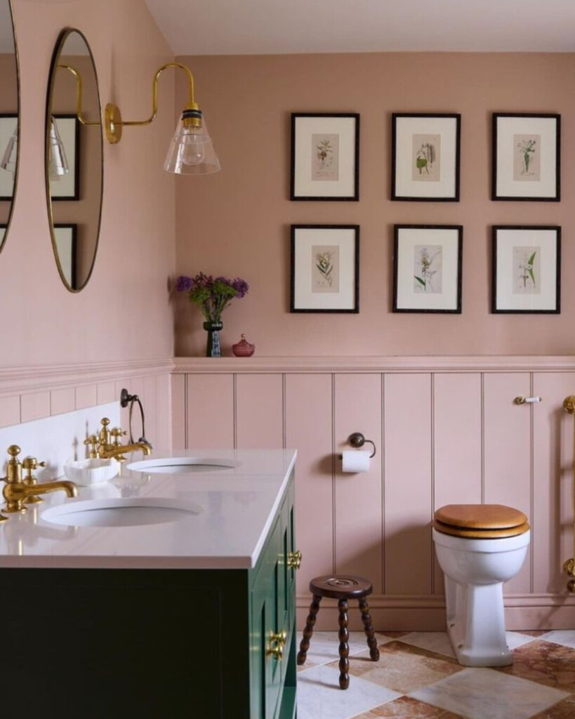
Design: Uns Hobbs interiors
Templeton Pink
Templeton Pink is a historic-feeling shade with more depth than it first lets on. It’s essentially a stronger, more saturated cousin to Setting Plaster, and in low light it becomes surprisingly rich and moody. This is a great option for rooms that don’t get a lot of natural light but still need warmth — hallways, dining rooms, or cozy sitting spaces. It doesn’t shout “pink,” but it absolutely adds presence. Buy a peel-and-stick sample here.
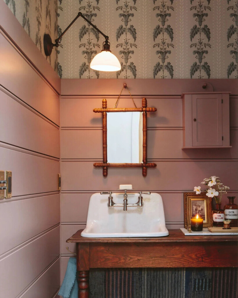
Design: Emily Henderson
Cocoa Berry
Cocoa Berry sits in the red family, but the brown and mauve undertones completely change how it behaves. It reads like a “dirty” 90s mauve (a bit cozy and nostalgic) rather than anything bright or playful. This color pairs beautifully with unfussy beiges, darker woods, and layered patterns, pulling subtle pink undertones from everything around it. It’s a great choice if you want elegance with personality, without leaning too feminine. Buy a peel-and-stick sample here.
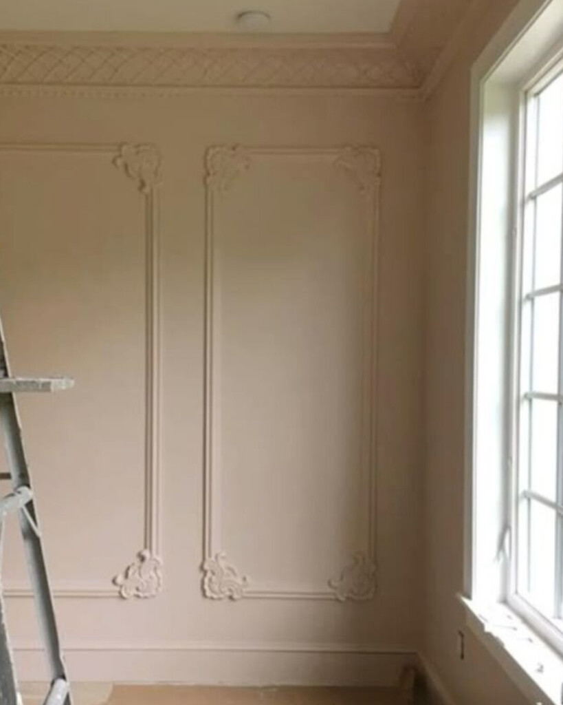
Malted Milk
Malted Milk is a blushing neutral at heart. It’s light, creamy, and softly peachy, with a brown undertone that keeps it from ever feeling sugary. This is one of those colors that feels almost invisible until you realize how warm and flattering the room suddenly feels. It works beautifully as an all-over wall color, especially when paired with corals, vibrant greens, or natural materials. A perfect stepping stone away from white. Buy a peel-and-stick sample here.
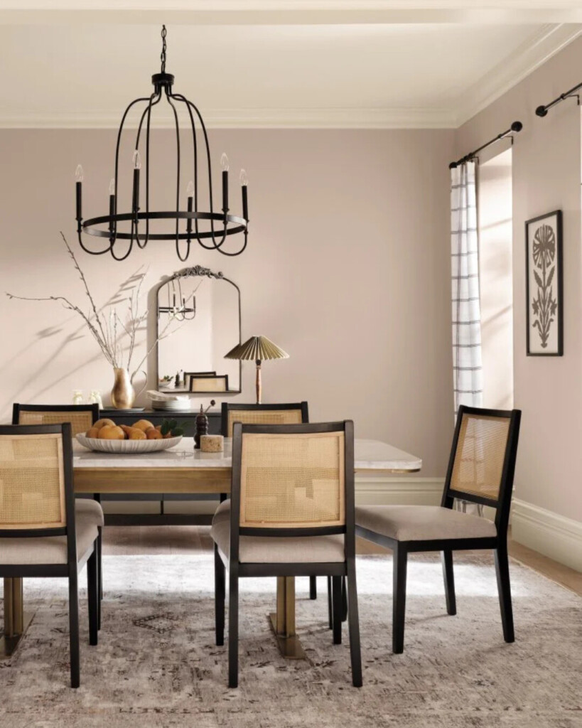
Cool Beige
Cool Beige proves that beige doesn’t have to be flat or lifeless. While muted and balanced, it carries a subtle pink undertone that makes it feel softer and more human than a traditional “greige.” This is an excellent option for anyone who wants a tranquil, timeless backdrop (like for bedrooms, family rooms, or transitional spaces) without committing to obvious color. Think calm, cohesive, and easy to live with. Buy a peel-and-stick sample here.
Glamour
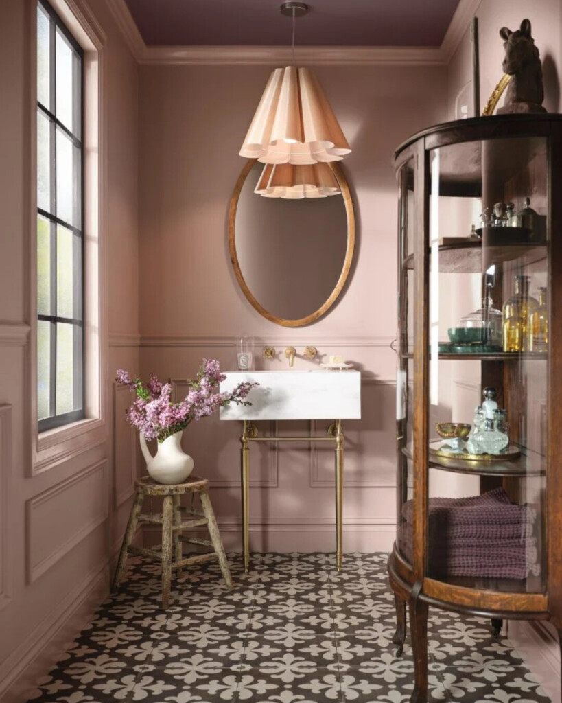
Glamour is where pink and taupe quietly meet, with a hint of violet underneath that adds just enough intrigue. It’s a dark, muted neutral that brings a calm allure rather than contrast or brightness. This shade works especially well in bedrooms, bathrooms, and living rooms where you want atmosphere without heaviness. It plays nicely with both warm and cool finishes, which makes it incredibly flexible when decorating. Buy a peel-and-stick sample here.
***
To close it out …
I’m still sitting with a few of these and letting them marinate — narrowing things down, painting swatches on the walls, and seeing how they shift throughout the day. I’ll share where we land once a decision is made (and yes, I fully expect opinions in the house to evolve along the way 😉).
Save this for the next time pink paint crosses your mind — so you can skip the overwhelm, order the right samples, and feel confident from the start.
And Happy Valentine’s Day lovers.
xx
Allison


