CLOUZ HOUZ DESIGN GUIDES - What’s your style?
TAKE THE QUIZ
Design

The Cozy Fall Trend Everyone’s Talking About

Jam Girl Autumn

A mood, a color palette, a way of living

You may have heard about Jam Girl Summer, that romanticized version of cottagecore where we all imagined ourselves barefoot in the garden with a bowl of peaches and a gingham apron. But if you ask me, the jam girl mindset only gets better in autumn.

A moody traditional pantry with deep burgundy cabinetry and vertical tongue-and-groove paneling. The counter is styled with vintage red and white transferware, pottery, and folded linens. A gingham curtain hangs under the sink in place of cabinet doors.
Photo: Pinterest

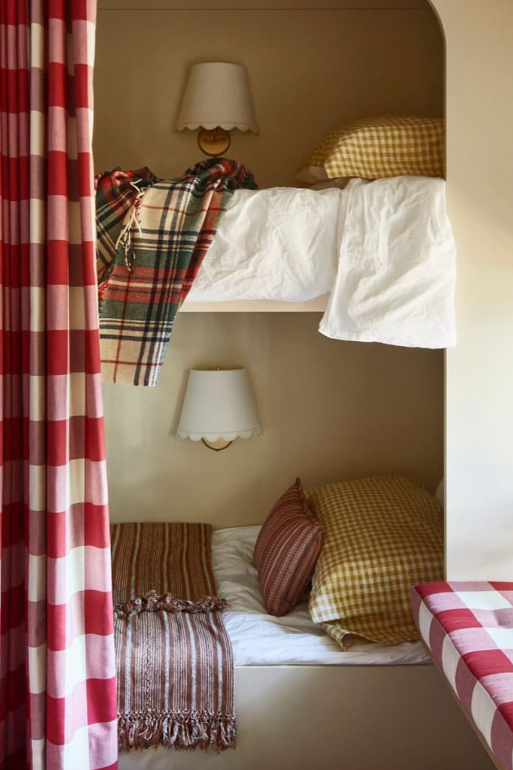
There’s something about this moment between seasons that makes the aesthetic feel even more meaningful. Jam Girl Autumn is less about aesthetic perfection and more about a slower, softer way of living… One rooted in comfort, ritual, and nostalgia. It’s the kind of vibe that makes you want to host a dinner party just to use the red checkered napkins you found at a vintage shop, or throw on a berry-colored sweater just because it makes you feel good. It’s homestead energy, but with a little more mood.

I keep coming back to the colors—deep berry tones, burgundy, faded red, mauve, dusty plum. These aren’t just fall tones, they’re jammy ones. And they work everywhere—your wardrobe, your tablescape, your bedding, even your recipe rotation. Think blue and red check linens, floral quilts, mismatched mugs for morning coffee. It’s not about buying a bunch of new stuff, it’s about reimagining what you already have, through the lens of something more intentional and cozy.

A cozy table setting with vintage floral china holding buttered scones topped with raspberry jam, a glass mug of tea, and a jar of Swedish raspberry jam labeled "Den Gamle Fabrik Hallon" with a spoon resting inside.
Photo: Pinterest

So What Does Jam Girl Autumn Actually Look Like?

Here are a few places I’m seeing it show up—and how I’m leaning into it in my own way. This isn’t just an interiors trend, it’s a mood you can infuse into everyday life.

A curated collage featuring jammy red and berry-toned lifestyle items: a block-printed tablecloth, Diptyque Tuberose candle, gingham throw blanket, vintage-style red blouse, Victoria Beckham lip stain, ceramic jam jar painting, scalloped cloth napkins, and a rustic wood stool—all set against striped red and cream wallpaper.

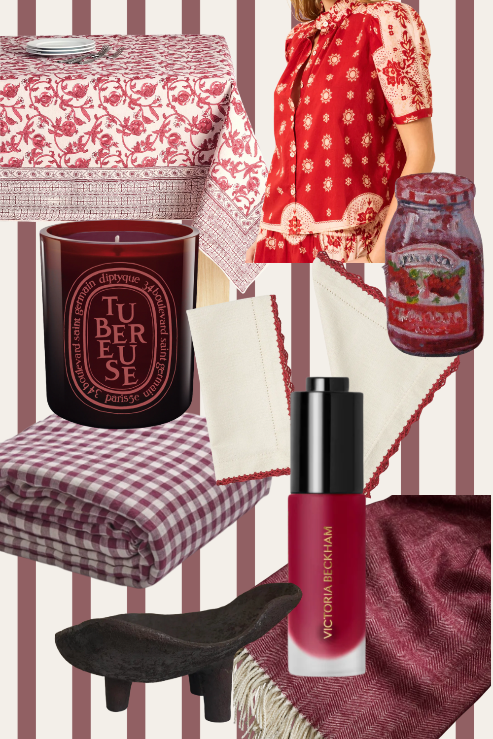
Tablecloth | Blouse | Candle | Napkins | Gingham Duvet | Fruit Bowl | Blanket | Blush
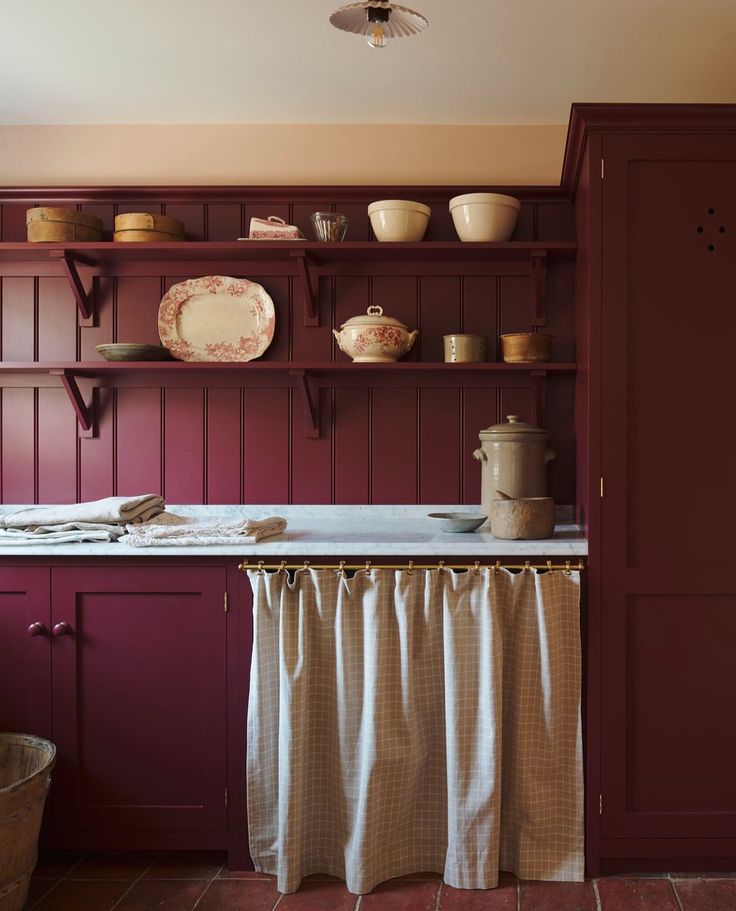

In the Home

You’ll start to see this through layered patterns—ginghams, florals, vintage reds and blues. It’s those tabletop moments that feel collected and old-world without trying too hard. Try pulling out your grandma’s linens or styling jam jars on your shelf just for fun. I’ve even been loving the idea of using jam jars for everything lately—cocktails, little vases, homemade sauces. The vibe is a little rustic, a little charming, and very much about embracing the everyday.

In the Closet

I’m reaching for cozy knits, deep reds, and anything that feels like it belongs on a fall farm day (even if you’re just going to Trader Joe’s). Gingham, stripes, muted florals, a pop of berry lipstick—Jam Girl Autumn style is easygoing, warm, and perfectly unfussy. Like you just threw it on and went out to pick apples.
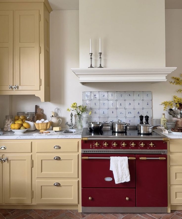
A charming cottage kitchen with buttery yellow cabinetry, a burgundy La Cornue range, and Delft-style tiled backsplash. The counter is styled with lemons, eggs, and vases of yellow flowers, evoking a warm and lived-in fall mood
Photo: Pinterest

In the Kitchen

This is where it really comes alive. Baking something seasonal, sipping tea in the afternoon, pulling out your favorite mug again… even just lighting a fig or blackberry-scented candle while you eat a grilled cheese. I’ve been saving old jam jars to reuse for overnight oats and iced coffee—they look cute on the counter and make morning feel a little more special.

In How We Host

Picture this: gingham tablecloths, berry desserts, candlelight, cozy playlists, and maybe even a “jammy” dress code for a dinner party. I love the idea of asking guests to wear berry hues and giving a special jam to the winner of “best jam girl look.” I’m planning one last farmers market trip before the season ends to stock up on my favorites—and maybe host a little jam-themed get-together with mulled wine and berry cobbler (in between packing moving boxes- it just sounds ridiculous I know, but it makes me happy to plan gatherings)

Built-in bunk beds with cozy autumnal bedding, including mustard gingham pillows, white sheets, and plaid blankets. A red and cream gingham curtain partially frames the scene, creating a private nook. Wall sconces with scalloped shades are mounted above each bed, and a striped brown throw blanket adds a rustic, layered touch. The overall palette feels warm, nostalgic, and perfectly suited for a cottage or cabin.
Photo: Pinterest

Ready to Lean In?

We’re pulling together a roundup of beautiful pieces that capture this mood—textiles, hosting ideas, recipes, fashion finds, and more. Whether you want to go all in or just try one little detail, there’s no wrong way to embrace the season.

Because Jam Girl Autumn isn’t about following a trend. It’s about slowing down, savoring the moment, and bringing a little extra intention to how you live, dress, decorate, and gather this fall. Who’s with me?? 

XO

Allison


Need a little more direction?

Promotional image for Clouz Houz Design Guides, featuring layered design boards and a close-up of a woman arranging a silver tray with accessories. Text overlay highlights the guides as a "15+ page complete design guide" for refining your home style.


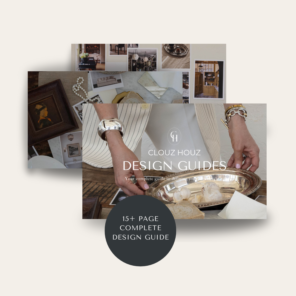
Are you struggling to define your style or figure out how to pull your space together? That’s exactly why we created our Clouz Houz Design GuidesThey’ll help you design a space that feels cohesive, elevated, and personal … without hiring a designer.

Click here to explore the five curated styles, complete with inspiration boards, designer tips, and product links that make sourcing simple.


Neutral graphic showcasing five curated interior design styles from Clouz Houz: Mountain Modern Ranch, California Casual Cottage, Timeless Colonial with a Modern Twist, Old-World Elegance, and Understated Eclectic. Designed to help guide users in choosing a cohesive home aesthetic. Clean, minimal branding with elegant fonts and floral sketch accent.


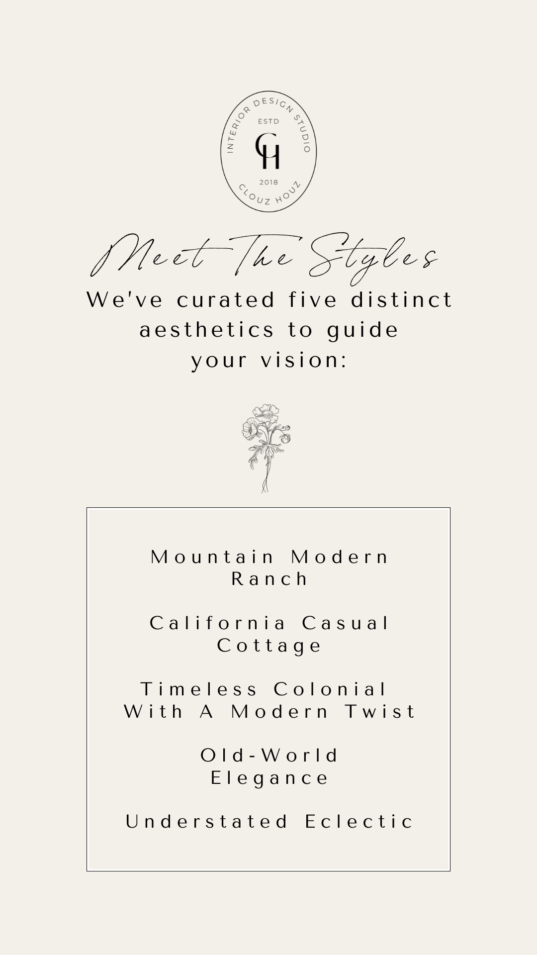
Not sure which one’s for you? Take our free quiz to discover which aesthetic best suits your space.

We’re here to help you move forward with confidence, and create a home that truly feels like yours.

P.S. Are you new to Clouz Houz? If you’d like to be in the know on all things home and lifestyle, subscribe now so you don’t miss a post! As a bonus, you’ll receive our exclusive 42-page ‘Paint Guide,’ which will help you select the perfect shades for your home. And, you’ll also receive our weekly newsletter, including special finds that are not on the blog — they’re only for subscribers. 🤍

Life is short. Make it beautiful!

Join the Conversation

get inspired
#clouzhouz
follow along
@clouz_houz
Before we sketch a floor plan or source furniture, we sit with the house and let it speak a little.
For the 6th Street Bungalow, this step was especially important. The house has its own personality, and the flatlay helps us study it from every angle.
It lets us play, make changes early, test combinations, and make sure each material has a reason for being there. Nothing is theoretical at this stage.
We want to feel the stone, the fabrics, the wood tones, the finishes, and see how they interact from room to room.
The flatlay becomes our anchor — a visual blueprint that keeps the design cohesive while giving us room to refine as we go. It’s a crucial part of our process and one of the most valuable tools for creating a home that feels intentional, personal, and true to the architecture.
If you want to get started on your home, our spots for Q1 of the new year are filling up. Visit our website (link in bio) to inquire.
My ins and outs this year!
Do you agree? Let me know if I missed any in the comments!
Hang in there for me on this one (I feel very passionately about this topic 😂). One of the things we care most about when designing homes is where the pieces come from. Vintage and antique sourcing isn’t just about finding something “different”... It’s about choosing pieces that already carry a story.
The truth is, the most memorable rooms aren’t built all at once or off a single shopping list. They’re layered over time. A chair with worn arms. A table that’s been repaired more than once. A piece you weren’t looking for, but couldn’t leave behind. Those are the things that give a home its soul.
When you bring vintage into a space, you’re investing in more than furniture. You’re investing in craftsmanship that’s hard to replicate today, materials that have already stood the test of time, and details modern manufacturing simply doesn’t prioritize anymore. And there’s something deeply satisfying about living with pieces that feel personal.
This is why we source the way we do. Not to fill a room, but to give it meaning. Collected doesn’t mean cluttered. It means intentional, patient, and a little emotional (in the best way).
A home should feel lived in, loved, and uniquely yours.
Ok here’s the truth- I have a lot of favorite whites- but this may be my new fave for cabinetry! 
Here’s the part no one tells you:
Most “bad” white cabinets aren’t bad colors… they’re bad context. White fails when it’s chosen in isolation. Paint chips are judged under fluorescent store lighting, held next to nothing, and decided before cabinets, counters, floors, or hardware are even finalized. Then that same white gets wrapped around an entire kitchen and suddenly feels gray at noon, yellow at night, or weirdly dull no matter how much light you have.
That’s why we chose Shoji White by Sherwin-Williams for our kitchen cabinets this time around.
Not because it’s trendy.
Not because it photographs well.
But because it behaves.
Shoji White has a soft warmth that doesn’t show up on a chip, but does show up when it’s next to real materials. It stays steady throughout the day, doesn’t compete with natural wood or stone, and doesn’t turn chalky once it’s covering full-height cabinetry. That consistency is what actually makes a white “safe” — not how popular it is.
Designer truth:
If a white only looks good at one time of day, it’s not a good cabinet white.
If it needs perfect lighting to work, it’s not a good cabinet white.
If paint decisions make you spiral, it’s not because you’re bad at this (it’s because white is reactive, and no one teaches you how to test it properly).
Our blog goes live today at 3:00pm PST, where I break down how to evaluate whites in your actual space and share a few other cabinet whites we consider truly “safe” — the ones we use repeatedly for clients because they hold up in real life, not just in photos.
Save this if you’re choosing cabinets soon.