April, oh how I love thee! Can you guys believe April is already here? It’s seriously one of my favorite months for our family. Three out of the five of us have birthdays in April, which makes it extra festive and fun. We love to celebrate all month long! But that’s not all I love about it. It’s also when the weather starts to truly feel like spring here in Central Oregon. While the rest of the country says spring begins in March, we usually don’t start to see the warmer weather until mid to late April. And let me tell you, these past couple of months in Bend have been chilly! I’m definitely ready for some sunshine and warmth.
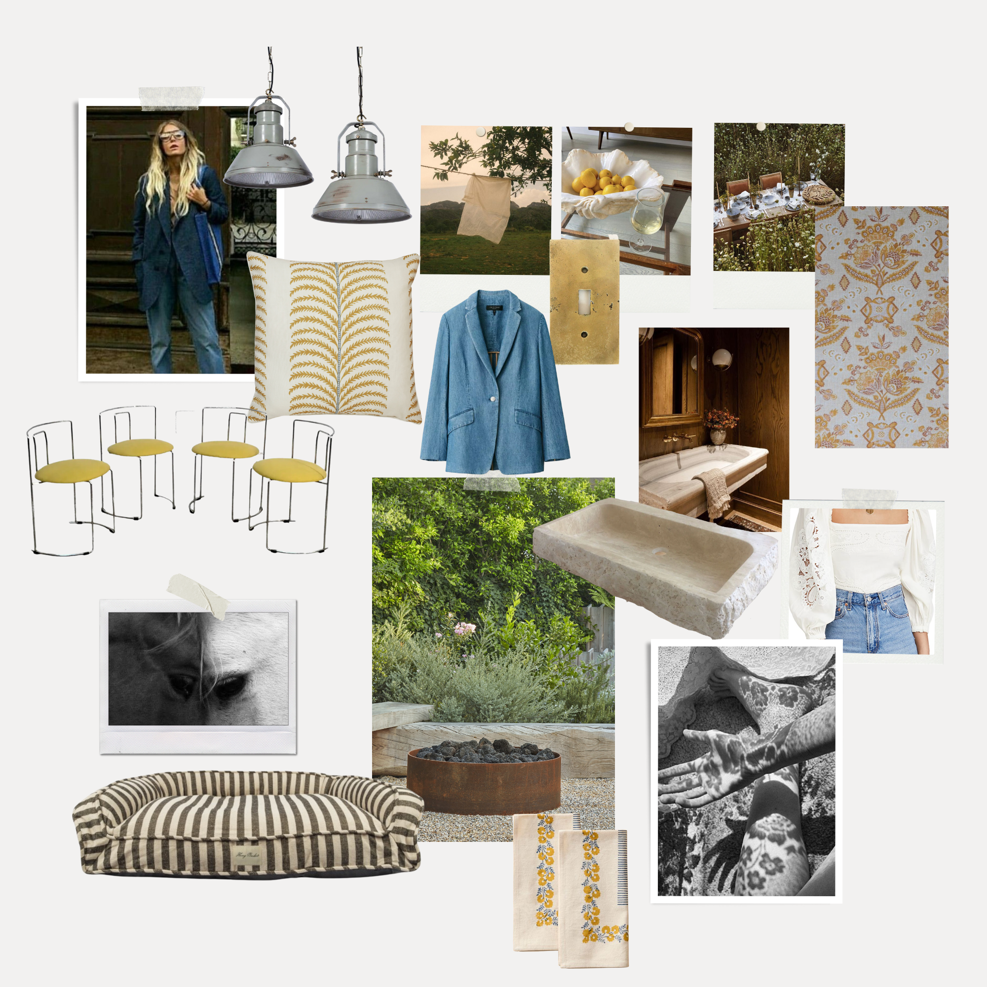
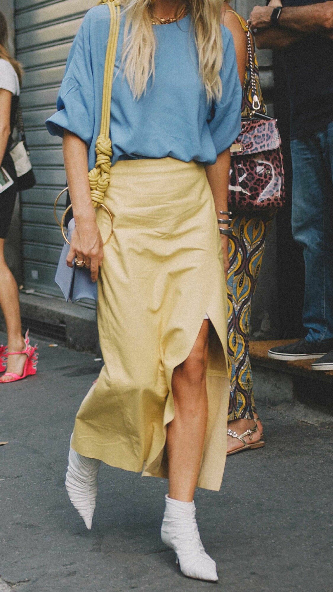
And can we talk about fashion for a moment? With spring finally in the air, I find myself gravitating towards all things yellow and floral. It’s like my own personal reminder that the sun will soon be heating things up, and the flowers and trees will finally start blooming. I’m loving all the bright and cheerful pieces that are popping up in stores right now.
On the topic of shopping, we have a couple of styling projects coming up, as well as planning an outdoor space. So you know I’m having a blast browsing all the latest trends and incorporating those trends into my home style as well! Stay tuned for some fun and colorful inspiration coming your way ?
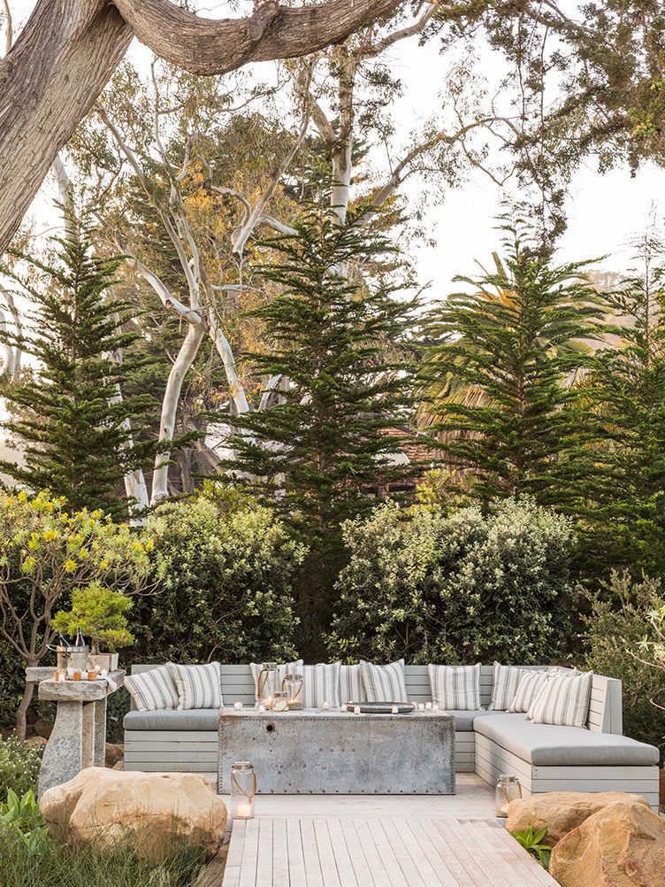
Dine Alfresco
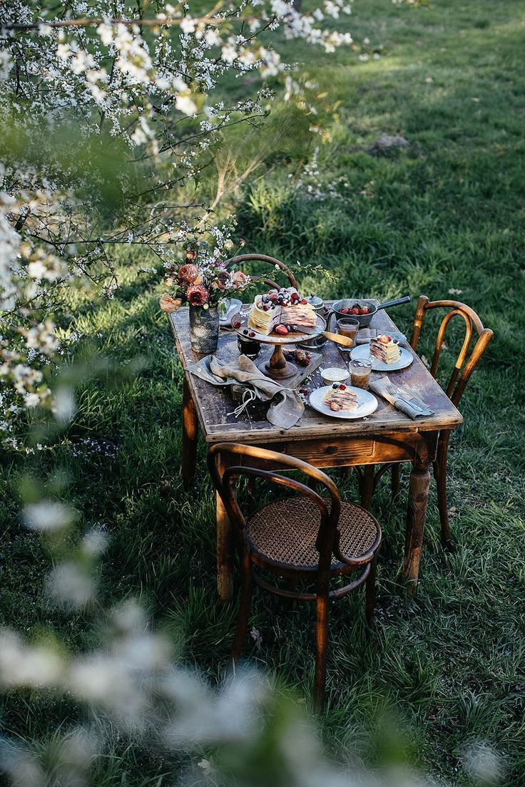
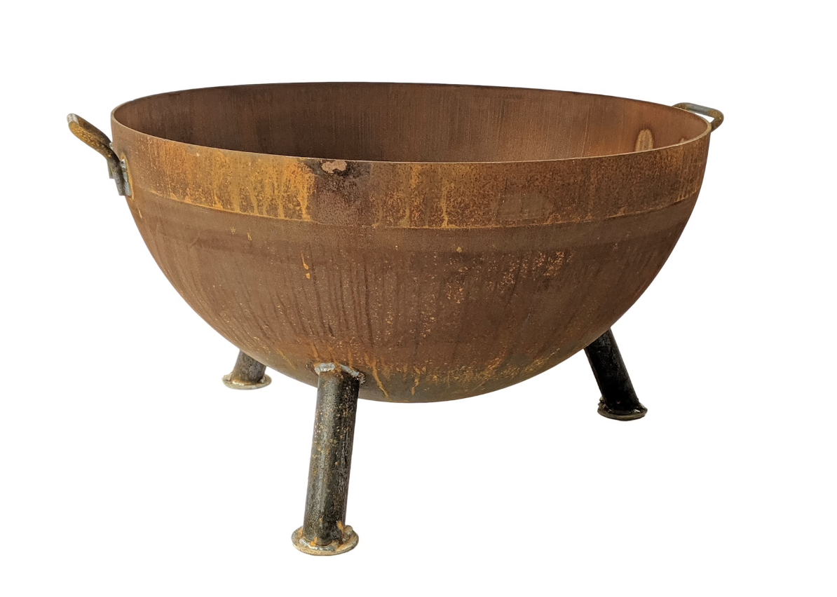
I love planning outdoor spaces, and I think everyone can agree that when spring hits, we are all itching to get outside to enjoy our patios and decks! There’s something about eating outside that elevates any dining experience, don’t you think? For our #highdeserttumaloranch project, we recently invested in this fire pit, It has the most beautiful patina, and I can’t wait to sit under the stars with a fire crackling to enjoy some s’mores with the fam. I’m also loving these gorgeous napkins that add the perfect pop of color to an otherwise simple table setting. It’s amazing how a few simple touches can completely transform a space and make it feel like an outdoor oasis.
![]() CLOUZ HOUZ TIP: Use something unexpected to keep your drinks perfectly chilled while entertaining outdoors. I’ve owned this clam shell for years, and love filling it with ice and our favorite rosés when having friends over.
CLOUZ HOUZ TIP: Use something unexpected to keep your drinks perfectly chilled while entertaining outdoors. I’ve owned this clam shell for years, and love filling it with ice and our favorite rosés when having friends over.
Paint Color of the Month
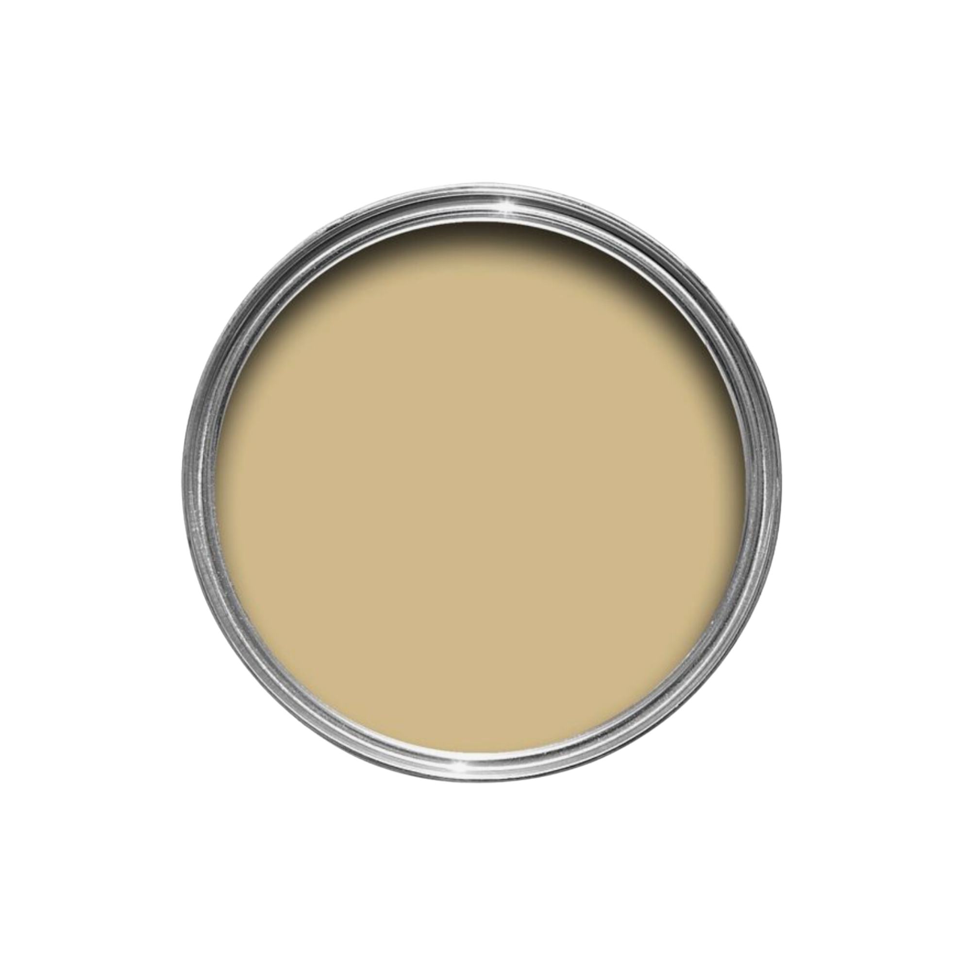
I recently discovered this stunning paint color, Hay #37 by Farrow & Ball, and I’m obsessed! This gorgeous shade of yellow is soft, subtle, and perfect for adding depth to any room in your home — especially if you are looking for something other than a creamy white. It’s not an intense, sunny yellow, but rather a sophisticated and neutral hue that complements a variety of design styles. One way to use it would be on cabinetry in a bathroom. Think of it like any other neutral, but it adds the perfect pop of color that envelopes the room.
Vintage Finds
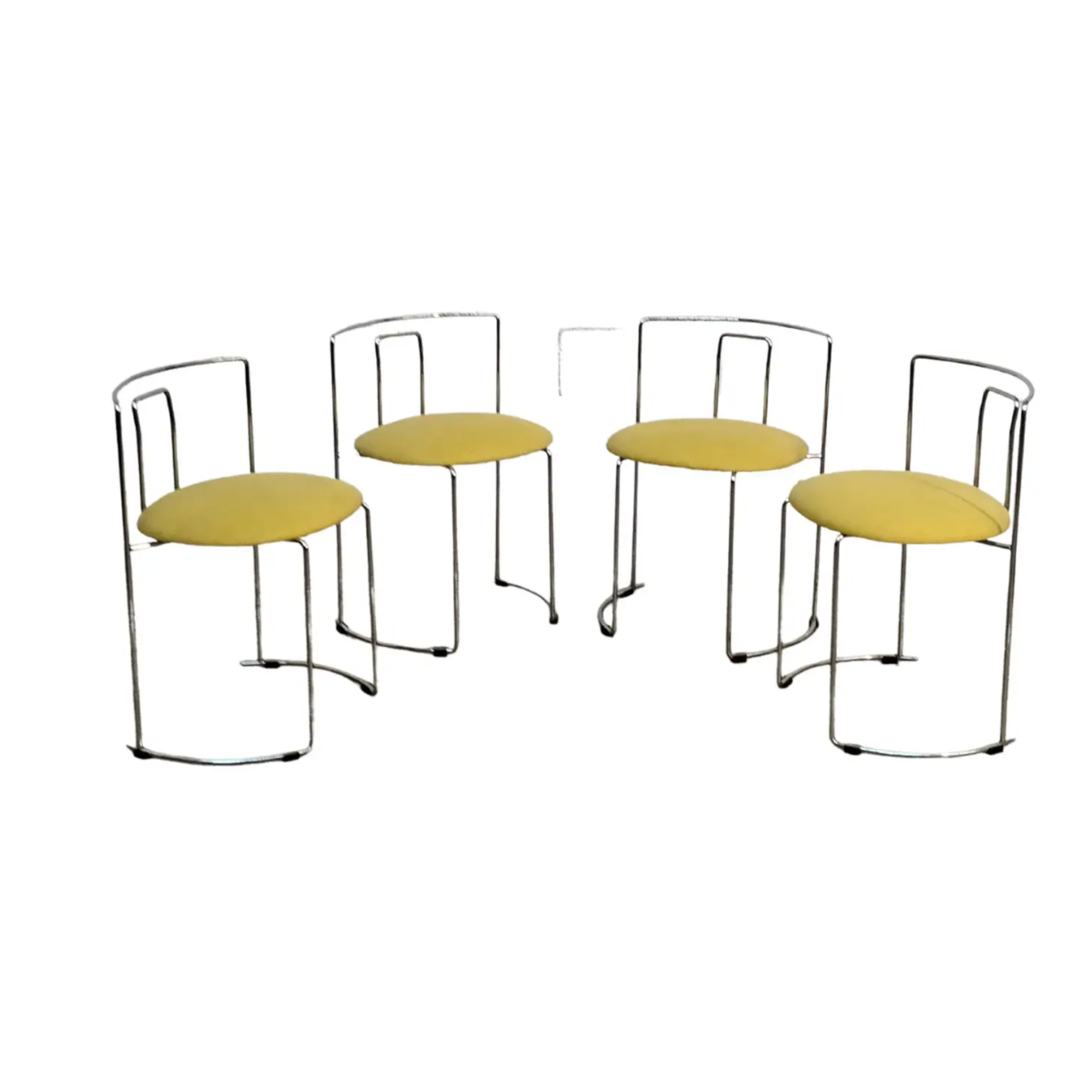
I firmly believe that infusing a little vintage into every space is a must. It’s not only more sustainable, but it also incorporates some unique character and charm into your home. Recently, we’ve been loving these vintage-inspired chairs we found – they’re not only stylish, but also practical as they can be stacked away when they are not being used. The pop of yellow on the seats has me swooning, and adds a playful and vibrant touch to any room. Consider shopping second-hand if you are looking to add some flair to your home.
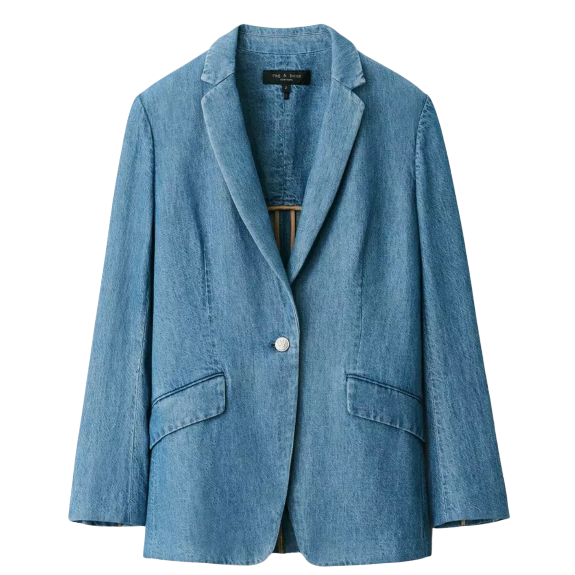
Chambray … aka denim

We all know that denim is a staple fabric that can be worn all year round, but when the warmer months roll in, chambray and lighter weight denim pieces become a go-to. They’re versatile, comfortable, and perfect for layering in the transitional seasons. One of my favorite ways to style denim is by mixing and matching different pieces to create the classic Canadian tuxedo look. I’ve been on the hunt for the perfect denim blazer, and found this one that I know I’ll wear all season long!
Outdoor Pillows
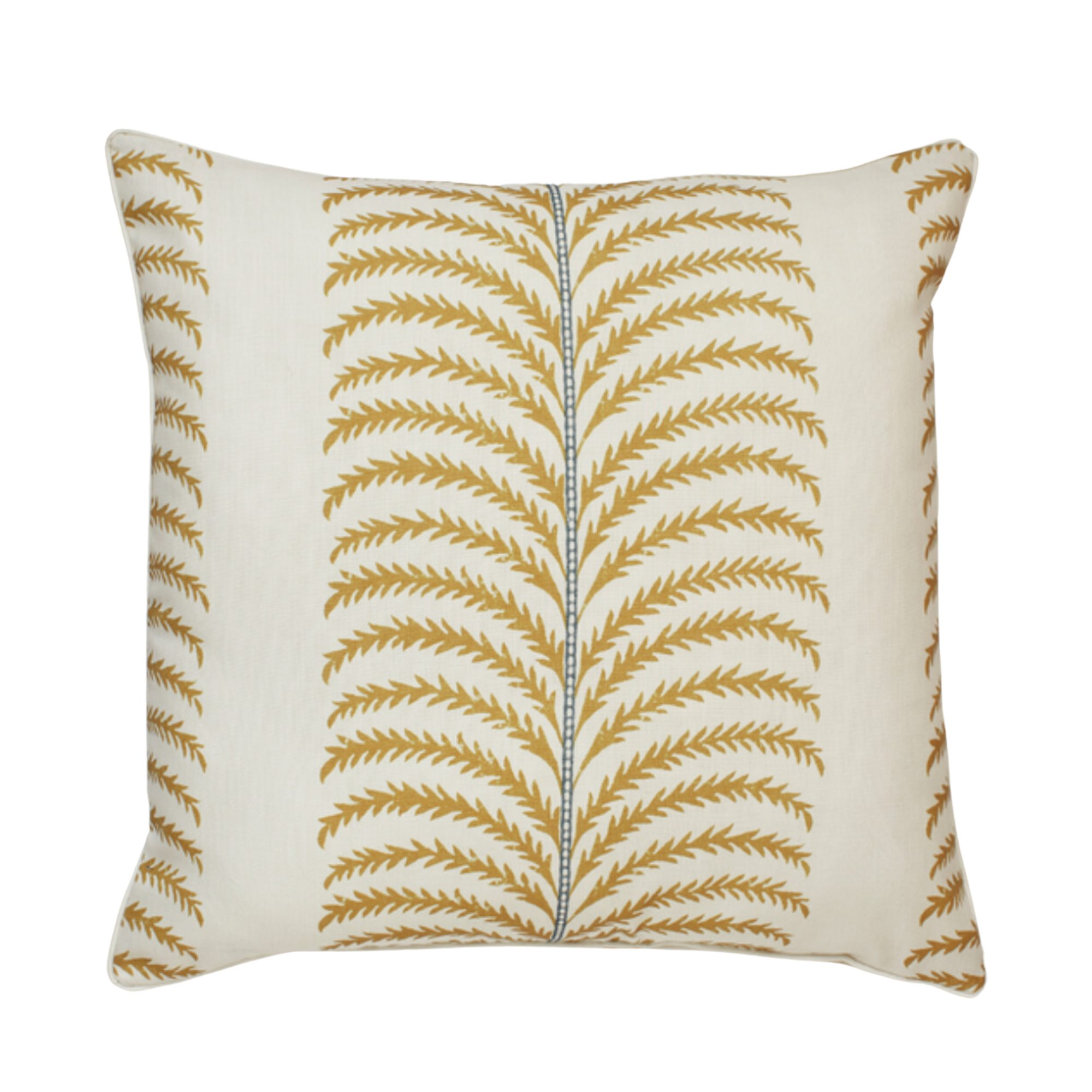
I recently stumbled upon Oka, a British-based company that specializes in high-quality furniture and décor, and I’m dying over their pieces! Their collection includes everything from elegant sofas to unique lighting fixtures, and their attention to detail and craftsmanship is simply stunning. What’s even better is that their pricing is surprisingly reasonable for the level of quality and design. I’ve been eyeing their collection of outdoor pillows and this amazing outdoor chair for our deck.
Anything with Stripes
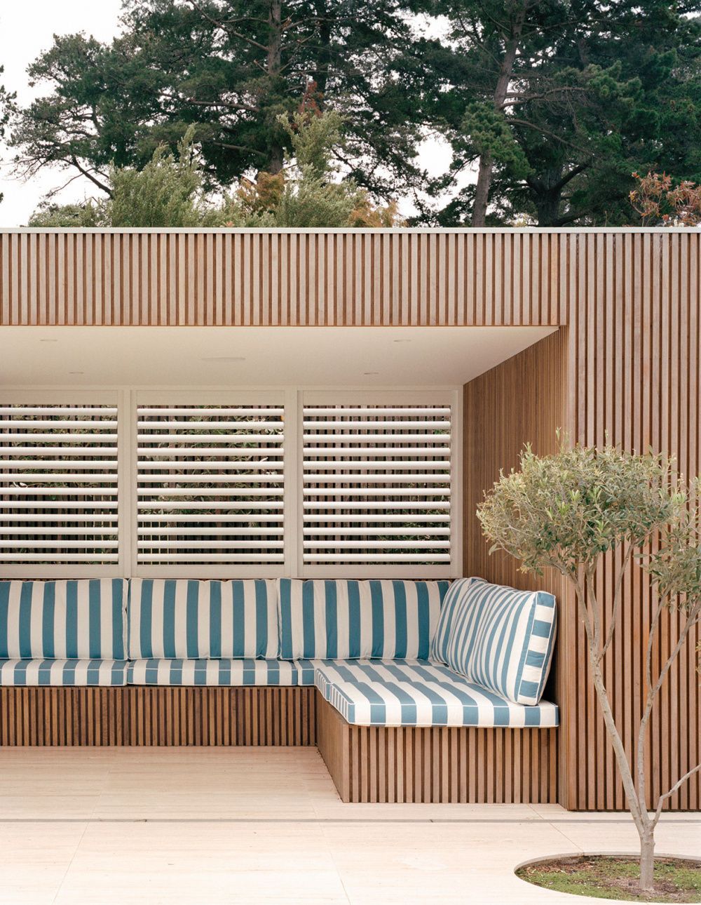
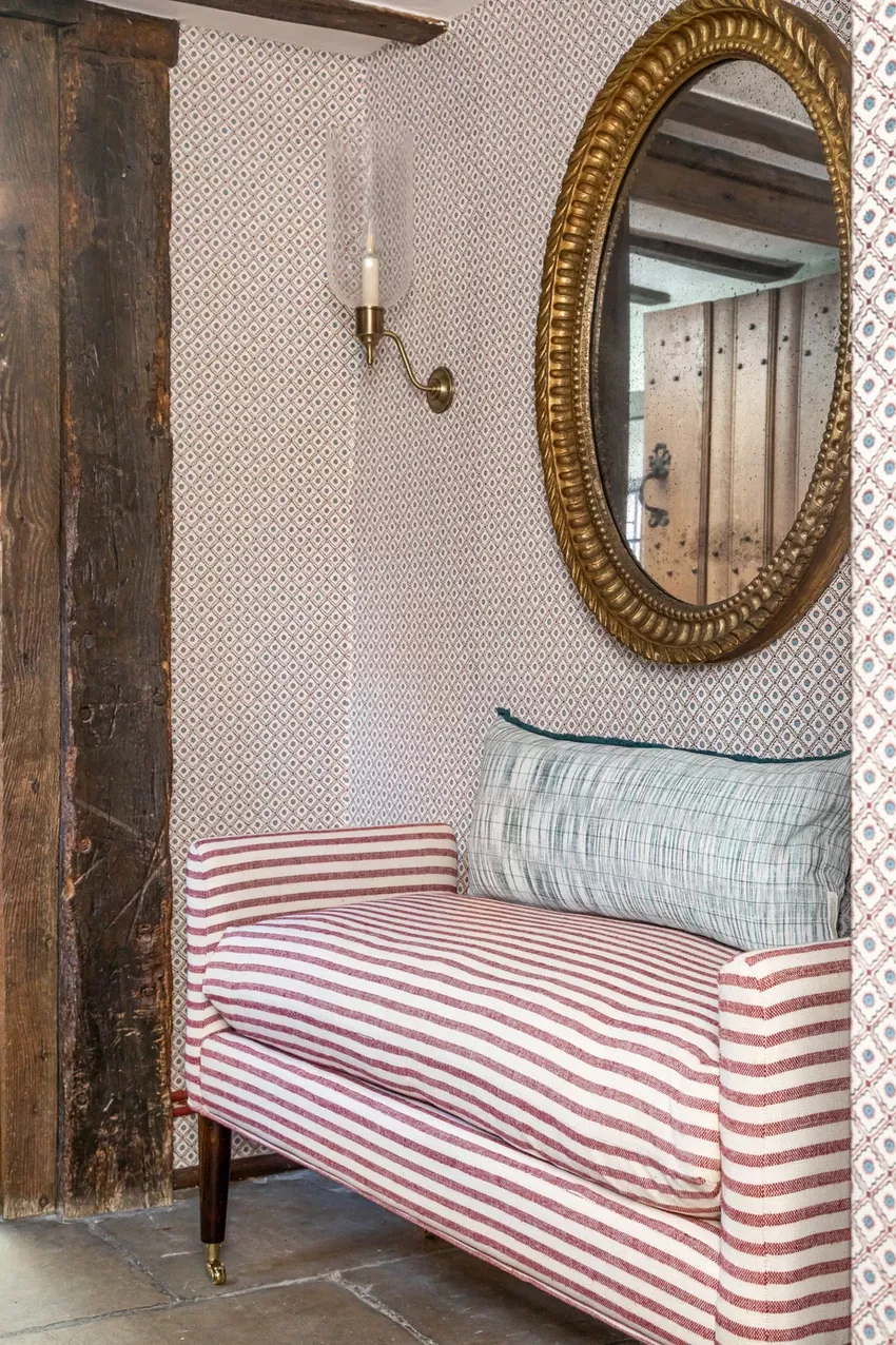
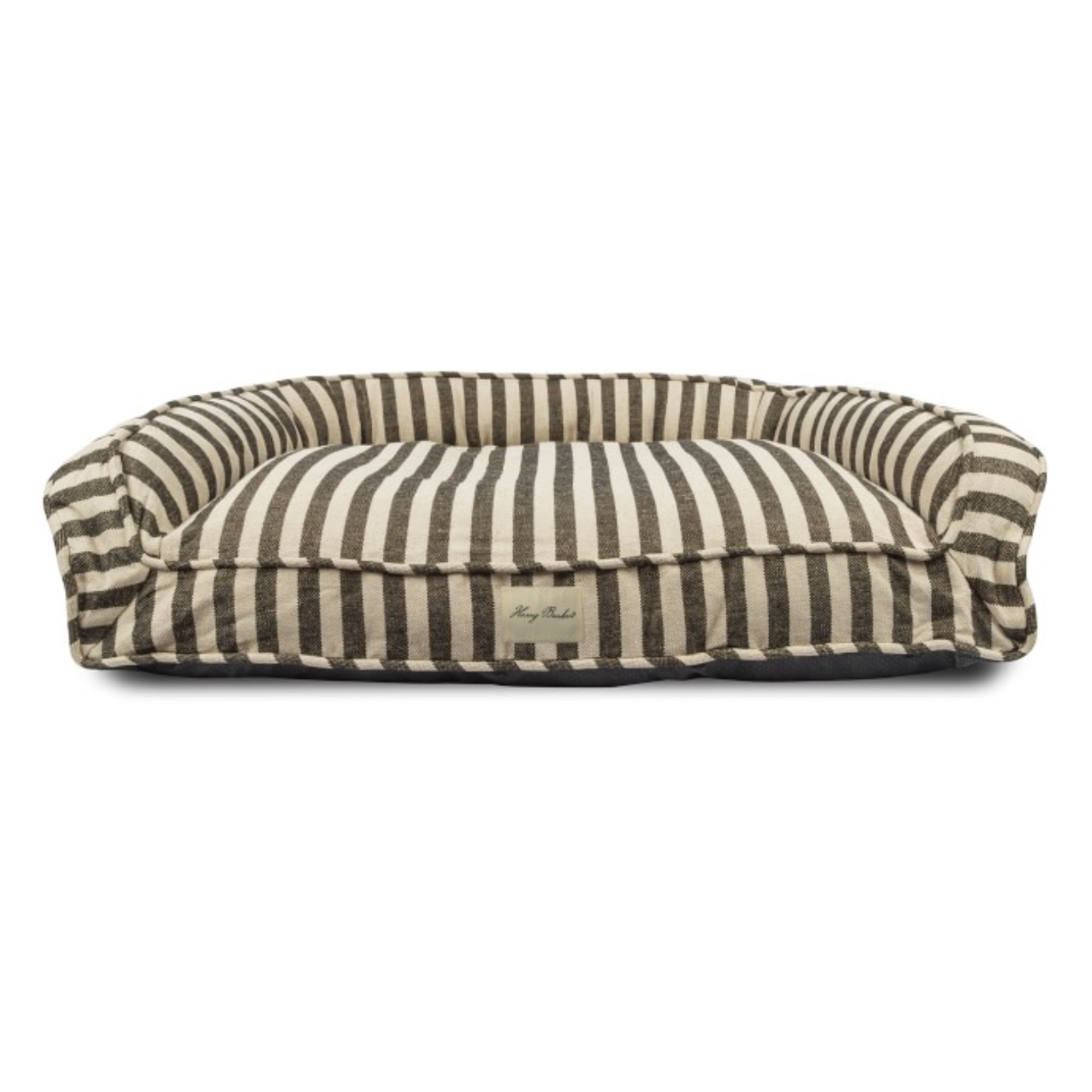 Stripes are a timeless pattern that add a touch of sophistication. From clothing to home décor, you can never go wrong with classic neutral stripes. Speaking of which, have you seen this new dog bed collaboration between Barry Barker and Williams-Sonoma Home? It comes in two sizes and is filled with eco-friendly foam chips. Not only is it functional and comfortable for your furry friend, but it also looks great with its bold striped design. It’s the perfect addition to any home with a coastal or classic aesthetic. I kinda want one for our home … but if I get one, I have to get two — one for each pup!


<3 my favorite Clouz Houz blog post to do!