Ever find yourself standing in the paint aisle, staring at a sea of color swatches and feeling completely overwhelmed? Trust me, we’ve all been there. With so many options, it’s easy to feel like you’re drowning in possible selections. But don’t stress, I’ve got a foolproof approach to navigating the paint deck that simplifies the process and leads to more successful and confident choices. So, grab your paintbrush and let’s dive into the colors you might want to steer clear of on your next painting project.
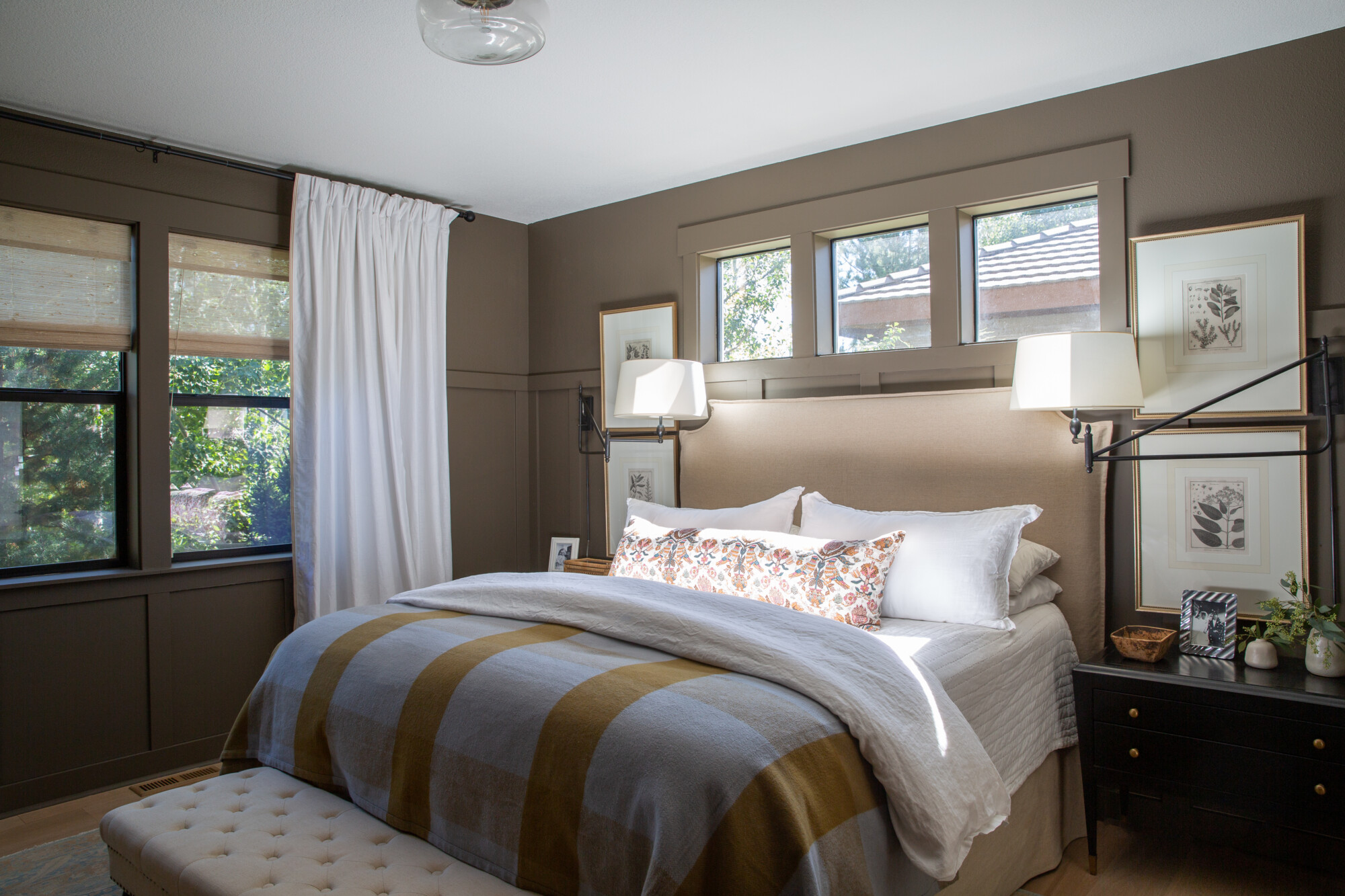
Invest in an Actual Paint Deck for Stress-Free Color Selection
Getting ready to choose paint colors? Skip the hassle of collecting countless tiny swatches and opt for a reliable solution: investing in a paint deck from your local store. These handy dandy decks contain an impressive range of colors within each “family,” making it easier to explore your options and find the perfect shade for your project. Plus, you’ll have the deck on hand for years to come, ready to help with any future painting endeavors. Trust me, the convenience and peace of mind are absolutely worth it!
Embrace Historical Paint Colors
When it comes to selecting paint colors that exude timeless elegance, look no further than the historical color collections offered by reputable paint companies. Personally, I swear by Benjamin Moore’s Historical Collection for nearly every project, and let me tell you, they never disappoint. These colors boast subtle gray and brown undertones, resulting in hues that are richer and more refined, without veering into overly bright or garish territory. Trust me, embracing historical colors will add a touch of charm to any space, making them a must-have for your next project.
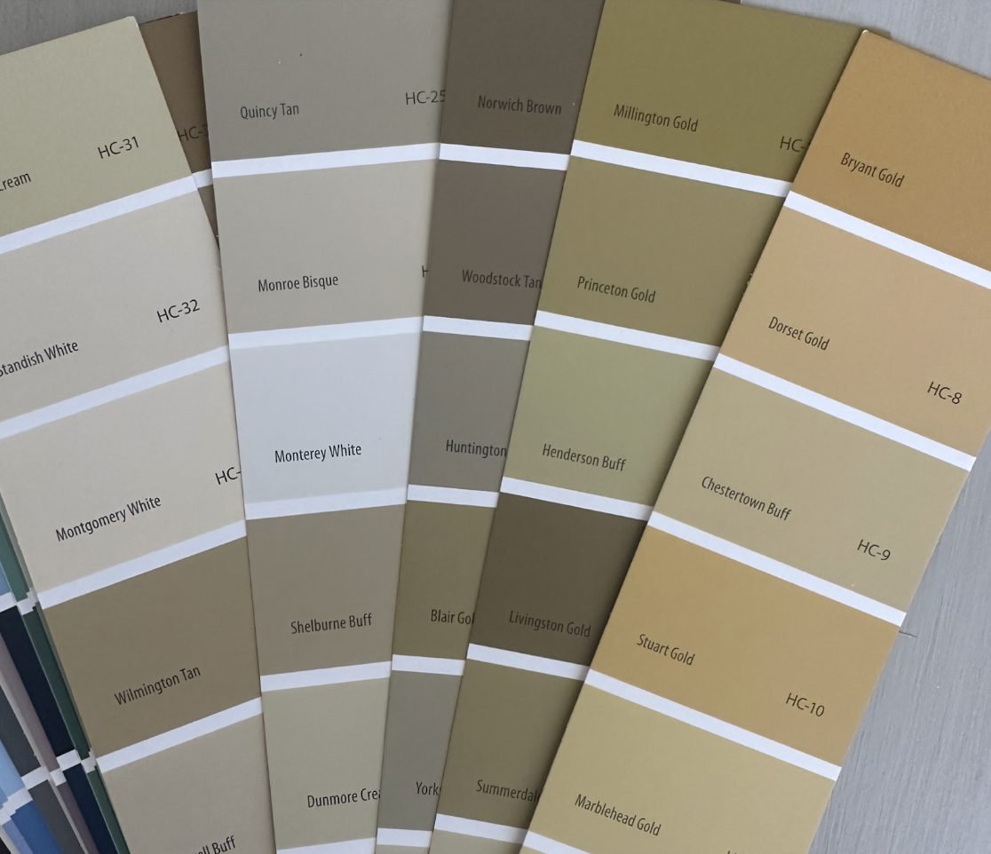
A Rule of Thumb for Flawless Selection of Paint Color
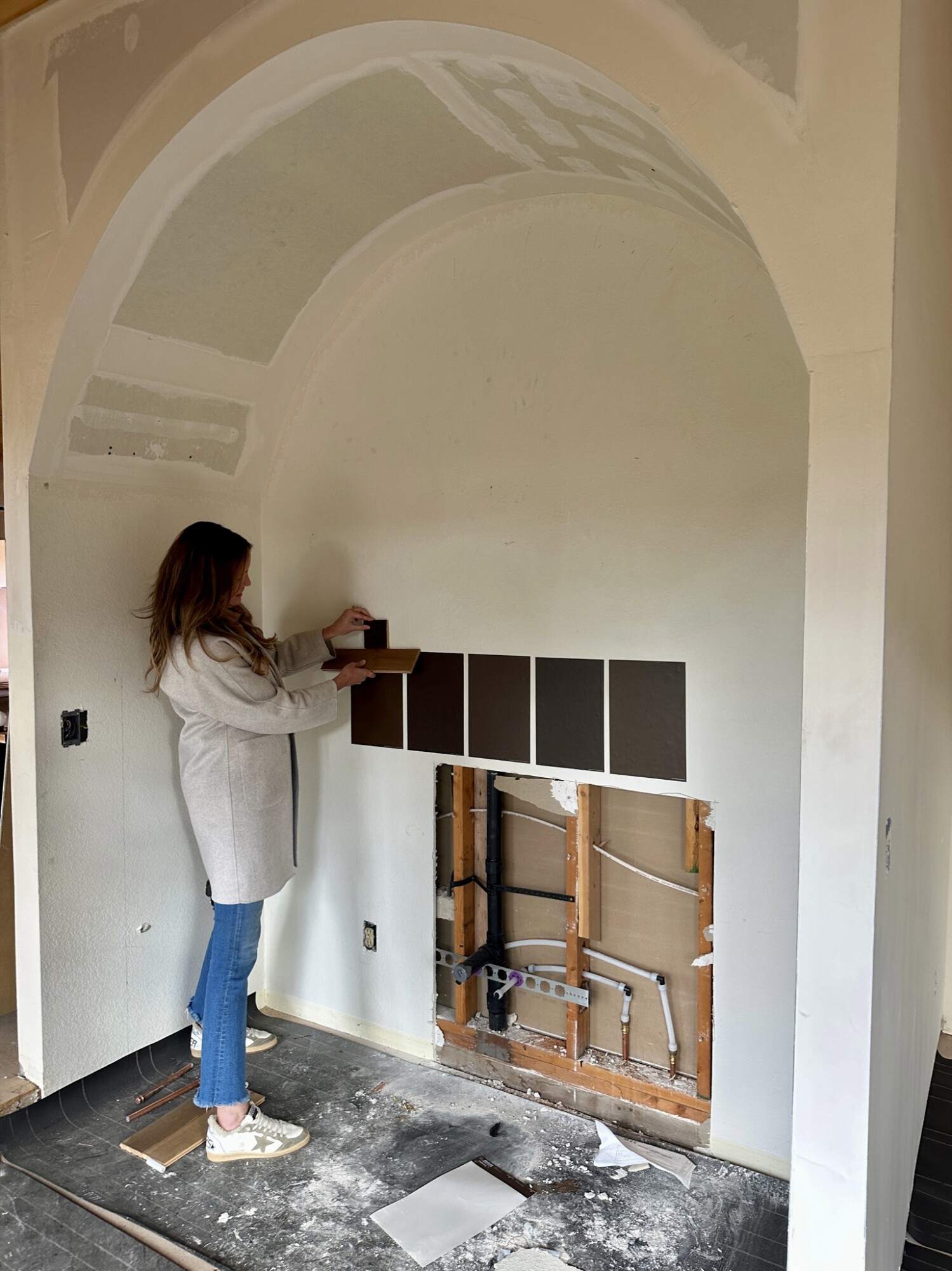
Perusing through paint decks and struggling to find the perfect historical color? Well, here’s a tip: lean towards the darker hues on the deck chip. Believe me, I swear by this, with only a few exceptions (we all have those, right?). Why? Because when you paint your chosen color onto your walls, it almost always appears lighter than the swatch itself. By selecting a darker shade from the paint deck, you’ll ensure that the color will translate beautifully onto your walls, providing depth and richness to your space.
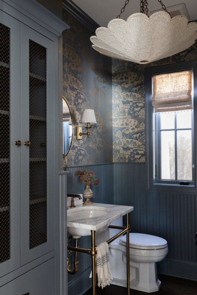
Embrace Neutrals
When it comes to painting, neutrals are your best friend. They provide a versatile canvas for any design, and also stand the test of time. Whether you’re going for a classic look or something more contemporary, neutrals offer endless possibilities. From warm beiges to cool grays, these timeless hues create a sense of calm and sophistication in any room. So, next time you’re overwhelmed by the rainbow of options at the paint store, remember: neutrals never go out of style.
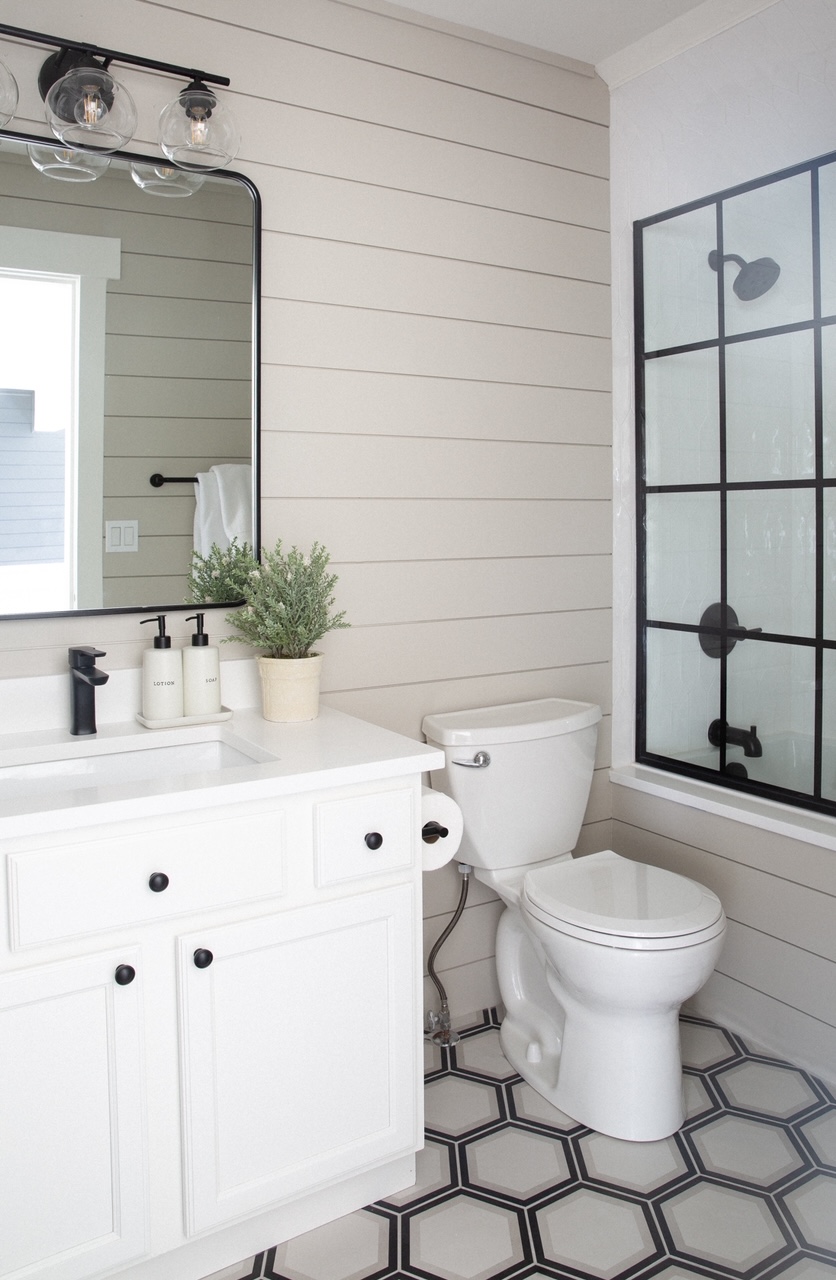
Dare to go Bold?
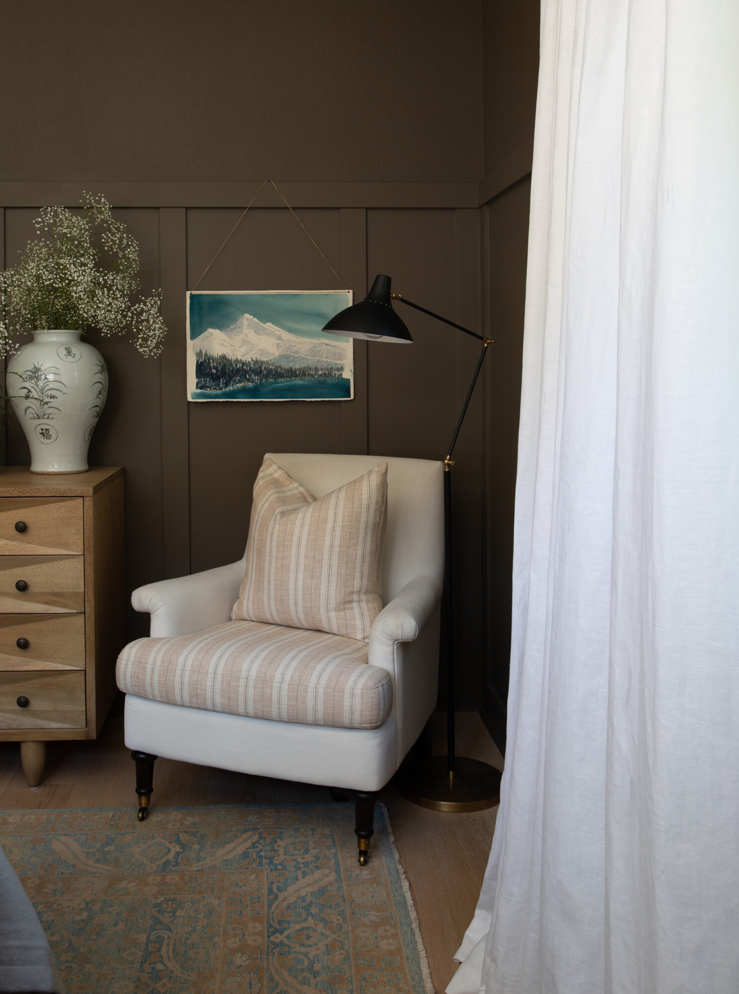
If you’d like to make a statement with paint, remember that going bold doesn’t have to mean choosing blindingly bright colors. Instead, consider opting for darker, moodier hues within the same color family. Take, for example, the difference between a vibrant, eye-searing hue and its darker, more subdued counterpart with brown and gray undertones. While both options are undeniably bold, the latter exudes a sense of depth and richness for maximum impact.
Test Before You Paint
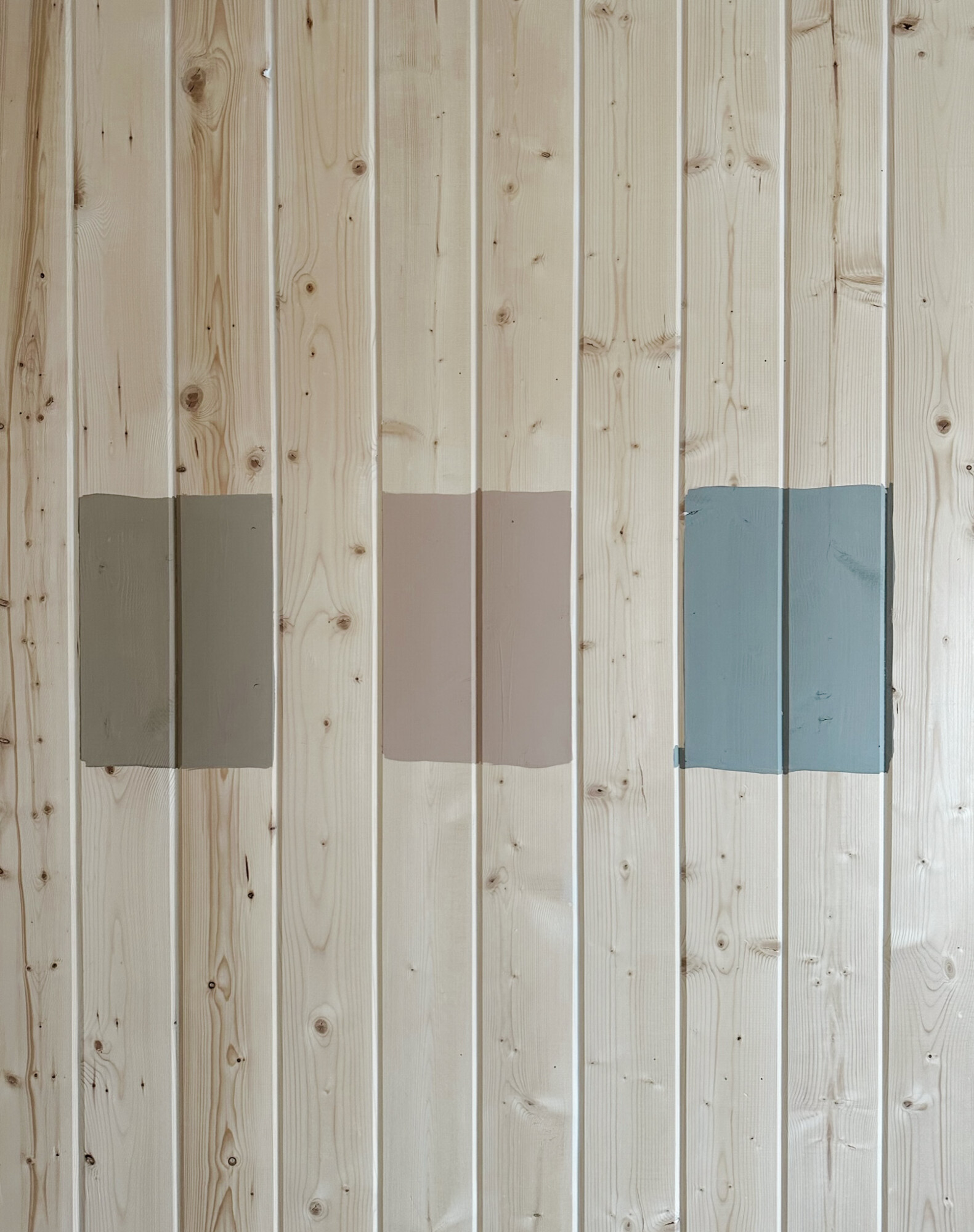
Before committing to a paint color for your entire room, it’s crucial to remember that a color will always feel different on your walls than it does on a tiny 2” x 2” swatch. That’s why, once you’ve narrowed down your choices from the paint deck, it’s time to order some samples. I highly recommend using Sampilize for this step. They offer swatches painted on re-stickable sheets of paper from renowned paint companies like Sherwin Williams, Benjamin Moore, Farrow & Ball, and more. With samples in hand, you can test how each color looks in your space under different lighting conditions, ensuring that you’ll make the perfect choice for your home.
Live with Your Swatches
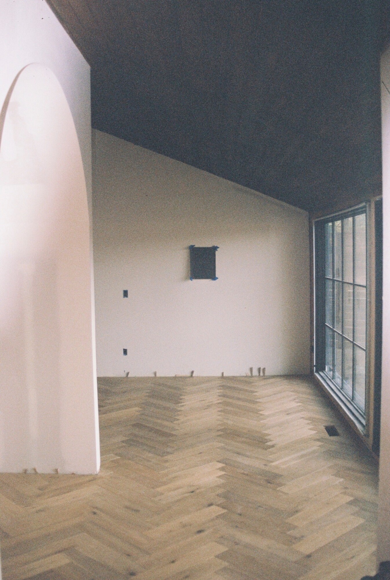
After you’ve applied your paint samples to the walls, resist the urge to make a snap decision. Instead, live with them for a day or two, observing how they look in various lighting conditions, from morning sunlight to evening dusk. Take note of how the colors change throughout the day, and how they compliment your furnishings and décor. This time allows you to truly visualize how each color will feel in your space, helping you make a confident and informed decision. So, take a moment to live with your swatches, and you’ll be rewarded with the right color — guaranteed.
Choosing Your Paint Color
Choosing paint colors doesn’t have to be a daunting task. By following these simple yet effective tips, you can streamline the process and make confident choices for your next project. With a little patience and thoughtful consideration, you’ll find the perfect paint color to transform your home into the ultimate haven for style and comfort. Happy painting!! (Derrick would never say those two words in the same sentence … ha!)
Looking for even more inspiration before you get started? Click here to subscribe to our weekly newsletter and upon signing up you will receive our ‘Complimentary Paint Guide’ directly in your inbox! a 40 + page guide complete with nine neutral and eight bold paint colors that are timeless and CH approved!


