A shift in pace, a return to living
April feels like movement.
Not the rushed kind, but the kind that builds. The kind that comes from finally being able to see what’s ahead. Windows open. Light lingers longer. Spaces start to feel lived in again.
If March was about stirring things awake, April is where things begin to take shape.
In design, this is the moment we start layering back in—texture, color, personality. Editing. Adjusting. Letting things evolve instead of forcing them.
And in life, it feels similar. A little more energy. A little more clarity. And, a willingness to move forward, but not at the expense of intention.
What March Gave Us
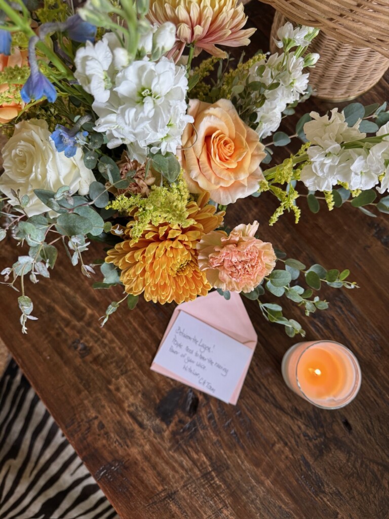
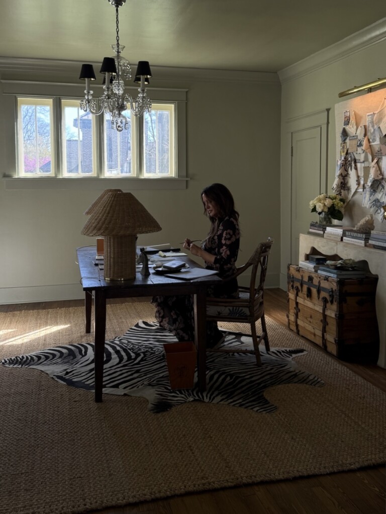
Progress, finally.
March was a big one for us!!
We made real progress in the house in a way that felt both exciting and grounding. The home office is finally set up — which feels like a milestone in itself — and we painted the dining and living rooms and started bringing in furniture. It’s still very much a work in progress (and likely always will be, in my book at least) but for the first time, it’s starting to feel like ours.
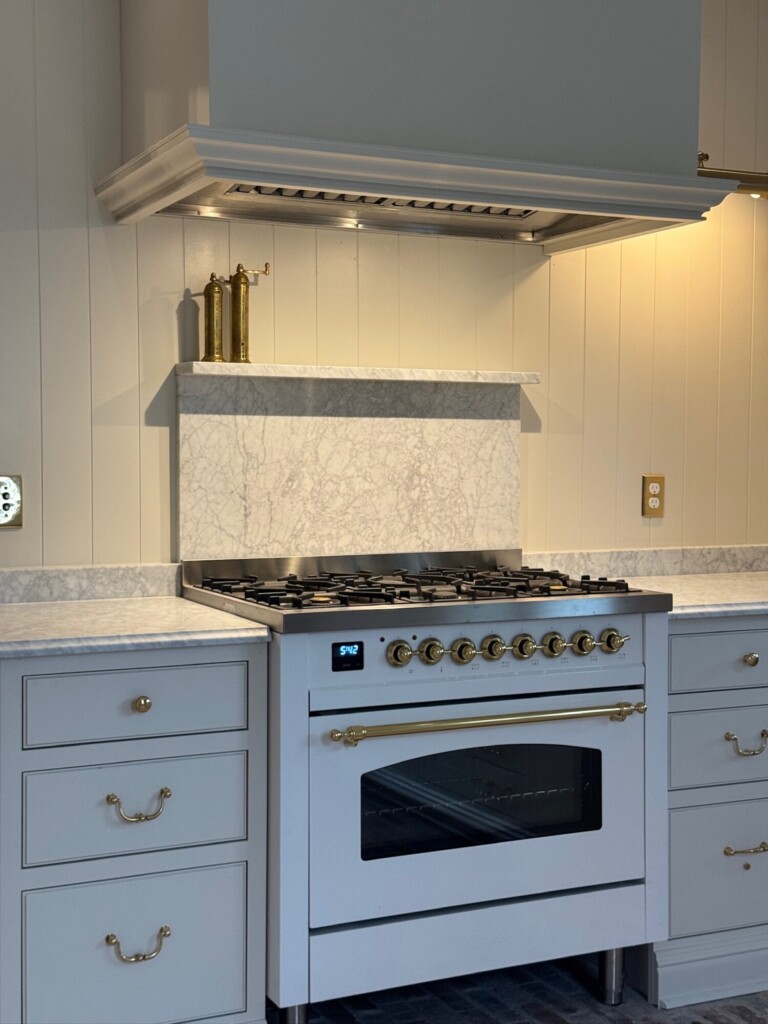
The biggest win? Kitchen appliances are in. We can cook again (IYKYK). After months of waiting, that alone feels like a turning point.
Upstairs, we were able to finish the guest bedrooms and bathroom just in time for my parents to come stay in a couple of weeks. There’s something really meaningful about having a space ready to welcome people in … it makes the house feel complete in a different way.
We’re so pleased with how everything is coming together, while also knowing there’s still a long road ahead. And honestly, that’s part of it. Letting a home evolve slowly over time.
Something New (and Long Overdue)
Between the Layers
We also launched something we’ve been thinking about for a long time: Between the Layers.
It’s a space for everything that doesn’t quite fit here, on the blog, and Instagram.
The deeper thoughts and behind-the-scenes decisions. The conversations we’re having in real time as we design, build, and live in these spaces. It’s where we can slow down a bit and share more than just the finished result.
If you’ve ever wanted more context — more “why,” more BTS, more honesty around what this all actually looks like — this is where that lives now.
You can subscribe for free on Substack, and new posts will land directly in your inbox. If you love following along here, it’s the natural next step, and where we’ll be spending more of our time going forward. We hope you’ll join us over there as we transition to writing our blogs on that platform.
Team Highlights
Allison — Floral patterns
I cannot stop gravitating toward florals.
We just chose this Kravet one for our upstairs guest bath. We are doing a skirt around the pedestal sinks instead of cabinetry (which I’m very excited about). It felt like the perfect place to do something softer, a little unexpected, and honestly, just more fun.
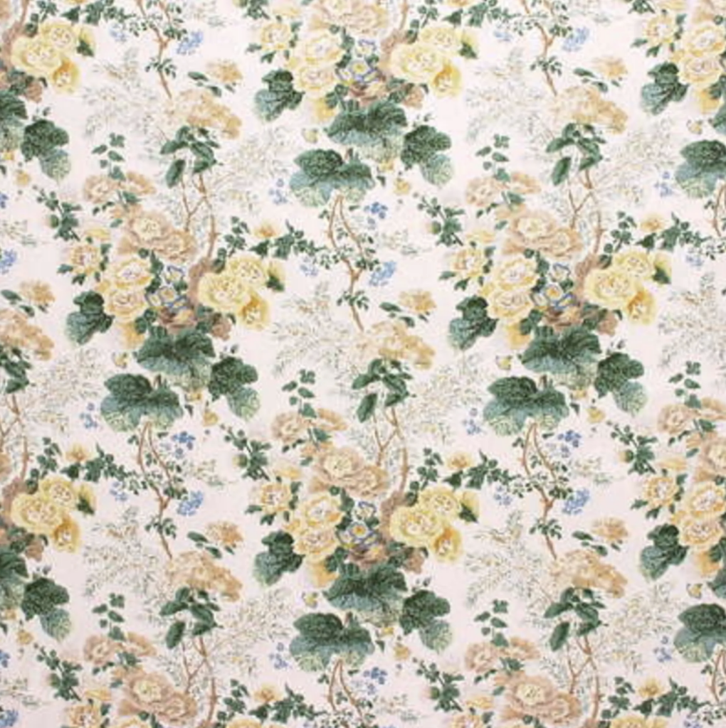
There’s something about florals that instantly bring warmth into a space. They break up all the hard surfaces, add movement, and make everything feel a bit more personal.
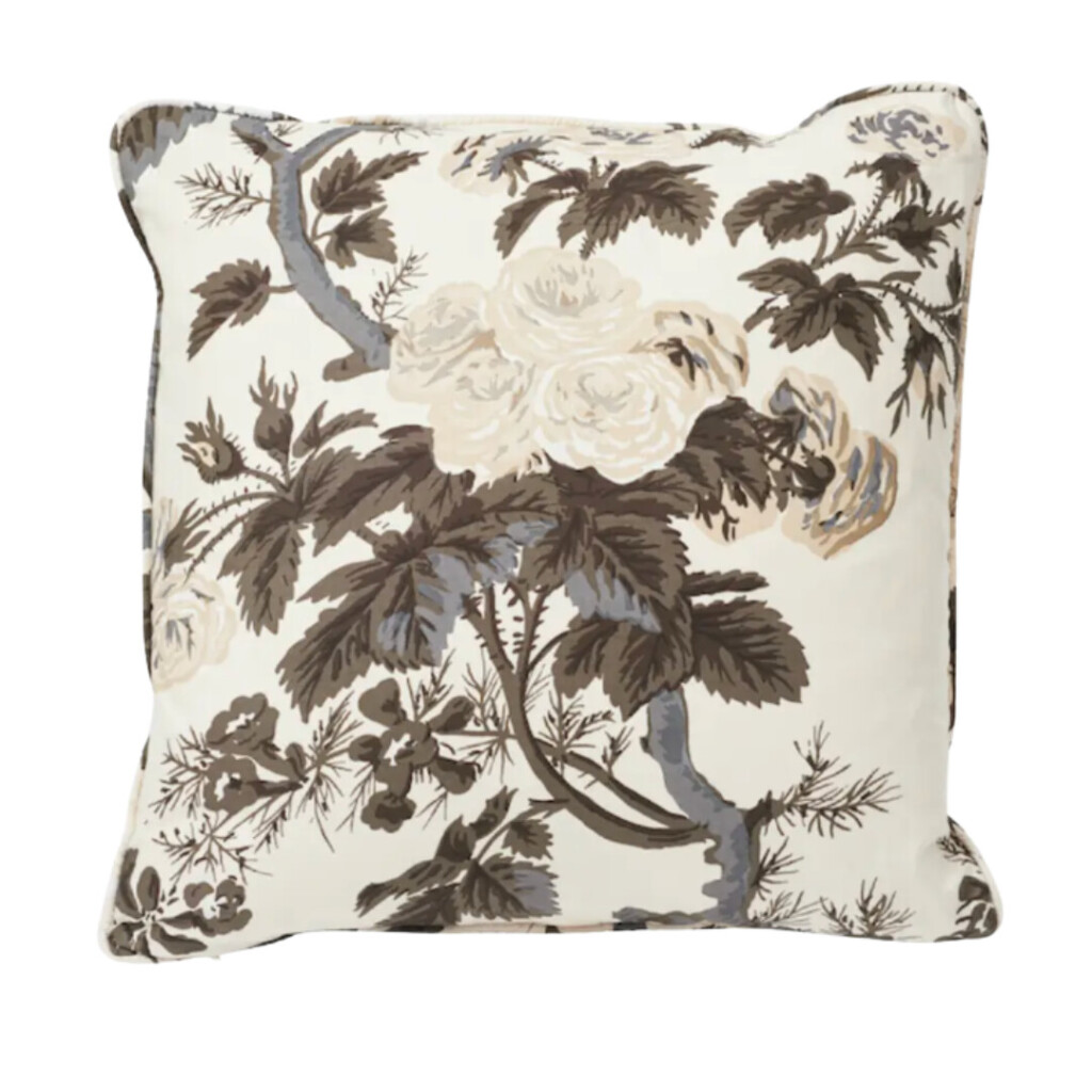
We used these Schumacher floral pillows in our living room, and they’ve quickly become one of those details that makes the whole space feel finished. I love how they add pattern without overwhelming.
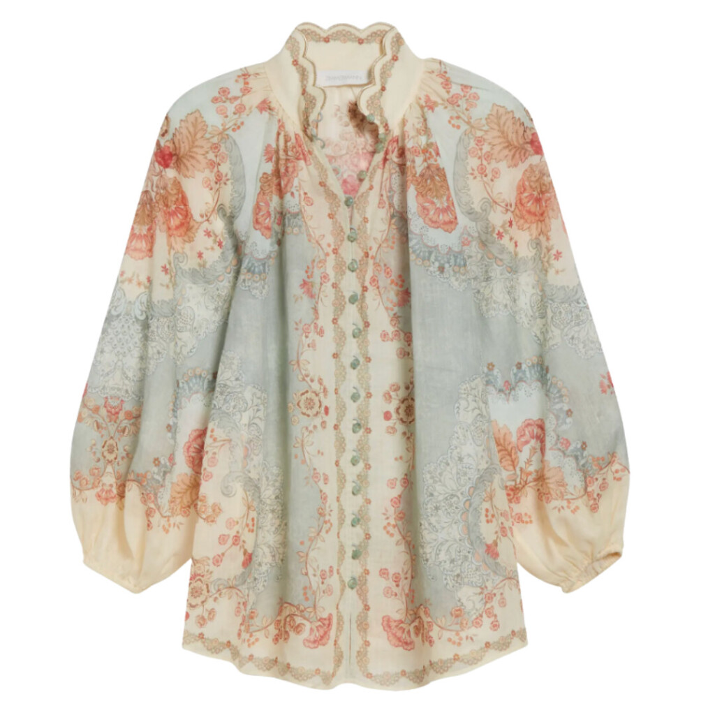
And, it’s not just showing up in our interiors! I’ve been reaching for florals in my closet too. This blouse feels like an easy extension of that same idea—soft, feminine, and a little romantic without trying too hard. It’s proof that the things we’re drawn to in our homes tend to find their way into how we dress too, which is always interesting.
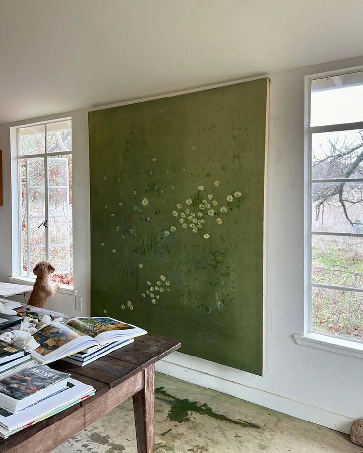
Lastly, I’ve been really drawn to the work of Kate Zimmerman Turpin lately—we actually shared her pieces in a recent client presentation and couldn’t stop coming back to them. Her florals feel so expressive and layered, almost dreamlike, with a sense of movement that makes them feel more like a feeling than a pattern.
Derrick — Rebels (Columbia, TN)
This has been our go-to spot when we want something low-key, fun, and full of personality. It’s a total dive (in the best way) but it sits in one of those pockets of Columbia that’s really starting to boom, with people buying, renovating, and bringing new energy into the area.
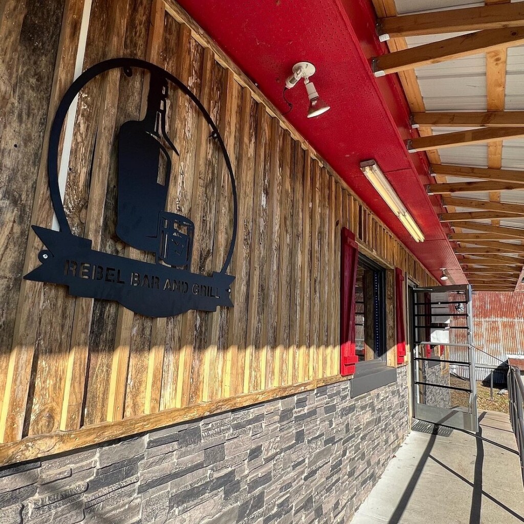
What keeps us coming back is the mix of people and the atmosphere. You truly get all walks of life here, and the staff is some of the friendliest I’ve come across. It feels welcoming, unpretentious, and just easy to be in.
Andrew and I especially loved going on Saturdays to watch Oregon Ducks football. One of the owners was from Oregon and passed away last year, so we’ve kind of unofficially claimed it as Columbia’s Oregon Ducks bar.
It’s also just a great hang … pool tables, sports on, and even karaoke some nights. When friends or family come to visit, this is definitely one of the spots we’ll be bringing them for a fun, laid-back night.
Kaylei — If not pink, white
(very much in my bridal era)
Lately, I’ve been loving everything white and cream. I wear white year-round, but right now, it feels especially fitting. A puff sleeved white blouse is always my go-to — it’s easy, feminine, and always works.
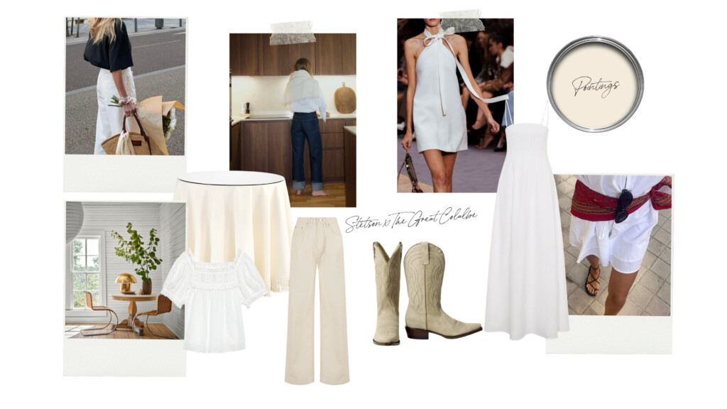
I’ve been really into the Stetson x The Great collaboration, and have my eye on a pair of their suede boots. They feel like a perfect balance to all the softness.
On the home side, I can’t stop thinking about Farrow & Ball’s “Pointing.” It’s a chic, warm neutral. And, I still love the fringe table from Ballard that Allison installed at 6th Street. It’s one of those pieces that just makes a space feel layered and interesting.
Emma — The Silent Patient
I could not put this book down.
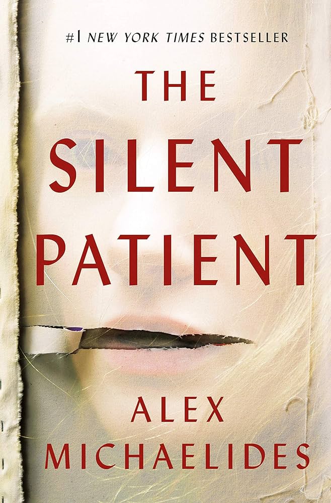
It’s a psychological thriller, but in a way that feels really smart and layered. Not overly dramatic, just deeply intriguing. It’s the kind of story that kept me thinking even when I wasn’t reading it.
I’ve also heard they’re turning it into a movie, with Anne Hathaway potentially starring … which makes me very glad I read it first! There’s something about knowing the story before everyone else that just feels like you’re in on it.
Monthly Roundup
What we’re reaching for, repeating, and not overthinking.
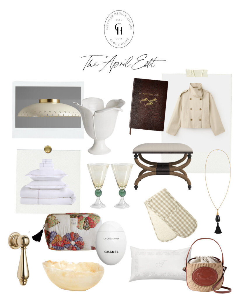
Flush Mount | Sculptural Vase | Leather Notebook | Cropped Trench Jacket | Teardrop Hardware | White Bedding Set | Amber Stemmed Glasses | Woven Bench | Tassel Necklace | Gingham Oven Mitts | Floral Toiletry Bag | Chanel Hand Cream | Onyx Bowl | Monogram Pillowcase | Chloé Raffia Bag
A Few Honorable Mentions …
The Tassel Necklace
I’ve been talking a lot about statement necklaces lately (and yes, it does feel a little 2016) but in a much better way. They’re coming back, just more refined. Less oversized and embellished, more subtle and intentional.
This one is exactly that. It adds just enough interest without overpowering anything, and looks amazing layered over something really simple—a basic tee, a button-down, even a lightweight knit. It does the work for you.
We used these in our upstairs guest bath on the IKEA Pax system to customize it a bit, and they completely transformed the look.
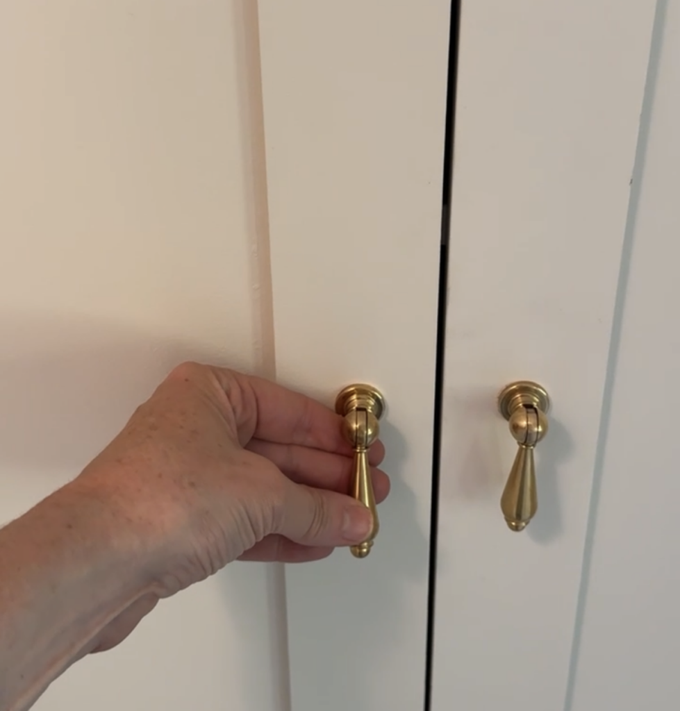
It’s one of those small upgrades that makes cabinets feel far more elevated and considered. The teardrop shape is classic but slightly unexpected, and it instantly pulls everything together in a quieter way. Proof that hardware really does matter!!
Crisp White Bedding with Trim
There’s something about really good white bedding that never misses.
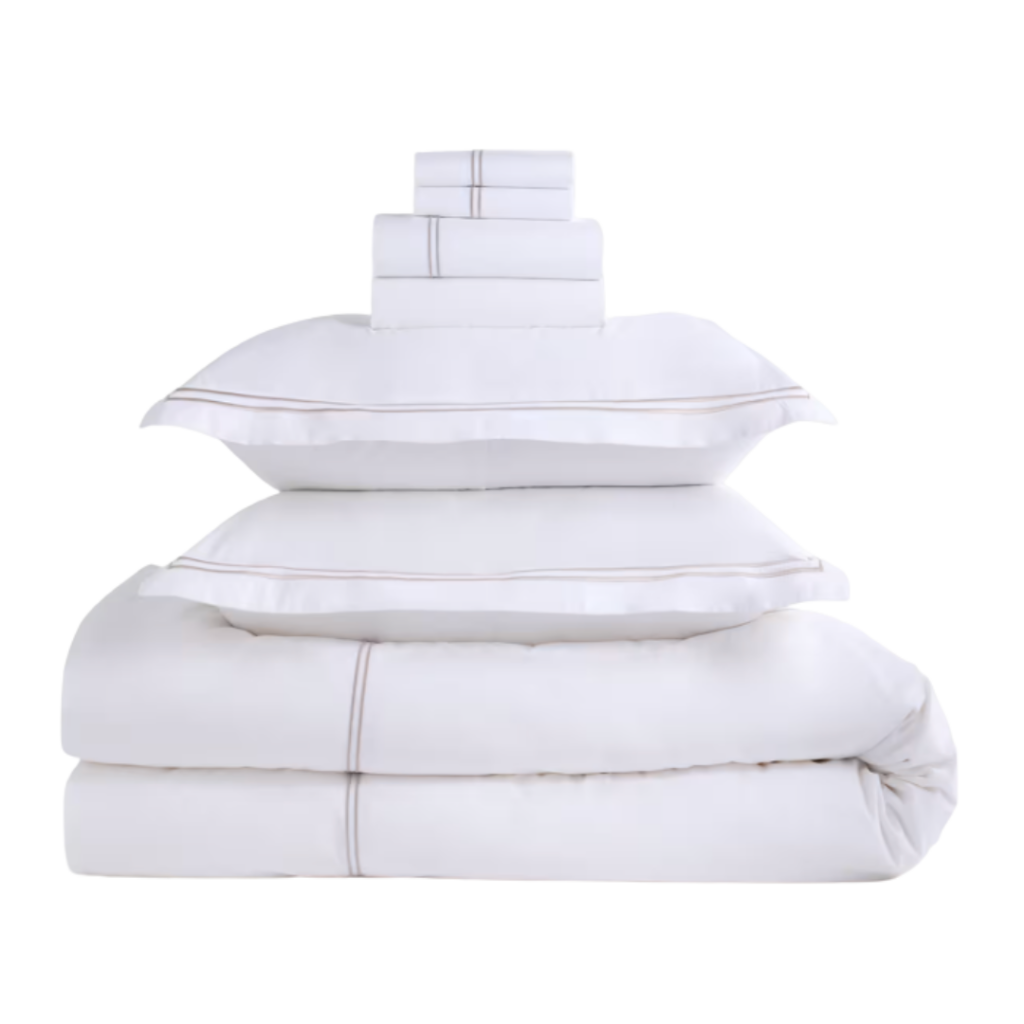
I just bought this set, with the subtle trim detail, and it feels very hotel-esque in the best way. Clean, tailored, and just structured enough. Love when my sheets are tucked in tight … it makes getting into bed feel like a reset.
Vintage Amber Stemmed Glasses
These feel like an instant mood shift.
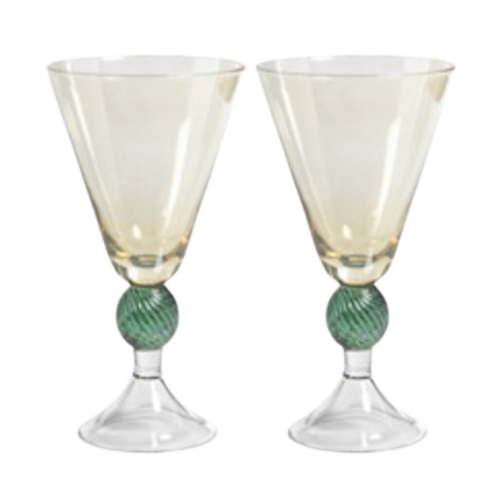
Perfect for dinner parties, but honestly just as good for a random weeknight glass of wine. A little detail that makes everything feel more special.
CHLOÉ Horse Medal Basket Tote
This one feels like spring in a bag. The mix of raffia and leather is timeless, but the horse medallion detail gives it something extra. It’s structured enough to feel polished, but still easy and effortless.
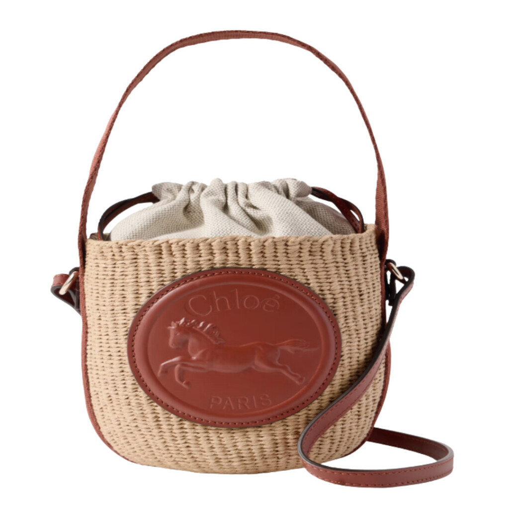
Perfect for everyday errands, weekends, or traveling light. It holds just enough without ever feeling bulky.

