Why We Chose Brick Veneer Tile for Our Kitchen Floors
February 17, 2026
Setting the Scene: The Feeling We Wanted
From the very beginning, we knew we didn’t want our kitchen to feel overly polished or precious. We wanted something warmer.
You don’t see brick flooring in kitchens all that often, and honestly, that was part of the appeal. We wanted a material that felt timeless and a little unexpected. Brick instantly brought in that old-world, European sensibility we were trying to achieve. I kept thinking about an old Southern charmer of a home, and this just felt right to me.
Credit: Liz Marie
Yes, We Had Questions Too
Before committing, we had all the same questions everyone asks: Is it cold? Is it hard to maintain? Will it hold up in a high-traffic space like a kitchen?
This post is meant to answer those exact questions—because while brick flooring isn’t the most common choice, it’s one that deserves far more attention than it gets.
The Materials We Chose
For our floors, we used Old Mill Brick in the color Castle Gate, sourced from Home Depot. We’ve only had the tile installed for about three weeks, so while we’re still early in the process, everything we’re sharing here is backed by extensive research, thoughtful planning, and lessons learned from past homes.
What Brick Veneer Actually Is
Brick veneer gives you the look and character of traditional brick, but in a much thinner, lighter format that works beautifully for interior floors. It delivers all the texture and variation we love about brick, without the bulk or complications of full brick installation (ie transition to other flooring).
The Old Mill bricks are kiln-fired, just like regular bricks, only thinner—so they’re still incredibly durable and well-suited for a high-traffic space like a kitchen.
Comfort Was Non-Negotiable: Heated Floors
We’ve lived with stone floors before, and we know how cold natural materials can feel. So, by adding heated floors beneath the brick ensures that the space feels just as comfortable as it is beautiful, proving that brick doesn’t have to mean cold or uncomfortable underfoot.
Why We Over-Grouted
One of the biggest decisions we made during installation was to over-grout the brick—and this was very much on purpose. We were drawn to a softer, more washed, timeworn look rather than crisp, high-contrast grout lines. Over-grouting helped blur the edges and gave the floor that aged, lived-in feel we were after.
We did hire a mason for this project, and I truly can’t recommend that enough. This is a lot of work and very much an art form. I asked him to fill the grout lines as fully as possible—slightly over the edges—then smear and wipe it back by hand. The result feels organic and imperfect in the best way. If you’re considering brick floors, this is one area where I’d absolutely say it’s worth the investment to hire it out.
We chose a lime grout, the kind you’d find in centuries-old homes. I love its natural texture and softness—it’s not a stark white and not too gray, which helps keep the floor feeling warm and authentic.
Form and Function
From a practical standpoint, over-grouting just made sense. We didn’t want deep grout lines or uneven edges that could catch toes or feel uncomfortable underfoot. Smoothing everything out creates a more seamless surface, which is especially important in a kitchen where you’re constantly moving around—often barefoot or in socks.
Maintenance & Upkeep (The #1 Question)
Let’s address the biggest concern right away: maintenance. This is the question we get asked most, and it’s honestly far simpler than people expect.
Day to day, upkeep looks like vacuuming, sweeping with a good old-fashioned broom, and mopping as needed—nothing fancy. While we haven’t fully lived in the space yet with daily cooking and traffic, early maintenance has been very straightforward.
For spills or scuffs so far, spot cleaning with a damp rag and a little soapy water has been more than enough. We’ll continue to share updates as we live with the floors longer, but everything we researched pointed to brick being far more forgiving than people assume.
The biggest thing to know is that brick flooring isn’t precious. It’s meant to be lived on: walked over, cooked around, and enjoyed without constantly worrying about every little mark. If anything, a bit of wear only adds to the character over time.
So, if upkeep is what’s holding you back, don’t let it. Brick can absolutely hold its own in high-traffic spaces like kitchens while still feeling warm, timeless, and approachable.
Where Brick Flooring Actually Works (Yes, Even High-Traffic Areas)
Brick flooring isn’t something I’d reserve only for “pretty but impractical” spaces. We felt confident using it in our kitchen (obviously), but also carried it straight into our laundry room since the two spaces connect.
Beyond that, brick works beautifully in bathrooms (especially a powder bath), entryways, and mudrooms. Basically, anywhere you want something hardworking but full of character). These are high-traffic zones by nature, and brick holds up without feeling overly delicate, making it a great option for spaces that see a lot of real life.
Living With It (So Far) + Final Thoughts
At the time of writing this, the brick floors have only been installed for about a few weeks, so yes—we’re still very much in the honeymoon phase. As we continue living with them and putting them to the test, we’ll be sure to share updates along the way.
If there’s one takeaway from this project, it’s permission to choose something a little different. Not every decision needs to be the most common or the most “on trend.” What matters more is how a space feels day to day. These floors feel collected and intentional rather than cookie-cutter—and that makes a real difference in the spaces we live in every day.
At the end of the day, the best materials are the ones you’ll love living with, not just photographing. The ones that age well, tell a story, and make your home feel like yours.
And if that sentence alone makes you nervous, you’re not alone 😉
When most people picture pink walls, they’re thinking of something sweet, bright, or overly playful. But, that version of pink is only one small corner of a much bigger spectrum. The reality is, pink is one of the most nuanced, complex paint families out there — and when you understand what you’re actually looking at, it can behave more like a neutral than a statement.
The key is undertone. Pink paint isn’t just “pink.” It’s a mix of red plus something else — brown, beige, gray, even a touch of green — and that secondary color is what determines whether a pink feels soft and grounding or sugary and loud. The pinks I’m drawn to (and the ones I use in client projects) are dusty, muted, and slightly earthy. They often read as warm plaster, aged stone, or sun-faded clay once they’re on the wall. Not precious. Not juvenile. And definitely not just for little girls’ rooms.
In honor of Valentine’s Day, I pulled together a roundup of my favorite pink paint colors — some I’ve loved for years, and a few I’m seriously considering for our dining room at the Sixth Street Bungalow. These are the shades that hold up in real homes, in changing light, and alongside natural materials. If you’ve ever been curious about pink paint but didn’t know where to start (or what to avoid), this is for you.
The Three I’m Considering for Our Dining Room
Right now, the three pinks I keep coming back to for our dining room are all by Farrow & Ball: Dead Salmon, Setting Plaster or Potted Shrimp. I’ve wanted to use Dead Salmon for years in my own home, but it never worked with what I was scheming in the past. So, I’m attempting it again. Stay tuned to see which I go with!
I’ll be honest — when I first floated this idea, Derrick was … surprised. “Pink dining room” was not on his 2026 bingo card 😂 But this is exactly why I love these shades. They’re pinks in the most technical sense only.
Potted Shrimp
Potted Shrimp has a muted, earthy quality to it. Almost like a clay or terracotta that’s been softened over time. This is the kind of pink that plays really well with wood tones, vintage furniture, and candlelight — which is why I keep picturing it in a dining room setting. I mean, can you imagine candlelight in this room — what a beautiful glow it would provide? Buy a peel-and-stick sample here.
Setting Plaster
Setting Plaster, on the other hand, is even more subtle. It’s lighter, airier, and sits right on the edge between pink and neutral. If you didn’t tell someone it was pink, they might never guess. It has that sun-washed, European feel. It would be the prettiest too for my complexion. A win win!
My Goal With These Shades
The goal is to make pink feel less daunting, especially to the men in the household. This isn’t about making a statement — it’s about creating a space that feels inviting, lived-in, and a little unexpected … in the best way! Buy a peel-and-stick sample here.
Dead Salmon Design: Black Sheep Interior Design
Dead Salmon is a color people debate … and that’s exactly why it works so well. Everyone sees it slightly differently: sometimes mushroom, sometimes buff, sometimes a deep salmon steeped in history. It has a magical, candlelit quality that makes spaces feel serene. This is a longtime favorite for a reason! It’s deeply forgiving, especially in older homes or rooms with texture like plaster, beams, or stone. If you want subtle drama without contrast, this one never fails. Buy a peel-and-stick sample here.
Left: Dead Salmon Middle: Setting Plaster Right: Potted Shrimp
A few more honorable mentions …
Sulking Room Pink
Sulking Room Pink
This is not a “pink” in the way most people fear. It reads more like a muted rose with a powdery, almost velvety softness that brings enormous warmth without sweetness. That makes it feel intimate and enveloping, rather than decorative. On the wall, it shifts between plum, taupe, and dusty mauve depending on light, which makes it incredibly easy to layer with antique woods, brass, stone, and aged textiles. This is a color that feels lived-in from day one. Buy a peel-and-stick sample here.
Templeton Pink Design: Uns Hobbs interiors
Templeton Pink
Templeton Pink is a historic-feeling shade with more depth than it first lets on. It’s essentially a stronger, more saturated cousin to Setting Plaster, and in low light it becomes surprisingly rich and moody. This is a great option for rooms that don’t get a lot of natural light but still need warmth — hallways, dining rooms, or cozy sitting spaces. It doesn’t shout “pink,” but it absolutely adds presence. Buy a peel-and-stick sample here.
Cocoa Berry Design: Emily Henderson
Cocoa Berry
Cocoa Berry sits in the red family, but the brown and mauve undertones completely change how it behaves. It reads like a “dirty” 90s mauve (a bit cozy and nostalgic) rather than anything bright or playful. This color pairs beautifully with unfussy beiges, darker woods, and layered patterns, pulling subtle pink undertones from everything around it. It’s a great choice if you want elegance with personality, without leaning too feminine. Buy a peel-and-stick sample here.
Malted Milk
Malted Milk
Malted Milk is a blushing neutral at heart. It’s light, creamy, and softly peachy, with a brown undertone that keeps it from ever feeling sugary. This is one of those colors that feels almost invisible until you realize how warm and flattering the room suddenly feels. It works beautifully as an all-over wall color, especially when paired with corals, vibrant greens, or natural materials. A perfect stepping stone away from white. Buy a peel-and-stick sample here.
Cool Beige
Cool Beige
Cool Beige proves that beige doesn’t have to be flat or lifeless. While muted and balanced, it carries a subtle pink undertone that makes it feel softer and more human than a traditional “greige.” This is an excellent option for anyone who wants a tranquil, timeless backdrop (like for bedrooms, family rooms, or transitional spaces) without committing to obvious color. Think calm, cohesive, and easy to live with. Buy a peel-and-stick sample here.
Glamour
Glamour
Glamour is where pink and taupe quietly meet, with a hint of violet underneath that adds just enough intrigue. It’s a dark, muted neutral that brings a calm allure rather than contrast or brightness. This shade works especially well in bedrooms, bathrooms, and living rooms where you want atmosphere without heaviness. It plays nicely with both warm and cool finishes, which makes it incredibly flexible when decorating. Buy a peel-and-stick sample here.
***
To close it out …
I’m still sitting with a few of these and letting them marinate — narrowing things down, painting swatches on the walls, and seeing how they shift throughout the day. I’ll share where we land once a decision is made (and yes, I fully expect opinions in the house to evolve along the way 😉).
Save this for the next time pink paint crosses your mind — so you can skip the overwhelm, order the right samples, and feel confident from the start.
For a while now, this room has quietly worn a lot of hats.
It’s been our makeshift TV room, our default hangout space at the end of the day, and (somehow) also our dining room when the rest of the house was in flux.
But, as the Sixth Street Bungalow continues to take shape, it finally feels like the right time to give this room a clear purpose. I’m officially turning it into my office! I want it to be a space that feels creative, collected, and functional, without losing the warmth and character that made it a place we naturally gravitated toward in the first place.
This office will be layered and lived-in: a proper desk for workdays, a sofa for reading or taking calls, bulletin boards for pinning inspiration, and finishes that feel timeless rather than trendy. Step one? Clearing everything out and starting fresh with paint—specifically, a subtle, yet very grounding green that sets the tone for the entire room.
Paint as the Foundation (Color Drenching the Room)
Green felt like the right choice almost immediately. I’ve always gravitated toward it in my own spaces—it’s grounding, classic, and works beautifully in older homes. Because this house was built in the late 1920s, I wanted something that felt a little retro, a little earthy, and like it could have always been there.
We initially landed on Farrow & Ball Vert de Terre, a grounding color that I’ve used before. On paper, it felt perfect: soft, muted, and mossy without being heavy. The kind of green that adds character quietly and lets the layers do the talking.
We decided to fully color drench the space (walls, trim, and ceiling) to create that wrapped, cocooned feeling I love in an office.
But, once we started living with it, something interesting happened.
This room is north-facing, and when you color drench a space like that, the color doesn’t just live on the walls. It reflects off everything. Ceiling, trim, light bounce… it all intensifies. And in north-facing light, Vert de Terre started pulling cooler and bluer than I was expecting.
Not bad—just different.
And, it was a good reminder of something I’m always talking to clients about: light changes everything.
Our soon-to-be home office
That’s what led us to Farrow & Ball French Gray.
Farrow & Ball ‘French Gray’
Despite the name, French Gray reads as a gentle green with a subtle warmth to it. Where Vert de Terre has punch with blue undertones, French Gray feels richer (I always say lean into what you are dealing with — no or little natural light spaces can go richer and darker) and a bit more neutral. If you’re searching for a true mid-tone green (one that isn’t overwhelmingly green or underwhelmingly gray) this might be the one.
It still gives me that timeless, lived-in look that’s perfect for this house, but without the cooler undertones taking over. It feels calmer, more balanced, and better suited for a room I’ll be working in every day.
Not a full pivot, just a thoughtful refinement.
Clouz Houz Tip: When I color drench, I use three different sheens: eggshell for walls, satin for trim and flat or matte for the ceiling.
How French Gray Reads in Different Facing Rooms
Paint colors will always look different from one home (and even one wall) to the next. Natural light, what’s outside your windows, floor tones, and room direction all play a major role. While testing samples in your actual space is always best, here’s a general guide for how French Gray behaves depending on exposure:
South-Facing Rooms South-facing rooms receive warm, consistent light throughout the day, which enhances French Gray’s warmer undertones. In these spaces, it often reads as a vibrant green with golden olive notes, though it can soften into a duller gray-green depending on the time of day.
North-Facing Rooms North-facing rooms receive cooler, indirect light, which amplifies green and blue undertones. In these spaces, French Gray can lean more subdued—sometimes reading as a cooler green, a darker gray-green, or even slightly blue-green. For reference, our office is north-facing, which is why this color felt calm and grounding, but also very honest—nothing overly warm or yellowed.
East-Facing Rooms East-facing rooms get warm morning light and cooler light for the rest of the day. French Gray may appear warmer and more olive in the morning, then shift toward a gray-green or blue-green as the day goes on.
West-Facing Rooms West-facing rooms receive cooler light most of the day, followed by warm, golden light in the evening. French Gray often reads as a muted gray-green during the day, then comes alive as a warmer, richer green at sunset.
A Standout Moment: The Zebra Hide Rug
Early on, I knew that I wanted to bring some form of animal print into this house. It breaks up all the softness and keeps a space from feeling too polite. For me, animal print always reads more classic than trendy when it’s used intentionally, and a hide felt like the right entry point.
What’s so interesting about using a zebra hide is that it feels like a layer, not a lifetime commitment. It’s bold, yes—but it’s also flexible. Laid over this larger jute or wool rug, it adds movement and contrast without overwhelming the room..
A little insider tip: hides work best when they don’t try to be perfect. Let the edges feel organic. Let it overlap furniture slightly. That relaxed placement is what makes it feel like it’s always been there.
Window Treatments: Softening the Space
Window treatments were all about balance in this room. With the walls fully color drenched, I wanted the windows to add warmth and texture without pulling focus. That’s where the combination of woven bamboo roman shades and linen drapery panels really shines.
The bamboo shades bring in that grounded, natural layer that is welcome in most any room. They filter the light just enough and add a subtle texture that keeps the room from feeling flat.
Photo: Pinterest
Layered with pleated linen drapery panels, the space softens instantly. The drapes add height and a sense of ease, especially when they’re hung high and allowed to puddle slightly. It’s a simple move, but one that makes the room feel taller, calmer, and more finished.
A Creative Corner
Bulletin boards are one of those things that instantly make a space feel alive to me. They’re practical, yes … but more than that, they’re inspiring. It’s fun to be able to pin things up, move them around, layer images, and let ideas live out in the open instead of tucked away in a folder on my computer.
Photo: Pinterest
This office is meant to be a working space, not just a pretty one, and bulletin boards feel essential for that reason. Paint samples, fabric swatches, tear sheets, handwritten notes, photos I’m drawn to lately—it all deserves a place where I can see it every day. There’s something about that visual clutter (the good kind) that sparks creativity in a way nothing else does.
I’ve made my own bulletin boards in the past, and it’s surprisingly simple to do. Get to choose exactly how it looks and functions for your space. If I end up going the DIY route again here, I’ll definitely share the process over on Instagram.
What’s Coming Next
Now that the direction is clear and the vision is set, this is where the room really starts to come to life. Paint was first on the list and everything else is building off of that foundation.
For seating, I found a cozy white, sleeper sofa (because this room has two roles- office and guest room when needed!)—something comfortable and inviting, not overly formal. Layered with these pillows (I’ve used these before at our last home and loved them so much decided to order again), it’ll feel collected and personal. This room needs to work hard, but it also needs to feel like a place I actually want to spend time in.
Then there’s the desk, which might be my favorite piece so far. I found a vintage wooden dining table on Facebook Marketplace that’s the perfect size to float in the center of the room. Using a table as a desk instantly makes the space feel warmer and less like a traditional office—more lived-in, more creative.
Design: Leanne Ford
More to come as I layer in the final details to make this an intentional, inspiring workspace.
Galentine’s Day Notes: What I’m Serving, Wearing & Playing
February 5, 2026
Celebrating the Girls
Galentine’s Day has always been one of my favorite excuses to slow down and celebrate the women in my life—the ones who hype you up, show up, make you laugh until you cry, and somehow always know exactly what to say. It doesn’t need to be anything big or overly planned … sometimes it’s just a few girlfriends, good drinks, and an evening that feels light and fun. If you’ve been thinking about throwing a small gathering (or even just a cozy night in for two), consider this your sign.
A Little Something Handmade
When it comes to Valentine’s (and really any holiday), I’ve always leaned toward homemade treats over anything store-bought. There’s something about taking the time to bake something simple, wrap it up nicely, and hand it to someone you love that feels extra special. It doesn’t have to be elaborate. A favorite cookie, a small loaf of something sweet, even chocolate-covered strawberries paired with a handwritten note goes a long way.
Personally, I love to pair those little treats with a card or short letter … just a few words to say “thinking of you.” A few years ago, I bought this monogram embosser and it has become one of those small but meaningful details I reach for over and over again. It makes even the simplest note feel intentional, and an accessory I’m always grateful to have on hand when I want to send something personal.
The Cocktail Moment
If you’re serving a cocktail for Galentine’s, you might try something that feels a little romantic and vintage without being over the top. Lately, I’ve been making a Clover Club for Two. It’s a classic gin cocktail with raspberry and lemon that feels feminine, nostalgic, and is honestly just really pretty in a glass. It’s the kind of drink that looks impressive but is surprisingly easy to pull together.
That said, I’m also a big fan of keeping things simple. A Dirty Shirley will always be a crowd favorite—especially if you load it up with maraschino cherries and use cute straws to elevate it just a bit. Last year we had so much fun using a little lips stencil to make Cosmos with beetroot powder—playful, unexpected, and such a hit! I linked that blog again here if you want to recreate it.
Party Decor & Little Festive Touches
If you’re serving drinks, you’ll obviously need napkins—and for this kind of gathering, I’m firmly in the paper napkin camp. It keeps things easy, relaxed, and low-stress, which is the vibe you might want for a fun Galentine’s night. However, if you want to invest in linen, look at these from this month’s edit post. So subtle, and could carry over to Easter! Try choosing ones that feel subtle but still festive. Nothing too literal, just a soft nod to the occasion. Little details like this go a long way without feeling overdone.
When it comes to what to wear for a Galentine’s dinner, happy hour, or cozy get-together, I actually love the idea of skipping the obvious red-and-pink route. There’s something so chic about going monochromatic, especially with winter whites having such a moment right now. It’s the perfect base to add a subtle pop of color or a fun accessory without feeling costume-y.
I’m obsessed with these Gucci heels!! I had a similar pair, but the glitz on these feels extra girly in the best way and works with many different looks. And, don’t forget a cute clutch. This is where you can really have fun and let your personality shine.
You know I couldn’t help myself! I made a playlist for the girls. Something feel-good, a little nostalgic, and perfect to have on in the background while you’re mixing drinks, catching up, and lingering longer than planned. It’s linked here so you can save it for your own Galentine’s night.
Whether you’re hosting a full-on Galentine’s gathering or just sharing a drink with one or two of your favorite people, I hope this inspires you to make it feel a little special. It doesn’t have to be perfect—just thoughtful, fun, and filled with good energy. Cheers to celebrating the women who make life sweeter, today and always 🤍
February always feels like an in-between month. The holidays are long gone, spring still feels far away, and everything slows down in a way that’s either uncomfortable, or quietly kind of beautiful.
This month, I’ve been leaning into softness. Think romantic details, slower mornings, comforting rituals, and little escapes that make late winter feel less heavy. Not Valentine’s Day romance exactly, but the kind that shows up in everyday life: the way you start your morning, what you watch at night, the textures you surround yourself with.
Here’s what has been inspiring me lately.
A New Morning Ritual (and a Little Bit of Magic)
I’ve been working my way through the Return to Magic challenge from To Be Magnetic, and I honestly didn’t expect to love it as much as I do. Manifestation is completely new territory for me, but after reading How to Manifest late last year, I felt pulled to go deeper.
Lately, most mornings look like this: Derrick brings me coffee in bed (I know … very spoiled), I put my AirPods in, and listen to one of the Deep Imaginings before the day starts. It’s become a grounding ritual, one that has helped me clarify goals and recognize areas in my life that need more attention or softness. If you’re even a little curious about this kind of work, I’d genuinely recommend it. A solid 10/10.
A Rom-Com Escape (When Football Takes Over the House)
The other night, Derrick and Andrew were fully locked into a football game (which I’m officially over for the season) so I retreated to the bedroom and stumbled on the cutest Netflix rom-com: People We Meet on Vacation. I curled in and got cozy with my blanket from Cozy Earth (I shared this last year and am still loving it — everyone fights over it!).
It was light, funny, mindless in the best way, and exactly what I needed. Everything in the world feels so heavy lately, and sometimes you just want something that lets you shut your brain off for a couple hours. This was that movie for me.
A Netflix Series That Had Me Hooked
On the complete opposite end of the spectrum — His & Hers on Netflix. I loved this series. A murder happens almost immediately (not a spoiler), and I was fully locked in from the first episode.
It’s a limited series, which I always appreciate, and I ended up binging the entire thing in one day. I’ve talked to a few other people who did the exact same thing. Netflix Originals really do it for me.
Music, Nostalgia, and Feeling a Little Sentimental
Lately, my music choices have been all over the place—very mood-dependent. But, I’ve noticed I’ve been feeling a little sentimental, missing those younger, carefree days when life felt simpler and responsibilities were fewer. Anyone else?
I’ve found myself looping back to the music I grew up listening to — it always brings a smile to my face. Lots of 80s and 90s. Starship has been on repeat, especially Nothing’s Gonna Stop Us Now. I can still picture myself crimping my hair, listening to that cassette tape. A full-circle moment LOL!
My Scarf Era (and a Deep Pinterest Spiral)
One of my favorite ways to unwind is scrolling Pinterest and setting vision (especially for outfits). I love to study street style and pull inspiration from the small details people don’t always think about.
Right now, I’ve officially entered my scarf era. I’m loving all the creative ways people are styling them—tied around the head, layered over sweaters, knotted onto bag handles, even worn as belts. Grabbed this one from Amazon recently and am hooked! It works now layered over knits, and will carry straight into spring with a simple white tee. One thing I’ve noticed that I absolutely love how a great scarf can take even the most basic white blouse or t-shirt with denim and make it feel more stylish.
Below is a little scarf moodboard, and I rounded up more favorites if you’re also feeling inspired. By the way, if you’re not already following along, you can find me on Pinterest—I’m there a lot.
Cashmere Everywhere (and Why It’s Worth It)
The material that keeps catching my eye lately? Cashmere. It’s showing up everywhere this season!! In bedding, socks, sweaters, and even unexpected home accents. And it feels so luxe in a quiet, understated way.
I always encourage investing in materials that last, and cashmere is one of those rare ones that truly does — if you take care of it. It only gets better with time, and it’s something you’ll reach for year after year. I’ve shared a few cashmere finds in this edit that feel especially good for late winter.
February always puts me in the mood to slow down and enjoy the in-between, and simple touches like ceramic plates with a red trim feel perfect for that. I love having little treats out this time of year, especially with Valentine’s Day around the corner. Paired with striped napkins on hand for an impromptu Galentine’s gathering, it’s those small, thoughtful pieces that make hosting feel effortless.
This bolster pillow has completely captured my heart. This brand has been on my radar lately for its timeless, heirloom feel. These salmon and coral-toned pillows styled on a bed or sofa are a reminder that pink can be such a beautiful, grown-up way to add warmth to a space. Don’t let anyone tell you pink isn’t allowed—it absolutely is when done thoughtfully. Layer in something like a brass and glass coffee table, a crystal cocktail shaker for the bar, or a pewter bud vase holding just a few pretty stems, and suddenly the room feels elevated without feeling overly styled.
Photo: Pinterest
We’re currently looking at custom lamp shades like these for the Sixth Street Bungalow office, and it’s such a good example of how subtle upgrades can completely shift a space. Cozy finishing touches like a cashmere cable knit throw, a rust-colored ottoman, or a ceramic and pewter mug and saucer set make everyday rituals feel more intentional. Add in embroidered crest guest towels for the bathroom, and you’re instantly ready for company. Proof that refreshing your home doesn’t always mean big furniture swaps. Sometimes it’s just about layering in a few beautiful accents!
Everyday Rituals
This red nail polish has been at the top of my list. I saw a friend wearing it and immediately became obsessed. It’s that perfect, classic Coca-Cola red that somehow works for everything, and of course it’s always sold out whenever I try to grab it. Paired with gold heart earrings, they feel playful without being overdone.
These striped pajamas with feather trim deserve a moment. I bought them for Em and I to wear over Christmas, and I’ve been living in them ever since. They’re cozy, chic, and feel especially perfect with Valentine’s Day coming up (especially if you enjoy staying in). Also been enjoying a little mid-day refresh with this Chanel glow stick. It’s such a pretty, subtle way to add dew and look instantly more awake without doing a full makeup reset.
I’ve also been fully embracing reader glasses lately. They’ve become such a vibe for elevating work outfits, and people are wearing them out to lunch or dinner as part of the look. For self-care, try thisbody oil, which has been a longtime favorite of mine, especially when paired with a dry brush. This time of year, when your skin just feels dull and dry, this ritual will help you feel better.
Shop the full February Edit here on our LTK. Everything linked and ready to browse ❤️
Valentine’s Day has always felt like one of those holidays that’s more about the feeling than the date itself. A little romantic, a little playful, a little excuse to lean into things that feel special (even if nothing on your calendar is particularly formal).
This year, I wanted to put together a gift guide that reflects that mood. Not overly themed. Not cheesy. Just elevated pieces that feel thoughtful, pretty, and genuinely enjoyable to live with.
Photo: Pinterest
Most of these are small luxuries or everyday pieces that feel just a touch more special than usual. Think jewelry you’ll actually wear, cozy layers that don’t feel throwaway, home pieces that make ordinary moments feel a little more intentional. Festive, yes, but not so tied to Valentine’s Day that they feel dated by February 15th.
So, consider this a fun, flirty little roundup of what’s been catching my eye lately. Save it, share it, forward it to someone who needs the hint … or just enjoy scrolling and dreaming a bit. That’s kind of the point anyway. Click here to shop this post directly on our LTK!
Slippers The kind of gift you don’t overthink but end up using every single day. Soft, cozy, and instantly make mornings and nights at home feel a little more intentional. Can never go wrong with a fresh pair of slippers!
Heart Pajama Set A classic pajama set with a playful Valentine’s twist. The long-sleeve and shorts combo feels cozy enough for cooler nights, but still breathable and comfortable thanks to the 100% cotton fabric. These are the kind of pajamas you reach for year-round, not just in February, which is what makes them such a good gift.
Pretty Things for the Home (That Still Get Used)
Photo: Pinterest
Dior Plates Yes, they’re beautiful!! But also meant to be used. These feel like the kind of plates that elevate a space even when they’re not in use. Beautiful stacked in a glass cabinet, styled on open shelving, or mixed into a tablescape for everyday meals that feel intentional.
Ginori Mug Everyone always shares the plates, but the mug deserves just as much love. Romanticizing your mornings starts with what you drink your coffee or tea from, and this one feels like a small everyday luxury. Total splurge, but it would make my morning coffee that much sweeter!
Decorative Pillow Not everyone needs a pillow, but for the home-lover, this is such a thoughtful gift. It adds warmth and personality without feeling kitschy. It’s the kind of piece that layers right in.
Candle A classic for a reason. I always reach for candles as gifts because they instantly set a mood and feel personal — without being too specific.
Everyday Accessories (But Better)
Photo: Pitnerest
Everyday Earrings I’ve been seeing this style everywhere lately, and it feels chic and designer without going overboard. An elevated pair you can wear daily. These are currently sitting in my cart. Such a good deal!
Tennis Necklace A little more of a splurge than everyday studs, but such a timeless, sentimental piece … and you’ll reach for constantly once you have it. Dorsey has the most special pieces and a great way to get a beautiful look with lab grown diamonds!!
Silk Scarf These are trending for a reason. Tie it around your head, a bag handle, or even as a belt (which is my personal fave look that I’ve seen so far). I love how versatile they are, and they instantly add a polished, chic touch.
Plaid Hat Beanies are always a safe gift, especially this time of year. Easy, cozy, and still perfect as we move into that in-between winter-to-spring phase.
Readers Wearing readersout as an accessory is having a moment, and I’m here for it. I need my glasses on me at all times, and love this pair — the pink frames, tortoise sides, and subtle stirrup detail feel so fun!
Beauty Favorites I Actually Use
Photo: Pinterest
Mascara – “Eye Want You” The name alone sold me, but it’s also just a really good mascara. A no-fail beauty gift that feels fun and flirty without being complicated.
Face Mask I genuinely love and use this all the time. It dissolves right into the skin and leaves your face feeling instantly better. It’s one of those products you’ll always want to keep stocked. Highly recommend sleeping it it!
Everyone seems to be using these lately, and I’ll be honest — I used to get this treatment at my aesthetician’s office and did notice a difference. It helps minimize fine lines and wrinkles. Might need to gift this to myself!
Thoughtful, Wearable Gifts
Photo: Pinterest
Sweater I’m loving patterned knits right now. With denim or trousers, it feels effortless but still special, and I think we’re going to see many great knit styles as we head into spring. This sweater is under $100!
Ballet Flats Timeless, feminine, and always in rotation. A great gift if you know someone’s style — or a classic to add to your own wardrobe.
Chic Little Extras
Cardholder I don’t love a clunky wallet anymore — just want something to hold a few cards, my ID, and maybe cash (easy to toss in a bag or even a pocket). Practical, but still a really nice gift.
Chanel Perfume I’ll admit it … I picked this because it’s pink. But gifting a scent is always a good idea, and this one feels classic, romantic, and smells delish. I’m hinting to Derrick now 🙂
Chanel Bag This style is everything and has never seemed to go out of style. The pop of color makes it feel fun and special. Definitely a statement gift, but one that feels timeless.
Personalized Waffle Toiletry Bag A thoughtful gift that feels custom without being over-the-top. Perfect for travel, everyday use, or just keeping things organized in a beautiful way.
***
At the end of the day, Valentine’s is really just an excuse to romanticize the little things. To be honest, this year what I really want is our fireplace to be finished so we can enjoy some bubbles by the fire! 😉
Shop everything linked here on our LTK, and follow us on Instagram for more everyday finds we’re loving (and sharing in real time).
Our Approach to Bathroom Tile: Sixth Street Bungalow Upstairs Bath Reveal
Bathroom tile can feel overwhelming. There are a million options, a lot of opinions, and a surprising amount of pressure to “get it right,” especially since it’s not something you want to redo anytime soon.
For the upstairs bathroom at our Sixth Street Bungalow in Columbia, Tennessee, we focused on a simple question: what will still feel good years from now?
Rather than chasing trends, we leaned into classic materials, thoughtful contrast, and details that quietly elevate the space without overwhelming it. This is the same approach we take with our client projects—choosing tile that works functionally, ages gracefully, and feels intentional rather than over-designed.
Below, we’re sharing the tile combination we landed on, what influenced those choices, and a few things we always think through when designing a bathroom from the ground up.
Before photo of where we started:
The Goal for This Bathroom
Timeless, practical, and designed to be lived in
This upstairs bathroom at the Sixth Street Bungalow is a shared Jack-and-Jill, and it’s the kind of space that gets a lot of real use. It’s the bathroom kids will use when they’re home for the weekend with friends, and the one guests will rely on when they’re staying with us. In other words, it needs to handle traffic.
When we design bathrooms like this, we think beyond aesthetics. Tile choices show their flaws quickly in high-use spaces. Anything too precious, too trendy, or too perfect starts to feel stressful instead of supportive. So, the goal here was to choose materials that feel calm, classic, and durable. Tile that wears well, hides everyday messes, and still feels intentional years down the road.
We leaned into timeless patterns, subtle variation, and finishes that don’t demand perfection. This is the same approach we take with our client projects: start with how a space needs to function, then layer in beauty in a way that actually lasts.
So similar, yet the difference changes everything—this is the decision we’re down to.
Why Classic Bathroom Tile Still Wins
… and how to keep it from feeling boring
Classic bathroom tile gets a bad rap for being “safe,” but in our experience, it’s actually what gives you the most freedom. When the foundation is calm and timeless, everything else has room to shine. You’re not locked into a moment or a trend, and the space can evolve as your life does.
The key is understanding that classic doesn’t mean plain. It’s not about defaulting to the most basic option, but about choosing materials that have proven longevity and then being thoughtful with the details. Scale, finish, and layout are what keep a classic tile from feeling expected. A traditional shape in an unexpected size. A familiar material with subtle variation. A simple pattern used with intention.
We also think classic tile matters most in bathrooms because these spaces see so much daily use. Trends can feel exciting at first, but they’re often the first thing people tire of (especially in high-traffic, shared spaces like this one).
Tile Selections, Broken Down
Once we landed on the overall direction for this bathroom, the tile selections became about balance. How each material could do its job without competing with the others.
A Classic Floor
We went with a jumbo basketweave marble floor in white Carrara with an absolute black dot. This pattern has been around forever for a reason. It’s visually interesting without being loud, and it instantly gives a bathroom that old, established feel. The larger scale keeps it from feeling busy, while the contrast dot adds just enough rhythm to ground the space. It’s also incredibly practical: the pattern disguises water spots and hair, and marble is incredibly durable for flooring (look all over Europe and you will see why they use it time and time again). We have clients ask us all the time is marble okay for floors, and our answer is always immediately a YES!
The Shower: Simple, Soft, and Not Too Perfect
For the shower walls, we chose a 2.5″ x 5″ ceramic wall tile in this sand dollarcolor, stacked in a traditional running bond. The color is subtle (not stark white, not beige), which gives the room warmth without competing with the marble. Ceramic also felt like the right move here: it’s durable, easy to maintain, and has just enough variation to keep things from feeling flat.
The matching glossy trim along the tile edges pulls everything together. This is one of those behind-the-scenes details that often gets overlooked, but it matters. Trim keeps tile installations looking intentional and polished (please no Schluter if you can avoid it!). It’s always a debate with builders about how to finish out edges when working with a porcelain tile. My vote is always trim vs the metal trim called Schluter Systems. We love this option because it blends seamlessly into the wall tile without calling attention to itself.
Why the Marble Curb Makes All the Difference
Instead of tiling the shower curb, we wrapped it in marble trim for the sides and used this for the top (it only comes polished, so our tile installer honed it for us). This is one of those details that feels small but makes a huge impact. Using stone here creates a clean visual break between floor and shower tiles, and gives the shower a more tailored, architectural look. It’s also more durable long-term (fewer grout joints means fewer places for wear to show up over time)!
A Few Design Takeaways We Always Come Back To
If you’re planning a bathroom renovation (or saving ideas for someday), here’s what to keep in mind:
Pattern is your friend. It hides wear, adds character, and keeps things from feeling flat.
Mix materials thoughtfully. Stone, ceramic, and subtle contrast go a long way when balanced well.
Reduce grout where you can. Stone curbs, trim pieces, and clean transitions make spaces feel more elevated and easier to maintain.
Choose finishes that forgive. Slight variation will always age better than anything too pristine.
Ordering + Planning Tips We’ve Learned the Hard Way
Tile decisions are not the place to rush. Order samples. See them in your actual light. And, always plan for a little extra material. Bathrooms are one of those spaces where patience up front saves headaches later.
Our Design Philosophy (In Real Life) + Work With Us!
At Clouz Houz, we design homes to be lived in. Whether it’s a family bathroom, a guest space, or a full renovation, our goal is always the same: create rooms that feel intentional, personal, and comfortable for the long haul. No two homes should look the same, because no two lives do.
If you’re dreaming about updating your home, starting a renovation, or just want guidance through the decision-making process, we’d love to help. Check out our design serviceshere, and let’s start designing a home you’ll love not just now, but for years to come.
(And yes, we promise to help you trust the process along the way.)
Every year, we hear the word trends and start thinking about what’s going to look new. However, what we’re really watching in 2026 is how people want their homes to feel.
This comes after years of ultra-minimal, everything-matching, perfectly-styled spaces … and almost un-lived in aesthetic. Indeed, 2025 quietly started a shift. Homes began loosening up. People wanted warmth again. Personality. A little chaos. A little romance. Spaces that felt like real life is happening inside them.
And now in 2026? That shift is fully here. Clients are asking for rooms that support their lifestyle very intentionally. Think slow mornings, kids dropping backpacks, late-night movies, hosting friends, working from home, doing skincare on the sofa. Design isn’t solely about showing off anymore. It’s about creating the feeling of home.
At Clouz Houz, this is what we’ve always believed: no two homes should look the same because no two lives look the same. The trends we’re seeing now finally support that philosophy: layered, collected, imperfect, and deeply personal.
So these aren’t just “what’s in.” They’re signals of what people are craving: comfort, creativity, and connection.
1. Colorful Cabinetry & Kitchens That Don’t Match
Design: Nathan Kirkman
The end of all-white, all-same kitchens
White kitchens had their moment. Then oak had its moment. And, while I still love both, there’s a new kid in town! 2026 is about color and contrast.
We’re seeing painted cabinetry, mixed finishes, and kitchens that feel more like rooms and not sterile boxes. A soft green island, a deep blue pantry, a warm wood hood, brass hardware that doesn’t match the faucet … and that’s exactly the point.
We always say nothing in a room should match, so why would a kitchen be any different?
Your fridge doesn’t have to match your range. Your hood doesn’t have to match your cabinets. When everything is allowed to play off each other, you get depth, character, and a space that feels designed (not bought as a set).
2. The End of Open Concept Everything
Design: Melanie Lissack Interiors
Open concept isn’t gone, but open everything is. People want rooms again!
In 2026, we’re designing more zones: cozy breakfast nooks, moody TV rooms, small reading corners, layered dining spaces. People don’t want one giant room doing ten jobs. They want spaces that support different moods and rituals.
This is a huge shift toward personalization. A family that loves movie nights needs something totally different than someone who hosts dinner parties every weekend. Closing things in, creating cased openings, curtains, millwork, or layout tricks lets designers actually tailor homes to the people living there.
3. Celebrating Craftsmanship and Sustainability
Design: Studio McGee
Mass-produced, flat, overly-perfect interiors are out. What’s in? Texture, depth, and things that look touched by human hands.You should be able to feel how something was made. This is especially aligned with sustainability and seeing designers source more and more from vintage finds. There’s something pretty rewarding about finding that perfect piece for a space and knowing that it’s not only saving the landmines, but also creating a special feeling with something that has a story.
Think:
Saturated millwork
Hand-stenciled walls
Furniture you can tell was built, not stamped
Tiles with variation
Vintage or one-of-a-kind furniture pieces
People want homes that feel layered and soulful.
4. Pattern Drenching (Curated Maximalism)
Photo: Pinterest
Pattern drenching is exactly what it sounds like: letting patterns take over a space. Wallpaper, rugs, textiles, upholstery, even ceilings, all working together instead of being afraid of each other. We are going to see a lot more of this as people want to feel cocooned in their spaces with color and patterns, and this brings a comforting feeling to homes.
The key is curation. This isn’t chaos — it’s storytelling through pattern.
5. Lived-In, Romantic Interiors
Photo: Pinterest
For years, we were taught that homes should look untouched. But in 2026, we’re romanticizing the signs of life. There is something truly elegant in a very juxtapositional way when we live in a beautiful space but in a relaxed way. Sitting on the all- white linen sofa, eating take out pizza in a formal dining room. I think people are romanticizing how they live, so shouldn’t our interiors follow?
A slouchy pillow on the linen sofa
A cashmere throw that isn’t folded perfectly
Books stacked on coffee tables — the more the better
Open shelving with pretty dishes meant to be seen and used.
A bed made for naps (no more crawling into a bed with fifty pillows)
These details tell a story. Someone was here, resting, living, enjoying their space. Homes can still feel elevated and beautiful, but they don’t need to look frozen.
6. Murals & Storytelling Walls
Design: Clouz Houz Photo: Emily Kennedy
Painted murals, hand-drawn scenes, and illustrated walls are exploding, especially in dining rooms, powder baths, and bedrooms.
I’ve always loved a mural for any space, and I’ve been seeing them more and more. They don’t just apply to certain rooms anymore — use in a bedroom or a powder bath to really set a tone. I think we will see a lot more of them this year, mixed with other elements that feel more contemporary to balance out the formality.
Where This All Lands
If there’s one takeaway from the shifts we’re seeing in 2026, it’s this: homes are becoming more honest.
Less about perfection. Less about copying what’s trending online. More about how people actually live—and how they want to feel when they walk through the door.
What excites us most is that these trends aren’t asking you to start over. They’re inviting you to layer thoughtfully, invest intentionally, and make choices that support your real life. Color that feels personal. Rooms that have purpose. Materials that age beautifully. Details that tell a story.
At Clouz Houz, this has always been our approach. We believe great design lives in the nuance—the way finishes interact, how light moves through a space, the balance between old and new, high and low. Mixing accessible pieces with meaningful investments doesn’t mean cutting corners. It means knowing where to spend, where to save, and how to bring it all together so it feels cohesive, elevated, and effortless.
Designing a home like this takes more than good taste. It takes experience, trusted vendors, deep sourcing, technical knowledge, and an understanding of how a space will function years down the road—not just on reveal day. That’s what our clients come to us for. And, it’s why no two Clouz Houz homes ever look the same.
If these trends resonate with you, consider them an invitation—not to chase what’s “in,” but to design a home that feels deeply yours. One that supports your routines, your family, your gatherings, your quiet moments, and everything in between.
Work with us!
If you’re ready to explore what’s possible in your own space, we’d love to help you get there. Explore our design services here and let’s start creating a home you’ll love living in for years to come!!
There’s something about a Paris loft that feels instantly collected; it’s as if the space has stories). Not “perfect,” not overly styled … just layered in a way that feels warm, a little moody, and quietly elevated. Think: vintage silhouettes, creamy neutrals, soft drape-y linens, dark wood, and a few unexpected details that make it feel like a real life is happening there (because it is).
And, before anyone says “I don’t live in Paris,” same 😂 But that’s the point of this series. This look isn’t about the location. It’s about the feeling.
Photo: Pinterest
What “Paris Loft” actually means
When I say “Paris Loft,” I’m talking about that mix of old-world romance + downtown edge. It’s the contrast that makes it work:
Elegant bones (arched details, classic shapes, a little vintage glamour)
It should feel like you can host a candlelit dinner and put your feet up with a coffee the next morning without babying everything.
The formula to get the look (anywhere)
If you’re trying to pull this vibe into your own home, here’s the shortcut. Start with softness + structure, then add one “anchor” piece that feels vintage, and finish with warm lighting.
That’s why the pieces in this month’s roundup lean into:
Skirted upholstery + relaxed drape
Traditional silhouettes with a modern twist
Warm metals, aged finishes, and moody neutrals
A few statement details (the kind of thing people ask about)
Everything in this edit is chosen with the same lens we use for client projects: will it actually function day-to-day, and will it still feel good a year from now? I’m always trying to avoid the “looks cute online, never use it” trap. So you’ll see pieces that layer well, wear well, photograph well (obviously), and most importantly, help your home feel more pulled together without needing a full renovation.
Use this as your starting point
Take this as a plug-and-play moodboard: copy it fully if you want, or just steal one idea. Either way, welcome to the Paris Loft. We’re going for effortless, collected, and a little romantic.
This space is meant to feel like the kind of room that actually gets used all day long for slow breakfasts, laptop afternoons, candlelit dinners. In Parisian homes, these rooms aren’t overly formal or precious. They’re layered, softly worn-in, and quietly elegant.
The Wallpaper Moment (aka: let’s dream for a second)
And then there’s the wallpaper.
This Gucci wallpaper is absolutely a Paris fantasy (expensive, impractical, and very much a dream scenario) but that’s part of the fun. When you think Paris, you think romance, history, and layers that feel collected over time, and this mural-style pattern nails that feeling instantly.
You don’t need this wallpaper to get the look (truly), but it’s a great reminder that even one bold, story-driven element can set the tone for an entire room. If nothing else, let it inspire you to think a little bigger, whether that’s a mural, a patterned fabric, or even just artwork that feels transportive.
Photo: Pinterest
The foundation here starts with the banquette bench, which instantly gives the room that café-meets-apartment feeling. Banquettes ground a space and make it feel architectural without being rigid. We paired it with a mix of seating — a velvet dining chair for something structured and tailored, and a skirted chair to soften the edges and bring in movement. Mixing silhouettes like this keeps the room from feeling flat or too “set.” Then, we layered in metal bistro tables to add contrast and a bit of edge. We finished the table with a soft, drapey tablecloth and it immediately warms up the harder materials.
Go for the Texture
Texture does the heavy lifting from there. Velvet pillows add warmth and depth, especially in muted, creamy tones. A skirted table brings that relaxed, European softness. It’s all anchored with a vintage-inspired rug to ground the space and add patina — something that looks better the more it’s used.
Lighting and tabletop details are where the personality really comes through. A soft-glow table lamp creates that low, ambient light Parisian apartments do so well, while glassware, ceramic plates, and serveware keep the room functional but elevated. Nothing here is precious! These are pieces meant to be used every day. Finish off with an espresso machine that earns its spot on display (because if you’re going to look at it daily, it should be beautiful).
This space leans into creamy neutrals, curved vintage silhouettes, and low, ambient lighting that makes everything feel calmer the second you walk in. Nothing here is shouting for attention, but every piece plays a role in creating that slow, collected feeling Paris does so well.
At the center of the room, the upholstered bed keeps the palette soft and grounded, while the linen bedding and textured throw add movement without visual noise. I love to keep bedding simple but substantial. Think pieces that feel good against your skin and get better the more lived-in they become. The goal is a bed that looks just as good, slightly undone, as it does freshly made.
Furniture, Lighting & Accessories
Flanking the bed, curved wood nightstands bring in warmth and a subtle vintage note, paired with table lamps and sculptural overhead lighting to layer the mood. Mixing light sources is key here. And, while the furniture stays classic, I like to add in one unexpected moment (hello, zebra accent chair) to keep the room from feeling too safe or predictable.
A small seating and sideboard moment is what pushes this bedroom from pretty to truly livable. A velvet sofa gives the room a place to land that isn’t the bed (somewhere to sit while getting ready, stack books, or casually toss a sweater) and instantly makes it feel more like a suite. Paired with a wood sideboard, this becomes a quiet display zone, especially when topped with a vintage lamp that highlights everyday pieces like jewelry, a watch, or a few favorite coffee table books like a Picasso book, the Passage book, things you actually reach for!
This bathroom is all about leaning into contrast: refined, old-world elements paired with pieces that feel relaxed and personal. The foundation starts with a freestanding tub (something sculptural and simple that instantly sets a spa-like tone). A patterned accent chair brings softness and story (yes, even in a bathroom), while a dark wood armoire adds that collected, almost inherited feeling we’re always chasing. You want storage that doesn’t scream “bathroom,” and this kind of piece lets towels, beauty essentials, or even books disappear beautifully. The small wood side table is there for function (setting down a book, a candle, or a glass of wine) while soft, ambient lighting keeps the space warm. Finished with plush neutral towels, subtle art, and thoughtful metal details like this coupe (for special occasion evenings when you want to enjoy a glass), the room feels elevated for getting ready.
This is the kind of wardrobe I reach for when I want to feel put-together but not overly styled. A soft off-the-shoulder top paired with an ivory pleated skirt, layered under a belted trench coat that instantly pulls everything together. Ground the look with black slingback flats you can actually walk in, plus chicsunglasses and a silk plaid scarf (which is such a fun trend I’ve been loving recently) for that quiet Parisian polish.
It’s the same approach I take with interiors: mix structure with softness. A wrap-style knit sweater or striped crewneck adds ease, a suede tote keeps things practical, and aleather belt finishes it off without trying too hard. Effortless, collected, and meant to be lived in—exactly how a Paris loft (and a good outfit) should feel.
The New Year is funny. Some people live for the clean-slate energy, the planners, the fresh starts. Others dread it because suddenly there’s this quiet pressure to get your shit together. I fall somewhere in the middle: llove a reset, but only if it feels intentional and doable. Not like I’m being asked to overhaul my entire life in one weekend.
Though I’m very Type A, it’s not in the color-coded-planner, everything-has-a-label way. For me, Type A means I’m deeply affected by my environment. When my home feels calm, cohesive, and functional, my brain does too. When it’s cluttered or visually chaotic? I feel it instantly. That’s usually my cue that it’s time to reset—not everything, just the things that matter most.
Photo: Zee Wendell
This isn’t about extreme decluttering or throwing your entire house into bins. It’s about small, thoughtful upgrades that make everyday life feel smoother, prettier, and more intentional. The kind of changes that quietly support your routines all year long.
Below are the home resets I prioritize every January—the ones that actually move the needle for me.
Start Where You Live, Not Where You Store
When you declutter, don’t start with the garage or the guest room. Start with the spaces you use every single day:
The kitchen
My closet
My bathroom
These are high-traffic, high-impact areas. If they’re functioning well, everything else feels easier. If they’re a mess, no amount of “out of sight” organization will save me.
And yes, this is where my strong opinions come in. I don’t believe in under-the-bed storage. Call it superstition or call it personal preference, but I’ve always heard it’s bad luck, and honestly? I just don’t like the idea of sleeping on top of forgotten chaos. If I don’t use it regularly, I don’t want it hovering under me.
Organization That Matches Your Vibe
If you’re going to get organized, the tools matter. I can’t function with bright plastics, mismatched bins, or clunky packaging that fights the aesthetic of the room. I feel best when everything is cohesive, minimal, and visually quiet.
Think:
Neutral storage that blends in rather than stands out
Materials that feel intentional (wood, ceramic, linen, glass)
Systems that look good left out, not hidden away
When your organization tools fit your home’s vibe, you’re far more likely to maintain them.
Photo by: Zee Wendell
Soft Structure: Curtains, Panels & Light Control
One of the most underrated upgrades you can make at the start of the year is addressing your window treatments. Drapes, curtains, or even upgraded blinds add instant structure and softness to a space… and they completely change how a room feels in winter.
I think of these as architectural layers for your home. They make rooms feel finished, grounded, and warmer (especially during the darker months when light really matters).
January is also when I replace bulbs throughout the house. It’s a simple task, but it has an outsized impact.Always opt for warm light with a slightly decorative or vintage feel—nothing harsh, nothing clinical.
Lighting sets the tone for how you move through your home. If the light feels good, everything else does too.
These uplights are so cool! I used them at Tumalo to spotlight on certain walls and they did the trick. Also used them to flank the banquette where we had our drapery panels, and at night it was so pretty and it created the best cozy mood! Might also be great for illuminating shelves or your artwork.
Get Ahead on Outdoor Spaces (Spring Isn’t That Far Away)
Spring always sneaks up faster than we expect. One minute it’s winter coats and early sunsets, and the next you’re wishing you had a place to sit outside with a coffee or host friends before dinner. This is why I love planning outdoor spaces now. So, you can actually enjoy them when the good weather rolls around instead of scrambling to pull things together last minute.
You don’t need to fully furnish or style everything yet. Think of this phase as groundwork. Simple upgrades like wood deck tiles, outdoor lighting, or even mapping out furniture placement make a huge difference later. When spring arrives, you’re not starting from scratch—you’re just adding the finishing touches.
Contain the Clutter (Without Hiding Your Life)
Real life happens in our homes. As much as I’d love every charger, remote, beauty product, piece of mail, and bag of rice to magically disappear into a cabinet, the truth is … some things just need to live out in the open so they’re easy to grab.
Instead of fighting that, I design around it.
One of my favorite organizing tricks is containment! Grouping everyday “ugly but necessary” items into beautiful trays, baskets, and vessels so they feel intentional instead of messy. It’s the difference between clutter and collected.
This is how I keep things feeling calm without pretending we don’t actually live here. A few staples I swear by:
Label maker We use this in the Clouz Houz office and I don’t know how we ever lived without it. It makes everything — pantry jars, linen shelves, office bins — instantly feel custom and considered. Organization that looks thoughtful is far more likely to stay organized.
Woven storage basket This is exactly the kind of vessel I love. It can live on a bathroom shelf holding hair tools and skincare, tuck into a closet with scarves or sweaters, or sit in a TV room hiding cords and chargers. It’s flexible, pretty, and doesn’t scream “storage.”
Upholstery cleaner + vacuum This is part of my January reset this year. Sofas, chairs, ottomans, rugs — the list goes on. You would be shocked how much fresher a space feels once you remove the buildup and stains of everyday life. It’s one of the fastest ways to make your home feel new again without buying a single thing.
Once you have your containment tools in place, the rest becomes much easier. Here’s how I apply this approach room by room.
Call me dramatic, but nothing ruins a pretty sink moment faster than a bright blue or neon green sponge sitting out on the counter. These neutral, toned-down sponges are a simple swap, but they make the whole space feel more intentional. They can live out in the open without killing the vibe, which is exactly what I want.
This espresso machine has been worth every single penny. It’s not technically an organizational tool, but it completely changed my morning ritual. Between the espresso quality and the milk frother, it truly rivals any coffee shop. And, when I think about how many Starbucks runs it’s replaced, it has paid for itself. A small luxury that supports a daily habit is always a yes in my book.
We used these glass canisters to organize all our dry goods in the very small pantry at Tumalo — rice, flour, brown sugar, beans, pasta — and they made such a big difference! They’re stackable (huge for tight spaces), airtight, and finished with a pretty bamboo lid. The matching labels are what really make them special. They’re pre-printed with basically everything you could ever need, so your pantry instantly feels custom.
Consider a lidded bin for hiding the “not so pretty” things. Theseseagrass ones with the little latch detail are perfect for kitchens, bathrooms, or closets — anywhere you need to stash extras without making the space feel cluttered.
Instagram absolutely knows I’m mid-reno, because this ad for an in-drawer charging station keeps following me. I’m planning to use one in the kitchen and one in the closet so devices can charge out of sight. No more cords draped everywhere or phones piled on dressers. If you’re remodeling or redoing a closet, this is a clean, easy upgrade.
These acrylic shelf dividers are essential if you stack sweaters, towels, or linens. They keep piles from collapsing into chaos. I use them in both my closet and linen closet, and paired with a label maker, everything suddenly feels very put-together.
Matching hangers are a non-negotiable. Even if the clothes aren’t perfectly folded, matching hangers instantly make a closet feel calmer and more cohesive. It’s a small detail, but it changes everything visually.
With our renovation in full swing, closet space is limited, so I ordered this rolling rack for overflow. The reason I love this one? The brass finish. It means it can live out in a bedroom or guest room and still look intentional instead of temporary.
I am terrible at folding sheet sets. Always have been, always will be. These zippered clear organizers keep everything tidy and visible, even if my folding skills are … questionable. They’re perfect for small closets and make rotating bedding much easier. Could also be great for blankets, seasonal sweaters, denim, etc.
I’m eyeing these hard. Right now, I’m using those flimsy plastic shoe bins and they are not it. These linen-covered ones add structure, look elevated, and still let you see what’s inside. Perfect for rotating seasonal shoes on higher shelves.
These marble trays are all over the house, and we especially love them in the bathroom. One holds hand soap, lotion, and perfume so the counter always looks styled instead of messy. Another lives on my desk holding pens and a framed photo. They’re endlessly versatile, and come in multiple marble tones, so they work in almost any space.
Metal shower caddies are my nemesis — they rust, they look industrial, and they just don’t fit the vibe. This rattan version is waterproof, easy to install, and actually looks good in the shower. Functional, but still beautiful.
One of our Amazon favorites. These rocking chairs and ottoman are perfect for coffee in the morning, wine at night, and everything in between. A classic teak chair silhouette that never goes out of style. These give your patio an instant “put-together” look. It might not be patio season yet, but protecting what you’ve invested in is key. Covers keep your furniture fresh and ready when the weather turns.
Another obvious upgrade is with pillow accents. Start with good inserts (like this 2-pack of waterproof fills) and swap out covers seasonally. Etsy has beautiful outdoor pillow covers that feel far more bespoke than big-box options.
We love these solar-powered pathway lights for driveways, garden paths, and walkways. They’re affordable, easy to install, and at night they make everything glow in the most magical way.
The idea of being able to lay down warmth and texture over cold concrete feels like such a game changer (almost like adding a rug, but for outside). These wood patio tiles click together and can be removed later, which makes them perfect for rentals, patios, or spaces you’re still evolving. This is exactly the kind of thing I’d do now, in winter, so when spring hits you’re not scrambling to make your outdoor area feel usable.
***
The little things really do change everything.
As much as we love big, sweeping design moments, it’s often the smallest, simplest swaps that make a home feel the most put together. The things you touch every day like your coffee maker, the tissue box on your nightstand, the tray on your counter, the lamp you turn on at night. It all quietly shapes how your home feels. When those pieces are thoughtful, beautiful, and aligned with your style, everything else starts to fall into place.
It’s easy to overlook these details, but they’re what turn a house into your home. One small upgrade can shift the entire mood of a room and suddenly things feel calmer, more intentional, more “you.”
There are even more of these finishing touches waiting in our LTK if you want to keep browsing — click here to discover the full Home Reset edit.
The Internet Made Me Buy It: Our 50 Best Finds From 2025
January 13, 2026
The internet made me buy it… but not everything earns a spot in our world.
Every year, we share hundreds of products across projects, client work, styling sessions, and everyday life. Some things get clicked once and forgotten. Others quietly become staples. The pieces we reorder, re-source, and recommend again and again because they actually work, live well, and align with the way we design and live.
This list is a mix of both:
Our most ordered, most clicked, most loved Clouz Houz finds of 2025—plus a few personal favorites that earned their keep.
Some of these items live in our own homes. Others have been sourced and installed in client projects across the country. All of them support the rituals we care about: creating layered spaces, investing in everyday beauty, mixing high with low, and choosing pieces that feel intentional rather than impulsive.
You’ll find artisan-feeling home pieces, wardrobe staples that quietly elevate everything else, entertaining essentials, and those “didn’t know I needed this until I had it” details—the kind that don’t just photograph well, but stay in rotation.
If it’s here, it’s because it fits our aesthetic, our lifestyle, and our belief that good design should feel both special and livable. Some are splurges. Many are surprisingly affordable. All are things we’d recommend to a client, a friend, or our past selves without hesitation.
Consider this less of a trend report—and more of a receipt.
Wardrobe Staples
Chocolate Suede Bootie: This was our most sold item of the year, and we only shared them a couple of months ago, which still surprises me. They’re currently my most-worn boots because they genuinely go with everything: denim, dresses, tailored trousers, you name it. The chocolate suede feels rich and elevated, and they instantly make an outfit feel intentional. And for those tall girlies … love the kitten heel! Seriously, I’m so happy with this purchase.
Jelly Flip Flops: Brown was undeniably the color of the year, and these were such a fun find. The jelly trend could’ve gone very wrong, but these feel chic and timeless instead of overly trendy. They’re playful without screaming “trend cycle,” which is exactly why they work. Wore mine all summer long with everything.
Gold Knot Earrings: My favorite everyday earrings. They’re simple, sculptural, and just interesting enough to elevate even the most basic outfit. You’ll reach for these constantly because they don’t compete with anything.
Denim Jeans: A truly classic fit with a wash that feels modern but not try-hard. These are the kind of jeans you don’t have to overthink. As a tall girly, I approve!
Classic Black Blazer: A true capsule piece and one of the biggest wardrobe trends of 2025 for good reason. I love belting a simple blazer with a statement belt (that pairing became an even bigger trend this year and instantly updates the look). It’s not overly expensive, but it’s one of those pieces you’ll be endlessly glad you own. I stuck with my usual size (M) for a classic, timeless fit. And you won’t believe the quality for just $89!
Suede Flats: A shoe I personally own and adore. Suede was a huge trend last year, and it’s not going anywhere, especially when it comes to adding texture to an outfit. Just like with interiors, mixing materials is what makes things feel layered and interesting.
Wrap Shawl: One of my favorite wardrobe purchases as of recently. Belted, cinched silhouettes had a major moment, and this piece hits that trend while still feeling cozy and wearable. It’s slouchy and comfortable it is, but that one detail makes it feel elevated. Winter whites are having their moment too, and this fits right in. Plan to wear it all through the winter.
Gold Pendant Necklace: Simple, understated, and still a statement. This is one of those pieces that makes an outfit pop without trying too hard. Love it layered, but it also stands beautifully on its own.
Red Woven Cardholder: Very Bottega-coded. You gotta love a cardholder over a full wallet — it’s easy to throw in a work bag, coat pocket, or carry on its own when you’re on the go.
Boat and Tote: An everyday essential for a reason. Durable, customizable, and perfect for carrying anything without worrying about wear and tear. Functional, but still fun. I have a couple of these and they are the bags to grab for everything — weekend car trip, running errands or to farmer’s market, towels for the beach, you name it.
Home Decor Staples
Linen Duvet Cover: This option is soft, breathable, and holds up beautifully over time. I’ve used multiple colors in our own homes and in client projects. Very impressed with anything from Quince if I’m being honest.
Striped Linen Bed Sheets: Again, another Quince favorite, and they are just as good. Their bedding truly never misses. I bought these for the first time when we were finishing out the guest rooms at our Tumalo house, and absolutely loved them.
Down Pillow: Life-changing. Light, fluffy, supportive … and they don’t flatten or clump over time like so many others do. If there’s one thing I’m absolutely taking into 2026, it’s these. Better sleep, guaranteed. We stayed at the cutest Airbnb last Spring Break on the Oregon Coast, and they had these pillows on every bed. I don’t know if it was this pillow or the sound of the waves all night that let me have the best night’s sleep!
Rechargeable Table Lamp: We sourced these for a project last summer and I just am obsessed with the green color. They add personality without overpowering a table, and the cordless feature makes it endlessly versatile.
Bone Lidded Jar: Again, another find when we were styling one of our projects last Spring.I love decor that’s both beautiful and useful, and this checks both boxes. It’s perfect for matches, cotton rounds, or little everyday essentials, and it blends seamlessly into almost any room. Neutral, tactile pieces like this are always a yes because they earn their place over and over again.
Rush House Original Rug: This one was revolutionary to us.We used it in so many client projects and I bought it for our Tumalo house and now again for the Sixth Street Bungalow too. The concept is genius: modular squares you can sew together to get the exact size you need. It’s more approachable than it sounds, just be prepared it does take a bit of time if you are creating a custom size and have to sew on additional squares, but once you are done- so worth it!! One tip, don’t forget their pad, it matches so well to the color of the rug that you won’t see it through the weave in the patterns. I’ve gone with the Original Rush House pattern every time, and it looks good in just about any space. Great for layering.
Skirted Table: A surprisingly reasonable price point for how elegant it feels. The skirt detail softens a space instantly and brings in that tailored, old-world charm I’m always drawn to. It’s classic now and forever. We owned this years ago for an entryway table, and I wish I still had it! So, it’s in my cart now for our new place and it’s going to be perfect.
Rattan Basket: A simple staple that always finds a home somewhere. It’s one of those pieces that moves with you from room to room over time.
Etsy Pillow Covers: Affordable, comfortable, and just the right amount of pattern to wake up a neutral space. Etsy is such a goldmine for pillows when you want something that feels collected, not cookie-cutter.
Copper Table Lamp: Mixed metals done right. This one feels unexpected but warm, and it adds just the right amount of character without overpowering a space. This was by far one of our top sellers from our Mountain Modern Ranch Design Guide.
Home Improvement + Renovation
Linen Drapes: One of our biggest design hacks, hands down. These are under $50 for a two-pack. Now, if you want a triple pleat, I shared how to get the look here in this blog post. You need to buy drapery pins (I bought these). Love the light-filtering effect. We share plenty of high-end options, but when we recommend something this affordable, it’s because we truly would choose it over pricier alternatives. With just a little effort you can achieve a very elevated and high end look for a fraction of the price you would pay for custom.
Vanity Sink: There are many great vanity sink options now that give you a custom look without committing to a full renovation. This is especially great for powder baths or guest bathrooms where you want something elevated but practical.
Mosaic Floor Tile: A beautiful example of using natural materials in a more interesting way. The pattern adds depth without feeling busy, and it instantly elevates a space. This is the kind of tile that feels special but not trendy.
Blue Zellige Tile: Zellige had a major moment last year, and I’m still not tired of it. The organic variation, the texture, the way each tile catches light differently… it all feels so artisan and timeless.
Bubble Pendant Light: We used this in a client project a couple of years ago, and it hass remained a favorite ever since. It reads sculptural and statement-making, yet still one you will never tire of. Lighting is one of those upgrades that doesn’t require a designer’s blessing. If you love the shape and scale, it’s usually a safe and impactful move.
Antique Nickel Sconce: If you want that bougie hotel bathroom vibe this one is for you. Puts off the most beautiful glow (great for getting ready) and it just reads classic. It was a fan favorite when we shared it and I understand why.
Brass Dish Sconces: These were the most asked-about lights from our Tumalo project. I was obsessed with how they glowed in the evenings. They were a bit of a risk, but that’s exactly why they worked. Not everything in your home should look like everyone else’s.
Double Arm Picture Light:Use it in a gallery wall, above a single piece of art, or even in a kitchen or office. It’s one of those finishing touches that makes a vignette feel complete. I love using them all over the house for “lamp o’clock” and create the coziest glow at night.
Sink Faucet: Polished nickel and soft silver tones had a big resurgence this year. It’s one of the easiest upgrades you can to your kitchen or bath without committing to a full renovation.
Hosting & Entertaining Essentials
Ooni Pizza Oven: What started as a “fun idea” quickly became a weekly ritual. Pizza nights, impromptu guests, family dinners … it turns food into an experience and makes hosting feel effortless. Build your own pizza night keeps everyone busy and chatty while dinner prep is underway!
Ribbed Coupe Glasses: The kind of glass that works for cocktails, champagne, or desserts. Affordable, classic, and unfussy enough to use every day without overthinking it. And if you know me by now, you know that the presentation is half of it when serving your favorite cocktail or bubbly.
Vintage-Inspired Serveware: Grandma-chic in the best way. These pieces instantly elevate the table but are meant to be used, not saved for special occasions. This mixed set is so fun and a little less fussy than your traditional set.
Two-Tier Silver Tray: Equal parts practical and romantic. Perfect for desserts, morning pastries, or turning a casual spread into something that feels considered. Romanticize your gatherings! I’ve been wanting to use mine with little bowls for a caviar night around the coffee table. Once our living room is finally livable I’m doing it! Got the idea from Bryan Graybill, and now I can’t get it out of my head.
Crystal Bar Mixing Set: Chic enough to leave out, approachable enough to actually use. This makes hosting feel fun instead of precious and encourages those spontaneous “one more drink?” moments we love.
Oyster / Clam Shell Ice Bucket: Effortless California-casual energy. Works beautifully for champagne, but just as good styled on a bar or console as a sculptural accent when it’s not in use.
Silver Coasters: Guests should never have to ask where to put their drink. Keeping coasters at the ready makes your home feel welcoming, thoughtful, and lived-in. Always.
Cheeky Embroidered Cocktail Napkins: A little personality goes a long way. These are instant conversation starters and always make a great gift.
White Needlepoint Napkins: An heirloom-style detail that elevates even the most casual weeknight dinner. I don’t own these myself, but they are on my list of “wants.”
Umbrella: The cherry on top of any outdoor space. A simple addition that instantly makes patios and backyards feel finished — start planning now for summer 2026. We used this for our So Susie Headquarters project and now I’m hooked! The scallop detail really does make a difference than your standard umbrella.
Everyday Rituals & Small Luxuries
Botanical Rescue Balm: A true holy-grail product. Keep one in my bag, one by the bed, and always restock the second it runs out. This is a go-to for dry skin! Slather it on at night and wake up in the morning feeling (and looking) refreshed.
Skin Tint: Clean, lightweight, and effortless in the best way. This is my go-to when I want to look polished without feeling like I’m wearing makeup. Just enough coverage for an even, healthy glow.
Body Oil: This feels like a luxury every single time you use it. The texture, the scent, the packaging … all of it!
Nail Oil: A gift from a friend that quickly became non-negotiable. It has made me so much more intentional about nail care, even when I’m not wearing polish. A small habit that makes a big difference.
Brass Soap Holder: One of those subtle upgrades that changes how a space feels. It supports the ritual of everyday routines and instantly makes a guest bath feel thoughtful and considered.
Ruffle Incense Holder: Self-care, but styled. A simple way to set the mood, slow things down, and add a bit of personality without overdoing it.
Faux Ranunculus Flowers: If you’re going faux, this is the only place I trust. The quality is unmatched and everything else just feels flat in comparison.
Handmade White Garden Pots: Buy a few in different sizes for a collected look. Very English garden, very timeless, and they work just as well indoors as they do out. I’m ordering some for our new kitchen counter.
Patterned Kitchen Towel: Pretty enough to leave out, functional enough to actually use. The kind of small upgrade that makes everyday moments feel more intentional.
Brass Dish: A small catchall that’s also collectible. Perfect for keys, jewelry, matches, or anywhere a little order is needed. I discovered Roan Iris a couple years ago, love their products and continue to go back for more. These are beautiful necessities that elevate the every day tasks and needs.
Coffee Table Book: Truly stunning and actually worth flipping through. The kind of book that adds soul to a space, not just styling. One of my goals for 2026 is to plant a garden and watch it thrive. This books inspires me!
Staring at paint chips and seeing 12 different whites? Here’s how to pick one that actually looks good in your light.
If there is one decision that seems simple (but almost always spirals), it’s choosing a white paint … especially for cabinets. What looks “clean” on a swatch can turn gray, yellow, pink, or oddly flat once it’s covering an entire kitchen. And, suddenly you’re standing in the paint aisle holding five samples that all look identical — until they’re not.
We’re living this in real time at The Sixth Street Bungalow. As part of our kitchen renovation, we landed on ‘Shoji White’ by Sherwin-Williams for the cabinets, a choice that came after testing, re-testing, and watching how the color behaved throughout the day. I wanted something warm but not creamy, soft but not dull, and flexible enough to work with natural wood, brick flooring, and evolving finishes. Shoji White checked all of those boxes in a way that felt calm and intentional, not trendy or risky.
Before we get into why Shoji White won for our space (and the other whites I always come back to), let’s talk about how to actually choose a white without regretting it six months later.
Why White Is So Hard (And Why Most People Choose It the Wrong Way)
Here’s the thing most people don’t realize: white paint is never just white. Every white has an undertone, and that undertone reacts to:
The biggest mistake I see? Choosing a white based on:
a tiny paint chip
how it looked in someone else’s house
how it photographed online
Paint chips lie. They’re too small, too isolated, and they don’t give you enough context to understand how the color will actually live in your space.
Photo: Zee Wendell
The Whites I Trust (And Why They Work)
These are the whites I come back to again and again (for clients and for my own homes) because they’re reliable, flexible, and proven.
One thing to understand about looking at white paint (or any color for that matter) is the Light Reflectance Value (LRV).
What that means:
Scale: LRV runs from 0 to 100: 0 reflects almost no light (very dark), and 100 reflects all light (very bright).
‘Shoji White’ by Sherwin-Williams
Soft, balanced, and slightly warm without reading creamy. This is what we chose for our Sixth Street Bungalow cabinets because it plays beautifully with natural materials and doesn’t swing too yellow or too gray throughout the day. In this kitchen, the main factor we are dealing with is … lots of natural light! Don’t get me wrong — I’m here for all the natural light I can get, but sometimes warm undertone whites will read too yellow, especially in a southern facing room, like our kitchen. I have been so pleased with this color. It’s my first time trying it personally, and it’s going in my “top 10” for sure!
For our cabinets, we were looking for a white that would:
Soften the space, not flatten it
Work with the warm tones of the brick and the cool tones in the carrara marble countertop (my new obsession is mixing warm whites with cool tones)
Feel timeless but not boring
Hold up in both bright daylight and evening lighting
‘Swiss Coffee’ Benjamin Moore
My longtime ride-or-die. Swiss Coffee is a warm, creamy off-white that’s one of Benjamin Moore’s most beloved neutrals. It’s often described as a soft white that avoids the starkness of high-contrast whites, while still feeling bright and airy, making it extremely versatile for interiors. I’ve used this in countless projects, including in my own homes. It’s warm, forgiving, and almost impossible to mess up. If someone wants a white that feels cozy but still elevated, this is usually my first suggestion. With a brown undertone, it’s exciting when a client wants something with a little more depth to it. It’s LRV is 81.9.
‘Simply White’ Benjamin Moore
Is a clean, bright off-white with just a slight hint of warmth that keeps it from feeling too stark or cold. Its LRV is about 89.5. Crisp and bright with just enough warmth. Great if you want a cleaner look without going stark. A true “white” (out of all of these) is also ideal for spaces with amazing artwork.
‘White Dove’ Benjamin Moore
A classic for a reason. What makes it special is its versatility. It reads as a clean, neutral white in many lighting conditions, while still feeling welcoming and soft. This is thanks to very subtle warm and gray undertones that avoid overt yellowing. It’s slightly softer than Simply White, very livable, and works well across different lighting conditions. It’s has a LRV of 83.
‘Greek Villa’ Sherwin-Williams
Greek Villa is another fave, with subtle yellow-beige undertones. In a south-facing room the warmth can become quite noticeable with a beautiful glow, without going too yellow. At 84 LRV, it is very light and reflective — close to a bright white, but with just enough pigment to keep it soft and warm rather than stark.
‘Shadow White’ Farrow & Ball
Subtle, complex, and quietly sophisticated. This one really shines in homes with character and layered finishes. What makes it especially pretty is that it has just enough gray-leaning tone to feel crisp and elegant without ever reading cold or sterile. We used this on the walls at our Tumalo kitchen and I absolutely loved it. I was going to use it on the cabinets here too, but decided to go for something a bit brighter. It has a LRV of 72, so it’s the lowest on the scale amongst all of these. But, I do love the richness it brings. And, it’s a perfect example of how different spaces can take whites. When I held up the sample here in the new kitchen, it looked way darker then it did in our Bend home!
A Few Resources Before You Decide (Because White Deserves Backup)
If this post made you realize you’re not crazy (and white really is that nuanced), here are a few tools we genuinely recommend (and actually use).
Want our Paint Guide? When you subscribe to our newsletter, you’ll send our complimentary Clouz Houz Paint Guide straight to your inbox. It includes two fully built palettes (one neutral, one bold) so you’re not just picking a color, you’re seeing how it lives alongside other finishes. Several of the whites mentioned here are included, plus combinations we use regularly for clients. It’s meant to take the guesswork out of the process and give you real direction, not overwhelm.
Skip the tiny paint chips. Use Samplize. Truly the only “paint chip” I trust anymore. Samplize uses large, peel-and-stick samples that are affordable, mess-free, and easy to move around your space. Get a few options. Test them on different walls. Live with them for a few days. You’ll be shocked how quickly the “wrong ones” reveal themselves, and how obvious the right one becomes once you see it in your light.
And, if after all of that you’re still second-guessing yourself … you’re not alone.
Already know what you like but want a professional gut-check
Are stuck between two whites and can’t tell which one’s lying to you
Want one-off guidance without committing to a full design package
We’re happy to help answer specific questions, give honest feedback, and steer you in the right direction (especially if you value expertise and want clarity, not chaos). However, if you’re looking for confirmation bias or want to override every recommendation, we’re probably not your people 😉
You don’t have to do this alone. And you definitely don’t have to guess! Reach out, and we’ll figure it out together.
Nothing makes me happier than getting to reveal our long awaited upstairs guest bath!
Comment ‘BATH’ and I’ll send you everything to get this look.
This was the very first room we demoed at the Sixth Street Bungalow, and easily one of the biggest transformations. What started as a simple update turned into redoing floors, vaulting the ceiling, and completely reworking the plumbing.
Now it actually works for how we live and host. With proper storage, a place for guests to hang clothes, built-in linen space, and a layout that finally makes sense.
At the core of every project for us is this idea: designing for how a space feels and functions, not just how it looks on paper. Every decision here was about creating something that feels lived-in, thoughtful, and quietly layered.
The details are what bring that to life. The custom sink skirts might be my favorite. They’re slightly feminine, but grounded in a way that still feels tailored and not too precious.
A long time coming, but exactly how it was meant to be! Hope you enjoy it:)
We are debunking a common misconception... people think that designing a room is picking out material things to go in them. But in actuality it’s about creating a feeling.
It’s something we see all the time. Because the focus is on the pieces, not the experience of living there day to day.
On Between the Layers, we’re diving into what it actually means to design from a feeling first. How to define it, why it matters, and how it changes every decision you make.
If you’ve ever felt like your space is close but not quite right, or you’re constantly second guessing what to add next to make it feel “better”... this is for you.
Live on Substack at 3:00 PST. Make sure you’re subscribed (link in bio) so it hits your inbox!
Don’t mind the current state of things... it’s a bit of a disaster in here right now. I shared the vision on stories, but I’m such a visual person that I wanted to pull everything together (both for you and honestly for myself) to see how all the elements will work together.
The first things I knew I wanted in this space: A fun pop of color (Charlotte’s Locks by @Farrow&Ball) A mosaic floor An inset mirrored medicine cabinet
I think this is going to be such a fun space for when we have people over. A powder bath is the perfect place to do something a little unexpected (or a few things) and really lean into it.
I had a potential client ask me on our discovery call the other day... “What can I expect from you... What are you really good at?”
And I loved that they asked this. I rambled way more than this 😂, but the gist of my answer was simple: Our team is really good at guiding the process from initial direction through the final details so it all comes together the way we envision. I am a real stickler for details. Period. And I know this to be true, our clients walk away feeling relieved that we are managing it all for them. Because let’s be honest- there are thousands of decisions that we help them make from beginning to end.
We offer both virtual and full-service design, depending on your project needs. Link in bio to inquire. We’d love to hear more about your project plans and how we can best help bring your dream home to life!
P.S. The beautiful styling accents and artwork you see in this home were sourced from a Bend favorite @borgorosati.
Between the Layers is where it all comes together 🤍
Timeless interiors layered with vintage and new, the pieces that quietly shape how I design, what I’m currently loving, and the real behind-the-scenes of our home projects as they unfold.
It’s slower, more thoughtful… and a little closer to how it all actually happens.
If you’re into design that feels personal, lived-in, and always evolving, then you’re in the right place. Thanks for being here.
It’s honestly so hard for me to share updates without giving away everything or without waiting until it’s “perfect.” (which... will it ever be?😂) I say this to Derrick all the time and he just rolls his eyes because he knows... I’II change my mind, move something, tweak a detail. That’s kind of the whole point though, right? A home is meant to evolve.
Even when I finally share a “reveal,” I already know there will be a version two... and probably a version three after that.
But truthfully, this past month has felt like a turning point. We’ve gotten so much done, and for the first time it’s actually starting to feel like a home-just in time for guests coming to stay with us this month (no pressure 😅).
More reveals coming soon, but for now... here’s a little peek behind the scenes.
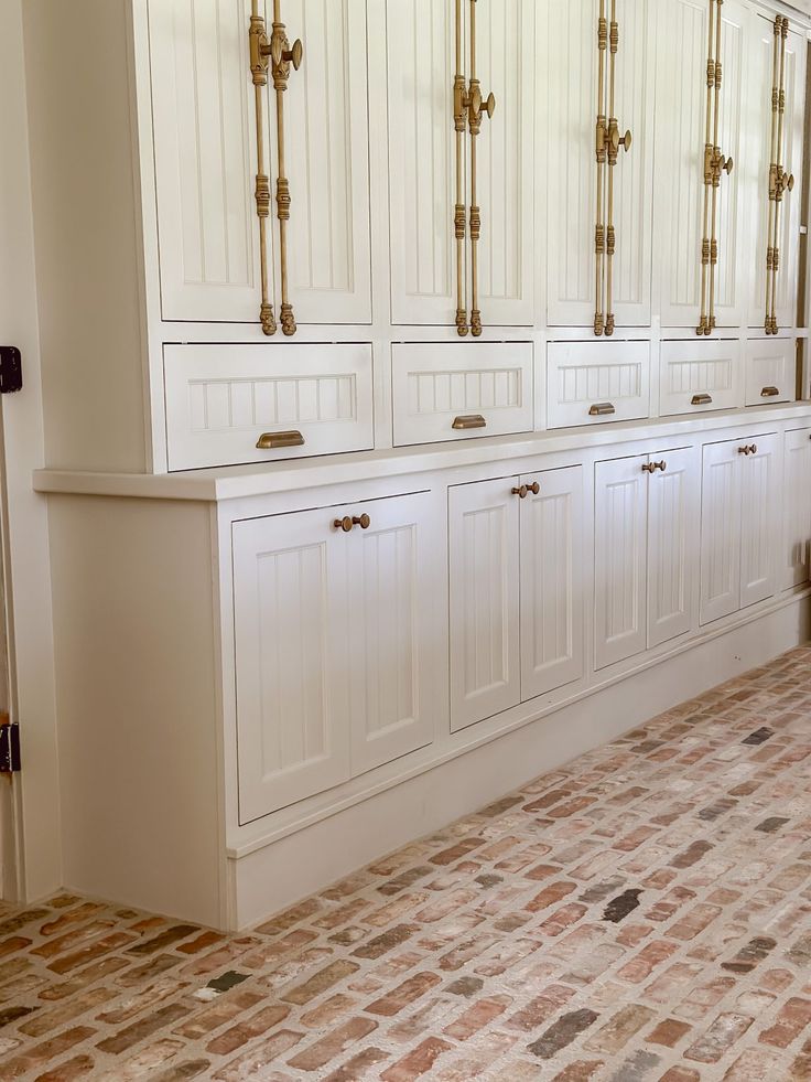
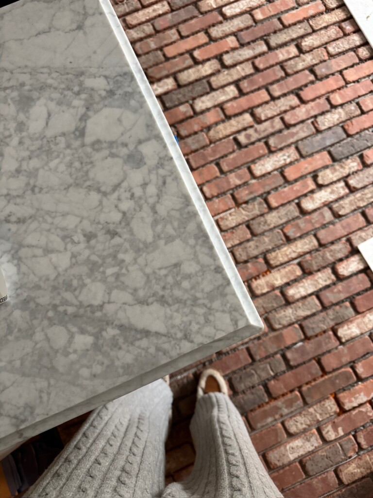
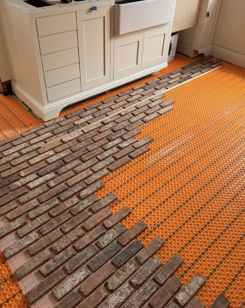
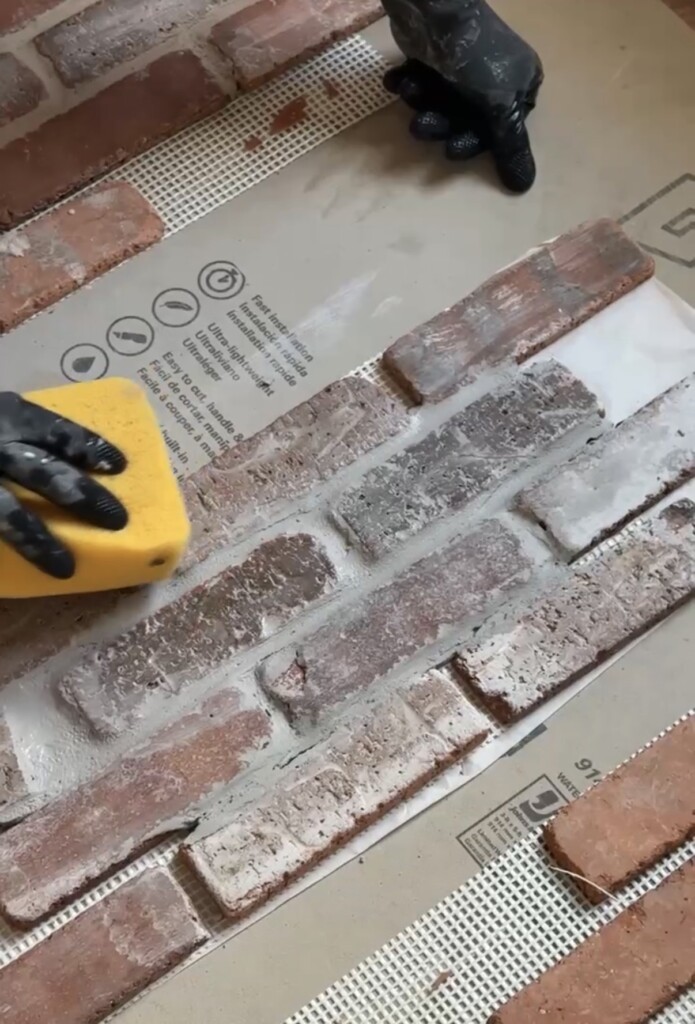
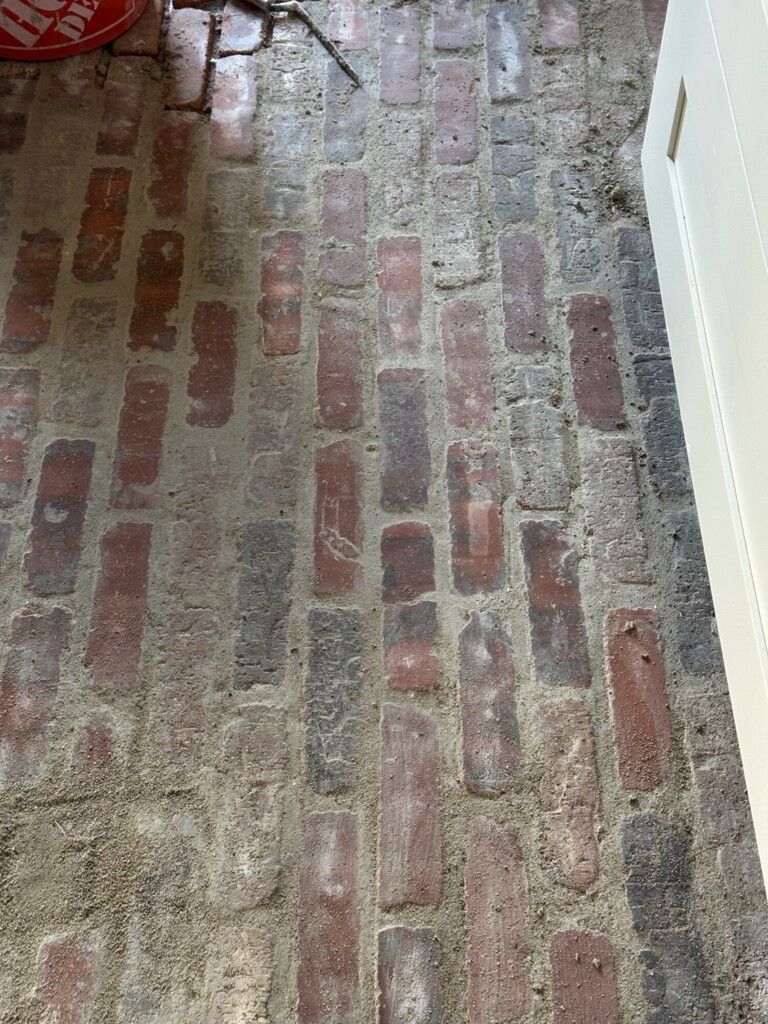
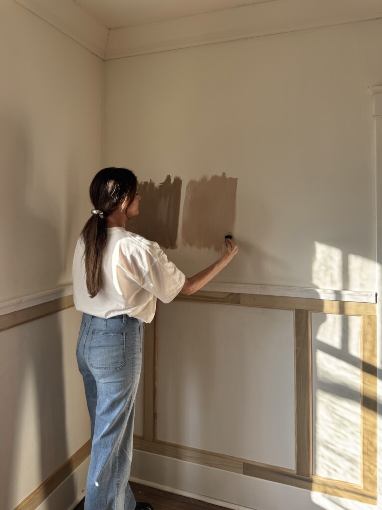
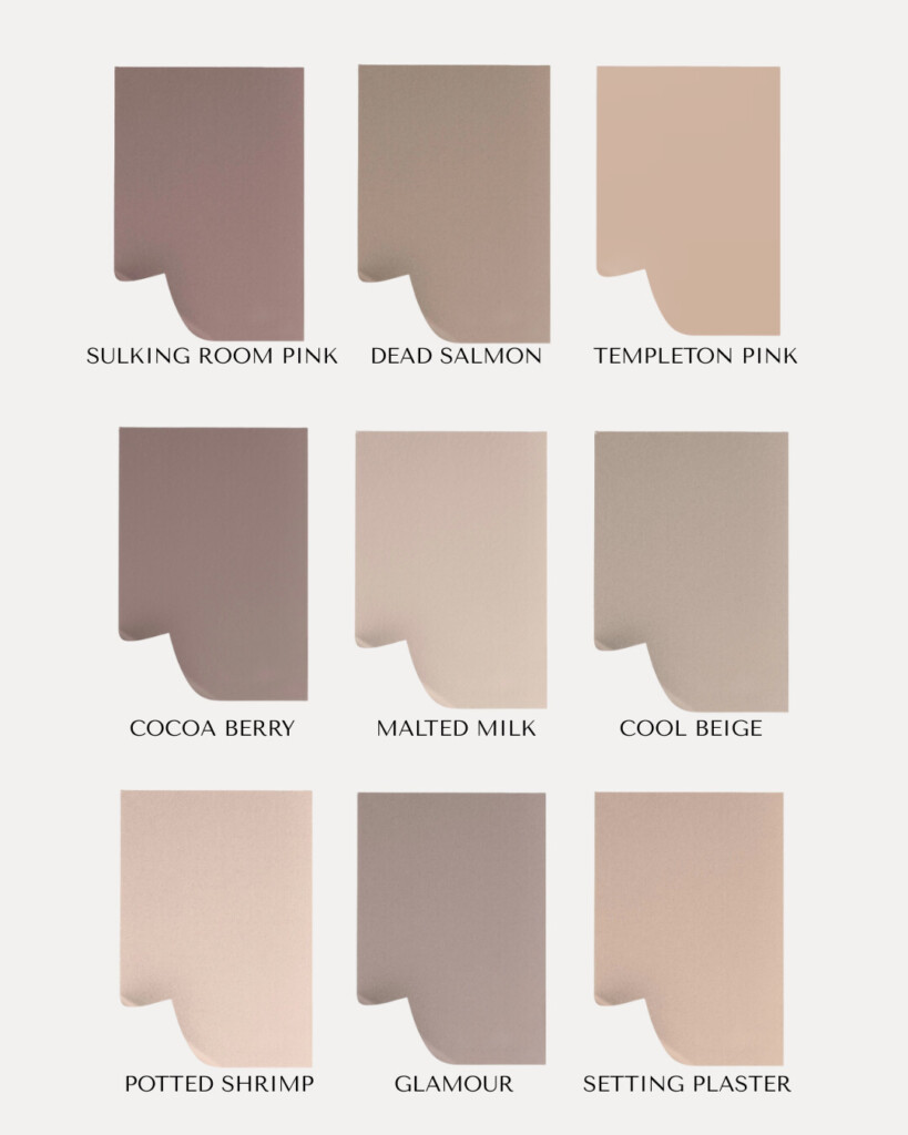
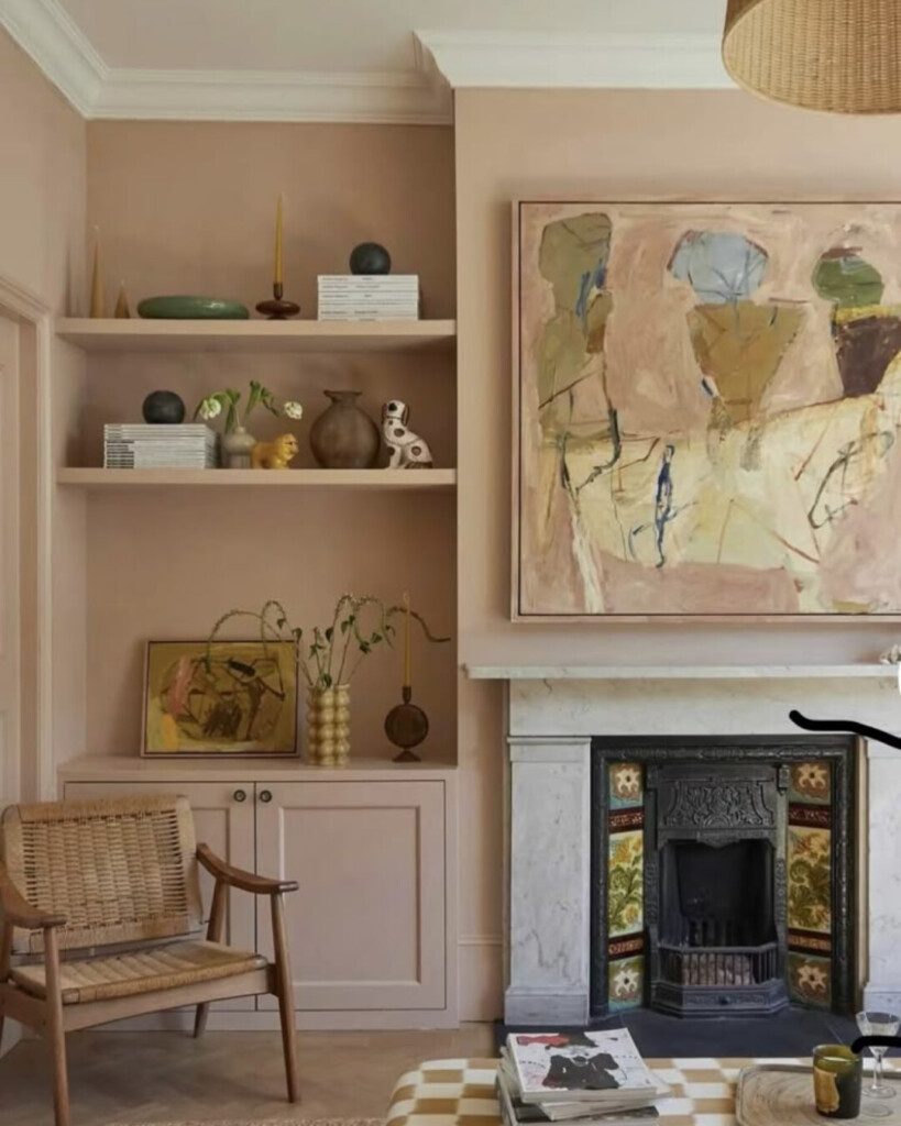
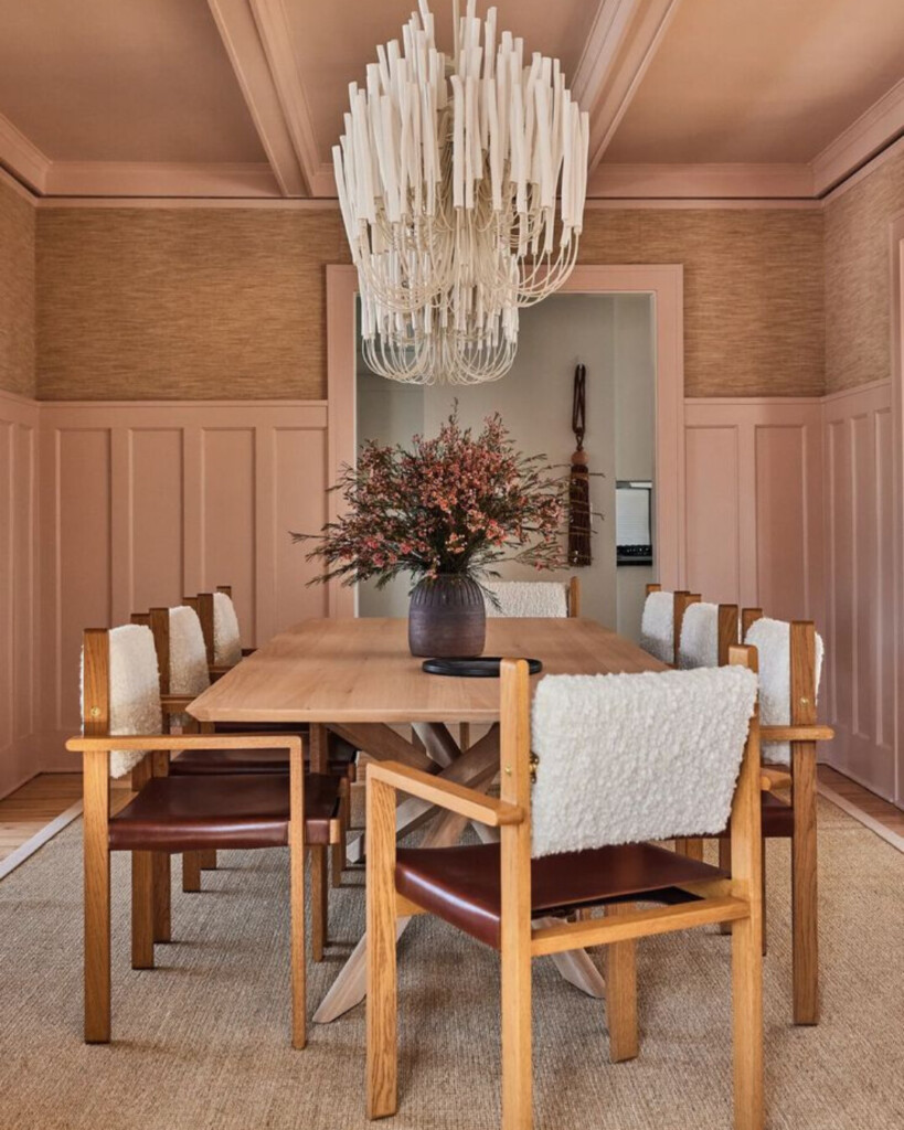
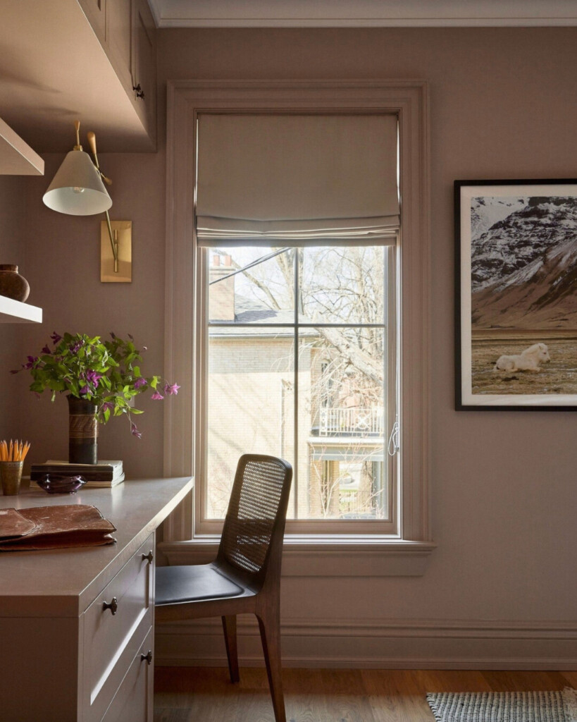
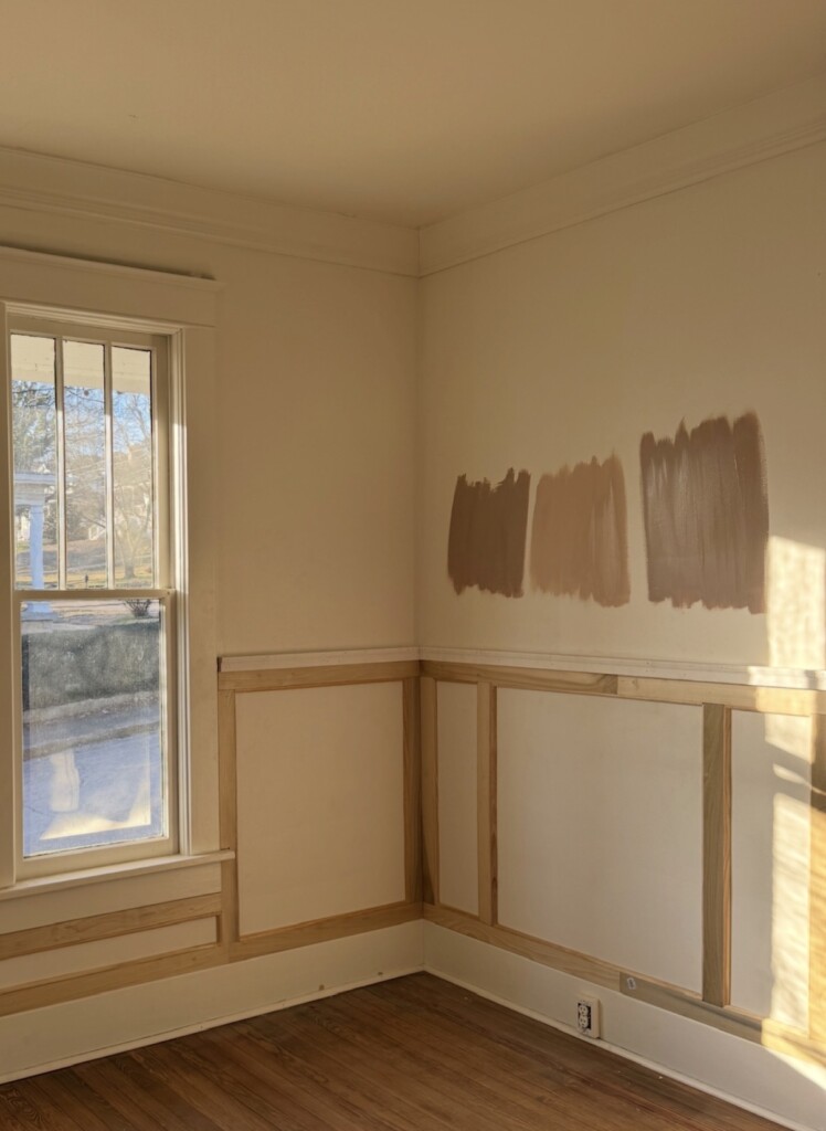
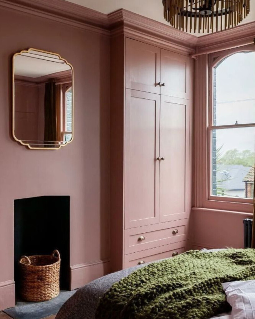
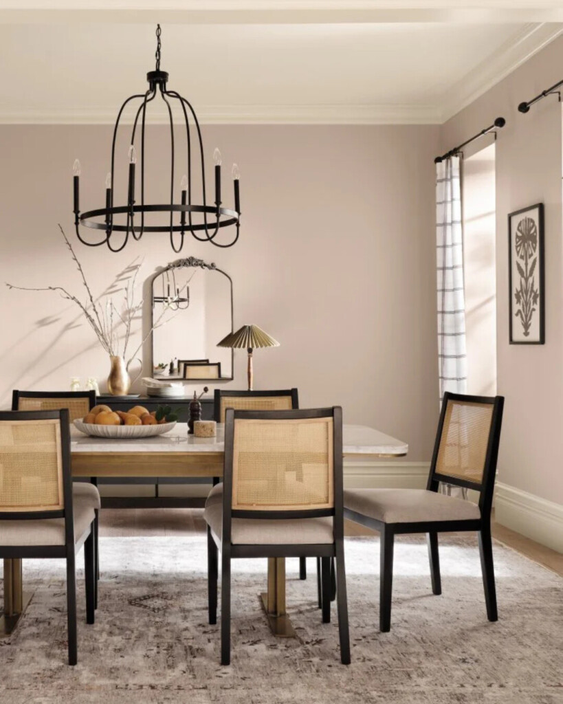
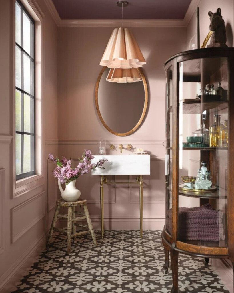
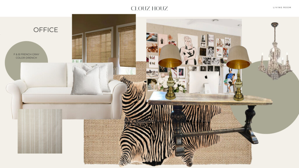
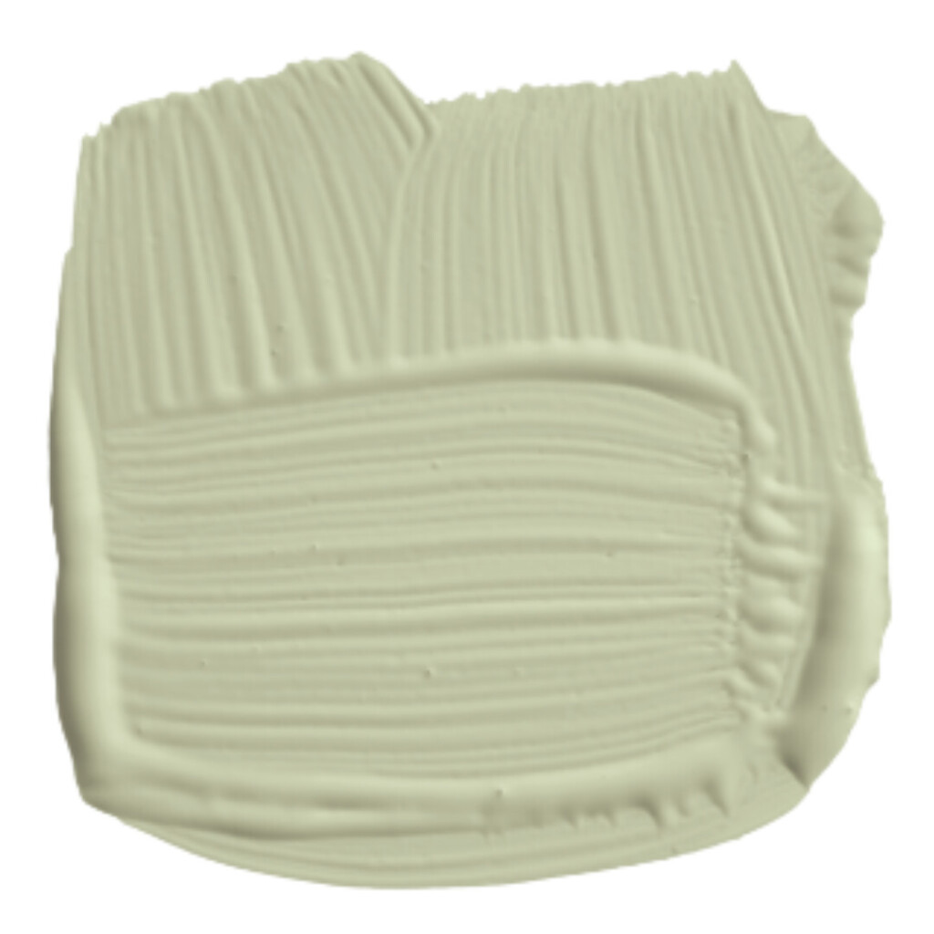
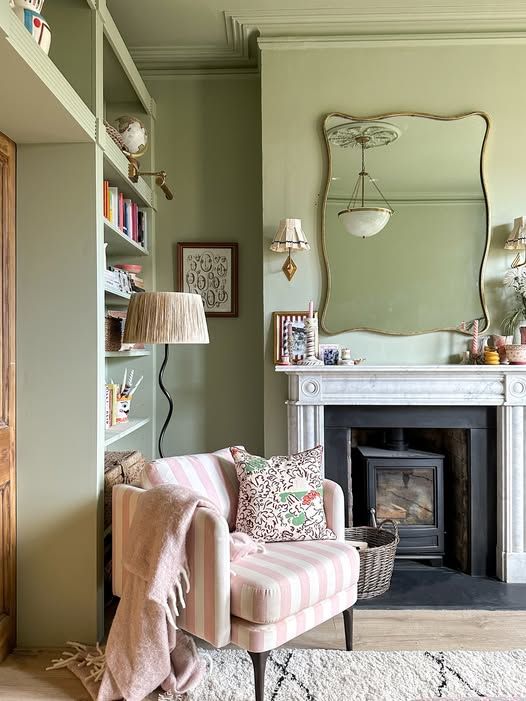
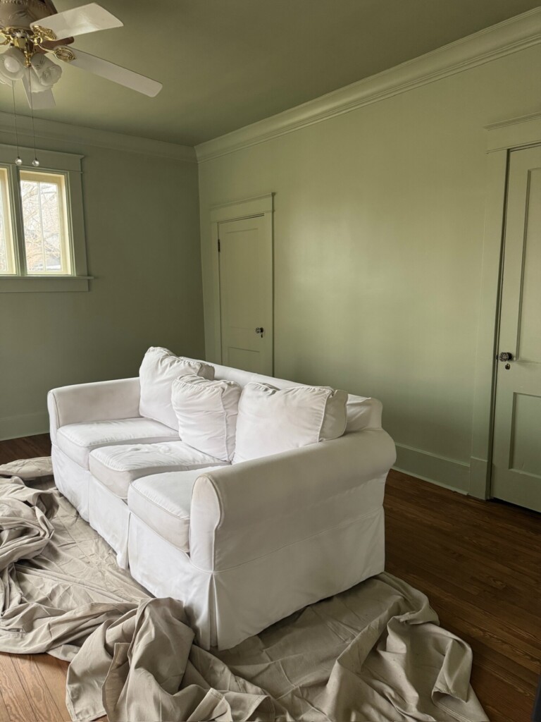
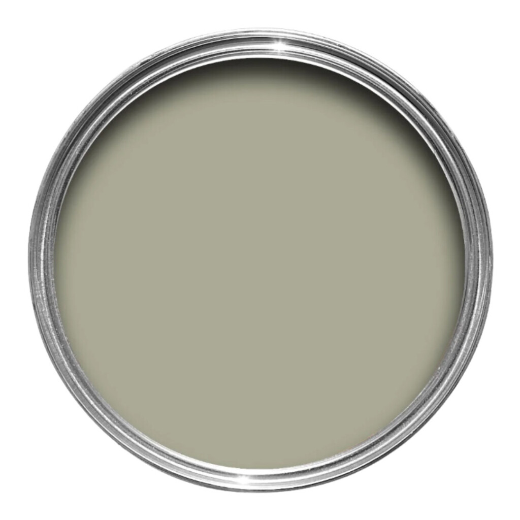
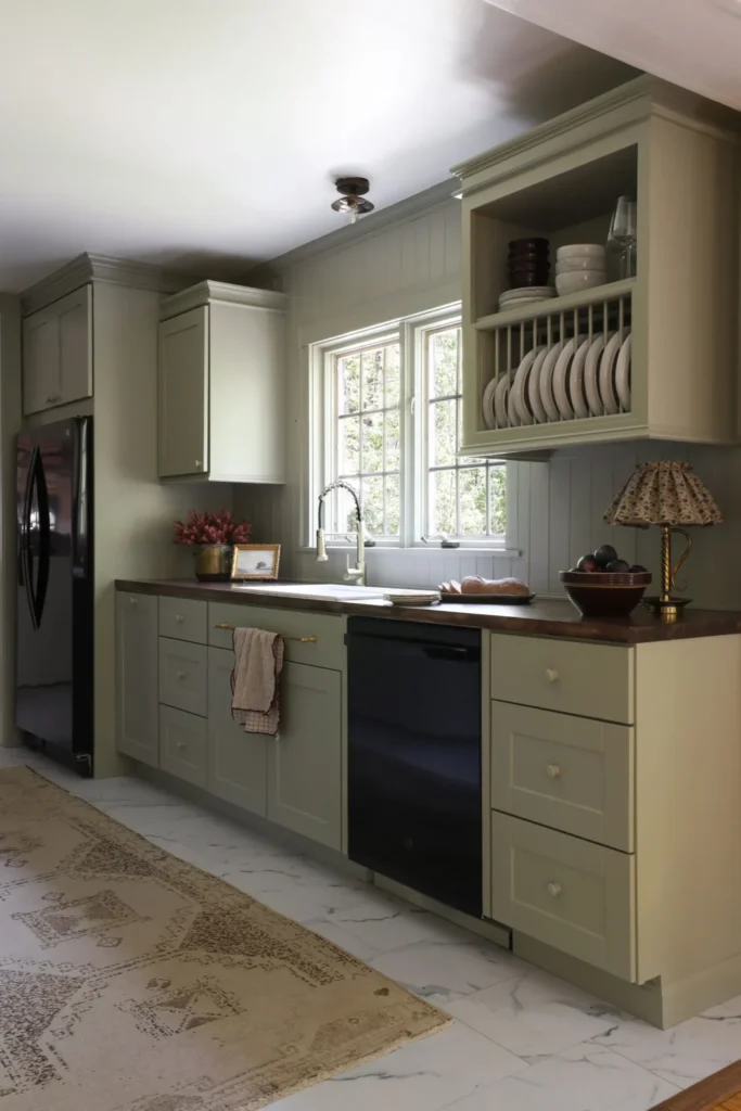
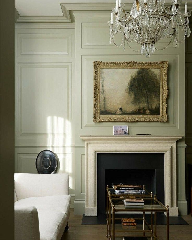
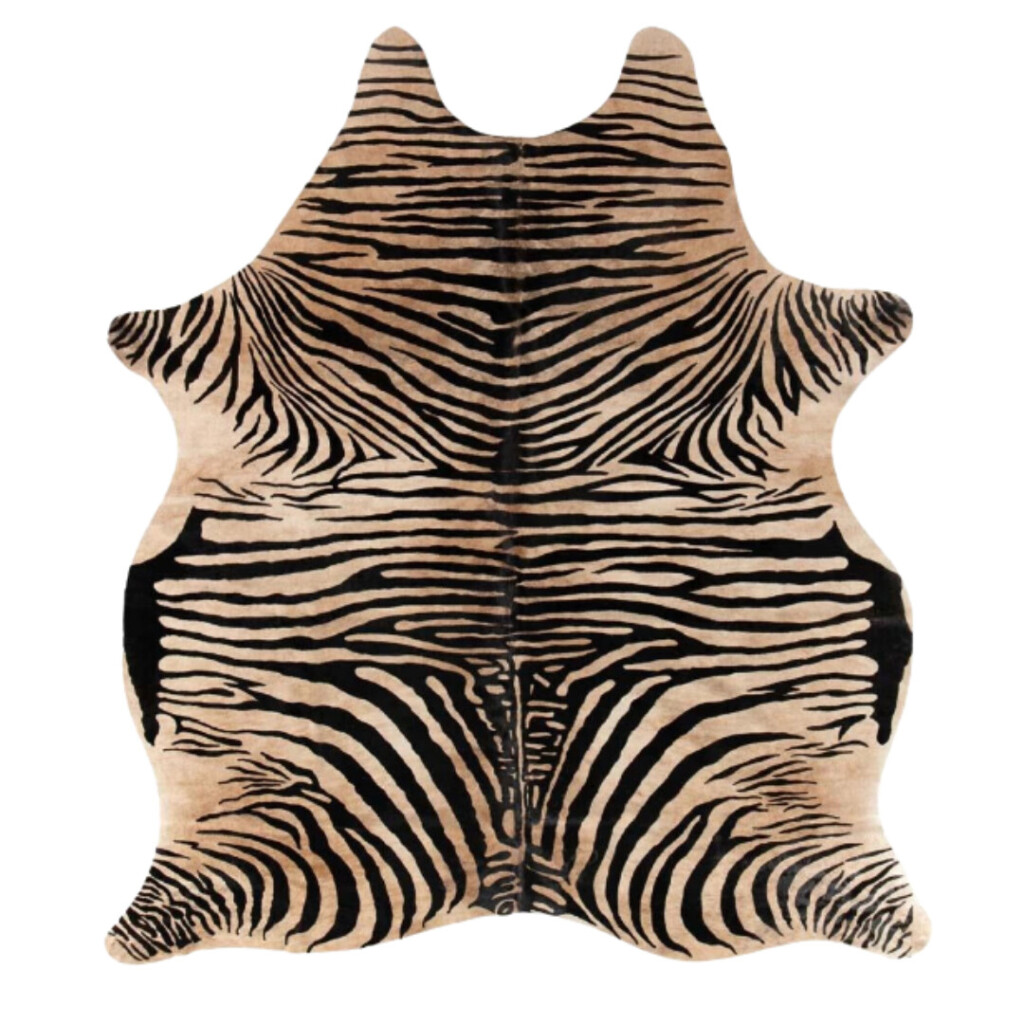
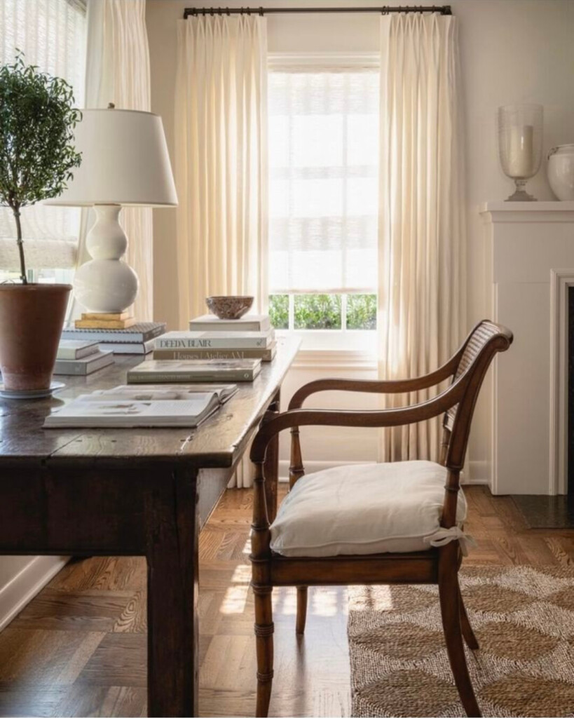
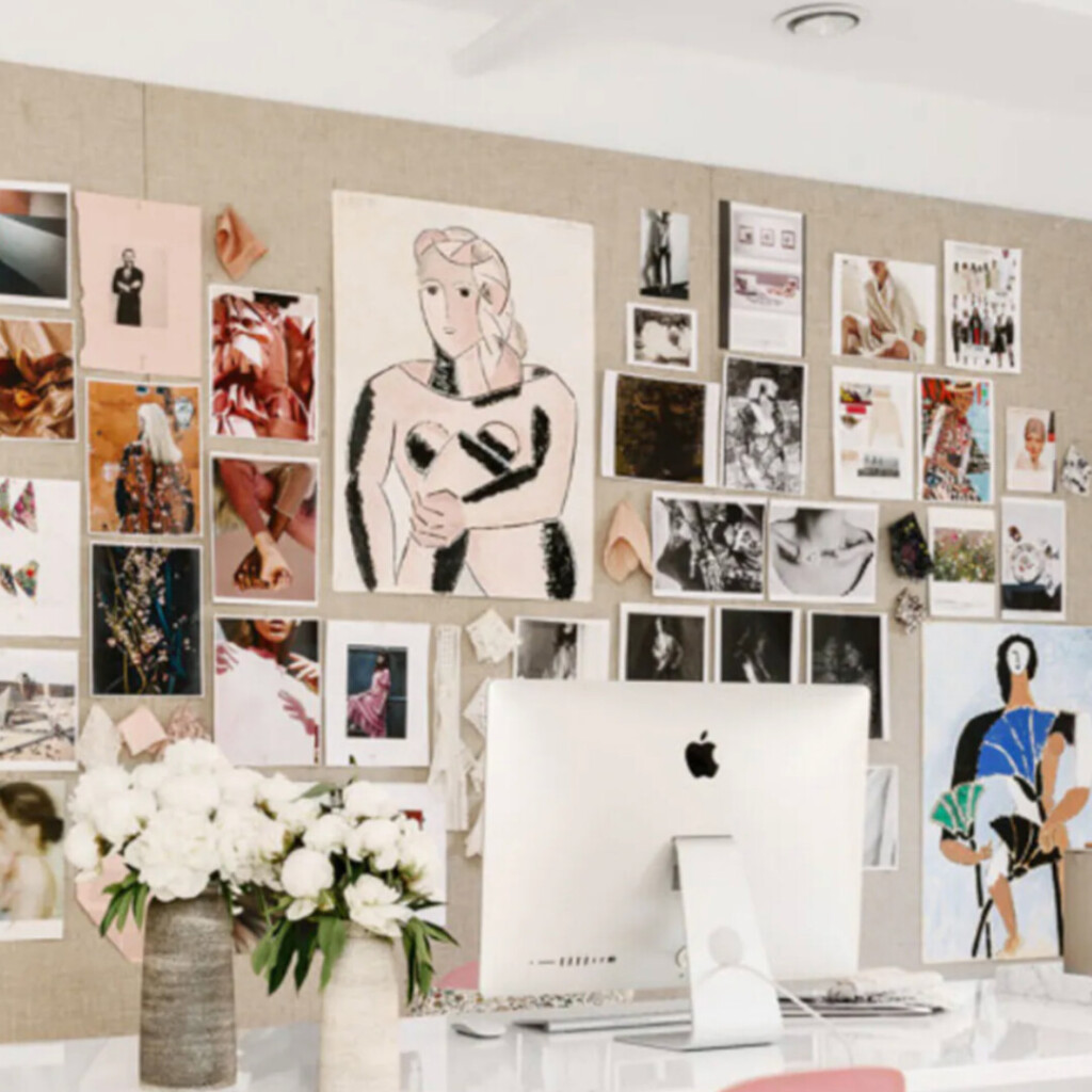
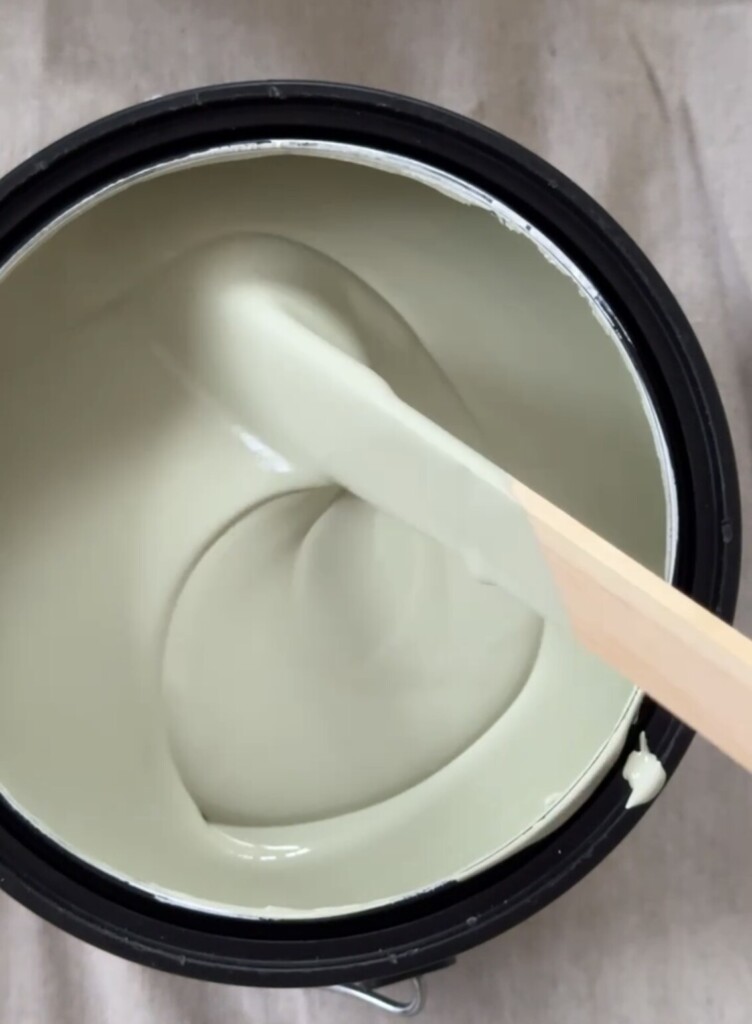
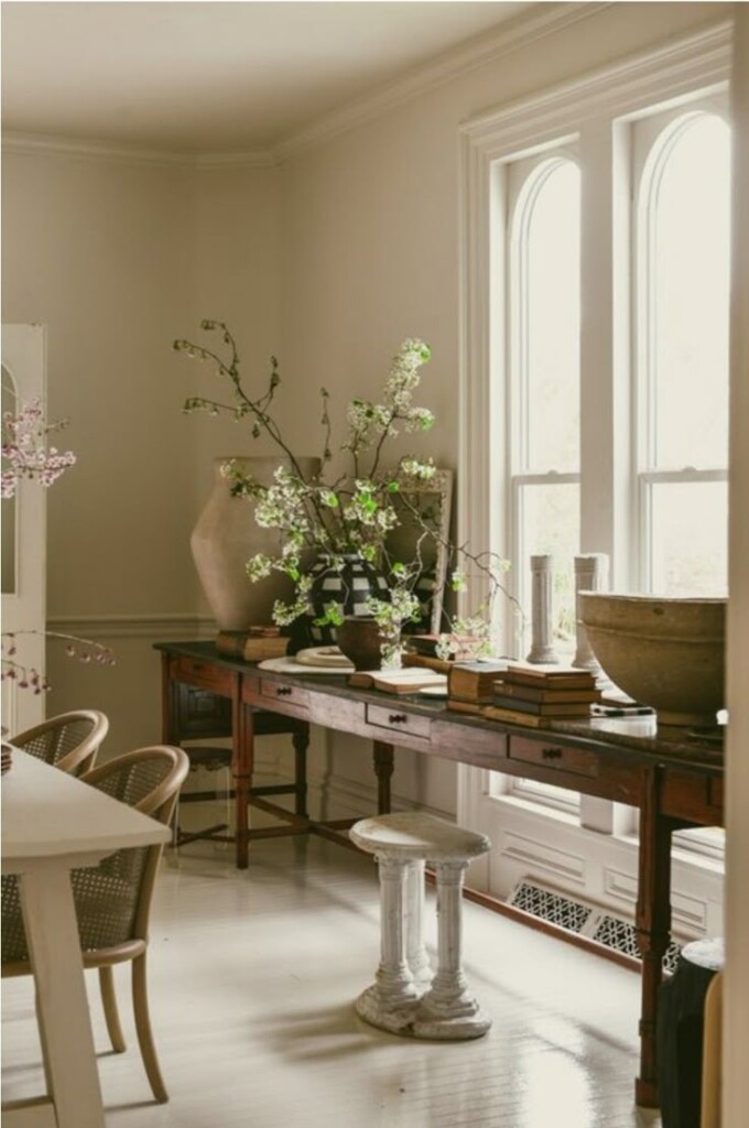
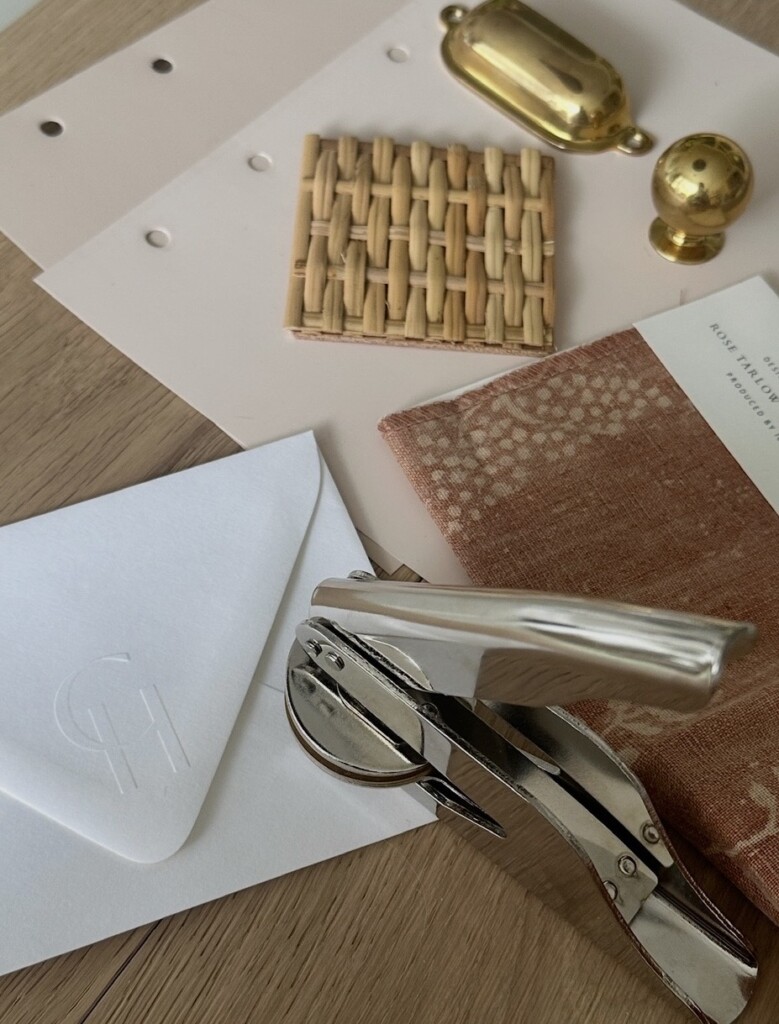
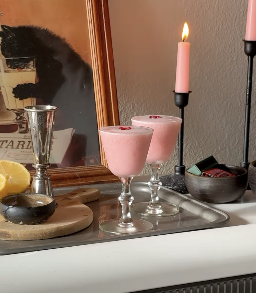
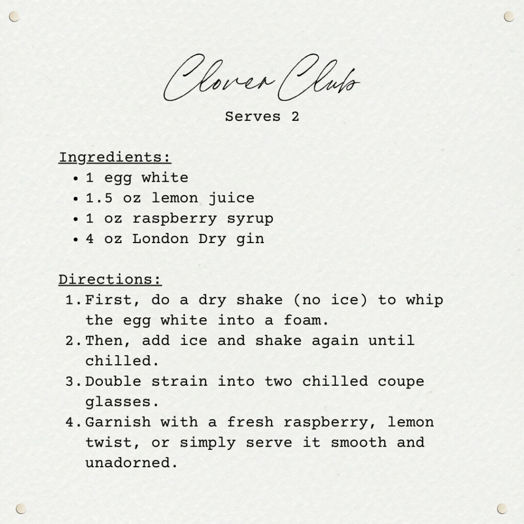
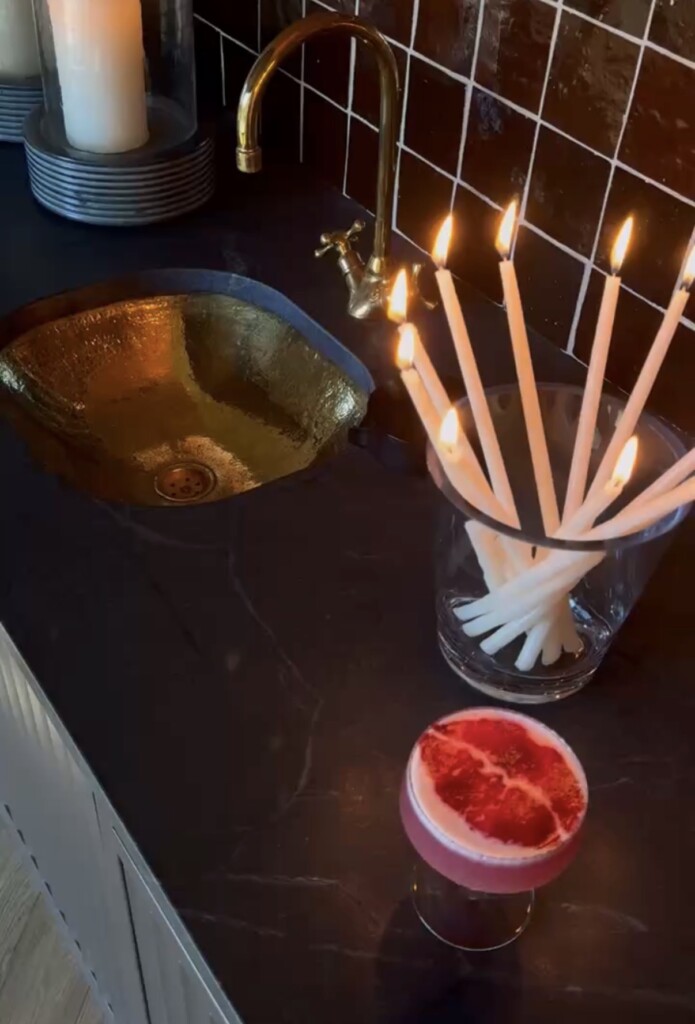
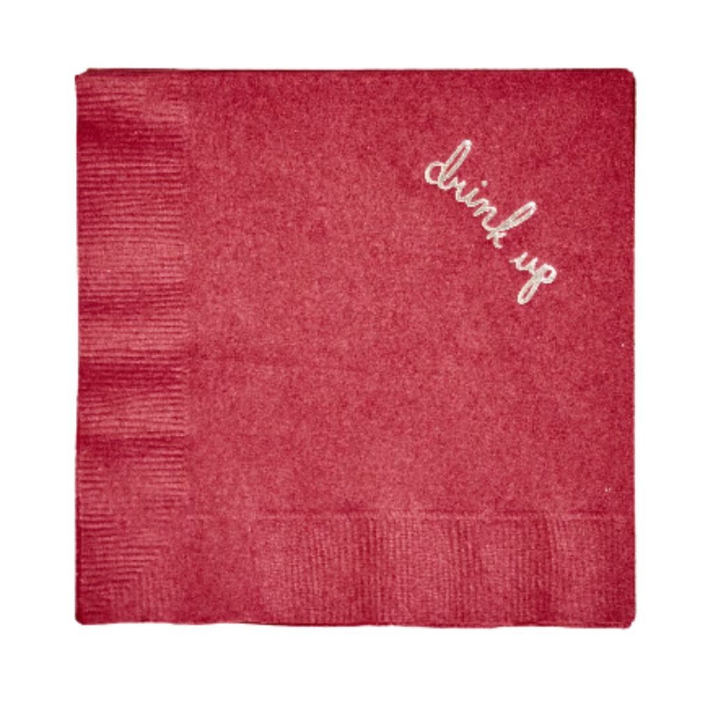
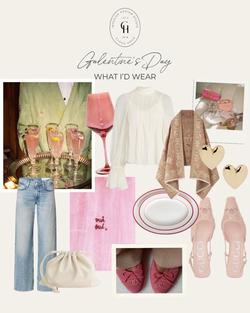
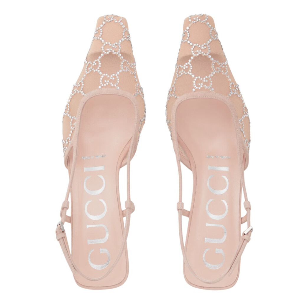
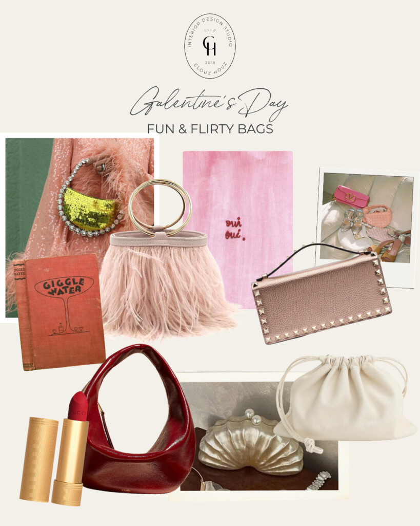


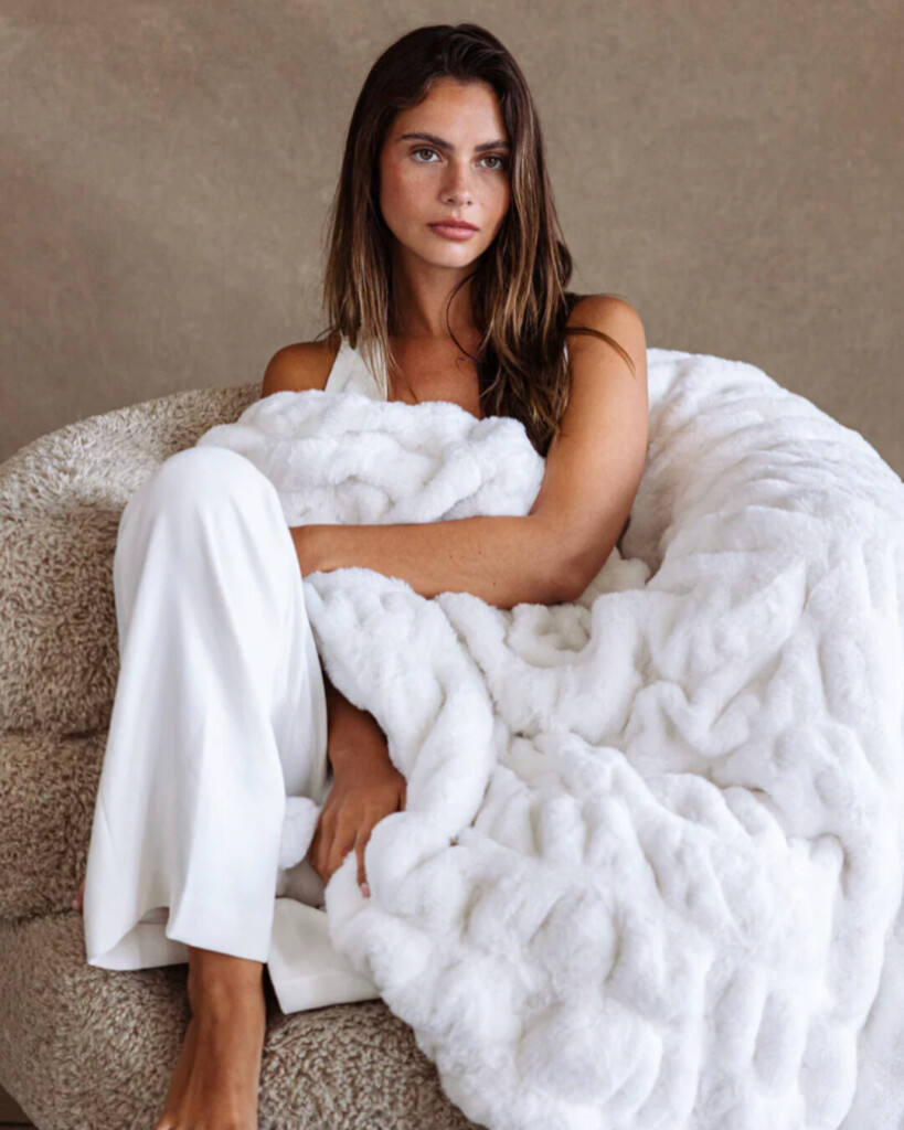

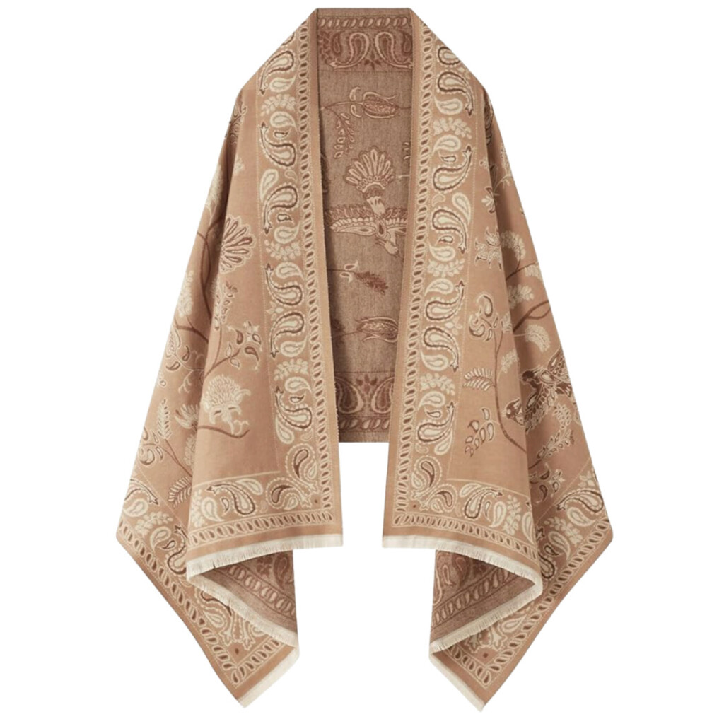

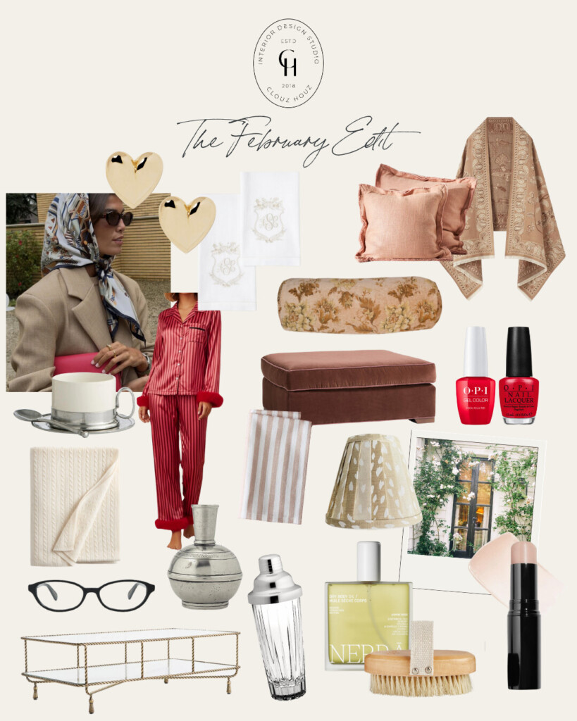
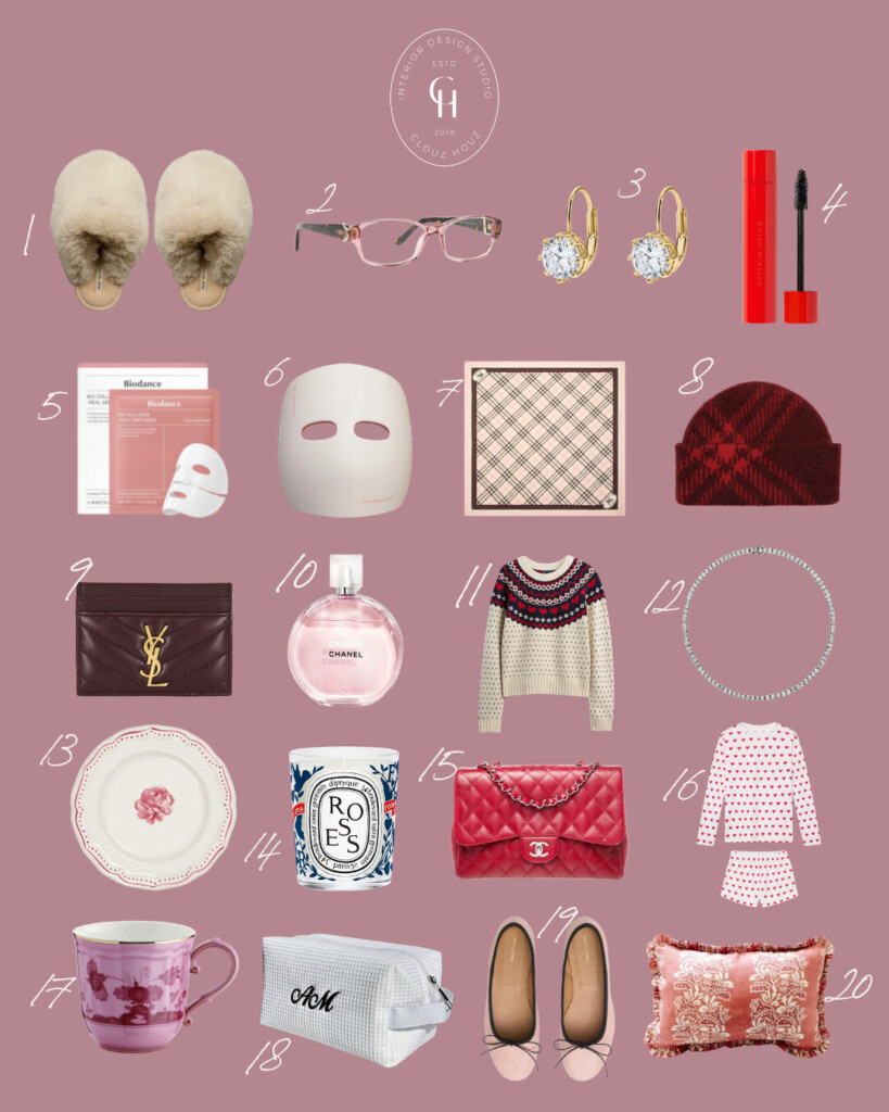
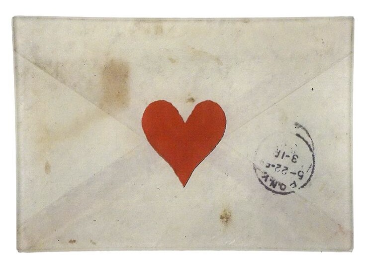
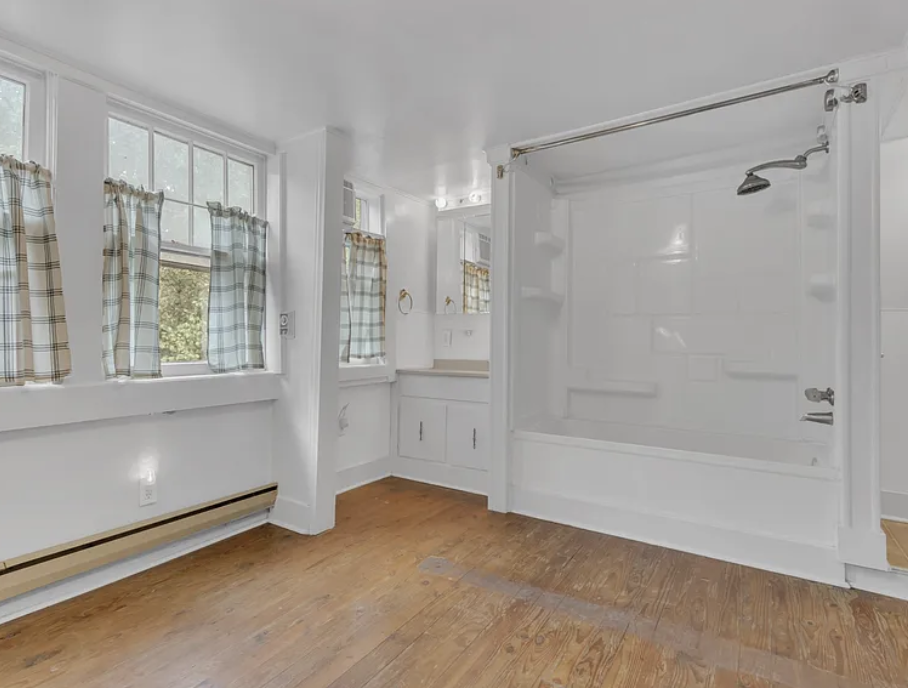
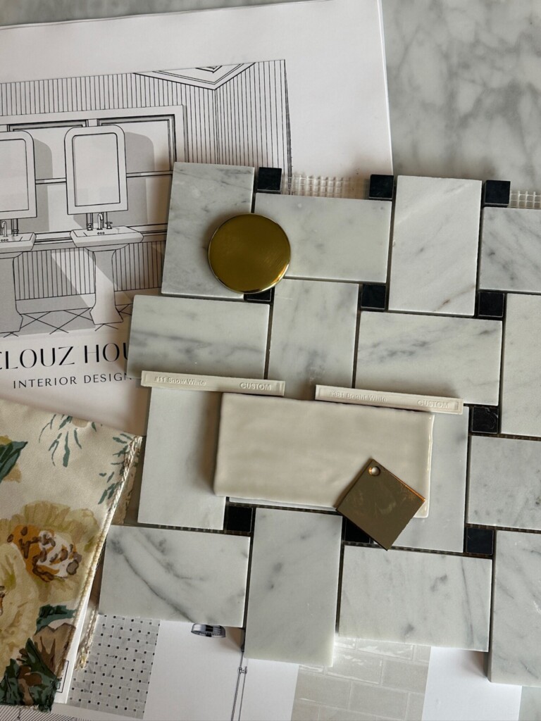
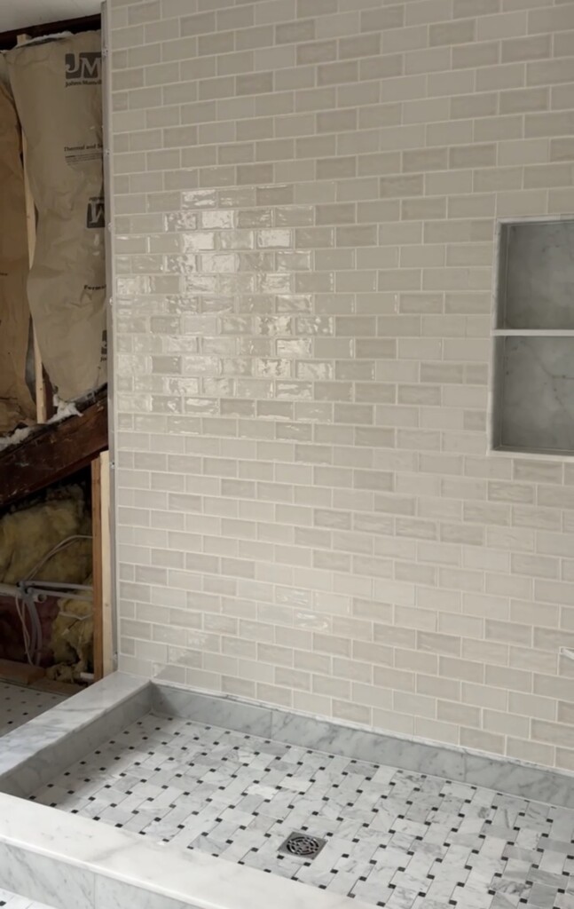
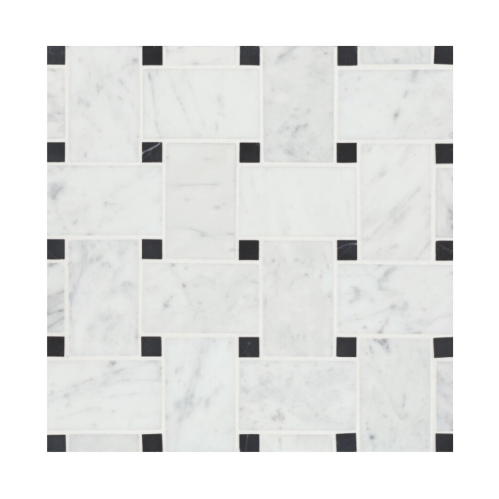
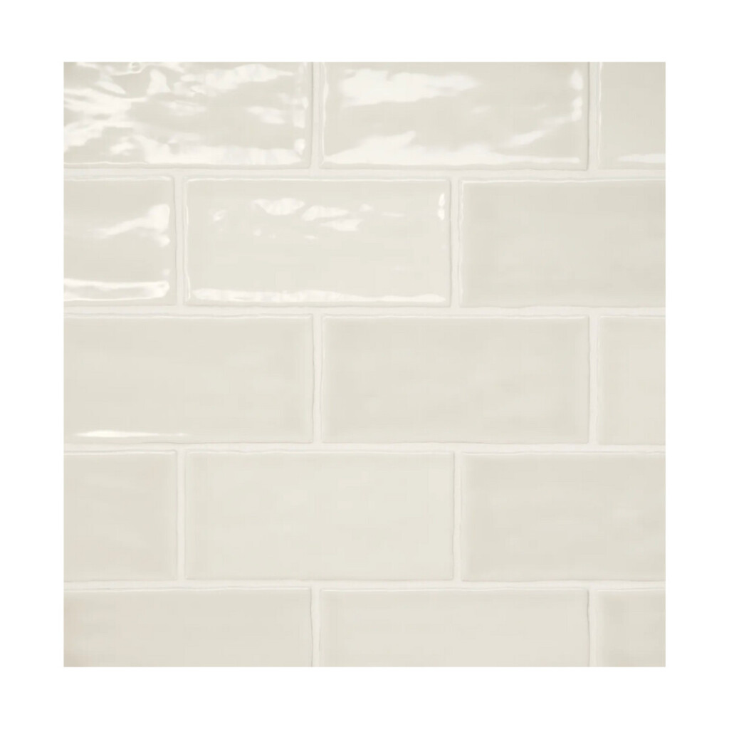
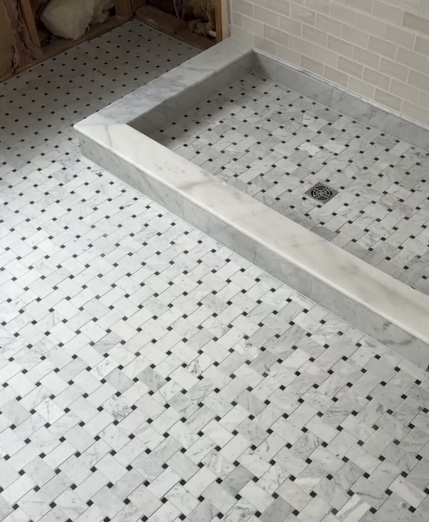
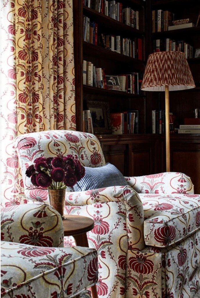
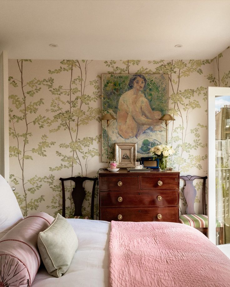
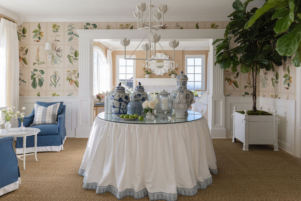
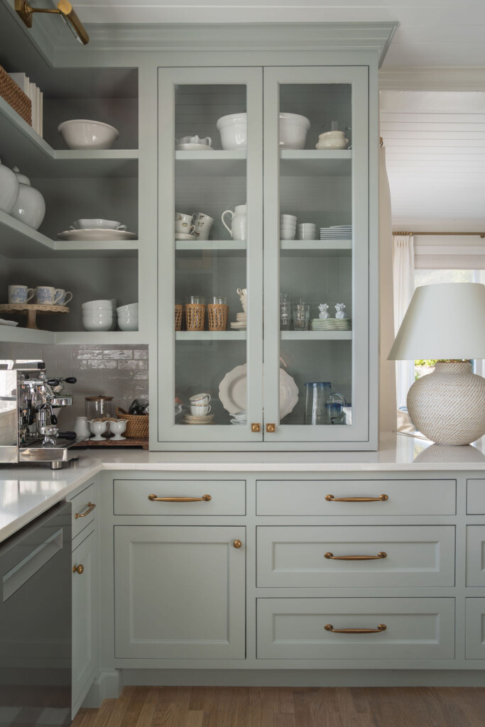
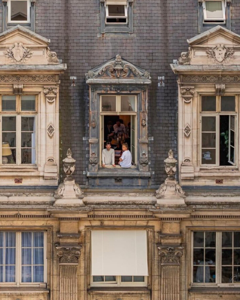
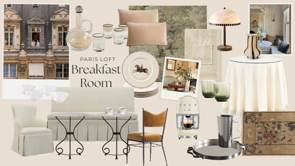
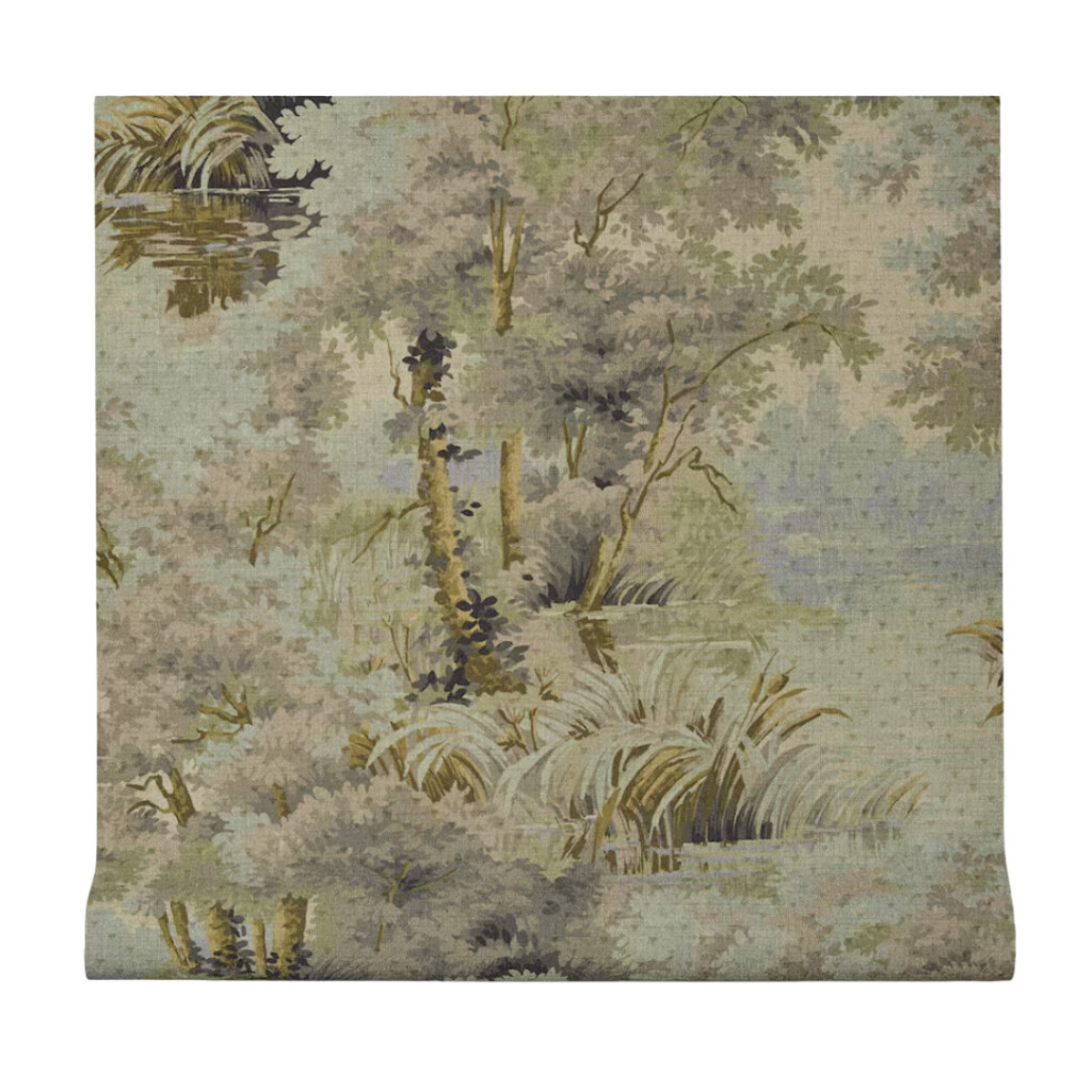
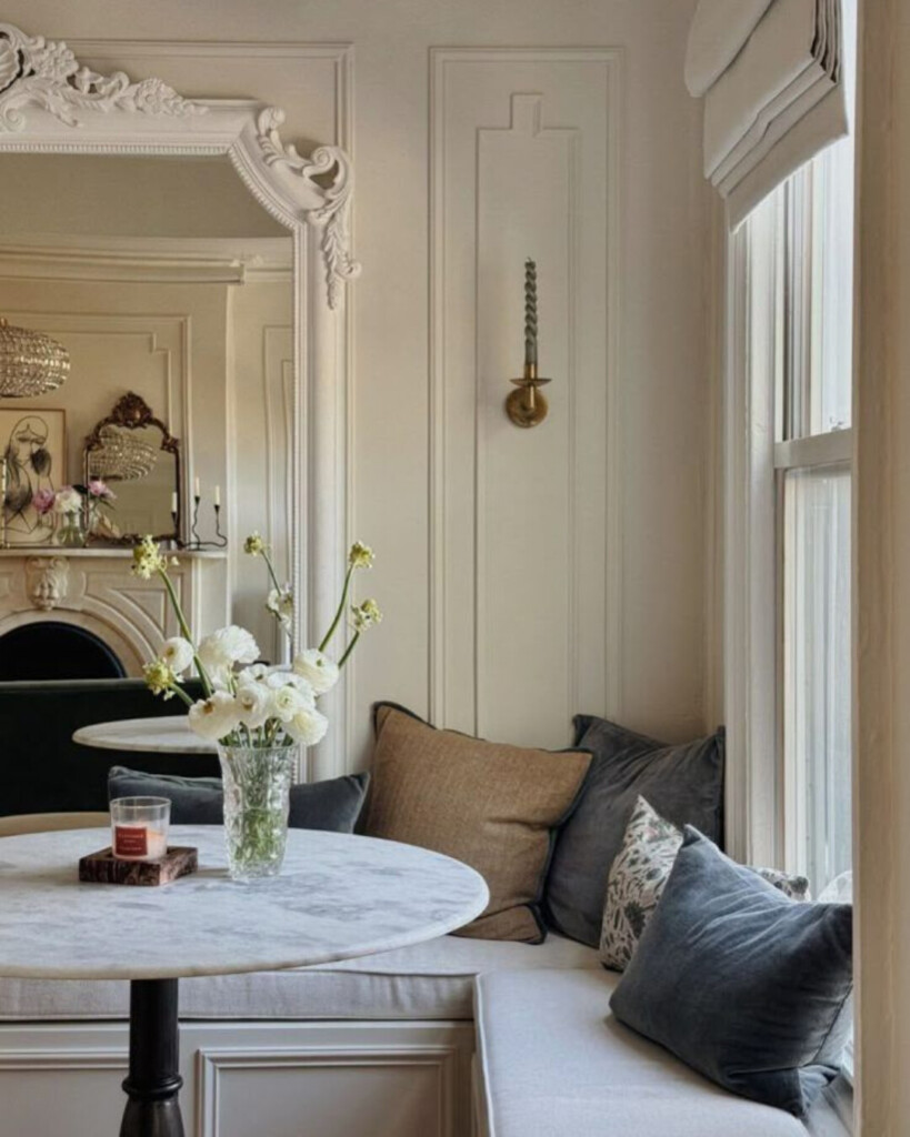
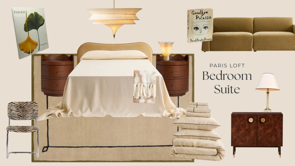
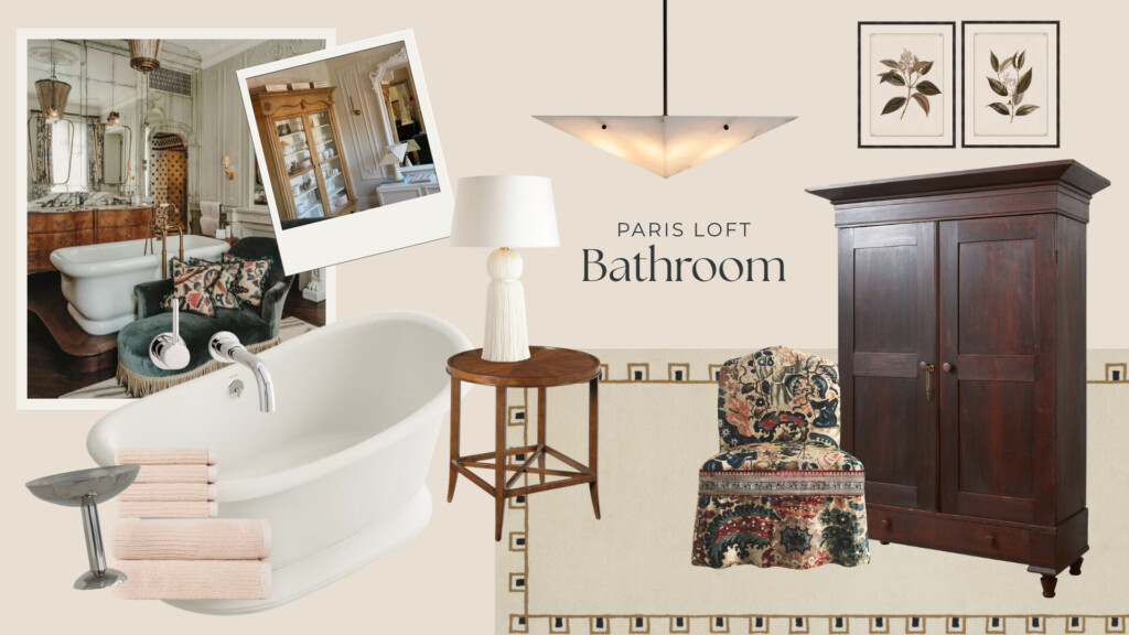
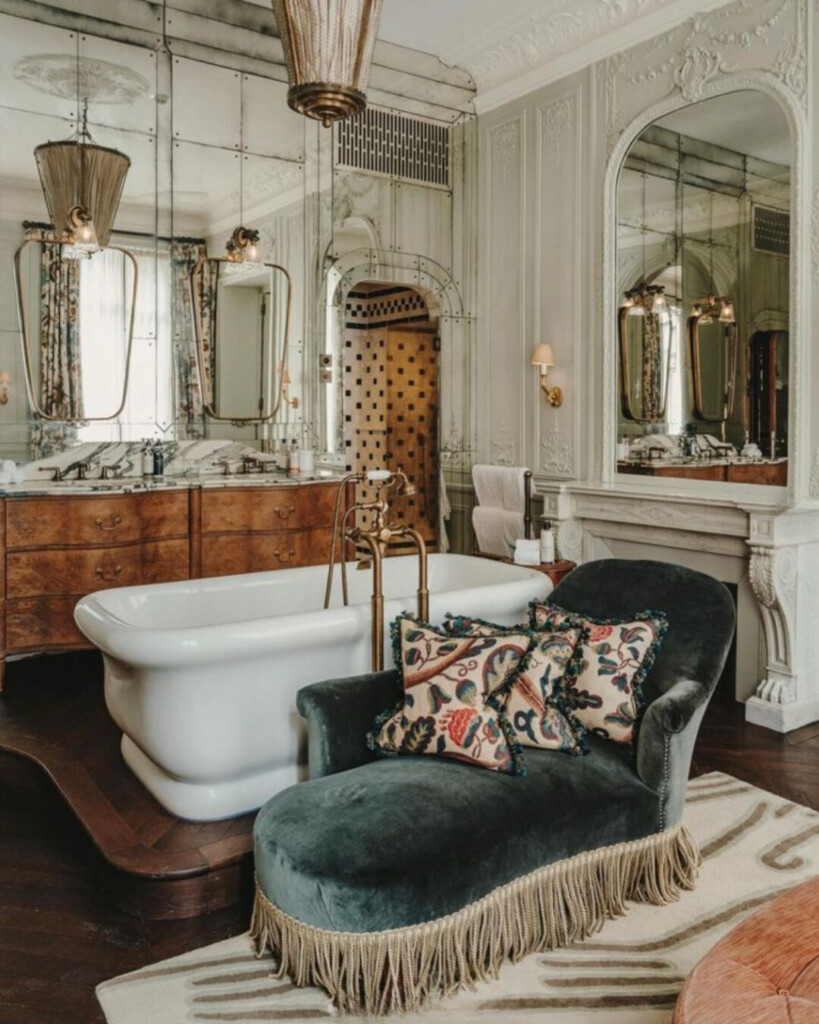
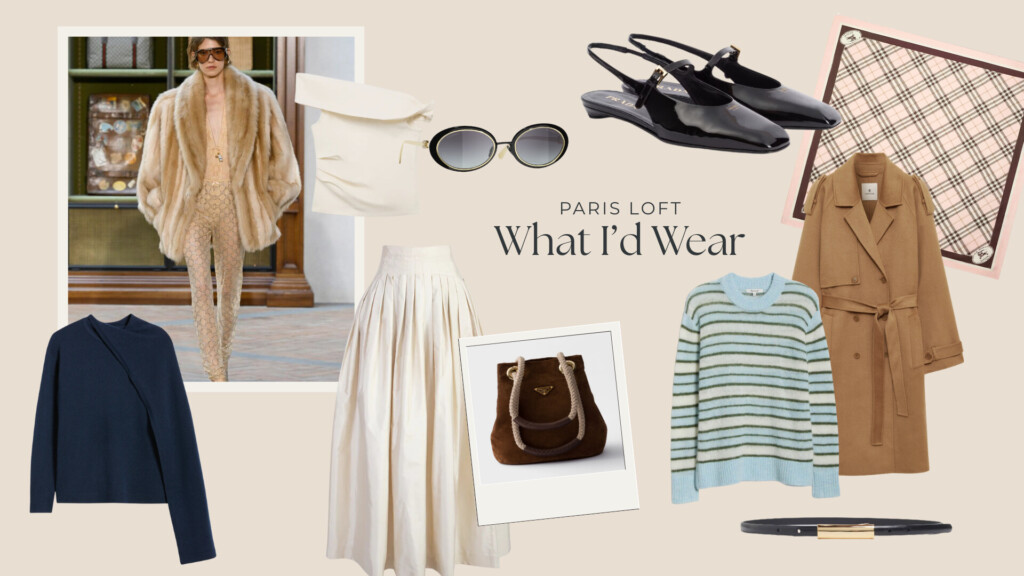
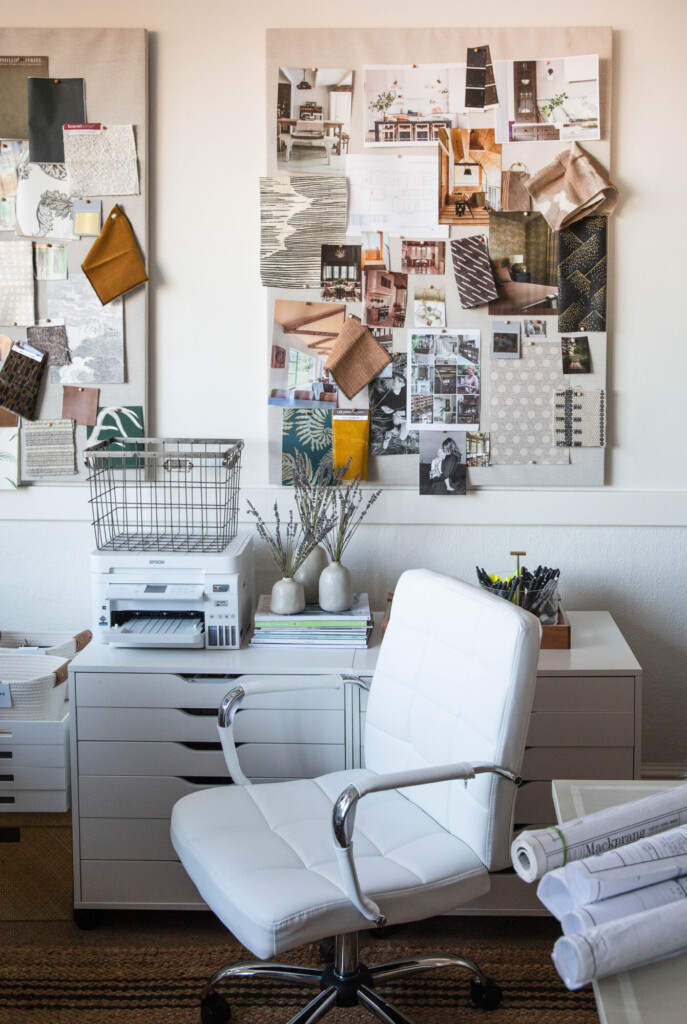
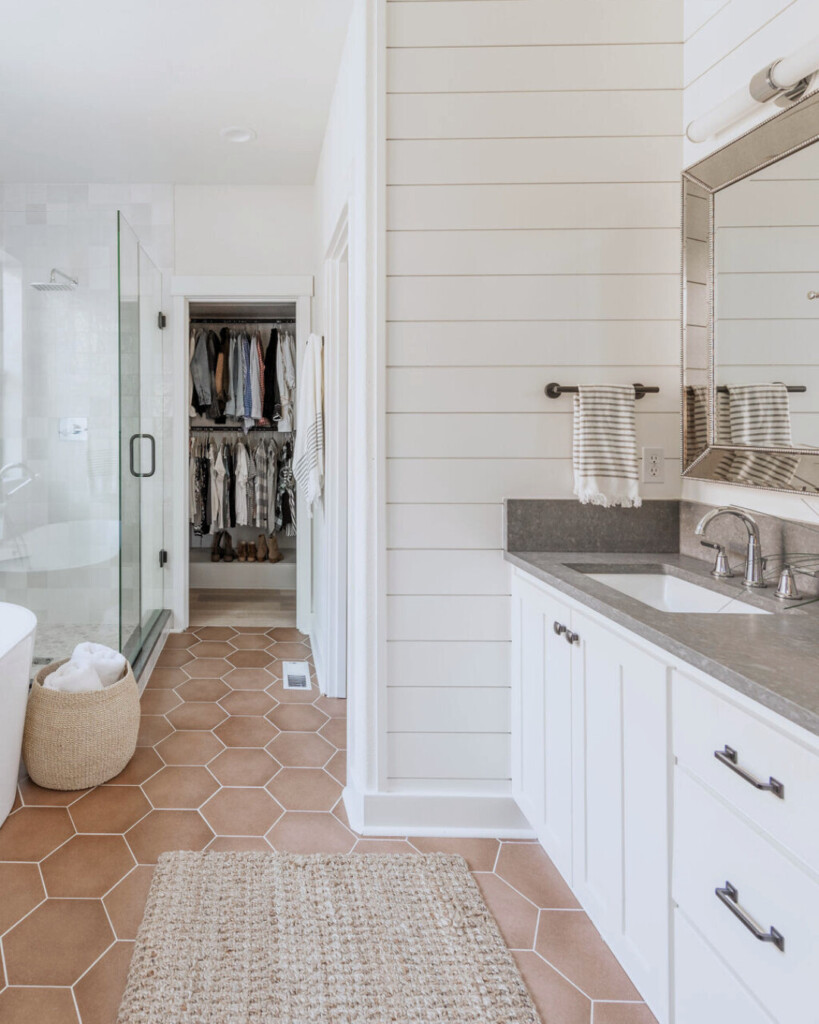
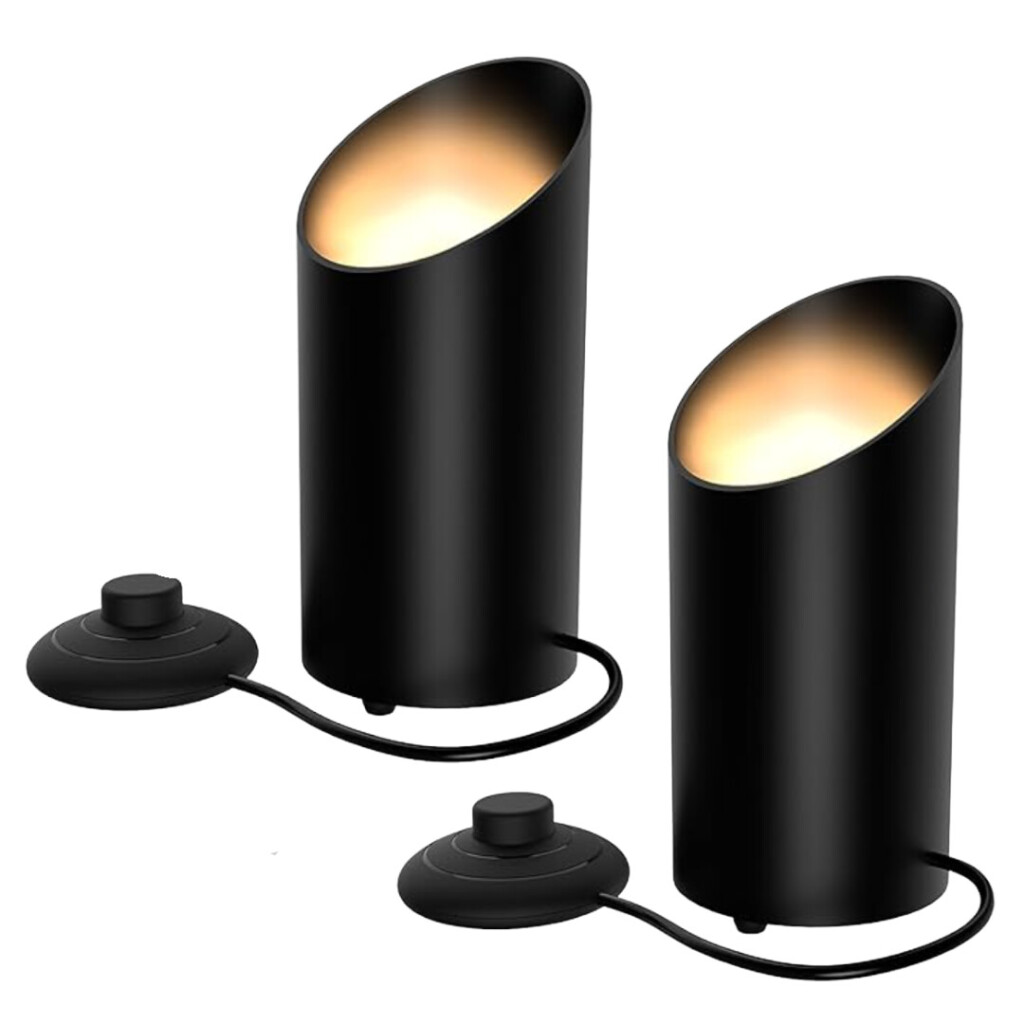
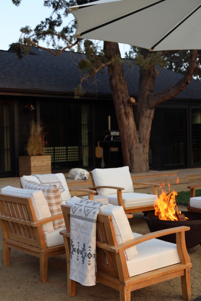

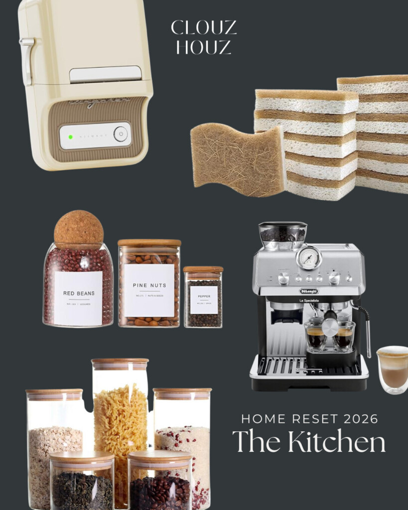
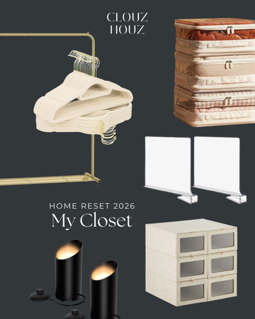
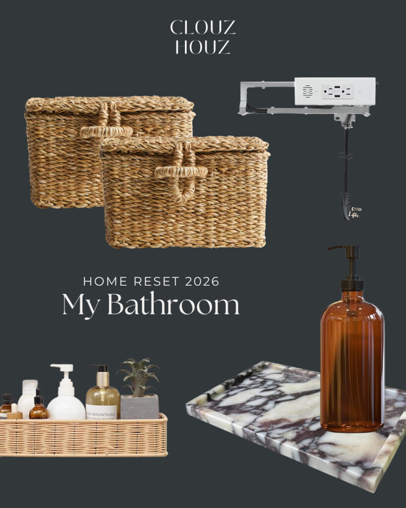
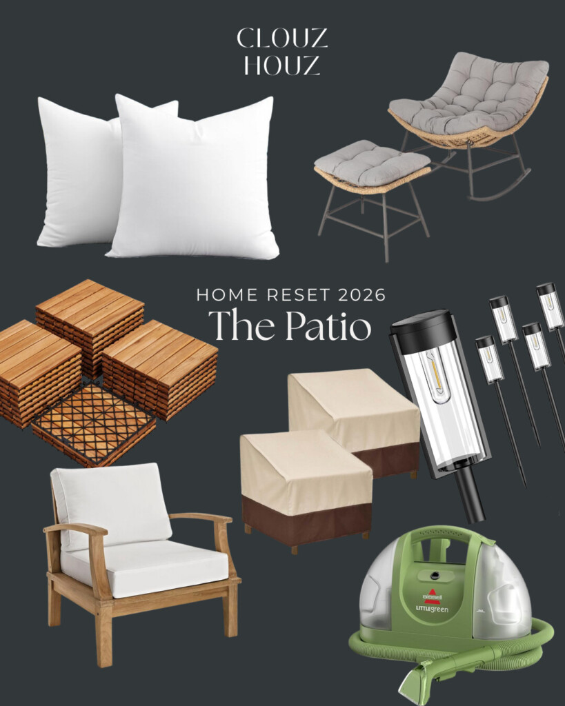

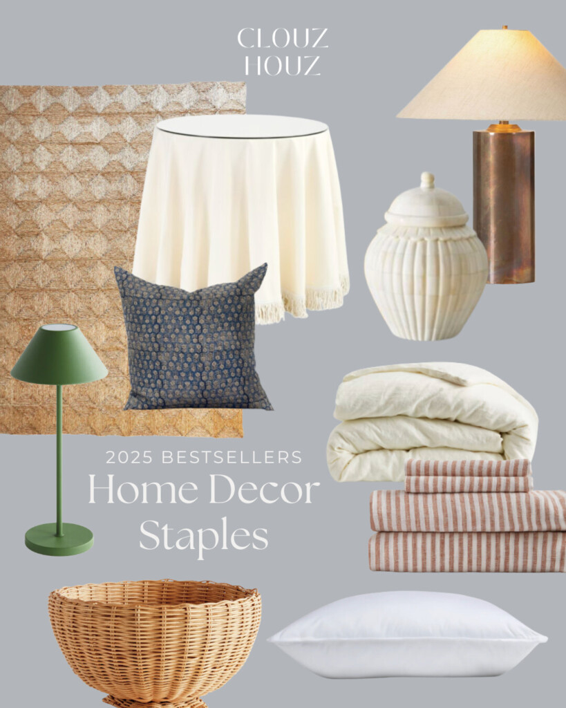

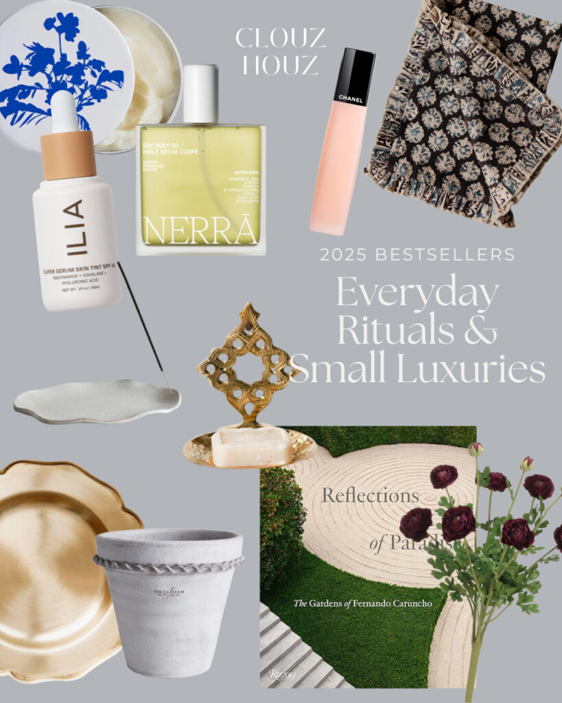
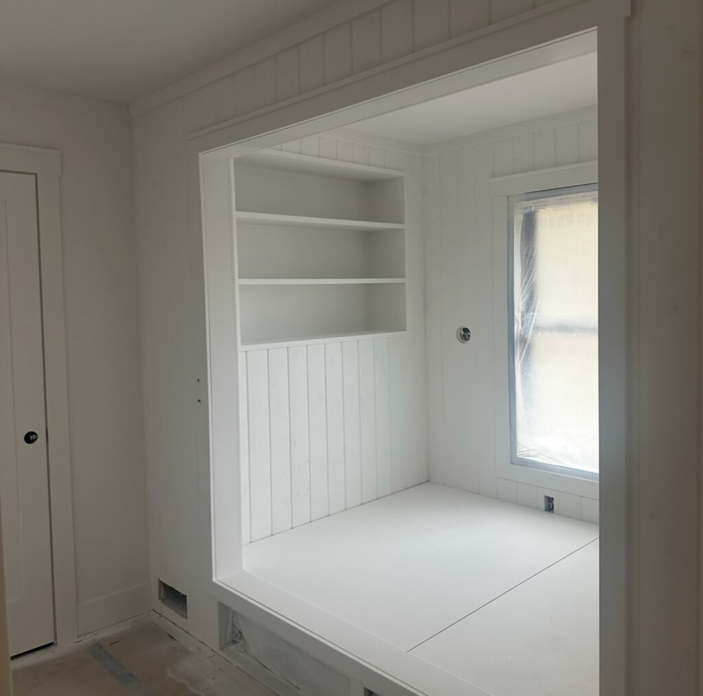
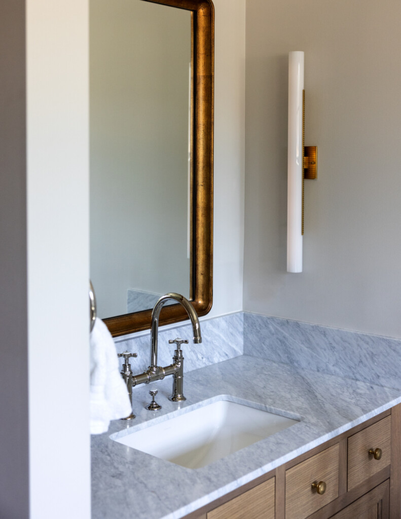
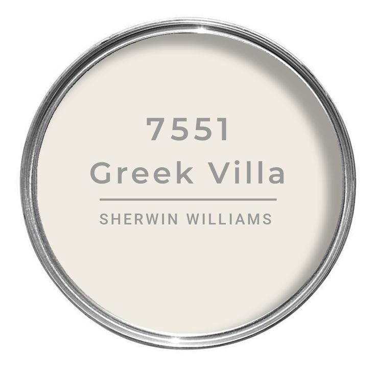
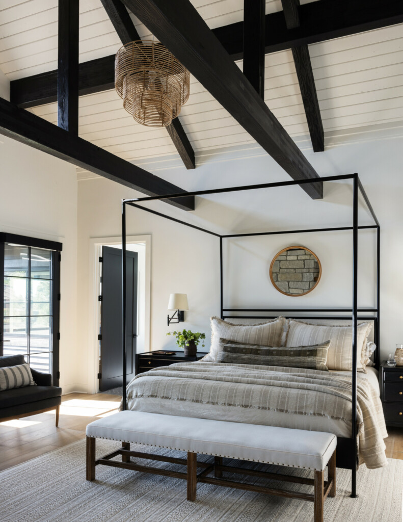
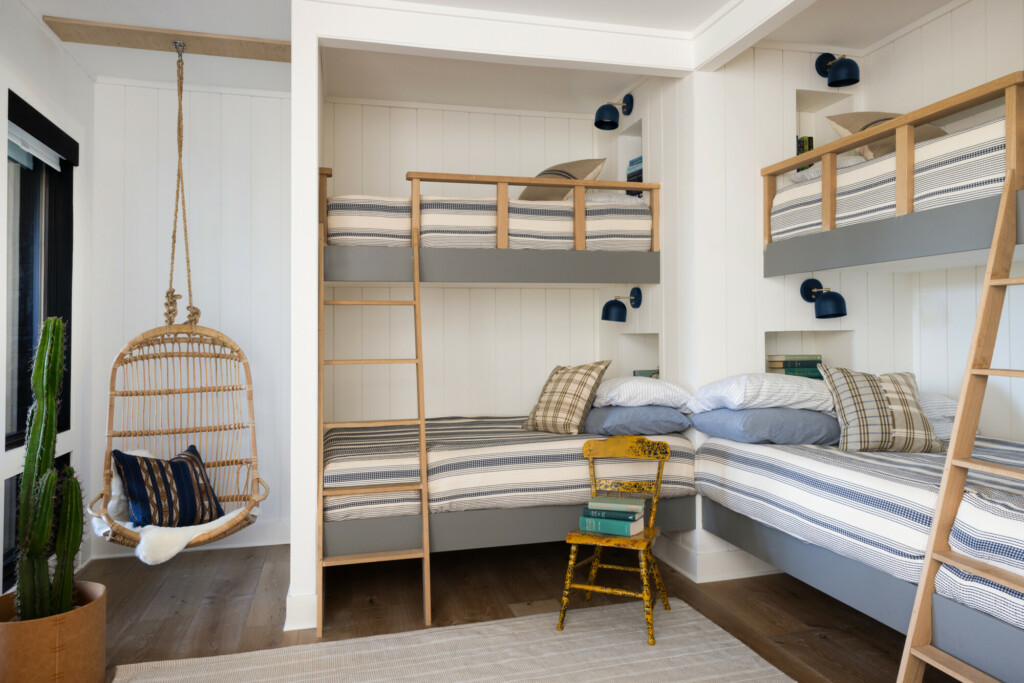

