We’re super excited to share the scoop on our Tumalo guest bathroom makeover … where tiny dimensions meet big personality! But that’s what is so awesome about a guest bath; you really get to put your own stamp on it, and try new and fun ways to show your creativity. It has been a journey filled with anticipation, and we’re thrilled to unveil the first fully completed room in our new home. Let’s dive into the nitty-gritty of this little gem that turned out to be a labor of love.
Now, when we say tiny, we mean it — this bathroom is basically a cozy nook. But small spaces can be the most charming, right?
It’s all about maximizing every nook and cranny! We played bathroom Tetris like pros to fit everything in without feeling cramped. So, let’s walk you through our tight little bathroom which radiates loads of charm, proving that even small spaces can have a big impact.
Foundational Elegance
In the heart of our guest bathroom transformation lies the foundation: the tile. We kicked off this design adventure by embracing a classic aesthetic, blending timeless elegance with intricate marble details. Our floor boasts a captivating cross-hatch pattern, courtesy of the beautiful 2.5” x 8” marble tiles sourced from Bedrosians Tile & Stone. I was drawn to this choice not just for its visual appeal, but also for the way it effortlessly balances a sense of simplicity with the sophisticated charm of marble. I think it turned out great, and it’s timeless — which leaves room for lots more fun!
Cozy Hues
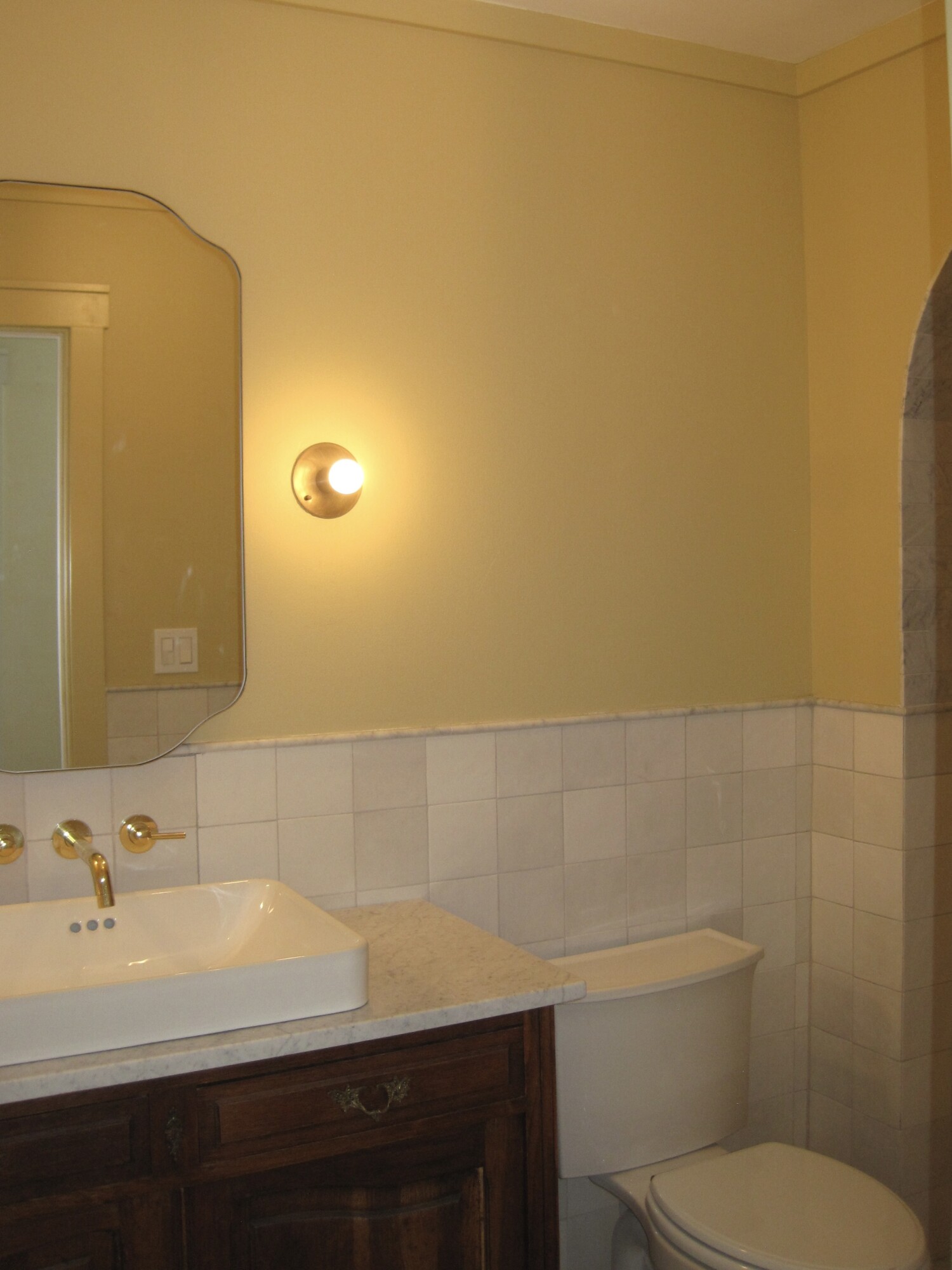
Our next stop during this journey was all about warmth. It’s a space without natural light, so creating a cozy ambiance was high on our priority list. Despite my initial inclination toward moodier tones, we got practical instead. Considering the frequent use by both kids and guests, I opted for ‘Hay’ by Farrow & Ball — a stunning muddy yellow with rich beige and brown undertones. This color not only adds a touch of warmth, but also ensures a welcoming atmosphere for everyone who steps in here.
Bathroom Shower Statements
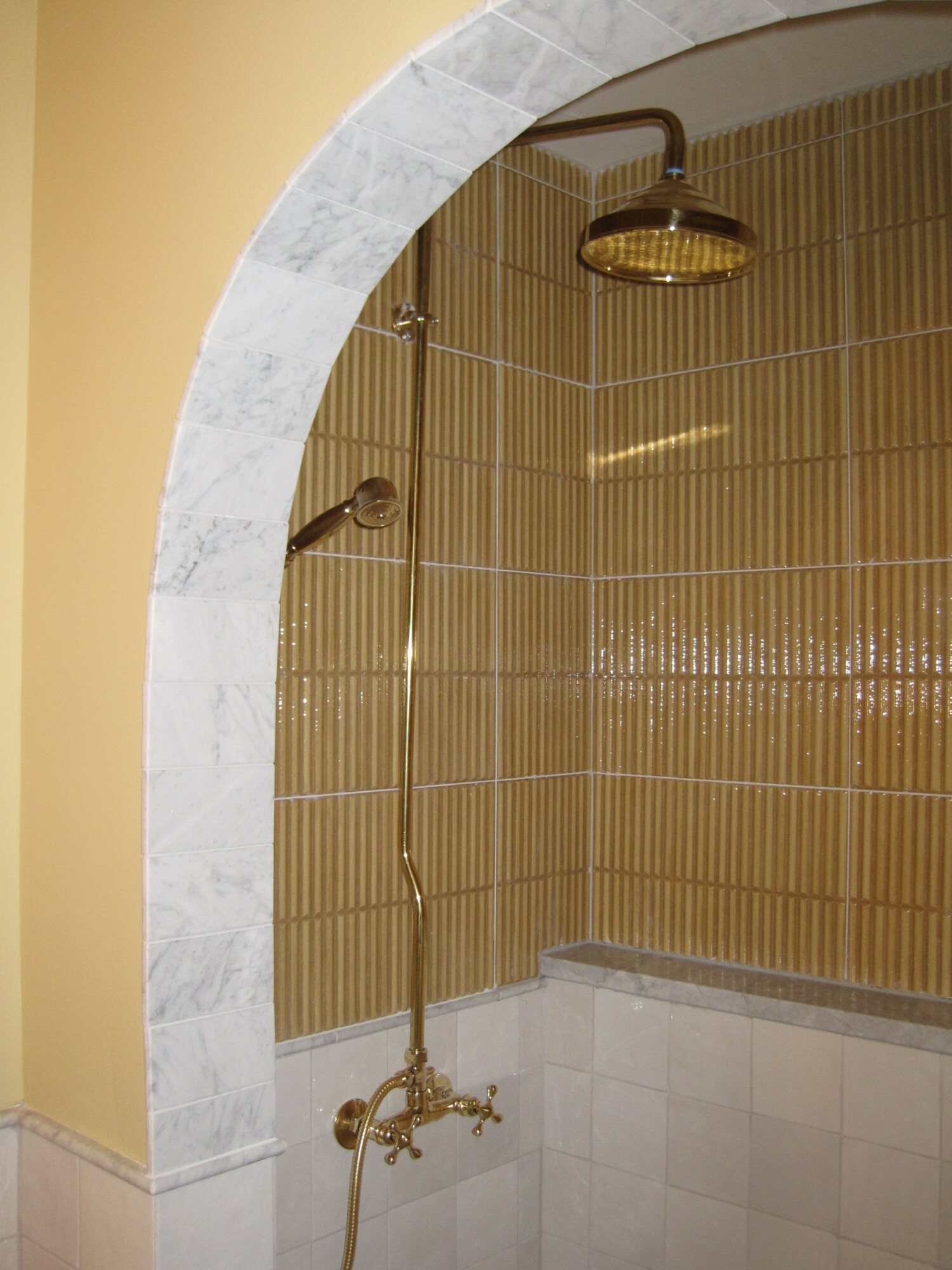
Let’s explore the shower space, where every detail contributes to the room’s character. The Z Collection tile emerges as a perfect compliment to the ‘Hay’ paint color, creating a seamless visual flow. The glossy mustard tiles, inspired by the pressed form of brick, add a playful touch without overwhelming the room. This choice wasn’t just about aesthetics — it was about infusing the space with its own distinct character and charm. I think that this tile choice really made this shower area a standout feature in this bathroom.
Tile Harmony
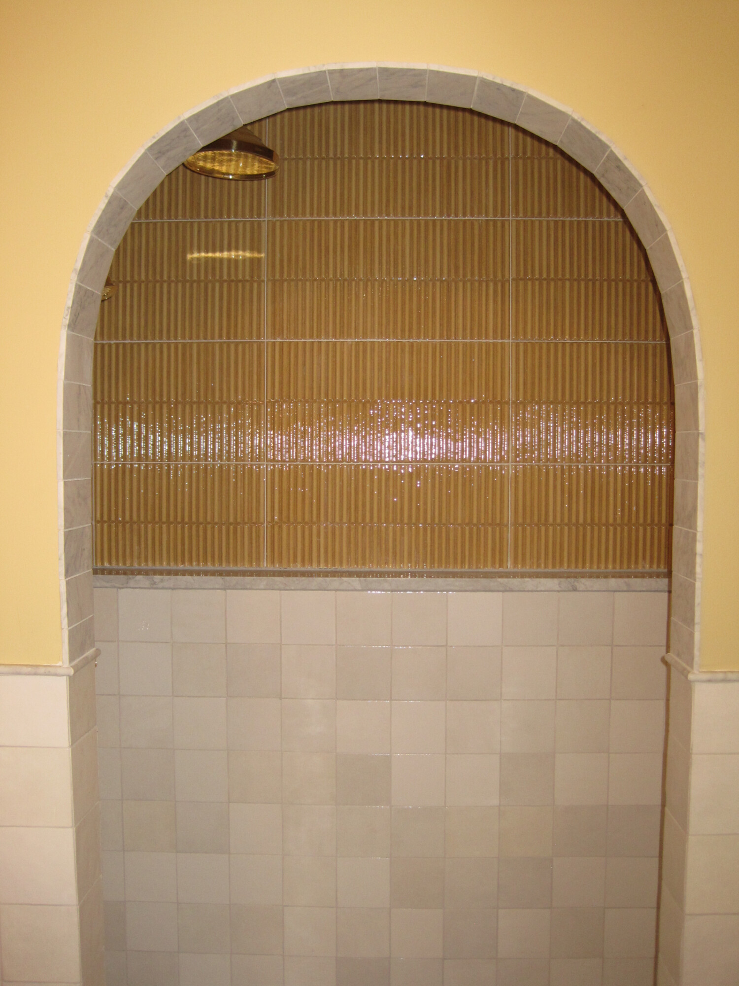
To break up the vibrant yellow and establish a connection with the marble floor, we introduced the familiar presence of the white 4 x 4 Cloe tile from Bedrosians. We had some left over from our previous home. The decision to reincorporate this tile was a testament to its timeless charm and my deep love for it, creating a beautiful link between the old and new.
Curtain Call
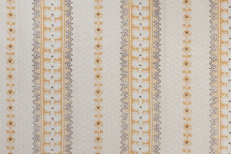
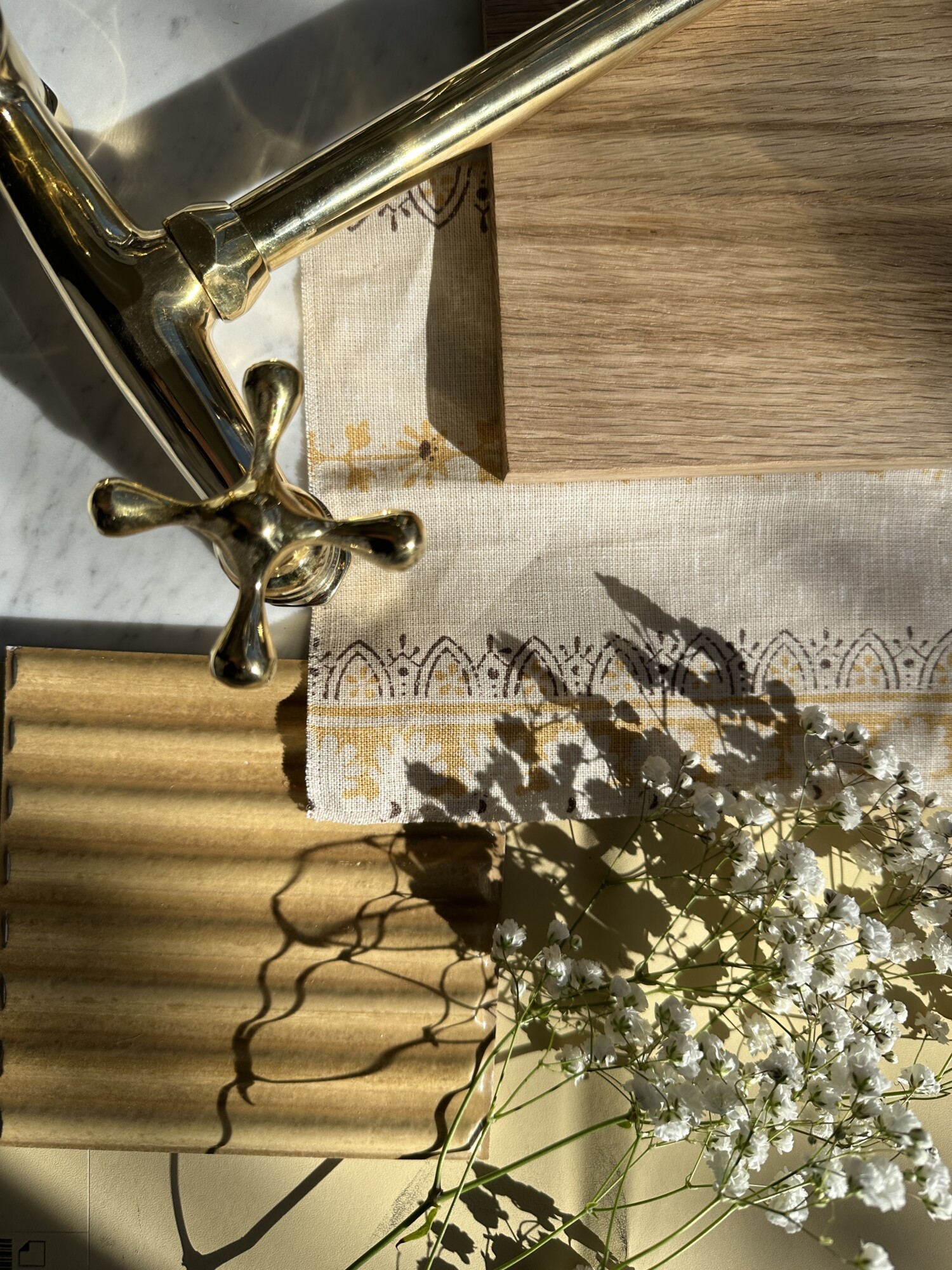
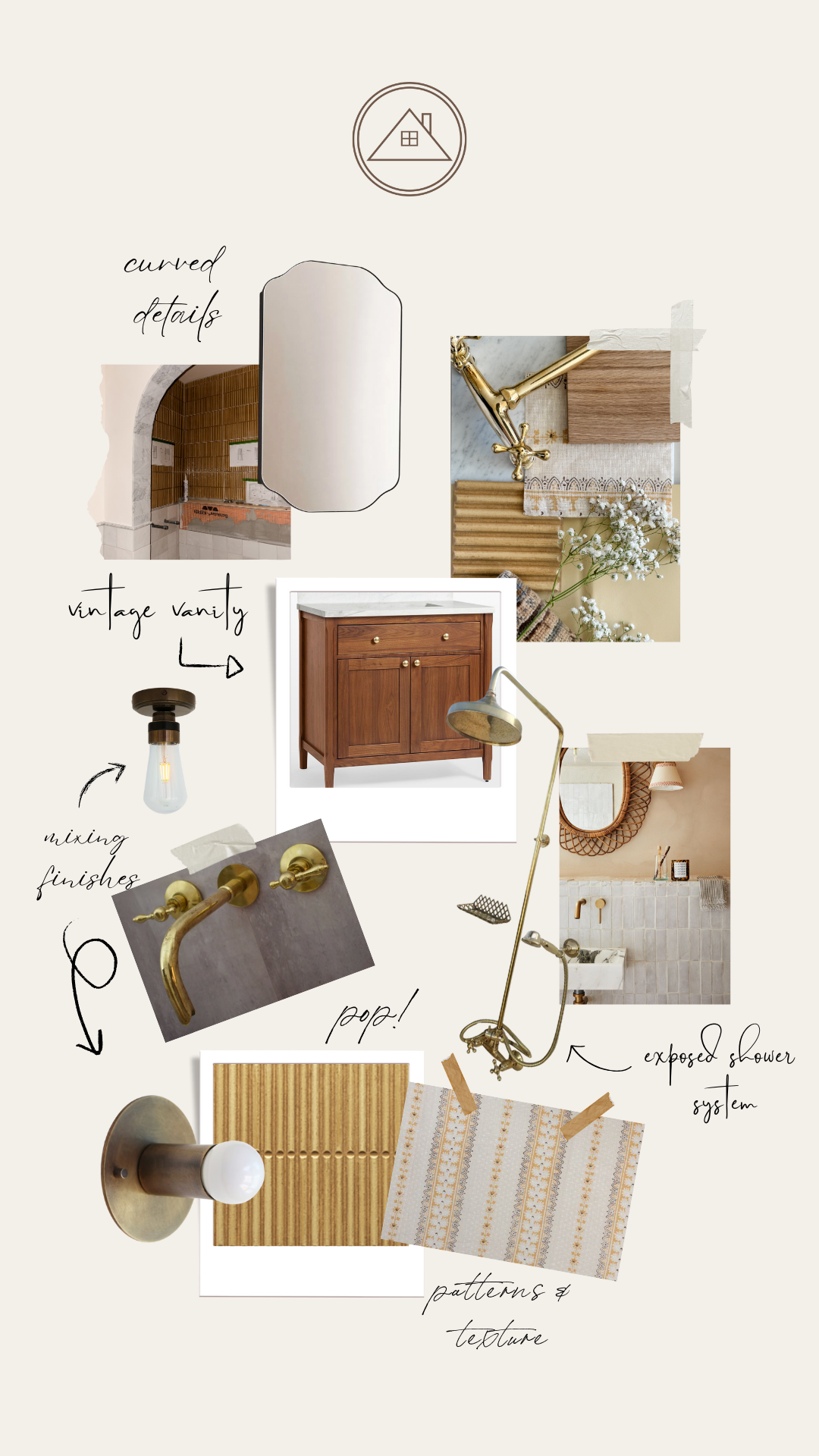
Let’s refocus our spotlight on the eagerly anticipated shower curtain. Envisioned in Alice Sergeant’s captivating fabric, Jasper in Caramel, this plan is set to elevate the space with a bit of flair. While the curtain is yet to be installed, the mere anticipation of how this print will tie everything together adds an element of excitement. Our decision to go with this fabric is rooted in the desire to bring more layering into the space, replacing the conventional glass door with a touch of warmth and an added texture. I adore this print, and am starting to become impatient because I know how impactfully this will give the space the look and detail it deserves.
Vintage Charm
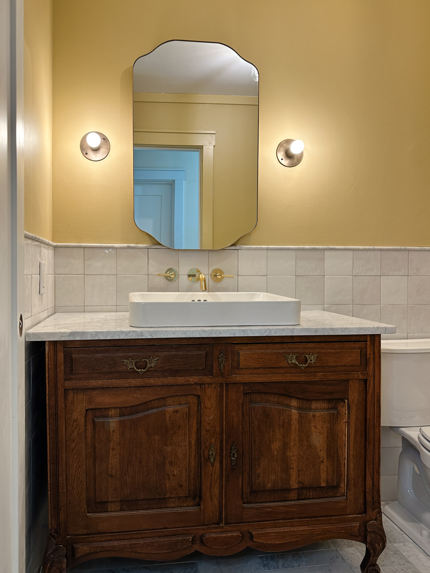
Check out this vintage dresser, reborn as a statement vanity. Crowned with a Carrara marble top and a vessel sink, the fusion of old and new is an ode to my love for timeless charm. The mixing of eras not only adds a touch of nostalgia but also creates a unique narrative for this space. It wouldn’t be right for me not to infuse a piece that brings its own tales to the room!
Bronzed Brilliance in the Bathroom
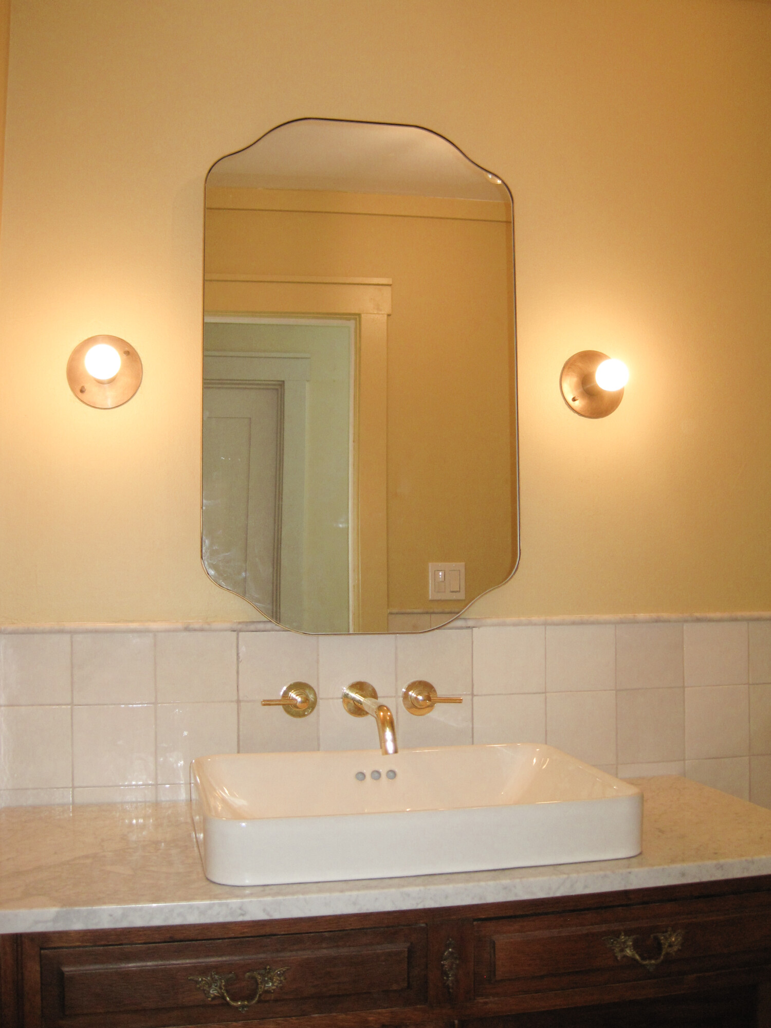
Let’s turn to the radiant details that truly enhance the entire bathroom. Enter the refined contemporary ceiling light and wall sconces, finished in the richness of aged bronze. These fixtures cast a warm contrast, setting a welcoming tone while harmonizing with the warm colors of the yellow and white marble. Their classic silhouette and vintage-inspired design compliments the style of the vanity and adds a touch of allure. I think we nailed this decision and it makes everything feel more cohesive.
Bathroom Brass Finesse
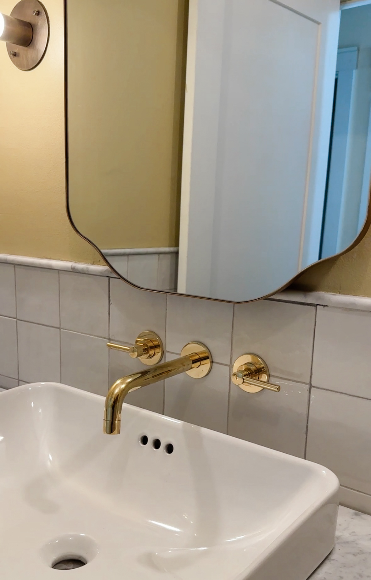
Let’s talk about this understated yet impactful element: the wall mount brass faucet from Etsy. This modern touch is practical and compliments the sconces, creating a sophisticated atmosphere. The brass adds a subtle hint of luxury, enhancing the overall vibe. This metal accent was supported by this unlacquered brass shower system, featuring a handheld and round shower head. This eclectic decoration, with its exposed hardware, really screams rustic modern and is the perfect jewelry for your space.
Curves and Cabinets
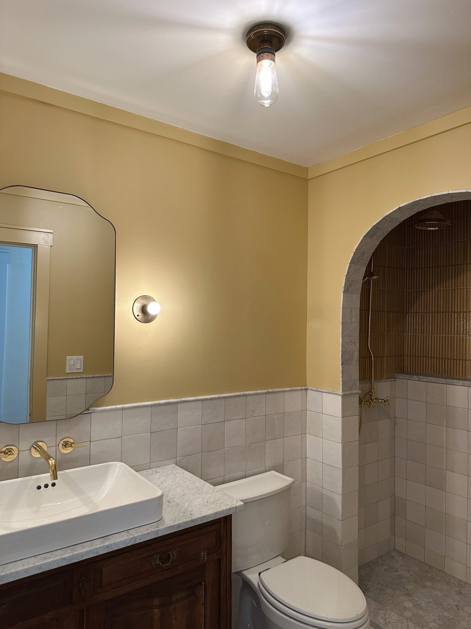
This medicine cabinet from Anthropologie was essential for storage, but also for its curved details which soften the space and balance the arched shower opening.
***
It brings me so much joy to have been able to share this transformation with you. It marks a significant milestone as our home begins to take shape, allowing us to revel in the excitement of adding those finishing touches. Each detail in this bathroom was a product of thoughtful consideration and intentional design choices. These elements provide the space with everything it needs to shine. Here’s to a home that reflects not just our style, but the joy and passion we poured into every corner.


