As winter settles in here at Bend, there’s a natural shift. It’s like the world slows down, and suddenly everything feels softer, more cozy, and a little more magical. The frost on the windows, the shorter days, the desire to wrap yourself in layers … it all inspires us to make home feel like the ultimate retreat.
In this December Edit, I’m leaning into all the things that bring warmth and texture. We love plush throws you can’t resist curling up with, vintage-inspired wood accents that add character, and moody hues like deep reds that feel festive without being over the top. After all, it’s about layering in a way that feels intentional but still relaxed, like you didn’t try too hard. But, it just works.
For me, this season is less about perfection and more about creating little moments. Enjoy soft lighting from candles, a cozy corner that’s all yours, or pulling out something special you’ve had for years and giving it new life. And that’s the vibe behind this edit: effortless, warm, and a little nostalgic, with pieces that make your space and your winter feel extra special.
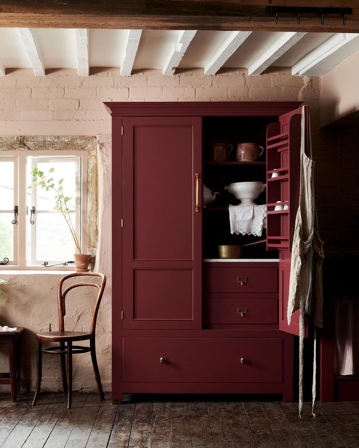
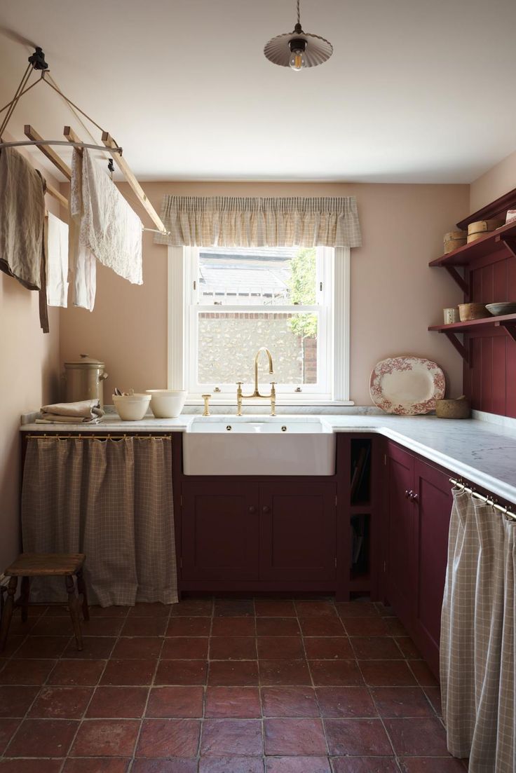
Color of the Month: Refectory Red
There’s something about a bold red like Refectory Red that feels timeless and daring all at once. After all, i’s not the kind of color you casually choose. It’s intentional, a statement that speaks to confidence and creativity in design. From the deVOL palette, this rich, warm hue carries a depth that immediately draws you in — bold without being flashy, classic without feeling dated.
I love the idea of using this color on cabinetry. Kitchens so often lean toward neutrals, like soft whites, grays, and muted greens. But, a color like Refectory Red takes the space to a whole new level. Imagine it paired with marble countertops and unlacquered brass hardware, or offset by rustic wood tones for a mix of modern and vintage charm.
Beyond cabinetry, I keep dreaming of other possibilities for this shade. Think a cozy library with floor-to-ceiling shelving painted in this rich red, filled with well-loved books and styled with warm brass accents. Or, even a bold front door that makes an instant impression, especially during the holiday season when red just feels right.
What makes Refectory Red so cool from a design perspective is how adaptable it is. Pair it with deep greens or navy, and it takes on a regal, traditional vibe. Pair it with crisp whites or softer neutrals, and it feels fresh and contemporary. It’s versatile but unapologetic—a color that commands attention without overwhelming the space.
For anyone nervous about using a bold hue like this, I’d say start small—a piece of furniture, a pantry door, even an accent wall. Once you see how much character it brings, you might just find yourself painting entire cabinets, confident that this color will hold its own for years to come.

Statement Pieces: The Ones That Steal Your Heart and Anchor a Room
- Portuguese Wooden Bench
This bench immediately makes me think of an old farmhouse—something that’s seen decades of life and holds stories in every scratch and knot in the wood. It’s perfect for your entryway perfect for stashing boots under, or by the fireplace with a cozy throw casually draped over it.
- Louis Vuitton Trunk
I love how a vintage trunk brings that “collected over time” look to a space. Use it as a coffee table, with a few art books and a tray for candles, or place it at the end of a bed to store extra blankets and throws. The leather details and hardware add richness, and it’s a piece you can pass down—it’s timeless in every way.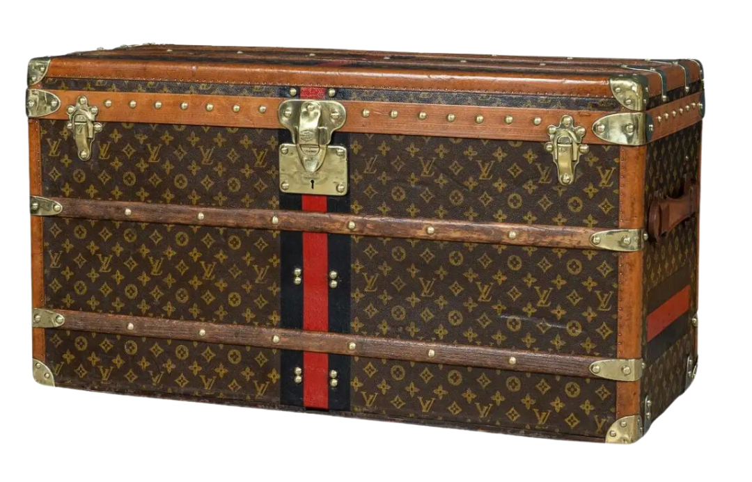
- Iron and Marble Console Table
This table is for those moments when you want your home to feel effortless but polished. Picture it styled with greenery spilling over the edge, a few candles for ambiance, and maybe even a bowl filled with ornaments or pinecones. It’s slim and subtle but packs a design punch.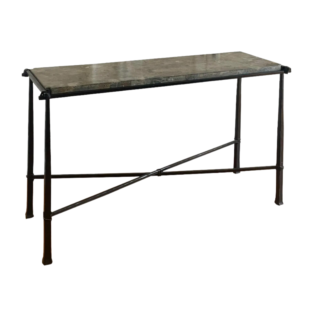
Layers of Texture: Cozy, Lived-In, and Perfectly Winter
- Carmine Velvet Bolster Pillow
Velvet in winter is non-negotiable for me. This deep red bolster with its floral print feels festive yet grounded—it doesn’t scream holiday, so you can leave it out long after the tree comes down. Try layering it with neutral linens on your sofa or bed to add depth and a touch of luxury.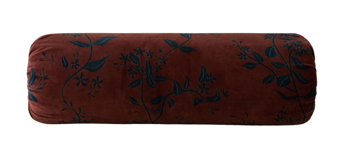
- Lola Blankets
This is the kind of blanket you’ll fight over during movie nights (so I’m telling you now, buy multiples!). The texture is rich and inviting, and it looks as good thrown over a chair as it does wrapped around you. Also, it’s neutral enough to work in any space, but with enough detail to feel special. Of course, I purchased a similar one (that is now out of stock) and I’m totally obsessed. Hah — I said it was for the “kids” but now I think it’s for my bed!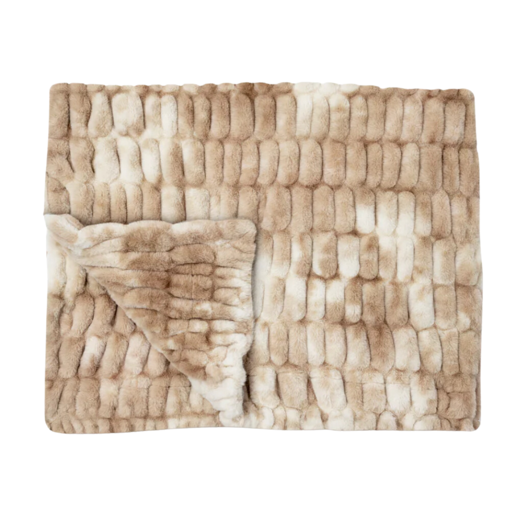
- Pleated Shade Chandelier
Lighting can make or break a room, but this chandelier does it all. And, it doesn’t hurt that it is priced reasonably! The floral pleats bring an unexpected pop of personality, perfect for over a dining table or in a cozy breakfast nook. Also, it’s functional art—and it quietly adds softness to a space.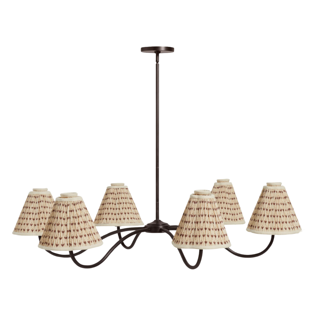
Seasonal Touches: Making Everyday Gatherings Feel Cozy and Special
- Traditional Pottery Plates
This plate feels like it has been pulled straight from a European countryside kitchen. Perfect for serving holiday treats or even just sitting on open shelves, it brings warmth and history to your space.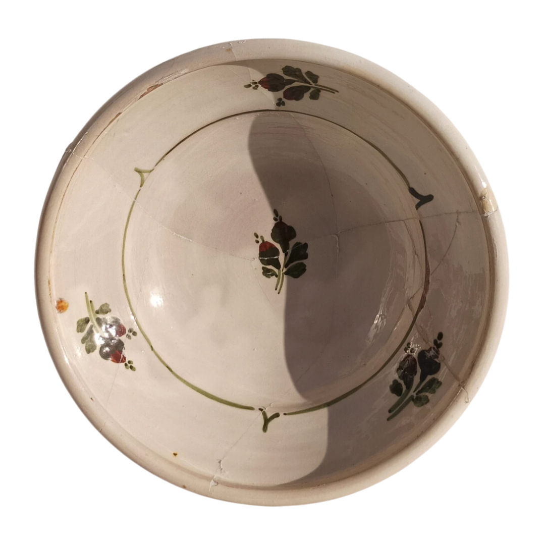
- Taper Candle Holders
Candlelight in winter is everything, and these taper holders are classic in all the right ways. Try them clustered on a mantle, or lined up along a dining table for a cozy glow that doesn’t feel fussy. Plus, they’re on sale right now!
Everyday Luxe: Elevated Basics for Winter Dressing
- Glossy Fringe Puffer Jacket
This isn’t your average puffer—it’s glossy, fringed, and full of personality. This is seriously my dream coat you guys … Santa?! Are you listening?? I’ve never seen anything more my vibe!
- Velvet Flats
I’m a total flats girl, being tall it just makes dressing easier 😉 These velvet flats have been my go-to since they arrived. They’re comfortable enough to wear all day, and somehow manage to go with everything in my wardrobe. Personally, I’ve been pairing them with tights and a plaid skirt for dinners. Or, with jeans and a white button down shirt for an effortlessly polished look.
- Studded Leather Clutch
Edgy studded details give any look a bit of personality, and this clutch is the perfect balance of modern and timeless. Of course, the silver hardware is a winter must, and it’s just the right size for all the essentials.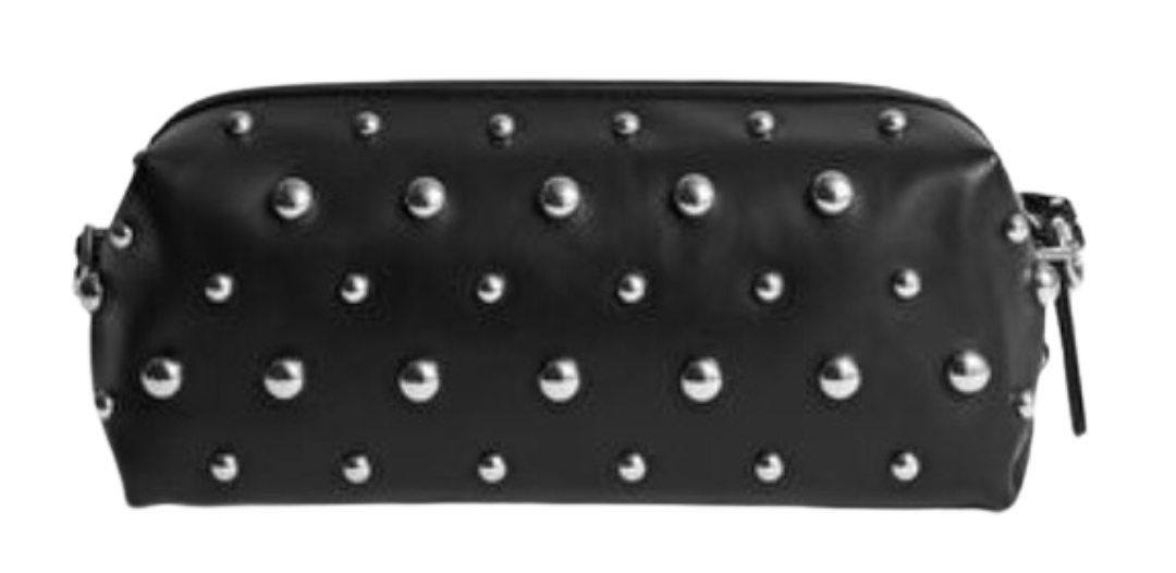
- Plaid Blouse
This plaid blouse has basically been on repeat for me this holiday season. The subtle ruffle detail at the collar and the puffy sleeves make it feel feminine, and the pattern is festive without screaming “holiday sweater.” I’ve been layering it under chunky knits during the day, and dressing it up with leather pants and my go-to velvet flats for dinners.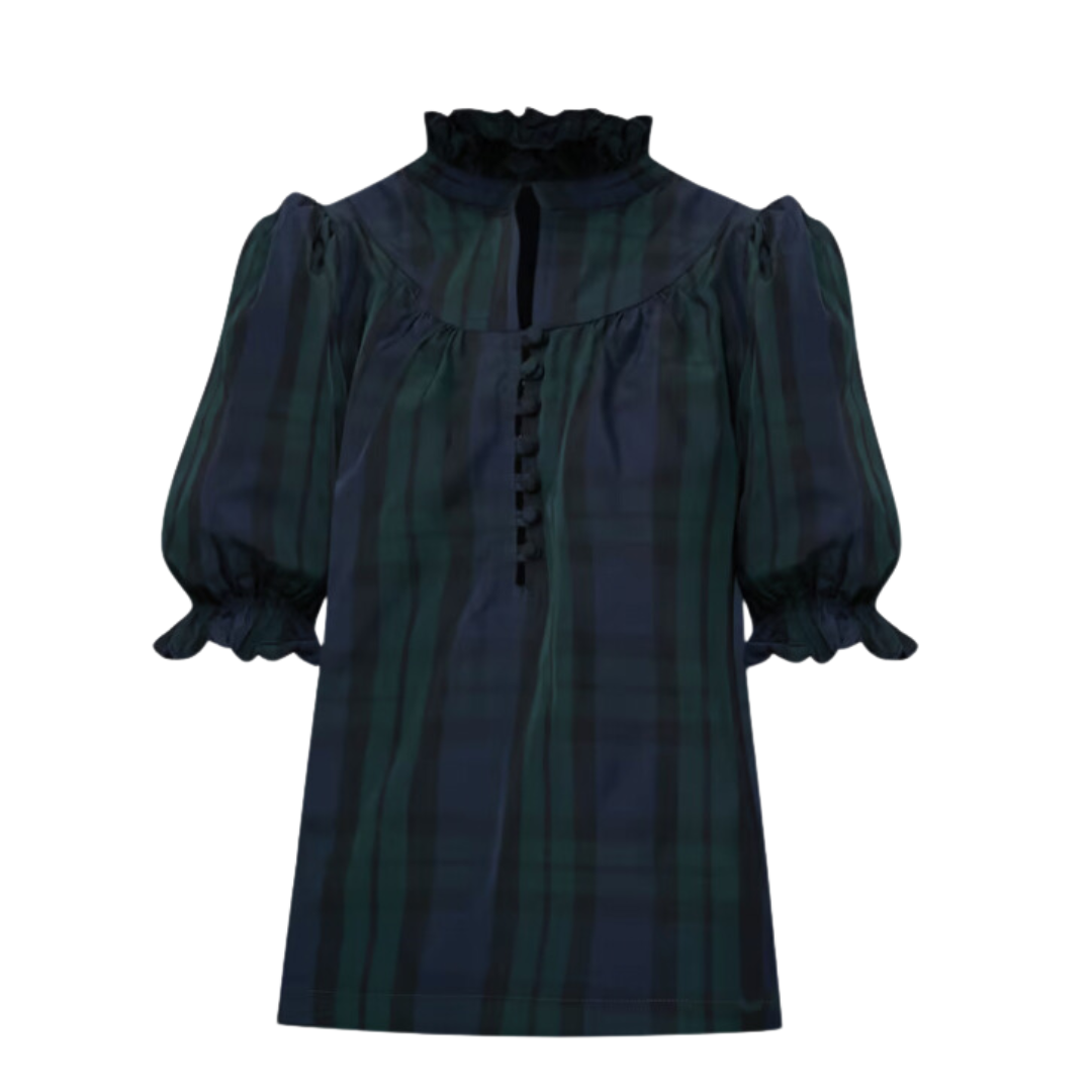
A Festive Nightcap: My Go-To Mocktail for a Cozy Night’s Sleep
With all the chaos of the holidays, it’s easy to let sleep slip to the bottom of the priority list. So, as a little extra treat, I wanted to share a quick and festive mocktail that’s become part of my nightly wind-down routine. Of course, it’s the perfect shade of red to match the season (haha). And, it’s packed with ingredients that help calm the nervous system and support a good night’s sleep. Bonus: it’s super simple—just three ingredients!
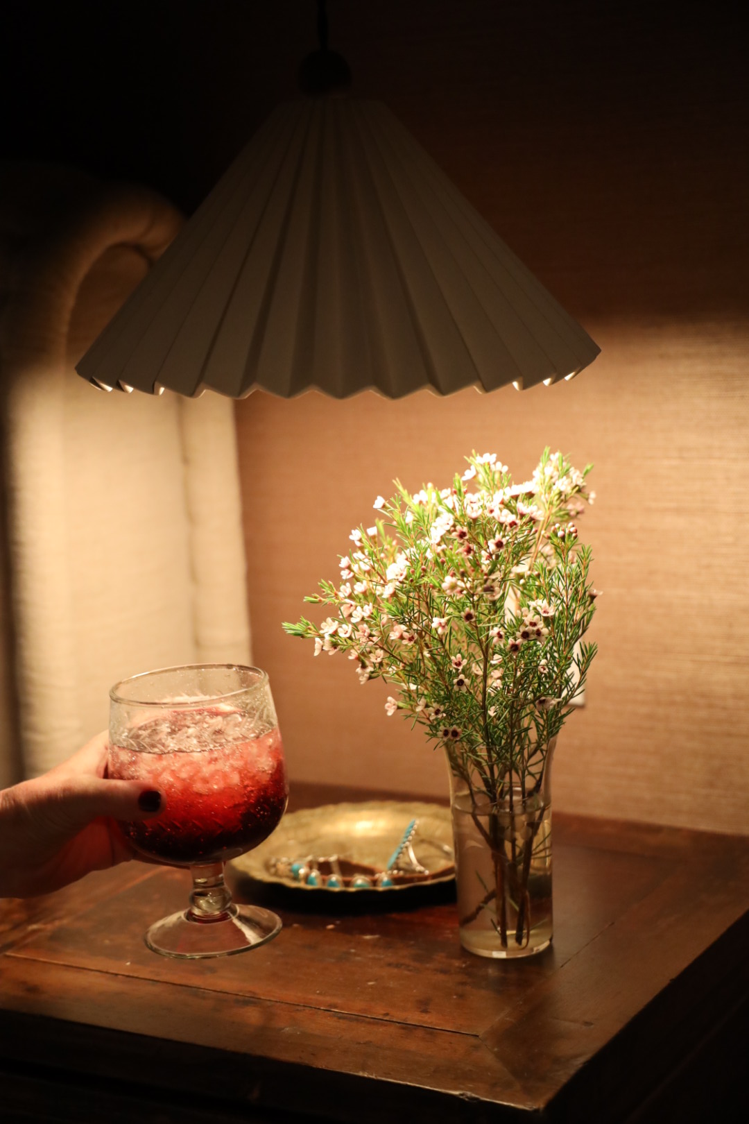
Here’s what you need:
- Tart Cherry Juice (great for natural melatonin)
- Magnesium Powder (I use Moon Juice – Magnesi-Om for stress support)
- Sparkling Water (Poppi’s Lemon Lime flavor is my favorite!)
Instructions:
- Combine the tart cherry juice and magnesium powder in a glass. Stir well to ensure the magnesium is fully dissolved.
- Add a handful of ice cubes to the glass.
- Top with sparkling water for some fizz.
- Sip, relax, and let the holiday stress melt away.
I love this drink as a little ritual to help me slow down after busy days working with clients, or prepping for holiday gatherings. It’s festive, delicious, and feels like a small gift. Cheers to more rest and more calm this season! ❤️🎄
***
The holidays are a wonderful time to slow down, connect with loved ones, and reflect on the year. So, light the candles, get cozy, and listen to your favorite playlist! And, why not indulge in a little extra—perhaps a stunning piece of décor, a new wardrobe staple, or just the joy of hosting a quiet night at home. I truly believe that design has the power to set the tone for how we feel and the memories we make.

From my family to yours, I’m wishing you the happiest of holidays filled with warmth, love, and a little sparkle. May your spaces be cozy, your gatherings be meaningful, and your winter wardrobe be effortlessly chic. Cheers to creating moments that matter—and to carrying a bit of that holiday magic with you into the new year.
Happy Holidays! ❤️

