CLOUZ HOUZ DESIGN GUIDES - What’s your style?
TAKE THE QUIZ
Projects

The Bold & The Beautiful
Part 1: Mudroom + Laundry Room

Some projects feel extra special from the start, and this is one of them. We’re so excited to kick off this ‘Design Plan Only’ project for our clients at The Bold & The Beautiful—a home that will be both striking and deeply livable, blending bold design moments with timeless materials.

If you’re new to Clouz Houz and want to stay in the know on all things home and lifestyle, subscribe now so you never miss a post! As a bonus,  you’ll receive our exclusive 42- page ‘Paint Guide,’ as well as our weekly newsletter including special finds that are only for subscribers. Basically, you are the cool kids 😉

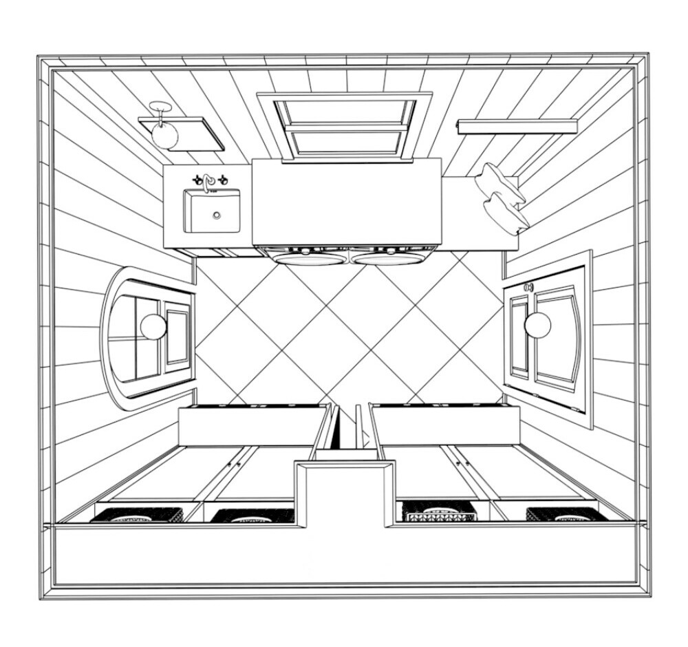
This is the first phase of a much larger transformation, and we’re starting with two of the most functional spaces in the house: the mudroom + laundry room. While they might not be the most glamorous rooms, they are truly the workhorses of the home—spaces that get used every single day. And because of that, we wanted to make sure they weren’t just practical but also stunning in their own right.


A collage-style mood board featuring design elements for a transitional, modern mudroom and laundry room. Includes a black faucet, unlacquered brass hardware, checkerboard tile flooring, dark cabinetry, and a cozy built-in bench with storage. The color palette blends earthy, organic tones with moody, bold contrast.

The Vision for the Home

Our clients came to us wanting a home that felt bold, elevated, and playful—but still warm and inviting. Think moody hues, layered textures, and a mix of traditional and modern elements. Every detail is being thoughtfully curated to create a space that feels fresh yet timeless, with an effortless blend of organic materials and high-contrast design choices.

We’re approaching this project room by room, ensuring each space flows beautifully into the next while still having its own moment. First up? The mudroom and laundry room—because if you’ve got to do laundry, you might as well do it in a space you love.

A black-and-white architectural floor plan showing a symmetrical laundry room layout with a central workspace, side-by-side washer and dryer, a utility sink, and built-in cabinetry for storage.

The Mudroom & Laundry Room: Function Meets Beauty

These two spaces are often overlooked, but when designed intentionally, they can completely change the way a home functions. Here’s what we’re focusing on:

  • Highly functional layout – Maximizing storage, efficiency, and flow.
  • Cohesive palette & materials – Creating a foundation that will tie into the rest of the home.
  • Durable, high-quality selections – Because these rooms work hard every day.
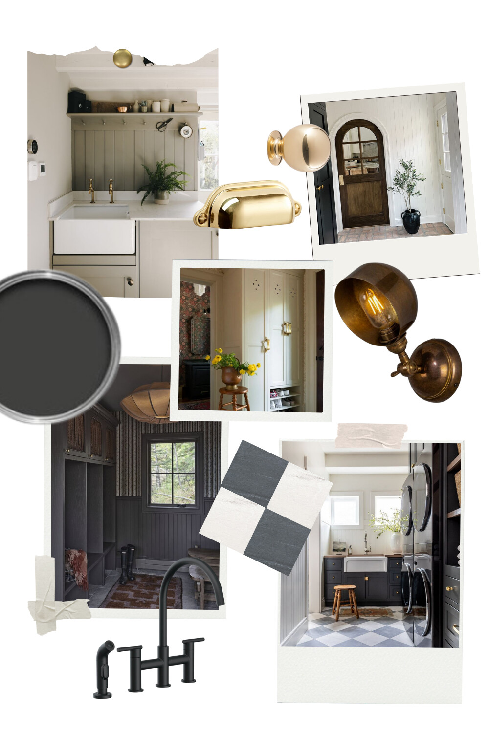
A collection of 3D renderings and material selections for a modern, moody laundry room design. Featuring a black utility sink, Sherwin Williams Iron Ore paint, a black Tempal countertop, and a butcher block countertop/bench top. The layout includes checkered porcelain flooring, custom cabinetry, and a sliding ladder for added functionality and charm. The design blends dark tones with warm wood accents for a sophisticated yet functional space.

The Inspiration

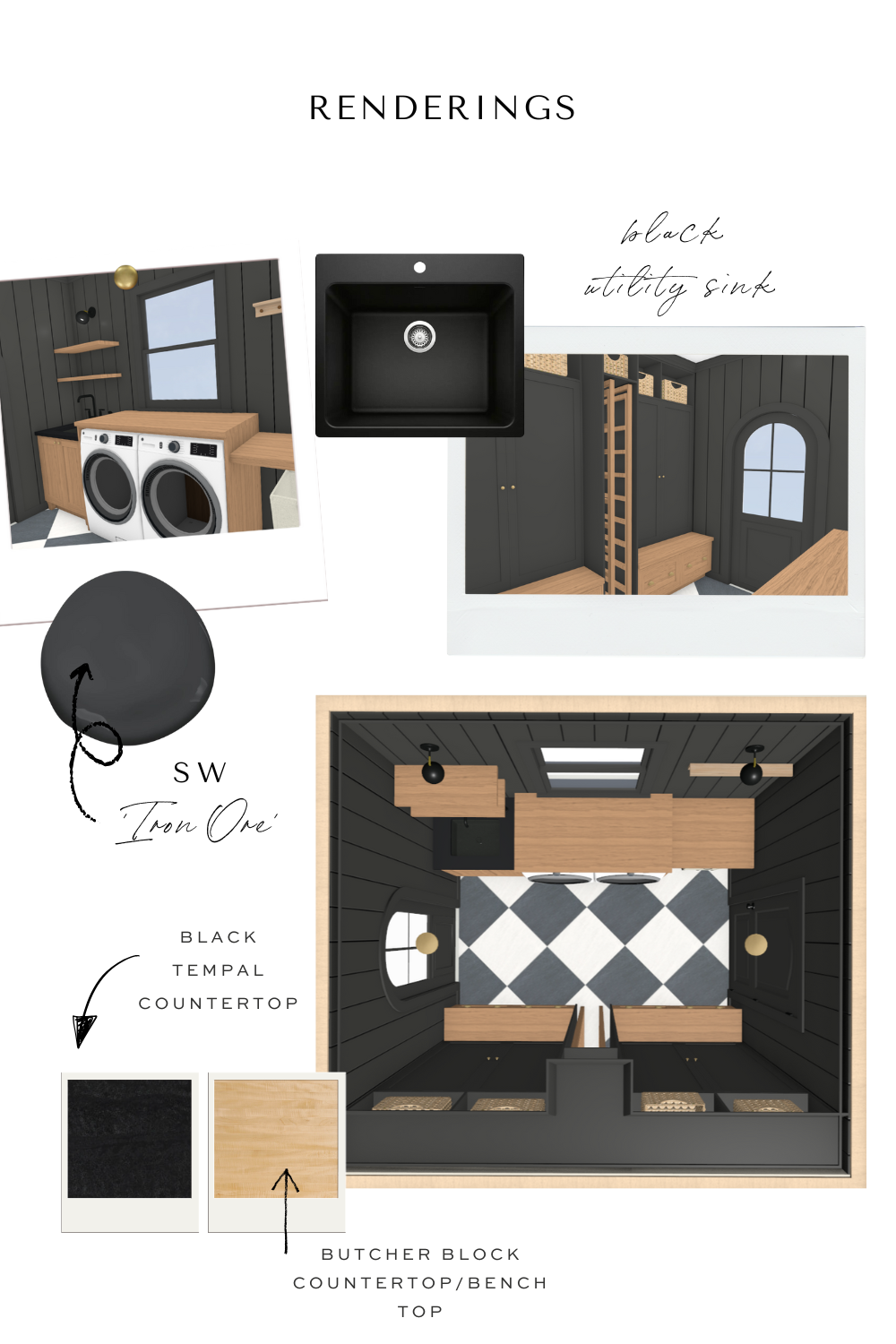
For these spaces, we wanted to go bold, but not trendy—something that feels both dramatic and timeless. Here’s what you can expect:

  • Color: Bold and moody hues, with a mix of deep neutrals and warm wood tones.
  • High Contrast: Un-lacquered brass cabinet hardware, checkered tile on floor, and natural wood for warmth.
  • Lighting: Thoughtfully placed fixtures that create a cozy yet functional glow. Adding sconces to walls turns this more functional room into something special.
  • Functionality: A spacious folding area, utility sink,  custom built-in cabinetry, such as a custom drying rack to hold clothes out of the way and cubbies to keep everything in its place for this young family of four.

What’s Next?

This is just the beginning! We’ll be diving into more of the home’s transformation soon, but for now, we’re focusing on making these foundational spaces beautiful and functional. We can’t wait to share more of this journey—stay tuned for all the behind-the-scenes as this project unfolds!

Join the Conversation

get inspired
#clouzhouz
follow along
@clouz_houz
After designing and remodeling so many kitchens, here are 5 mistakes I’II never make again:
1. Not taking cabinetry to the ceiling.
That awkward gap collects dust and instantly makes a kitchen feel builder-grade. Full-height cabinetry feels intentional and custom.
2. Forgetting landing space.
Every appliance needs a place to land. No counter next to the fridge or range = daily frustration.
3. Using the same cabinet hardware knobs and pulls throughout. Mix styles for interest (I can’t wait to share what I’ve picked for our new kitchen)
4. Underestimating drawer storage.
Drawers > lower cabinets. Always. Deep drawers for pots, pans, and dishes change everything. I hate digging through cabinet shelving!
5. Relying on one overhead light.
Layered lighting (pendants, cabinet lighting, sconces) is what makes a kitchen feel warm and personal.
If you’re planning a remodel, save this for later🤍 Sharing cabinet and counter details soon!
We painted our dining room pink... and I’d do it again in a heartbeat.
This is Setting Plaster by @farrowandball, and it completely transformed our dining room at the Sixth Street Bungalow in Columbia, Tennessee. It’s not bubblegum. 
It’s not trendy. Joa Studholme, one of color curators at F & B created this beautiful hue when she discovered the beauty in her home with freshly plastered walls. And I just love it!
Depending on the light, it shifts from soft blush to a muted clay tone, which makes the room feel romantic and cozy without feeling overly sweet. I love how it warms up the wood floors. As Joa explains, it feels like a big hug!
If you’ve been nervous to step away from white, this is your sign.
Save this for your paint list and share it with someone who would absolutely love this color.
Share with someone who needs to hear this!!
I didn’t fully understand this early in my career. I thought good design was 90% about pulling together beautiful finishes and getting the palette right.
But over time (and after walking through many homes), here’s what I noticed:
The homes that felt the best weren’t always the most expensive. Or the most styled. They were the ones where everything worked together in a way that supported the people living there. And the homeowners? They weren’t constantly tweaking or second-guessing. They were living.
That’s when I realized design is about creating a space that quietly holds you.
When a home feels right, you can’t always explain why. But you feel it immediately. And once you feel it, you can’t un-feel it.
Spring is officially here!
We’re kicking off the season with The March Edit - now live.
Think of it as a little peek into what we’re loving right now... what we’re noticing, bookmarking, wearing, cooking, reading, and saving for projects. This month feels fresh and full of ideas, and I’m leaning all the way in.
I’m also introducing more of the team and sharing a few of the things we’re personally obsessing over lately — from design to everyday life. It’s a little more journal-style this time, and I kind of love it.
If you want to see what we’re manifesting for spring (and maybe find a few new favorites of your own), head to the blog and read the full March Edit. (link in bio)
People always think design starts with picking the sofa or paint color... but honestly, so much of our process lives in the tiny details.
A room doesn’t become you until it’s styled with intention. That’s why we spend time learning how you move through your day, what objects matter, where your eye naturally lands.
When we work with clients, we don’t just drop furniture into a floor plan. We design the feeling - the quiet corner, the morning moment, the lived-in beauty.
Styling a coffee table is just a peek at how much thought goes into every inch.
Ready to love where you live? Start the process through the link in our bio.