Embracing the Present
The summer months are such precious days, aren’t they? We have limited time to spend the days lounging outside on patio furniture, BBQing with friends and family, and experiencing nature blooming along with our spirits. This season can feel so chaotic at times, always trying to jam the most trips in, that we often get carried away. I have to constantly remind myself to stay in the moment and embrace the time that I am currently in. And honestly, a staycation can be just as relaxing if you’re intentional with how you spend your time in the comfort of your own home.

Furniture That Encourages Relaxation
And with that comes home furniture and lifestyle items that support that goal and make it enjoyable to linger in a memory longer. August is all for those special pieces that evoke emotions, start conversations, and inspire. We’re taking it back to the basics, with neutral and soft color palettes of a calm summer day, and with pops of exciting colors and patterns sprinkled throughout.
Pieces Inspiring My Designs
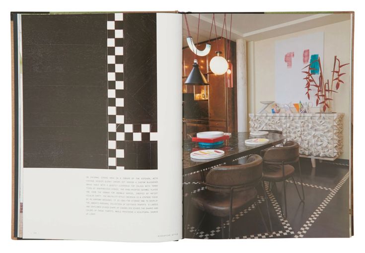
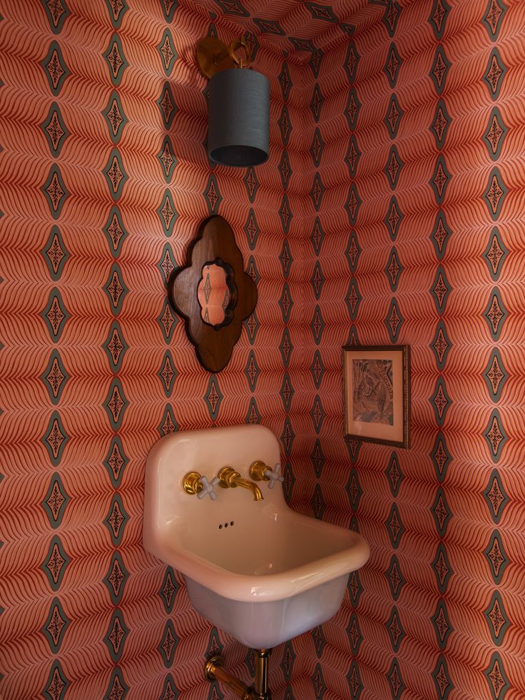
In August, it’s all about those light and airy styles that feel organic to summertime, while bringing a breath of life and fresh twists into the equation at the same time. And, what better way to understand the vision than to include Kelly Wearstler’s book, “Kelly Wearstler: Evocative Style.” Everyone should pick up this book, the designs inside are just so uniquely stunning! Perfect for a lazy Sunday afternoon perusing her pages chocked full of inspiration.
Color of the Month
Benjamin Moore’s ‘Coral Spice’ has a nice punch of color while also being mellowed with a hint of brown tones. I chose a pinky coral for August because there are so many different hues you can pick from, but it feels refreshing for summer.
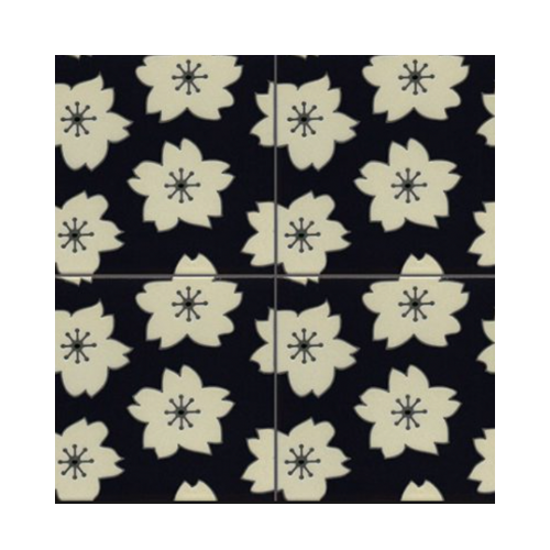
I also came across this black & white tile and knew I needed to include it in this month’s roundup. This is from a local company, Kibak Tile in Sisters, Oregon, and I just love the colors and patterns of their designs. The contrasting colors feel like such a nice and refreshing contrast to the rest of this edit’s color palette. And, the floral motifs give it a variety of characters. I’d love to use this in a bathroom, beach home, or as a backsplash.
What I’m Wearing: Slow Living Essentials
I want to emphasize the importance of slow living being our lifestyle, and handpicked a few things that give that vibe while still making me feel fresh+seasonal yet relaxed.
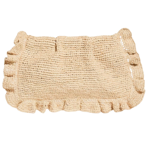
- Raffia Clutch with Ruffles: A subtle accent for any outfit, this clutch is the material of the season.
- Essential Tote: MASSIVE and perfect for carrying work materials or stocking up at the farmer’s market. The durable canvas is easy to clean. Kaylei was so sweet and surprised us with Clouz Houz totes for travel and site visits. We load them up with samples, plans, etc. You can customize them with your initials, logo or name. So so cute!
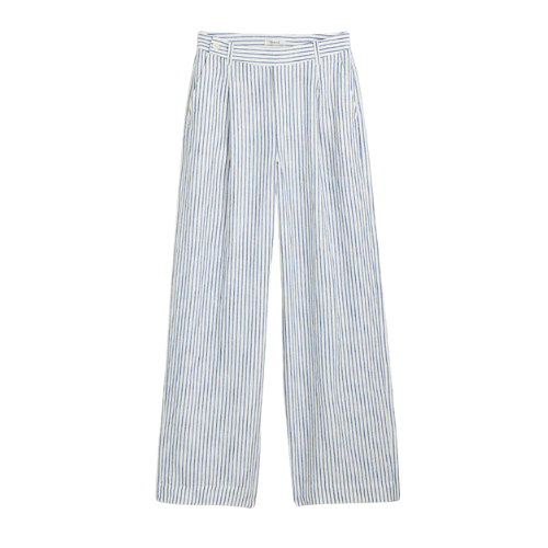
- Seersucker Linen Pants: These pinstriped linen pants elevate any basic outfit. Pair them with a white tee or a graphic one for an effortless, breathable, and flowy look.
What I’m Using to Style My Home
This month is all about the little accessories that make a house a home.
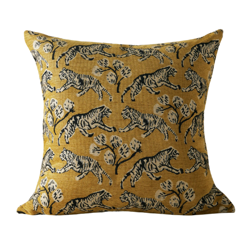
- Fun and Retro Print Pillows: Perfect for jazzing up a couch or adding a fun accent to a chair or bed. Summer is the time to pick playful designs!
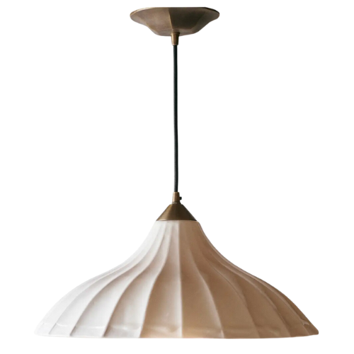
- Porcelain Lighting: Inspired by our primary bedroom in Tumalo, this statement fixture adds a stylish touch.
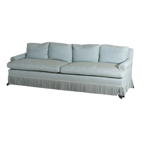
- 20th Century Fringe Skirted Sofa: The dreamy blue is perfect for a soothing month. It’s a versatile statement piece.
- Outdoor Side Table from Amazon (under $100): A great summer find for our patio. It’s affordable and looks expensive. One of my favorite Amazon finds of the season!
- Simple Silhouette Nightstand: Whitewashed and perfect for any decor.
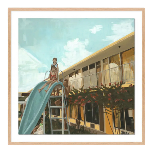
- Painted Art Piece: Nostalgic summer scenes to bring warmth to any room.
Lifestyle Favorites
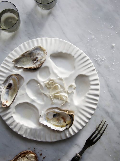
- Oyster Plate: A Clouz Houz staple for the season. We love our oysters, and this plate is both functional and beyond aesthetic.
Linger Longer
August is about those special pieces that evoke emotions, start conversations, and inspire. It’s about understanding the intent behind each item and relating to where some of us might be at this point in the summer. Relish the good times, embrace the soon to be end to the season and linger longer outside, in the comfort of your home with loved ones. Life is short. Make it Beautiful…. however it brings you joy.
Cheers to a season of joy, inspiration, and unforgettable moments! ?
***
I case you missed last month’s posts…
Pro’s and Con’s of Quartzite Counters
Grilled Peach Smash Cocktail Recipe
Our Fave Sofa and Coffee Table Combos
Shop the High Desert Tumalo Ranch Living Room


