CLOUZ HOUZ DESIGN GUIDES - What’s your style?
TAKE THE QUIZ
Design

So Susie Headquarters:
The Plans, Materials & Details

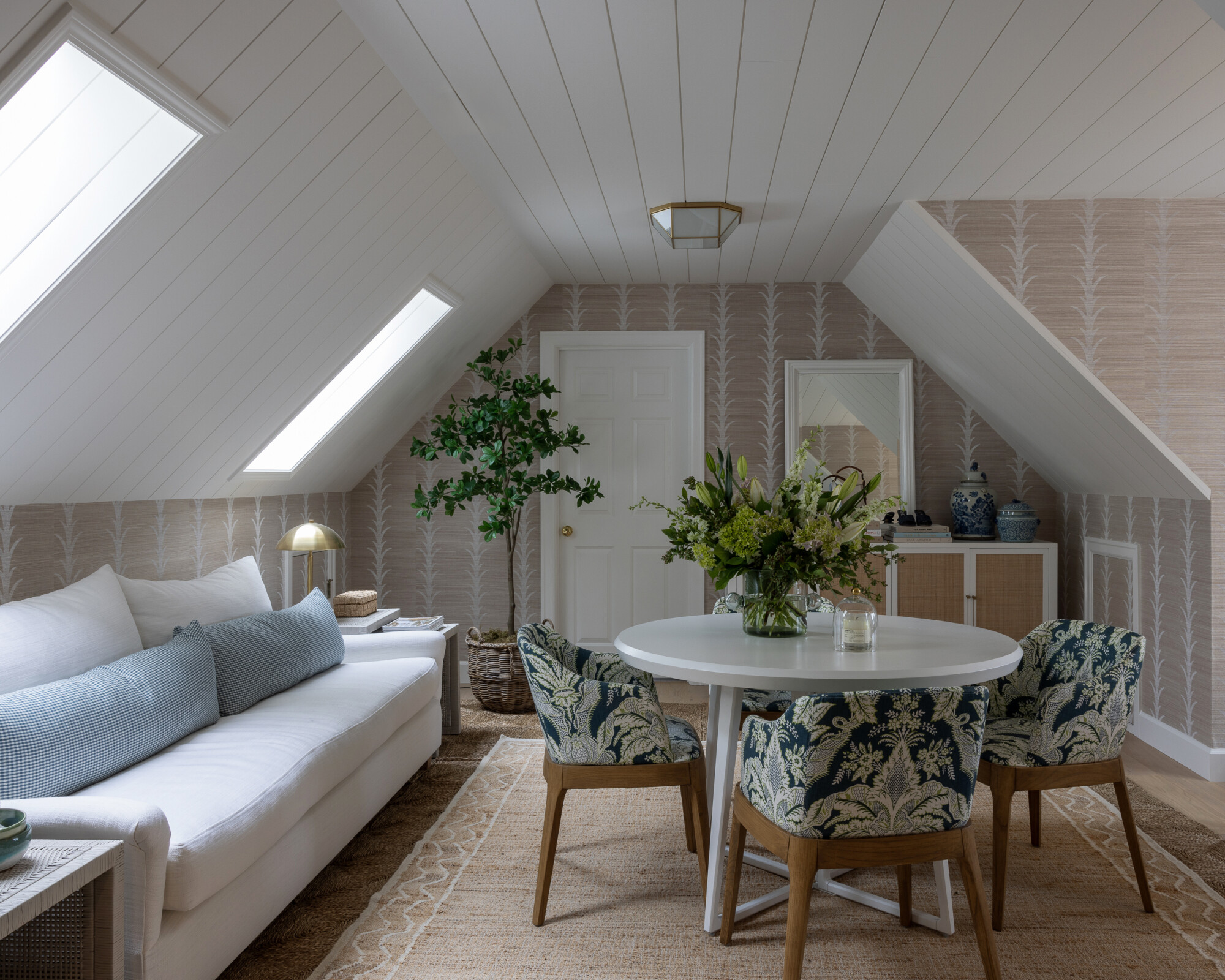
Setting the Scene at So Susie Headquarters

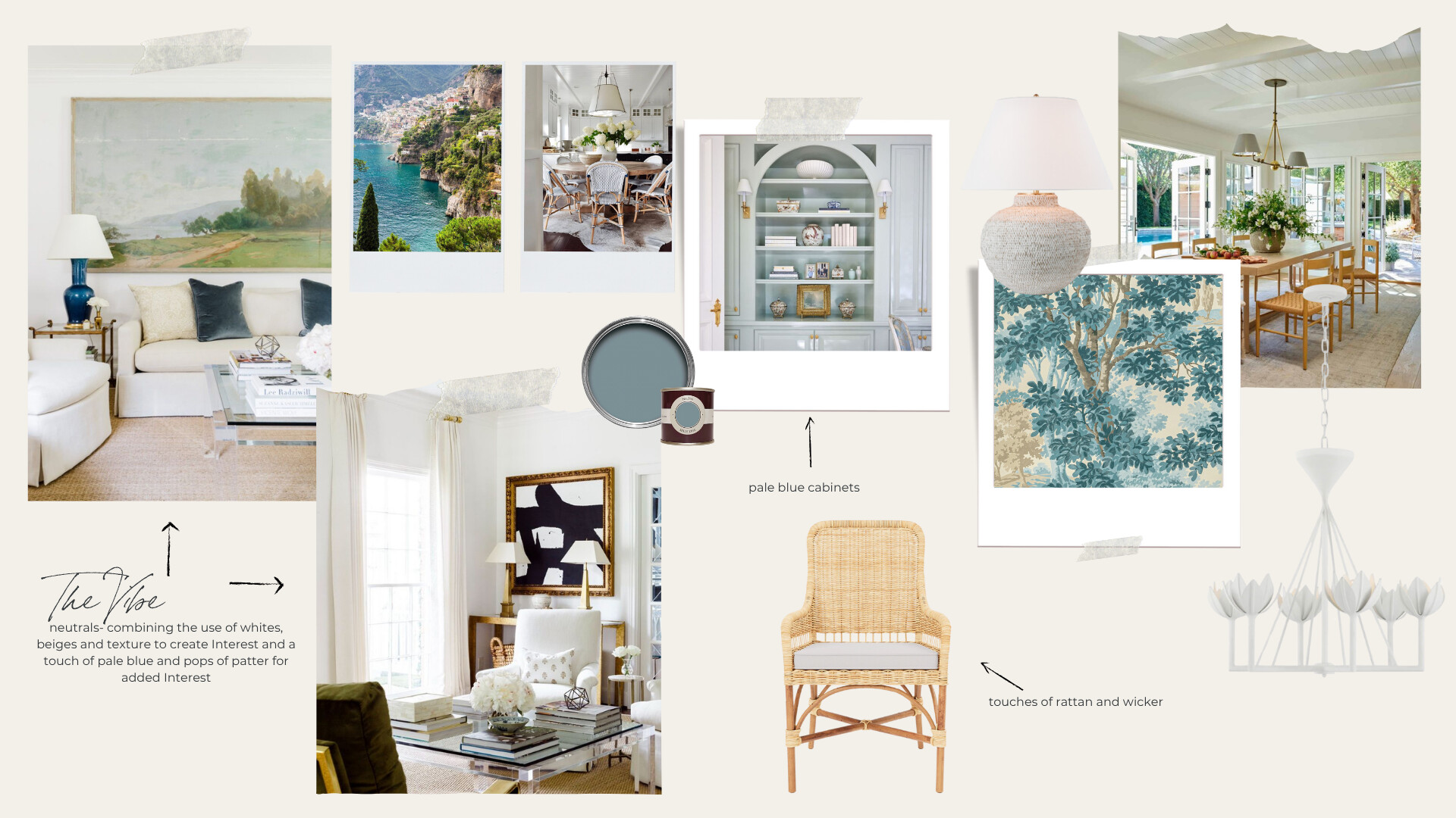
When we first teamed up with Susie, the vision was to create a home that felt beautifully lived-in, elevated, and endlessly inspiring. As a fashion influencer and blogger, Susie’s fashion sense is elegantly classic with pops of color. So, we wanted her home to reflect the same! Think California casual meets timeless tradition—a collected mix of light, warmth, and charm with a subtle hint of femininity. It’s not trendy or flashy, but it’s full of intention and pretty details. Every room should feel relaxed, welcoming, and tailored without being too precious.

The spaces reflect soft color palettes, layered textures, beautiful accents, and a sense of effortlessness that still feels pulled together. The kind of home you can host in, live in, and linger in.

Photo: Zee Wendell

Where We Started

We kicked things off upstairs, transforming the Susie’s office space into a space that’s cozy, intentional, and totally her. If you missed that reveal, you can take a peek here.

Now, we’re back for phase two—and it’s a good one.


Interior design mood board featuring neutral tones, pale blue cabinetry, wicker and rattan furniture, layered textiles, and soft coastal-inspired accents. Includes inspiration photos, a woven armchair, a textured table lamp, wallpaper swatch, and a floral chandelier, all curated to reflect a calm, classic, and airy aesthetic.

What We’re Tackling Now

This round focuses on the main living areas:

  • The kitchen
  • The pantry
  • The breakfast nook
  • And the family room

Each space is getting its own moment, but all are tied together with a cohesive look and feel—one that blends charm, practicality, and Susie’s signature style.

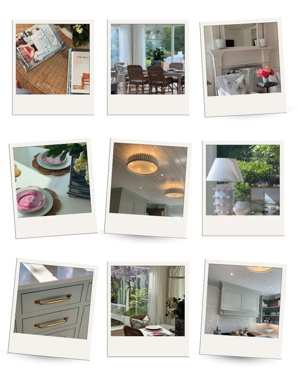
Here’s a little BTS from our latest site visit:

A collage of nine Polaroid-style snapshots showcasing light-filled interior moments: coastal coffee table books, rattan dining chairs, a styled mantel with florals, pink dessert plates on woven placemats, sculptural flush mount lighting, a white ceramic lamp by a window, brass hardware on pale blue cabinetry, garden views through French doors, and a serene kitchen with soft blue cabinets and white tile backsplash. The images reflect a breezy, curated California cottage aesthetic.


The Kitchen

Layered, Livable, and Light-Filled

3D-rendered design of a light and airy kitchen featuring pale blue cabinetry, marble countertops, and warm wood flooring. The space includes open shelving, a central island with a glass vase and greenery, and a window dressed with a café curtain. Brass-accented flush mount lighting and layered textures like a woven lamp and natural window shades add charm and softness to the clean, coastal-inspired layout.


A Soft, Thoughtful Palette

For the kitchen, we wanted to lean into something that felt timeless but still had personality. We chose Farrow & Ball’s Light Blue for the cabinets—a soft, dusty blue that she loves. It instantly warmed up the space and gave it a serene, collected look. Paired with natural wood accents and brass hardware, the palette feels quiet but far from boring.


Interior moodboard featuring soft blue cabinetry, open shelving with collected white dishware, vintage-inspired lighting, and a woven table lamp. The palette is serene and coastal with a hint of traditional charm. A playful white ceiling fixture adds whimsy, while warm styling details like wood accents and floral arrangements complete the cozy kitchen vignette.

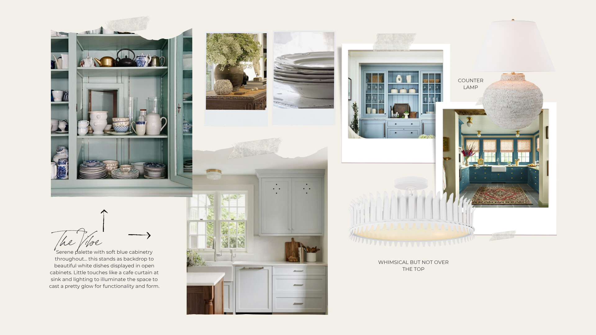
Why We Chose a Café Curtain

One of the first things we decided on was a café curtain at the kitchen window. Susie has a beautiful view here, so we didn’t want to block the light—but we also wanted a little softness and pattern to serve as a beautiful backdrop to her sink. We chose a fabric from Soane Britain which filters the light beautifully, adds a tailored detail, and introduces a subtle pattern and ties in beautifully with her pale blue cabinetry. It’s a small choice that adds a lot of charm and practicality.

Finishing Touches That Matter

To layer in warmth and detail, we added a few unexpected touches: a white rattan counter lamp, these light fixtures, and classic materials like this tile  that give the space its signature Susie feel. Everything was chosen with a mix of function and form in mind—creating a kitchen that works hard but still feels effortless.

This space really sets the tone for the rest of the home: soft, inviting, and full of subtle details that make it feel personal and lived-in.


The Pantry

A Jewel Box Moment

Susie wanted the pantry to feel like a little surprise—something charming and special tucked just off the kitchen. With a few thoughtful updates, we gave it a serious glow-up while keeping it totally functional. This space is going to be pattern drenched in one of my most favorite patterns by Pierre Frey… an iconic pattern that she loves as much as I do!


Close-up view of a built-in plate rack painted in soft blue, featuring an artful display of vintage white and blue transferware platters and dishes. Brass rails hold each shelf in place, adding a touch of elegance and shine. The curated collection creates a charming and timeless focal point within the pantry.


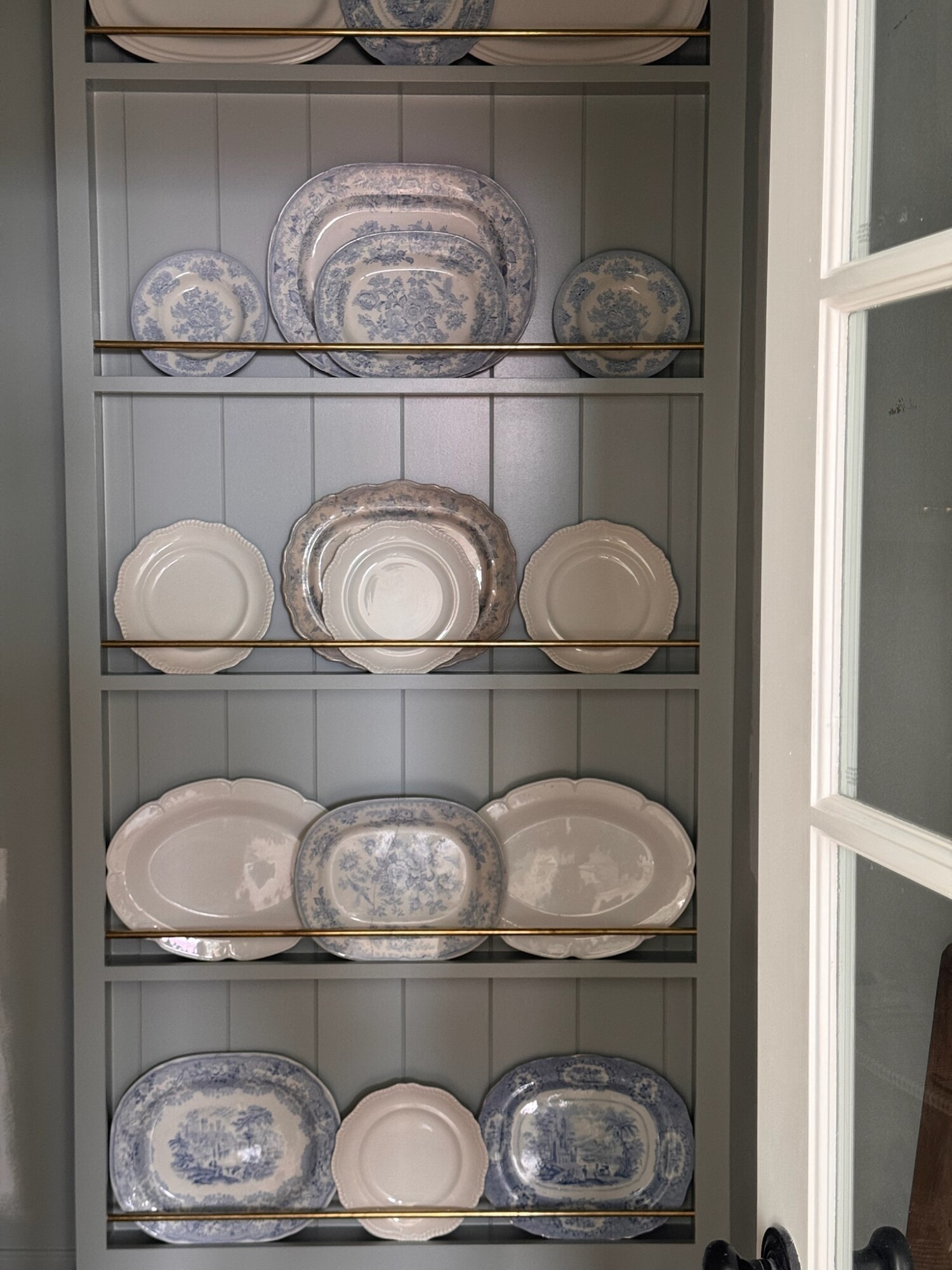
We added new upper cabinetry painted in the same soft blue as the kitchen, incorporating open shelving for cookbooks and beautiful everyday dishes. A custom plate rack on the far end creates the perfect spot to display Susie’s collection of vintage platters—pieces she’s gathered over time that deserve to be seen.

Toile de nantes intisse Toile de Nantes flamed or ikat of the 18th century. An emblematic and timeless pattern, here screen printed on a wide width non-woven backing, also available as a wallpaper roll and fabric.

A warm butcher block countertop brings in texture and warmth. We tied the space together with a café curtain in the same pattern as the Pierre Frey wallpaper. This added just the right dose of softness. For lighting, we used classic aged brass flush mounts overhead and added a picture light above the shelving for that cozy, ambient glow.

Now, when you walk past the pantry, it feels like you’re catching a glimpse of a hidden jewel box—sweet, styled, and full of personality. I can’t wait to capture some pictures next time we’re there!


The Breakfast Nook

Warm, Casual, and Connected to the Kitchen


3D-rendered view of a bright and airy breakfast nook featuring a white dining table surrounded by rattan and white bistro-style chairs. The space is framed with crisp white drapery panels and natural woven Roman shades, and finished with a white petal-shaped chandelier overhead. Light wood flooring and shiplap ceiling add to the coastal, casual charm.


Seamless Flow with Elevated Touches

Just off the kitchen, the breakfast nook is getting a refresh of its own. We wanted it to feel cohesive with the kitchen—like a space that still feels casual but can handle a lingering dinner or slow Sunday morning. The design leans into soft elegance: drapery panels from Restoration Hardware at the windows help frame the space and add instant height and softness.

New Furniture, Timeless Style

We swapped in a new dining table and rattan chairs that complement the kitchen’s natural textures but feel a little more tailored. The table brings in a casual touch with a powder coated finish while the chairs strike that perfect balance between comfort and texture.

Lighting That Sets the Mood

Overhead, we chose a new chandelier that feels somewhat feminine but playful. It adds a focal point above the table without overwhelming the room—helping to anchor the space and add a fun touch to this monochromatic palette of whites and cream.

This nook is all about connection: to the kitchen, to the morning light, and to the people who’ll gather there. It’s simple, elegant, and styled to make everyday meals feel just a little more special.


The Family Room

Comfort-First, Polished Second


3D-rendered view of a light and airy family room featuring white slipcovered sofas, a round rattan coffee table, patterned accent chairs, a low wood console with woven baskets, and a tall leafy plant. Navy and soft blue pillows add contrast, with a large mirror reflecting a pale blue kitchen in the background. The space is styled in a casual yet polished aesthetic with shiplap ceilings and soft coastal tones.

A Layout That Works for Real Life

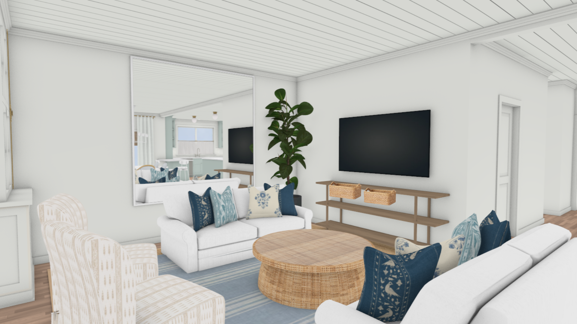
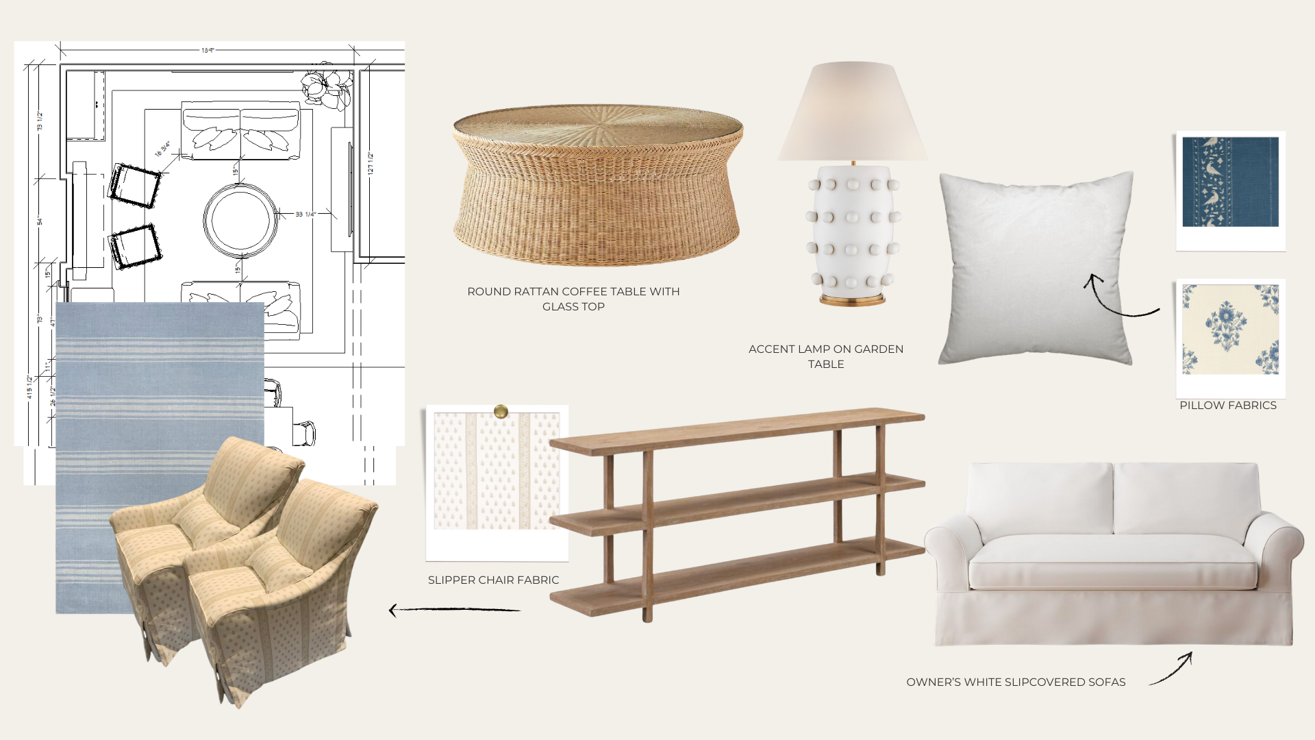
The family room is the heart of the downstairs—a place for relaxing, watching movies, and spending time together. We leaned into a layout that feels cozy and conversational: Susie owned two white slipcovered sofas that we worked into the new plan. We then added two custom chairs made out of the beautiful Schumacher fabric—adding a neutral pattern to this space was just what was needed to bring it all together. This round rattan coffee table, which helps soften the space, invites everyone to put their feet up. We sourced a new large seagrass rug to cover the floor and found this cutie to layer over the top. Susie loves blue and white, but wanted this room to just have pops of blue but overall a soothing neutral palette.


Family room design board featuring a floor plan and furniture layout. Includes a white slipcovered sofa, a round rattan coffee table with a glass top, blue striped rug, custom slipper chairs in patterned fabric, and a white accent lamp with raised detailing. Light wood console table and a mix of blue and cream floral pillow fabrics add softness and texture to the cozy, collected space.

Mixing Textures and Pattern

To make the room feel layered and lived-in, we incorporated a thoughtful mix of textiles and finishes. From the woven coffee table to the accent lamp, to the mix of blue and patterned pillows, every element was selected to create warmth, contrast, and a touch of personality. We also added a light wood console table under the TV for functional storage. It doesn’t feel heavy, and it’s the perfect place for baskets where you can stash away things that don’t need to be left out.


Wrapping It All Up

We’re just as excited as you are to see this all come to life! Hopefully next time, we’ll be sharing the finished look. This home is already beautiful, but these light, airy updates make it shine even more. From woven textures to soft palettes, everything was selected to bring in that relaxed California casual vibe that’s stylish, but totally livable.

Need a little more direction?

If you’re loving this look and want to bring something similar into your own home, we’ve got a design guide that walks you through it—complete with product sources and styling tips. It’s a great starting point if you’re looking to create this same feel, with or without a designer.

Promotional image for Clouz Houz Design Guides, featuring layered design boards and a close-up of a woman arranging a silver tray with accessories. Text overlay highlights the guides as a "15+ page complete design guide" for refining your home style.

Are you struggling to define your style or figure out how to pull your space together? That’s exactly why we created our Clouz Houz Design Guides. They’ll help you design a space that feels cohesive, elevated, and personal … without hiring a designer.

Click here to explore the five curated styles, complete with inspiration boards, designer tips, and product links that make sourcing simple. 


Not sure which one’s for you? Take our free quiz to discover which aesthetic best suits your space.

We’re here to help you move forward with confidence, and create a home that truly feels like yours.

P.S. Are you new to Clouz Houz? If you want to be in the know on all things home and lifestyle, subscribe now so you don’t miss a post. As a bonus, you’ll receive our exclusive 42-page ‘Paint Guide,’ which will help you select the perfect shades for your home. And, you’ll also receive our weekly newsletter, including special finds that are not on the blog — they’re only for subscribers. 🤍


1

The Kitchen

This kitchen sets the tone for the entire home with its calm, collected feel. It’s light-filled and functional, but still full of charm. From the soft color palette to the airy layout, every detail was chosen to feel effortless yet elevated—just the kind of space that makes you want to slow down and stay awhile.
Leslie 21″ Semi-Flush
Avedon Medium Table Lamp
2

The Pantry

Tucked just off the kitchen, the pantry feels like a hidden gem. It’s practical, yes—but also thoughtfully designed to feel special. With layered materials and a subtle sense of nostalgia, it brings personality to an everyday space in a way that feels warm and welcoming.
Siena Small Flush Mount
3

The Breakfast Nook

The breakfast nook brings an understated elegance to the corner of the kitchen, creating a soft moment to gather around. It’s casual but considered, and filled with natural light—perfect for slow mornings, quiet dinners, and everything in between.
Aqua Virgo Dining Table
Alberto Small Single Tier Chandelier
Allison Armchair
4

The Family Room

The family room was designed with comfort and connection in mind. It’s a space that invites conversation, lounging, and living—with a look that’s pulled together without ever trying too hard. Soft textures, open layout, and a quiet color story help this space feel both grounded and serene.
Salinas Rattan Coffee Table
Linden Table Lamp
Bergamot Striped Cotton Rug
Collector’s Oak Console, Limewash
Join the Conversation

get inspired
#clouzhouz
follow along
@clouz_houz
We’re sharing some BTS progress at the #SoSusieHeadquarters today—and trust me, this one is extra good. We just published a blog diving into all the juicy design details (linked in bio if you want the full scoop), but here’s a peek at how it’s all coming together! ✨
If you’re into that California casual style—think soft layered palettes, timeless furniture that’s still comfy, natural textures like rattan and linen, subtle pattern play, and a whole lot of lived-in charm—this is going to be your thing. It’s collected, not chaotic. Effortless, but intentional. Elevated, but never too precious.
If this sounds like your style, I’ve got something just for you 🤍 Comment ‘ME’ and I’ll send you everything you need to recreate this vibe—plus all the tools to help you get started today.
This might be controversial... but I’d choose this countertop over marble every time.
If you’re dreaming up a kitchen reno (or in the thick of one), don’t overlook this one detail-it can seriously change how you live in your space.
Let’s be honest: marble is gorgeous, but it can be high-maintenance. It scratches. It stains. It needs constant sealing and can be sensitive to acidic foods like lemon juice, etc. After years of using natural stone, we finally found something just as beautiful but more forgiving.
Meet Taj Mahal Quartzite.
It’s a natural stone that looks like marble-soft veining, creamy tones, timeless feel... but more durable.
Why we love it:
- Natural, elevated look
- Handles heat+ red wine spills
- Doesn’t stain easily
- No sealing every few months
- Durable enough for real life
And here’s our pro tip:
Go with a leathered finish. It gives a subtle texture that hides smudges, adds depth, and makes the stone feel more relaxed and lived-in (we’ve seen zero marks on ours). Think: the softness of a honed finish but more textured and full of character. 
We’ve used quartzite in so many client projects, and it continues to be the best of both worlds—beautiful and functional. It’s the countertop l’d recommend again and again.
Save this post for your kitchen reno-or send it to someone who needs this advice! You won’t regret going with quartzite.
I love the vibe of these clips... just like an old home video with loved ones... and that’s just what this little team of ours feels like. Family.❤️
A little Clouz Houz work retreat to Chicago-just me, my biological daughter, and my work daughter!😄
We planned the trip to be part business, part play... and ended up with so much more than we expected.
We made it all over the city-browsing showrooms, touching fabrics, pulling samples, walking through vintage shops that felt like treasure hunts. We geeked out over lighting displays, layered materials, and moody paint colors (as designers do), and in between all the design inspo, we laughed over wine, soaked in the skyline along the lake, and shared meals that turned into memories.
Chicago just hits different when you see it through a design lens-the textures, the architecture, even the way restaurant lighting sets a mood. I left with my creative tank totally full and my heart even fuller.
And yes, we documented it all. If you’re a fellow design lover (or just planning your own trip), we shared our full itinerary + recommendations in our ‘A Design Lovers Guide to Chicago’ blog post-live on our website.
Grateful for my team, this work, and this life that lets me chase what I love.