Unlocking the Charm of Limewashed Walls: Our Tumalo Project Journey
I’ve been fascinated with limewashed walls for quite a while, always envisioning that quaint charm reminiscent of old European chateaux. Limewashing your walls creates magic, blending lime, water, and pigment to create a textured, weathered finish. But, truth be told, I’d never taken the lime plunge until our recent Tumalo renovation.
Learning Curve Alert! If Limewashing Intrigues You, Read On …
Buckle up for an insider’s scoop as we spill all our lime painting secrets. Because let’s face it, who wants to deal with mistakes when you can learn from ours? We’re here to help!
Convincing Derrick, My Paint-Averse Partner
Confession time: Derrick loathes painting. I promised him this would be different, and even vowed to be his painting sidekick. The journey began with a deep dive into lime paint brands, and we found our holy grail in Color Atelier Paints. Not sponsored, just genuine love for their products. Their website became our lime paint bible, and their FAQ page answered all our burning questions. Plus, their customer service is top-notch!
From Brand Exploration to Lime Perfection: The Step-by-Step Guide
Curious about our limewashing experience? We’re laying it all out – the victories, the hiccups, and the laughter (because, yes, there were many laughs). Stay tuned as we guide you through the process, sharing the steps we took and the obstacles we faced. Let’s make your limewashing journey smoother than ours ?
Step 1: Start with a Clean/Primed Surface
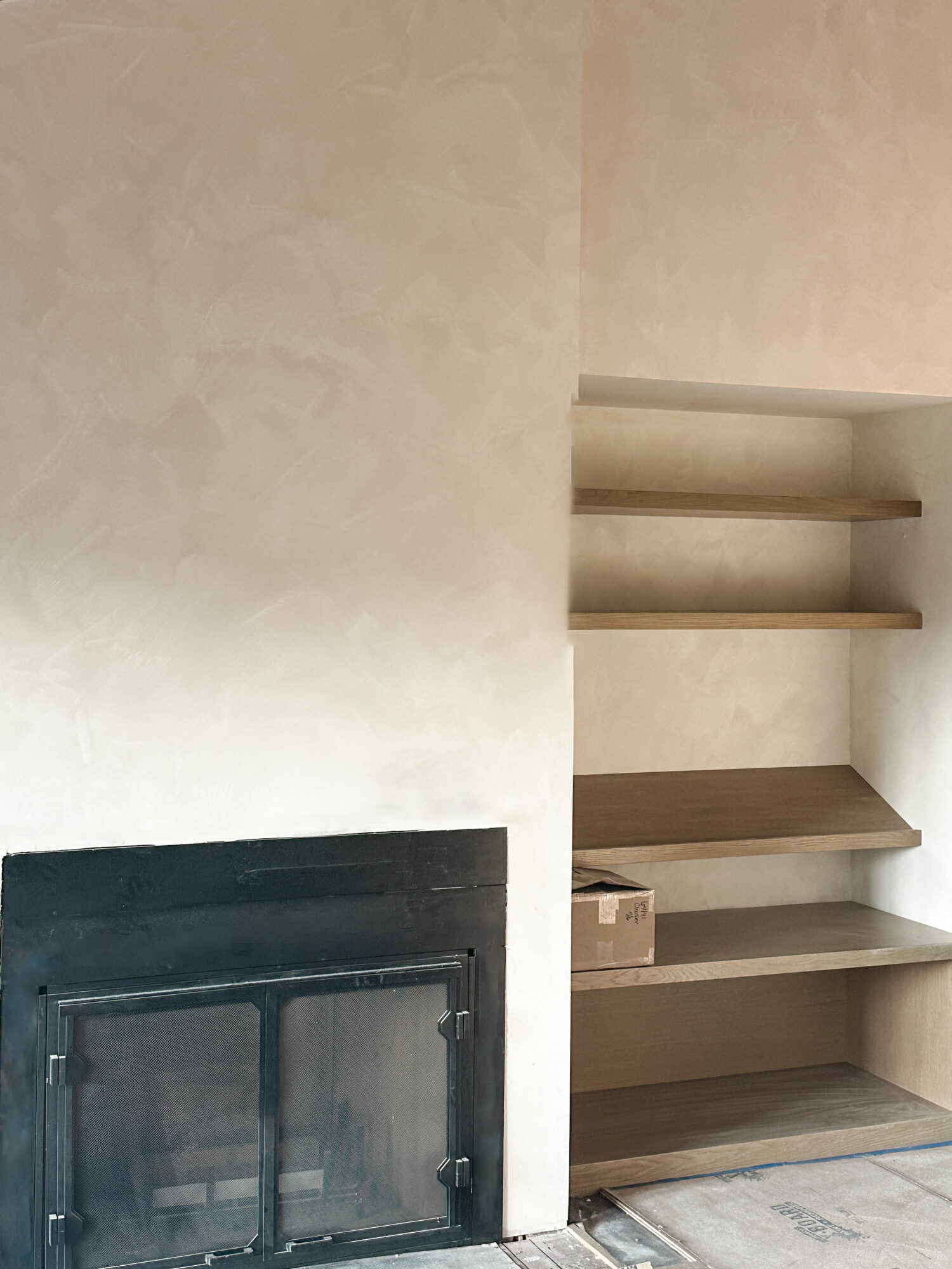
Before we began on this journey, we knew a flawless foundation was key. Starting fresh with sheetrock, the primer debate was real. Some said skip it, but with Color Atelier, we opted for their primer – a precautionary investment to ensure worry-free results. By the way, our sheetrock boasts a sleek level 4 finish (smooth as can be, but level 5 is supreme), yet Color Atelier assures their paints also play well with plaster, brick, and textured walls. And, Derrick swears by these Home Depot paint rollers that efficiently hold paint in the handle for easy application.
Cue Derrick, our paint-reluctant hero, who rolled on a single coat of primer. We let it dry overnight, setting the stage for the limewashing to begin its course …
Step 2: Brush on the Magic — The First Coat of Limewash
Now brace yourselves, because no matter the color you pick, it’s a double-coat dance with limewash. The color game affects the final look, so here’s where the fun begins.
We dived into color exploration with Color Atelier’s actual paper samples (yes, they send them!). After eyeing them up close, we bought sample pots for our chosen hues. Pro tip: Samples won’t show you the full look of the two-coat effect, so keep that in mind.
Color Atelier’s gallery became our muse for inspiration. Some swear by one color in different strengths (for instance, first coat at 100% and the second coat at 50%, meaning they mix their paint with 50% less pigment). Others (like us) opt for a darker first coat and a lighter top coat.
![]() Clouz Houz tip: For a vibrant mottling effect, consider mixing it up. We wanted to go for a more dramatic effect (hence the two colors) to really show the lighter coat on top.
Clouz Houz tip: For a vibrant mottling effect, consider mixing it up. We wanted to go for a more dramatic effect (hence the two colors) to really show the lighter coat on top.
After MUCH trial and error (more than I would like to admit), we decided on the colors Wabi and Bone.
Here’s what you need to know … and we definitely recommend watching a few YouTube videos to better understand the technique we’re about to explain!
We bought Color Atelier brushes (the 6” champs). Here’s where the technique comes into play: the secret is staying consistent with triangular, arching brush strokes. Make sure to work in one direction, or if you are working in pairs, start at opposite ends and work your way towards the middle. Just a heads up, the first coat is the messy one. Trust the process and keep your cool, maintain your pattern, and ensure coverage. Working in small sections, keep that edge wet to dodge awkward dry patches. Don’t stress; this paint forgives!
Let the first coat dry for at least an hour or two before going in with that second coat.
Step 3: Encore – Second Coat of Limewash
This is where we started to mess up, so pay attention!
As you brush on the second coat, the color shift might play hide-and-seek (it dries lighter FYI). Here’s where our misstep happened. The even, careful pattern we aced on the first coat? Well, it took a back seat. Lines and brush strokes started popping out, and the soft wash effect we were aiming for was nonexistent.
However, it’s a very straightforward fix as the goal is for it to be perfectly imperfect. Simply touch up the problematic areas, or if the whole wall is giving you grief, restart the process. Yes, back to the first coat color, then the second coat.
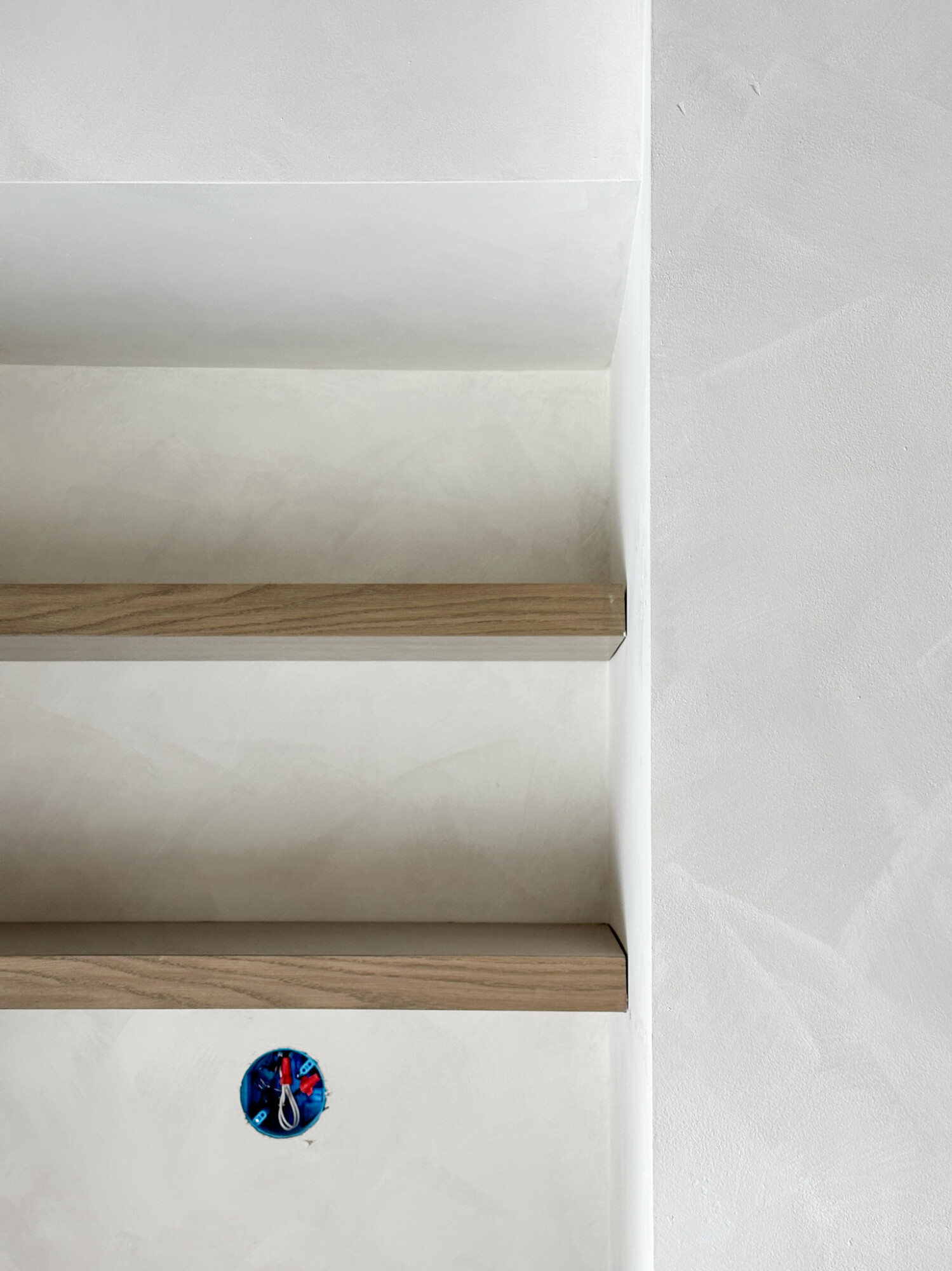
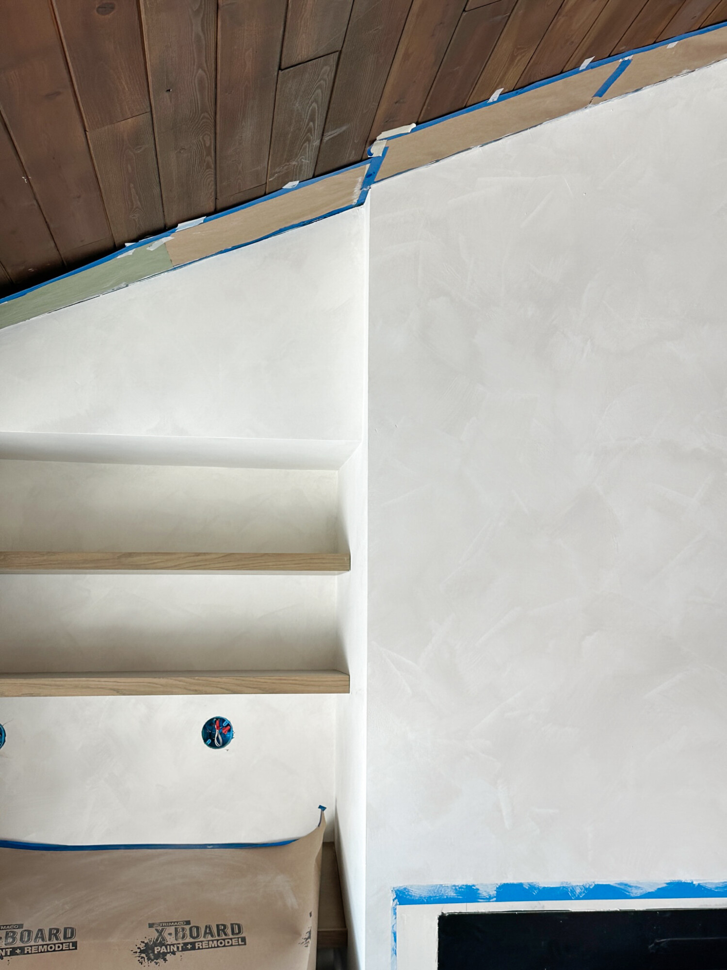
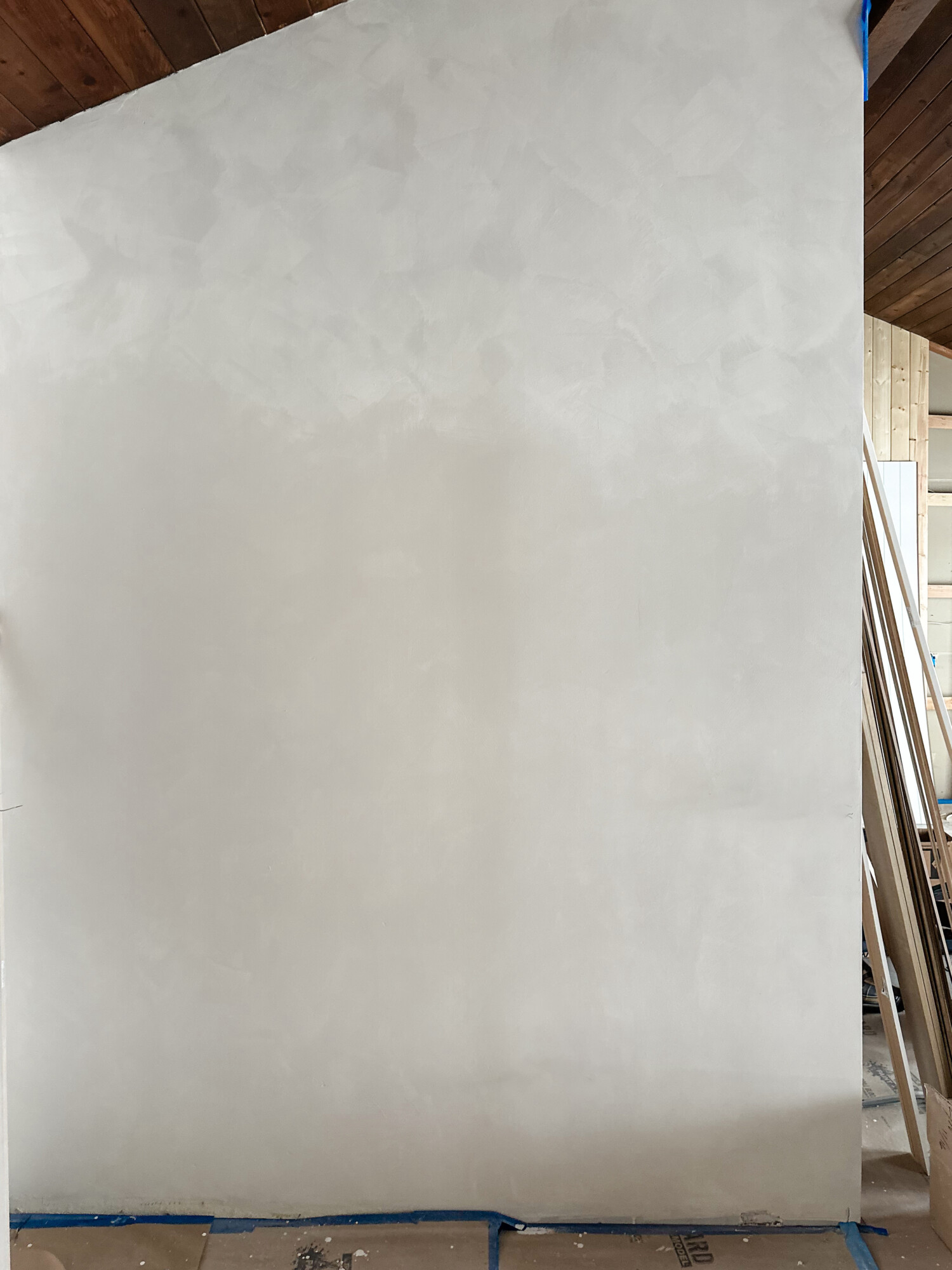
Check out this wall – half with the initial coat and half with a messy double coat. See the stark contrast? We learned the hard way that subtlety triumphs over definite brush strokes. Our preference is a gentle pattern and texture, not a messy triumph!
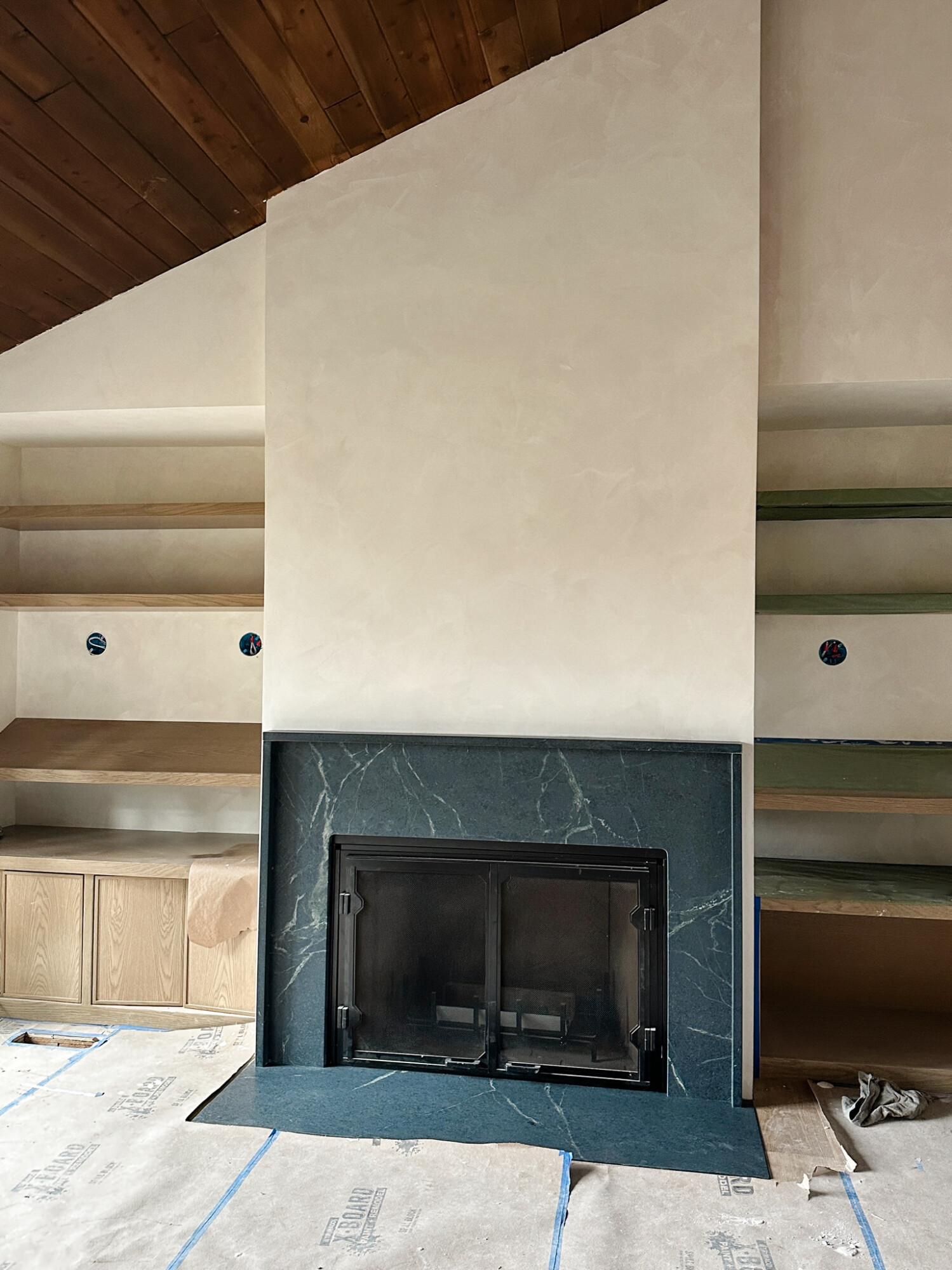
Step 4: Sit Back and Enjoy Your Masterpiece
We are over the moon with how ours turned out (after a few touch-ups in the living room). Wabi and Bone stole the show! Wabi, with its rich depth and warm undertones, brought a touch of brown to the white palette, creating a cozy vibe. Meanwhile, Bone, a creamy dream, added a yummy contrast.
We wholeheartedly recommend this product if you’re aiming for walls that exude more personality than a standard paint job. Our room transformed into a haven of character. Now, while we’re smitten, Derrick is relieved that the limewash isn’t taking over every nook and cranny (at least not yet!) of the house. Who knows, maybe other rooms will catch the lime bug (it can be used over regular paint).
***
If you take the plunge into limewashing, share your experience with us! We’re all ears and can’t wait to hear about your limewash journey. Cheers to newfound, vibrant walls!

