Now THIS is something that I feel like isn’t talked about enough, and is considered a low priority during the designing phase. Grout is so important — it can transform any tile look! It’s all about the vibe you’re going for and deciding between a neutral option or the contrasting option that gives a standout feel. I know this all comes down to personal preference, but I wanted to share my process for picking out grout and what I did at the Tumalo project.
It can be hard to look at a grout palette with its tiny little samples and try to envision the larger picture in an entire room. So, I always suggest looking at inspo images on Pinterest to get a sense of what you like best. This helps you visualize how different grout colors work with various tiles and in different settings.
Considering the Other Materials
In addition to looking at inspiration images, it’s important to think about the other materials in the space. To explain this, let’s think hypothetically. Imagine your shower walls are a white porcelain tile and your floors are a gray slate; there are a couple of ways you could go about grouting both your walls and the floor.
If You Want To Highlight the Shower
If you want the shower to be more of the “star” of the room, I’d recommend going bolder with a contrasting grout (like shown below with the white grout against the green tiles). I’d suggest a light or even charcoal gray for contrast against your white tiles. This gives visual interest with the pattern of the tiles. By doing this, you will have more “busyness” on your walls, so try contrasting with a simpler, or “quieter” floor where you match your grout to the slate color of your tiles (like they did here with the white tile floor and white grout). 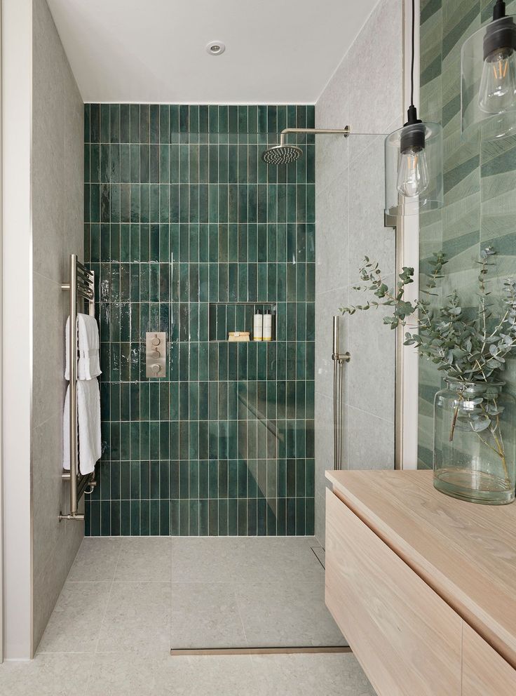
Source: Fivesextillion
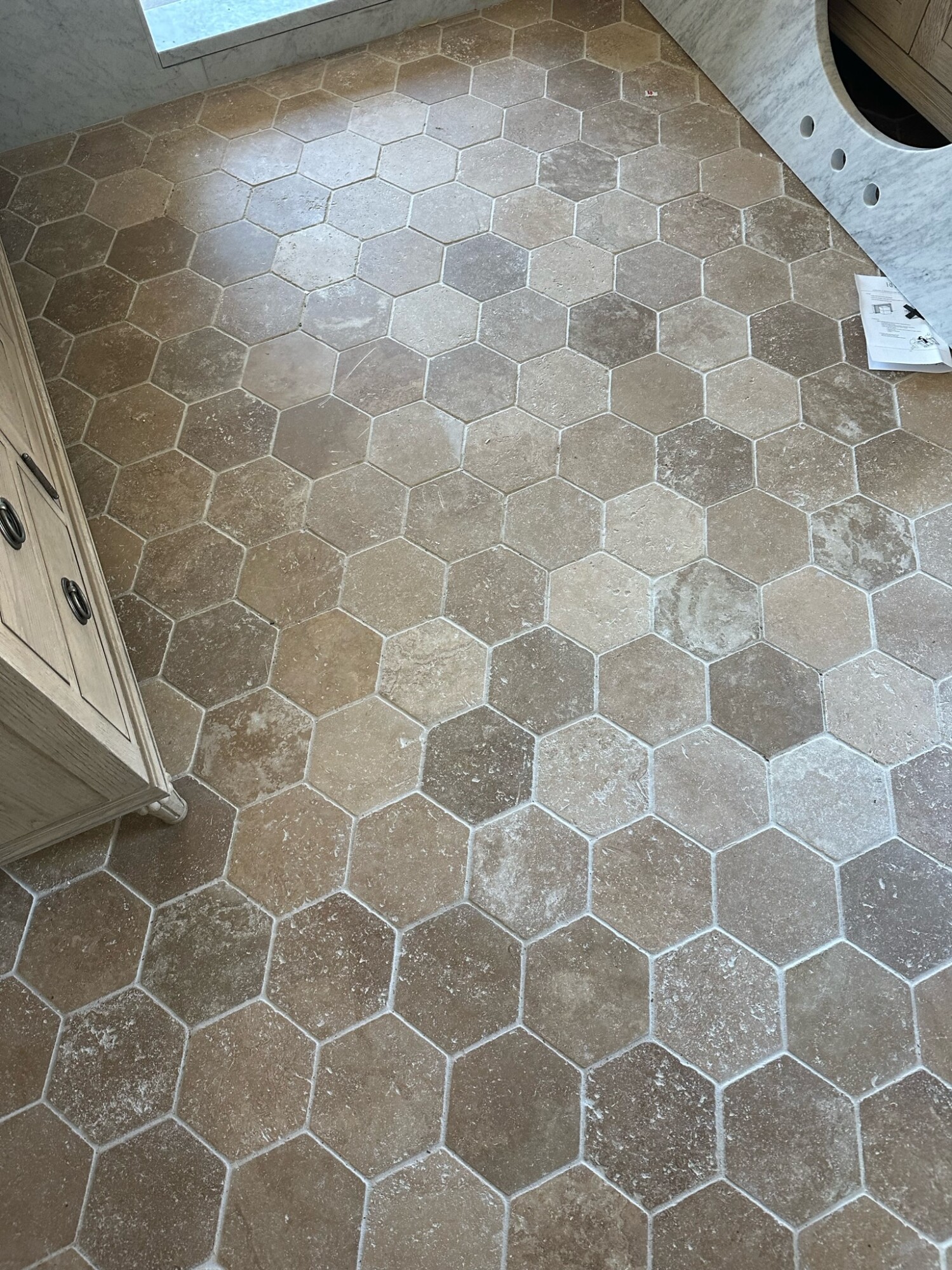
If You Want to Showcase the Floors
Now, if you have laid your floors in a pattern that you want to show off, then I recommend doing the reverse. Use a lighter grout to contrast with your gray slate tiles (like seen below with our white grout against the terracotta hue Clé tiles in our primary bathroom). Then, use a white grout to match the tiles in the shower to keep it secondary to your floors. I hope you understand what I mean … it’s all about choosing what you want to show off in your space and then make your grout selections.
Grout Choices at the Tumalo Project
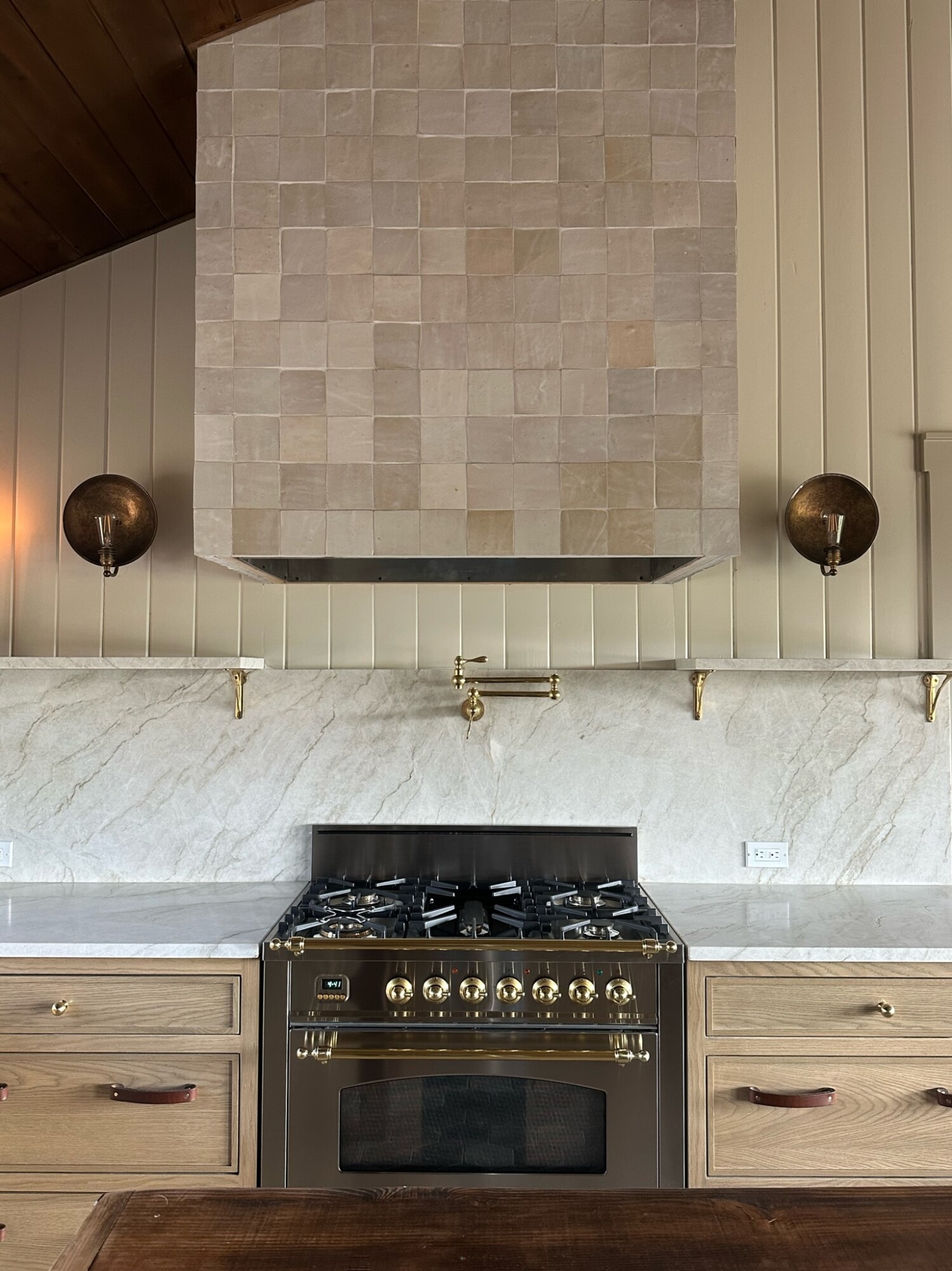
The Kitchen
With all the Zellige tiles we have been seeing, the colors and handmade nature of these tiles are beautiful on their own! For instance, in the kitchen, we chose a tonal grout for the hood where we used these Riad Tiles. We matched that color to the tiles so it blends seamlessly and allows the tile to really shine. This choice highlights the natural beauty of the Zellige tiles without any distractions, creating a cohesive and elegant look.
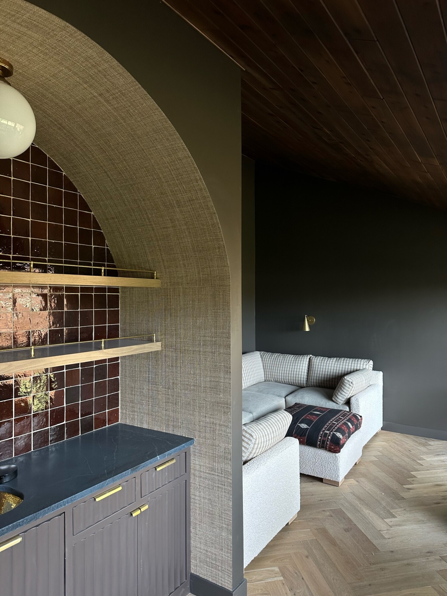
The Rumpus Room Bar
In the Rumpus Room bar, we wanted something different from the kitchen hood. We chose a lighter grout to show the pattern and contrast against the pretty deep red of the Clé tiles. This choice emphasizes the unique pattern and rich color of the tiles, making the bar area a standout feature of the home. Both the kitchen and the bar showcase how grout can either blend in to let the tile shine, or stand out to highlight its pattern.
Grout may seem like a small detail, but it plays a significant role in the overall look and feel of your space. By carefully selecting your the color, you can enhance the beauty of your tiles and create the perfect ambiance in any room. So next time you’re planning a renovation, give grout the attention it deserves and watch how it transforms your space!


