Why Santa Barbara Has Me in a Chokehold
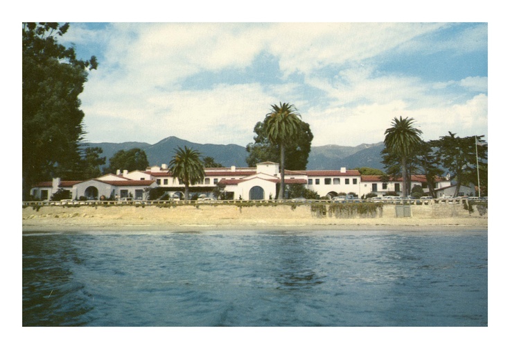
Santa Barbara is one of those coastal towns I could totally see myself retiring in. It’s dreamy, charming, and full of that relaxed elegance that just feels so timeless. Designing a Spanish-influenced home here would be a dream. Until then, this post is my version of manifesting it. ✨
If you’re new here—hi! Every month, we choose a new location to inspire our moodboards and space-by-space styling ideas. It’s part creative practice, part design daydream. This special locale is full of inspiration you can pull from, no matter where you live. You don’t have to be in California to get the feel of a Santa Barbara hacienda. You just have to be intentional about the pieces you bring in.
We always include curated items to help you shop the look, but we also talk through key elements—like reclaimed wood beams, terracotta tile, and wrought iron details—that make this style feel authentic. So, think of this as a spark for your own creativity. If you love this aesthetic, use it to shape your own home in whatever way makes sense for you.
And, if you’re not sure if this look is you or just a passing crush, I highly recommend taking our free design quiz. It’s a quick way to discover your signature style before impulse-buying something you’ll regret. If your results say California Casual or Old World Elegance, you’re probably in the right place!
Honestly, this post reads a lot like what you’ll find in our complimentary Design Guides. We set the tone with mood and materials, then walk you through the actual products—from finishes and fixtures to furniture and décor. It’s our way of helping you get the look and the feel of a home you love—with more clarity and less guesswork.
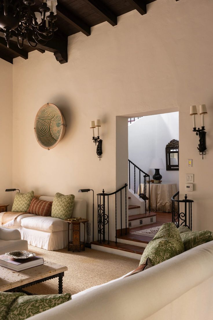
What Makes a Santa Barbara Hacienda
This style is equal parts rustic and refined. It celebrates old-world craftsmanship but with a modern edit. You’ll find:
- Plaster walls in soft white or warm taupe (we love limewash for this)
- Terracotta and saltillo tile, often laid in creative patterns
- Wood beams and iron details that give the space soul
- Rounded edges and arches for that relaxed, lived-in elegance
- Wrought iron lighting, clay pots, vintage artwork, and layered textures
There’s a subtle romance in these homes. They feel rooted in history but never stuffy.
If You Like This, You’ll Love…
- The mix of Mediterranean and California design
- Traditional materials used in a fresh, clean way
- Homes that feel both minimal and meaningful
- A balance of cozy textures and open airiness
You might already be leaning toward this look and not even realize it. Do you pin a lot of archways, vintage rugs, breezy curtains, and linen sofas? Yep, this one’s for you.
Bringing the Look to Life: Tips for Your Own Home
You don’t need to live in California—or have a Spanish-style home—to tap into this feel. Here’s how to channel the look:
1. Start with Texture
Even in a neutral palette, texture is everything. Think plaster walls, natural stone, woven baskets, hand-formed ceramics. These elements ground the space and give it that casual, lived-in charm.
2. Layer in Wood + Iron
Aged wood adds warmth, especially when paired with blackened or patinaed iron. Use it on furniture, light fixtures, and accent details like curtain rods or drawer pulls.
3. Keep It Collected
Nothing should feel too matchy-matchy. Pull from different eras, cultures, and finishes. A vintage sideboard with a modern sofa. A sleek lamp on a rustic table. This is where it starts to feel personal.
4. Let the Architecture Shine
If you’ve got arches or niches, highlight them! If not, fake the feel with curved furniture, organic shapes, and softer lines.
5. Play with Earth Tones
We love creamy whites, olive green, dusty rose, rust, and mocha browns. It’s all about warmth. Avoid stark black-and-white—it’s more about softness and sun-washed shades.
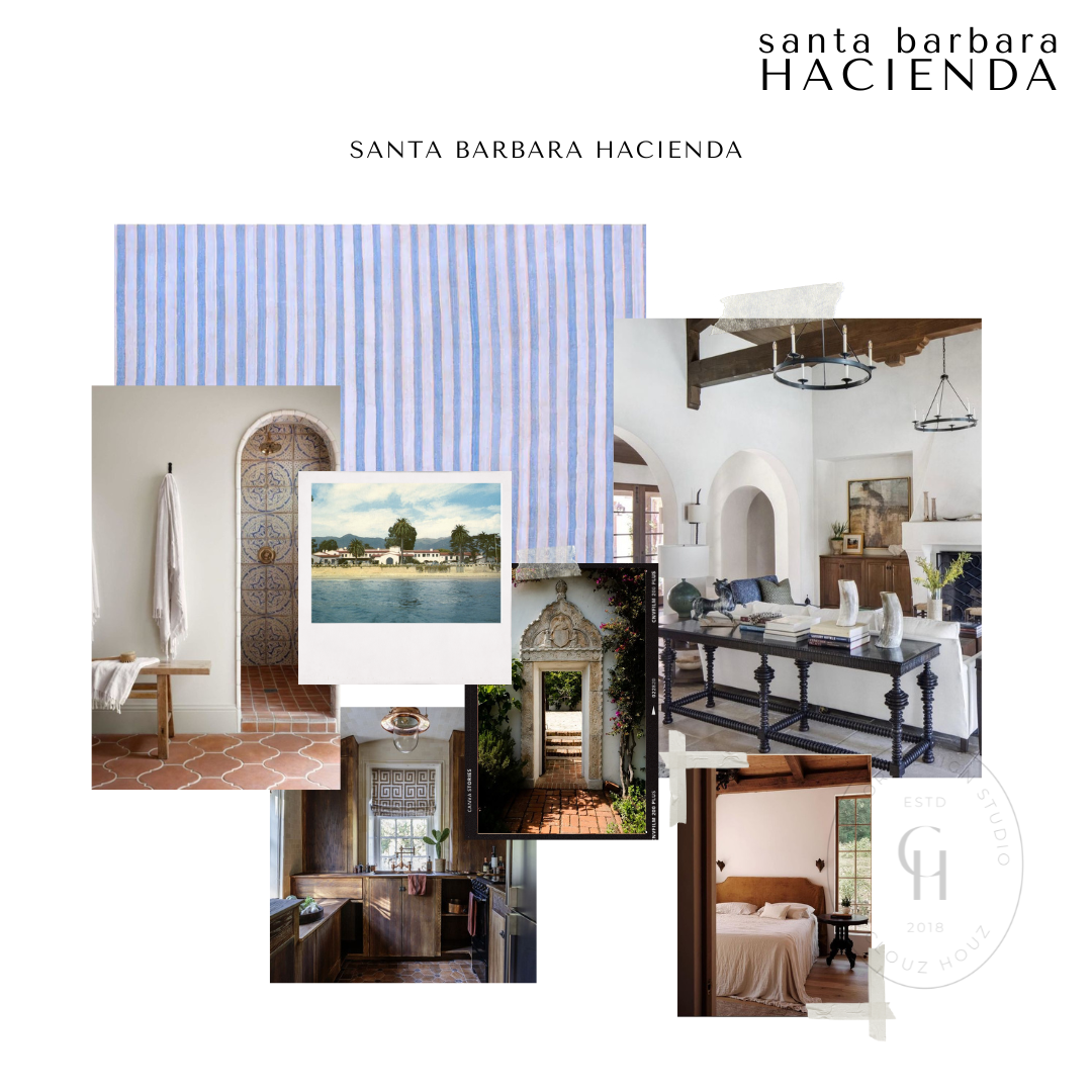
Shop the Room Boards
We pulled together a few mood boards to help you build this look at home. Whether you’re starting fresh or just want to layer in a few new elements, these pieces will help you get the vibe without second-guessing your style.
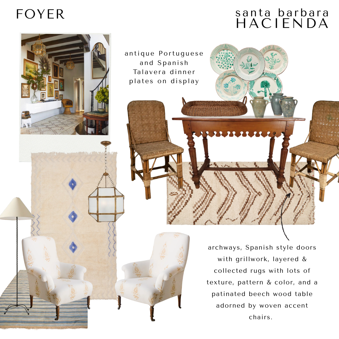
The Entry: Where It All Begins
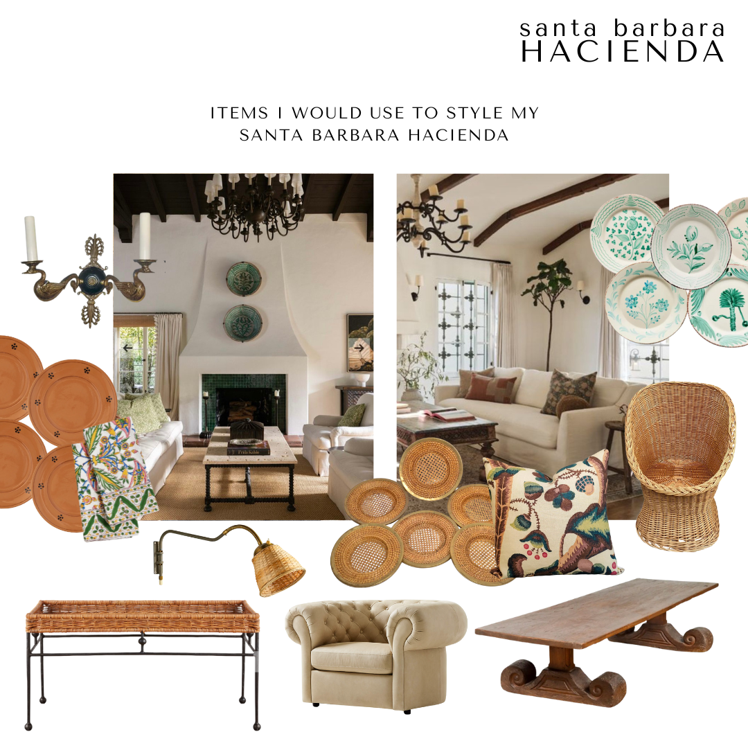
Your entry should feel like a little preview of what’s to come. It doesn’t need to be overdone, just thoughtful. In this space, I pictured a few friends coming over, dropping their hats or tote bags, maybe someone setting a wine bottle down on the table while chatting. The layered rugs bring in texture and color without being loud. And, I couldn’t stop thinking about how charming vintage dinner plates would be on the wall—they add that old-world charm without trying too hard. You could totally recreate this moment with a rustic console table, a few woven chairs, and some collected pieces (even thrifted finds!) to make it feel personal.
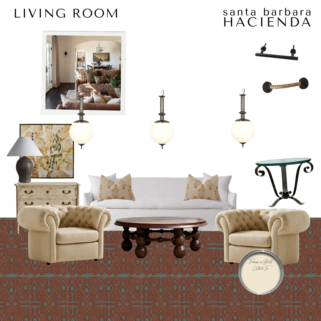
The Living Room: Comfy but Put Together
This one feels like the kind of room where you’d hang out all afternoon—feet up, music on, maybe a stack of books you’ve been meaning to get to. I kept the tones soft and warm, but added enough contrast with the floor tile and chunky furniture to make it feel grounded. The pendant lights give it a little drama, but everything still feels approachable. You could lean into this look with neutral seating, something vintage or antique for a coffee table, and a mix of patterns that still feel calm. It’s giving cozy, but elevated.
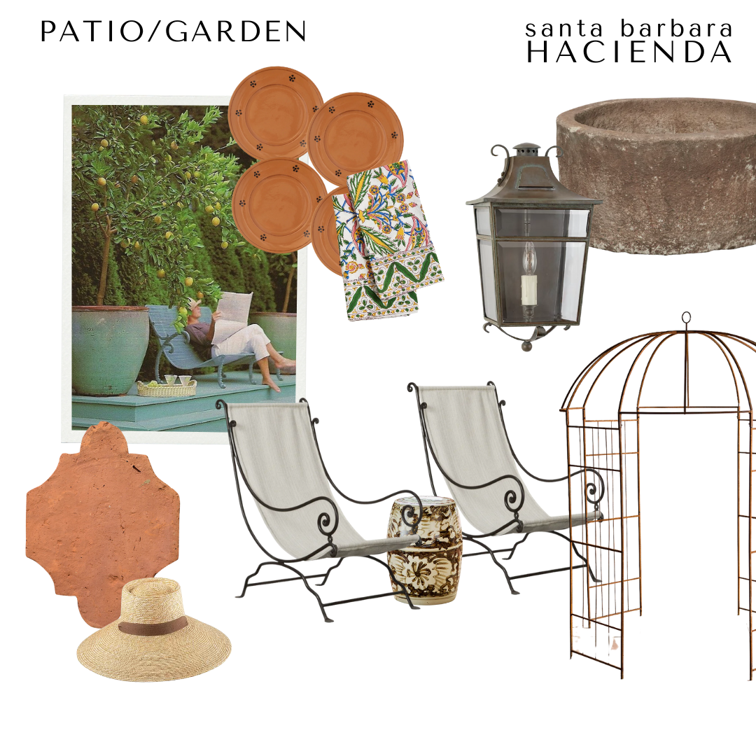
The Patio: Basically My Summer Mood Board
This patio was built for slow mornings and golden hour. Imagine sipping something cold under the lemon trees, or flipping through a book in one of those sling chairs (which are surprisingly comfy, by the way). The terracotta touches and wrought iron feel so “Santa Barbara” — relaxed but full of texture. You could layer this look with a few oversized planters, some market-finds like pottery or textiles, and a vintage lantern if you can find one. The goal isn’t perfection, it’s just creating a space that makes you want to linger.
Need a little more direction?
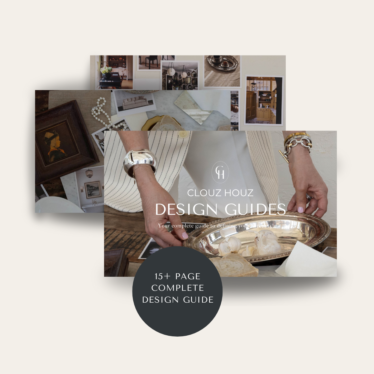
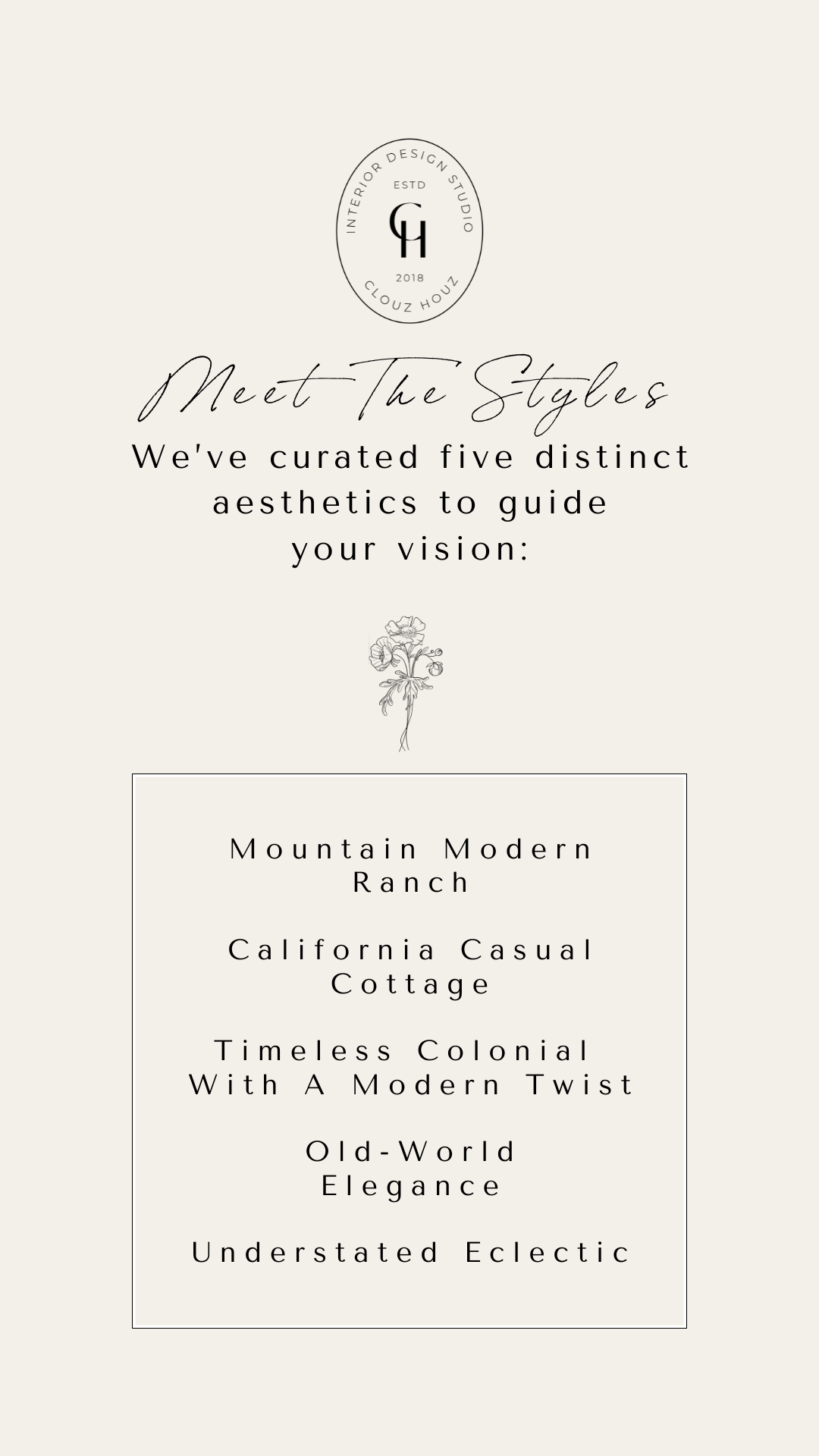
Are you struggling to define your style or figure out how to pull your space together? That’s exactly why we created our Clouz Houz Design Guides. They’ll help you design a space that feels cohesive, elevated, and personal … without hiring a designer.
Click here to explore the five curated styles, complete with inspiration boards, designer tips, and product links that make sourcing simple.
Not sure which one’s for you? Take our free quiz to discover which aesthetic best suits your space.
We’re here to help you move forward with confidence, and create a home that truly feels like yours.
P.S. Are you new to Clouz Houz? Do you want to be in the know on all things home, design and lifestyle? Subscribe now so you don’t miss a post! As a bonus, you’ll receive our exclusive 42-page ‘Paint Guide,’ which will help you select the perfect shades for your home. And, you’ll also receive our weekly newsletter, including special finds that are not on the blog — they’re only for subscribers. 🤍
Life is short. Make it beautiful!

