Do you like all the walls to match, or do you prefer mixing up your favorite colors? Picking paint colors can be confusing, and a little stressful. But, having a color palette on hand is like having a guide — it helps you get started, and keeps everything looking good together.
Now, here’s the deal: I don’t usually recommend painting every room the same color. Instead, I like to think about how colors can flow smoothly from one room to the next, making your home feel connected but still interesting. Each room gets its own special touch; but together, the colors make a happy, cohesive home. So, next time you’re thinking about painting, consider how the colors will complement each other in the entire space. With a little planning, your home will feel just right!
Understanding Color Theory
Color theory is all about finding colors that work together to create a pleasing visual harmony. It’s not just about picking your favorite shades — it’s about understanding how colors interact, mix, and contrast with each other. Lighter colors can evoke feelings of calmness and spaciousness, while darker hues can bring depth and intensity to a room. Paint has the power to transform the atmosphere of a space, which is why I believe in the importance of mixing and matching colors throughout your home.
In my experience, walls that are all the same color can feel a bit monotonous and lacking in personality. That’s why I like to introduce a variety of options, while still maintaining a sense of cohesion. However, using too many colors can quickly become overwhelming. So, the key is to find the right balance.
Here’s my step-by-step approach to creating a paint palette for an entire home
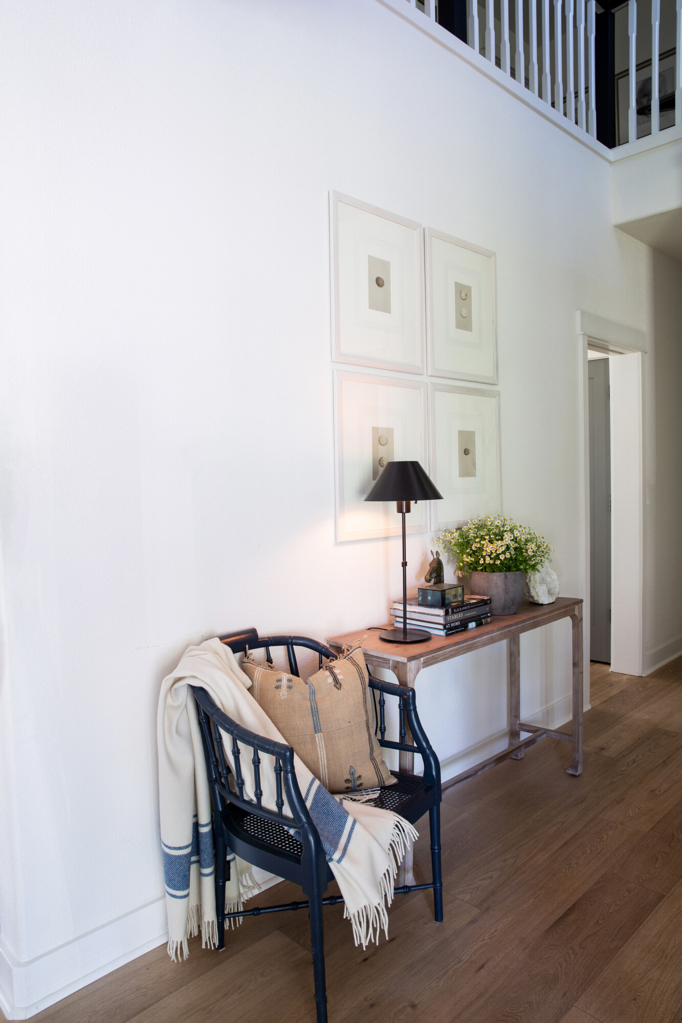
First, start with a dominant color that will be used in the majority of spaces throughout your home. This sets the tone, and provides a sense of continuity in transitional spaces such as your entryway and hallways, etc. It’s typically a neutral that complements all the other colors in your palette. Next, incorporate a secondary color. This is often your trim color, or one that is used on cabinetry in at least 2-3 areas of your home. Third, incorporate accent colors (the most powerful colors of the palette IMO) into secondary areas (like bedrooms, bathrooms, offices) to add depth and interest. It’s all about finding that perfect balance between consistency and variety to create a space that feels cohesive and inviting.
Dominant Colors
The dominant color in your home’s paint palette plays a crucial role in setting the tone and mood for each space. This color serves as the anchor, providing a cohesive thread that ties the entire home together. Typically, the dominant color is a neutral shade that can easily transition from room to room, acting as a backdrop for the secondary and accent colors to shine.
By selecting a versatile neutral as the dominant color, you establish a consistent ambiance throughout your home while allowing for flexibility in incorporating different accent hues in each space.
Secondary Colors
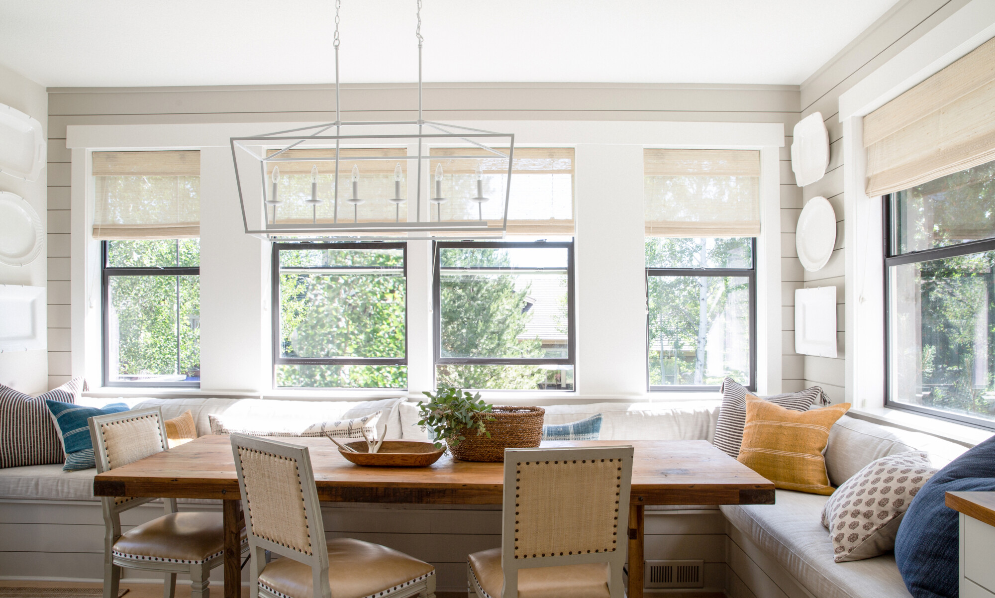
The main role of secondary colors is to complement and enhance the dominant color. This color should provide support without overpowering the overall feel of the space. For example, in the Tumalo project, I opted for Farrow & Ball’s ‘Shadow White’ as a neutral wall color for my dominant color. My secondary color was Farrow & Ball ‘Drop Cloth’ for the trim. These two colors together create a balance that is cohesive from room to room. They serve as the bridge between the accent colors in individual rooms such as bedrooms, bathrooms and the Rumpus Room. This allows for a seamless transition, while adding depth and visual interest.
Experimenting with different shades, such as using a lighter neutral on the walls paired with a darker neutral on the trim, can create a complementary look in transitional spaces like the entryway and hallways . Additionally, secondary colors can be introduced through elements like ceilings and cabinetry, further enriching the palette and adding dimension to the overall design scheme.
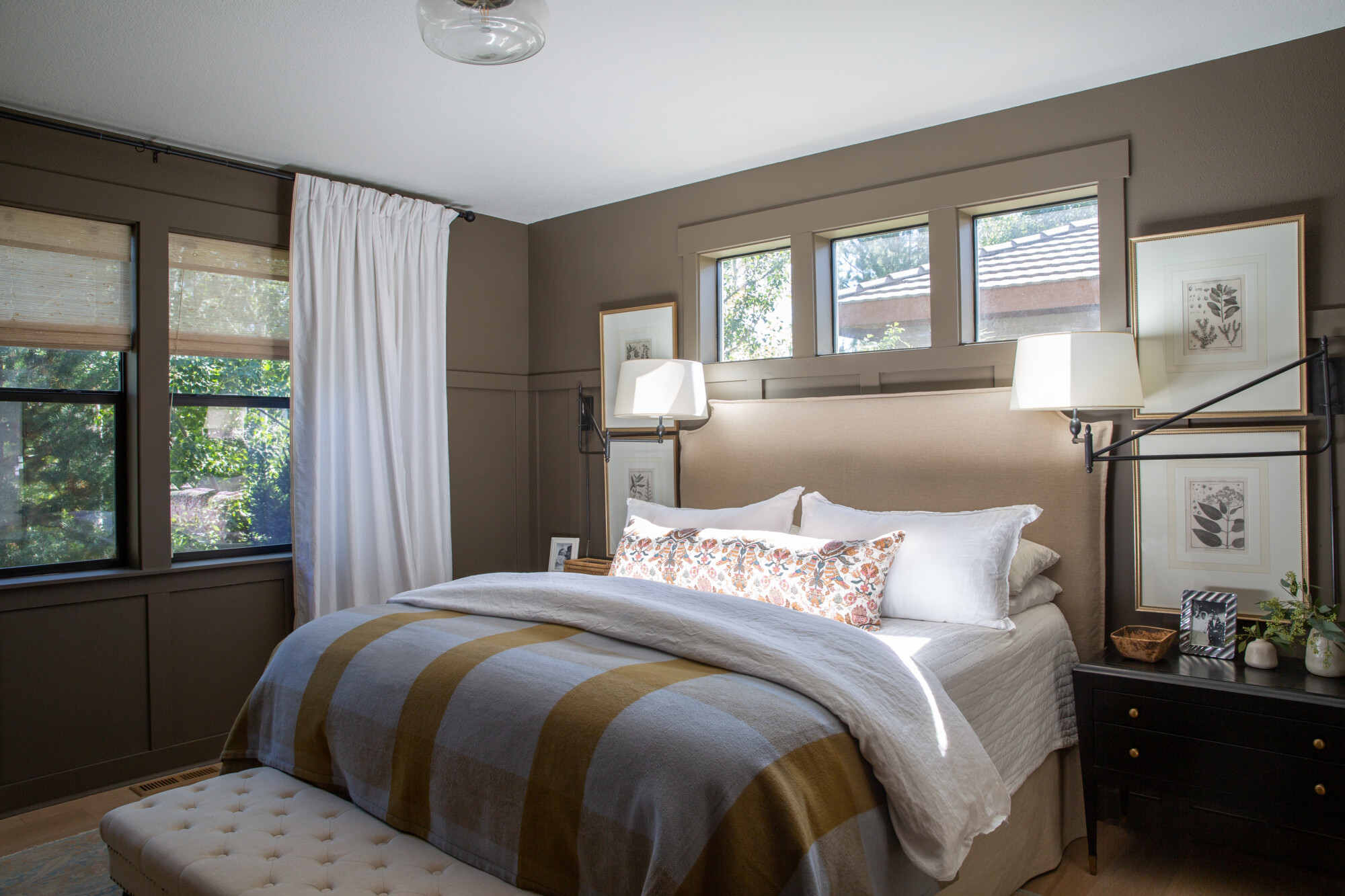
Accent Colors
When it comes to accent colors in your home’s paint palette, the sky’s the limit! These colors are all about adding personality and flair to your space, so feel free to get creative. Whether it’s a vibrant plum or a calming blue, choose colors that speak to you and evoke the feeling you want in each room. The key here, though, is to stick to a consistent tone for all accent colors — whether it’s warm or cool undertones — across different rooms. This is key for creating the most cohesive flow throughout your home.
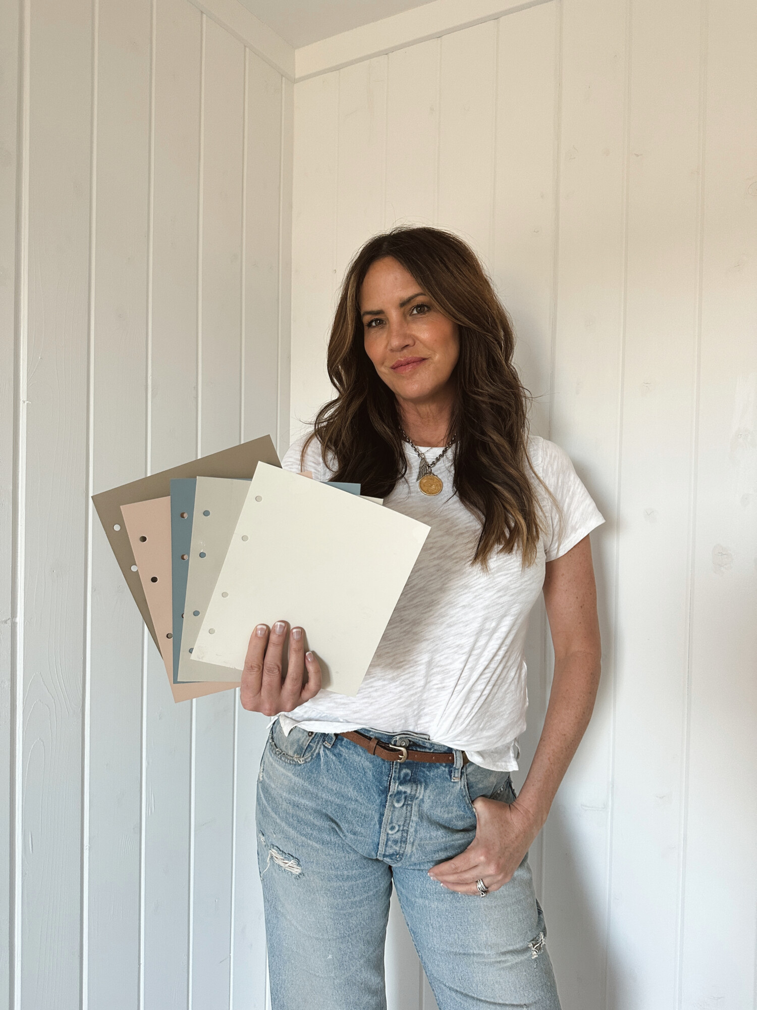
![]() Clouz Houz tip: Don’t rush your decision on accent colors. Instead, test them out in the actual space where they’ll be used. Grab some drawdowns (paint stores will take the paint you have chosen and paint on heavy ply paper so you can see sheen/color without having to paint onto walls) and place them in the rooms to see how lighting affects them. Trust me, what looks good under fluorescent lights might not translate to your home’s natural light. Taking the time to see how colors interact in your space will help you make confident decisions and avoid last-minute doubts.
Clouz Houz tip: Don’t rush your decision on accent colors. Instead, test them out in the actual space where they’ll be used. Grab some drawdowns (paint stores will take the paint you have chosen and paint on heavy ply paper so you can see sheen/color without having to paint onto walls) and place them in the rooms to see how lighting affects them. Trust me, what looks good under fluorescent lights might not translate to your home’s natural light. Taking the time to see how colors interact in your space will help you make confident decisions and avoid last-minute doubts.
Color Palette Tips
Remember that your home’s color palette should reflect your personal style and preferences. There’s no need to conform to design trends if they don’t resonate with you. Let your excitement guide you, and choose colors that make you happy. Consider the overall vibe you want each space to evoke, whether it’s calming and soothing or playful and bold. Once you’ve identified your favorite colors and the feelings they inspire, lay them out together and observe how they interact. If something feels off, don’t hesitate to tweak the color and experiment with different shades in the same color family.
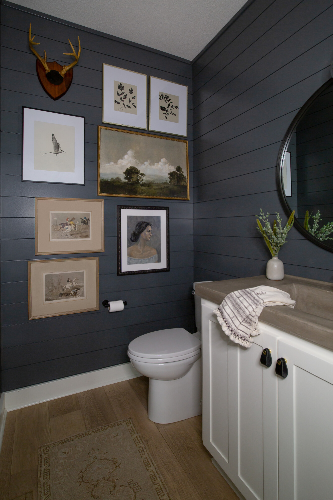
Keep in mind that opposites can often complement each other, so don’t be afraid to use the color wheel as a reference. For instance, creating balance can sometimes mean just choosing colors that are opposing on the color wheel. For instance, if you choose a deep blue for your powder room, then offset the intensity with a muddy, mustard yellow adjoining the space — maybe on the cabinetry, etc. See what I mean?
Lastly, try various combinations before settling on one palette option. You want your home to feel curated; to be a place that you truly love. Don’t rush this process! If you want to get started on designing your home and you’re still unsure where to start, reach out and let us help guide you. We can make your decisions feel more effortless. I hope this was helpful to you!
***
Looking for even more inspiration before you get started? Click here to subscribe to our weekly newsletter and upon signing up you will receive our ‘Complimentary Paint Guide’ directly in your inbox! a 40 + page guide complete with nine neutral and eight bold paint colors that are timeless and CH approved!


