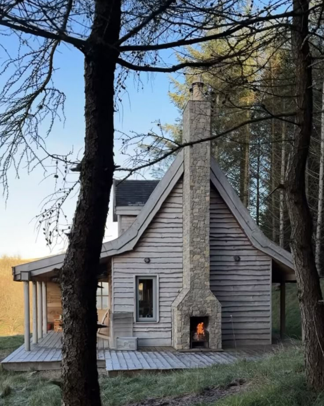
Winter 2026 Trends
January always feels like a reset, doesn’t it? This is the month where I start noticing patterns again — what to keep coming back to, what still feels good after the holidays are packed away, and what I actually want to live with moving forward. Not what’s new for the sake of being new, but what’s resurfacing in a way that feels relevant now.
This Winter 2026 Edit is less about chasing what’s trending and more about recognizing what’s circulating again. Silhouettes, materials, and details that have staying power. Style that always comes back around. It just shows up slightly reworked, a little softer, a little more lived-in. That’s where my eye is right now, and I want to share it all with you!
What We’re Seeing Come Back (and Why It Works)
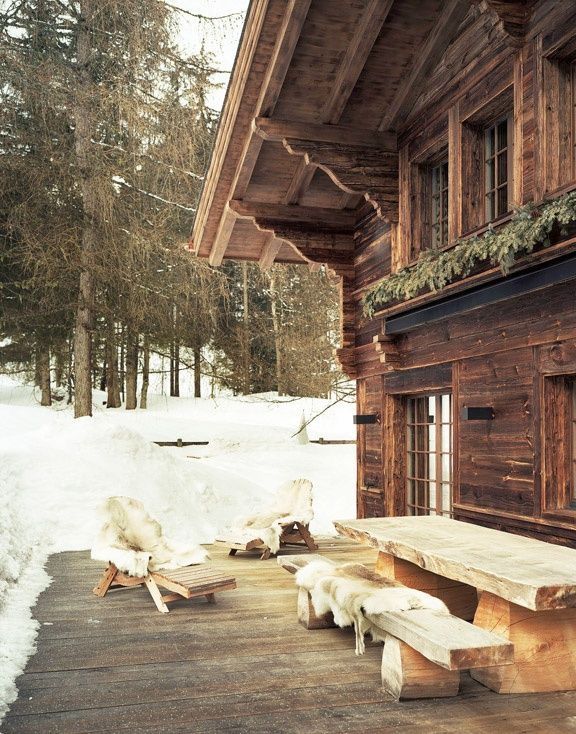
Across interiors, fashion, and lifestyle … there’s a clear return to classic elements. Like a pattern that feels familiar but refreshed, or materials that wear well over time. These are pieces that work because they’re practical, tactile, and easy to layer into real life. This edit leans into that balance.
What I love about where trends are heading right now is that they’re more flexible. These aren’t one-season moments. They’re pieces that move with you, adapt as your space evolves, and feel just as good six months from now as they do today.
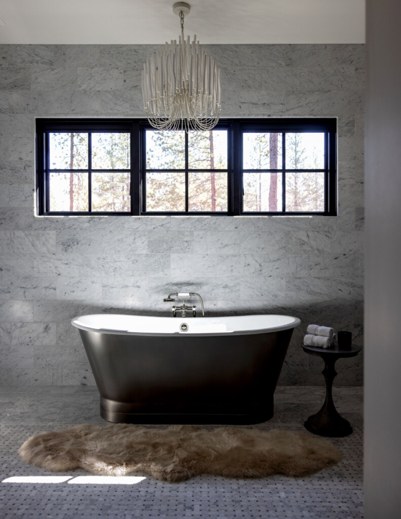
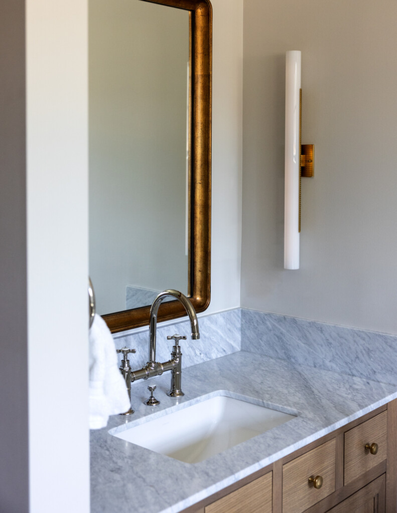
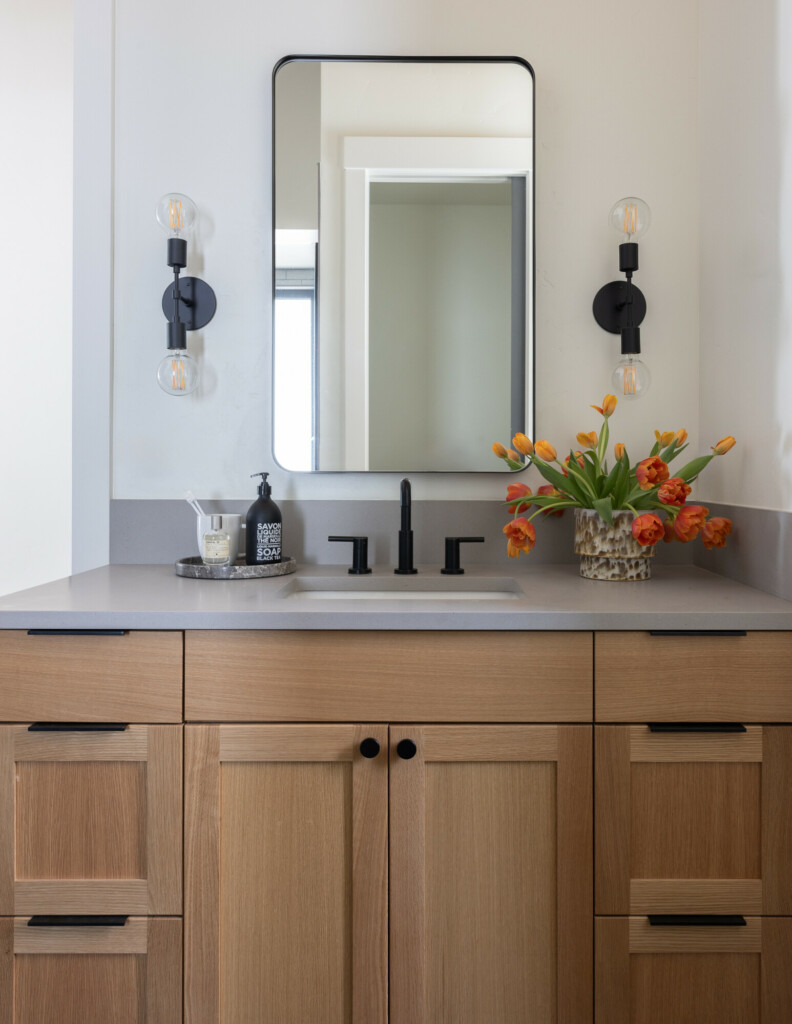
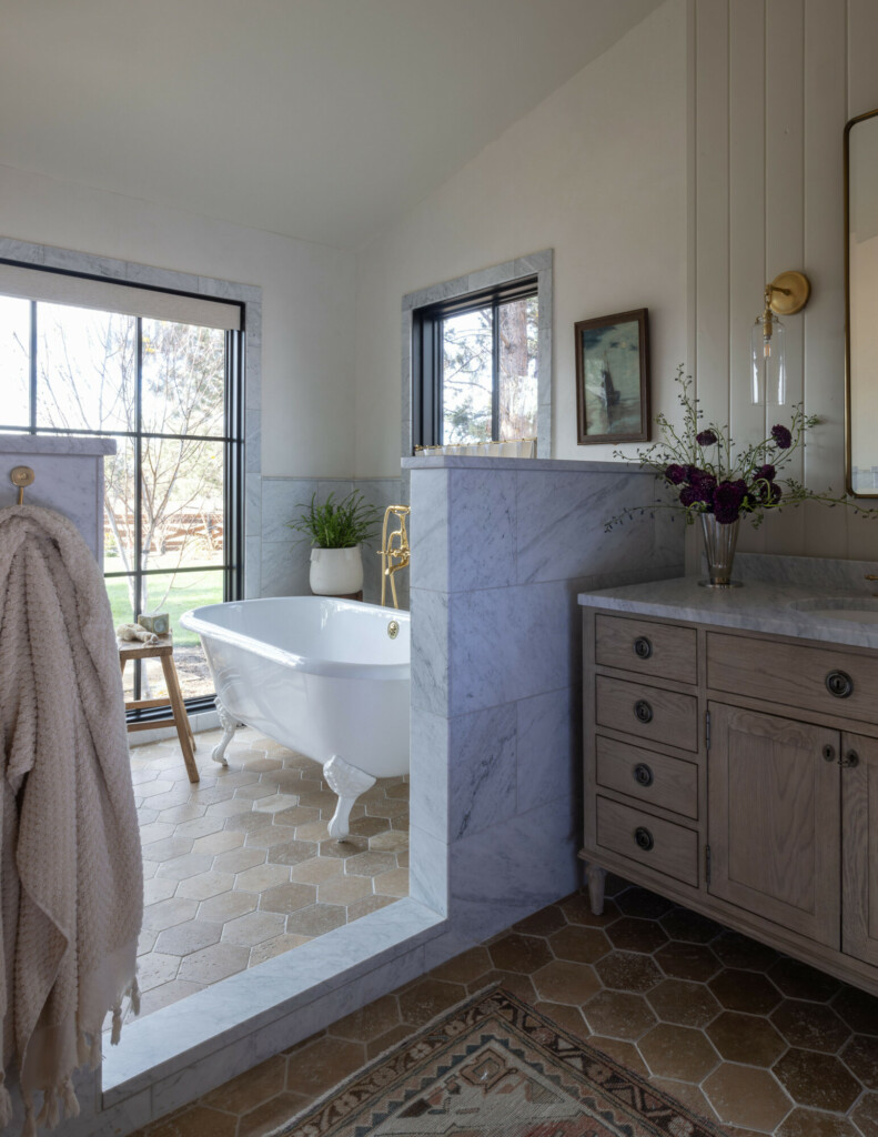
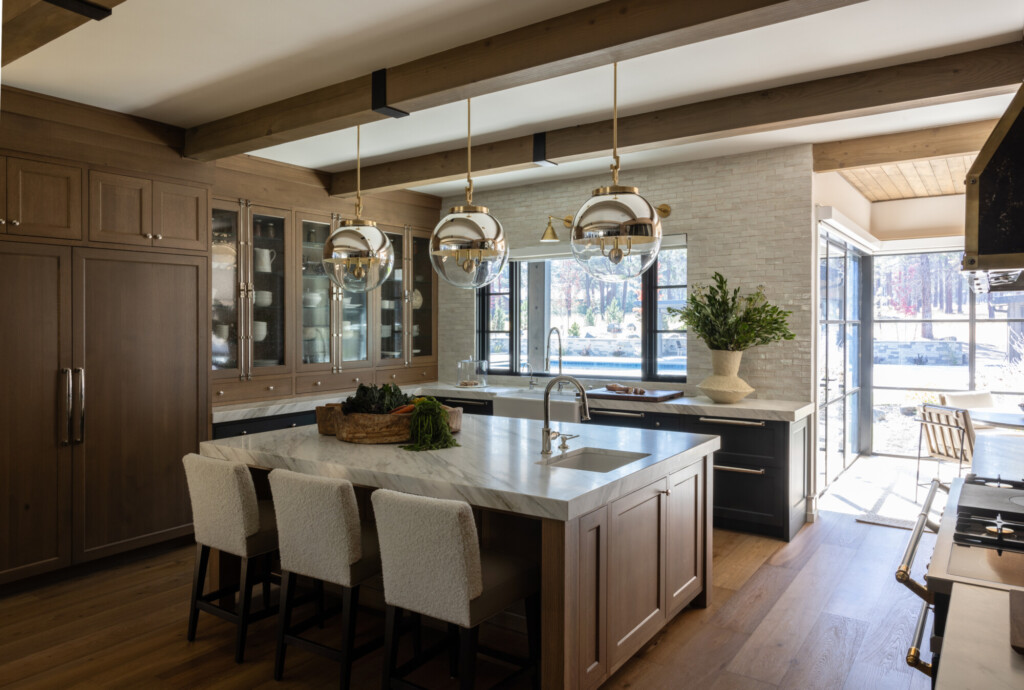
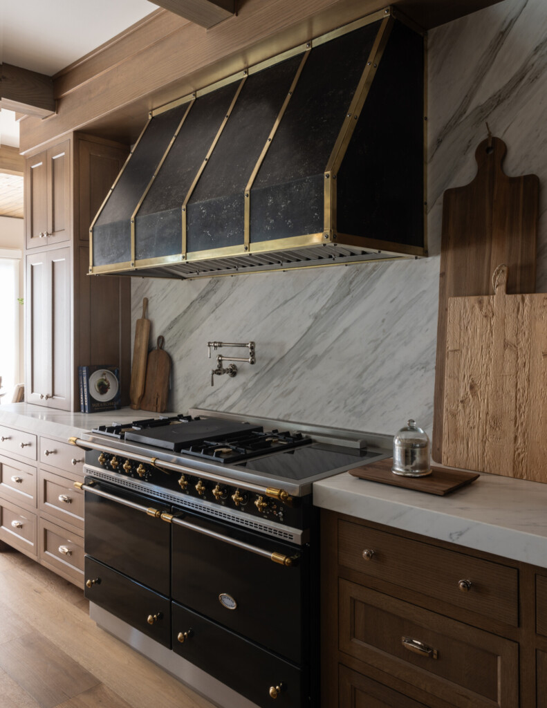
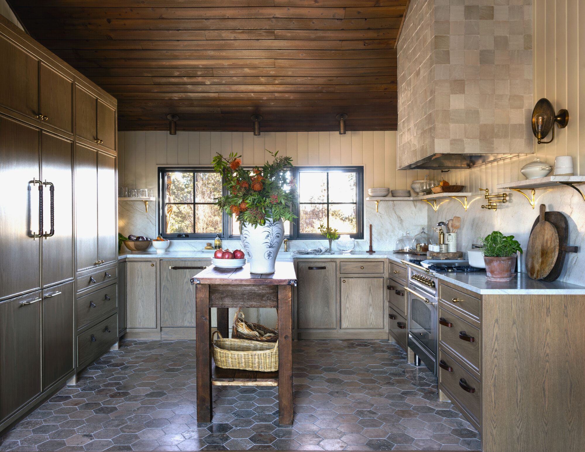
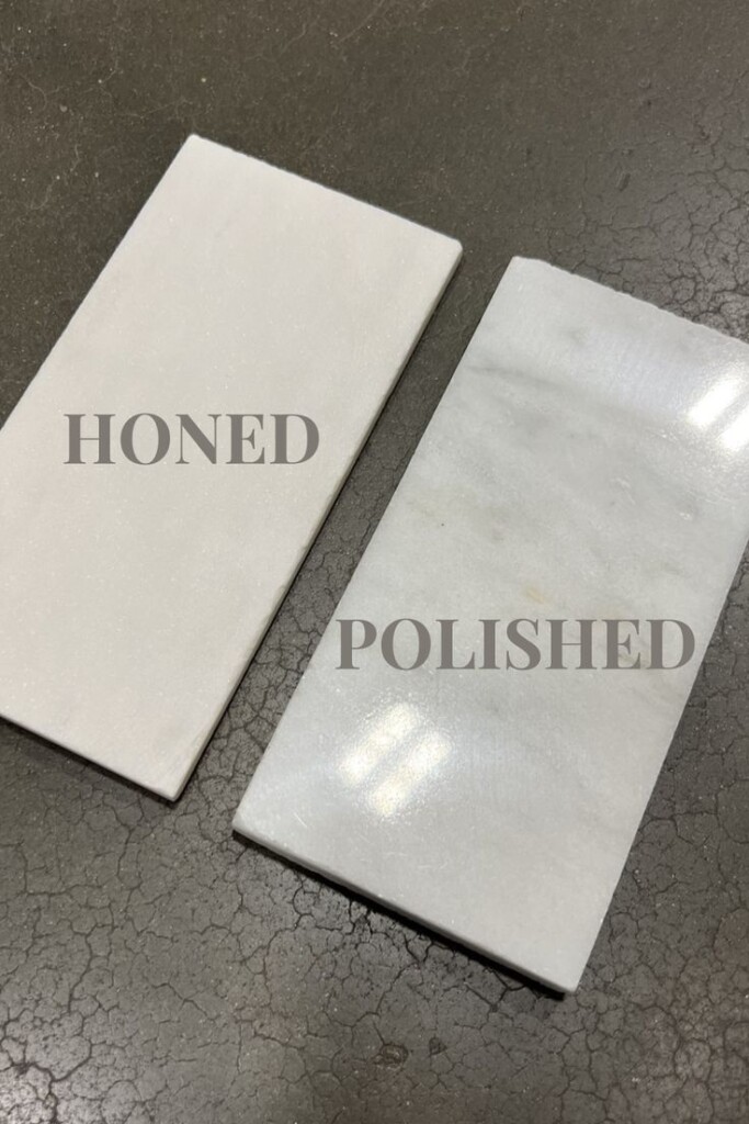
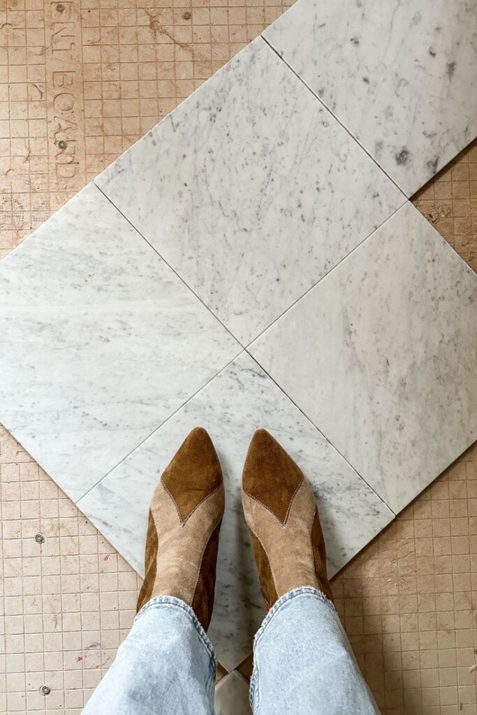
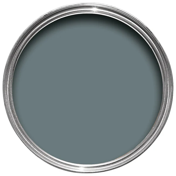
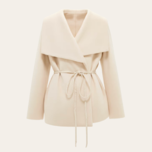
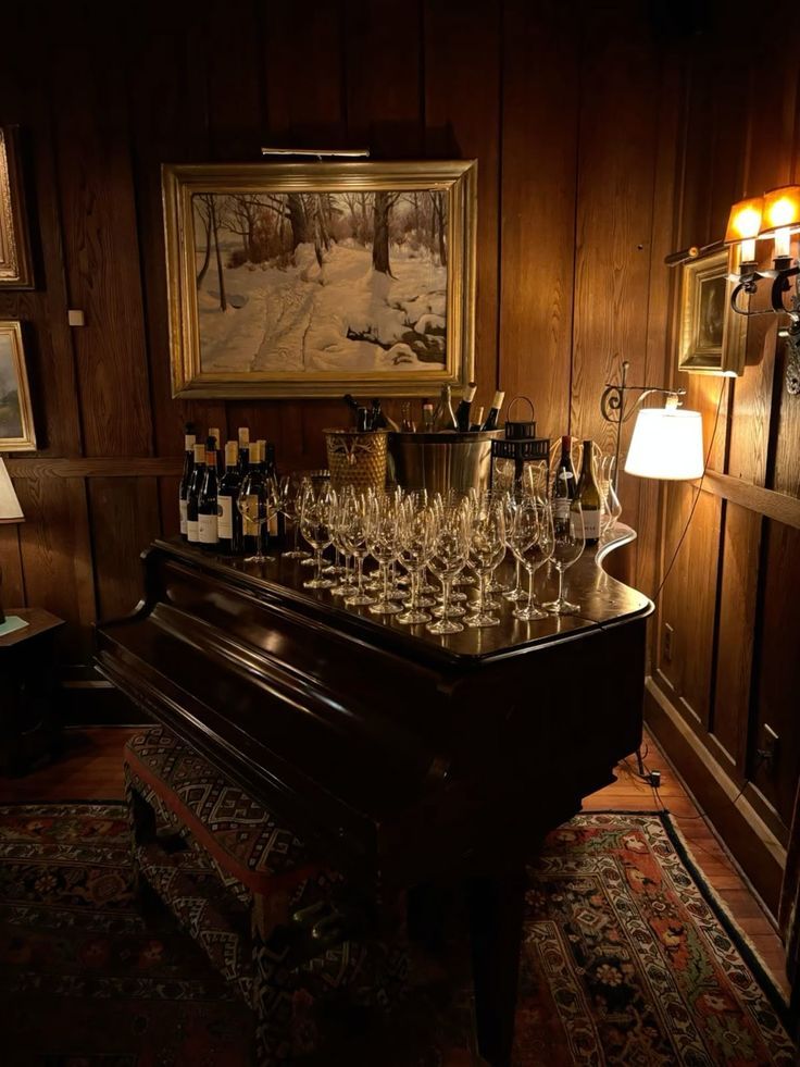
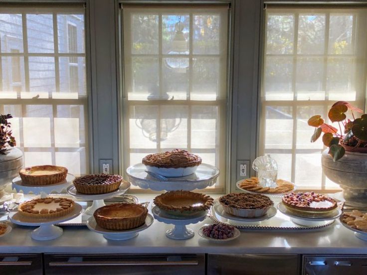
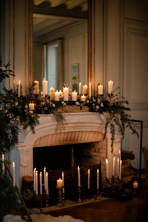
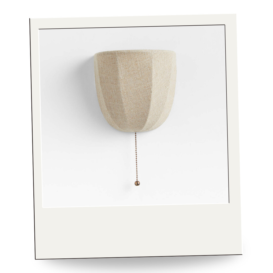
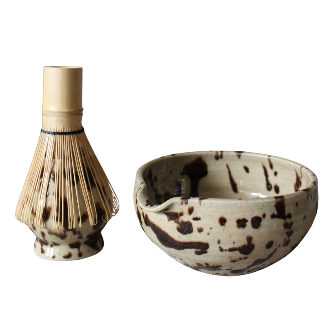
Color of the Month: Winter Whites (a.k.a. ‘Cloud Dancer’)
Pantone naming Cloud Dancer as the 2026 Color of the Year honestly made me pause—in the best way. Not because it’s groundbreaking, but because it’s subtle. In a season where everything feels louder, bolder, and more expressive, choosing a soft winter white feels almost … rebellious.
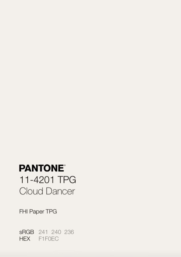
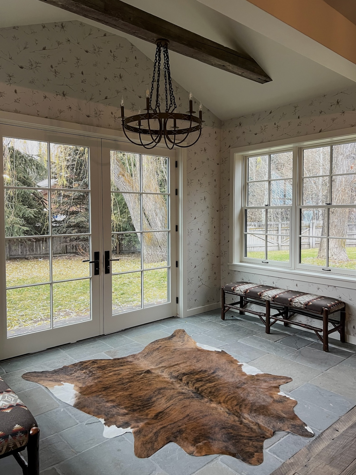
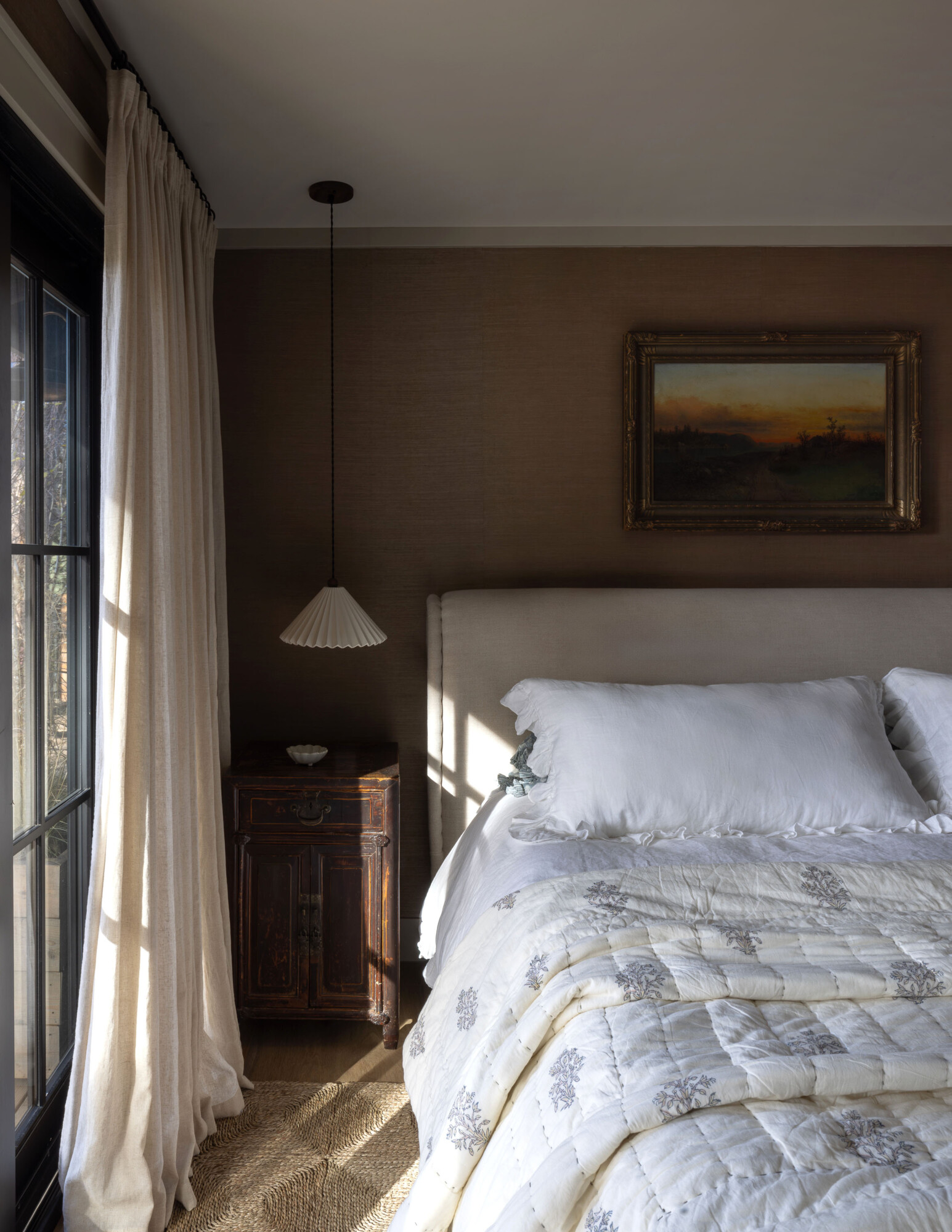
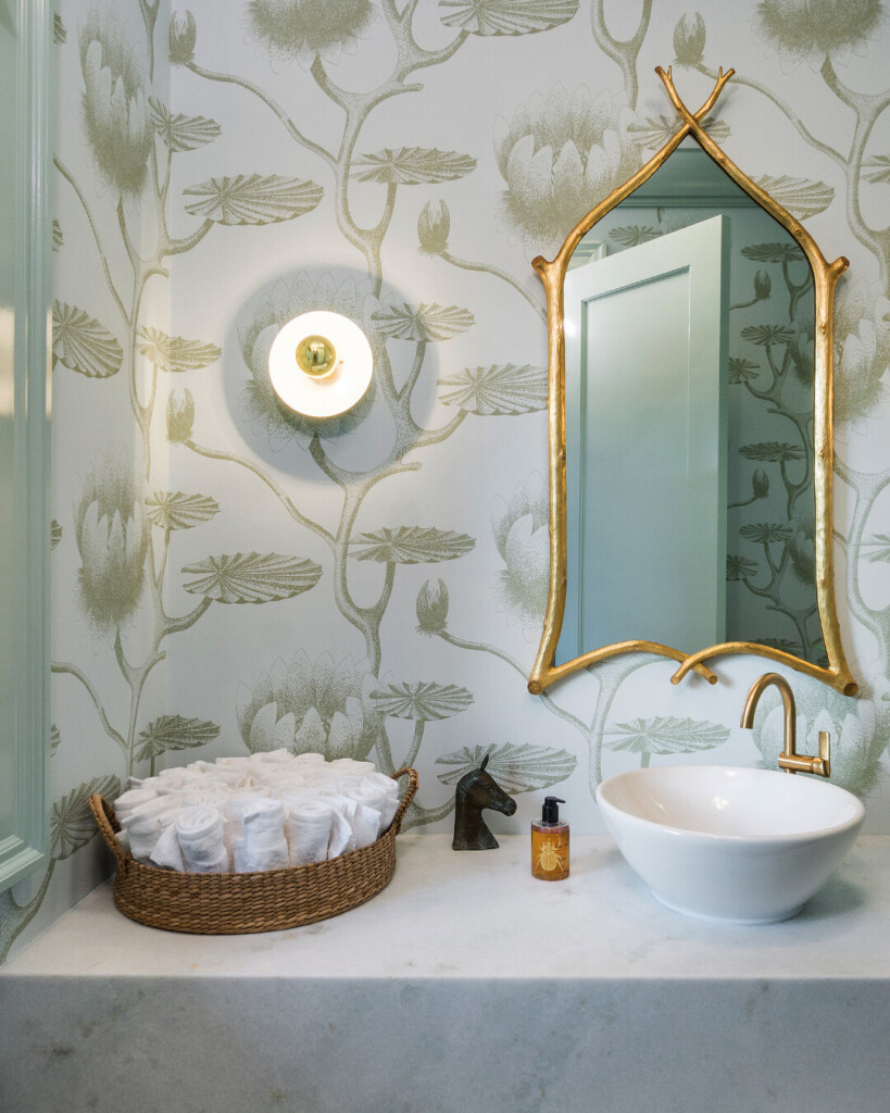
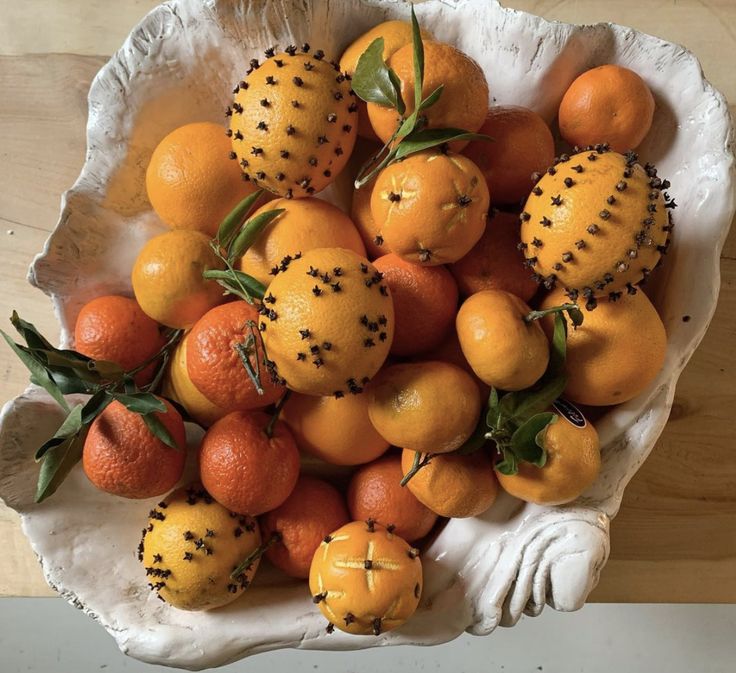
I’ve always loved whites in winter, but not the stark, sterile kind. I’m drawn to the creamy ones. The shades that feel warm even when the light is low. Whites with undertones you can feel (ivory, bone, chalk, linen, plaster). They soften a space without washing it out.
What Cloud Dancer does so well is lean into that idea. It’s not “just white.” It’s atmospheric. It lets texture do the talking. It creates a backdrop that makes wood feel richer, metals warmer, patterns more intentional.
A Color of the Year doesn’t always have to shout. Sometimes it just sets the tone. And this one? It feels like a reset.
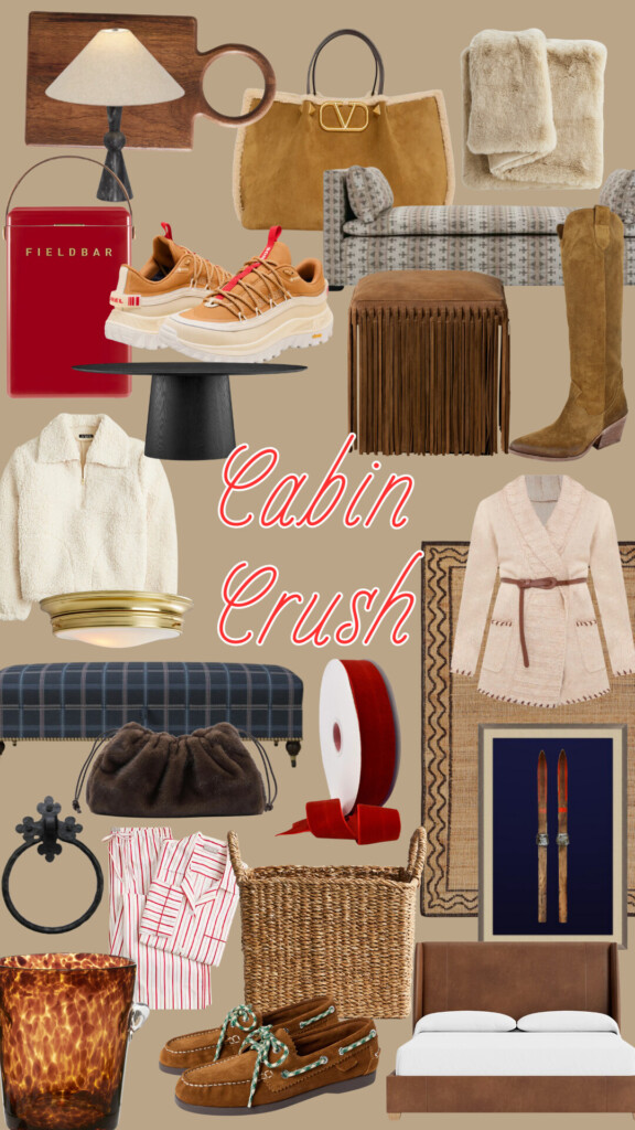
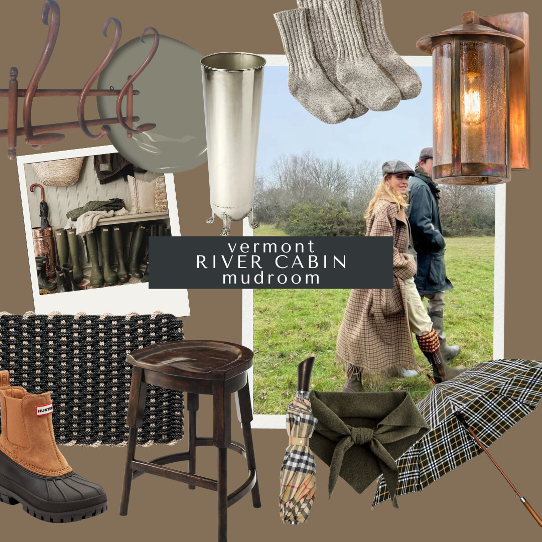
The Edit: Fashion, Home & the In-Between
These are pieces that feel good to reach for, good to live with, and good to layer into your everyday without needing a special occasion. It’s the kind of mix where fashion and home blur a little, which is honestly where I feel most myself.
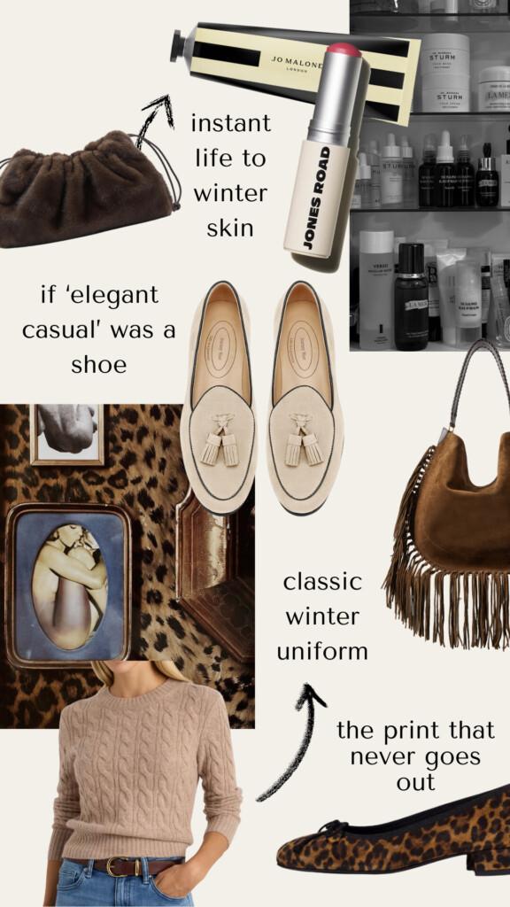
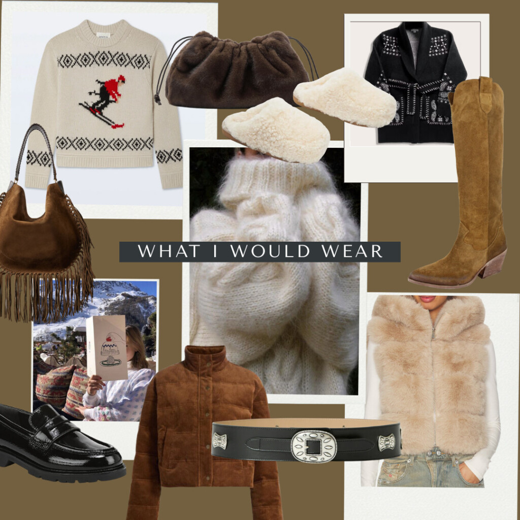
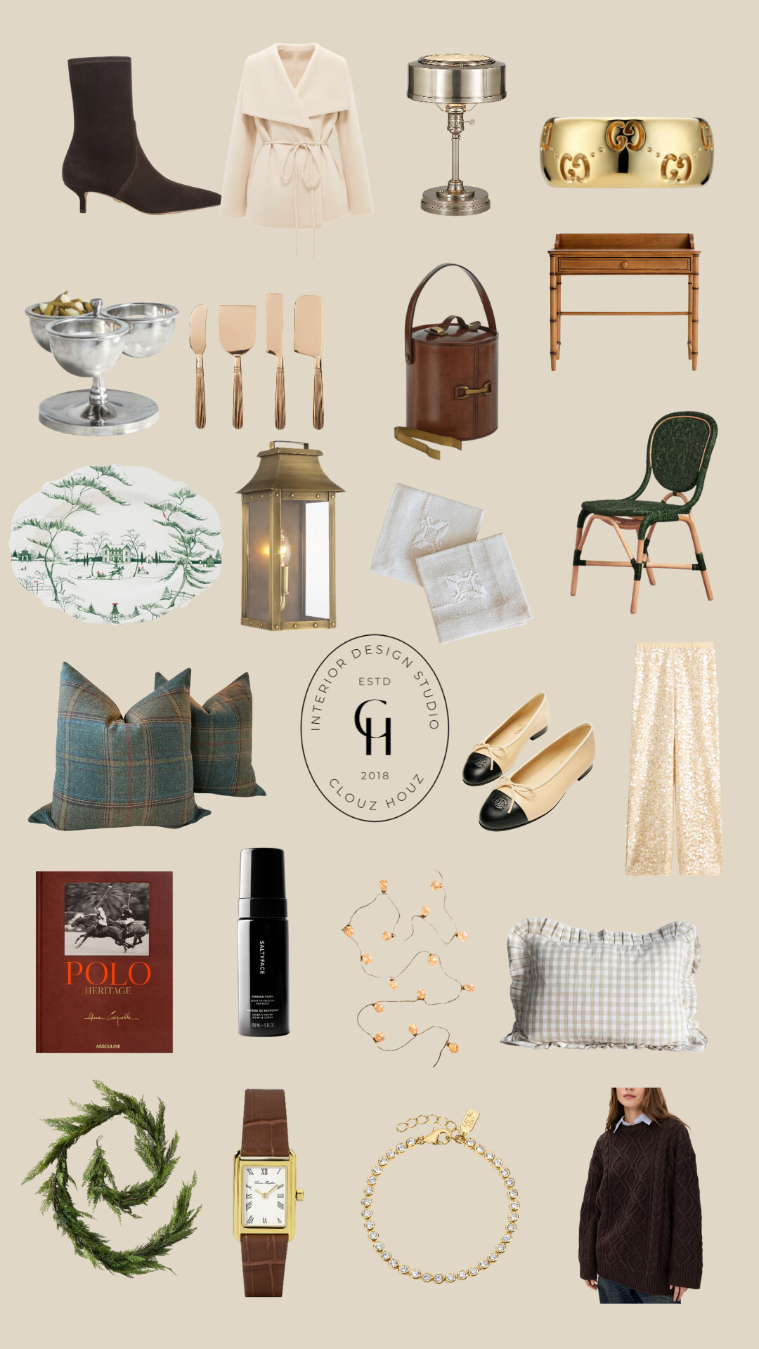
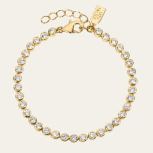
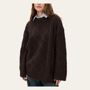
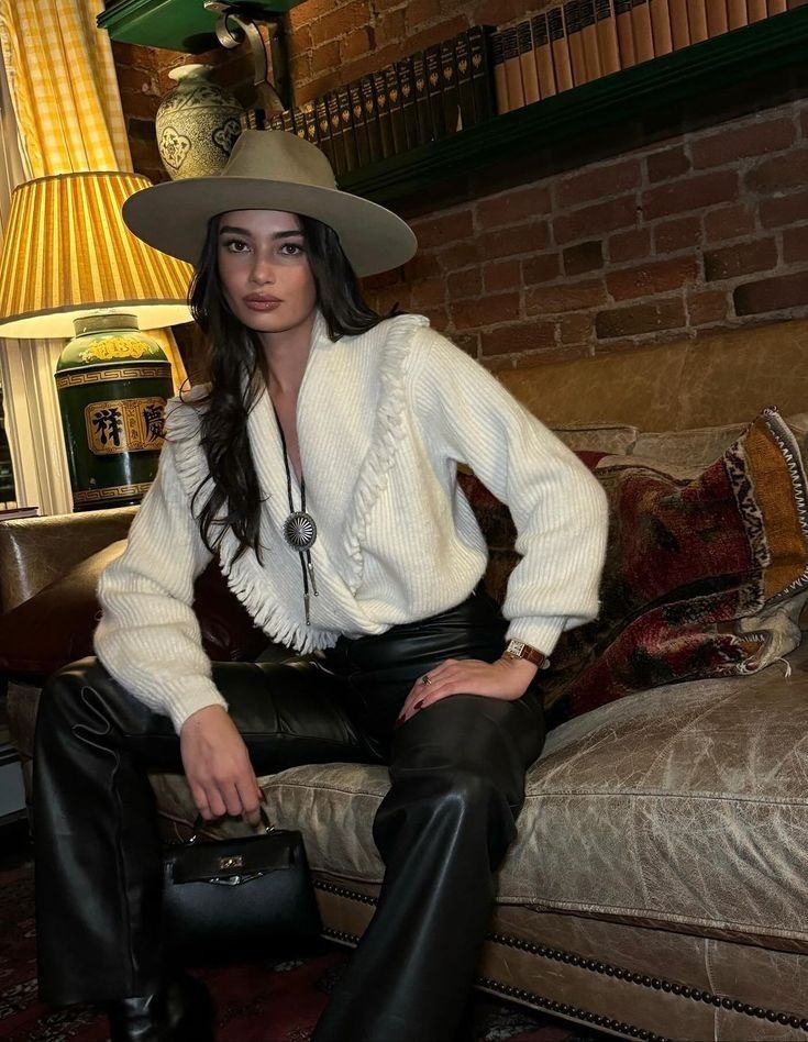
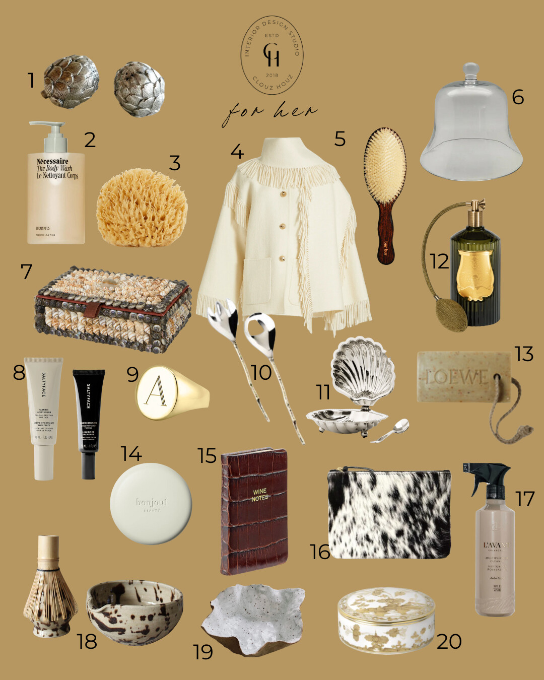
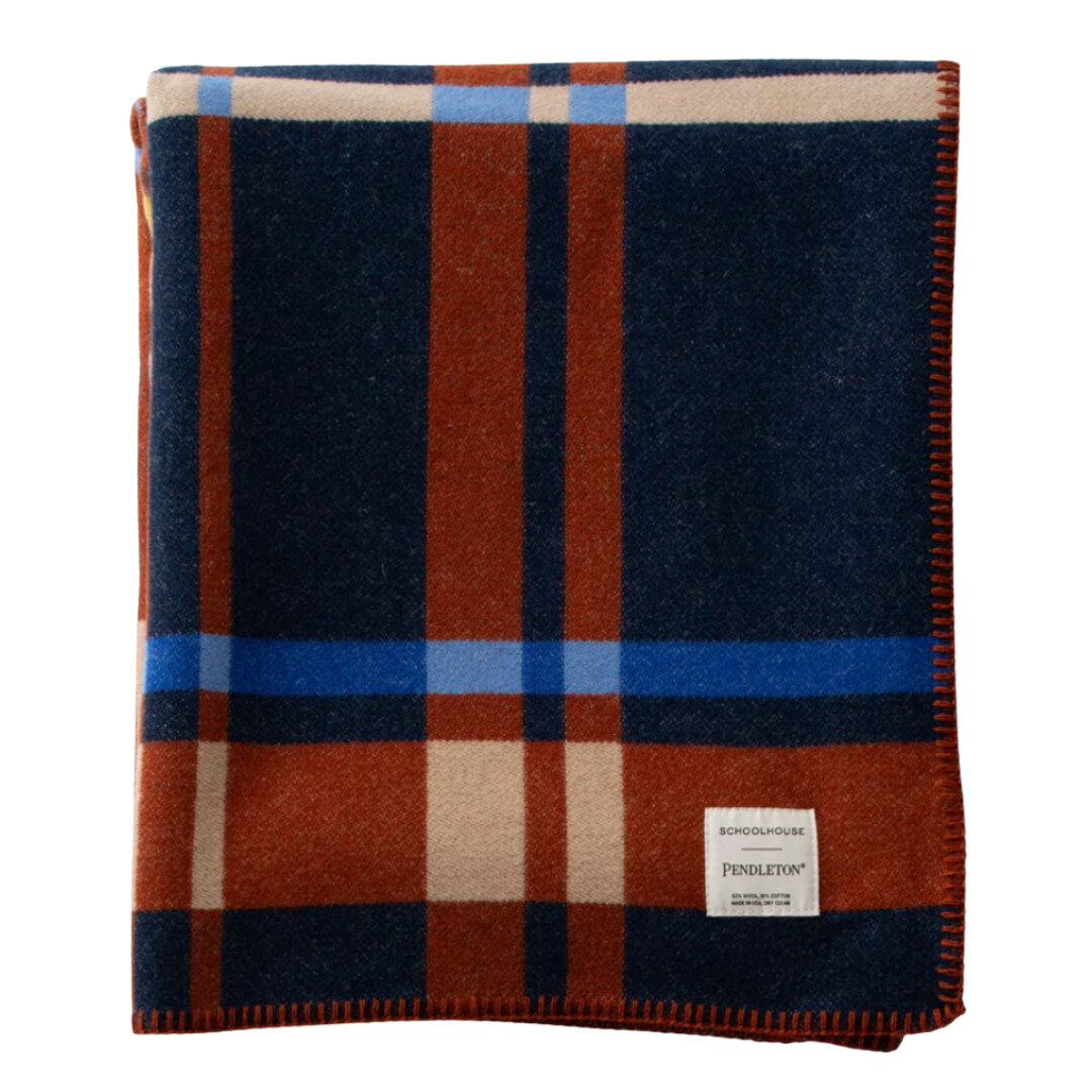
On the fashion side, I’m leaning into things that feel polished but unfussy. Pieces like a soft cable-knit sweater or a neutral loafer (can you believe these are Amazon??) that instantly reads “put together” without feeling precious. I also like this other loafer style (but FYI it’s more of a splurge, but one you’d love forever). Leopard shows up again (because it always does), but in a way that feels timeless rather than trendy. For example, a leopard flat works just as well with denim as it does with something dressier. I just bought these, and especially love how they are adjustable with the bow-tie on the top of the toe (how cool)! I’m also loving accessories that add texture instead of color: a suede fringe bag, or a faux fur handbag.
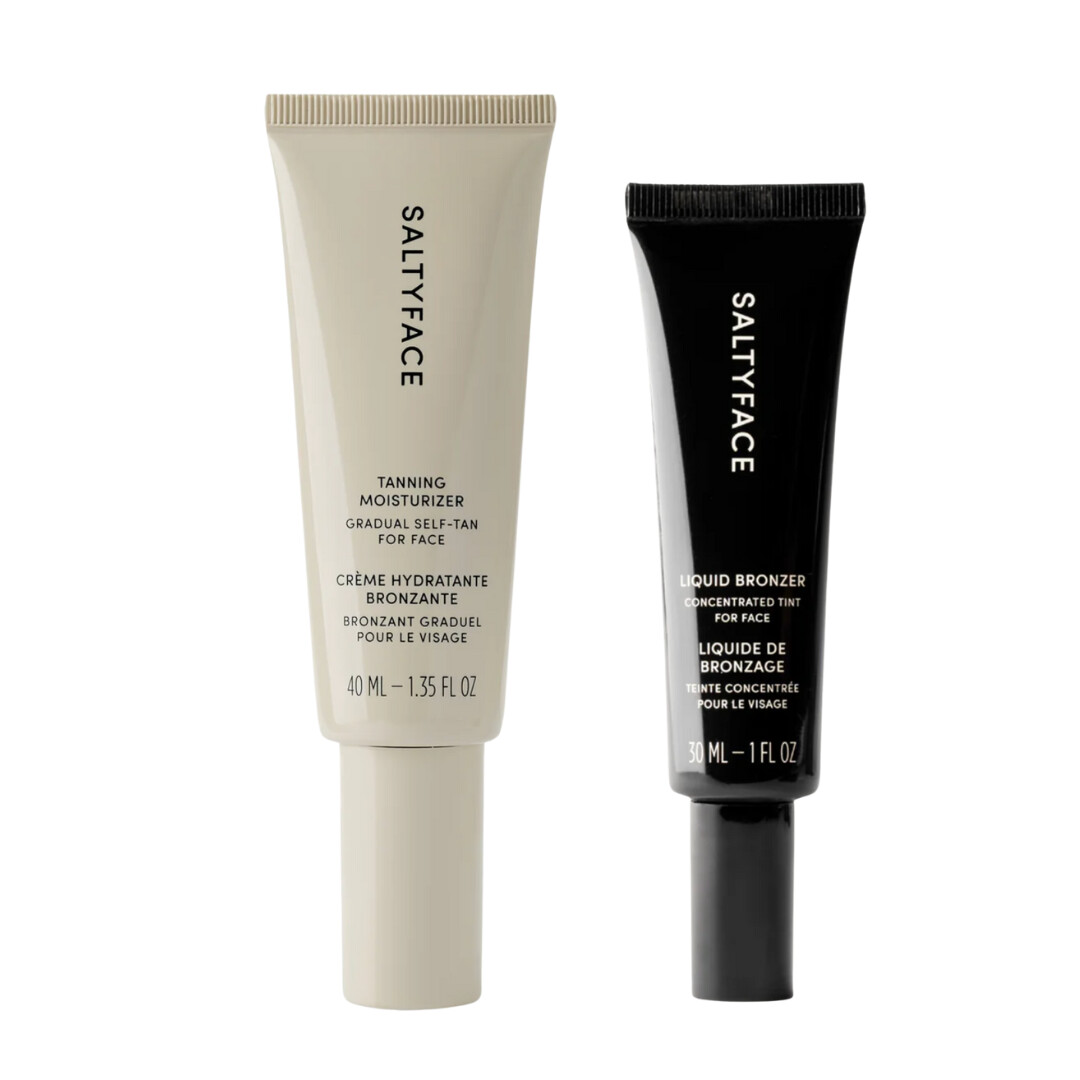
Also couldn’t resist slipping in a few beauty-adjacent pieces that live right at the intersection of fashion and ritual. If you haven’t tried these face masks… you’re missing out! This hand cream made the cut purely because the packaging is that good. It’s chic enough to leave out on a vanity, toss in a bag, or keep by your bedside, which honestly makes me use it even more. Same goes for the Jones Road lip balm … effortless, wearable, and the kind you can throw on without a mirror.
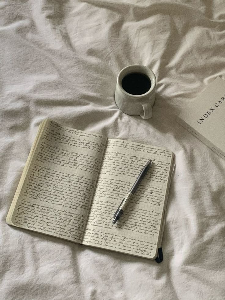
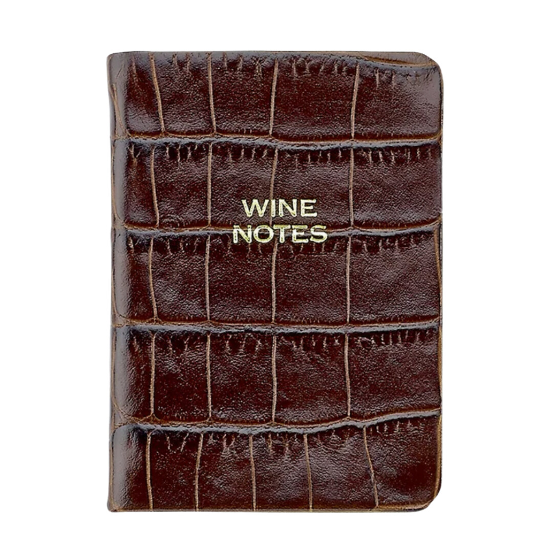
I really like this journal as a simple, grounding way to start the new year with intention. It’s not overwhelming or time-consuming (which is key), but it keeps you consistent and mindful in a way that actually sticks. A few minutes in the morning or before bed helps you stay on top of journaling, reset your mindset, and reflect on what you’re working toward—especially during busy seasons when routines tend to slip.
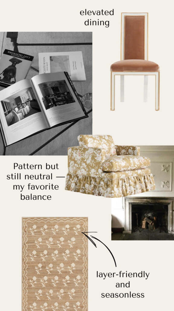
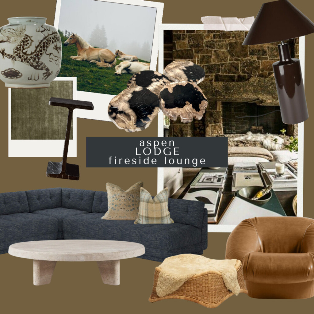
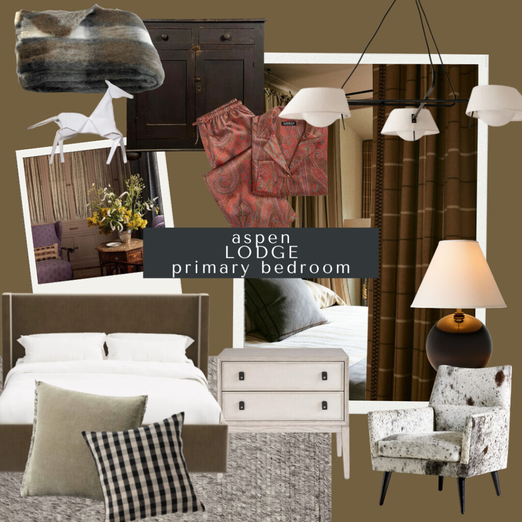
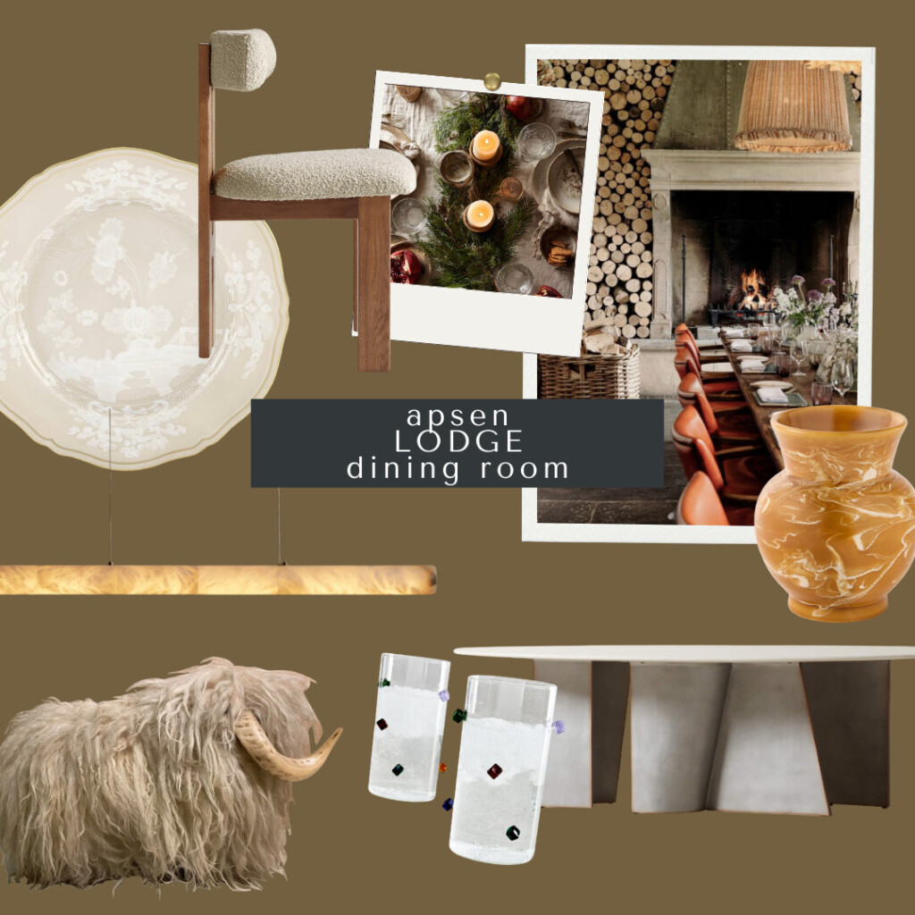
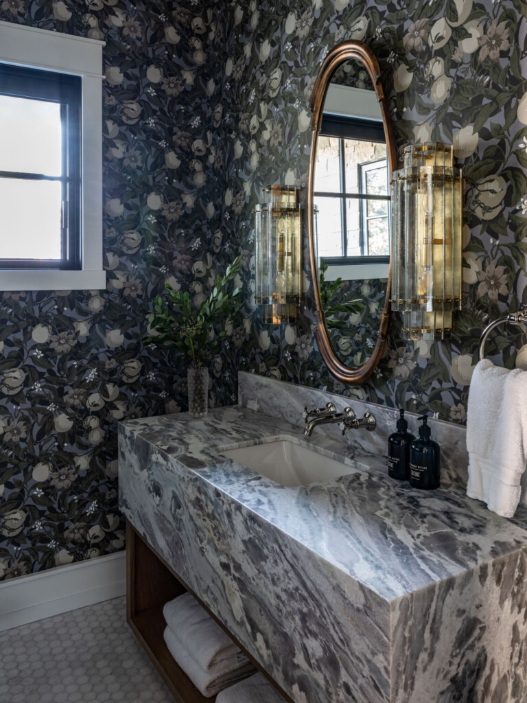
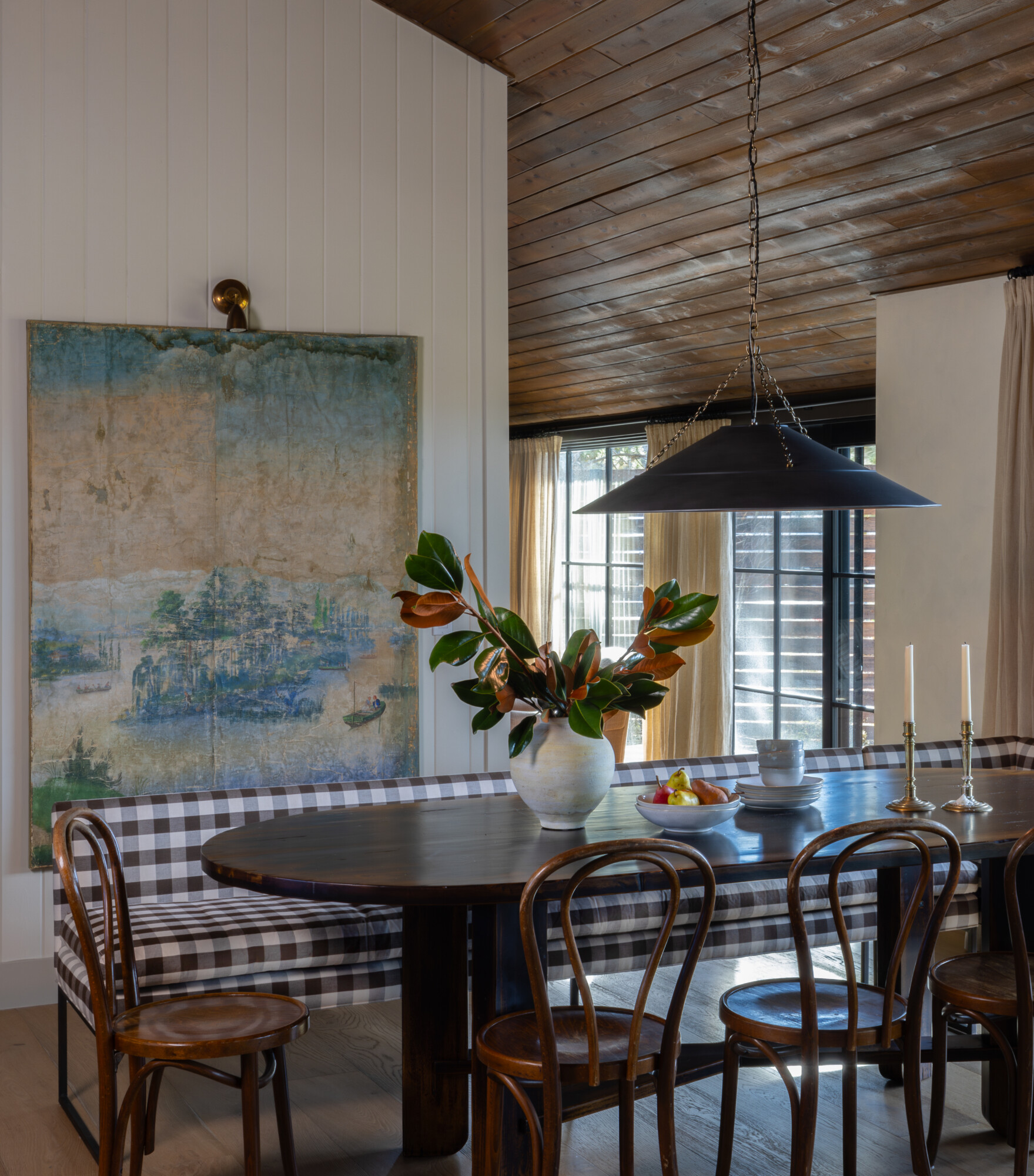
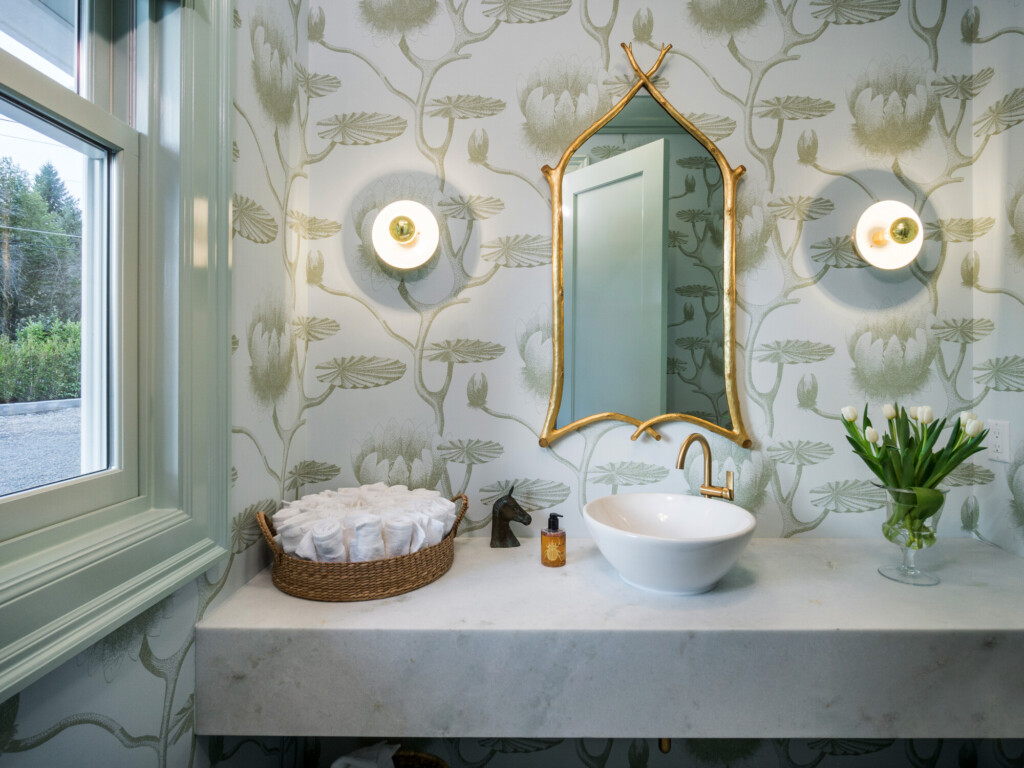
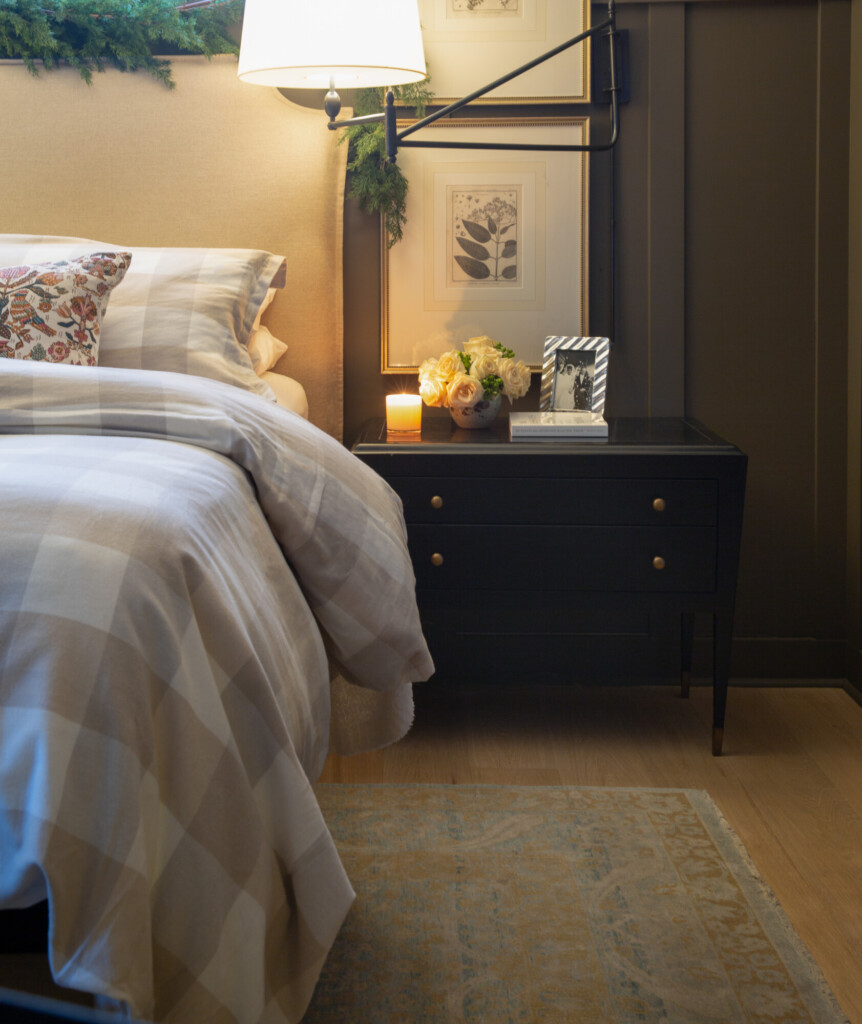
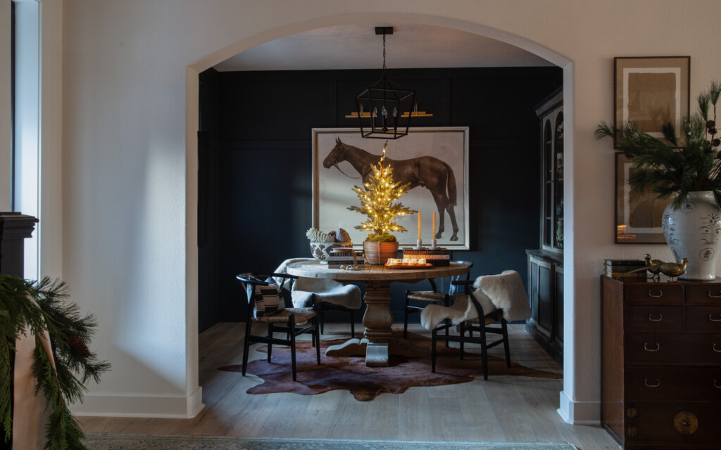
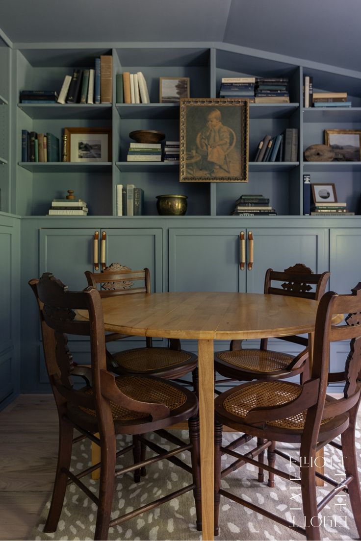
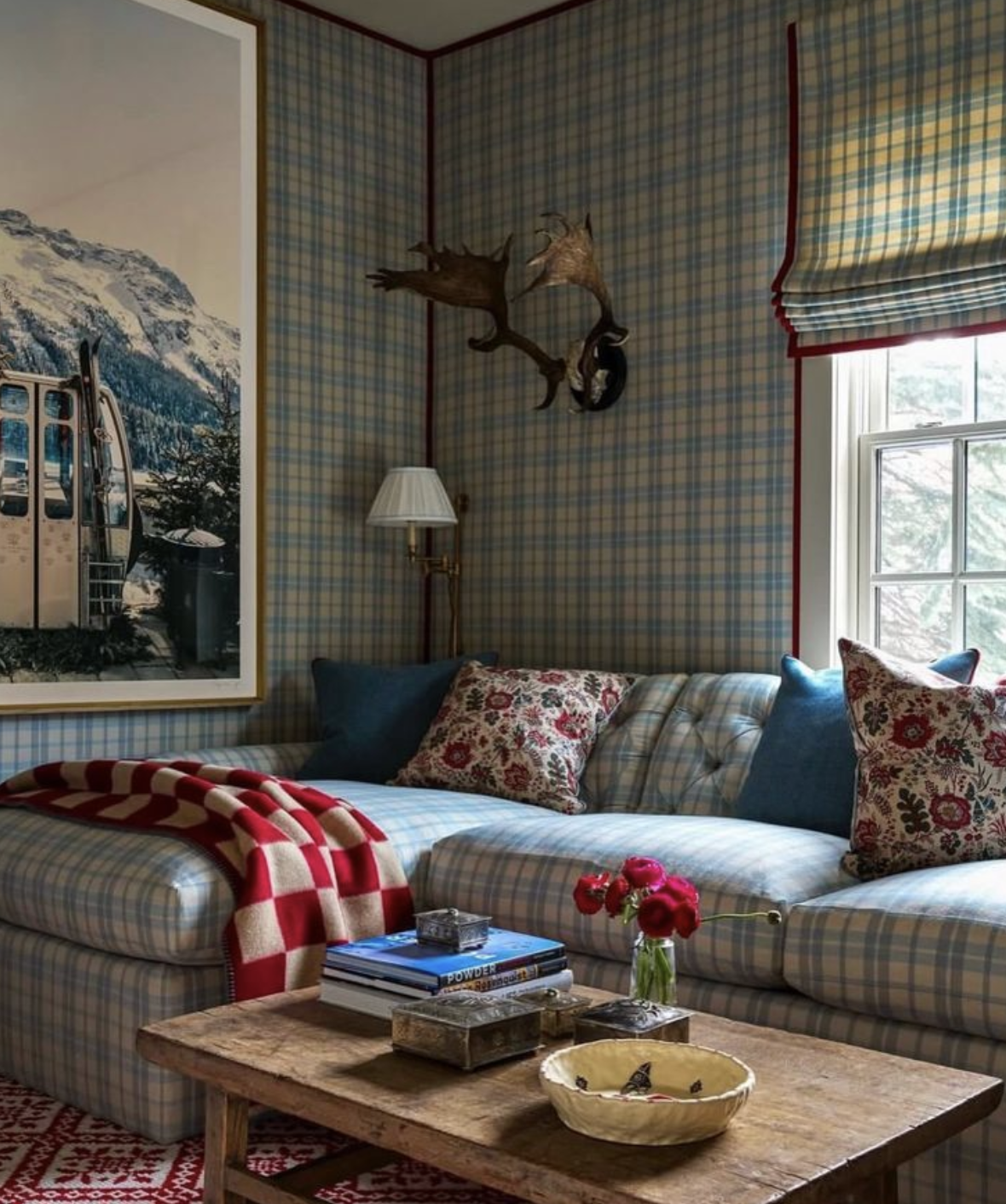
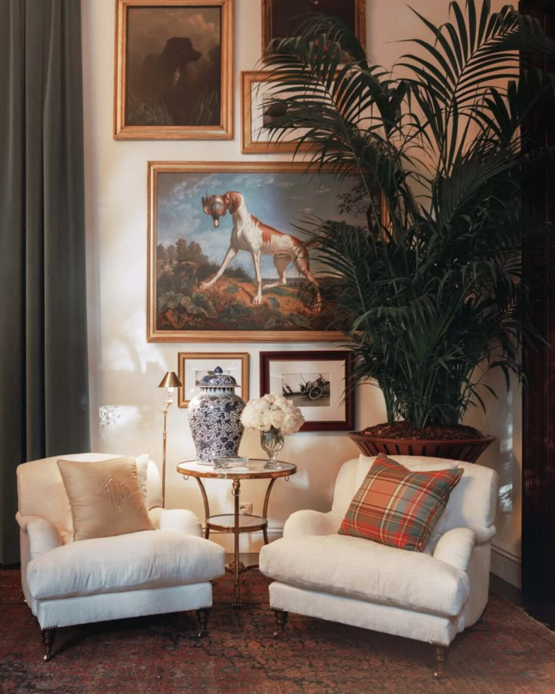
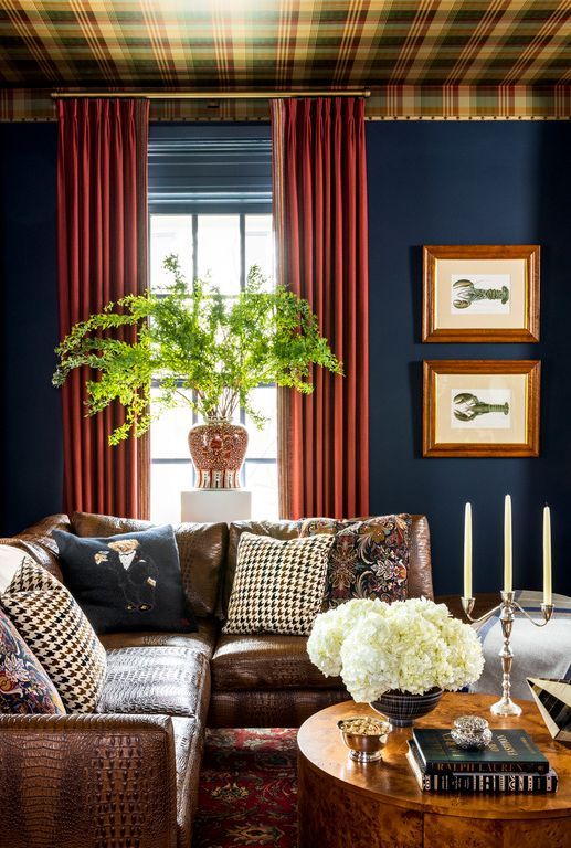
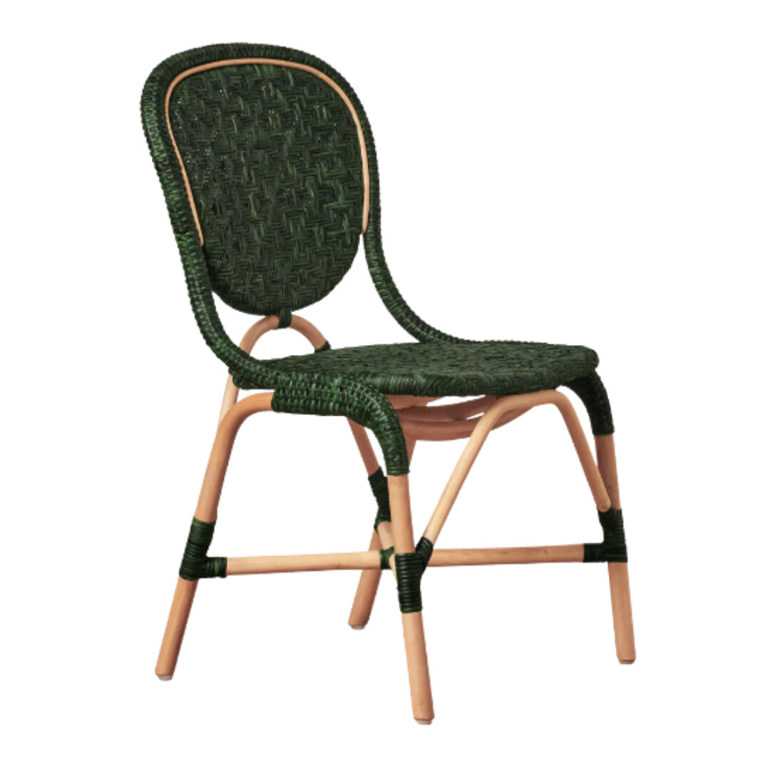
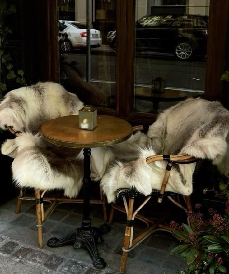
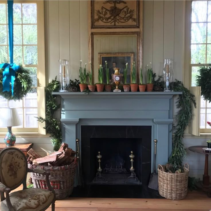
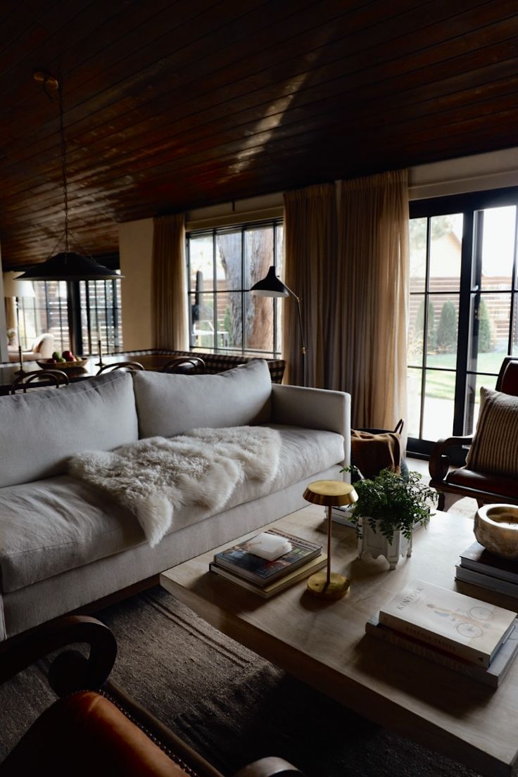
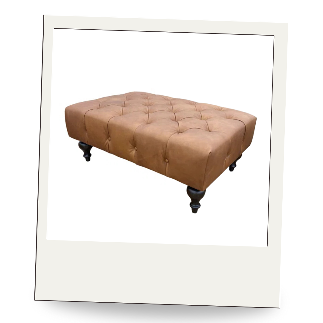
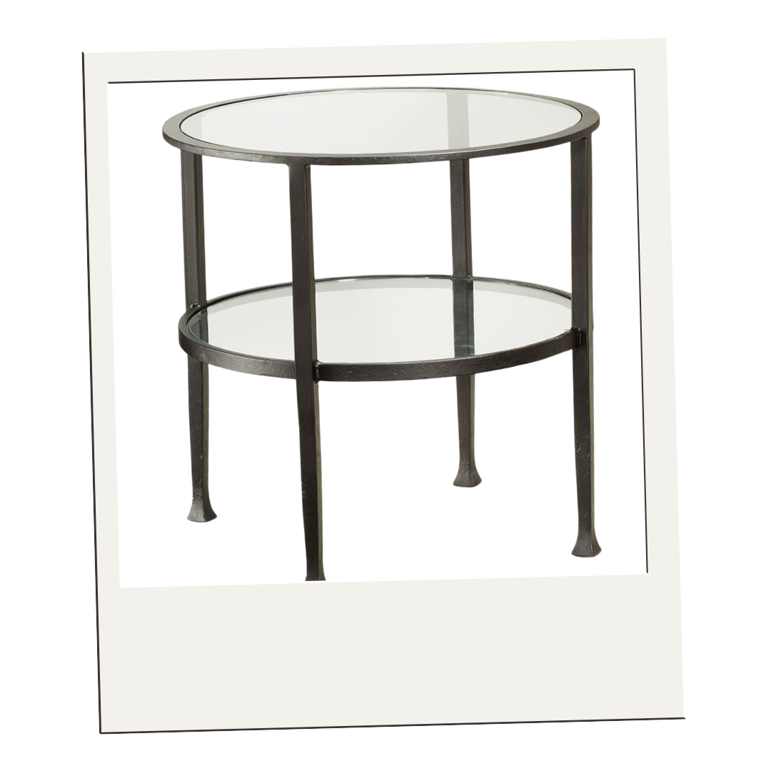
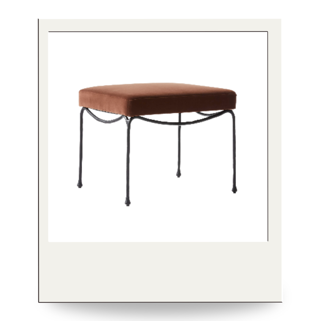
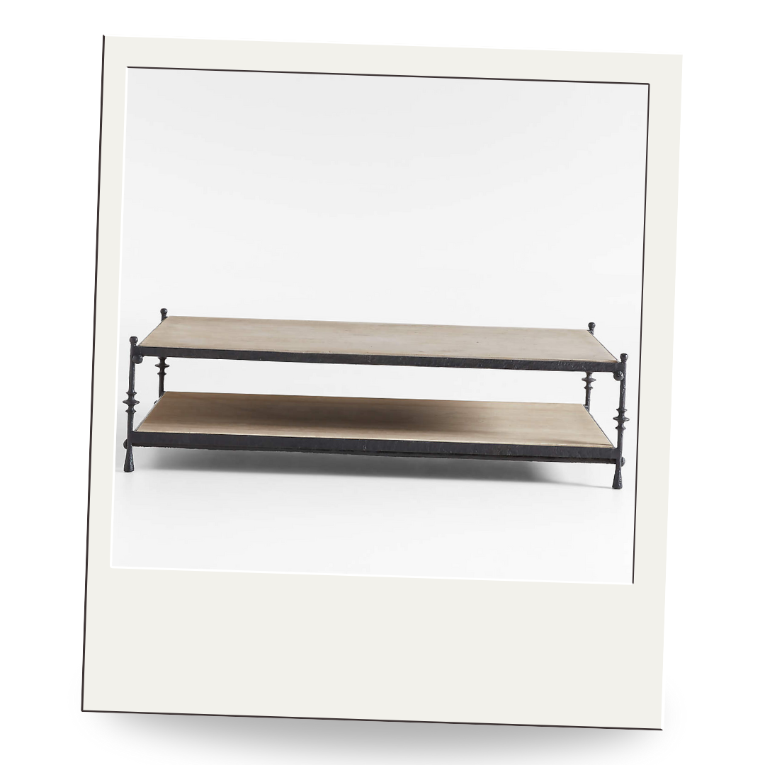
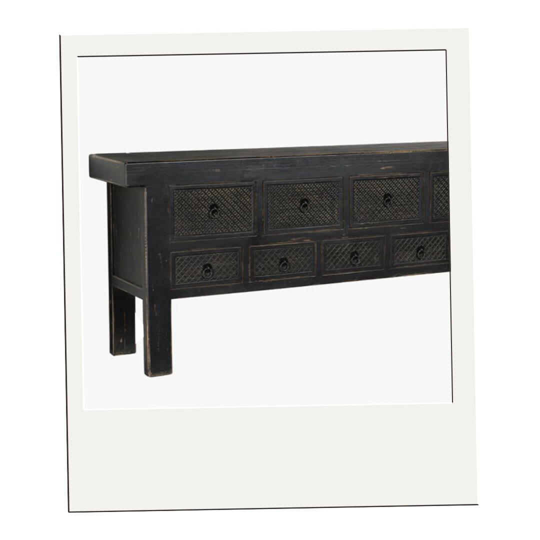
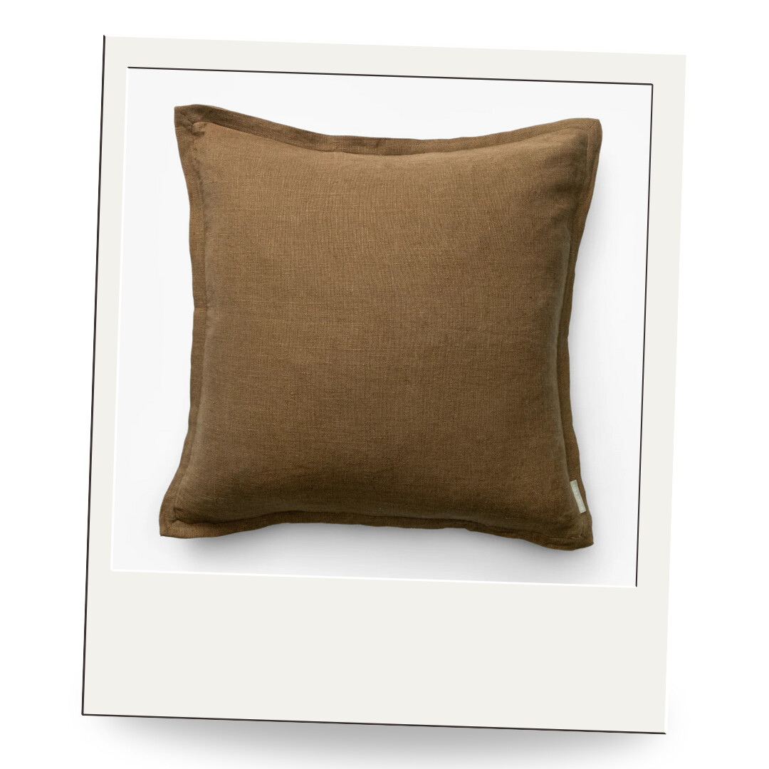
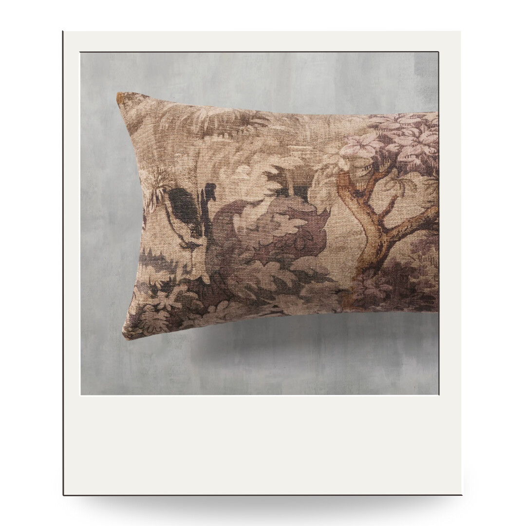
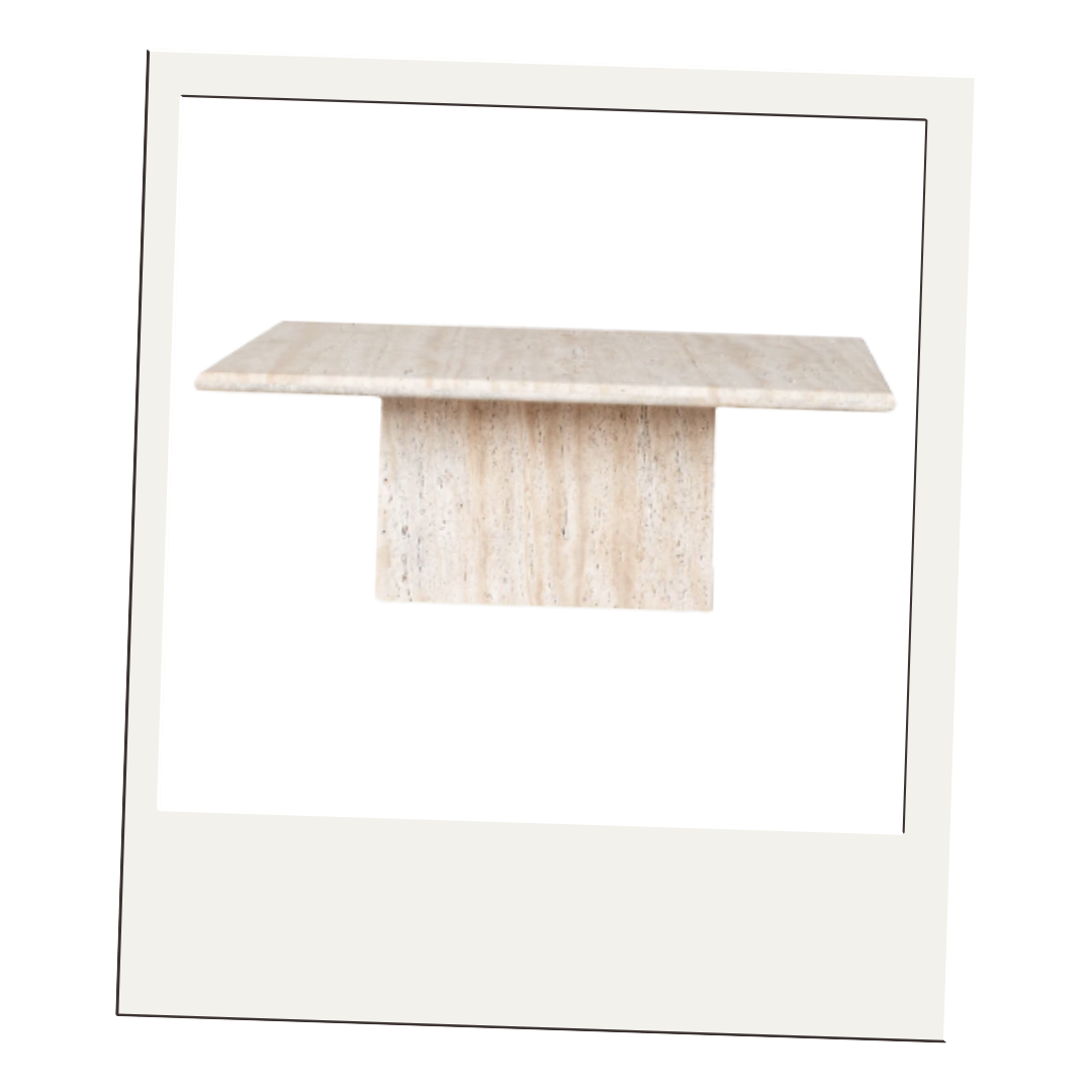
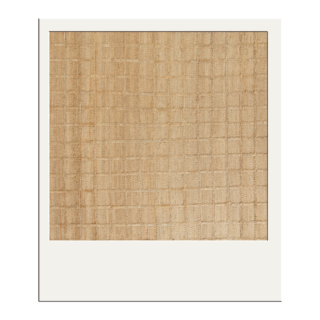
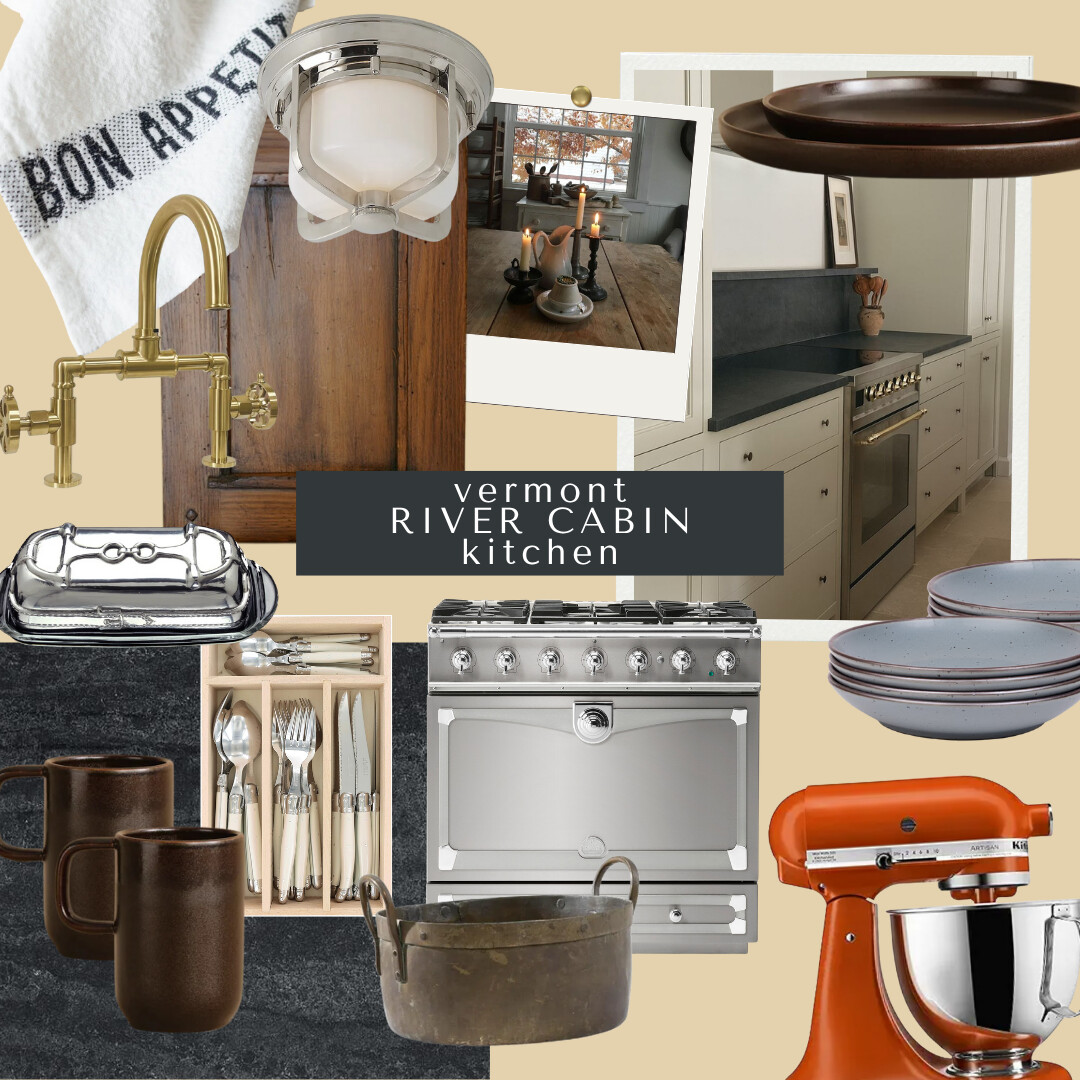
At home, the throughline is warmth and restraint. A patterned rug that reads neutral from afar but reveals itself up close. A slipcovered chair that brings pattern without overpowering a room. Even something like a classic dining chair can completely change how a space feels when the materials are right (warm wood, soft upholstery, thoughtful proportions). These pieces quietly raise the bar.
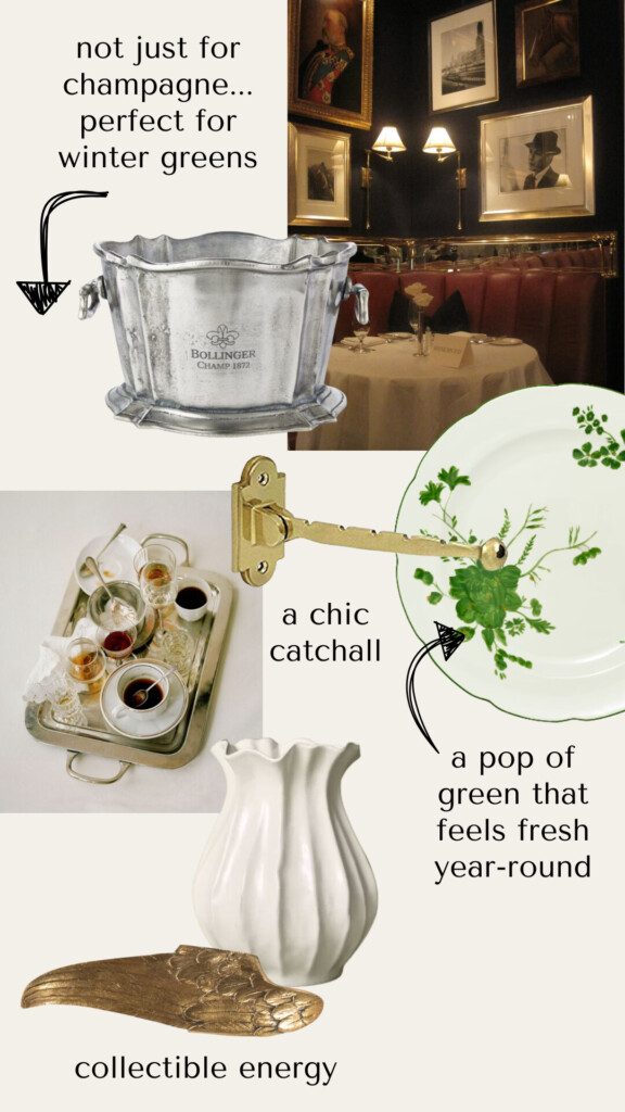
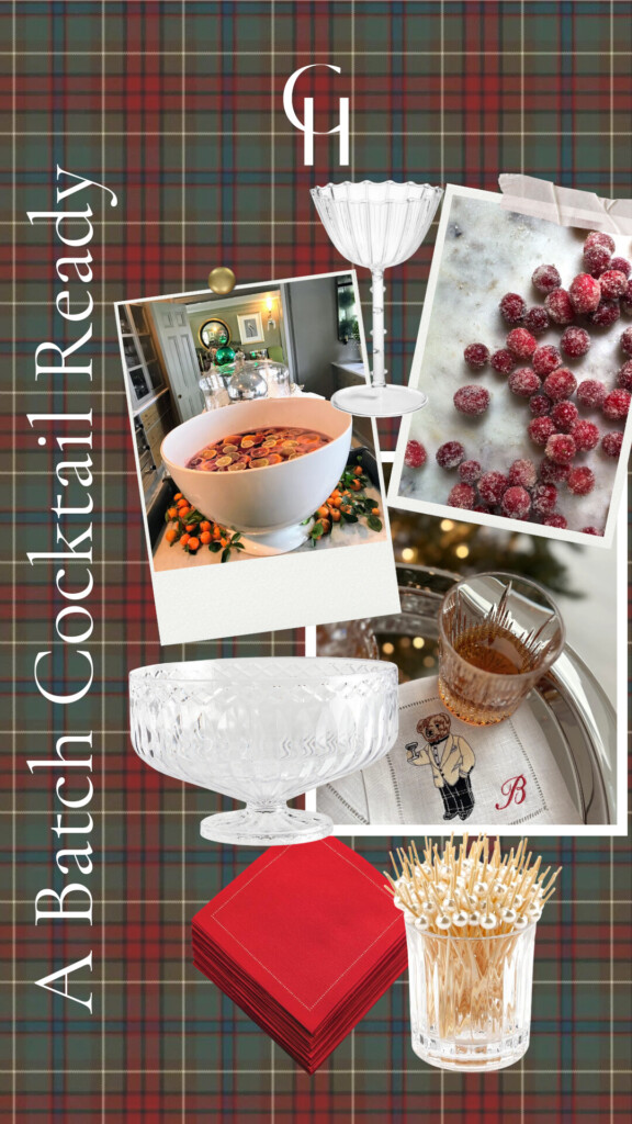
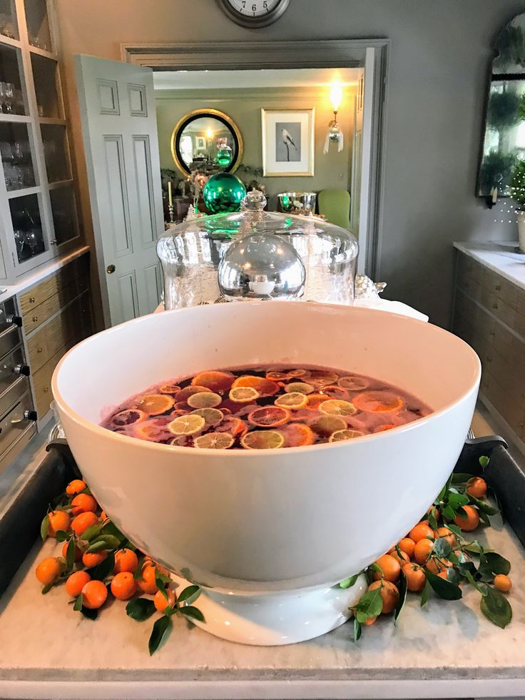
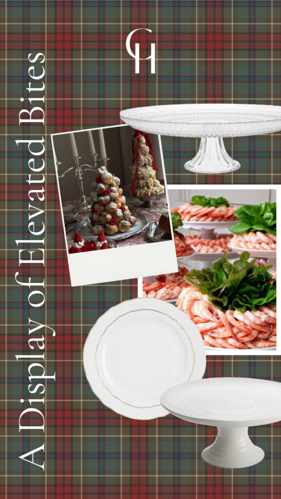
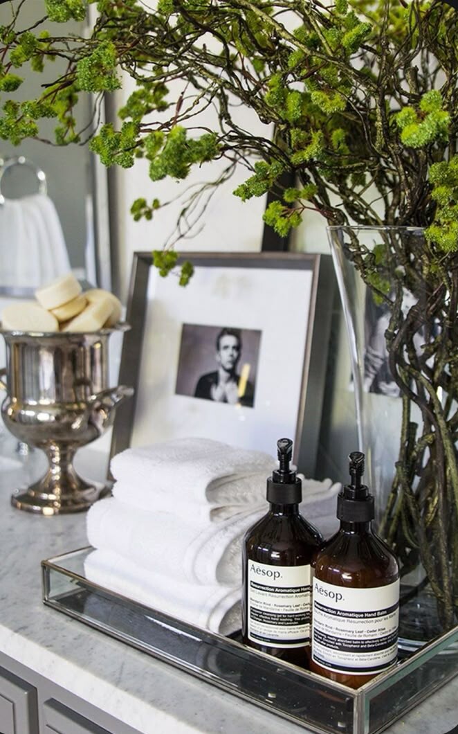
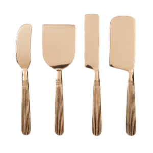
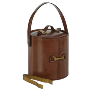
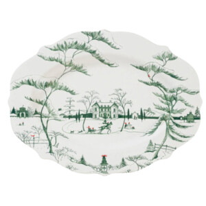
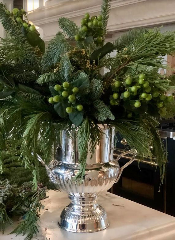
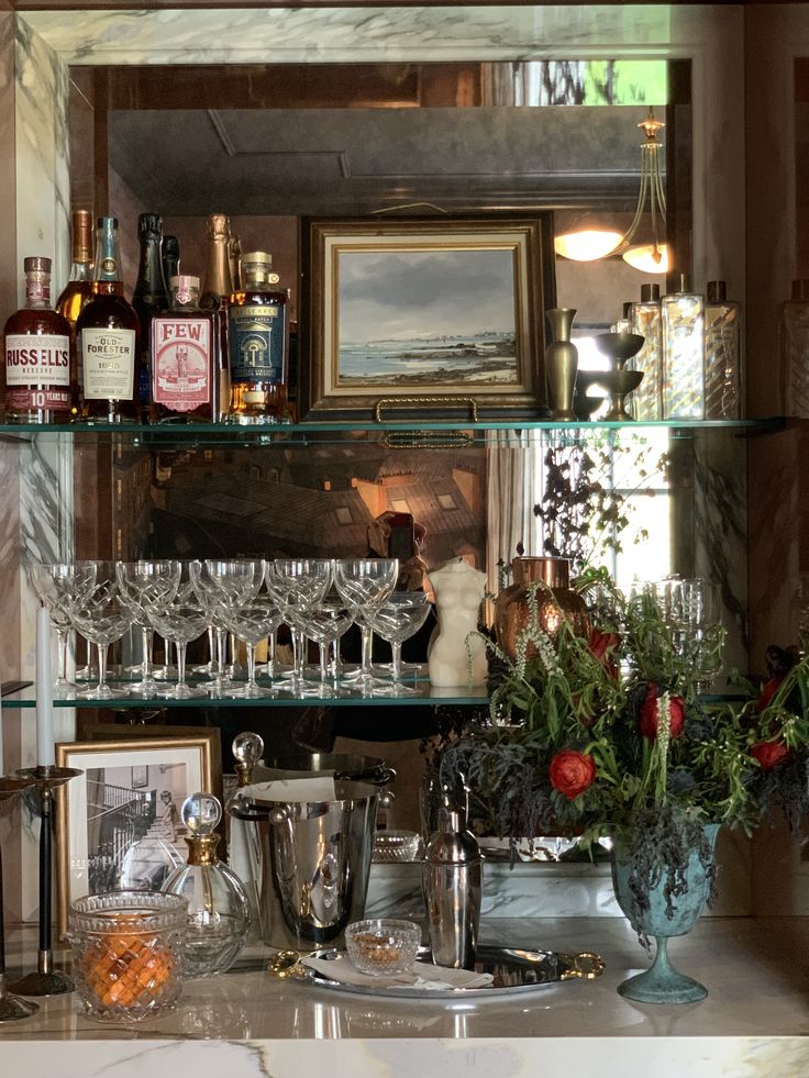
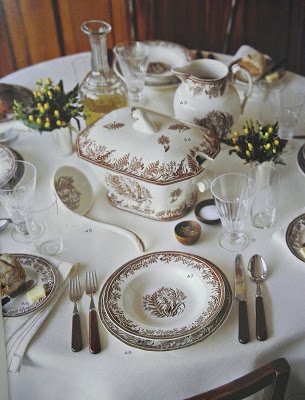
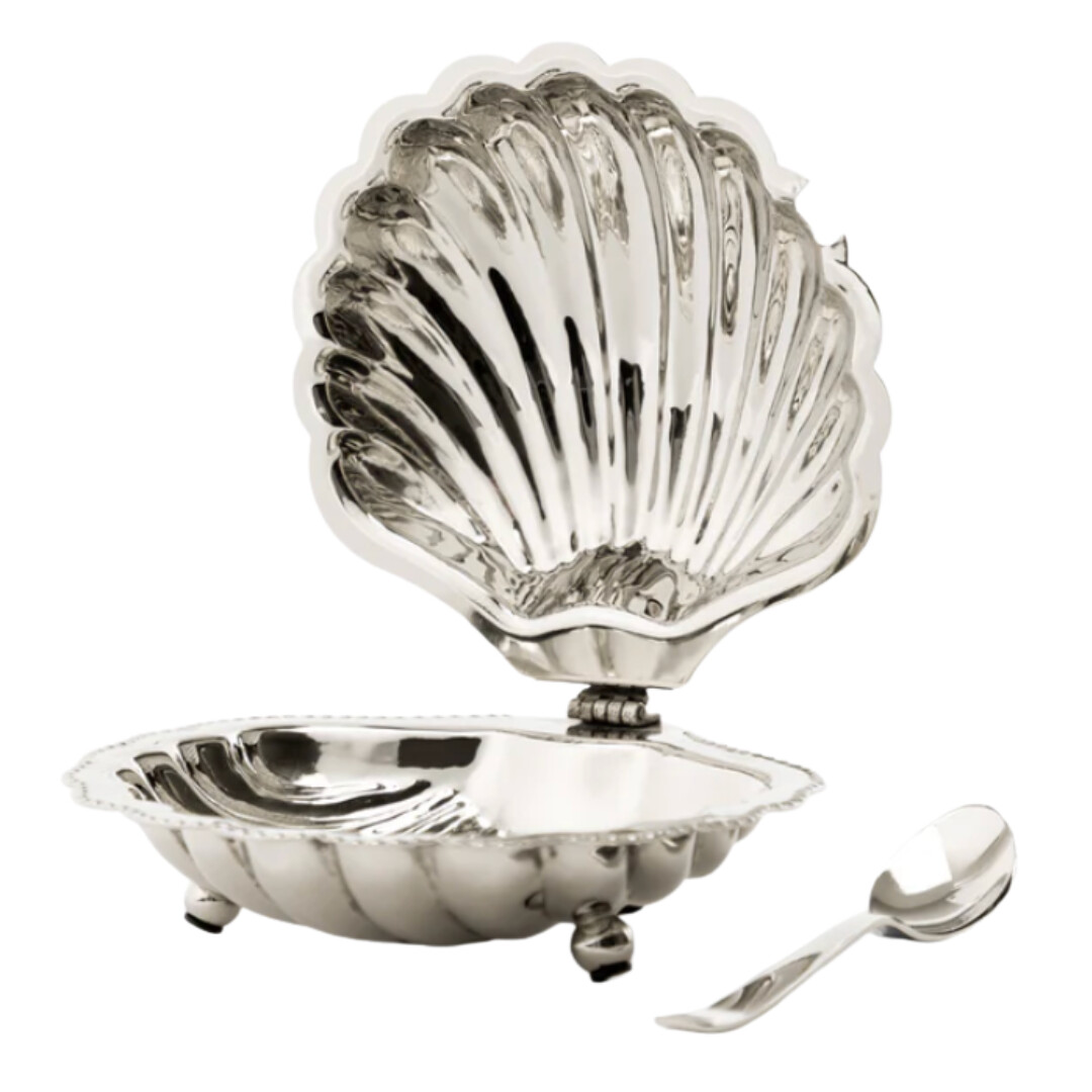
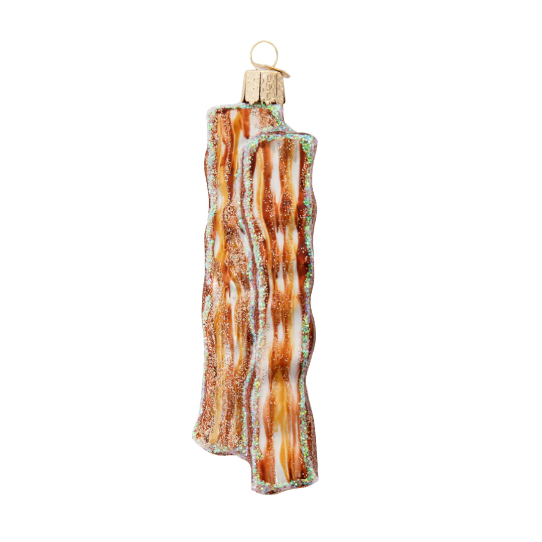
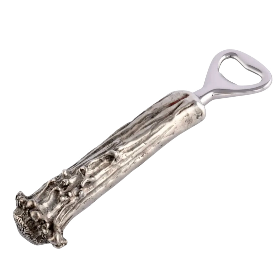
And then there are the accents … the unsung heroes that make everything feel layered and lived-in. A champagne bucket that isn’t just for champagne (we use ours for winter greens and fresh herbs). This valet-style brass hook feels like the kind of thing you’d install once and wonder how you lived without it! It’s perfect for coats, bags, or even hanging something beautiful — just because. This botanical plate adds a soft hit of color that’s fresh, classic, and not tied to any one season. Pieces like this are ideal layered on a shelf, or leaned against the back of a cabinet for an easy, collected look.
There’s also something about small decorative objects that makes a space feel finished without feeling styled. The angel wing brass accent is one of those pieces that’s simple, sculptural, and great for shelves or a stack of books when you need a little visual pause. Then there’s the oversized ceramic vase—much larger than I expected in the best way. My mom had it styled on her island, and seeing it in person completely changed my perspective. The scale, the weight, the presence — and it works just as beautifully empty as it does with branches or greens.
And finally, the Staub Dutch oven. This one feels especially meaningful with it being the Year of the Horse — a symbol of strength, warmth, and gathering. It’s one of those pieces that earns its place out on the counter, not tucked away in a cabinet. Equal parts beautiful and hardworking.
***
What ties all of this together is versatility. Nothing here feels seasonal in a way that will feel dated by spring. These are pieces you build on. The new year, to me, isn’t about reinventing everything. It’s about refining what you already love, and choosing things that make daily life feel just a little more intentional. ✨


