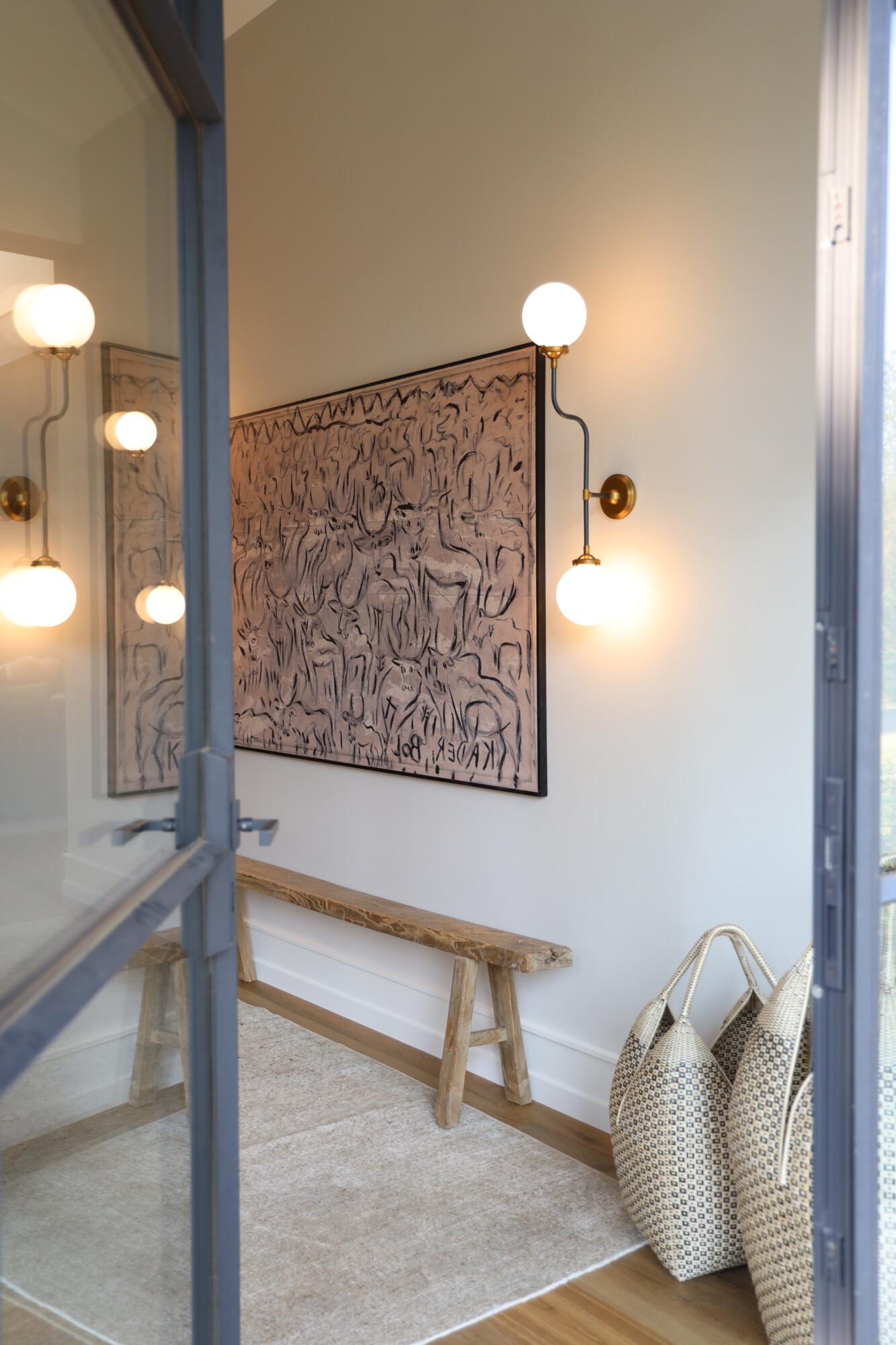
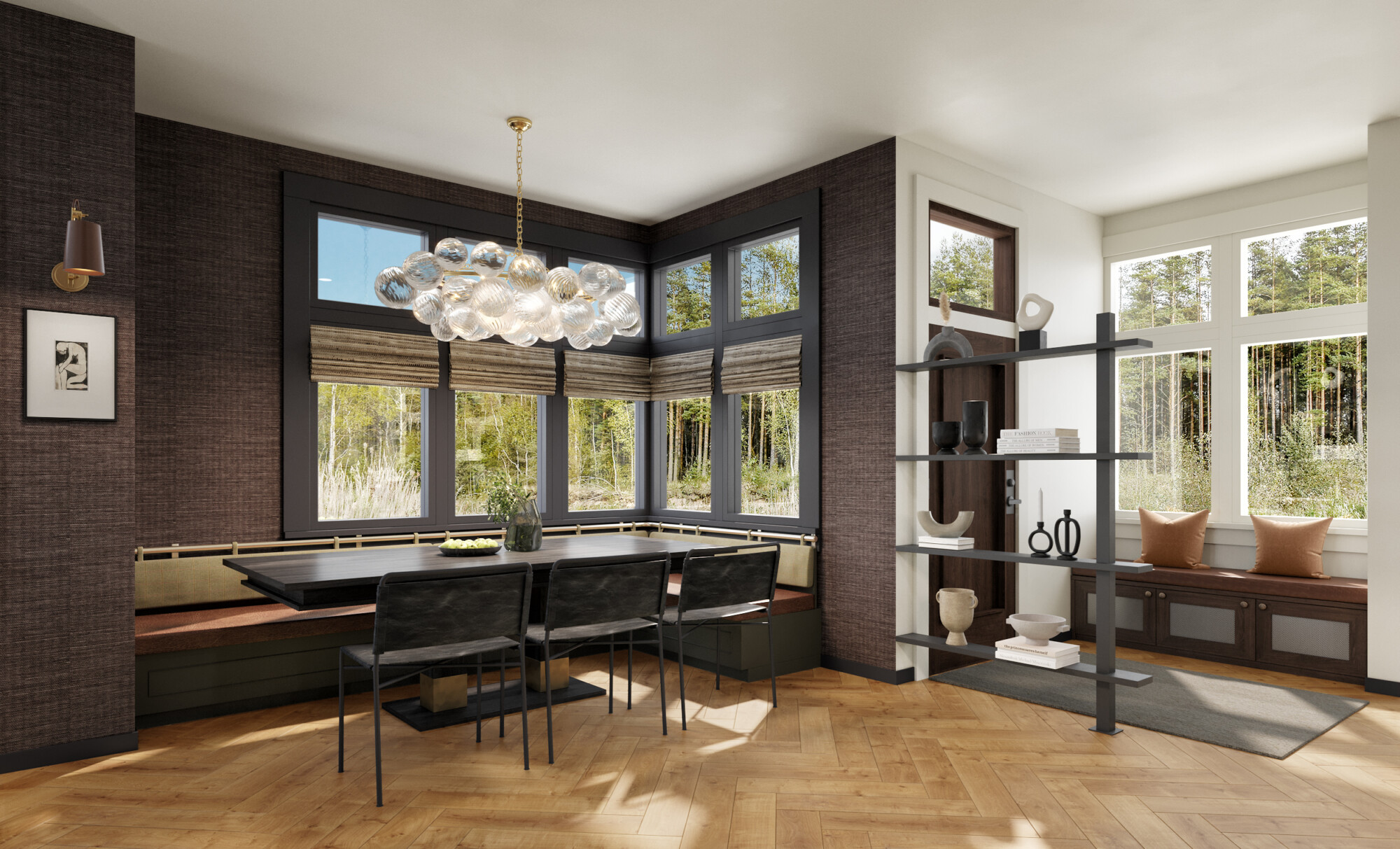
Let’s take a little trip down memory lane! When we first walked through the Tumalo house, one of the more puzzling aspects of the layout was the original primary suite’s location—it was situated right off the entryway. As in, you could open the front door and practically see straight into the bedroom. That setup didn’t feel functional, private, or intentional. It lacked the kind of separation and flow that makes a primary suite feel “special.”
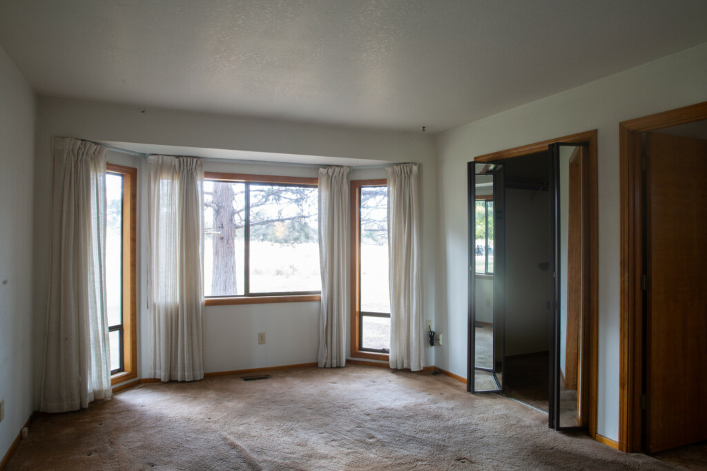
We knew we had to rethink this entirely. The bedroom being so close to the entry and main living area meant no buffer between the most personal part of the home and the spaces meant for hosting and gathering. It also felt a little too tight, like the house didn’t have the breathing room it needed.
So, instead of trying to make that layout work, we completely reimagined the space. The solution? Create a den in the original primary bedroom and extend the house to build a new suite further back. By sectioning off the old bedroom with French doors and turning it into a den, we gave the home a cozy space right off the entry that sets the tone without feeling too exposed. This gave us the breathing room to push the primary suite back into a more private part of the house, making it feel like a true retreat.
Now, when you walk into the home, the den greets you as a warm, inviting space. It’s the perfect spot for lounging, reading, or catching up by the fire, and it creates that much-needed buffer between the entry and the new primary suite. The reimagined layout not only solved the privacy issue but also gave the home a sense of flow and thoughtfulness that was missing before. Sometimes, the best design decisions come from solving the trickiest dilemmas!
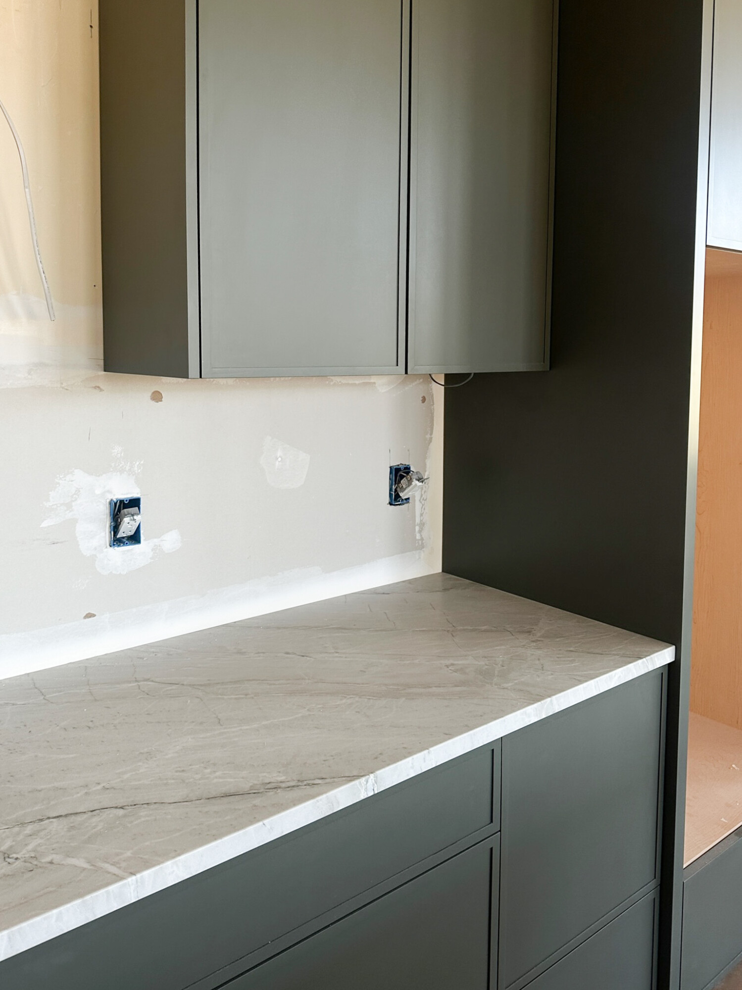
And if you’re new here, this whole area—the primary bedroom and bathroom—is actually part of an addition we built during the remodel. We added 500 square feet to create what you see now!
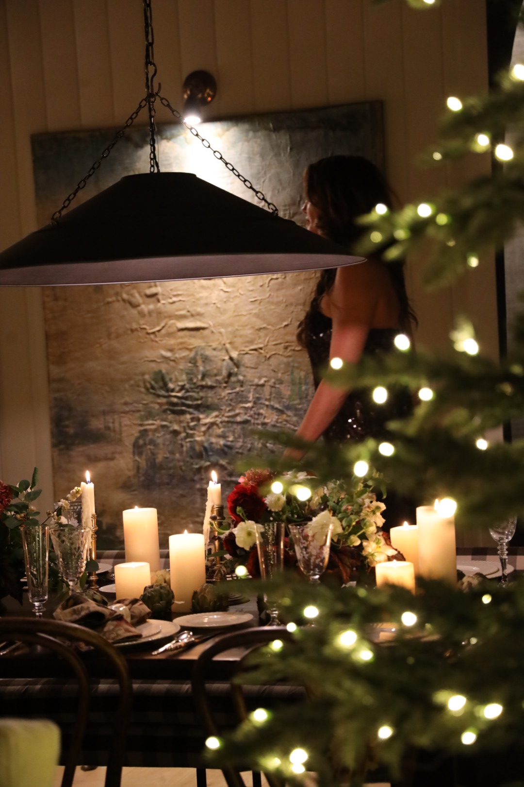
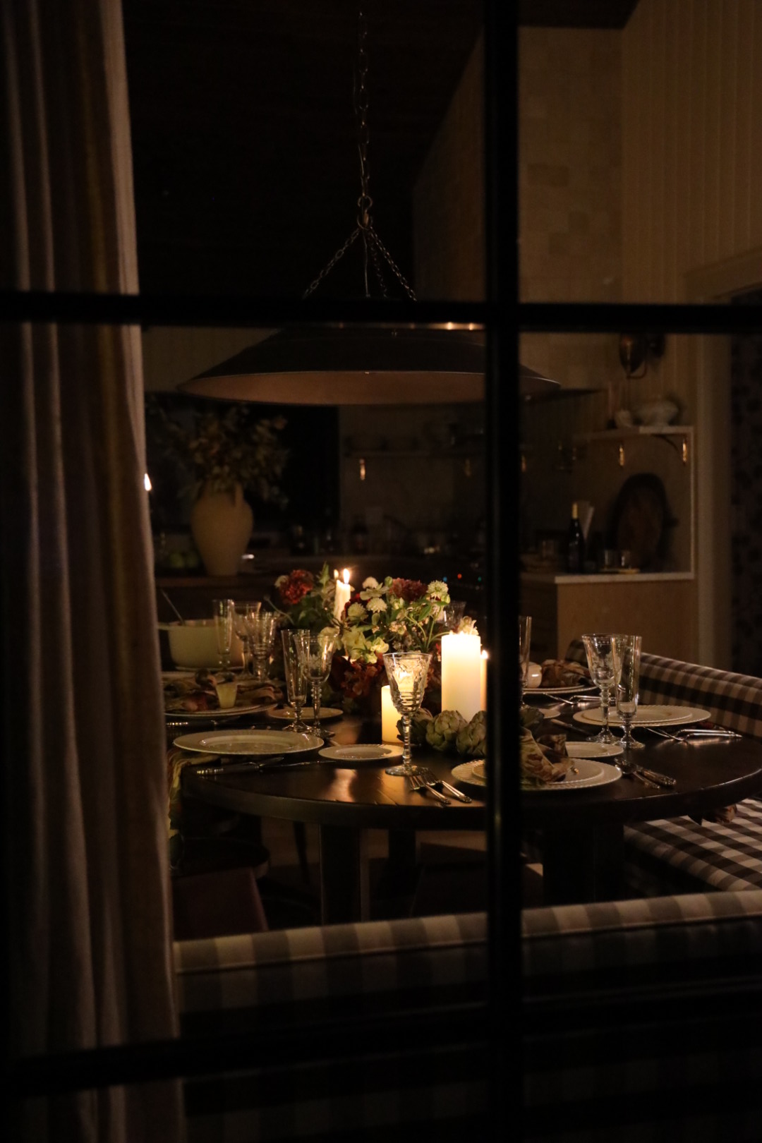
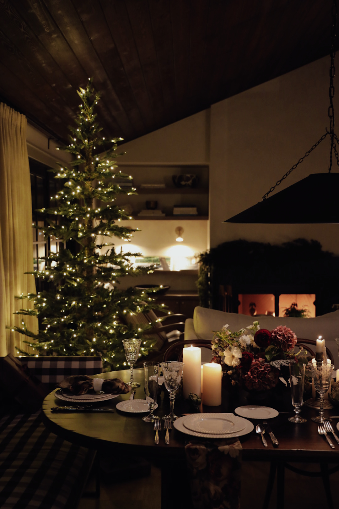
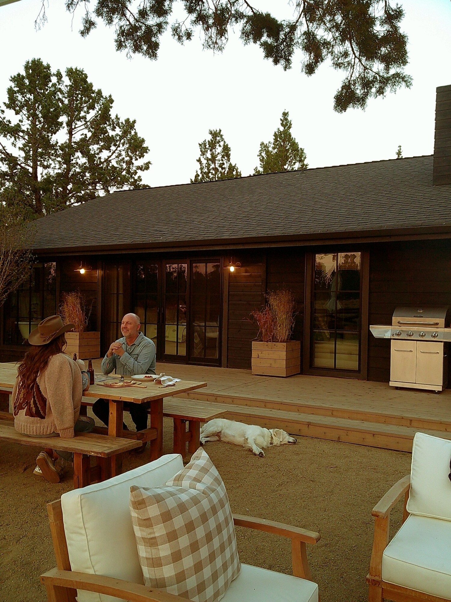
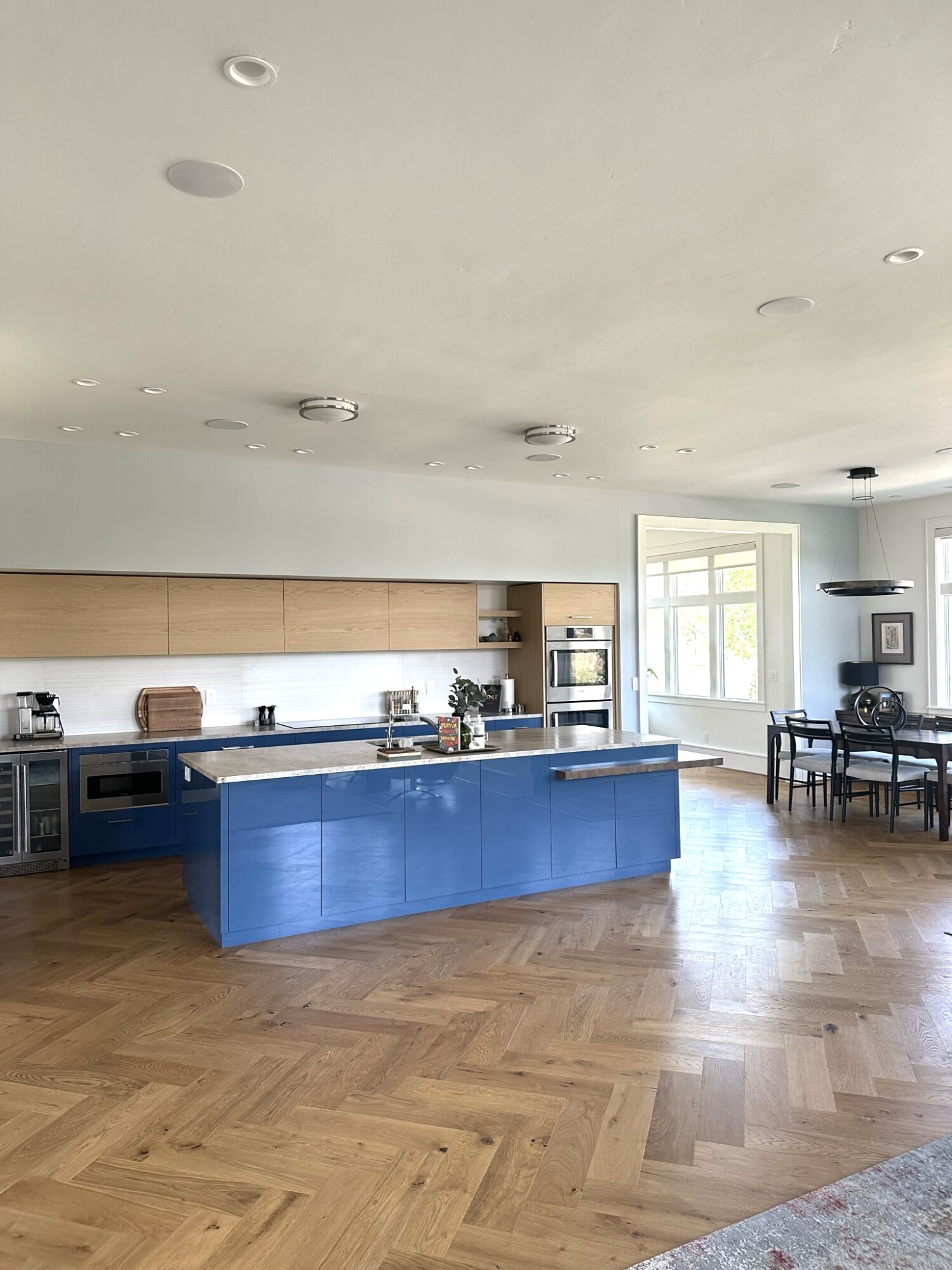
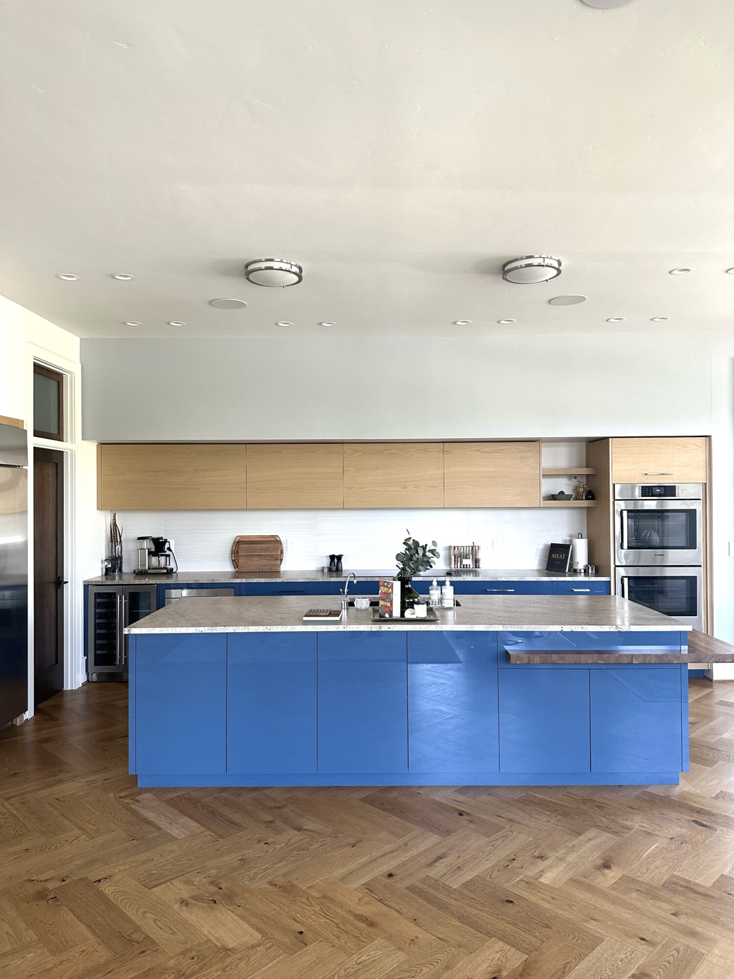
Let me show you around 🤍
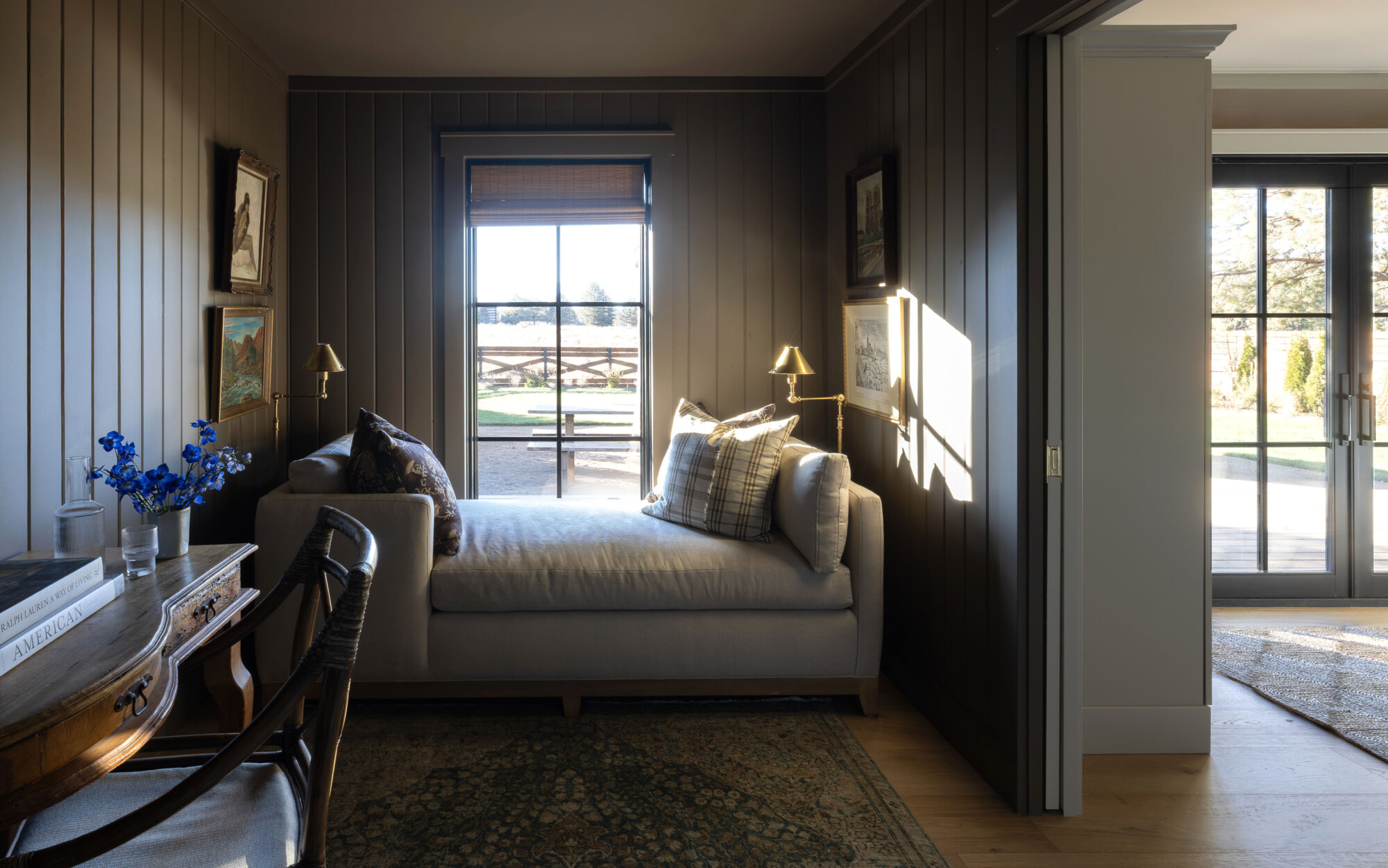
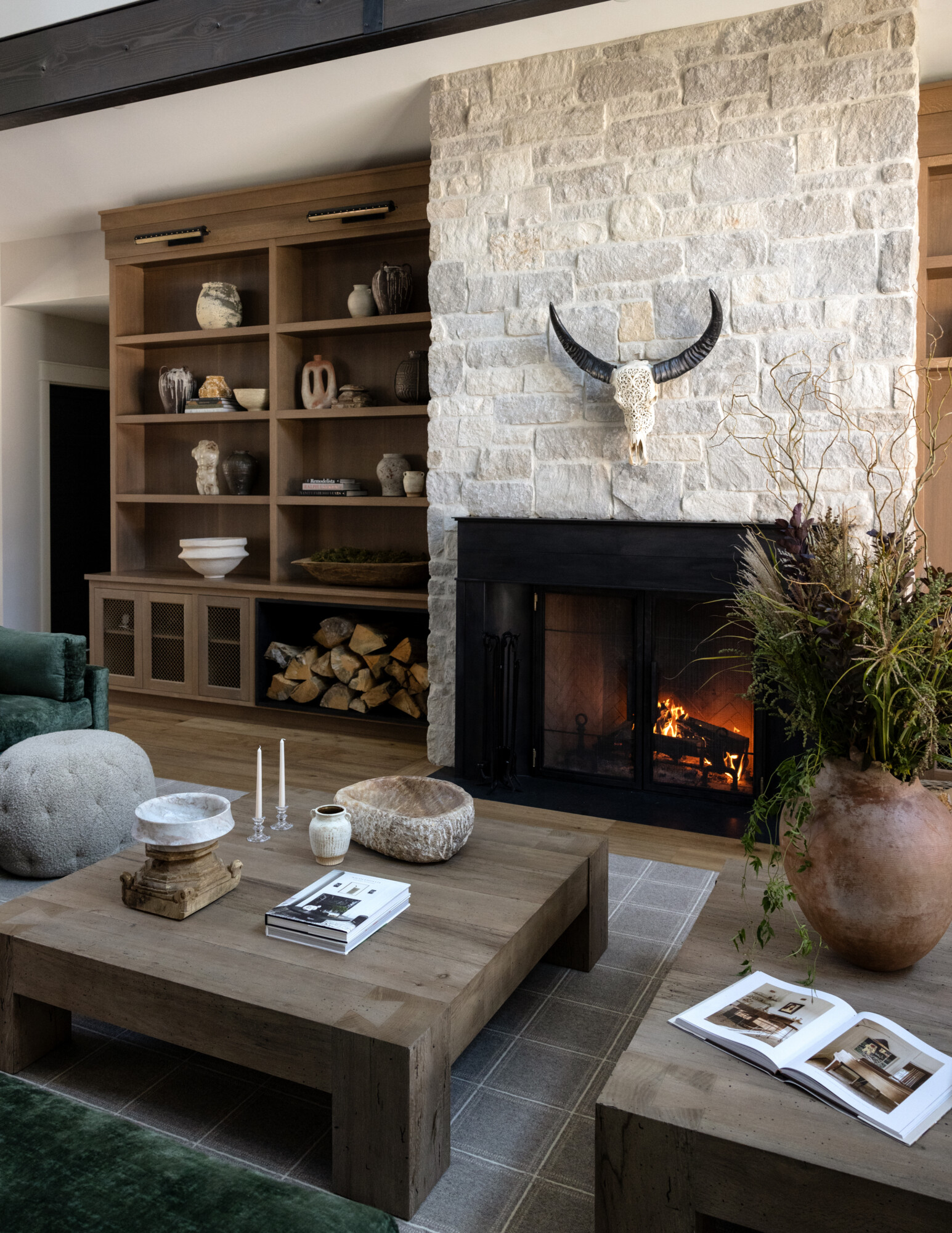
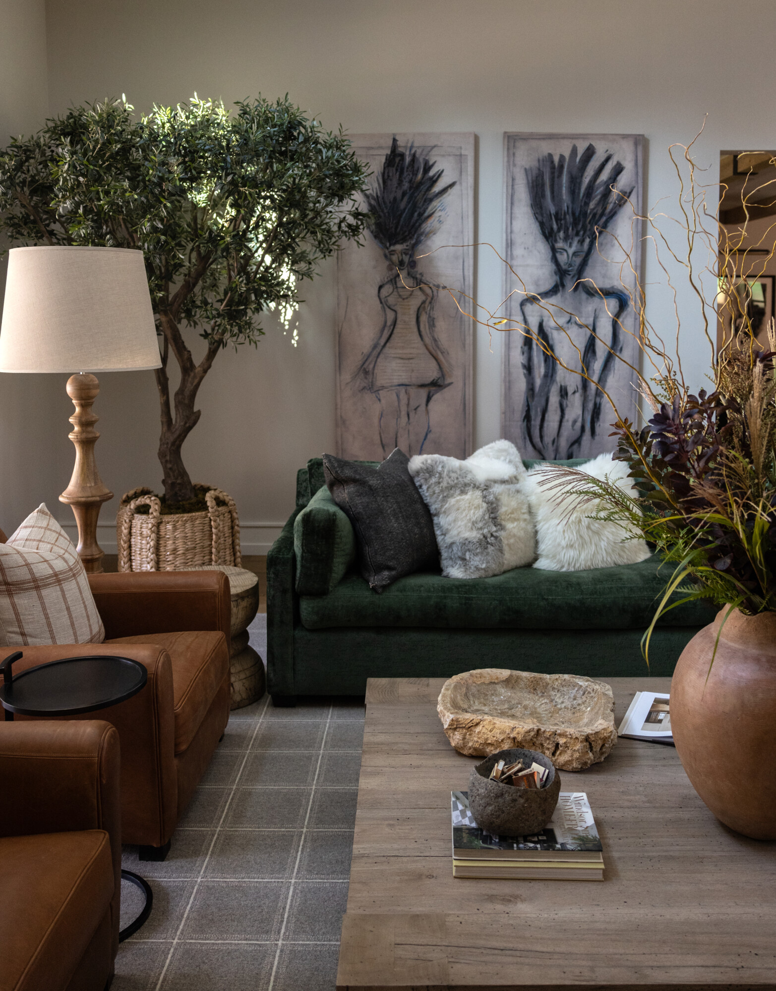
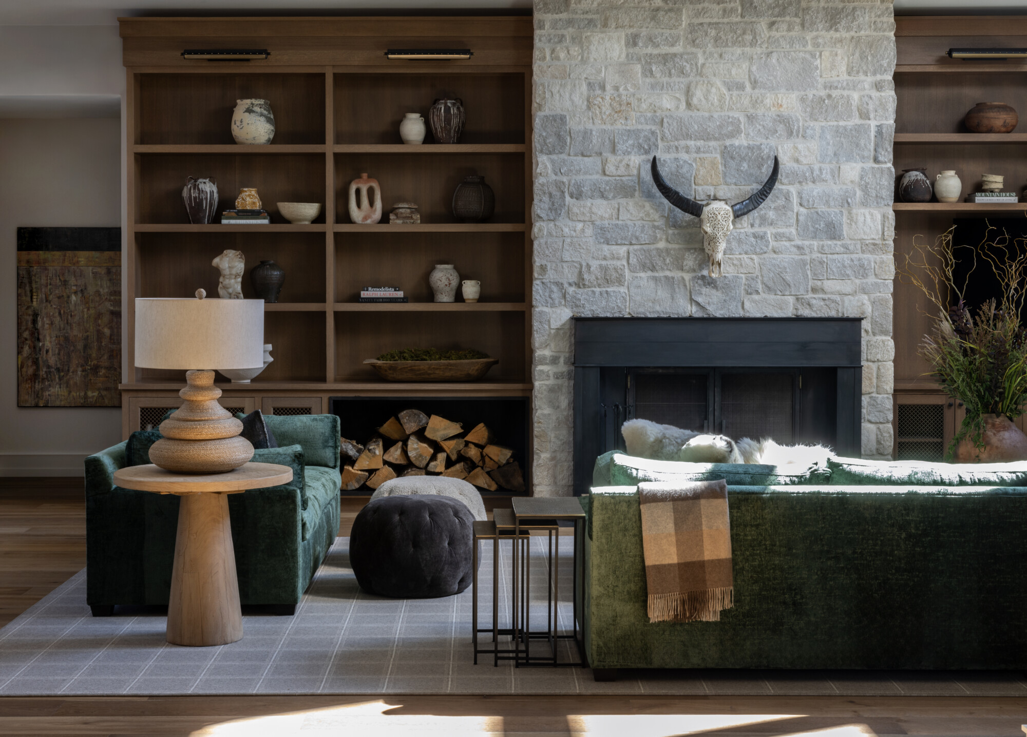
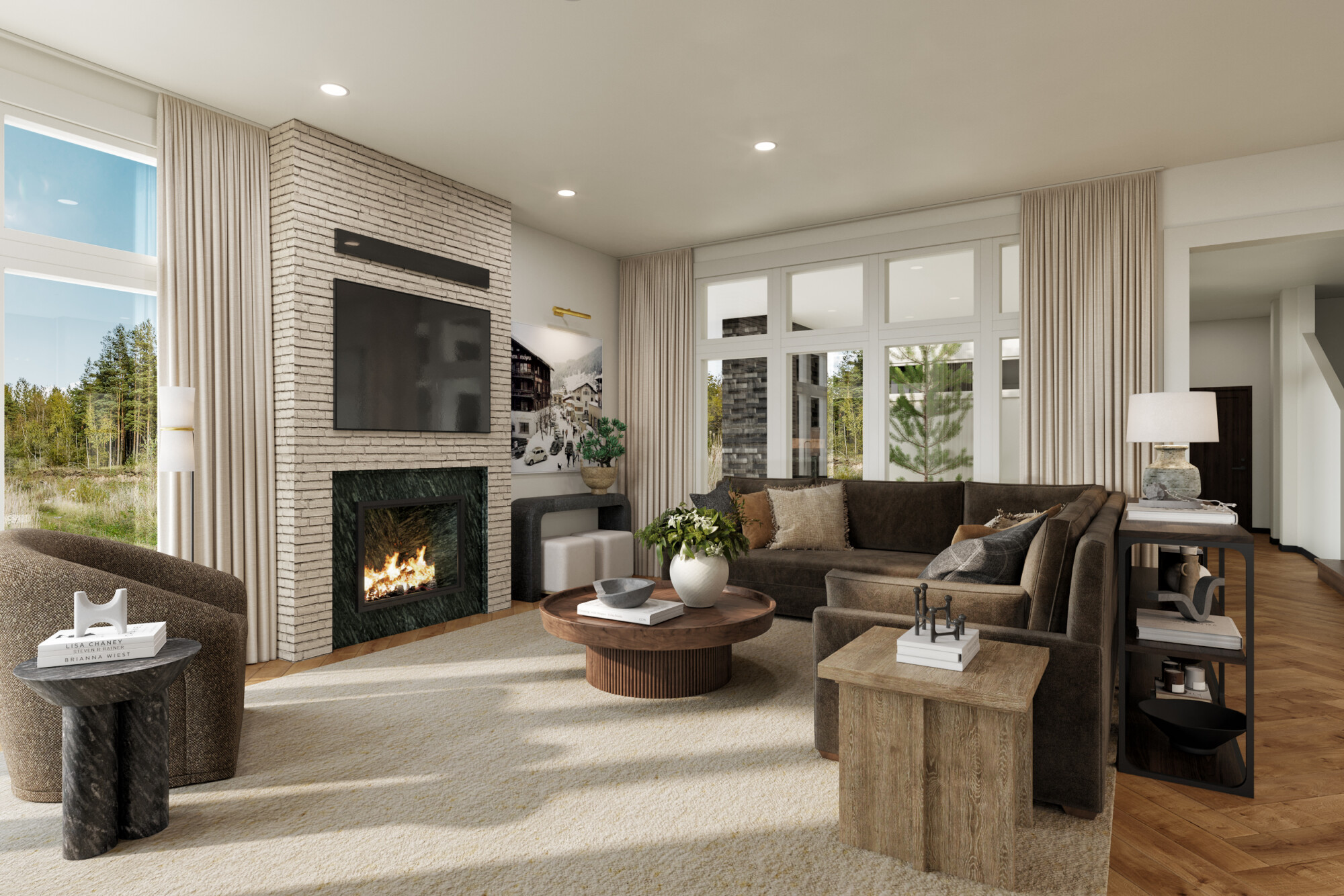
Why Every Home Needs a Cozy Space Like This: The Den
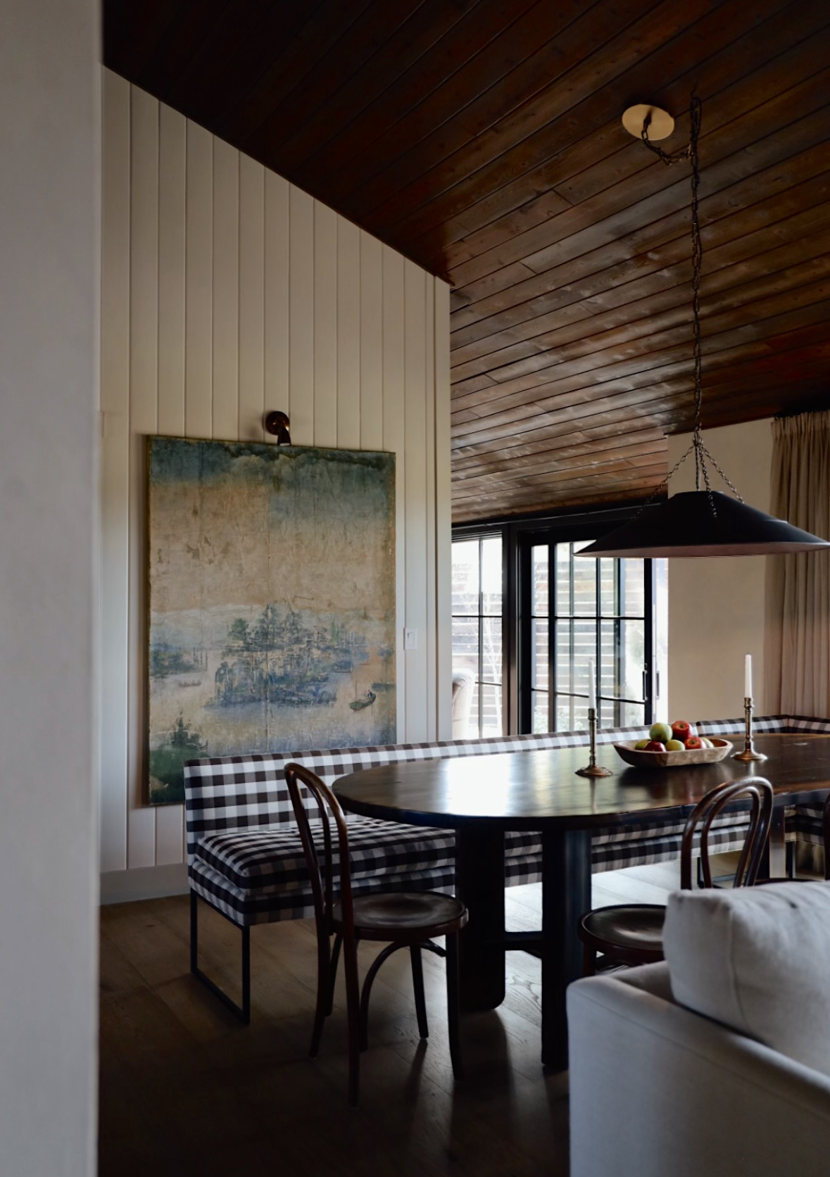
When designing the den (AKA ‘The Snug‘), I knew I wanted to lean into the space’s natural coziness. With limited natural light and a smaller footprint, it made sense to embrace the moody vibe and make it feel like the ultimate retreat.
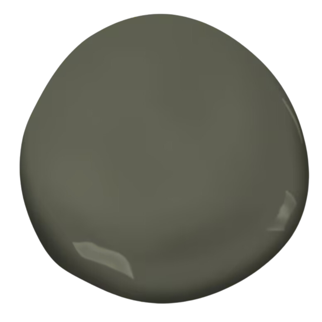
We covered all the walls in shiplap and drenched them in Farrow & Ball ‘Salon Drab, a rich, deep brown that instantly sets the tone. We used the same color in our bedroom at our old house, and I loved it so much that I used it again in here! It’s one of those colors that wraps around you, making the room feel snug and intimate.
The furniture in this space had to work overtime. We brought in our most beloved chaise (find a similar one here)—it has been with us for years, but recently got a much-needed refresh. (Shout out to Lucy, our golden, who has appropriated it as her prime lookout spot).
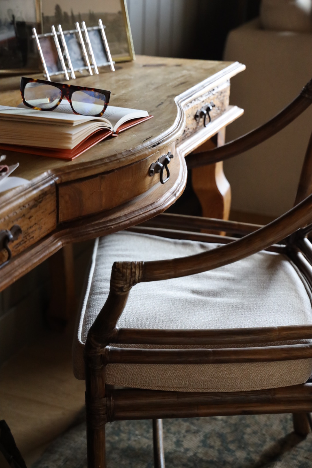
Then, we added a few pillows to give it a whole new look. I’m OBSESSED with this pattern: a beautiful floral with a deep plum ground that makes it so yummy! Alongside it, we added a vintage desk and chair to create a multifunctional area.
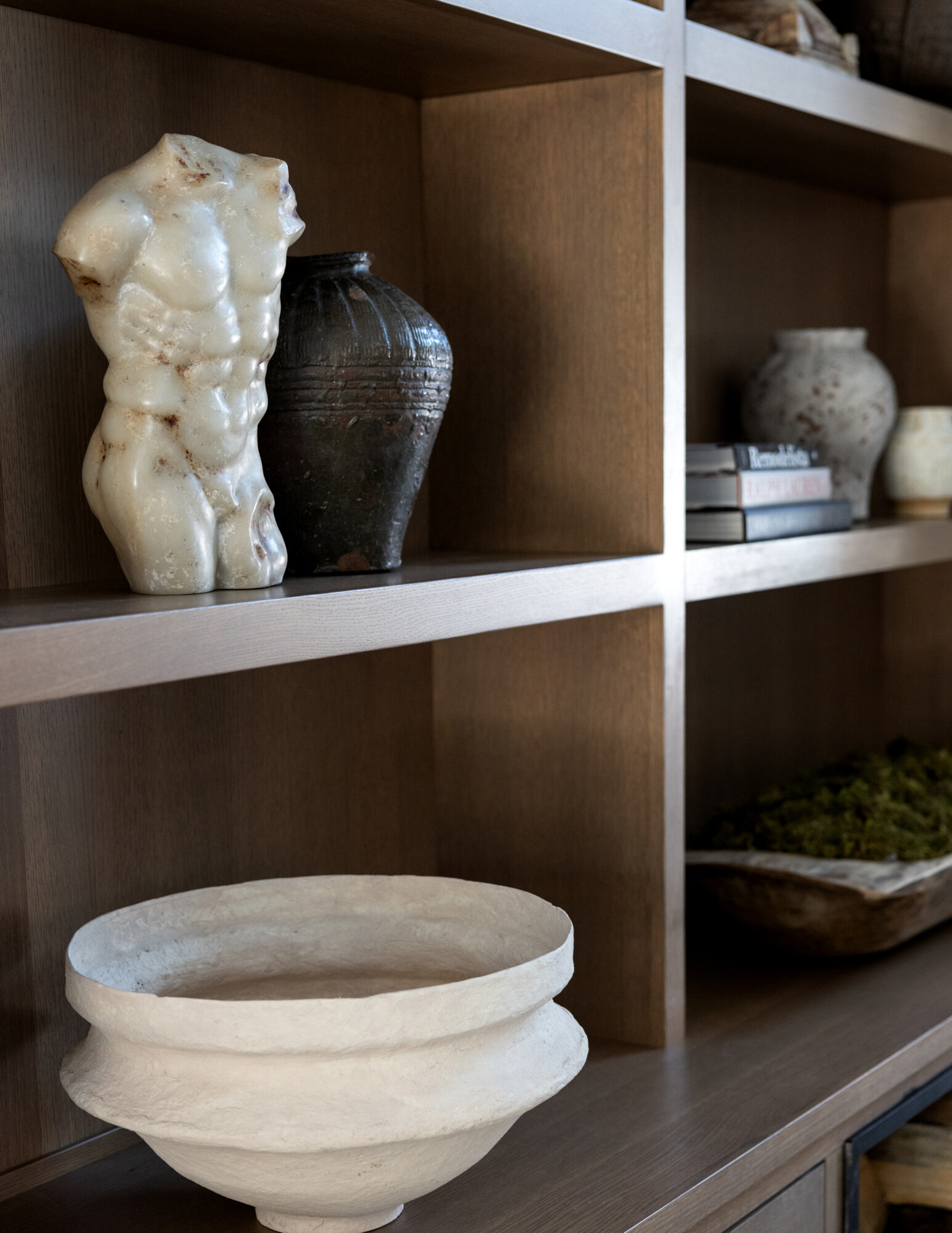
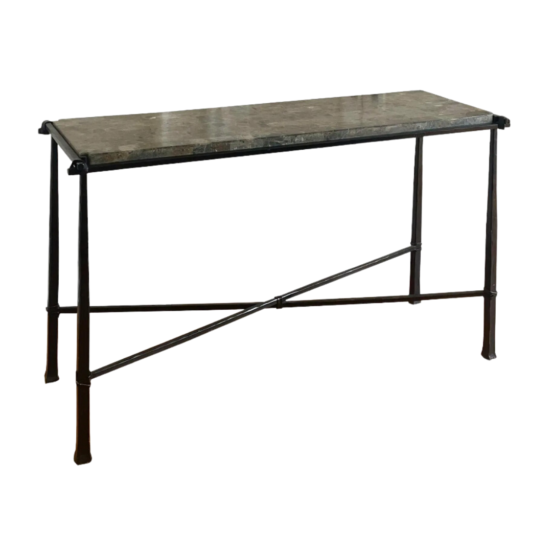
There’s also a hutch for extra storage, and the layout encourages lounging, working, or anything in between! And as always, a beautiful vintage rug really sets the tone for a space. Ours is vintage from Cloth & Wool, find a similar one here.
This space truly gives us options. It’s where we can relax and watch TV (yes, the TV is in the den—it’s so nice to have it separate from the bedroom), or sip a cocktail while waiting for an Uber.
It’s also just a great spot work or relax while the other person is still sleeping. There have been several mornings that I got up before Derrick, and I can close the pocket doors to journal and check emails. It’s designed for all the little moments that make a home feel alive.
What I appreciate most about this den is how versatile it has become. Some days, it’s the perfect spot to recharge with a good book; other days, it’s where creativity sparks while sitting at the desk. It’s a space that feels like an invitation—to pause, to reflect, or to just be. And honestly, having a dedicated room that doesn’t demand much from you but gives you so much in return? That feels like a luxury.
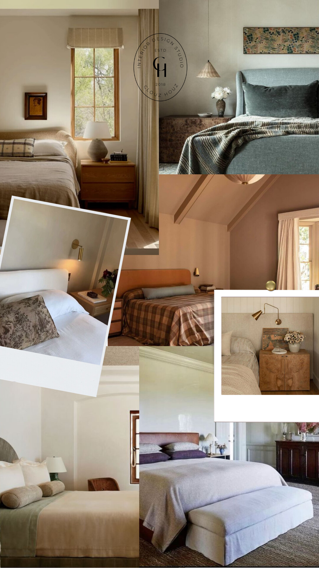
Why Bedrooms Should Be More Than a Place to Sleep
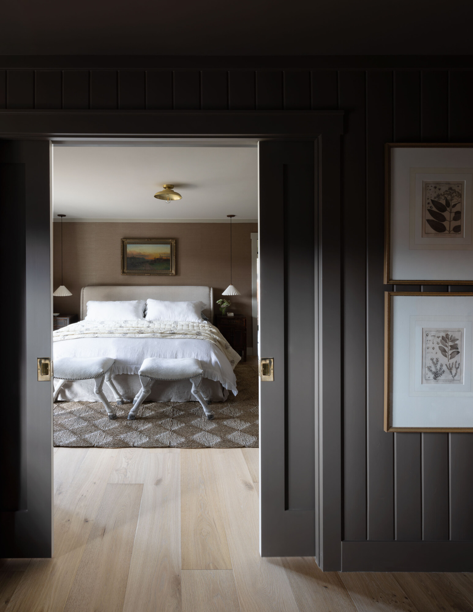
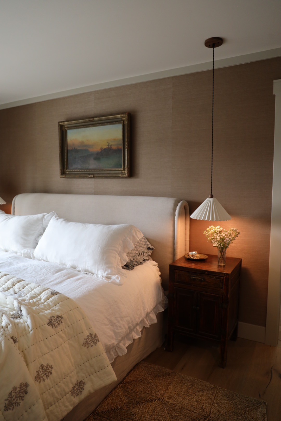
First off, yes, Derrick was fully on board with the muted mauve grasscloth wallpaper I decided to cover the entire room in at the last minute. (Okay, maybe it’s more of a dark salmon, but it’s everything to me). To keep the primary suite grounded, we painted the trim in Farrow & Ball’s ‘Dropcloth,’ which ties in with the rest of the house and pairs beautifully with the wallpaper.
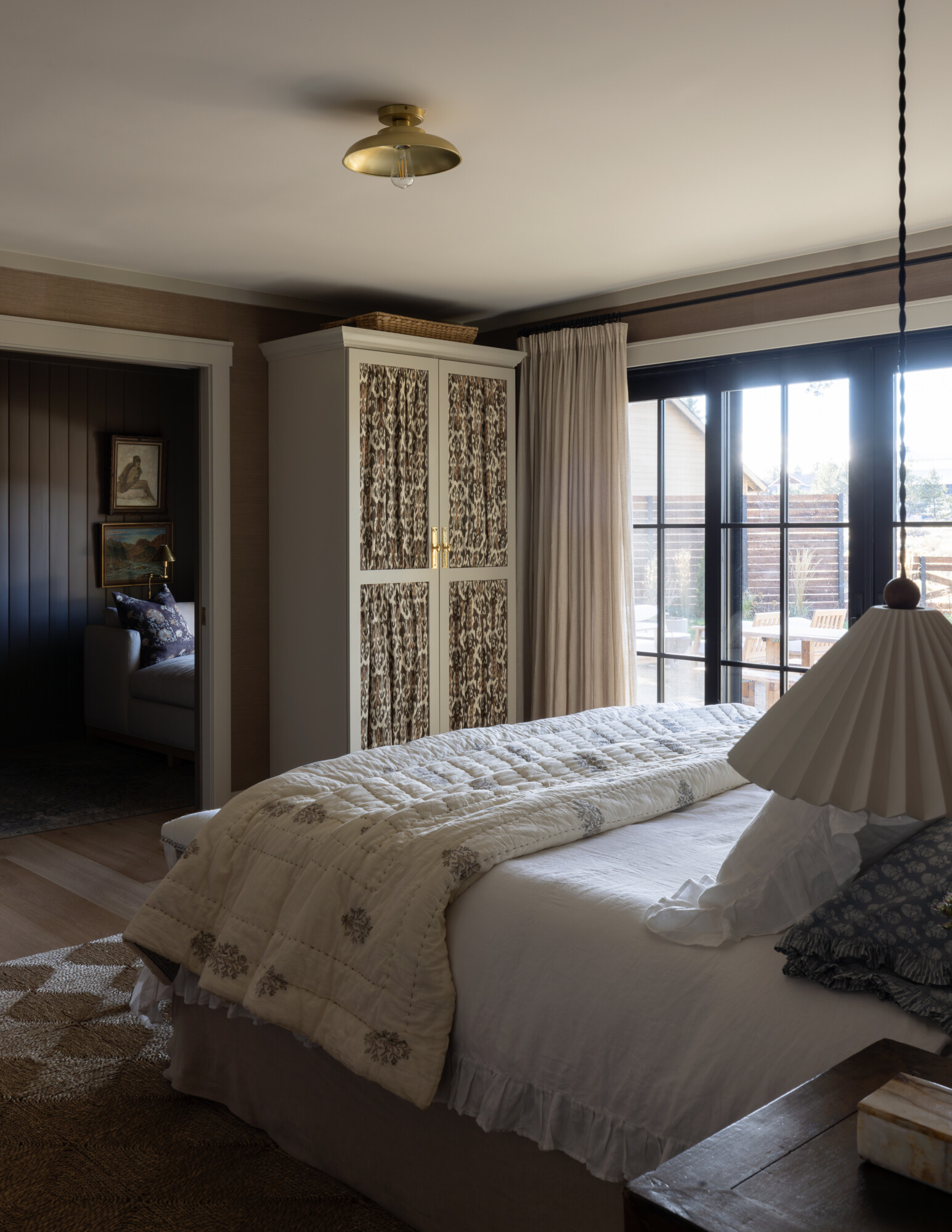
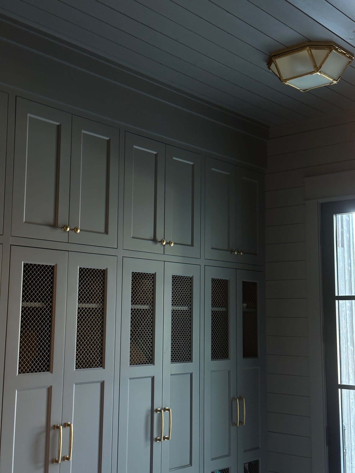
Storage was a big consideration since our closet isn’t exactly spacious. We went with customized Ikea cabinets, and let me just say, they were a game-changer. With fabric panels made from Kettlewell Collection and hardware from Rejuvenation, they look completely bespoke—and saved us thousands. If you’re curious about how we pulled this off, we’ve got a whole video on it. And, I’ll happily do a deep dive if you want the details all in one blog post–just let me know in the comments!
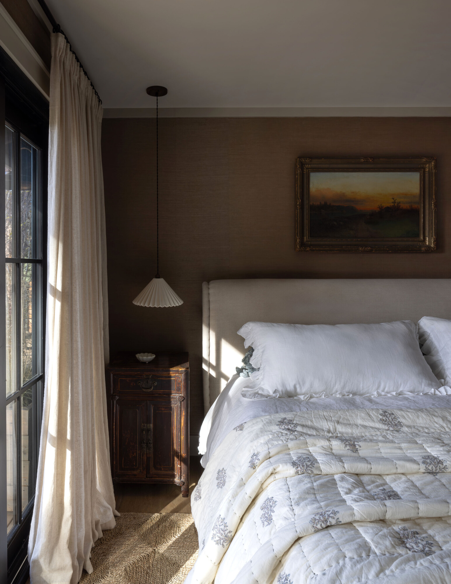
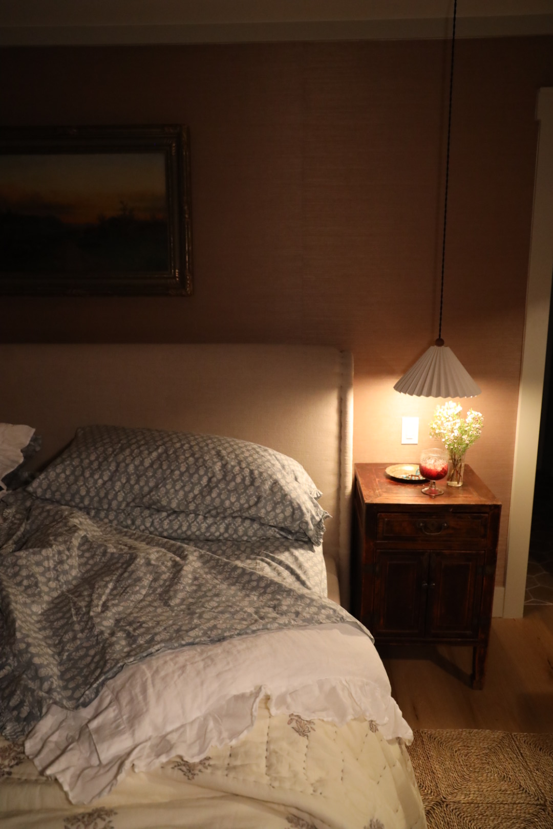
One of my favorite features in this room? The pendants that are from Huey Lighting — but I’ve found a lookalike! Not only are they gorgeous with their ceramic shades and rope details, but they free up ample space on the nightstands, making the room feel less cluttered.
Clouz Houz tip: pendants are a game-changer if you’re working with limited surface for nightstands. In our space with a king bed, we could only allow for nightstands 18” wide. Opting for a lighting fixture of this style completely frees up your nightstand and allows for a more sleek look!
The Finishing Touches in the Primary Suite
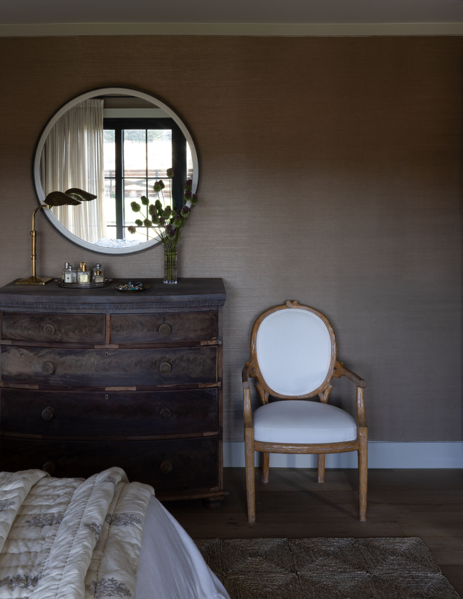
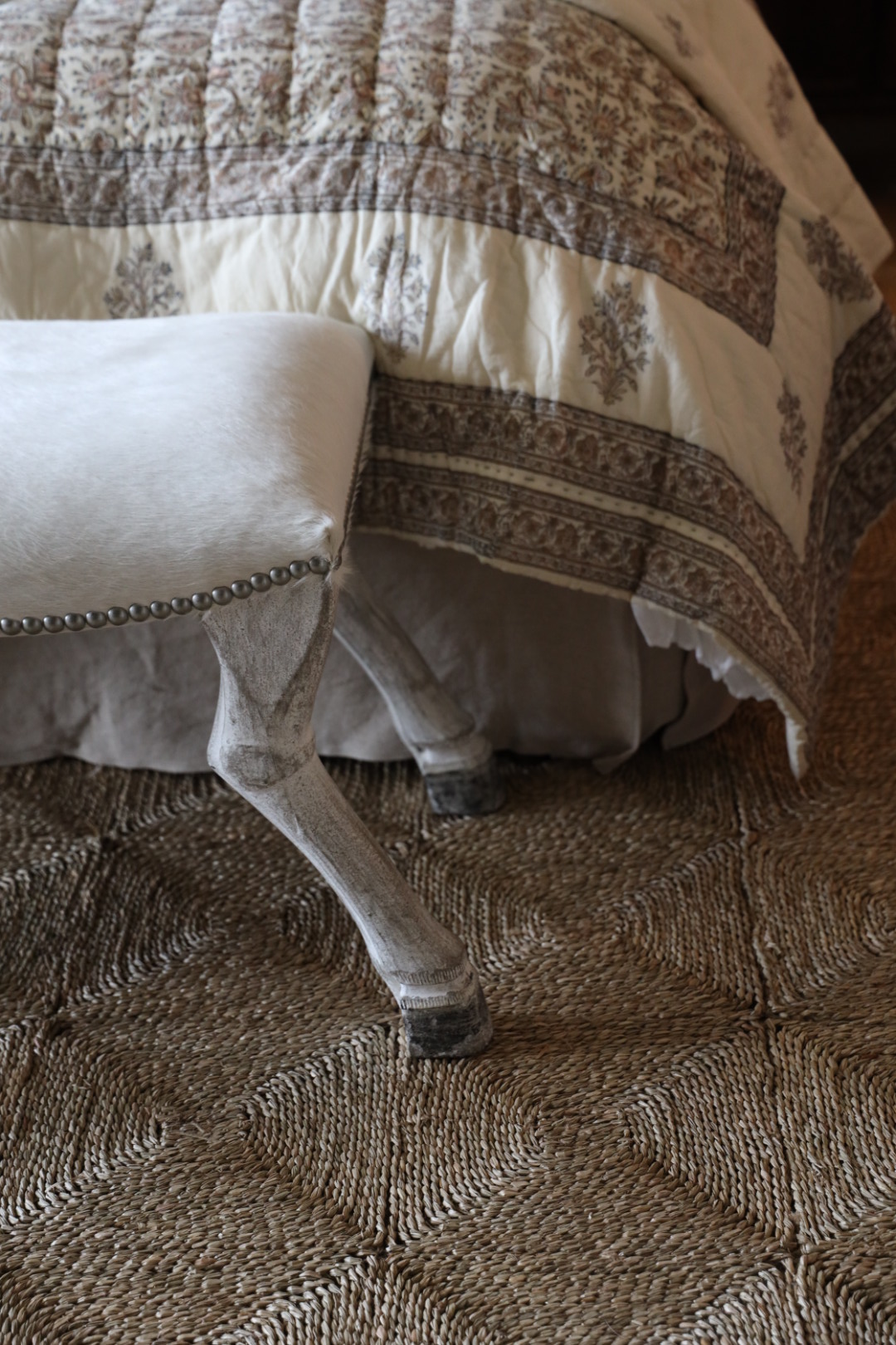
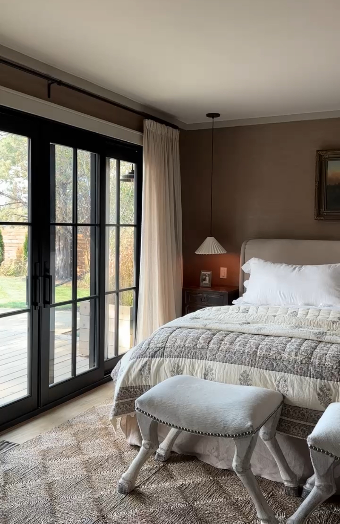
For the finishing touches, we layered in a Rush House rug, a bed from Amber Lewis Collection for FourHands, and some antique pieces we’ve collected over the years, like the dresser and chairs. It took me a while to find the right bedding, but I’m absolutely loving the linen duvet with ruffle trim and matching shams. And this McGee & Co quilt is the cherry on top! I’ve been really loving the simplicity of this bed — comfy, inviting and not overly complicated.
This bedroom has become my sanctuary. It’s calm, functional, and a space where I can truly unwind at the end of a long day.
The Bathroom: A Space for Function and a Little Luxury
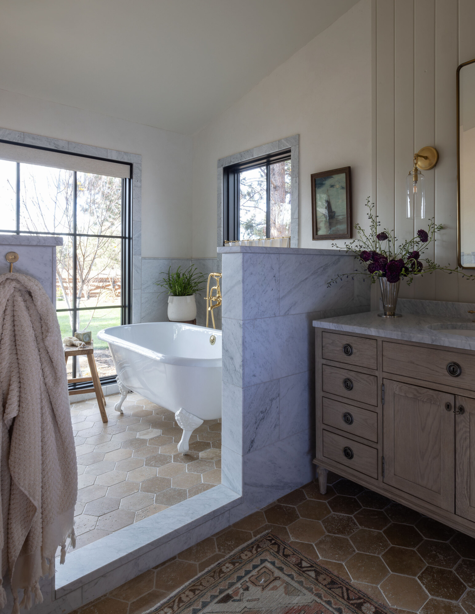
Welcome to our bathroom—one of the most functional and serene spaces in the house. One of the best decisions we made was adding his-and-hers vanities from Restoration Hardware. Having separate sinks and areas feels like such a simple luxury, but trust me, it makes mornings easier and more functional. It’s a great way to start the day!
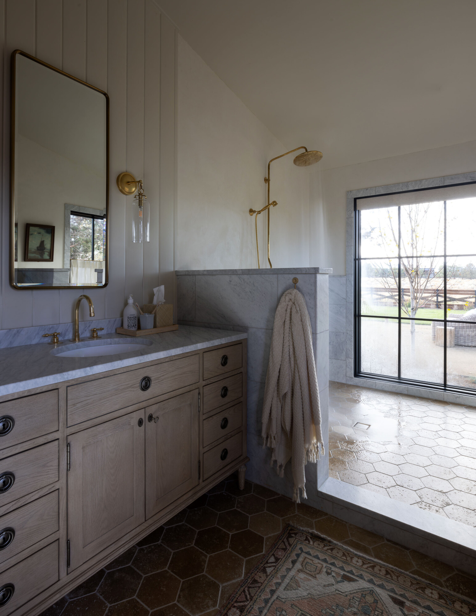
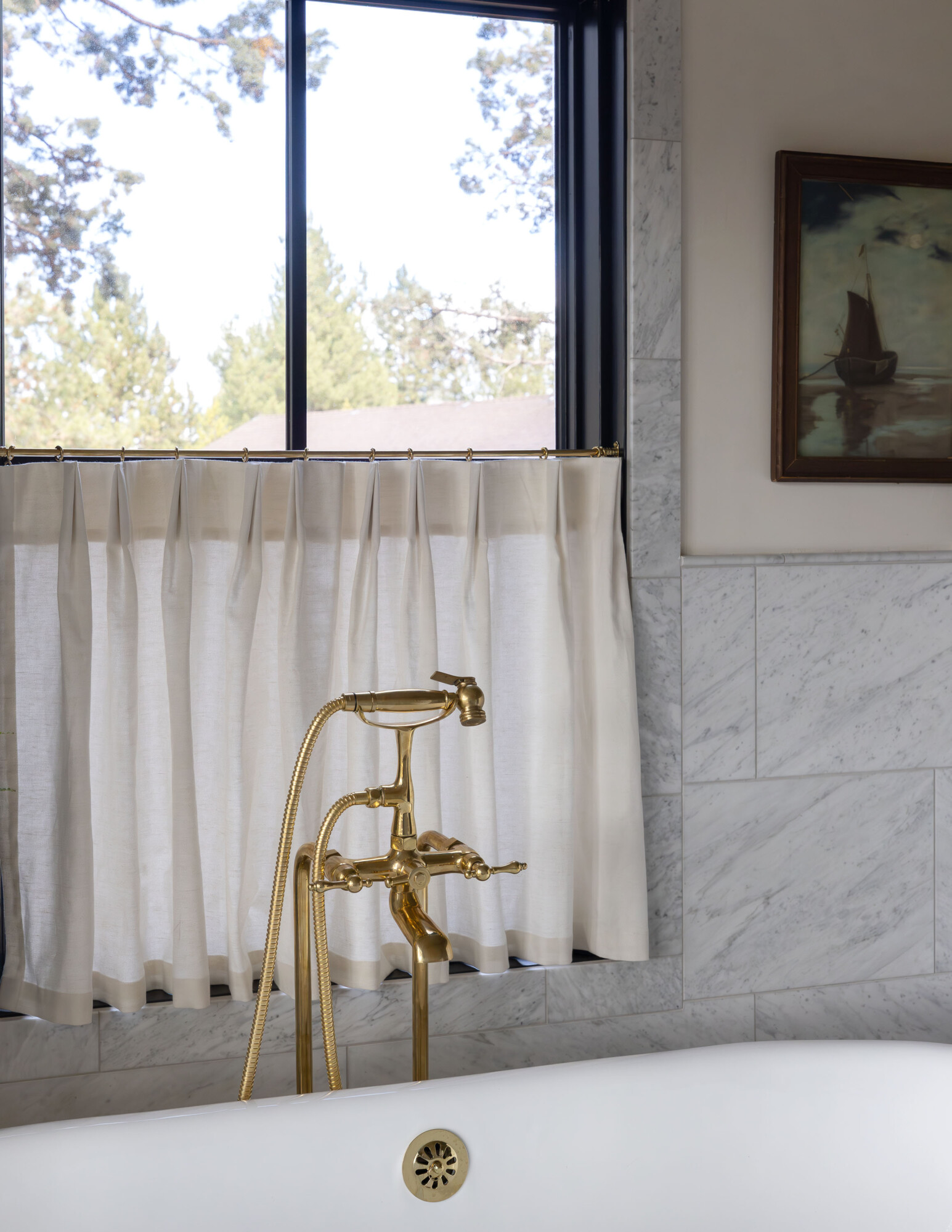
The layout is open and airy. On one side, we installed a brass exposed shower system we found on Etsy—a unique detail that brings a little charm to the space. On the opposite side, we placed the bathtub. And yes, I know what you’re thinking—windows in the bathroom? Thankfully, no neighbors off the back!
We did add a roller shade from Blinds.com for the shower window but honestly, it feels private facing the back of the house. Call me crazy but I prefer bathing with a view. It makes the space feel connected to the outdoors. We planted Aspen trees right outside the large window to add some privacy as well. Another great find … this cafe curtain by Pepper Home. I’m so impressed with the quality — beautifully lined and pinch pleats are my love language.
For the walls, we went with a mix of plaster which we had professionally finished by a local artisan, Wallsart International. She added a finish that makes it waterproof for wet areas. It gives the bathroom texture and warmth, and shiplap, painted in Farrow & Ball ‘Old White.’ The floor tile is from Cle, and we took the extra step to have it heated—because waking up to frigid Central Oregon mornings is not for me! Derrick will say I’m always cold, which is an exaggeration, but I do think this was a needed luxury 🤣). Stepping onto warm tiles is one of those little details that feels indulgent, but makes a big difference in your daily routine.
***
A House Becomes Our Home
Honestly, taking on our own home project was equal parts exciting and overwhelming (so many decisions!). This house really pushed us to rethink everything. Creating the den and moving the primary suite felt like a leap at first. But, now I can’t imagine it any other way! That den has become the coziest little corner of the house.
The best part of this whole process? Watching this house slowly turn into our home. It’s not perfect (I’m still figuring out what art to hang in the snug), but it’s functional, it’s personal, and it feels like us. I guess that’s the magic of design—it doesn’t have to be perfect to be exactly right. Thanks for following along—truly, it means so much. Here’s to creating spaces that feel good, quirks and all.


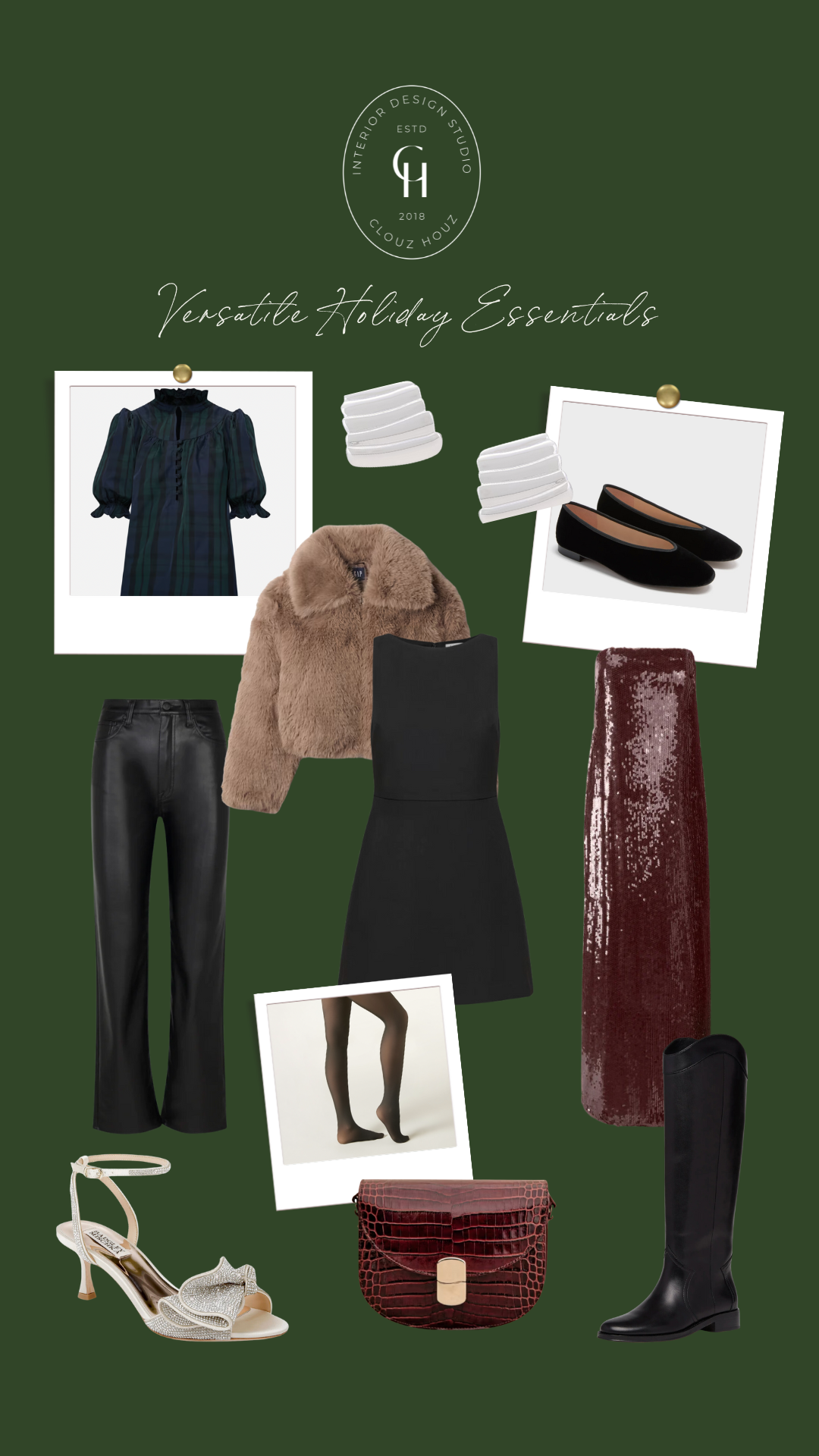


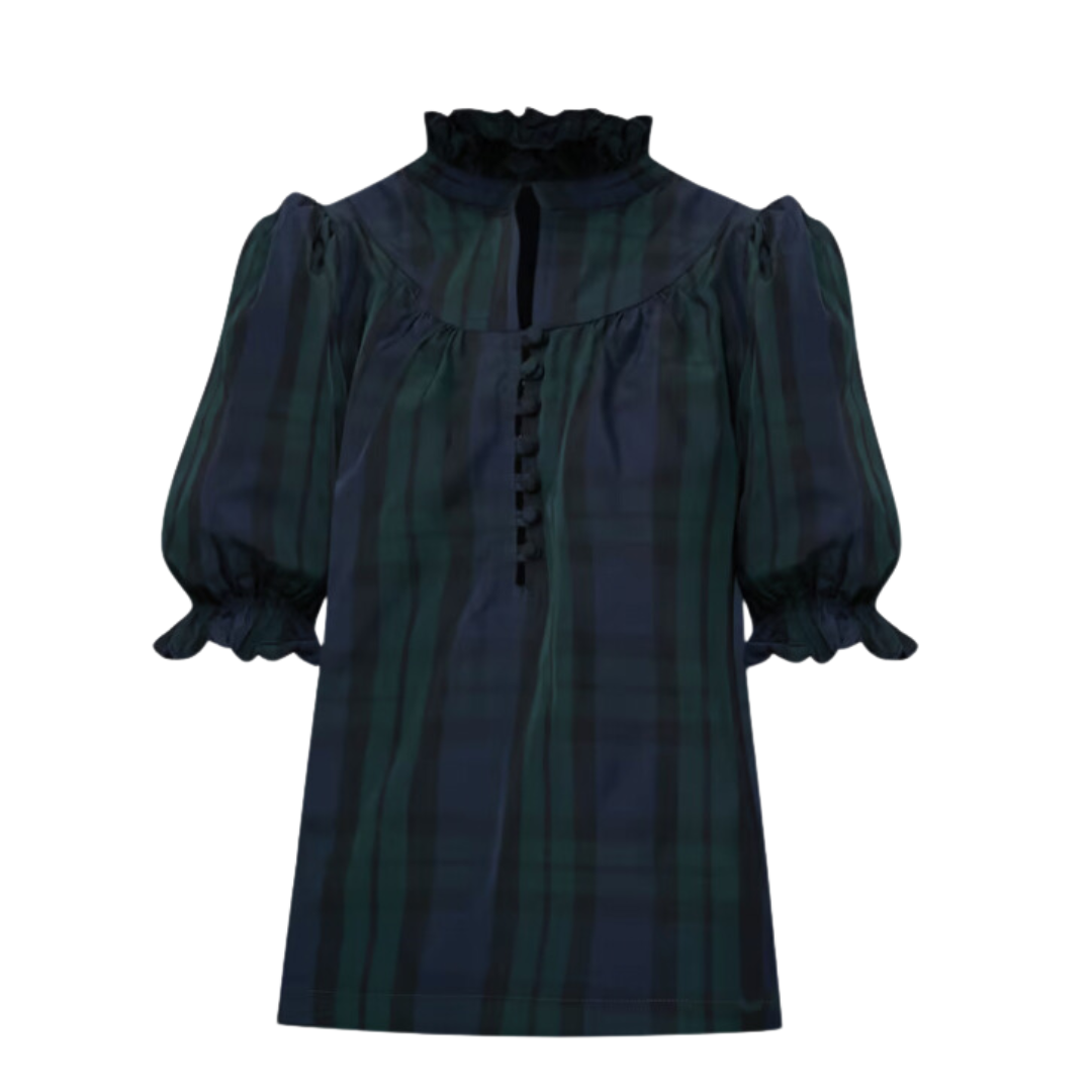
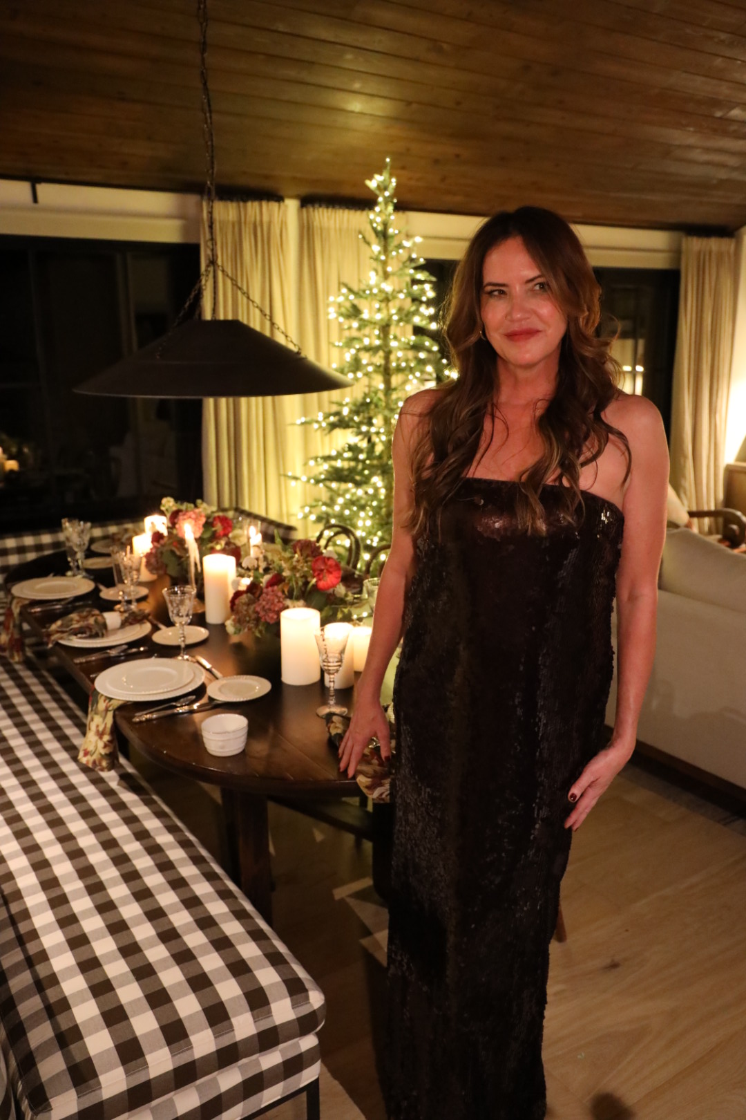

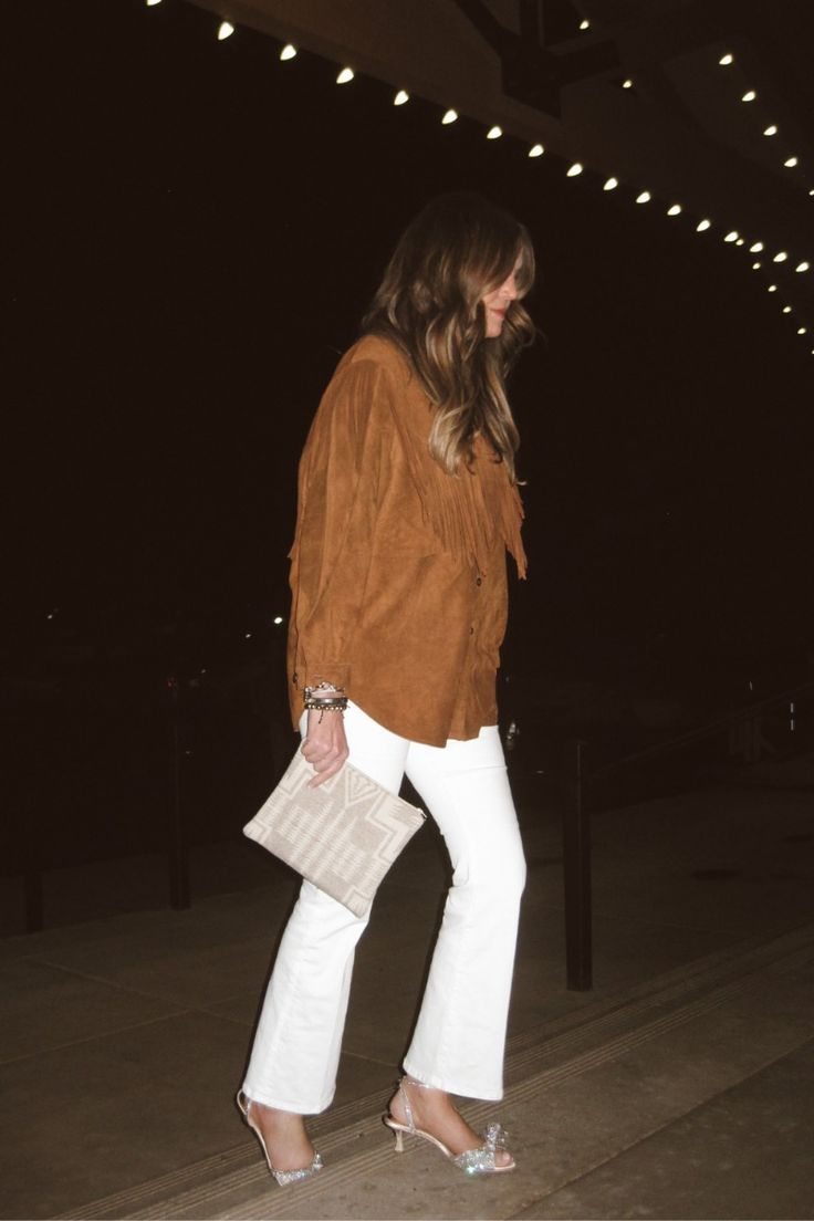

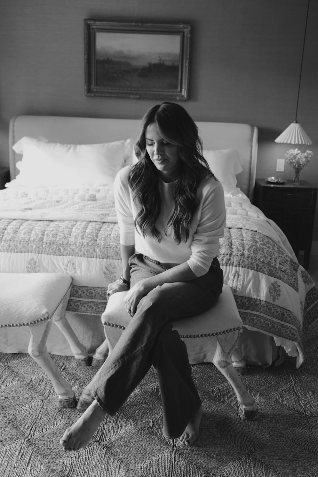
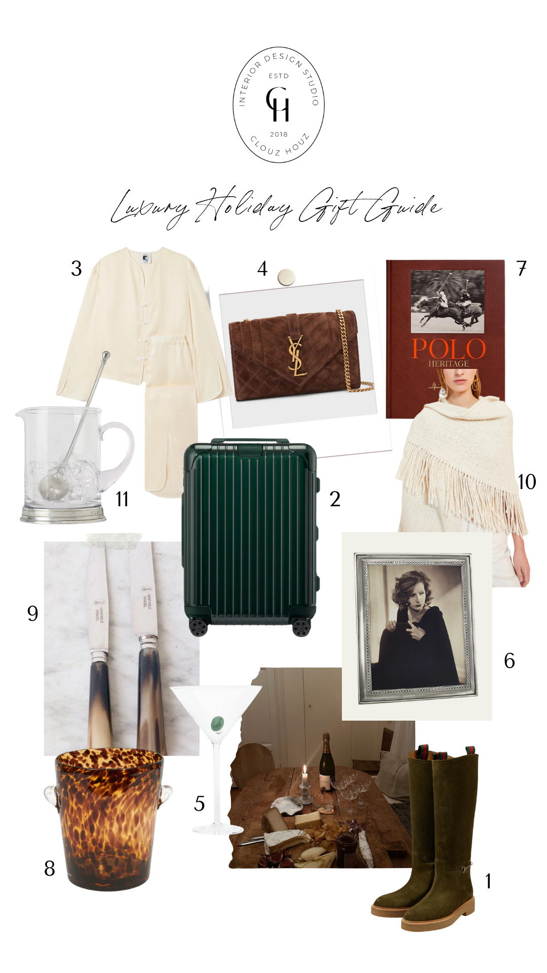
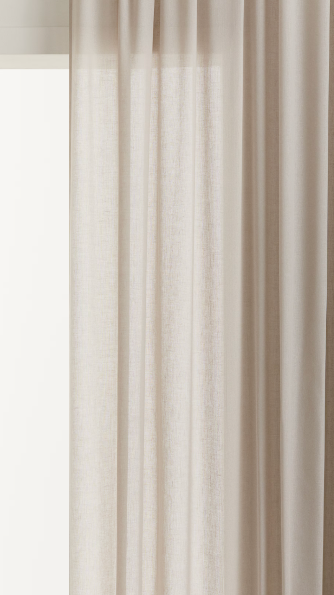
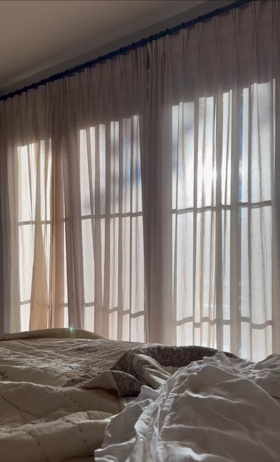
 Clouz Houz tip: Let’s not forget the importance of staying warm without sacrificing style. This is possibly my greatest hack that I have to offer you in this post:


