Inside a Virtual Design Project: From Conception to Execution
What you actually receive—and how we think through every decision
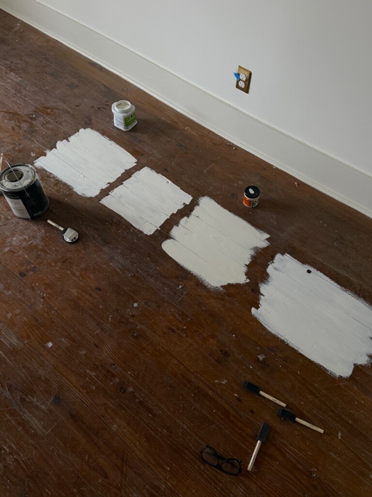
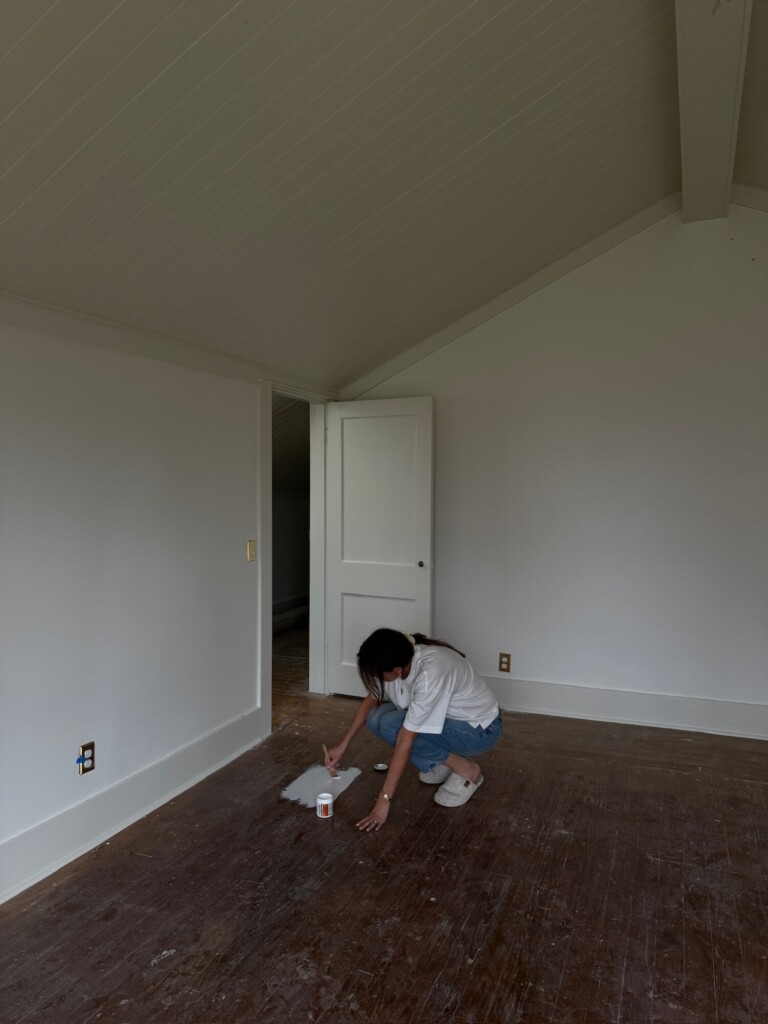
Design Starts Long Before the Final Reveal
Most people don’t realize how much goes into it. When you think about working with a designer, you picture the end result: the finished kitchen, the layered living room, the before and after.
What’s less talked about is everything that happens before that. The decisions and the planning. The way each element is considered in relation to the next.
That’s exactly the part we focus on through our Premier Virtual Design service. Creating a complete, highly detailed plan delivered to you within weeks, not months! Ready for you to implement on your won. So whether you’re working on just one room or a couple, the goal is the same: to create a clear, cohesive plan before anything is executed.
For many of our clients, they don’t necessarily need full-service project management. But, what they do want and need is clarity. A clear direction. A plan that ensures everything works together before they start making purchases or construction decisions.
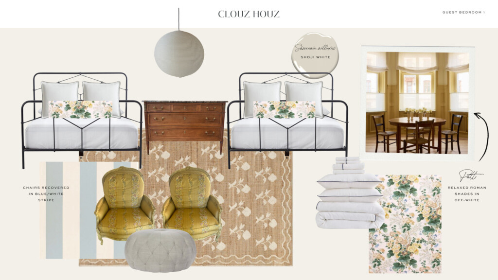
What Premier Virtual Design Actually Looks Like
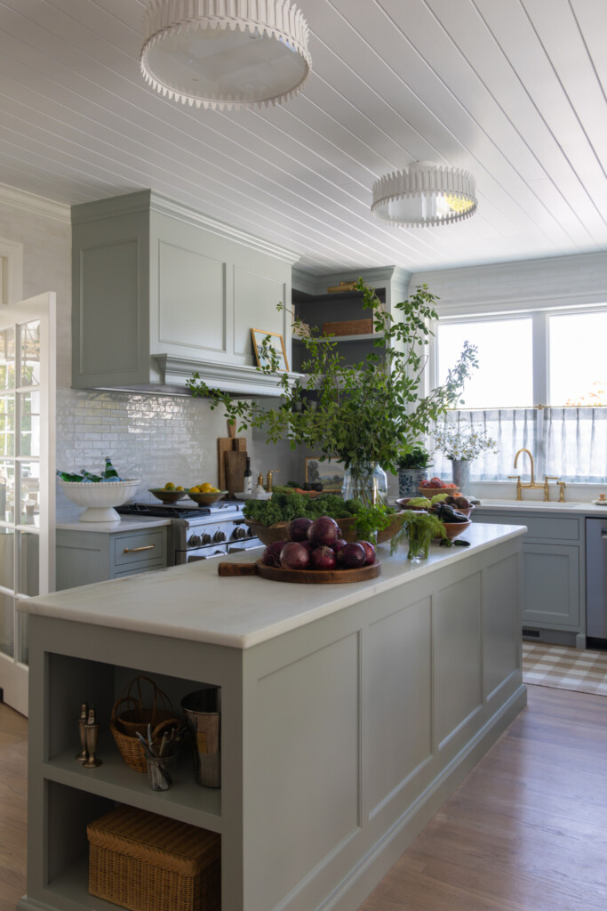
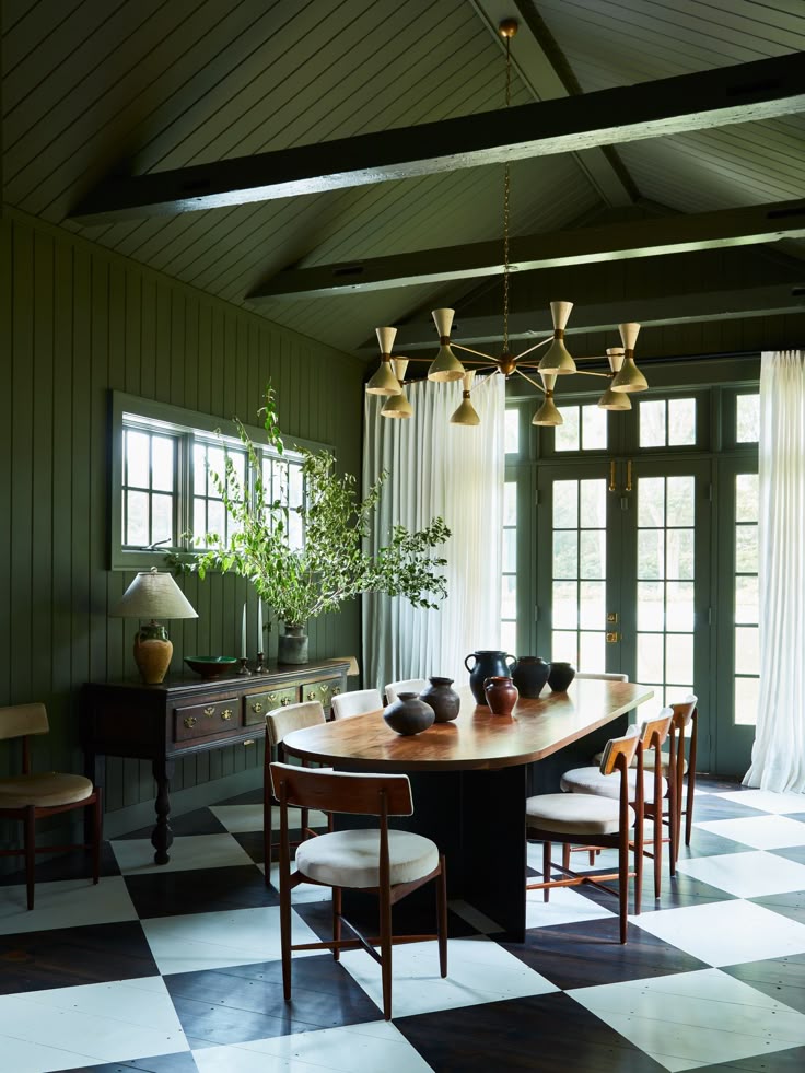
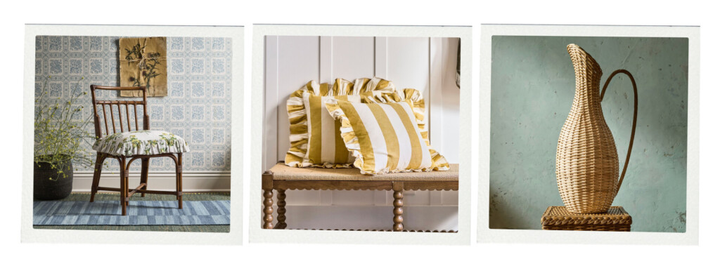
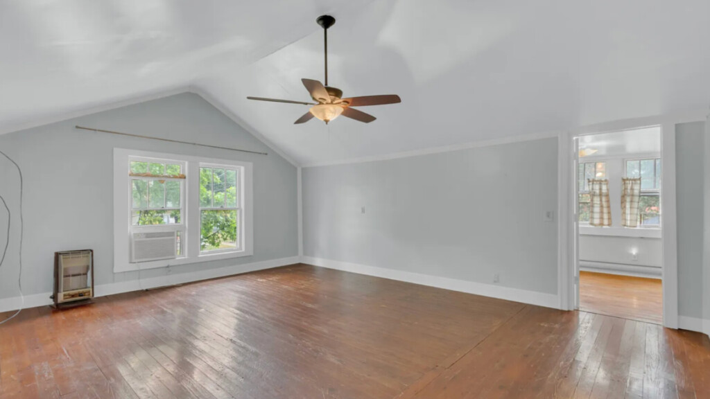
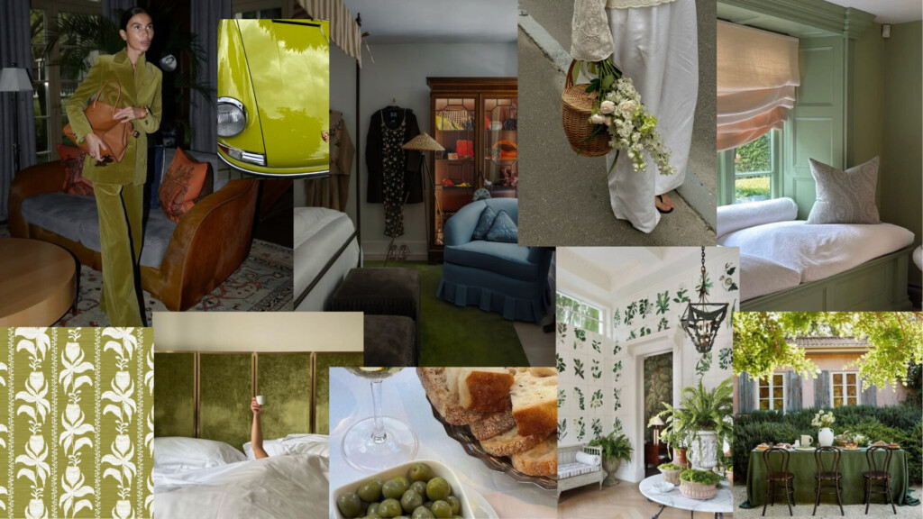
This project started the same way many of ours do … with a feeling.
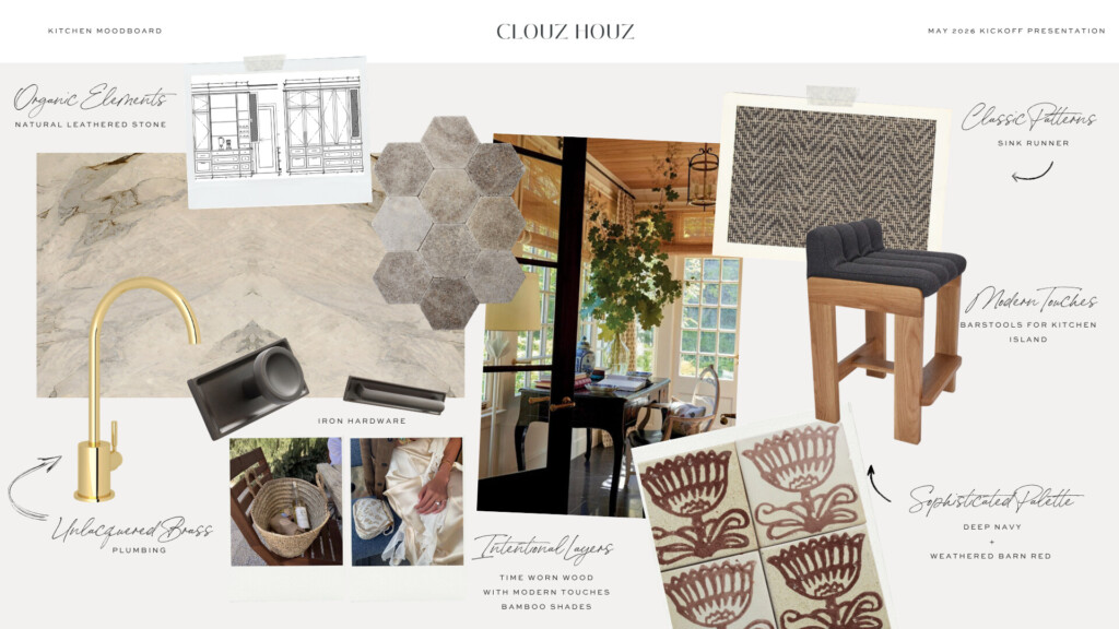
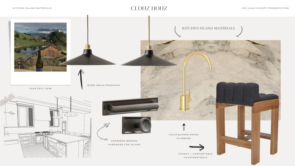
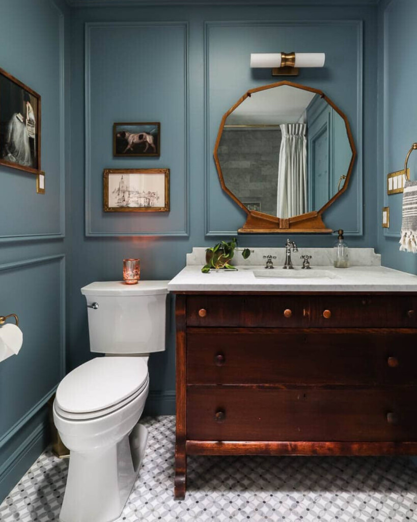
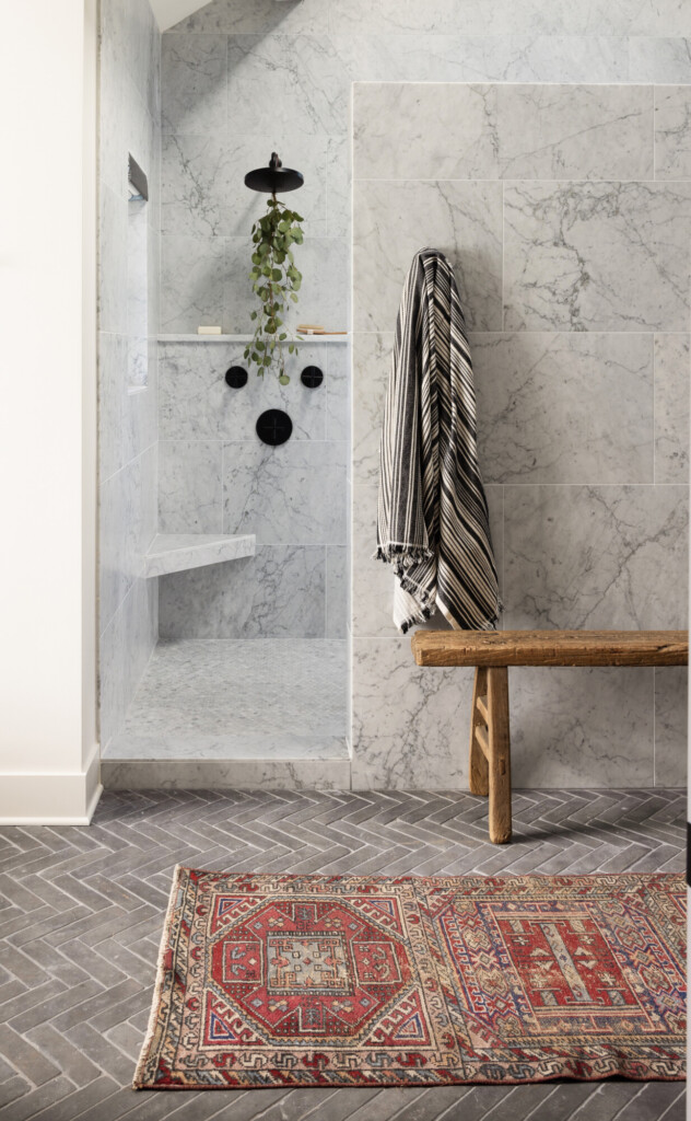
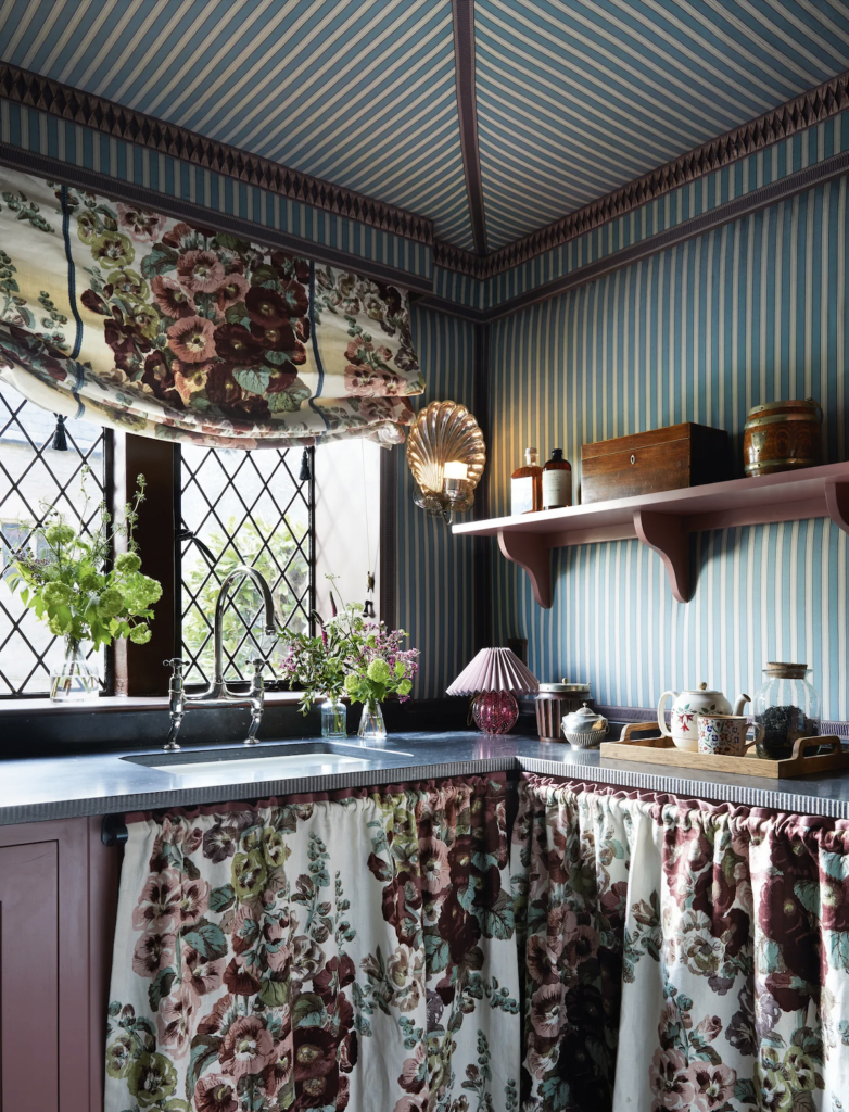
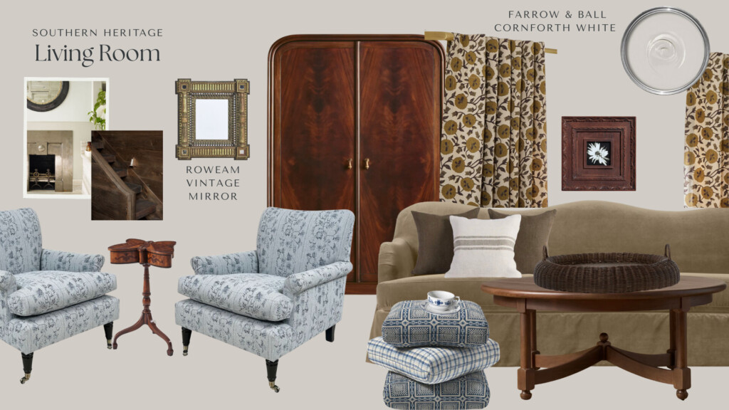
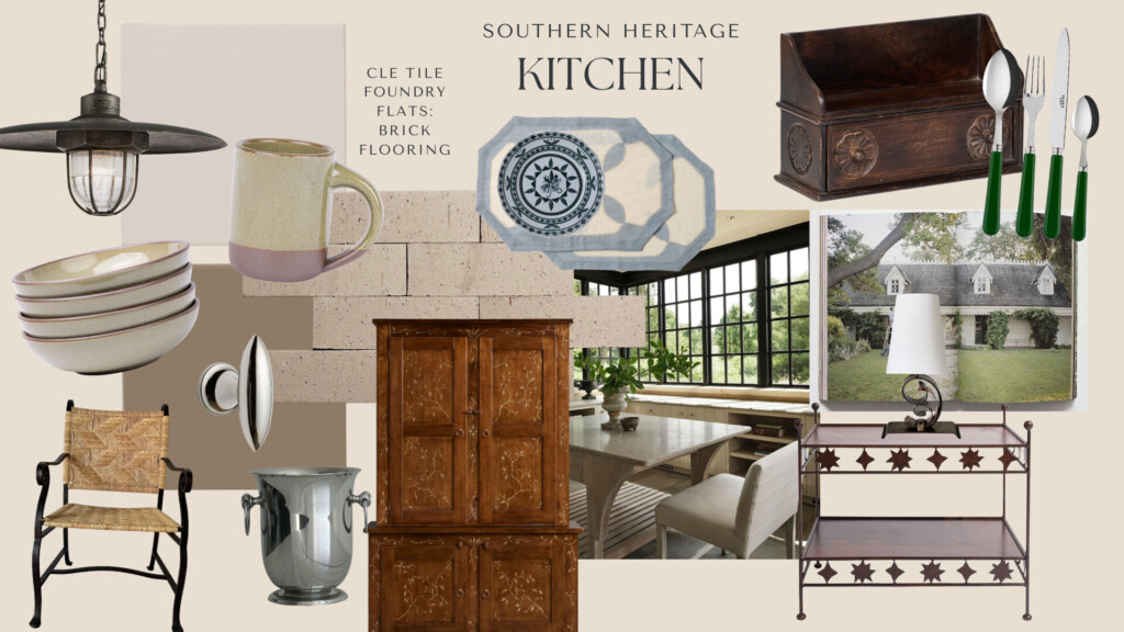
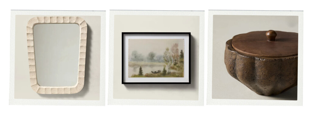
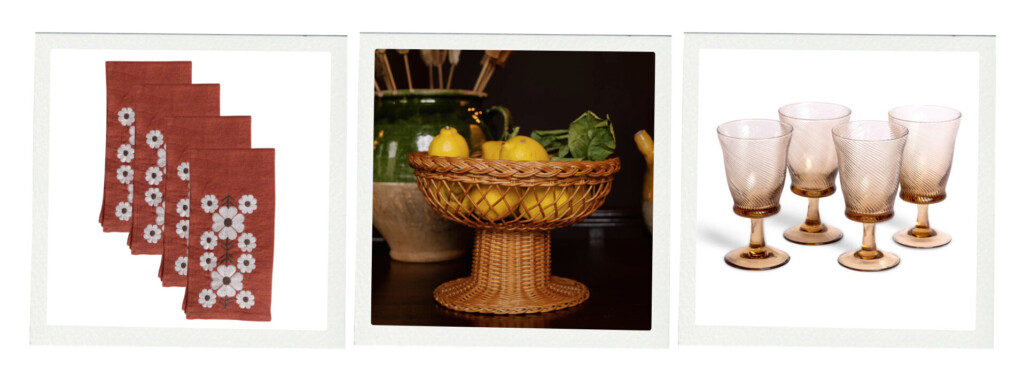
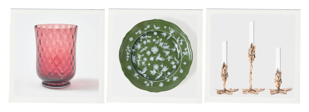
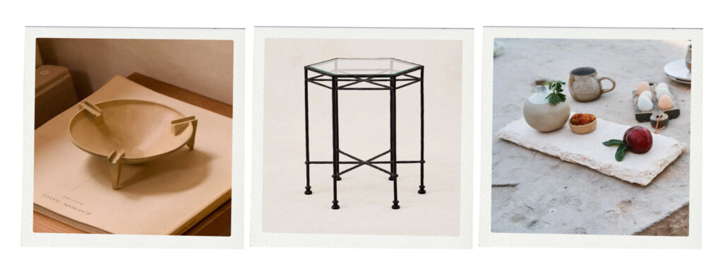
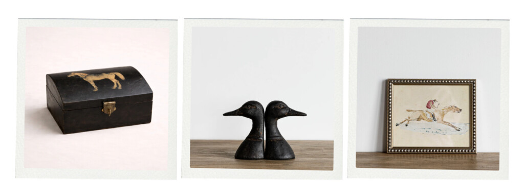
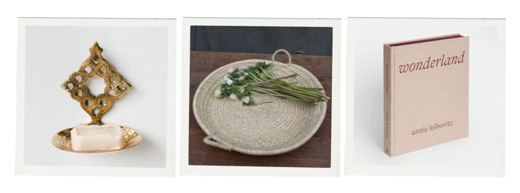
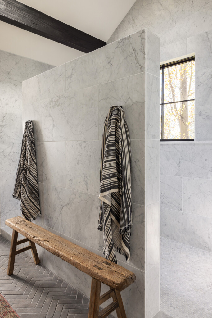
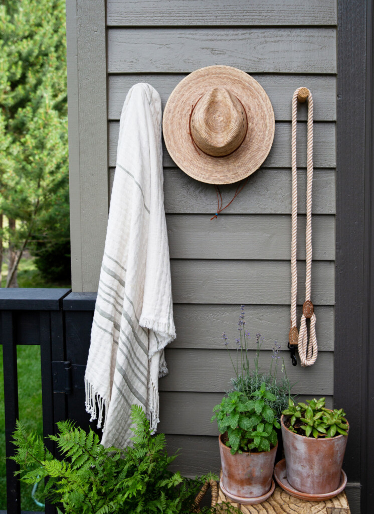
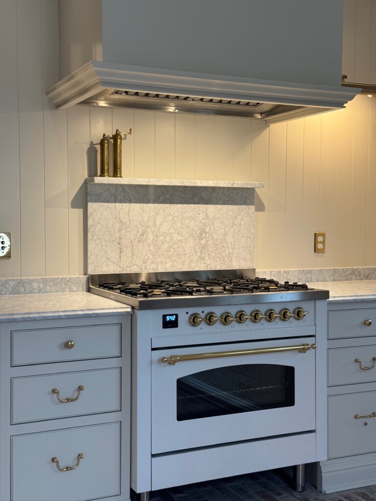
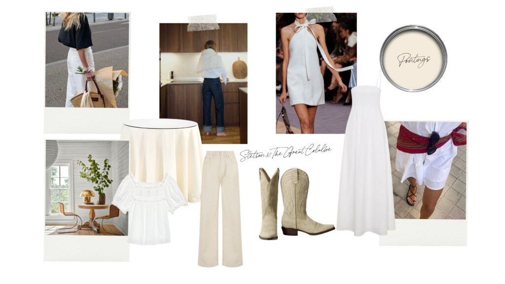
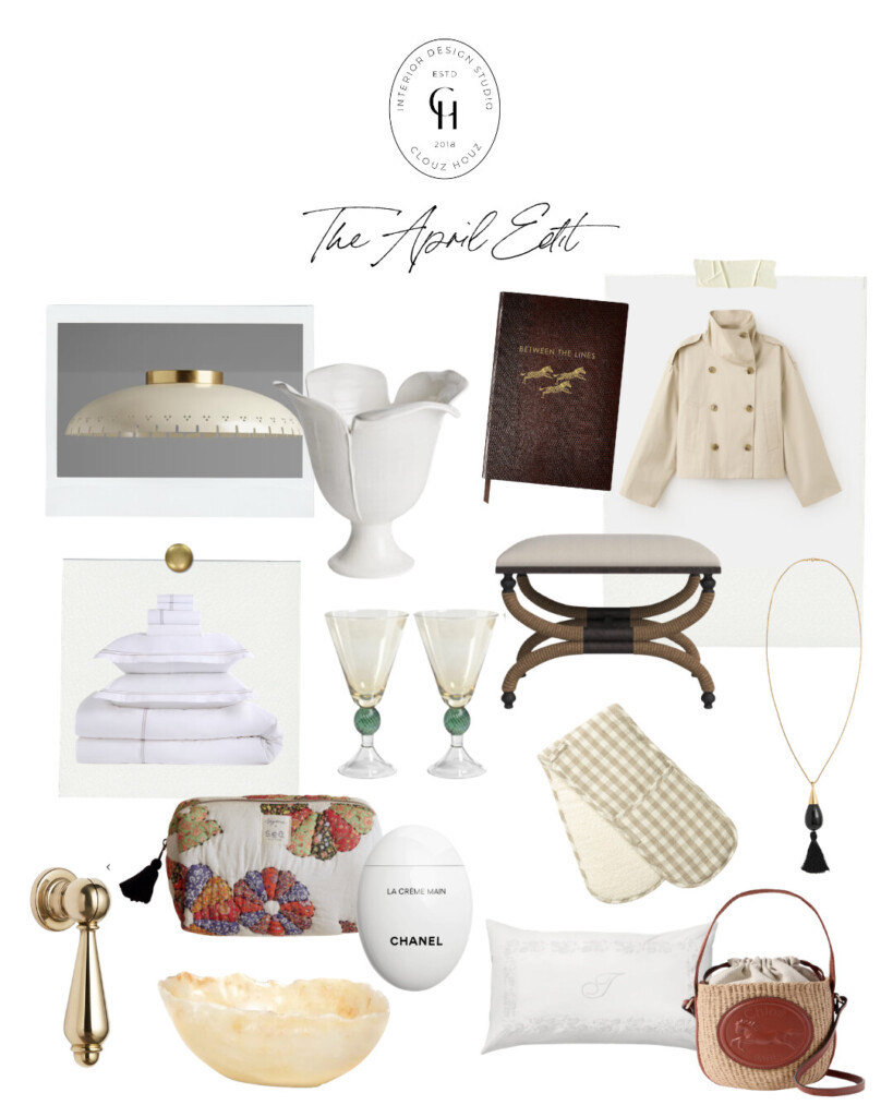
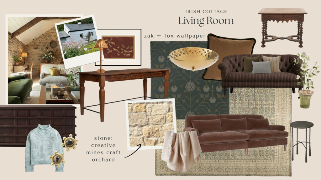
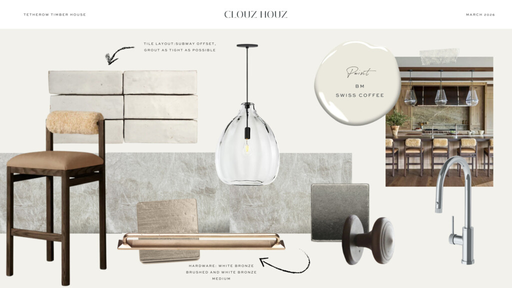
In this case, it was Sonoma. A slower pace. Spaces that feel grounded, earthy and natural. Materials that age well. Homes that don’t try too hard, but feel deeply considered. What you’re seeing here is a full kitchen design presentation, similar to what we deliver to our virtual design clients.
Where to Spend (and Where to Save)
One of the biggest misconceptions about working with a designer is that we will make your project more expensive. But in reality, we can help you avoid costly mistakes. And a big conversation we have with our clients is guide them where we can save them money, in order to allocate on the items that are most important. In other words, we help you spend well.
In a kitchen especially, there are moments where it makes sense to invest, and others where you can be more flexible without sacrificing the overall feel.
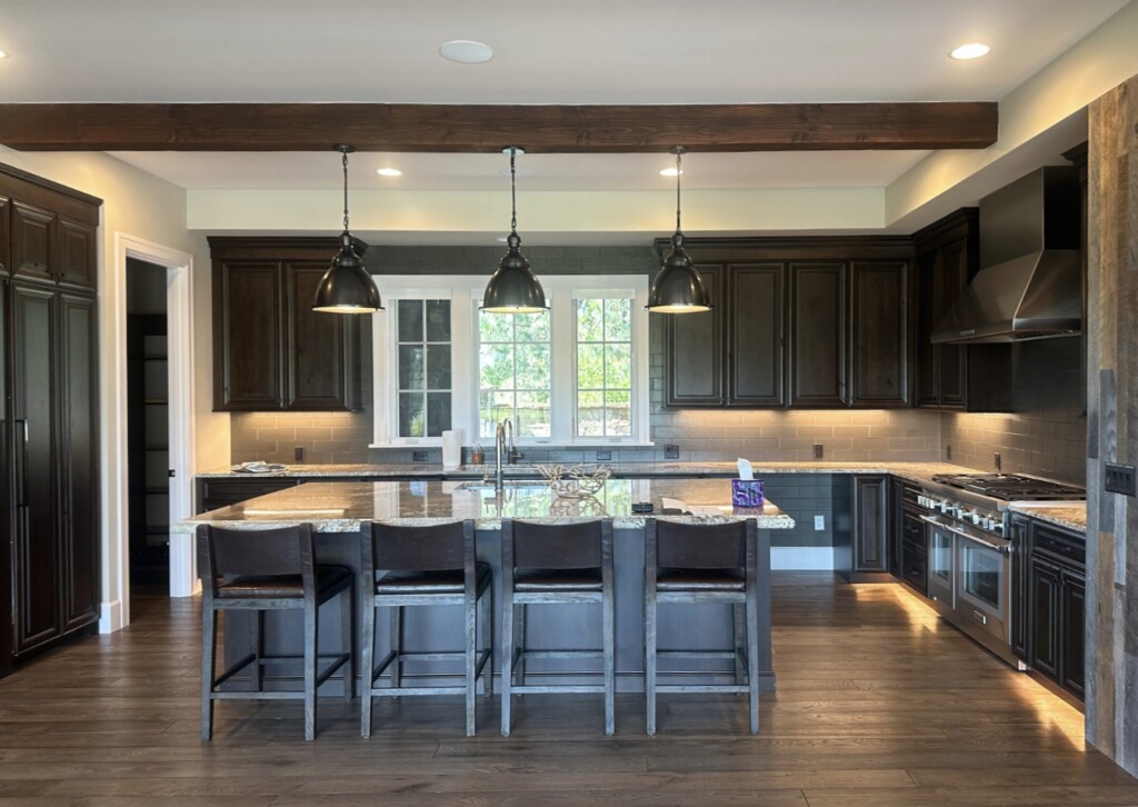
For this Sonoma-inspired kitchen, we approached it the same way we do with all of our projects: By prioritizing what will have the biggest impact both visually and functionally.
Where We Invest
There are a few areas we almost always prioritize.
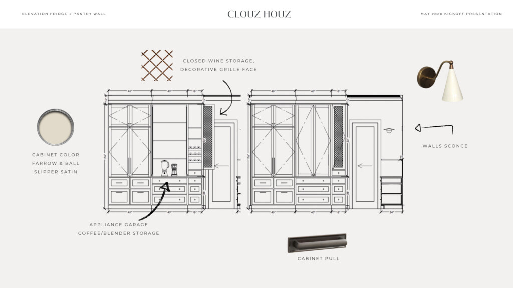
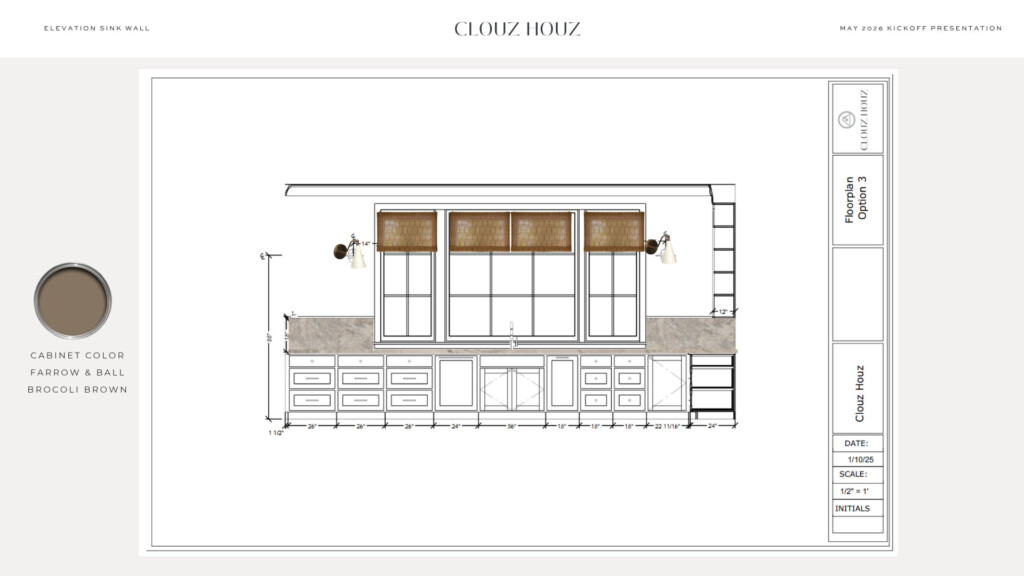
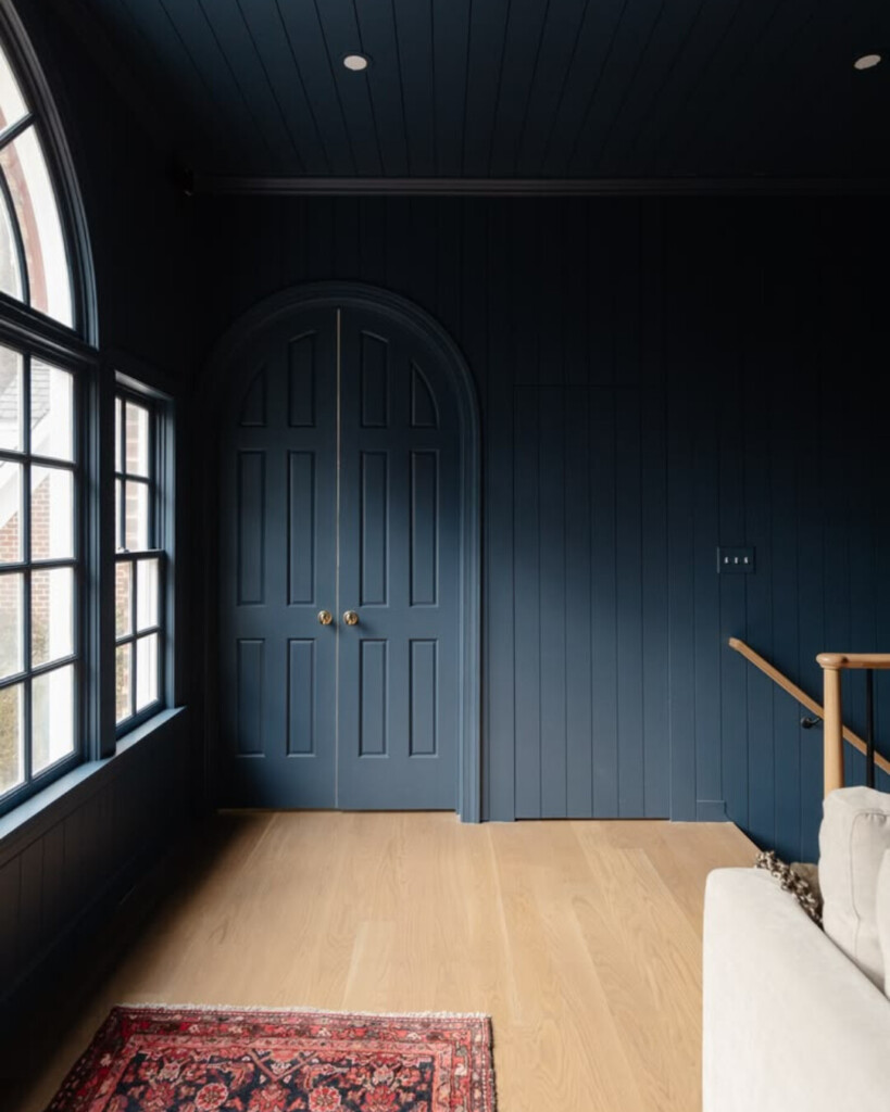
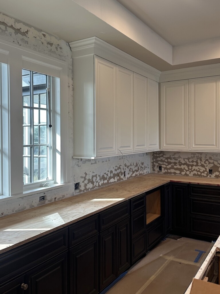
Cabinetry
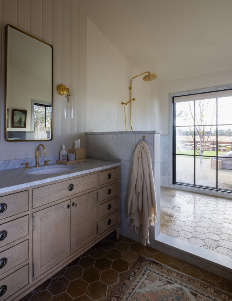
I almost always choose to invest here. It’s one of the first things your eye reads when you walk into a kitchen, and it’s also one of the hardest things to change later. The scale, the detailing, the finish, it all contributes to how elevated the space feels.
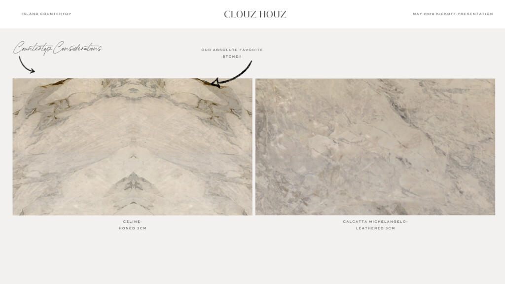
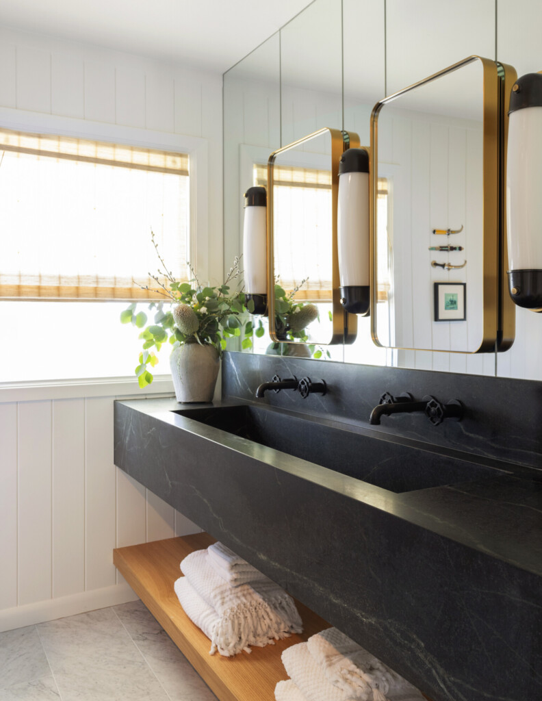
Countertops
This is where I like to create a special moment. Stone brings movement, depth, and a sense of permanence that’s hard to replicate with anything else. It’s one of the few materials that can feel both understated and impactful at the same time. If I’m going to spend somewhere, this is also a big one.
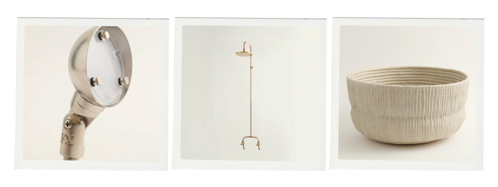
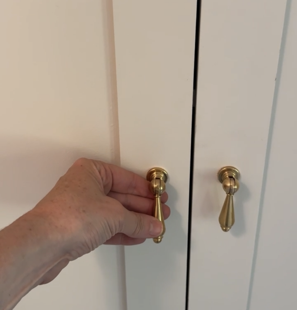
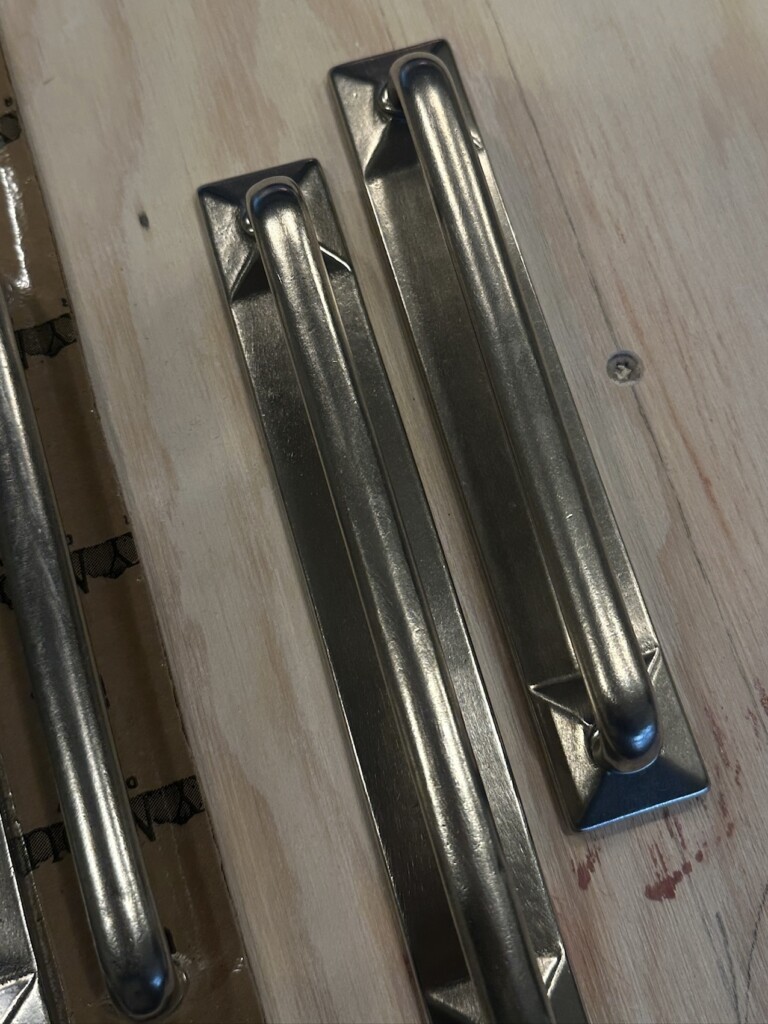
Plumbing + Hardware (selectively)
These are the pieces you interact with every day. I don’t believe everything needs to be top-tier, but I do think these smaller details can shift how the entire space feels. A well-scaled pull, a beautiful faucet. Those touch points matter more than people realize.
Where We Pull Back
That doesn’t mean everything needs to be top of the line.
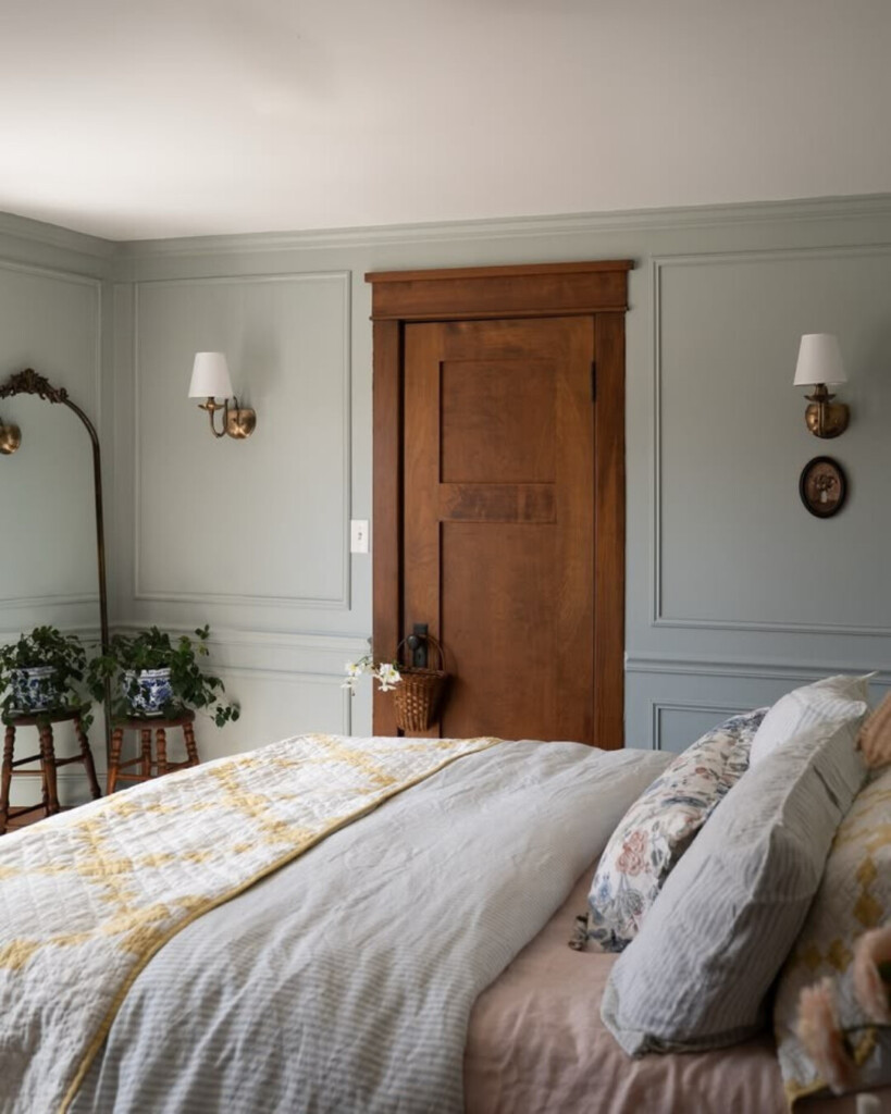
Layered Materials + Finishes Instead of going all-in on every surface, we create balance. Pairing a more elevated countertop with a simpler backsplash, or mixing high and low materials in a way that still feels cohesive.
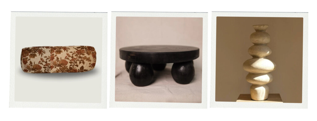
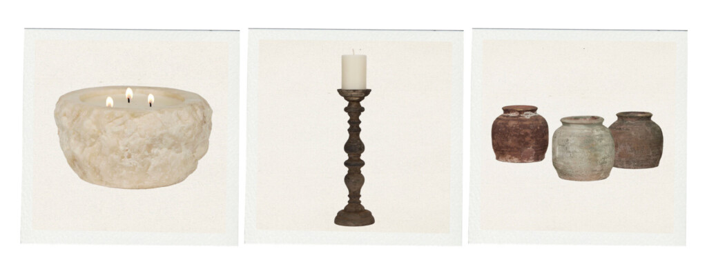
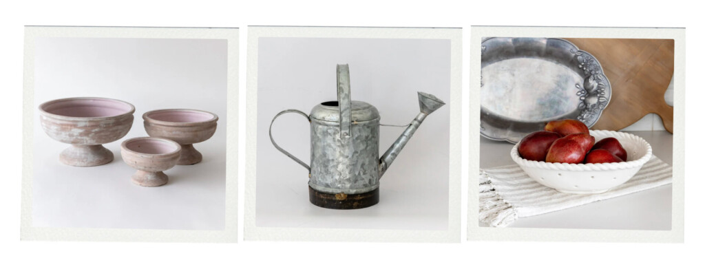
Furnishings + Styling Moments
These are often areas where we can be more flexible. Vintage finds, sourced pieces, or more accessible options can still feel incredibly curated when they’re placed within a strong overall plan.
Taking everything we’ve outlined and translating it into something you can actually use.
All of these decisions — where to invest, where to pull back, how materials work together, don’t live in isolation. They’re all built into a complete design plan. This Sonoma kitchen is a good example of how we approach that.
Rather than handing over a few ideas or a direction, everything is fully thought through and documented, so you’re able to move forward without having to reinterpret anything on your own.
With our Premier Virtual Design service, this is exactly what you receive:
- a complete presentation that walks you through the space in full (typically delivered within a 4–6 week timeframe)
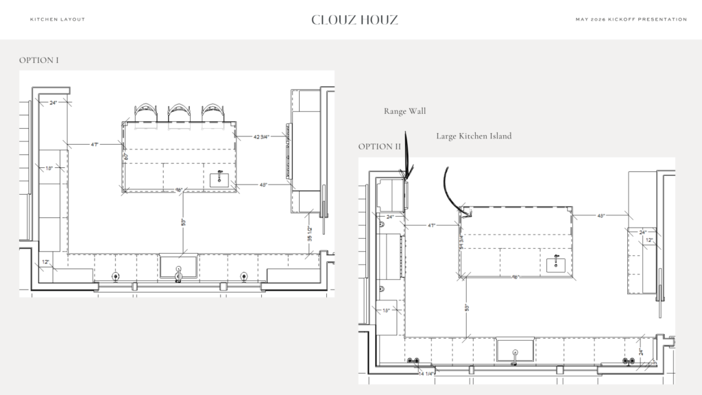
- floor plans and elevation drawings to guide layout and installation
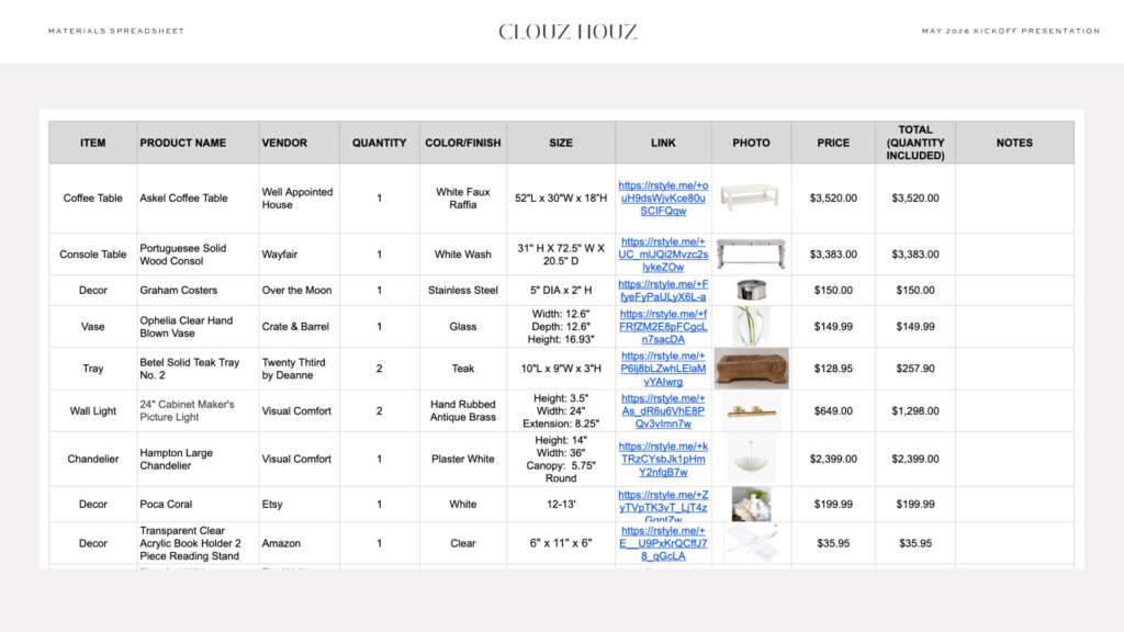
- all materials, finishes, plumbing, and hardware selections
- a detailed specification guide with direct links to purchase every item
- and one round of revisions to refine any final details
What makes this approach appealing for a lot of our clients is the flexibility. You’re getting the same level of thought and detail that goes into our full-service projects, but in a format that allows you to implement it on your own timeline.
You can move quickly, or take your time.
Purchase all at once, or phase things out.
The plan stays the same.
This is best suited for clients who want that level of clarity before they begin. Who would rather make decisions once, and move forward knowing the space will come together the way it’s intended. Whether that’s for a single room or multiple spaces throughout the home.
If This Feels Like You …
We’d love to help you bring it to life.
You can start by filling out our inquiry form and booking a complimentary 30-minute discovery call. It’s a chance for us to learn more about your space, your goals, and talk through whether this service is the right fit for you. We genuinely love this way of working.
We’re always excited to step into a project at this stage. When ideas are forming, decisions are being made, and there’s an opportunity to shape something really special from the start.


