Embarking on the journey for the perfect white paint? The struggle is real, my friend! With slight variations, undertones, and the influencer of natural light, choosing the right shade can feel like navigating a maze. And let’s face it, the stakes are high – we’re after bright, clean, energizing and warm … not a space that resembles a hospital.
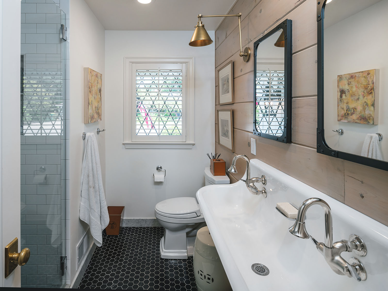
Over the years, I’ve consulted for many clients on the perfect shade for their home. And, while no color looks the same in every space, one of these three is bound to work for your next project. I swear by one of these every time. One important thing to note — if you are painting a room, such as a bathroom where you have a white tub, white sinks, white toilet etc. The white paints typically will show their true undertones up against those items. But, here’s what I always suggest doing, no matter what the room: paint a large swatch once you’ve narrowed your selection onto your wall, and live with it in the space for a day or two. This way you can see how the color changes as the sun rises/sets, cloudy day, sunny day etc.
In this post, I’m spilling the details on my three go-to white paints that have consistently worked wonders in my projects. These shades not only pair seamlessly with any other color but also bring a creamy and fresh vibe to both walls and trims. It’s a lot to think about, so why not let an expert guide you through the maze of whites? From cool and crisp to soft and warm, these timeless whites are the secret that every space needs – and they’re here to stay!
1. Benjamin Moore ‘Swiss Coffee’
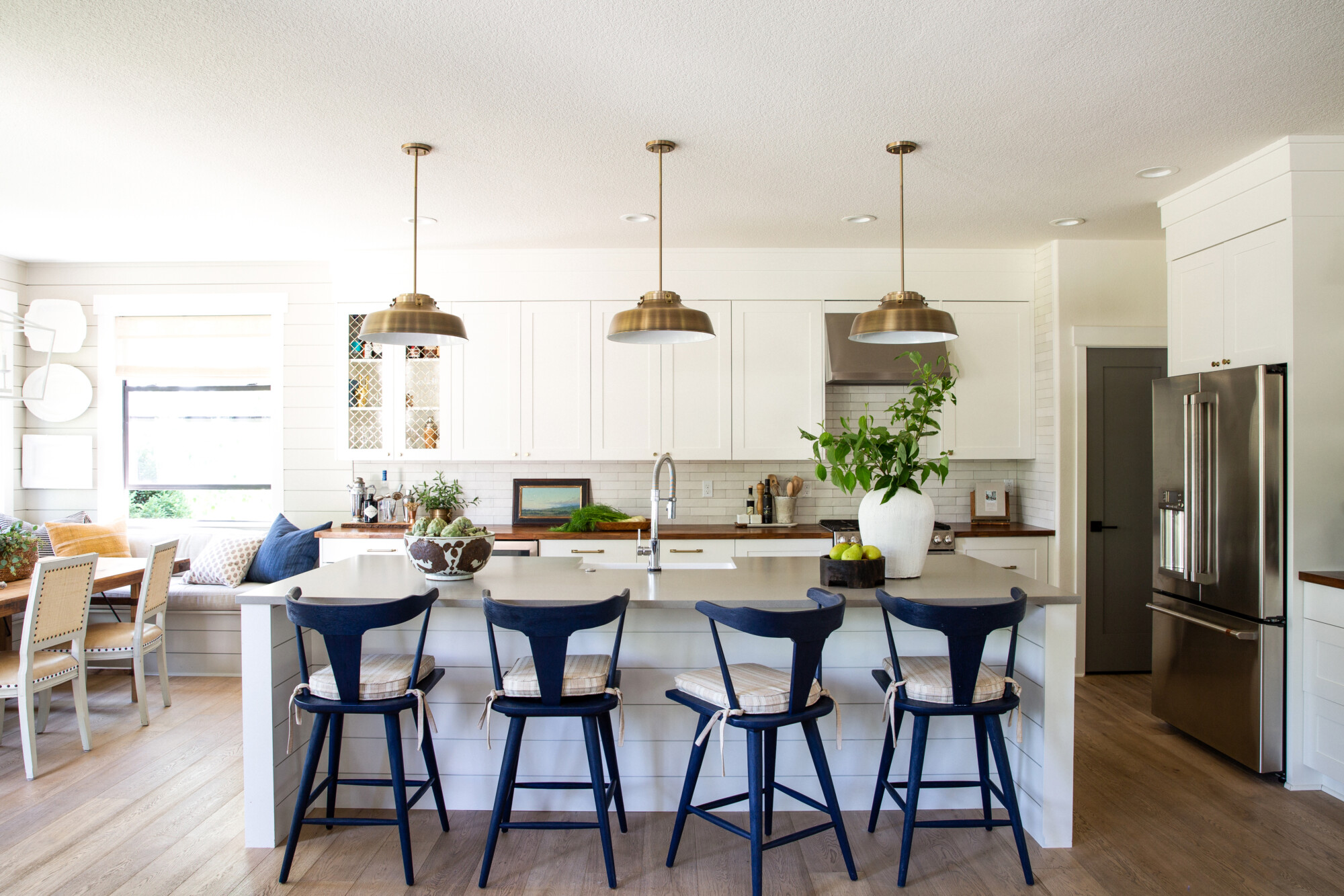
Let’s start with my true favorite – Benjamin Moore “Swiss Coffee” at 50% strength. What does 50% strength mean? Basically, when you ask the paint store to mix the color, they’ll only add half the formula of pigment to your paint. This shade holds a special place in my heart because it skillfully cuts a bit of the yellow, resulting in a finish that feels cleaner and more fresh. Like the name suggests, there are some brown undertones … think a creamy cup of coffee! The warmth it exudes is undeniable, making it a versatile choice that effortlessly complements any project. I especially love it in kitchens! I’ve wielded this magic in numerous spaces, and it has proven time and time again to be a foolproof color.
2. Benjamin Moore ‘Simply White’ Paint
Moving on to the next white wonder in my collection – Benjamin Moore “Simply White.” It was Benjamin Moore’s Color of the Year in 2016, and for good reason! This hue brings a touch more brightness, a true pure white compared to “Swiss Coffee.” And, it offers a clean and fresh aesthetic without appearing too yellow or too stark. So, it’s the perfect middle ground, where the white isn’t overpowering, yet it brings an undeniable brightness to the space. This is a perfect choice for those seeking a crisp and invigorating vibe without venturing into overly stark territory. I recommend Simply White every time a client has an amazing art collection, as it’s the perfect backdrop to offset any color.
3. Benjamin Moore ‘White Dove’
Now, let’s dive into the allure of my third white paint choice – Benjamin Moore’s “White Dove.” With a subtle infusion of ivory tones, this shade sits somewhere between “Swiss Coffee” and “Simply White.” Lighter than “Swiss Coffee” but a tad warmer than the others, “White Dove” strikes a harmonious balance. And, its versatility has earned it a top spot in my lineup, offering a touch of warmth without compromising on that clean, fresh aesthetic.
![]() Clouz Houz tip: When diving into the realm of white walls, here’s a pro tip: opt for an eggshell finish. This subtle choice creates a velvety texture that adds a touch of sophistication without overpowering the space. Now, the real magic happens with the trim. I like to use the same color, whichever white you’ve chosen, but in a satin finish. Then, the play of sheens (though it’s the same color) introduces a delightful contrast, casting shadow lines that elevate the overall aesthetic.
Clouz Houz tip: When diving into the realm of white walls, here’s a pro tip: opt for an eggshell finish. This subtle choice creates a velvety texture that adds a touch of sophistication without overpowering the space. Now, the real magic happens with the trim. I like to use the same color, whichever white you’ve chosen, but in a satin finish. Then, the play of sheens (though it’s the same color) introduces a delightful contrast, casting shadow lines that elevate the overall aesthetic.
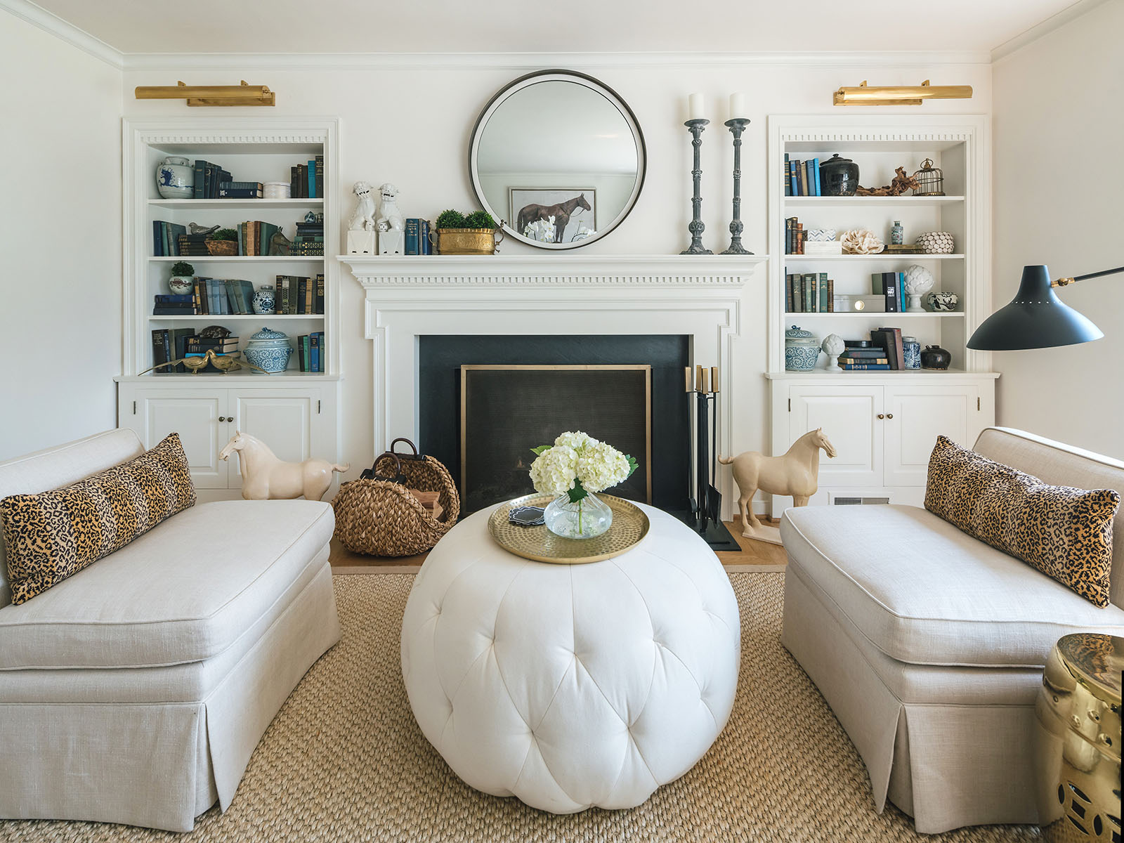
In a design landscape teeming with darker and muddier hues, white walls stand as a timeless and safe bet. As such, they offset bolder fabrics, rugs, or accents, bringing out the best in every element. It’s the kind of magic that works wonders when you seek a fresh and airy palette. White paints ultimately offer a blank canvas on which to infuse color through furniture and décor accessories. The possibilities are truly endless with these three white paints!


