Today I’m spilling the paint beans on one of my favorite topics: neutrals vs. moody paint colors. You know, those magical hues that transform your home from ordinary to extraordinary? Let’s dive into the world of paint and create that Pinterest-worthy space you’ve been dreaming of!
Balancing these moody gems with the open and neutral main living spaces is one of my go-to design tricks. And guess what? You don’t always need fancy wall treatments like wallpaper or wood siding to make a big impact. Just a splash of paint can work wonders, turning your home into a real masterpiece.
***Before we dive into the world of paint, click here to subscribe to our weekly newsletter and you’ll receive our free comprehensive paint guide directly in your inbox! 17 beautiful neutral and bold colors to help get you inspired!
But first things first … neutrals!
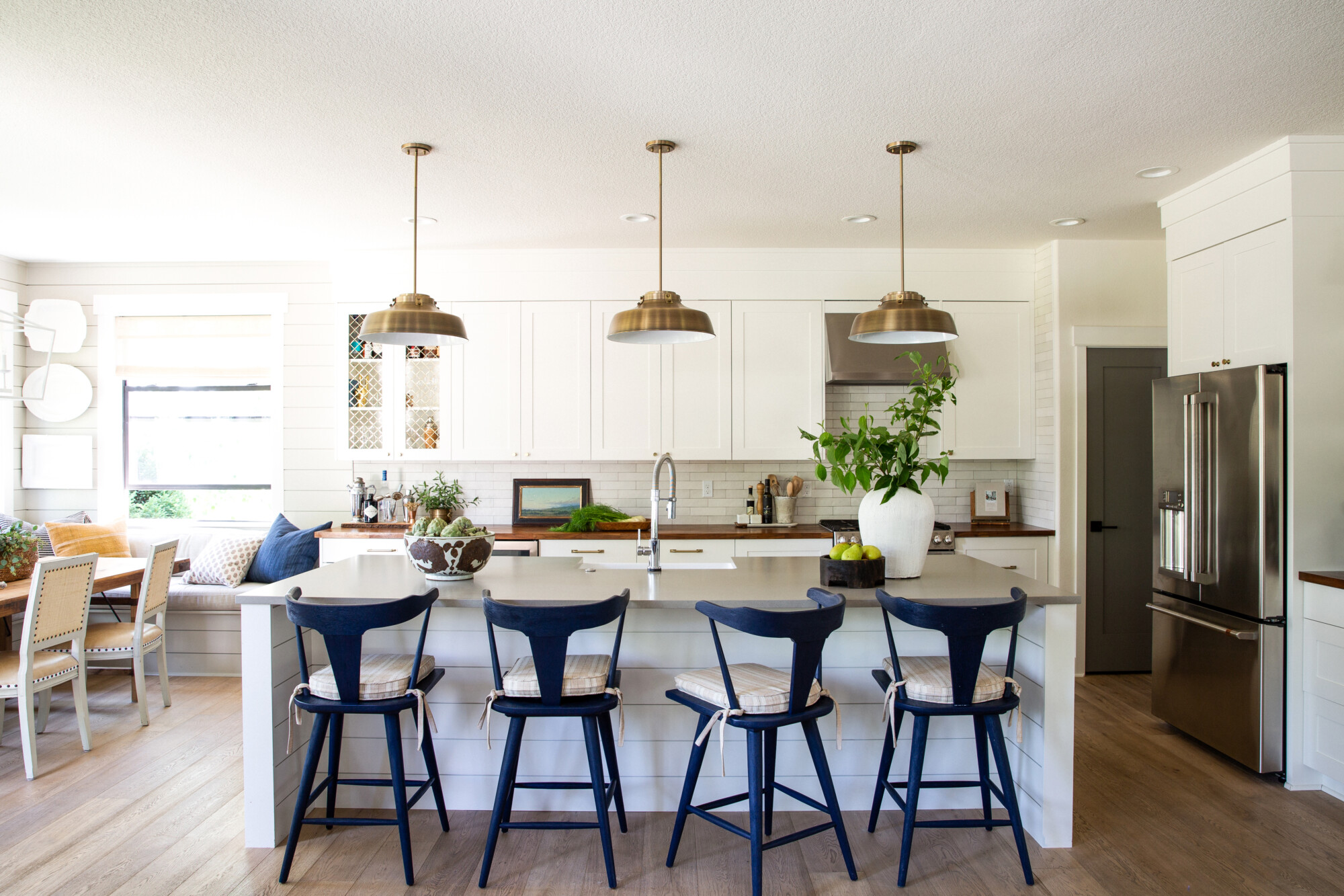
Pick a color that runs throughout your entire home, creating a seamless flow in the main living spaces. In our cozy home, we went for a gorgeous neutral that we splashed everywhere on the main floor, tying everything together in perfect balance. But, here’s where the magic happens: we then sprinkled moments of moodiness amidst the neutrals.
Moody Colors
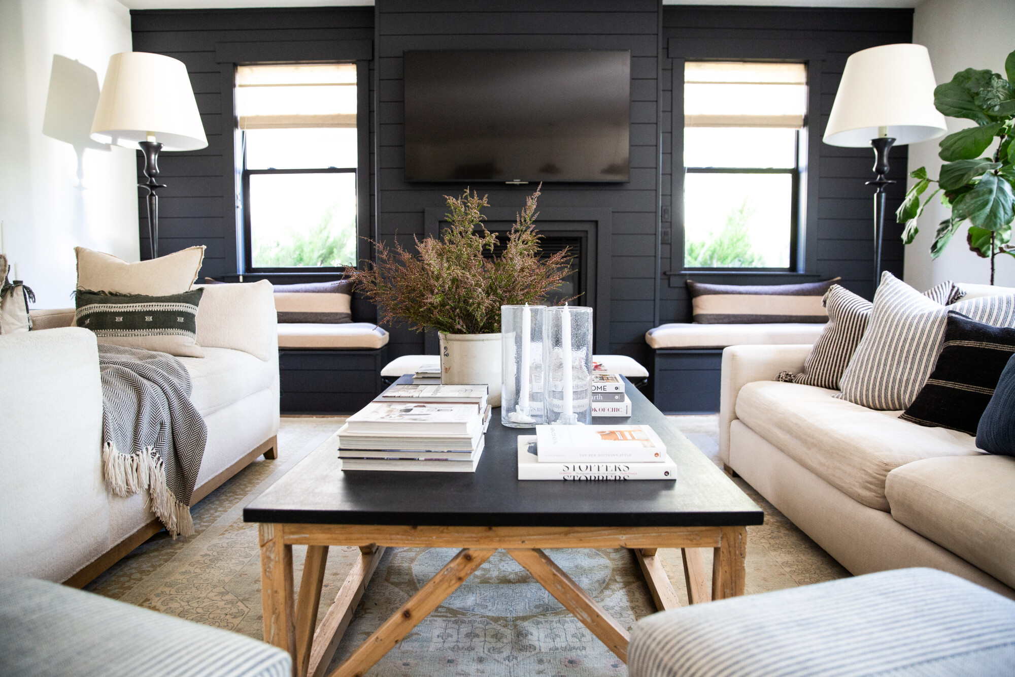
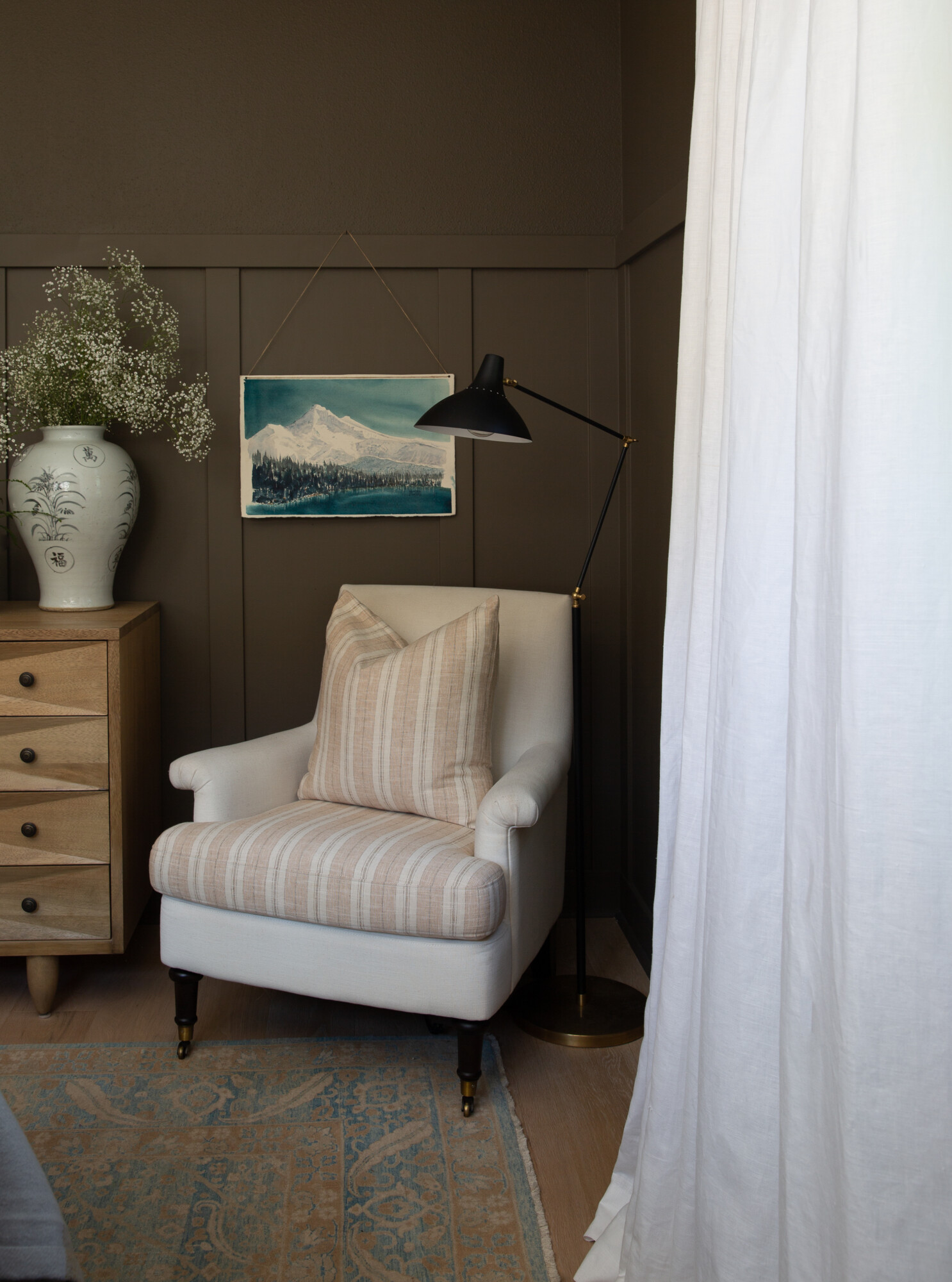
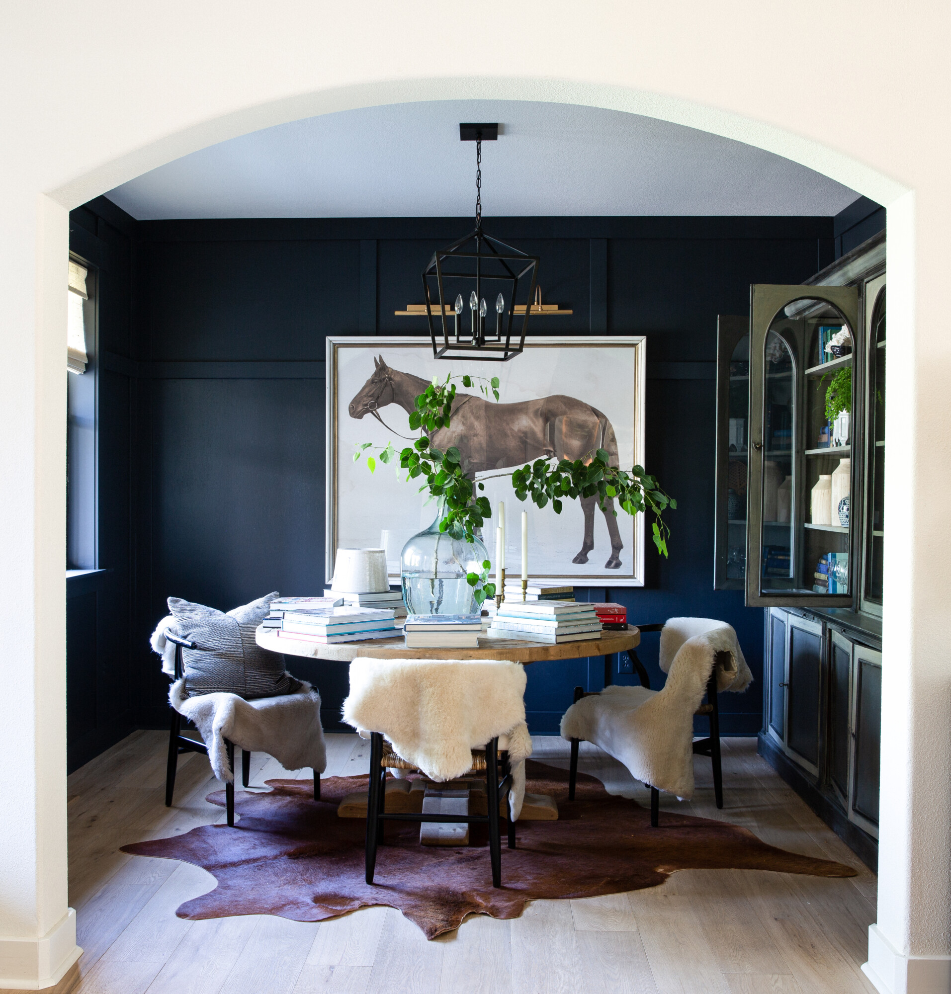
Think accent walls in the living room! When it comes to accent walls, they’re proven to be an essential way to add depth, character, and a focal point for your guests. We painted our living room in a sultry “Off Black” by Farrow and Ball, and used a deep “Midnight Blue” by Benjamin Moore in the entryway. Blue is my favorite go-to, and the deeper and moodier, the better. This technique really helps elevate the first impression of our home.
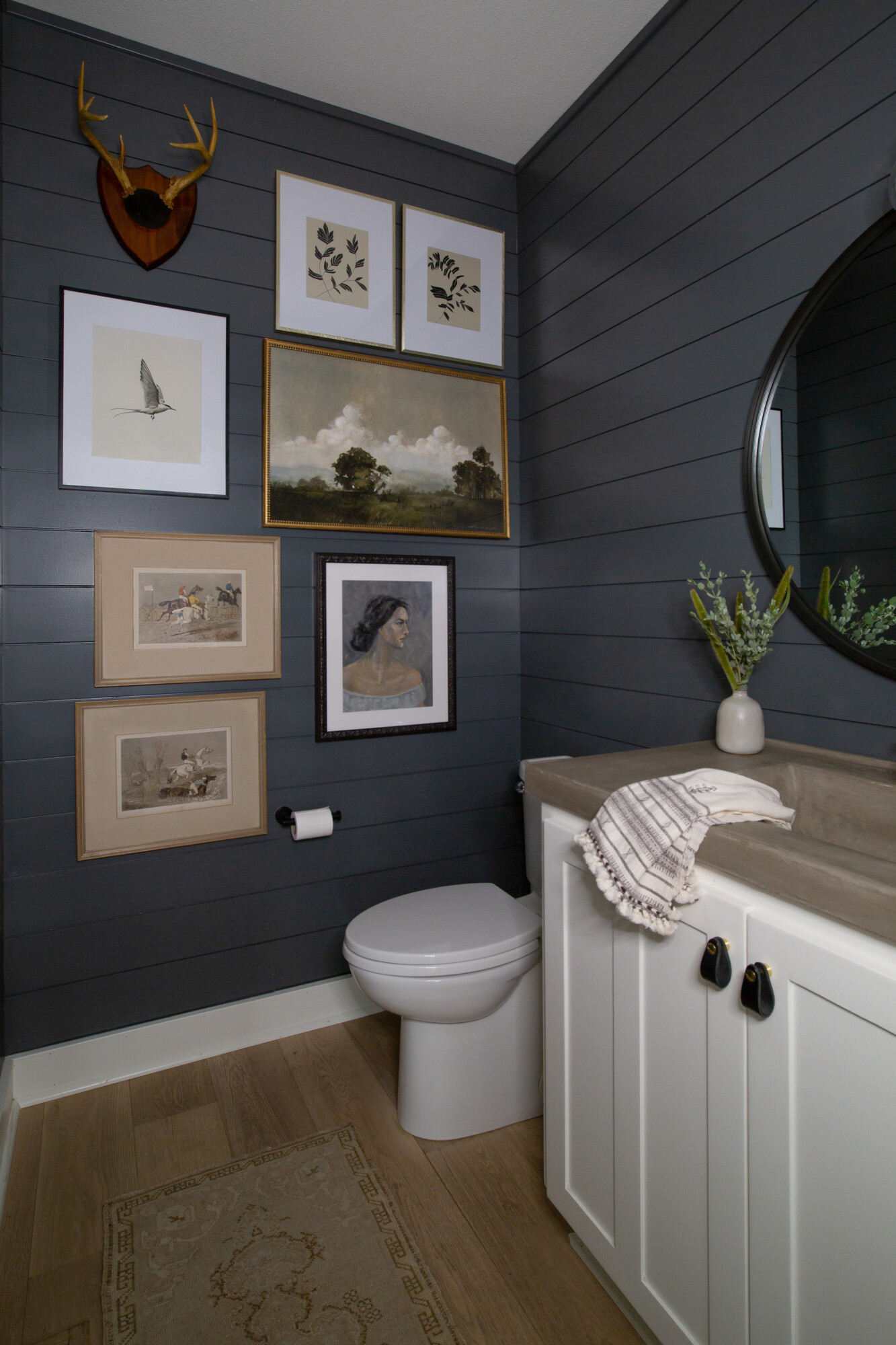
Oh, and let’s not forget the powder bathroom, dressed in the beautiful shade “Down Pipe” by Farrow and Ball. You know, sometimes it’s the small spaces that pack the most punch! That touch of moodiness offsets all that neutrality, making it a fun surprise. It goes to show that thoughtful color choices in even the tiniest corners of our home can make a significant impact on the overall aesthetic and ambiance.
Speaking of surprises, the laundry room upstairs got a fabulous paint makeover with a splash of “Studio Green” by Farrow and Ball. This bold choice infused a sense of energy into the otherwise mundane chore of laundry. Now, laundry day has a whole new vibe, and trust me, it’s cooler than ever!
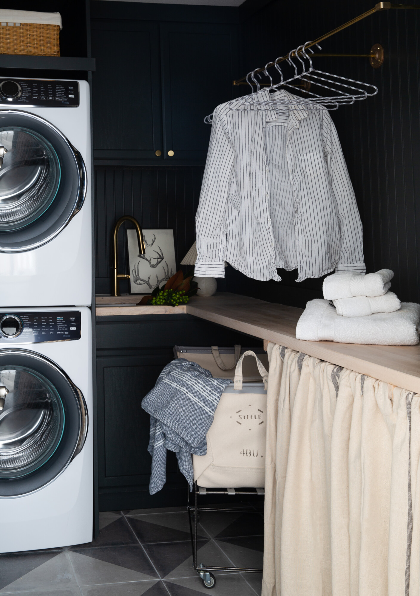
![]() Clouz Houz Tip: When you have rooms without much natural light, like our powder room or laundry room (no windows in there, oh dear!), don’t shy away from embracing the darkness. Painting them in deep and rich colors elevates the mood instantly. I’m even loving the trend of rich jewel tones in these spaces lately — they add a hint of cool and classy vibes!!
Clouz Houz Tip: When you have rooms without much natural light, like our powder room or laundry room (no windows in there, oh dear!), don’t shy away from embracing the darkness. Painting them in deep and rich colors elevates the mood instantly. I’m even loving the trend of rich jewel tones in these spaces lately — they add a hint of cool and classy vibes!!
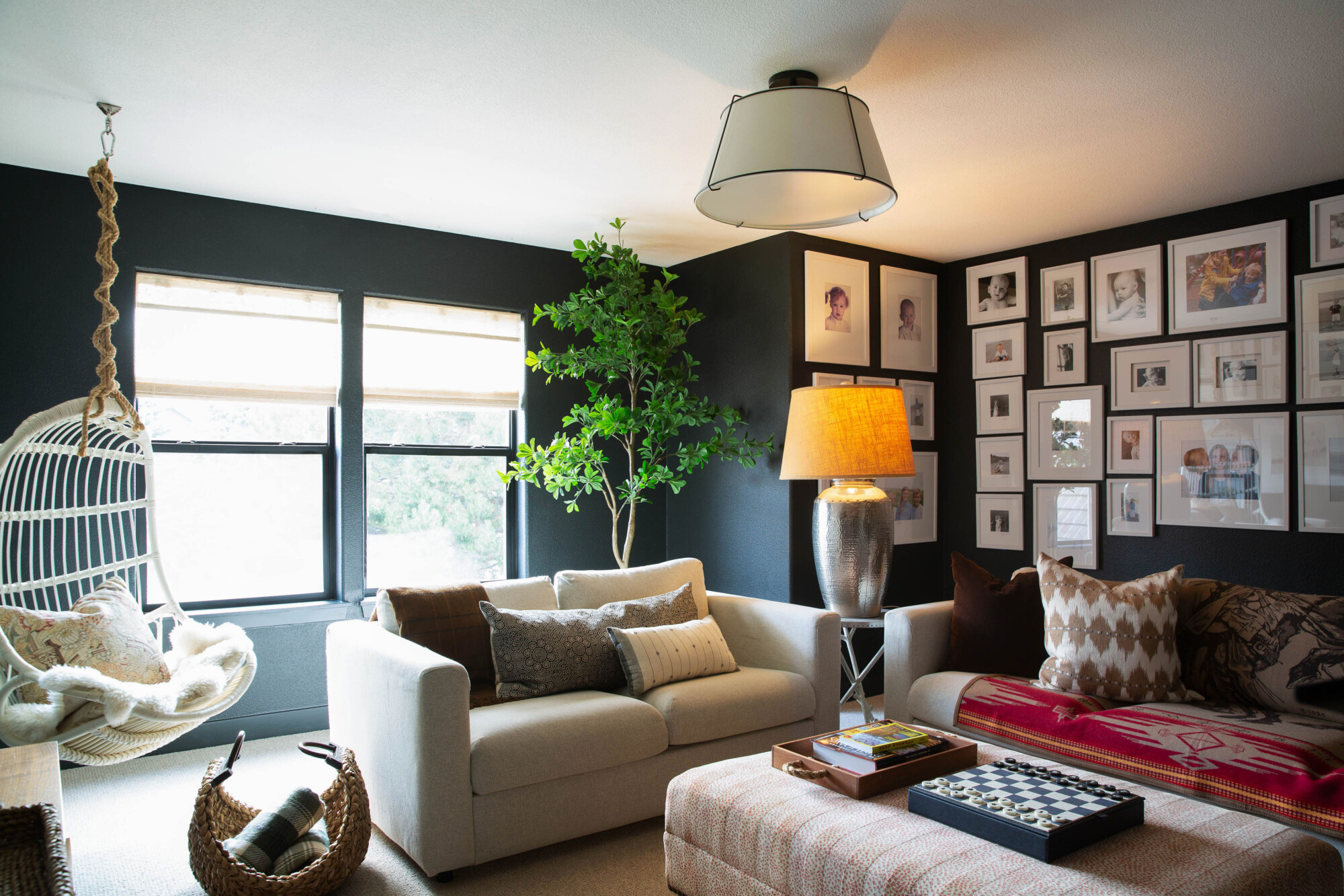
Make your photos pop!
I wanted our little TV hangout zone upstairs to have its own personality. So, we went for “Greenblack” by Sherwin-Williams, and boy, did it work magic. The high contrast with framed photos is pleasing to the eye, and it makes the photos really stand out.
You know what’s a fun trend I’m seeing more of these days? Rich jewel tones! They really give a pop of personality to any space. So, how about going for something like a deep eggplant or wine shade? After all, it could be a hidden paint treasure, adding that perfect touch of excitement to your home ?
Neutral Colors
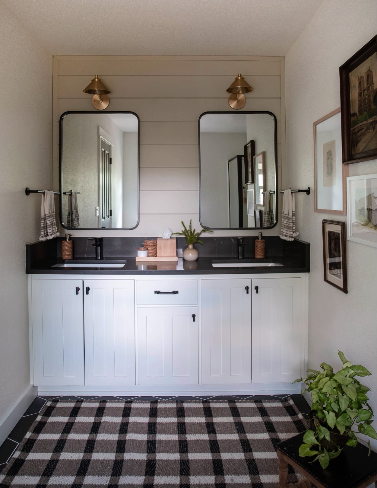
For my neutrals-loving friends, I have some tried-and-true white paint recommendations for you. Try “Swiss coffee” by Benjamin Moore (we used it at 50% strength in our house), “Simply White” (also Benjamin Moore), or “Greek Villa” by Sherwin-Williams. Any of these will make your space feel fresh and airy. Let’s not forget about “Drop Cloth” by Farrow and Ball — it’s a knockout neutral that we used in the upstairs bathroom on that shiplap wall. It’s versatile and looks fabulous on cabinets too, especially for those who crave a neutral kitchen without going all-out white.

So there you have it — the tale of neutrals vs. moody colors. Choose wisely, mix and match, and watch your home transform into a design wonderland!
![]() Clouz Houz Tip: It’s important to note that these colors might have varying effects during different hours of the day. In fact, you might want to check out the Samplize roundup below. They offer a game-changing solution of peel and stick wall samples, making the process hassle-free and efficient. And, make sure to revisit these swatches throughout the day to get a feel for how your chosen colors interact with natural and artificial lighting.
Clouz Houz Tip: It’s important to note that these colors might have varying effects during different hours of the day. In fact, you might want to check out the Samplize roundup below. They offer a game-changing solution of peel and stick wall samples, making the process hassle-free and efficient. And, make sure to revisit these swatches throughout the day to get a feel for how your chosen colors interact with natural and artificial lighting.
Happy painting, my stylish friends!


