Our Approach to Bathroom Tile: Sixth Street Bungalow Upstairs Bath Reveal
Bathroom tile can feel overwhelming. There are a million options, a lot of opinions, and a surprising amount of pressure to “get it right,” especially since it’s not something you want to redo anytime soon.
For the upstairs bathroom at our Sixth Street Bungalow in Columbia, Tennessee, we focused on a simple question: what will still feel good years from now?
Rather than chasing trends, we leaned into classic materials, thoughtful contrast, and details that quietly elevate the space without overwhelming it. This is the same approach we take with our client projects—choosing tile that works functionally, ages gracefully, and feels intentional rather than over-designed.
Below, we’re sharing the tile combination we landed on, what influenced those choices, and a few things we always think through when designing a bathroom from the ground up.
The Goal for This Bathroom
Timeless, practical, and designed to be lived in
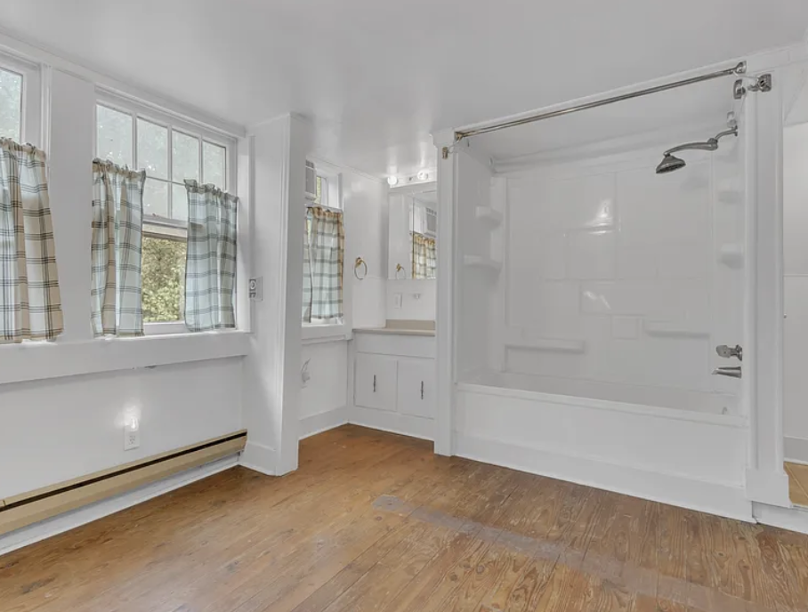
This upstairs bathroom at the Sixth Street Bungalow is a shared Jack-and-Jill, and it’s the kind of space that gets a lot of real use. It’s the bathroom kids will use when they’re home for the weekend with friends, and the one guests will rely on when they’re staying with us. In other words, it needs to handle traffic.
When we design bathrooms like this, we think beyond aesthetics. Tile choices show their flaws quickly in high-use spaces. Anything too precious, too trendy, or too perfect starts to feel stressful instead of supportive. So, the goal here was to choose materials that feel calm, classic, and durable. Tile that wears well, hides everyday messes, and still feels intentional years down the road.
We leaned into timeless patterns, subtle variation, and finishes that don’t demand perfection. This is the same approach we take with our client projects: start with how a space needs to function, then layer in beauty in a way that actually lasts.
Why Classic Bathroom Tile Still Wins
… and how to keep it from feeling boring
Classic bathroom tile gets a bad rap for being “safe,” but in our experience, it’s actually what gives you the most freedom. When the foundation is calm and timeless, everything else has room to shine. You’re not locked into a moment or a trend, and the space can evolve as your life does.
The key is understanding that classic doesn’t mean plain. It’s not about defaulting to the most basic option, but about choosing materials that have proven longevity and then being thoughtful with the details. Scale, finish, and layout are what keep a classic tile from feeling expected. A traditional shape in an unexpected size. A familiar material with subtle variation. A simple pattern used with intention.
We also think classic tile matters most in bathrooms because these spaces see so much daily use. Trends can feel exciting at first, but they’re often the first thing people tire of (especially in high-traffic, shared spaces like this one).
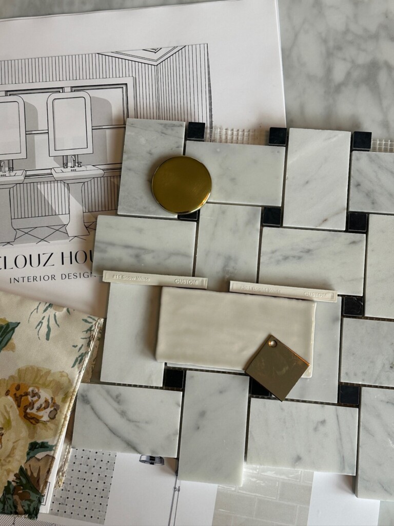
Tile Selections, Broken Down
Once we landed on the overall direction for this bathroom, the tile selections became about balance. How each material could do its job without competing with the others.
A Classic Floor
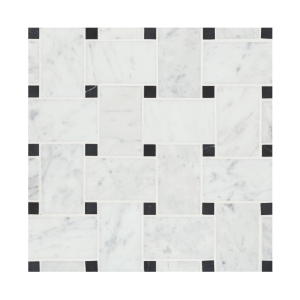
We went with a jumbo basketweave marble floor in white Carrara with an absolute black dot. This pattern has been around forever for a reason. It’s visually interesting without being loud, and it instantly gives a bathroom that old, established feel. The larger scale keeps it from feeling busy, while the contrast dot adds just enough rhythm to ground the space. It’s also incredibly practical: the pattern disguises water spots and hair, and marble is incredibly durable for flooring (look all over Europe and you will see why they use it time and time again). We have clients ask us all the time is marble okay for floors, and our answer is always immediately a YES!
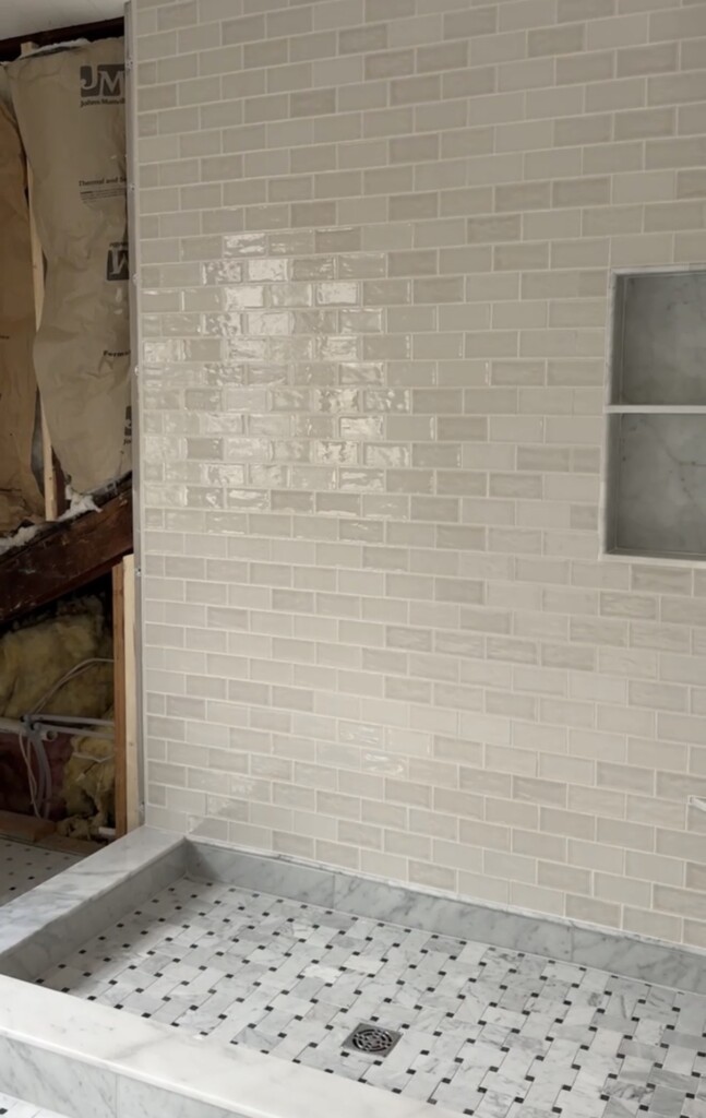
The Shower: Simple, Soft, and Not Too Perfect
For the shower walls, we chose a 2.5″ x 5″ ceramic wall tile in this sand dollar color, stacked in a traditional running bond. The color is subtle (not stark white, not beige), which gives the room warmth without competing with the marble. Ceramic also felt like the right move here: it’s durable, easy to maintain, and has just enough variation to keep things from feeling flat.
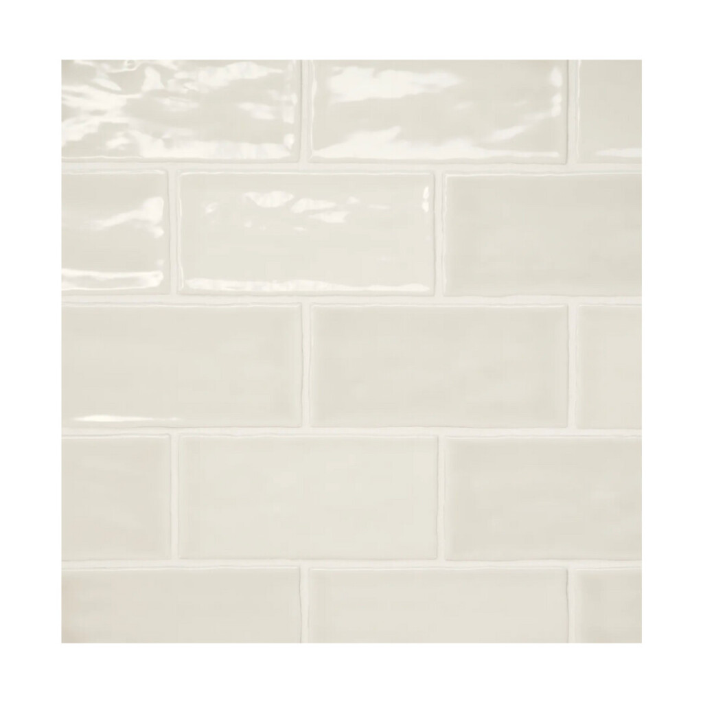
The matching glossy trim along the tile edges pulls everything together. This is one of those behind-the-scenes details that often gets overlooked, but it matters. Trim keeps tile installations looking intentional and polished (please no Schluter if you can avoid it!). It’s always a debate with builders about how to finish out edges when working with a porcelain tile. My vote is always trim vs the metal trim called Schluter Systems. We love this option because it blends seamlessly into the wall tile without calling attention to itself.
Why the Marble Curb Makes All the Difference
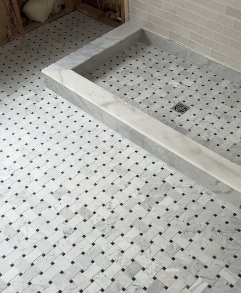
Instead of tiling the shower curb, we wrapped it in marble trim for the sides and used this for the top (it only comes polished, so our tile installer honed it for us). This is one of those details that feels small but makes a huge impact. Using stone here creates a clean visual break between floor and shower tiles, and gives the shower a more tailored, architectural look. It’s also more durable long-term (fewer grout joints means fewer places for wear to show up over time)!
A Few Design Takeaways We Always Come Back To
If you’re planning a bathroom renovation (or saving ideas for someday), here’s what to keep in mind:
- Pattern is your friend. It hides wear, adds character, and keeps things from feeling flat.
- Mix materials thoughtfully. Stone, ceramic, and subtle contrast go a long way when balanced well.
- Reduce grout where you can. Stone curbs, trim pieces, and clean transitions make spaces feel more elevated and easier to maintain.
- Choose finishes that forgive. Slight variation will always age better than anything too pristine.
Ordering + Planning Tips We’ve Learned the Hard Way
Tile decisions are not the place to rush. Order samples. See them in your actual light. And, always plan for a little extra material. Bathrooms are one of those spaces where patience up front saves headaches later.
Our Design Philosophy (In Real Life) + Work With Us!
At Clouz Houz, we design homes to be lived in. Whether it’s a family bathroom, a guest space, or a full renovation, our goal is always the same: create rooms that feel intentional, personal, and comfortable for the long haul. No two homes should look the same, because no two lives do.
If you’re dreaming about updating your home, starting a renovation, or just want guidance through the decision-making process, we’d love to help. Check out our design services here, and let’s start designing a home you’ll love not just now, but for years to come.
(And yes, we promise to help you trust the process along the way.)

