Why Bathroom Remodels Are Never as Simple as They Look
If there’s one thing I’ve learned after designing more bathrooms than I can count, it’s this: a bathroom will expose every assumption you didn’t know you were making. Everything seems straightforward … until you’re living with a layout that never quite flows. You’ve got lighting that isn’t flattering, or storage that mysteriously disappears the minute your products move in. Where are the mistakes you ask? Well, read on!
As we live through our own remodel at the Sixth Street Bungalow, I’m remembering just how many micro-decisions sit beneath a space that looks “simple” on the outside.
The Sixth Street Bungalow: A Lesson in Good Bones … and Odd Choices
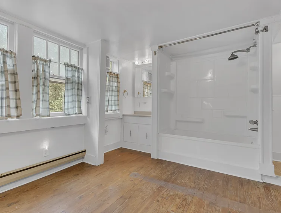
This bathroom had great square footage, but the layout was fighting us from day one. All the fixtures (vanity, shower/tub, toilet) were piled onto one wall, while the entire opposite side sat completely empty. It was a room with potential, but not a room with purpose.
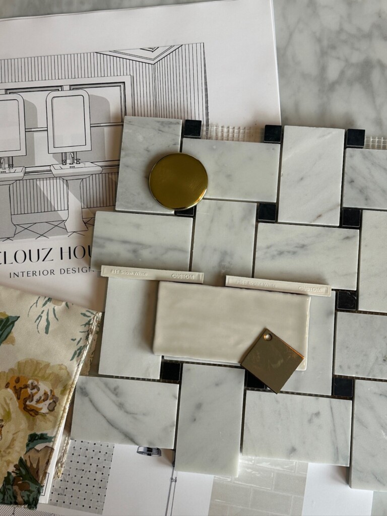
Cue the chaos: ripping up floors, rerouting plumbing, reimagining everything from how we move through the space to where the natural light actually hits your face in the morning. We moved the plumbing for the sinks to fit on the window wall (I’ve always wanted to have a bathroom where you hang the mirrors over the window). And, we kept the toilet in the same area roughly where it sat before. We also kept the shower on the wall it originally lived in but enlarged it, eliminated the tub all together.
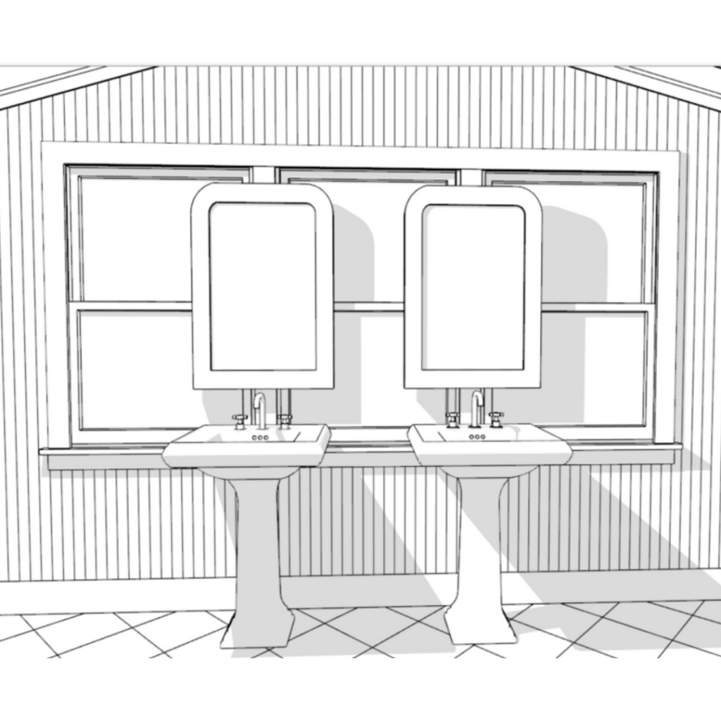
Back to that Window Wall … Designing “A Moment” — The Concept We’ve Been Waiting to Use
One thing about me? If a room gives me an opportunity for a design moment, I’m taking it.
Across the window wall, we’re doing something I’ve been dying to try: suspended mirrors hanging in front of the windows with two pedestal sinks sitting side-by-side. It’s airy, European, slightly daring … and it finally gives this room a focal point.
The Storage Reality Check No One Talks About
And then, there’s the unglamorous but very real part of bathroom design: storage.
The two guest bedrooms don’t have nearly enough (like we are talking about the smallest closets!), so the completely blank wall is becoming a full run of IKEA Pax cabinets. This isn’t our first rodeo with the PAX wardrobes.
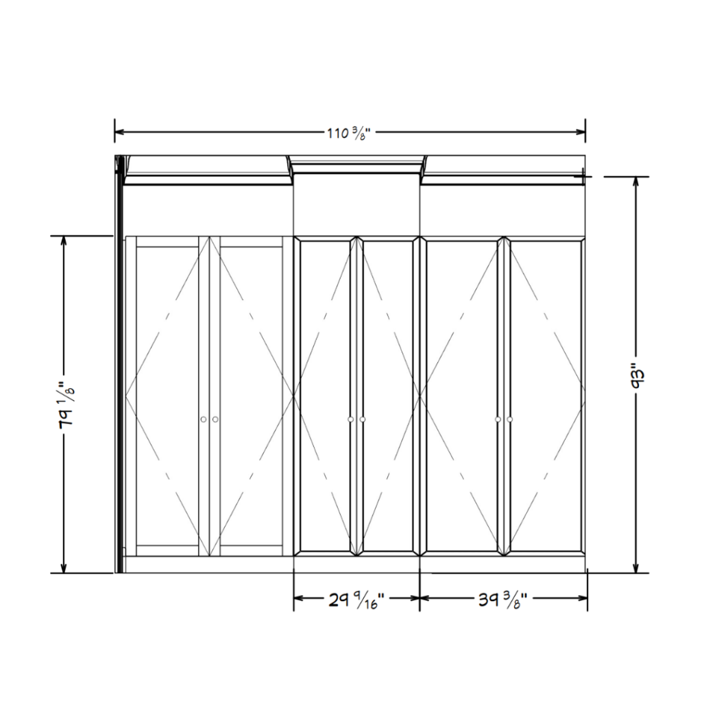
Having made mistakes before, Derrick has now mastered how to make them look more custom and intentional (more on this soon). Still debating about the interior layout, but imagining they will be a great place to store towels, linens for the adjoining bedrooms and even some hanging room for guests’ clothing. It’s not “swoon-worthy” in the Instagram sense, but it is the thing that will make our daily life easier. A bathroom has to hold a lot more than people admit.
What You Learn Only After Designing Dozens of Bathrooms
Every bathroom renovation teaches you something new, usually the hard way. And, after years of client projects and living through multiple remodels myself, there are things I simply will not do again. These are the mistakes people don’t realize are mistakes until they’ve moved in and felt the consequences every day.
Before you make a single mood board or start picking finishes, hear it from me first. These are the choices that will make or break whether you love your bathroom for the next decade, or quietly resent it every time you turn on the lights.
With all that said, here are the core lessons I come back to every single time: the non-negotiables that will shape whether your bathroom feels intentional or like a compromise.
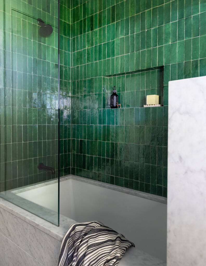
Mistake No. 1: Stopping Tile Too Low (or in the Wrong Places)
One of the fastest ways to make a bathroom feel “builder basic” is stopping the tile at the height of your shower head. Tile carries visual weight, and when it just — ends — the room loses height and continuity. At Sixth Street Bungalow, we’re taking tile up all the way, especially in the shower. With tall vaulted ceilings like ours, we didn’t go full-tile everywhere, but we created intentional elevations so the tile meets architectural details (like our tongue & groove paneling) instead of fighting them.
Mistake No. 2: Prioritizing Form Over Storage
I love a pedestal sink — until there’s nowhere to put toothpaste, skincare, a hairdryer, medicine, or guest towels. This is the trap so many people fall into: picking the prettiest pieces first, then realizing they’ve sacrificed half their function.
For our renovation, we’re intentionally mixing form and storage. We are doing two pedestal sinks because the look is perfect with the window wall. But, we balanced that choice by dedicating an entire opposite wall to IKEA PAX cabinetry disguised as built-ins. The bedrooms don’t have enough closet space, and bathrooms are where the overflow always ends up (linens, toiletries, seasonal items, everything). This solves the problem elegantly, yet still providing ample space for all the things.
You don’t need a giant vanity to have good storage. A combination of a pedestal or console sink plus a medicine cabinet, a tall cabinet, or a built-in niche can completely change how the room functions. If you skip storage at the sink, make up for it somewhere else with intention—not with a random rolling cart after the fact.
Mistake No. 3: Using the Wrong Grout Color
People tend to treat grout like an afterthought, until they see how much of it there actually is. A bright white grout on a dark floor, high-traffic shower, or busy patterned tile will age quickly, show every ounce of hard water, and visually chop up what should feel cohesive.
The sweet spot is a mid-tone grout that lets the tile be the star but still hides a bit of real life. Don’t get me wrong, there is a time and place for a white grout (like our guest bath that won’t be used that often). But for a highly used bathroom, I’d definitely suggest a color that is a bit more forgiving. Also, it softens contrast and helps everything read more high end. Designers almost never choose stark white unless the goal is a very crisp, graphic look (and even then, we warn clients about maintenance).
Clouz Houz tip: Bring home multiple grout samples and look at them dry, not wet. Compare them against your tile in natural daylight and overhead lighting—grout shifts undertones quickly. And if your tile has variation, match the grout to the lightest or mid tone within it, not the darkest. Your future self will thank you.
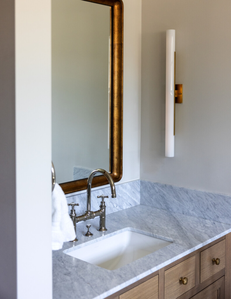
Mistake No. 4: Choosing Fixtures That Look Good Online but Feel Cheap in Person
Hardware and plumbing fixtures are the jewelry of the bathroom — and nothing gives away a rushed remodel faster than overly shiny, lightweight, bargain finishes. Photos hide this, but real life doesn’t.
The biggest misconception we see is that “chrome is chrome” or “nickel is nickel.” But the quality of the finish determines everything: the depth of the metal tone, how it patinas, how it feels in your hand, and how long it lasts. Inexpensive polished nickel, for example, tends to look almost plastic (too bright or too blue). A well-made fixture, on the other hand, has richness and weight; it reads intentionally chosen, not default.
You don’t need to splurge on every fixture, but anchor the room with at least one high-quality piece like your faucet or your shower set. Those are the elements you touch daily. Then, build around it with supporting finishes rather than mixing anything that happens to be in stock. Incorporate a different finish for your lighting or hardware. Consistency in tone and sheen creates a bathroom that feels cohesive and elevated, regardless of budget.
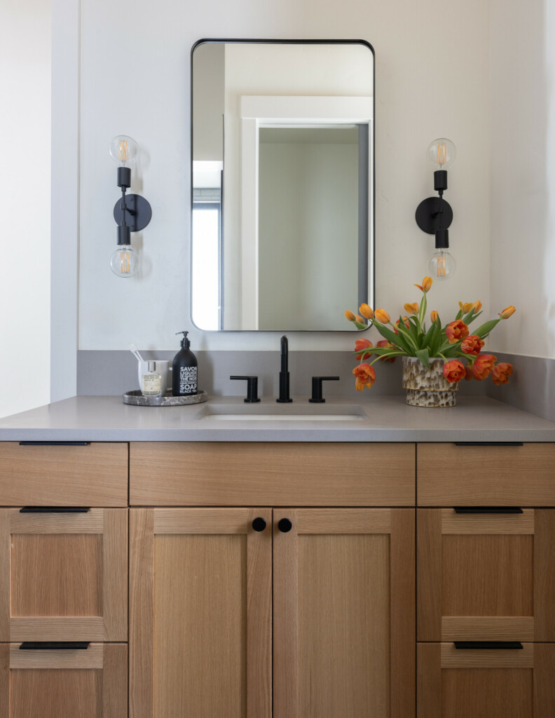
Mistake No. 5: Relying Only on Overhead Lighting (and Ignoring Lighting at Face Level)
Bathrooms can have the most beautiful materials and still feel flat or unflattering if the lighting is wrong. A single overhead can light creates harsh shadows, highlights texture you don’t want highlighted, and makes getting ready feel dark and dismal.
This is one of the most common oversights homeowners make because it feels “good enough” during construction. But once you start living in the space, you realize how much proper lighting impacts functionality and mood.
Think in layers:
- Sconces at face level give even, flattering light for getting ready (this is the step people regret skipping most).
- A central ceiling fixture fills the room and adds beauty.
- Accent lighting (like a small lamp on a vanity or a dimmer for evening routines) brings warmth and softness.
Lighting is often what separates a nice bathroom from one that feels hotel-like and intentionally designed. Once you’ve lived with layered lighting, you’ll never go back.
Wrapping It Up (and What’s Next)
If this renovation has taught me anything, it’s that a bathroom only looks simple from the outside. Once you’re in it, you realize how many tiny decisions shape the final space. The Sixth Street Bungalow guest bathroom has stretched us due to its unusual size and layout, but I’m excited to keep sharing the real behind-the-scenes: the problem-solving, the progress, and the moments that don’t make it to Instagram.
If there’s something specific you want us to cover—send me a message!

