A season of softer light, layered textures, and small, considered moves
Fall changes the pace, doesn’t it? Afternoons go honey-gold, the air gets a little more crisp, and homes start asking for warmth without clutter. October is that hinge month—still easy and breezy from summer, but quietly getting ready for hosting, early sunsets, and longer evenings in. That’s the headspace for this edit.
The mood (and why it suits fall)
I’m reaching for things that feel steady and lived-in: wood with visible grain, brass that’s okay with fingerprints, linen that shows a bit of slub, suede and wool you actually want to touch. The palette leans walnut, tobacco, bone, and inky black with a small jolt of turquoise to keep it awake—cozy without going pumpkin-spice literal. There’s a light Southern nod in the mix (think porch-light glow, a tailored antique, a quiet scallop), but it’s really about pieces that patina through the season and beyond.
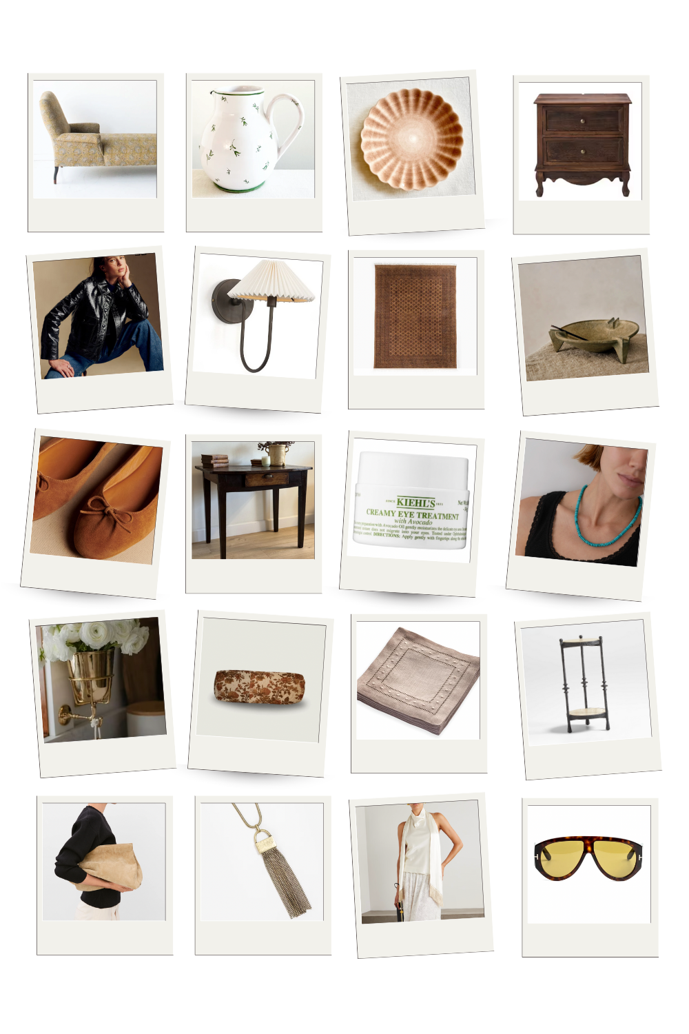
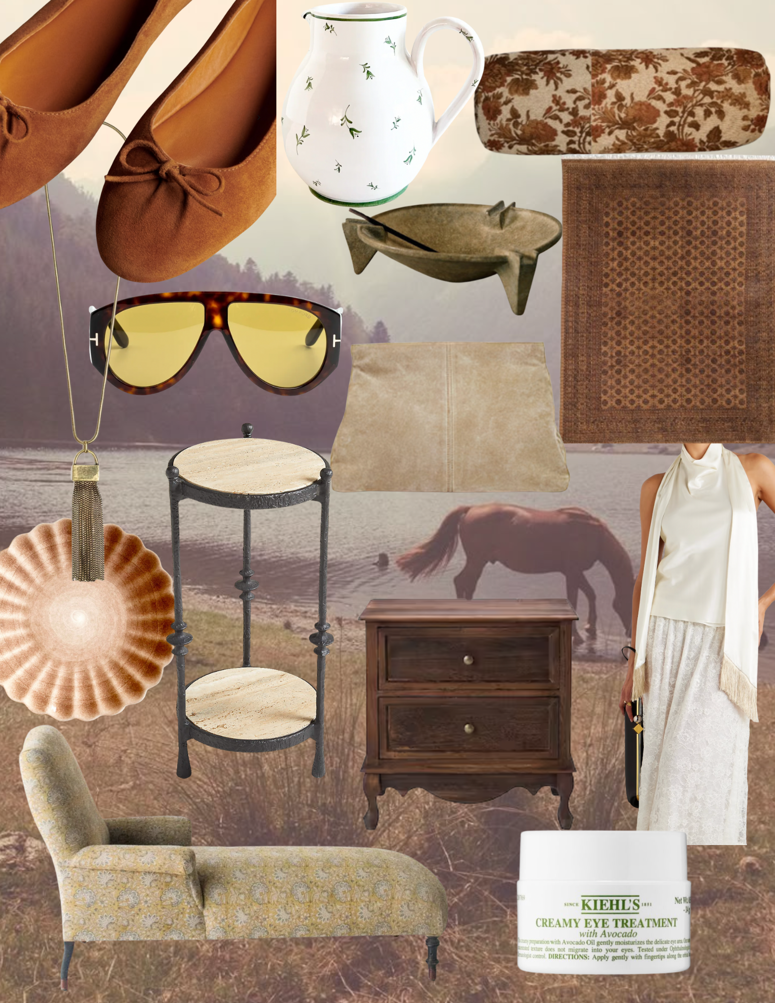
Vintage Chaise | Pitcher | Salad Plate | Nightstand
Leather Jacket | Sconce | Rug | Ash Tray
Suede Flats | Antique Desk | Kiehl’s Eye Cream | Turquoise Necklace
Brass Wall Vessel | Tapestry Bolster | Cocktail Napkins | Martini Table
Suede Clutch | Tassel Necklace | Fringe Top | Sunglasses
Lifestyle threads
This is the month for practical romance. A pleated shade that throws warm light at 6pm, a tiny marble table for tea or a nightcap, a floral bolster that makes a bench feel finished, a hand-thrown pitcher that does double duty as a vase for whatever you clip outside. In the closet: suede flats, a good scarf, a leather jacket; same language as the house—texture over trend.
How to translate that at home (quick, not basic)
Swap one lampshade for a pleated or gathered shade and dim the bulbs. Use a painted pitcher as a sink-side vase. Mount a slim brass wall cup in a dead corner for a single stem—dahlias now, branches next month. Frame one wall with picture moulding so the architecture carries more of the look. Add a petite marble pedestal beside a chair so a book and glass have a spot. Ground the room with a tight, low-pile patterned rug. Keep a rich eye cream at the bathroom sink for those on-the-go moments. Quiet moves, real atmosphere—very October.
How to use this edit
Treat it like a nudge, not a checklist. Pick one idea, repeat it once somewhere else, and let the room breathe.
Now, onto the pieces guiding our studio this month.
Home, styled for October
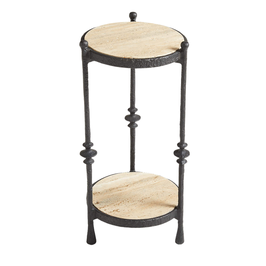
October is when the house starts asking for little rituals, so I’m building them into the layout. The vintage chaise by the window has become my late-afternoon pause—nothing formal, just ten quiet minutes while the light drops. This sets the mood for evening. I paired the chaise with a pleated wall sconce on a dimmer, and a travertine “martini” table because I love to create a tiny vignette for unwinding: a book, a low candle, maybe a nightcap. It’s one square foot of surface that makes the whole corner feel intentional.
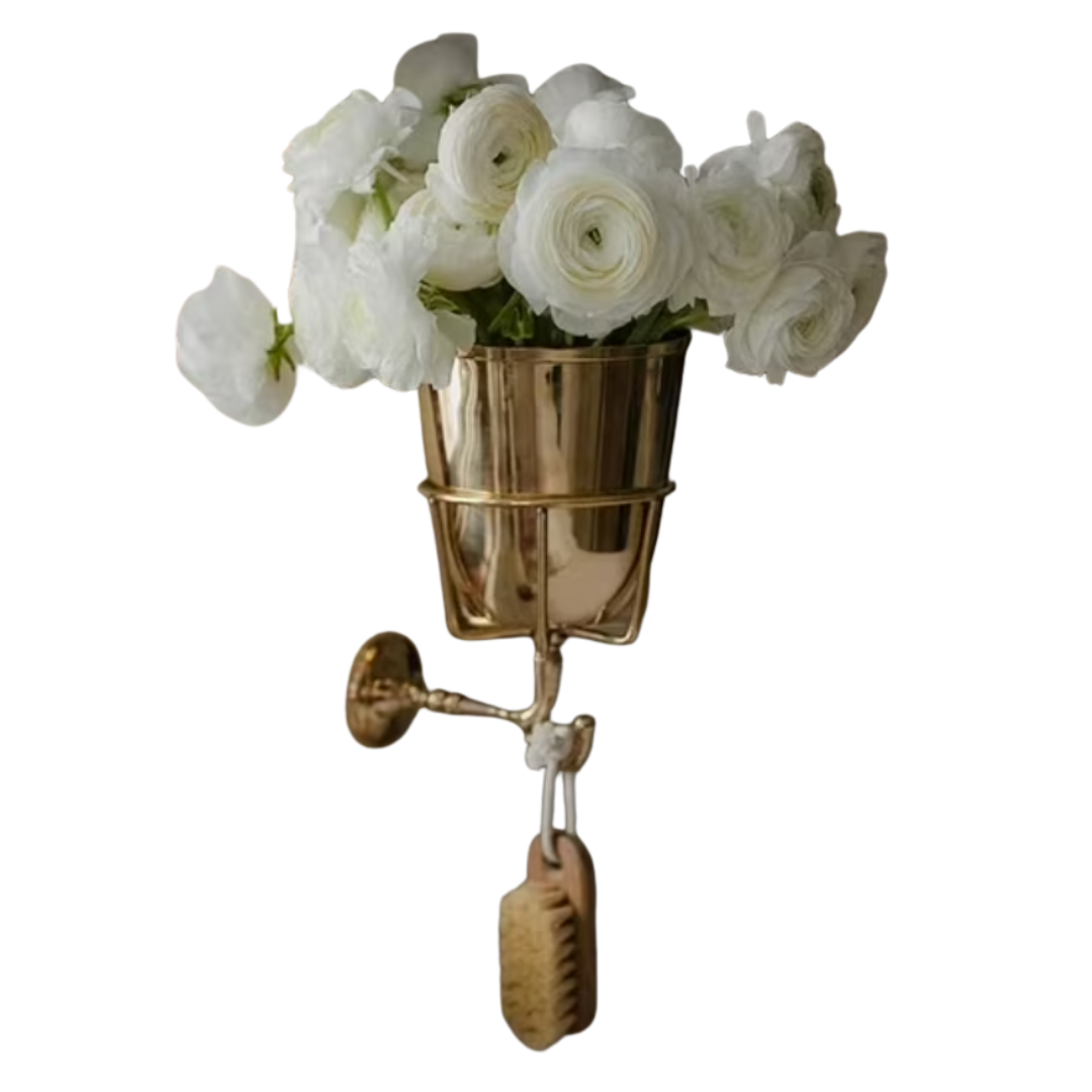
Texture is doing the heavy lifting everywhere. Try layering a Persian rug over jute—pattern that hides real life now and swings festive later. Then, toss a tapestry bolster on the sofa instead of swapping every pillow. Storage wants to look pretty in fall, so a three-footed bowl near the door holds matchbooks and keys without looking like storage, and a brass wall vessel takes a single stem in the kitchen or a toothbrush in the bath. For bedside, I found a pair of vintage-looking nightstands with great detailing; add a tassel key and a shallow dish and they pass for designer.
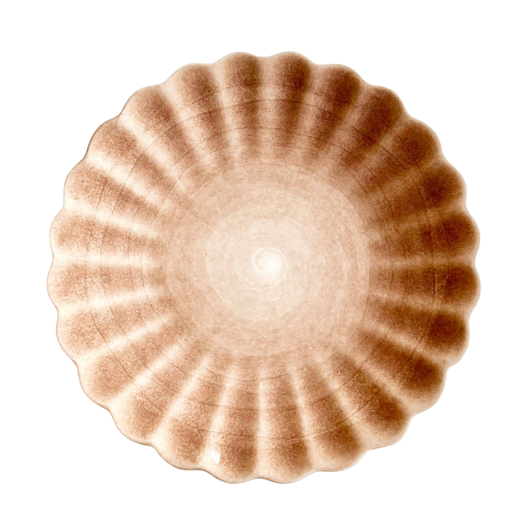
The table follows the same “use it daily” rule. A handmade pitcher with little green grasses lives by the sink most days, then pours water when friends drop in. And I will die on this hill: salad plates are the best “extra” dish to buy. Love this cinnamon-toned pattern and can even use them for dessert, snacks, bread—anything. Stack them on open shelves with linen cocktail napkins and you’re always halfway to hosting. I still believe in handwriting thank you’s: a late 18th-century French writing table is where receipts and ideas land so the kitchen counter doesn’t have to. It’s a small, steadying habit—sit, sort, breathe.

What I’m wearing this month

The October mood in my closet is simple but specific. Suede ballerina flats with straight denim and socks are my default—polished without trying. Also been reaching for a glossy button-front leather jacket (Emma found hers in brown and now I’m obsessed); it feels like a blazer but cooler, and works day to dinner. When a tote feels like overkill, a suede clay clutch tucks under the arm and behaves.
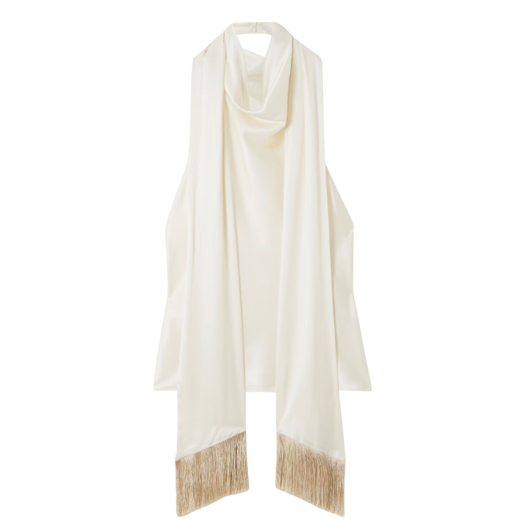
Jewelry carries most of the mood. Personally, I’m in a turquoise bead necklace phase—Tennessee Turquoise in Lieper’s Fork has me hooked—and I love how it wakes up a black knit and layers with a gold tassel pendant. Statement chains are quietly back; one good piece with a button-down is enough. For the in-between light, Tom Ford sunglasses with an amber tint are perfect. You can still see your eyes and they feel tres chic (honestly, I wondered if they were too cool for me but I have gotten so many compliments so I’m keeping). And, for nights out, I purchased this fringe top for my birthday—simple cut, a little movement, and that “I showed up for myself” feeling.
Beauty & other small rituals
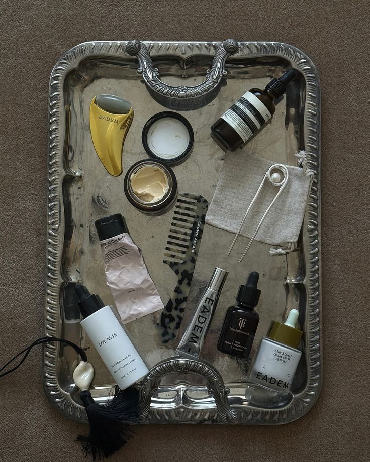
Product-wise, I’m keeping it minimal and moisture-forward. I added Kiehl’s Avocado Eye Treatment for fall dryness (you know after all the summer days in the sun!) and keep it in the fridge so it doubles as a quick de-puff. The rest is lifestyle: a short journaling block at the desk before touching my phone, a Sunday intention reset (three lines: what I’m leaning into, what I’m letting go of, and one tiny action), and a walk with a podcast that gets my head right—lately To Be Magnetic with Lacy Phillips. Queue one design listen and one TBM episode, take a lap, then jot a single takeaway so it actually sticks. Evenings stay simple on purpose: lights low, windows cracked if the weather allows, candle hour after dinner. Not precious—just choosing atmosphere on a Tuesday.
That’s October around here. Nothing dramatic, just a few choices that make the day feel more considered. If this month had a mood headline, it’d be: less filler, more feeling.
I’m curious what you’re trying. A pleated shade? A tiny martini table for your wind-down corner? A turquoise bead with a sweater you’ve had forever? Pick one thing, repeat it once, and let the space breathe.
Thanks for reading and making room for this monthly pause. I’ll be over here finishing my candle hour and jotting next week’s intention. See you again in November!
Need a little more direction?
Are you struggling to define your style or figure out how to pull your space together? That’s exactly why we created our Clouz Houz Design Guides. They’ll help you design a space that feels cohesive, elevated, and personal … without hiring a designer.
Click here to explore the five curated styles, complete with inspiration boards, designer tips, and product links that make sourcing simple. Download for free and get started designing your dream home today!
Not sure which one’s for you? Take our free quiz to discover which aesthetic best suits your space.
We’re here to help you move forward with confidence, and create a home that truly feels like yours.
P.S. Are you new to Clouz Houz? If you’d like to be in the know on all things home and lifestyle, subscribe now so you don’t miss a post! As a bonus, you’ll receive our exclusive 42-page ‘Paint Guide.’ This Guide will help you select the perfect shades for your home. And, you’ll also receive our weekly newsletter, including special finds that are not on the blog — they’re only for subscribers. 
Life is short. Make it beautiful!

