Today, I’m excited to share a project that we’ve been hinting at for a while but never had the chance to have professionally photographed … until now. I’m thrilled to finally reveal this cool bathroom space and walk you through the design details that make it special. Our goal here is to show you how to make a small bathroom feel bigger, so read on for our best tips!
This project was for a virtual client from Portland, Oregon, in a beautiful area (our old neighborhood when we lived there), Montclair in Raleigh Hills. These are repeat clients, and dear friends of ours, so it always feels good when we have customers coming back to our services and asking us for more help! We faced an interesting challenge: designing a bathroom that serves as a teenager’s bathroom and as a guest bathroom for overnight visitors. Given the small space, our goal was to make a big impact without overwhelming the room. We wanted it to be playful enough for a soon-to-be teen, yet sophisticated enough for guests.
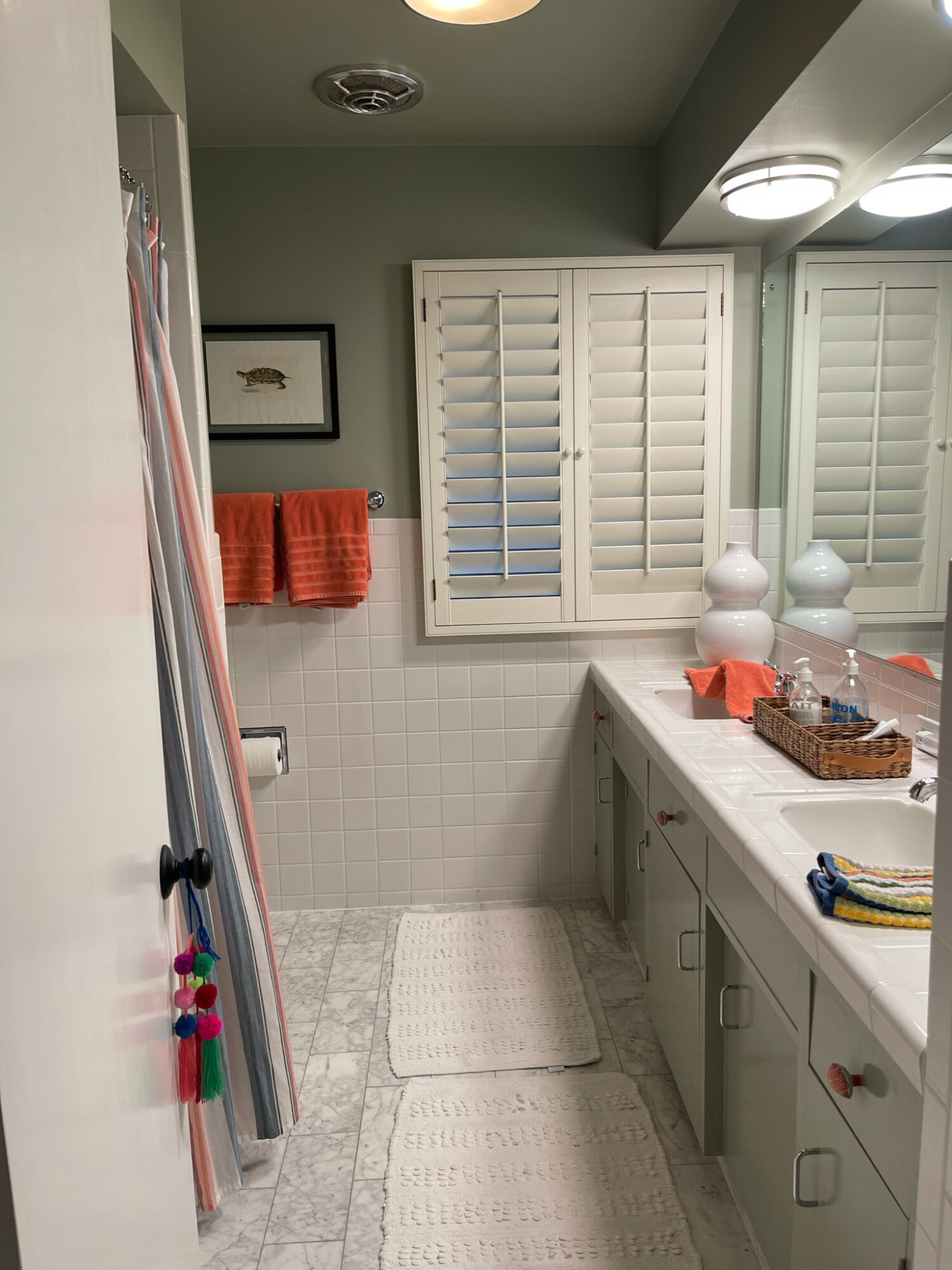
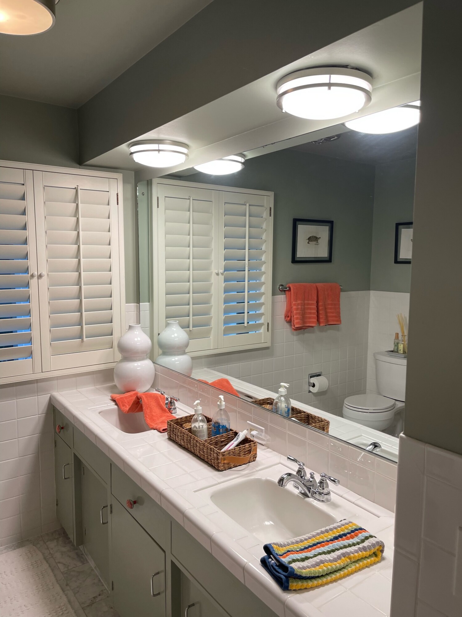
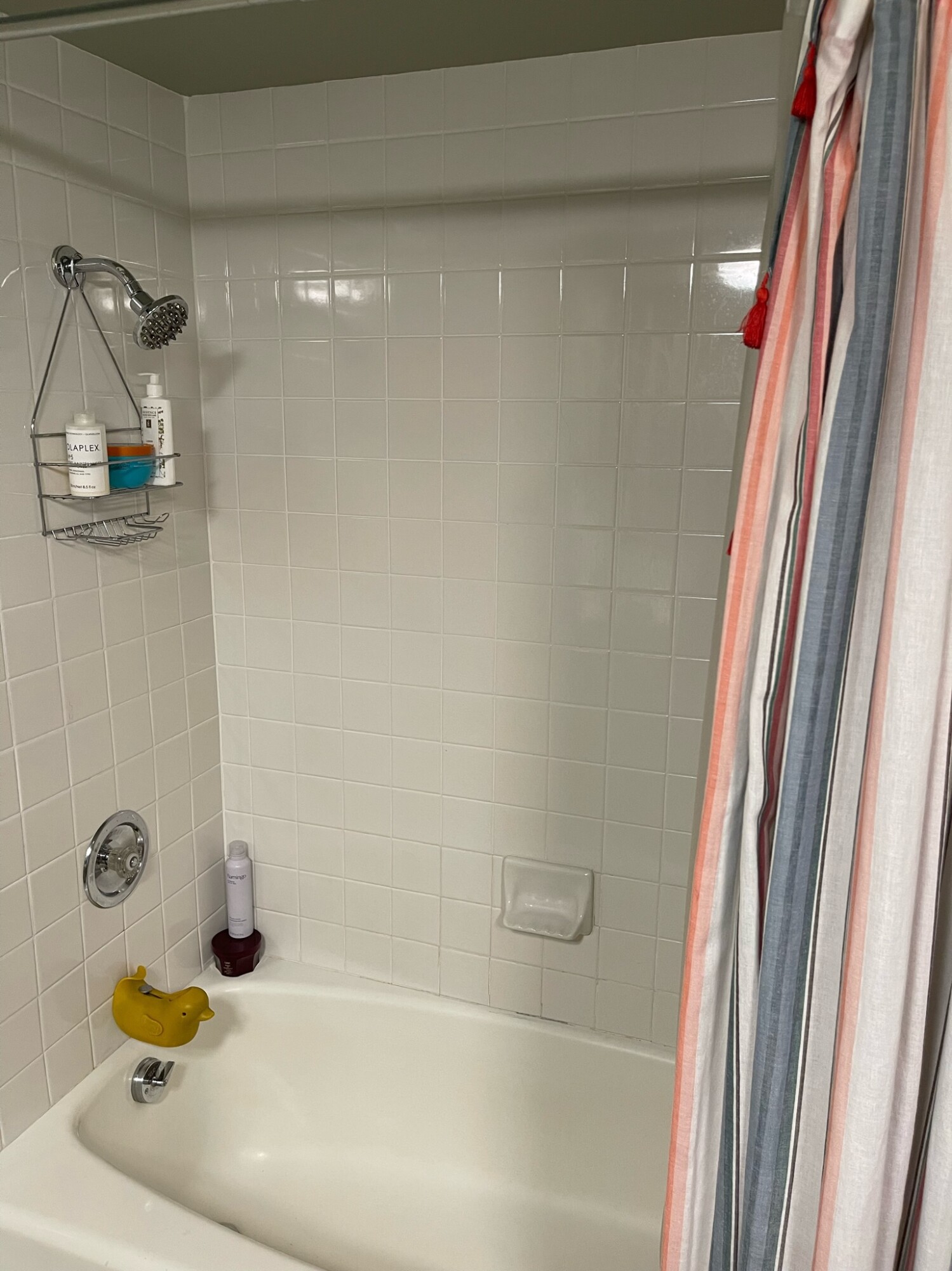
As you can tell from the “before” images, it was a really cute bath, but it was time for an update. Our aim was to give it a more mature feel while keeping it fresh and fun. We retained the existing layout, but introduced new materials and design elements to transform the space.
Making a Small Space Feel Bigger
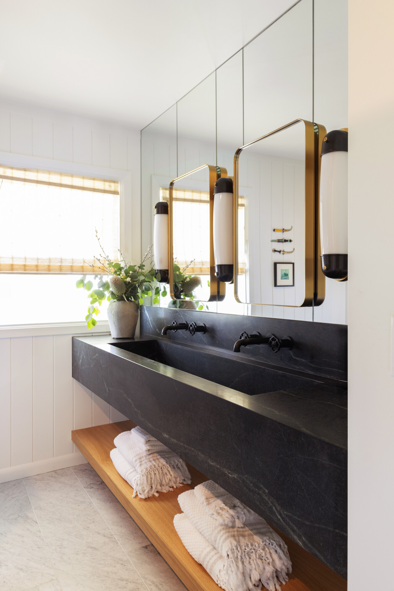
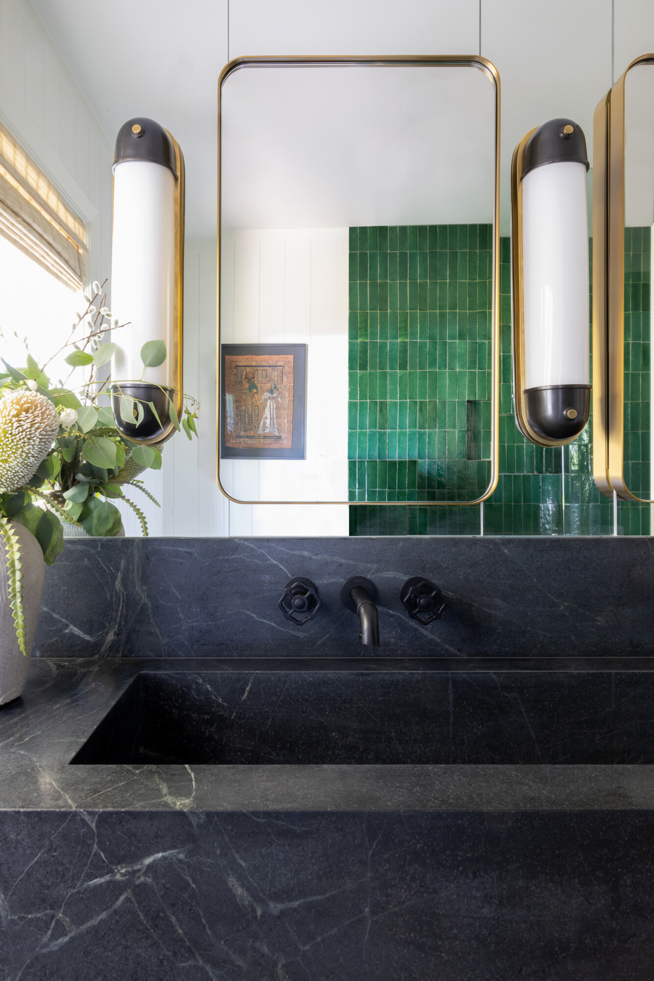
One of our key strategies was the all-glass/mirrored wall above the vanity. This design choice was intentional to create the illusion of a bigger space. In a small bathroom, visual tricks like this can make a world of difference. The mirrored wall opens up the room, making it feel airy and expansive.
Clever Storage Solutions That Will Make Your Bathroom Feel Bigger
Storage was another critical aspect we had to address. As you can see, the vanity design lacks storage for smaller toiletry items, so we opted to inset the medicine cabinets, providing much-needed space for essentials. Additionally, a well-placed shelf acts as a convenient spot for stacking towels, while baskets below can stow away hair dryers, toilet paper, and other necessities. These small yet significant touches help keep the bathroom organized and functional.
A Pop of Color and Texture
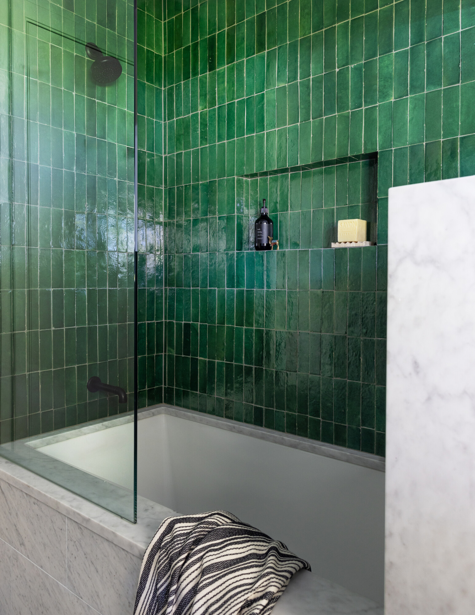
The green tile from Zia Tile is obviously the showstopper. We love that pop of color! In a small space, bold choices like this can define the entire room. The vibrant green tiles add a lively and fresh vibe, making the bathroom feel modern and inviting.
Grand Features in a Small Space
Another standout feature is the trough sink, fabricated out of soapstone. The original bathroom had two separate sinks, which, while practical, made the space feel cramped. By incorporating just one larger trough sink, we achieved several benefits: it made the space feel bigger, provided more counter space, and gave the bathroom a more luxurious feel. We were thrilled with how this element came together. The black-on-black plumbing fixtures blend seamlessly into the design. The different finishes add subtle interest without overwhelming the space.
Classic and Timeless Elements
The Carrara marble floors add a classic touch that sets off the other materials beautifully. This timeless element provides a neutral base that complements the bolder features of the design.
Adding Layers of Texture
To add another layer of texture and interest, we incorporated tongue-and-groove siding on just two of the walls. This detail not only adds depth, but also ties the entire design together, giving the room a cohesive and polished look.
***
This bathroom redesign demonstrates how thoughtful design can transform even the smallest of spaces. By combining clever storage solutions, bold design choices, and classic elements, we created a multifunctional bathroom that feels both spacious and inviting. We hope you love this transformation as much as we do!


