April is what spring is all about … it feels like the month where everything clicks into place. I always say that March is transitional — the thaw, the in-between — but April is when things start to bloom, literally and figuratively. The energy shifts, and we know spring has officially arrived.
But hold on — Easter plays a part in that too. There’s just something about the fresh greens, the soft pastels, the little rituals around the table, isn’t there? Suddenly I’m changing how I dress, what I cook, how I spend my mornings. The farmer’s market starts back up, the layers get lighter, and it always feels like it’s time to refresh.
This month feels like the beginning of movement — more client projects that let me explore my creativity, more time outside with our sweet dog Lucy, more inspiration coming from random vintage finds or restaurant interiors I want to recreate. So naturally, this edit is pulling from that in-between of grounded tradition and playful transitions.

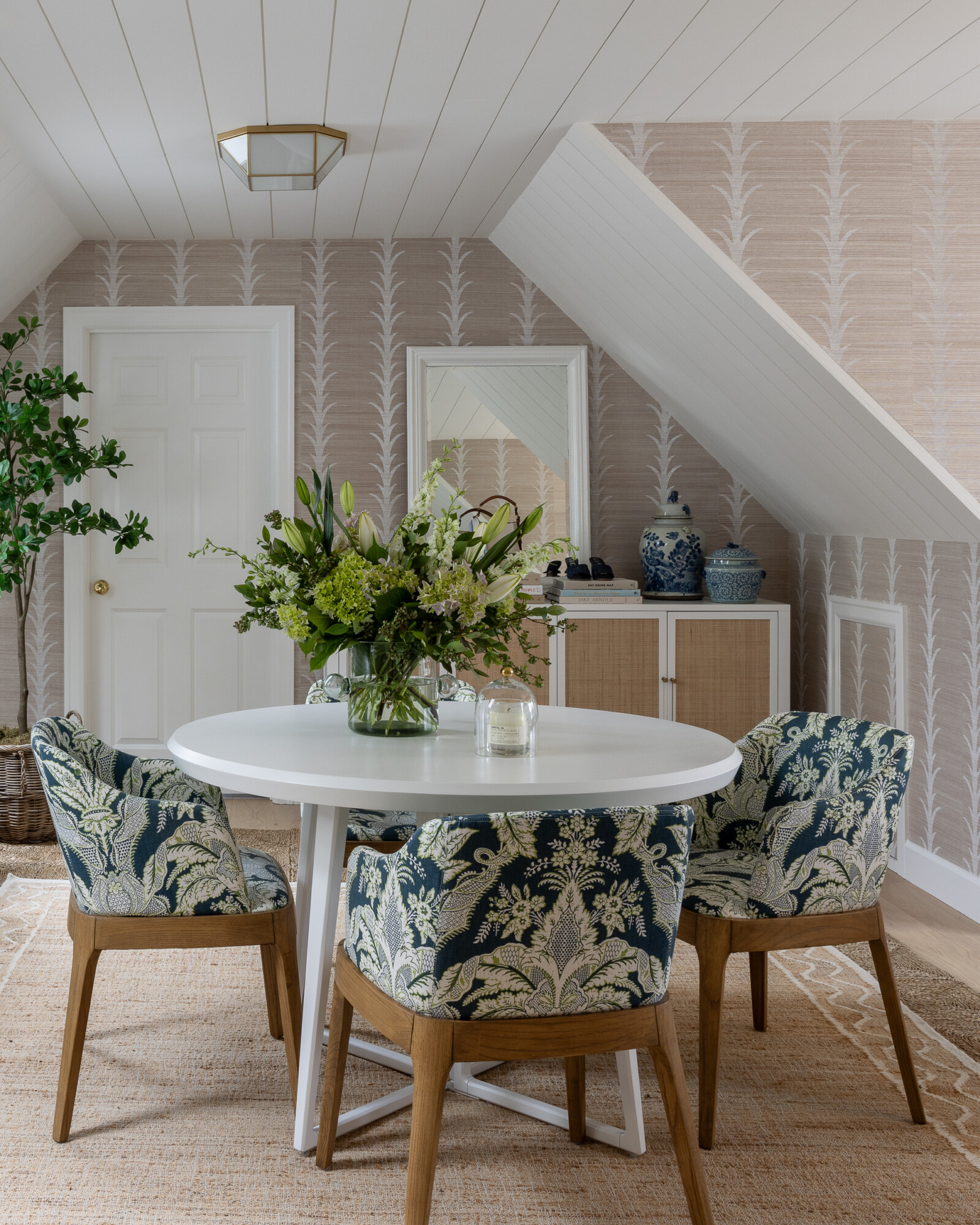
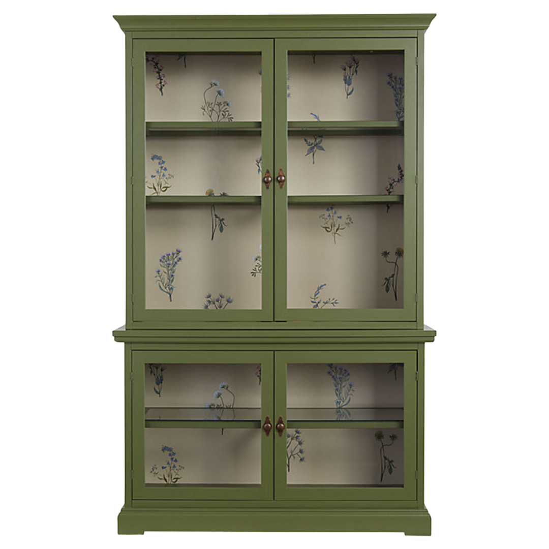
Wallpaper of the Month
Amber Interiors Grasscloth Wallpaper
This month’s wallpaper pick is something I stumbled across while pulling materials for a project. It’s soft but earthy, nostalgic but not too sweet — and the floral print layered over grasscloth texture adds just enough depth without feeling overly bold.
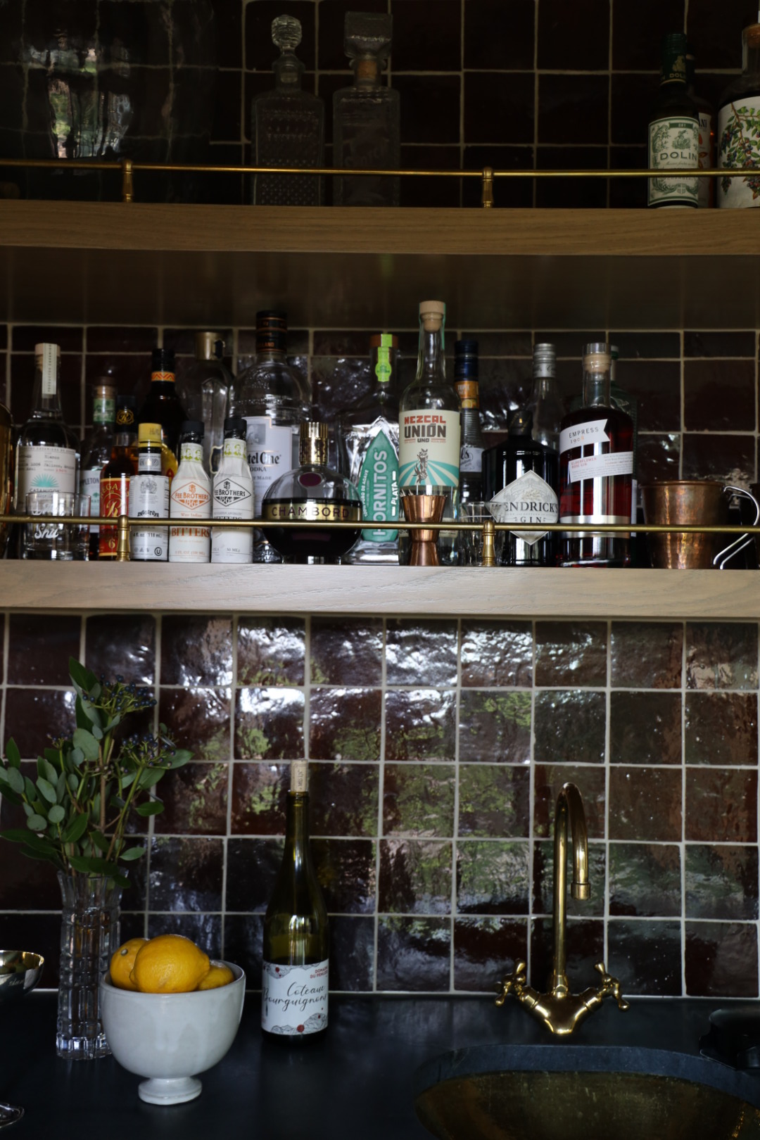
This wallpaper is best used in smaller spaces — a powder room, reading nook, or even behind open shelving — where it can feel a bit more like a hidden gem. The floral motif gives a nod to spring, but the neutral tones keep it grounded and timeless. It’s the kind of print that whispers, not shouts … which feels like the perfect energy for this time of year.
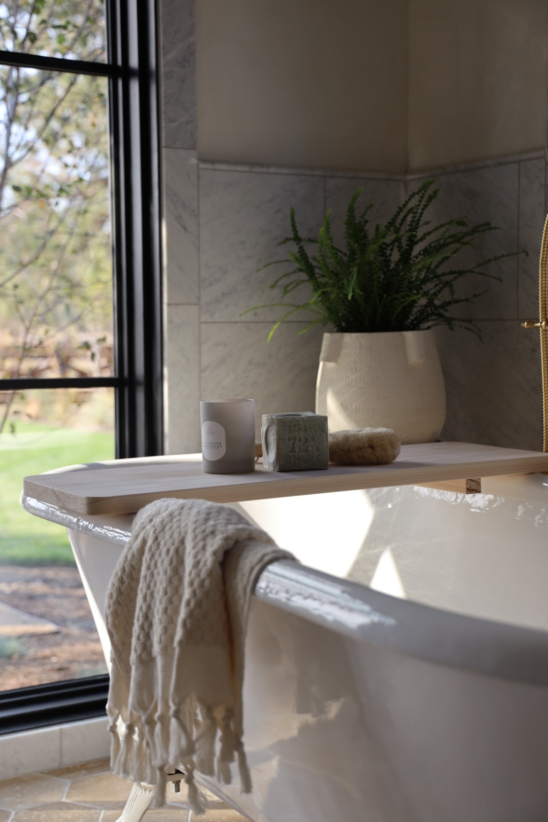
Self-Care Essentials

Pieces That Make Everyday Moments Feel Special
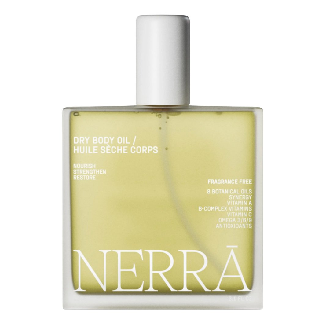
Let’s start with things you’ll reach for day in and day out. First up: this Mediterranean-inspired body oil. I swear by this one. It smells like spring in the most elevated, not-too-floral way, and instantly makes your skin glow. It’s packed with botanical oils and feels like a treat, but works overtime for moisture and radiance.
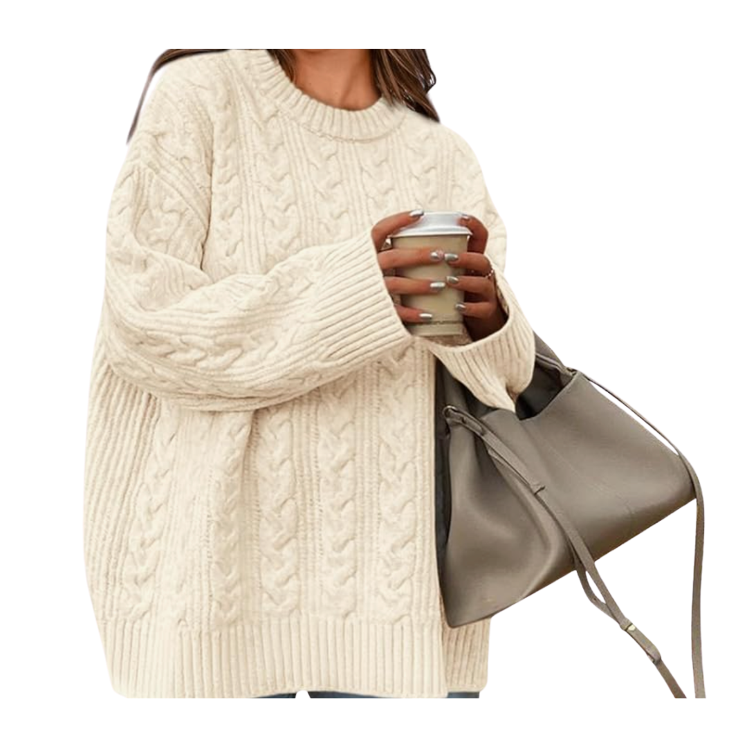
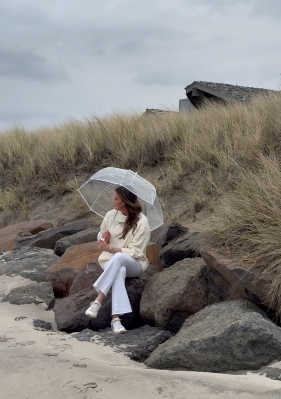
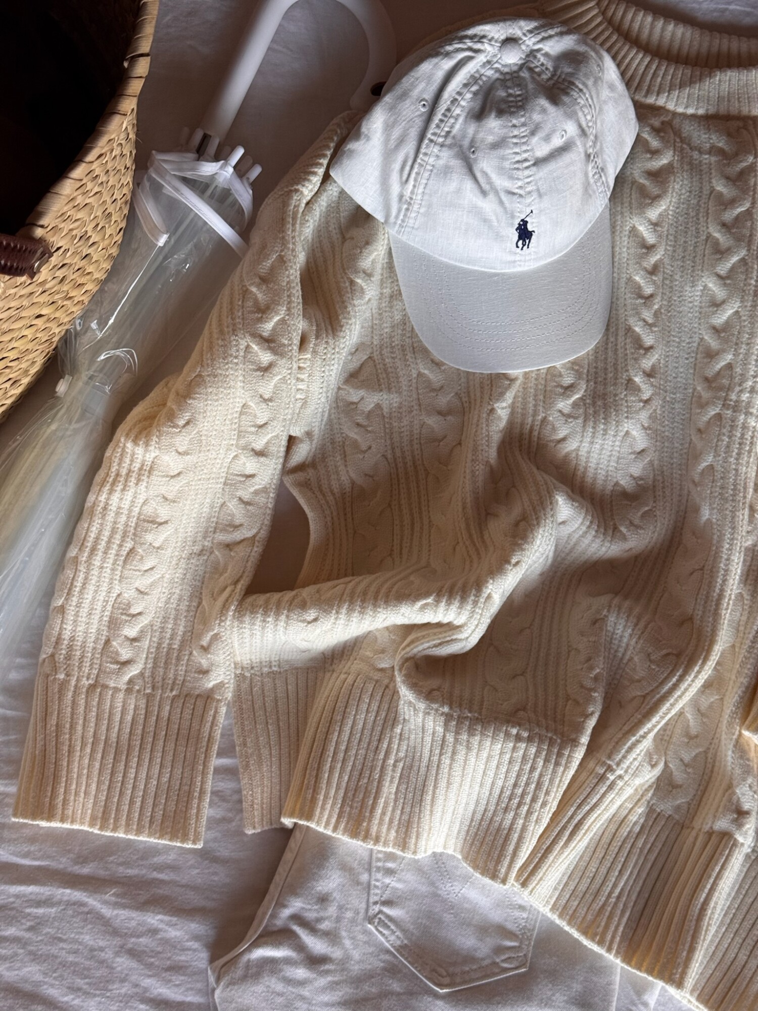
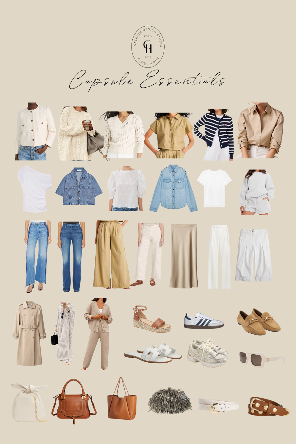
Pair that with the Amazon oversized sweater—a capsule wardrobe essential that’s effortlessly cozy and versatile. I’ve been wearing it with everything lately. It is the softest cotton and comes in many colors. Now I want another one!
We’re also swapping out bedding this month, and I always come back to this striped sheet set in a fun fresh color from Quince. Affordable, pet-friendly, and so soft. We have a set in both of the bed nooks — one in the natural and one in the bluev — and I love the subtle pattern they bring to each space. Sometimes self-care is as simple as making your home feel just a little more like a sanctuary.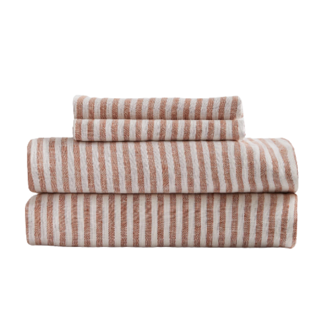
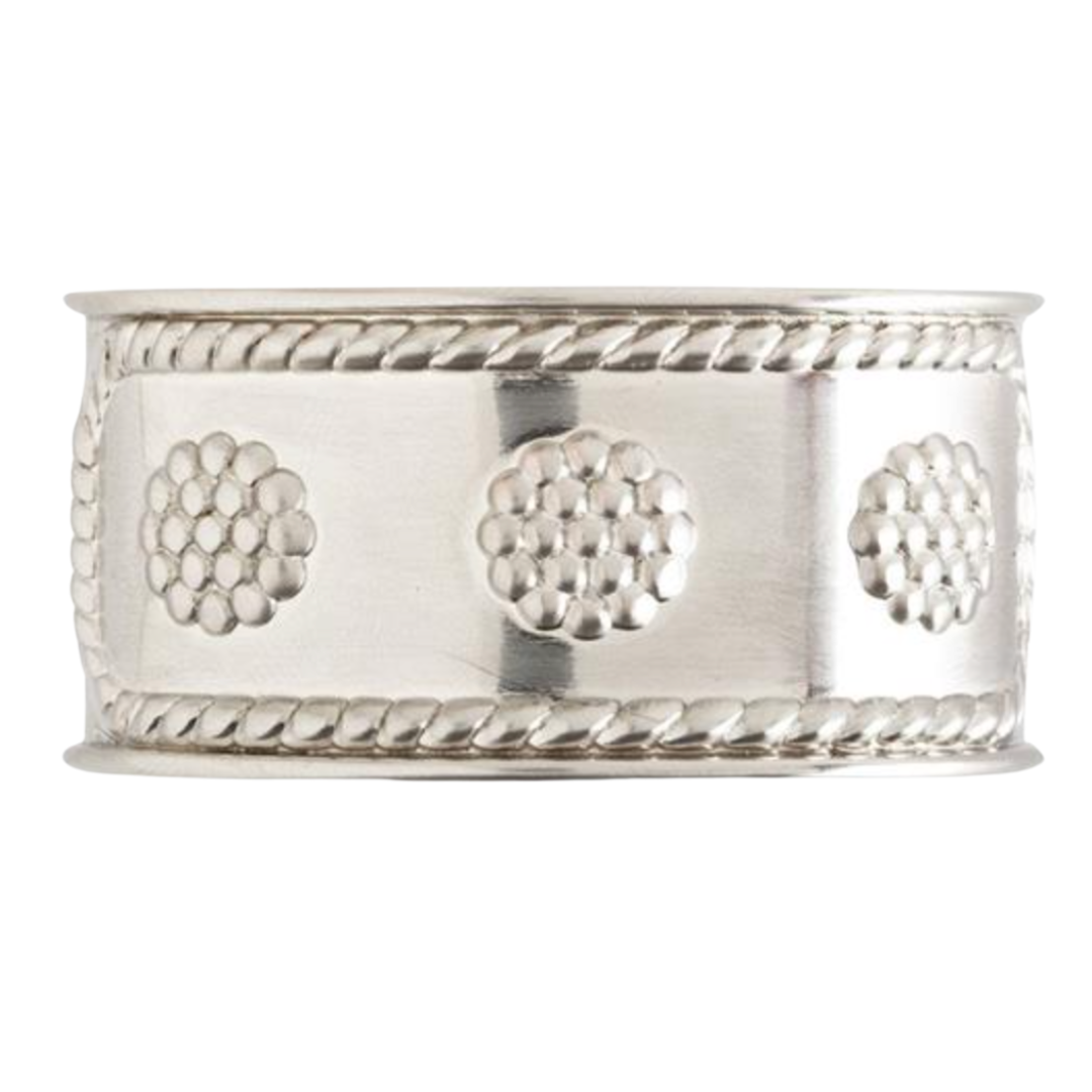
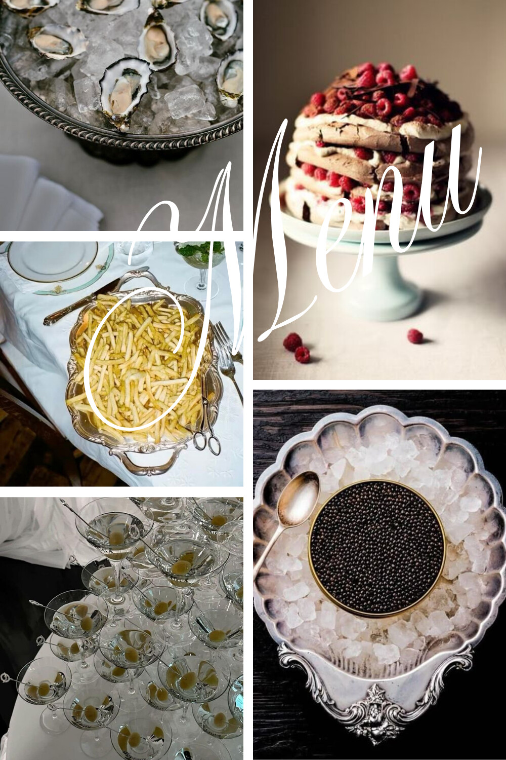
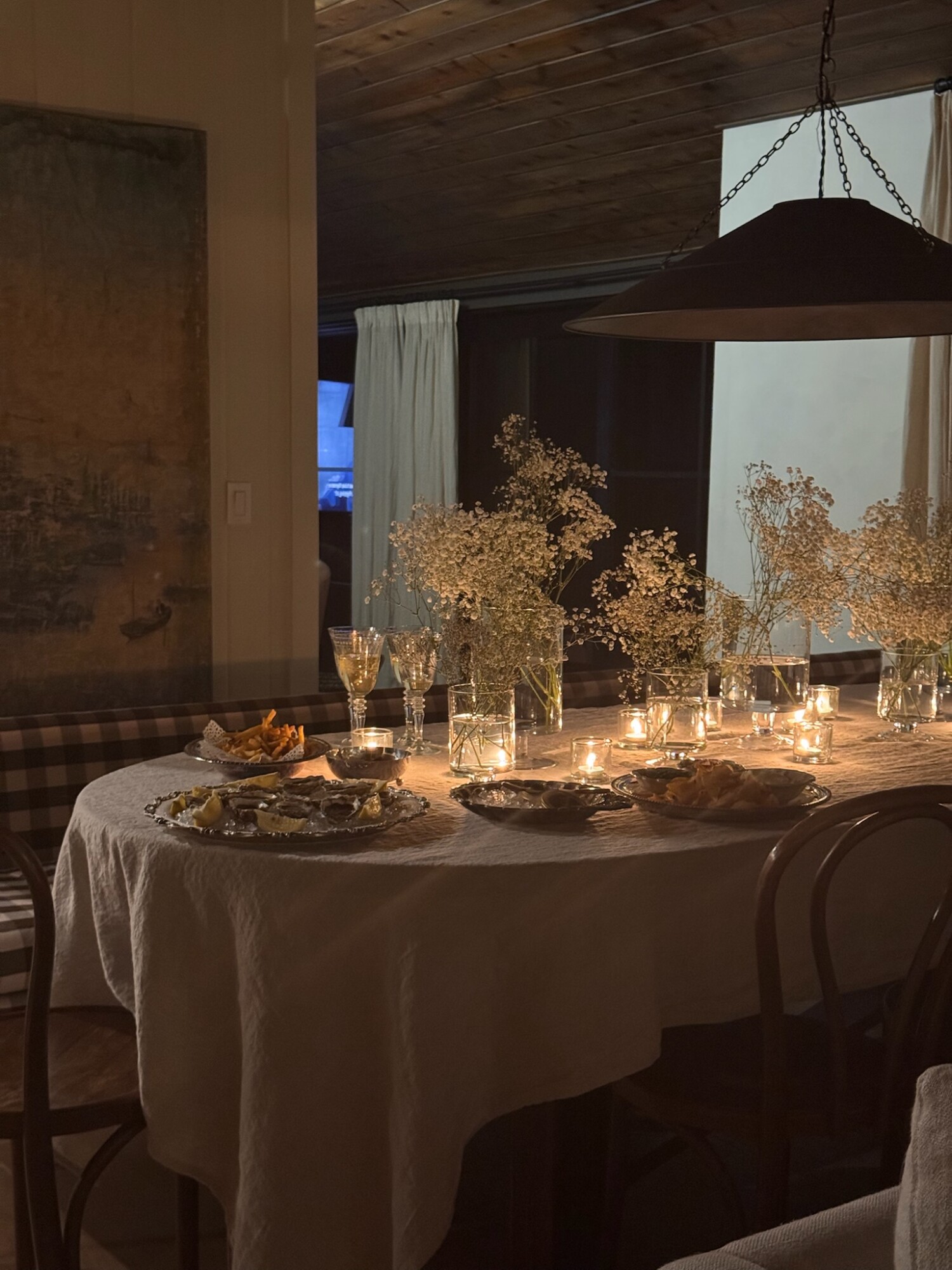
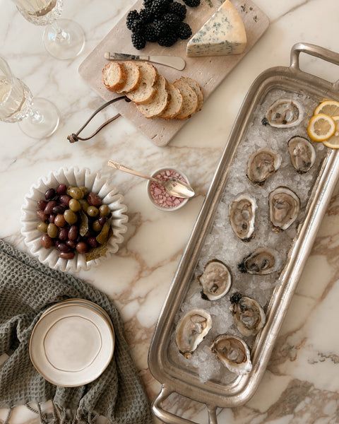
Spring Hosting
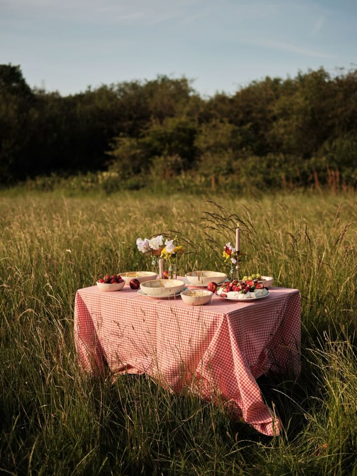
Effortless Style for Gatherings Big or Small
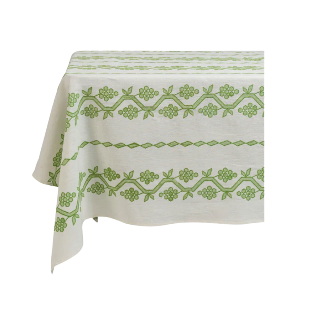
Spring Hosting
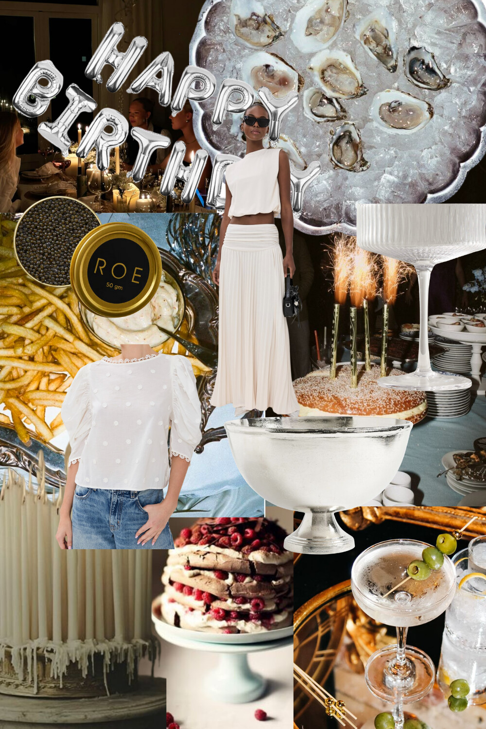
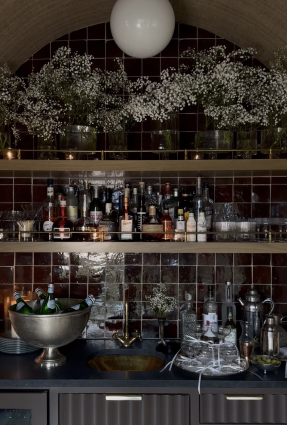
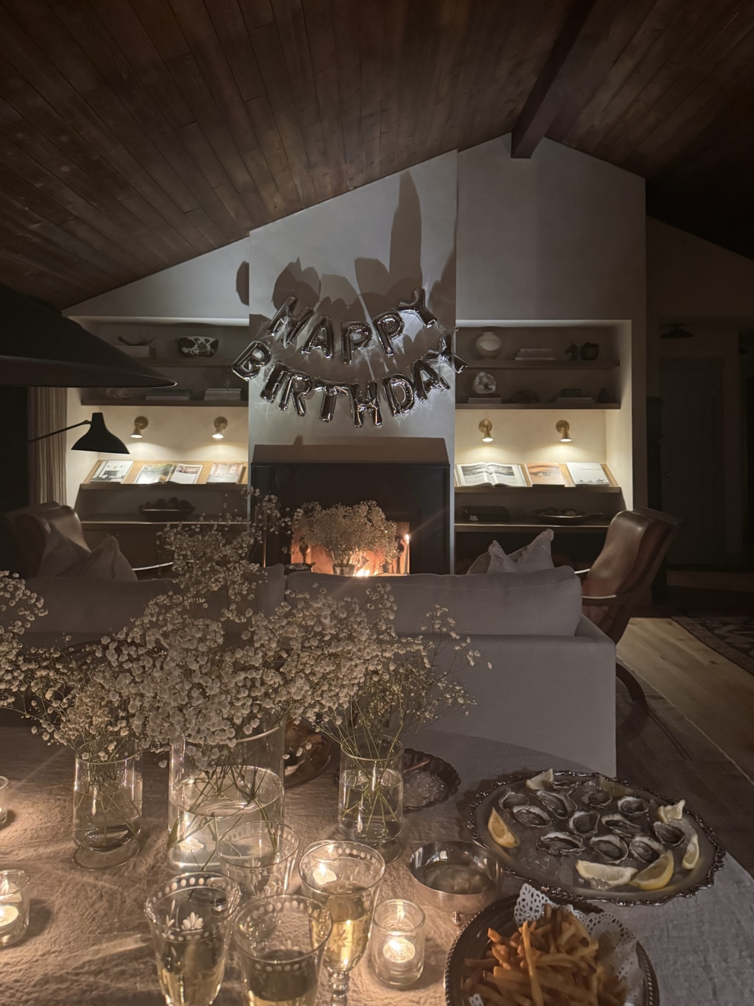
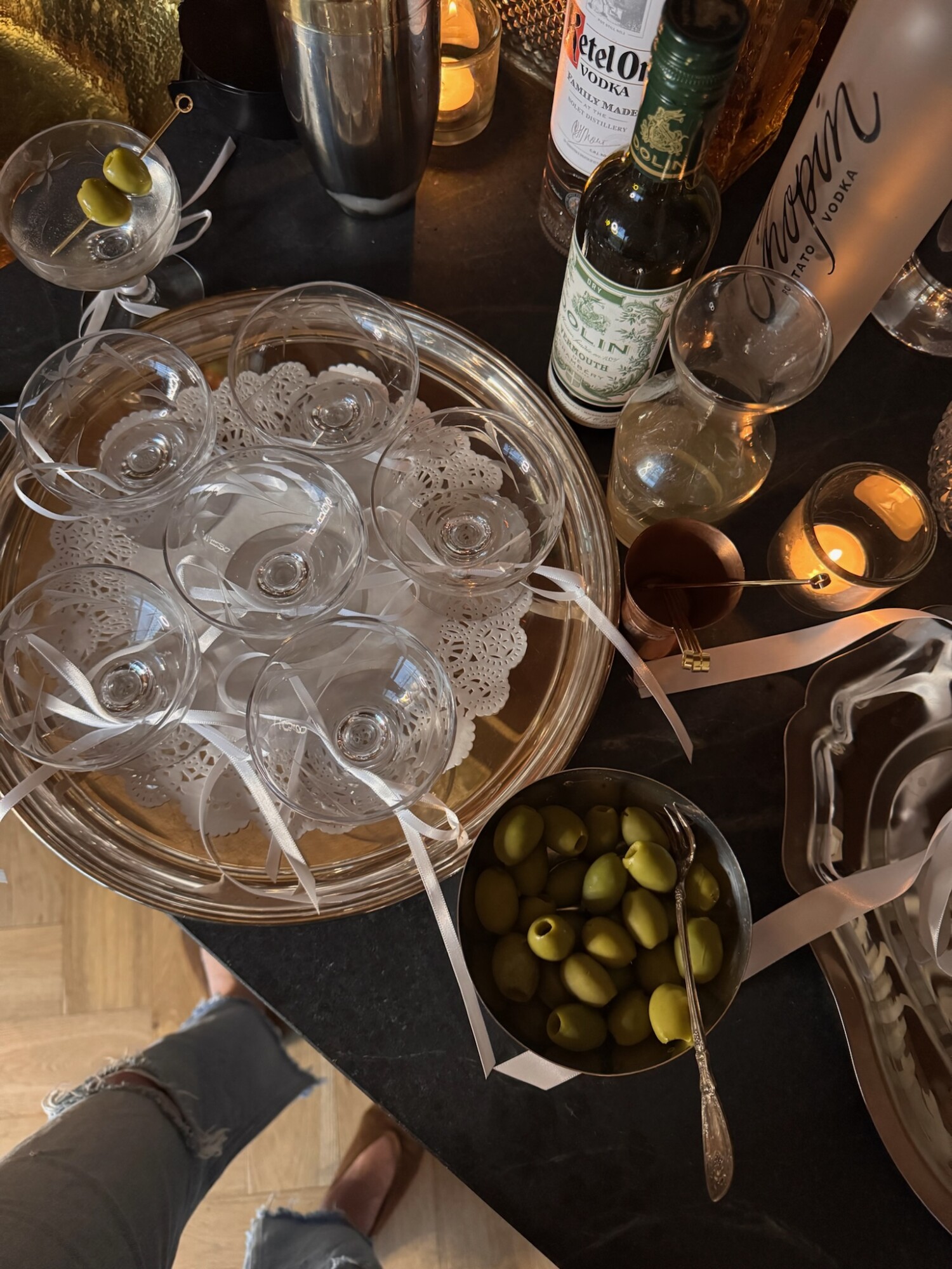
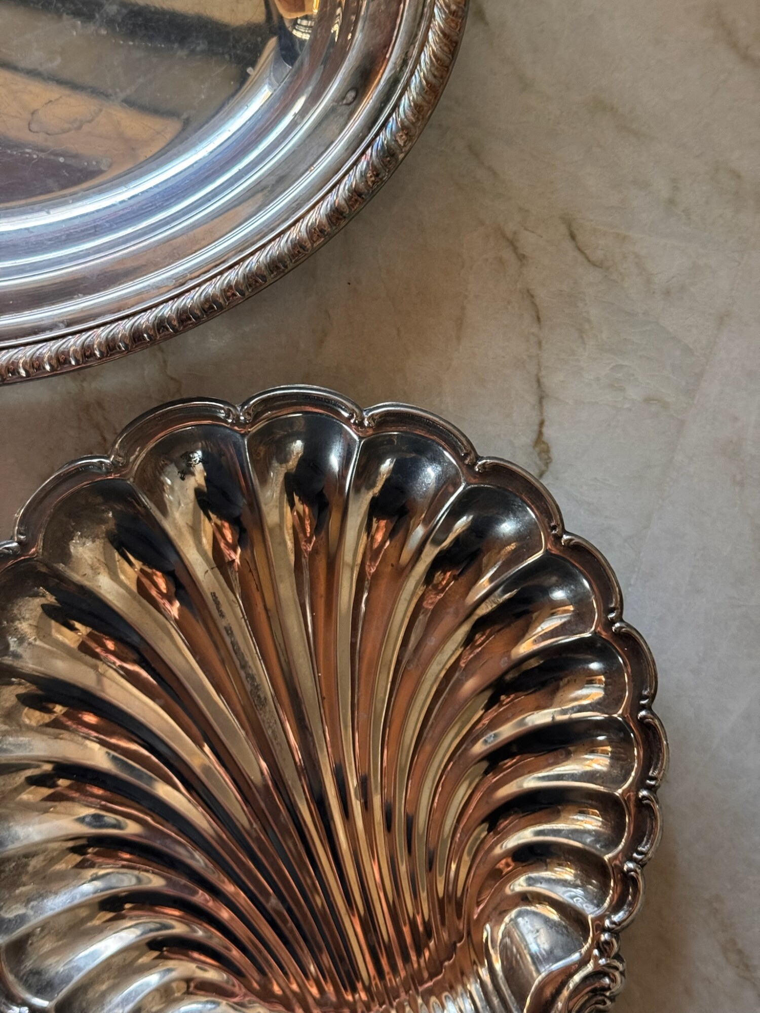
Hosting feels different in the spring—it’s lighter, more spontaneous, and somehow even more special. I’ve been styling tables lately with this hand-embroidered linen tablecloth, and it completely transforms a space. It feels heirloom, but still easygoing. Pair it with the mother-of-pearl caviar spoons I found on Amazon (yes, Amazon!)—a small upgrade that elevates the whole meal and ditches the plastic cutlery vibe. Lastly, these silver napkin rings are a small but beautiful finishing touch to any tablescape. Those are the kinds of things that feel like the cherry on top—and this one definitely is.
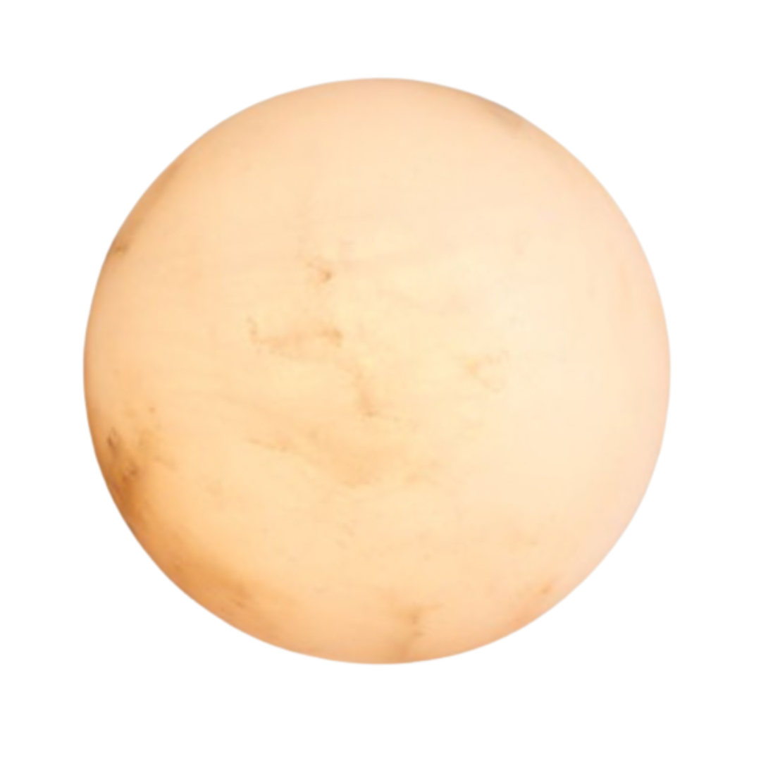
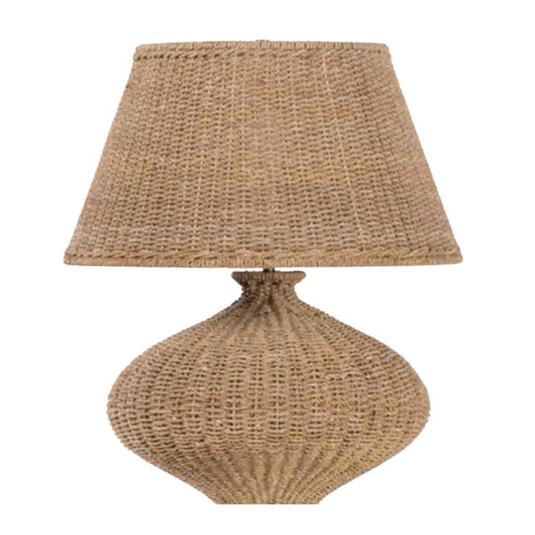
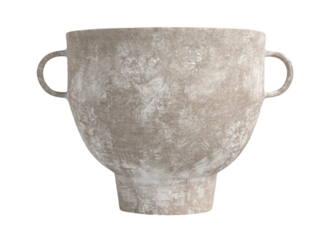
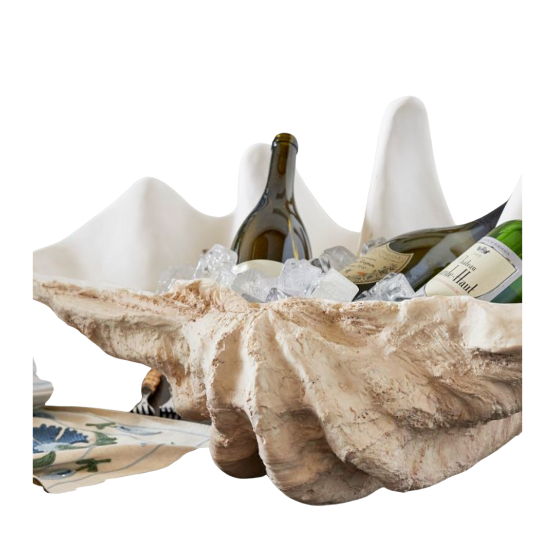
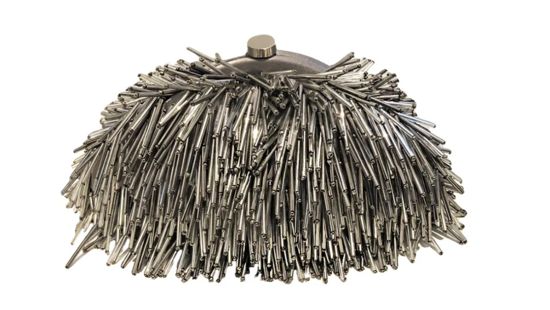
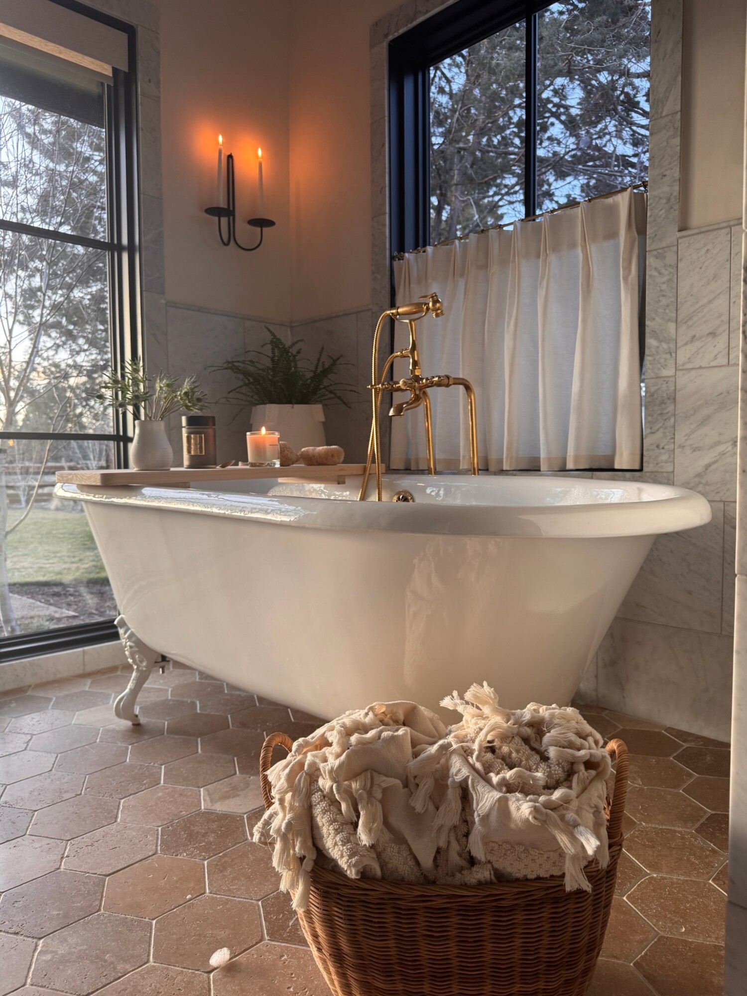
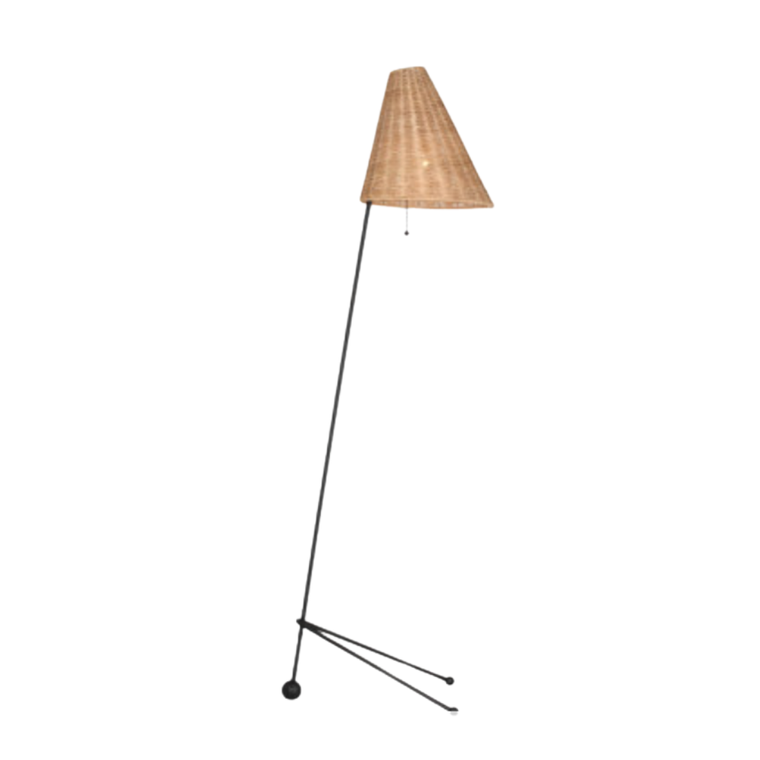
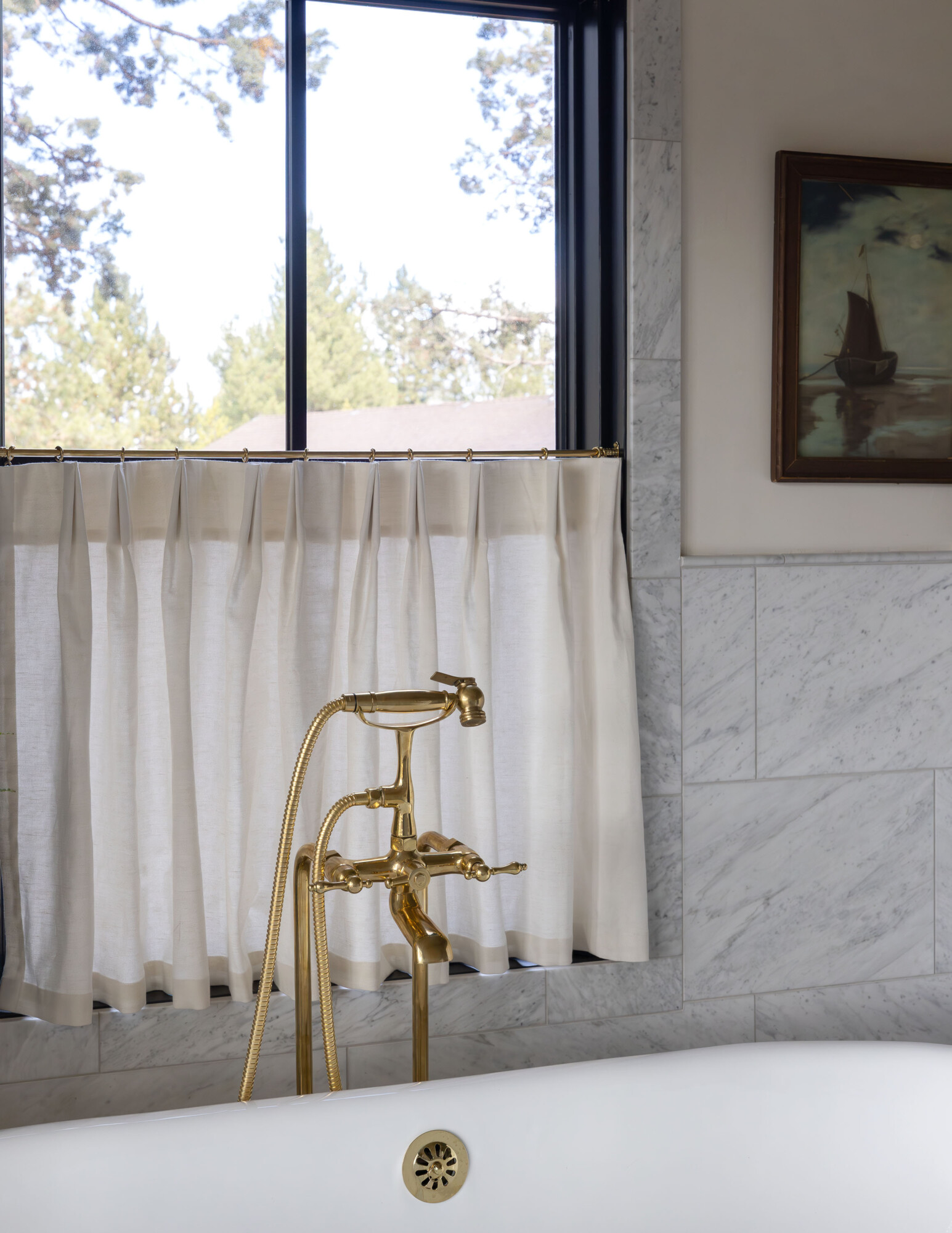
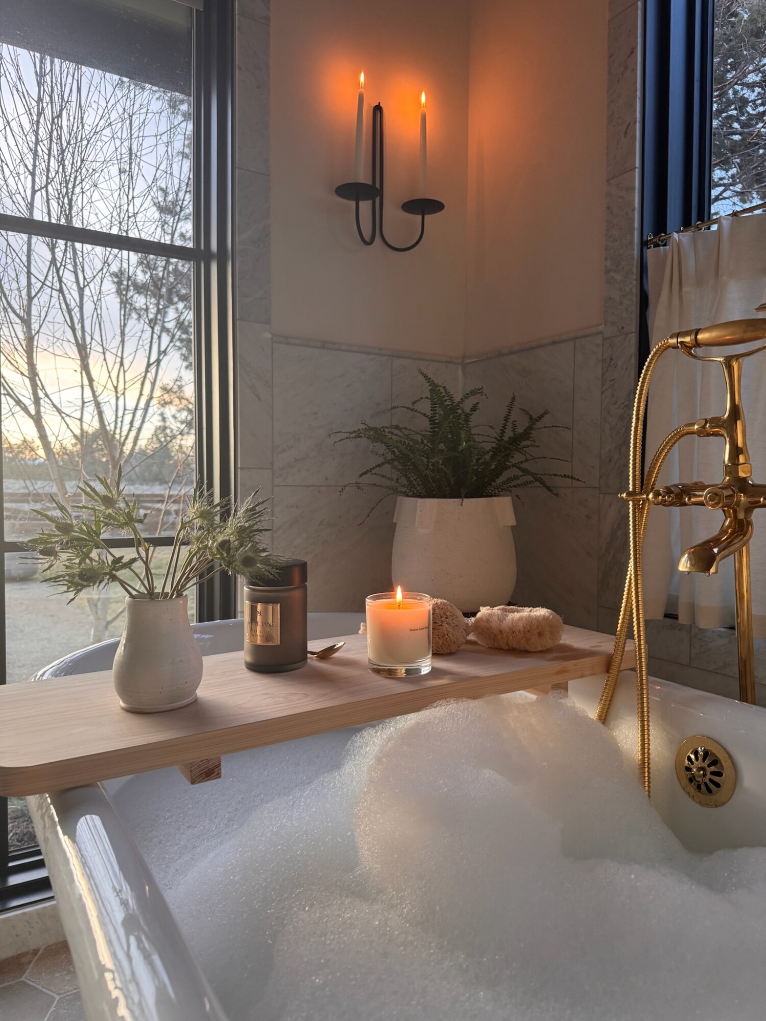
This ceramic footed bowl is another favorite. You could use it for seasonal citrus, or for a low flower arrangement as a centerpiece. And, let’s not forget dreamy lighting—this alabaster sconce works beautifully in a bathroom, closet, or stairway.
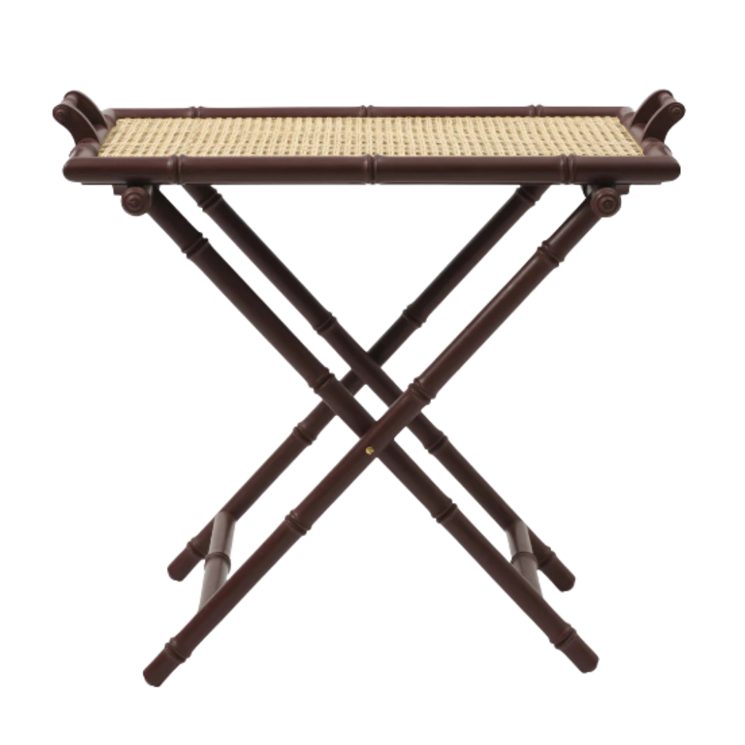
For tabletop accents or an extra styling surface, I love this bamboo folding tray. It could work as a nightstand, a side table, or something to bring out when you’re hosting. Stylish, portable, and functional.

Vacation-Ready Picks
Warm Weather Staples That Work Wherever You Are
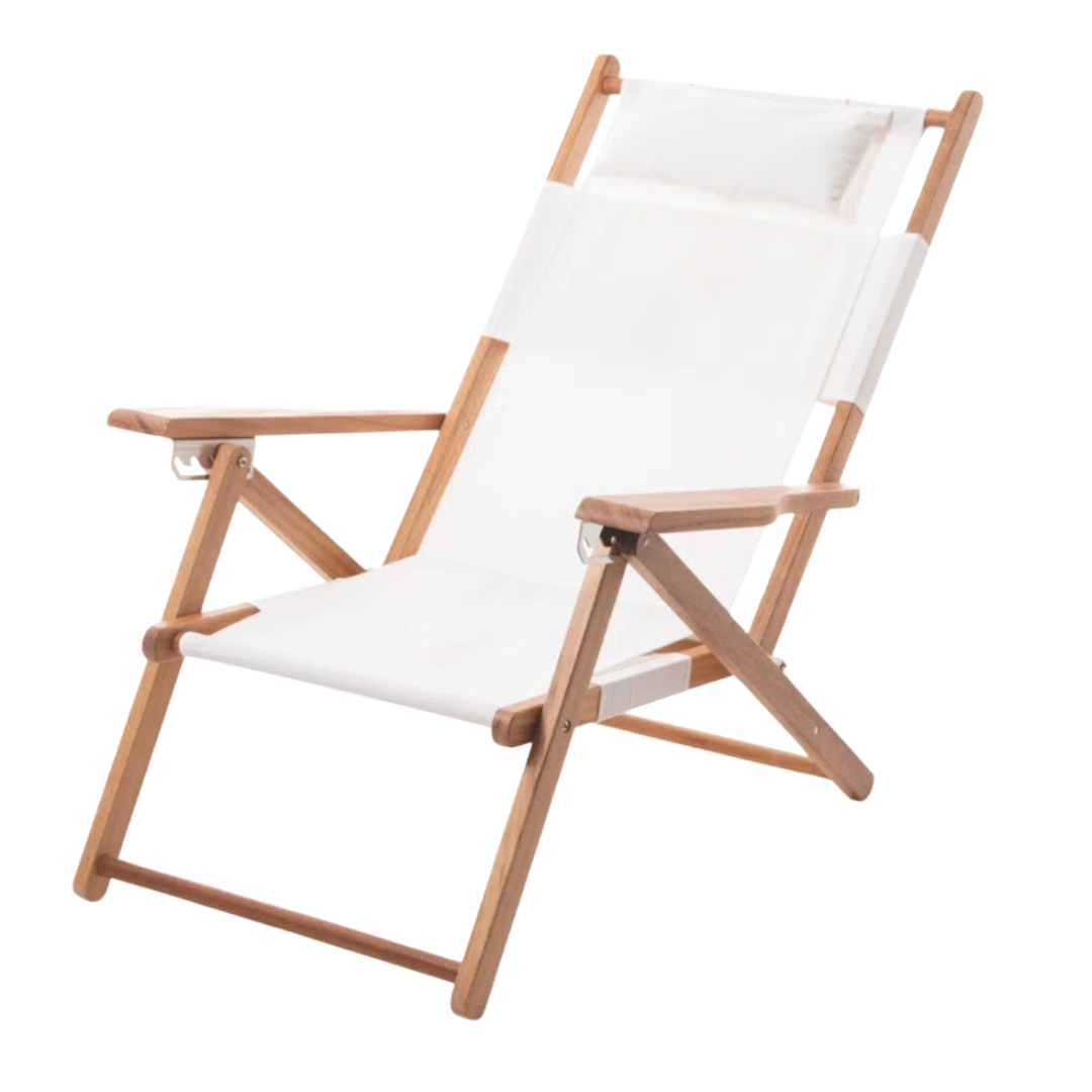
Even if you don’t have a spring trip planned, these pieces bring the vacation energy home. Folding chairs are one of my most-loved pieces for lake and beach days. These fold into a backpack (!!), and recline in five positions. They also have zip pockets for all the essentials. Great for the backyard too.
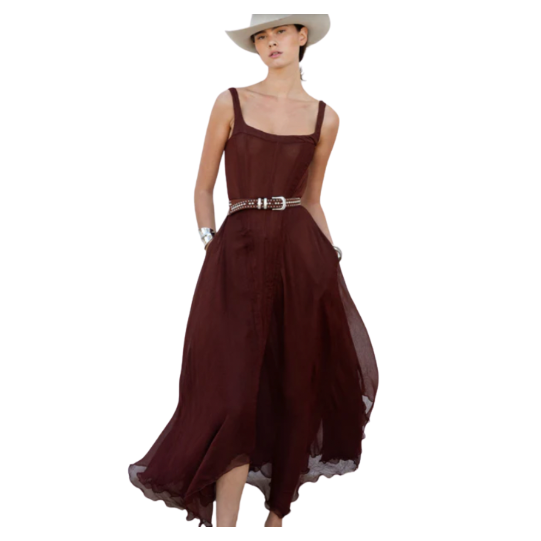
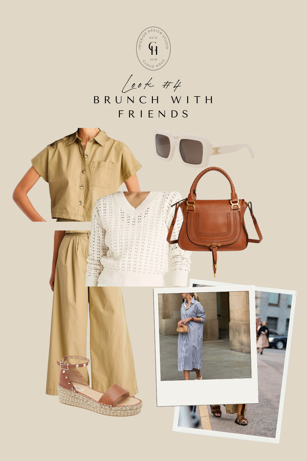
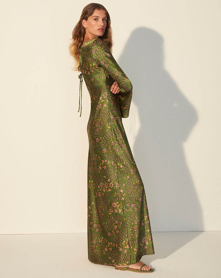
This chocolate brown midi dress feels classic and feminine with a bustier-style top and easy, flowy bottom. It’s the kind of dress that looks good with no effort. Cowboy hat optional 😉
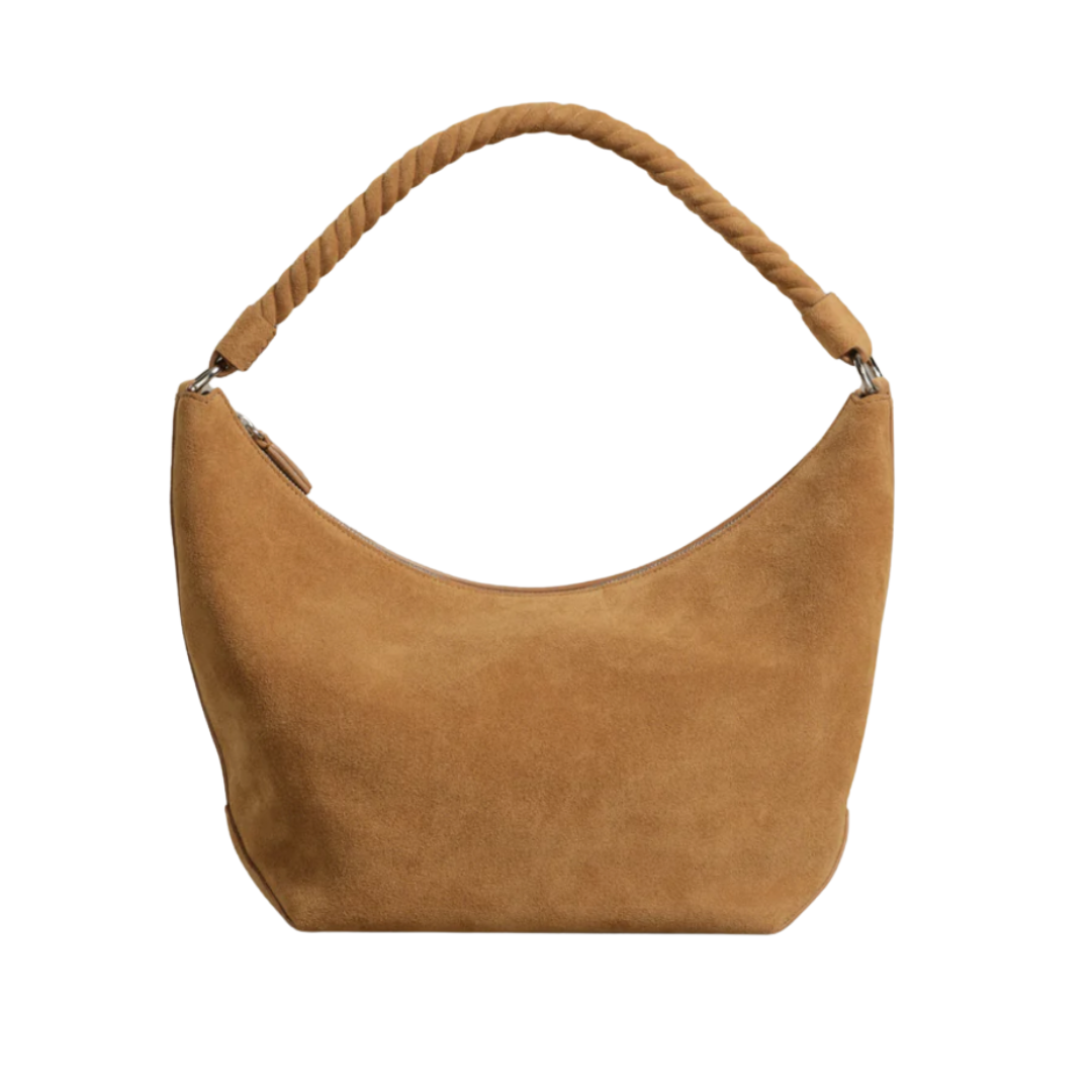
Add the suede shoulder bag with the braided handle and you’ve got an everyday spring look that feels like you’re heading somewhere fabulous, even if it’s just out for coffee. And of course, the Celine sunglasses I had (and lost … still heartbroken) are at the top of my re-buy list. They worked with every outfit, dressed up or down.
Other Favorites
Little Details That Bring Big Joy
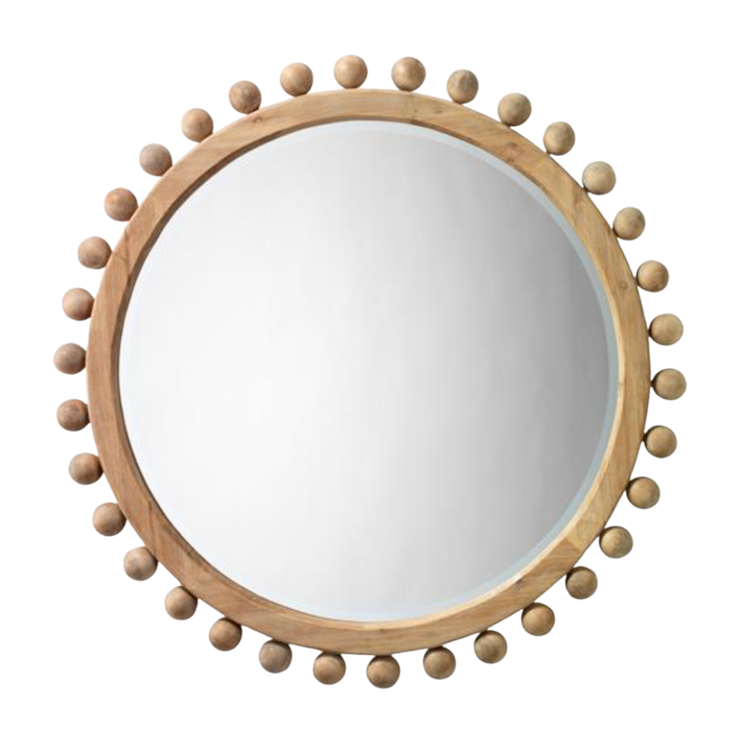
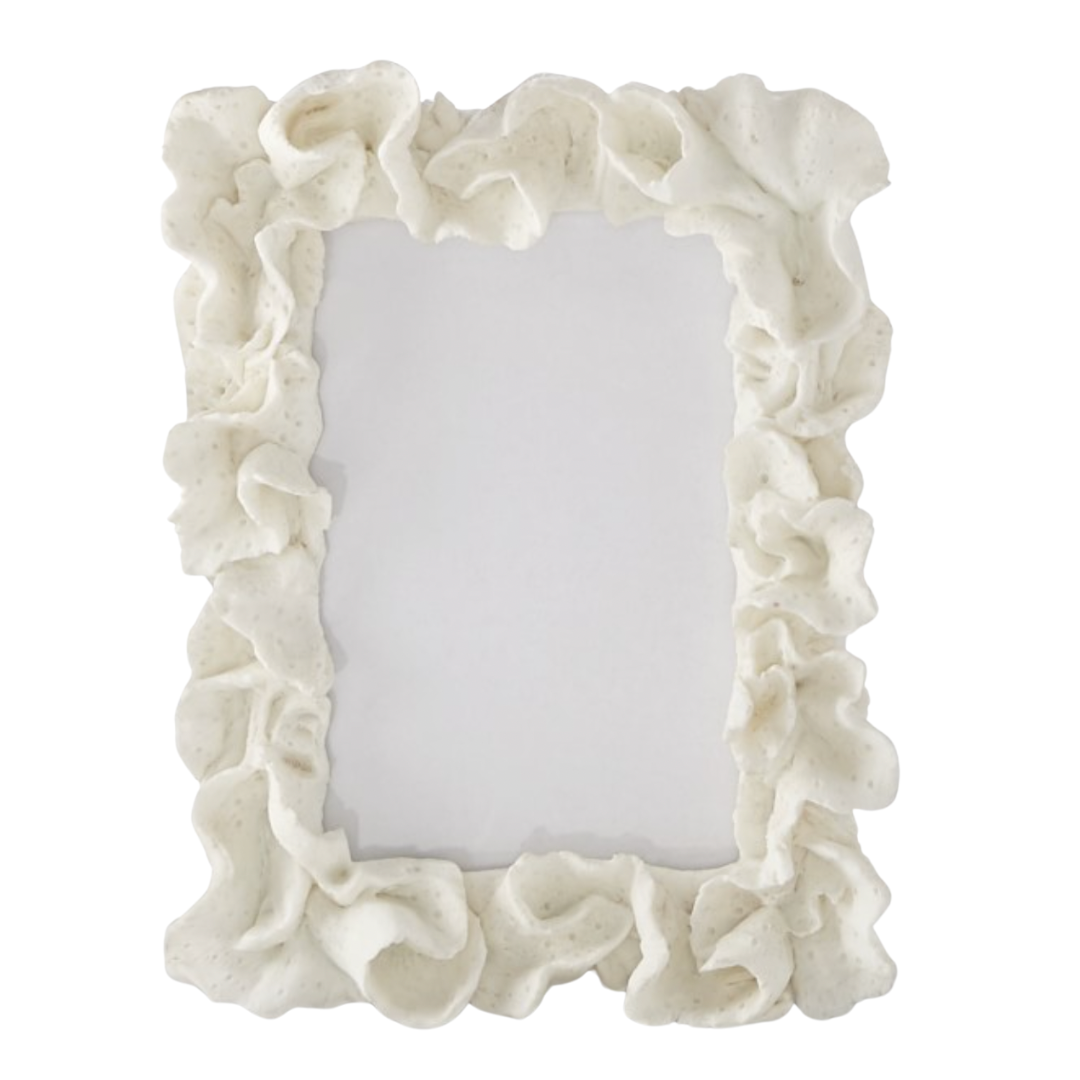
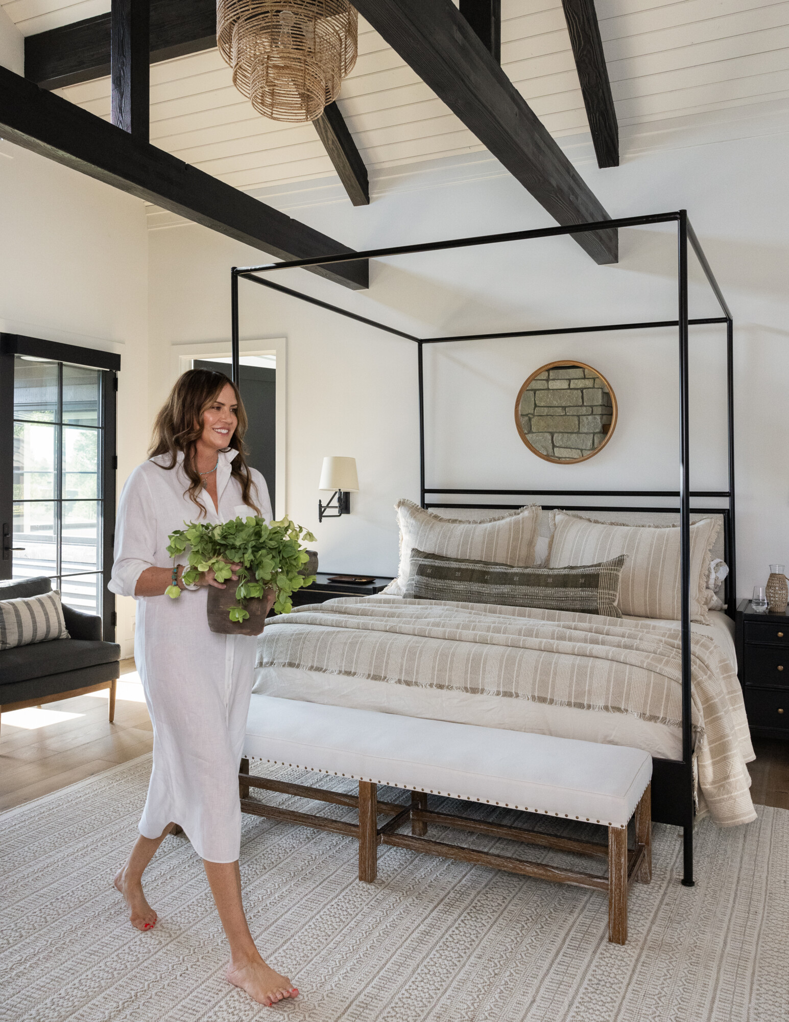
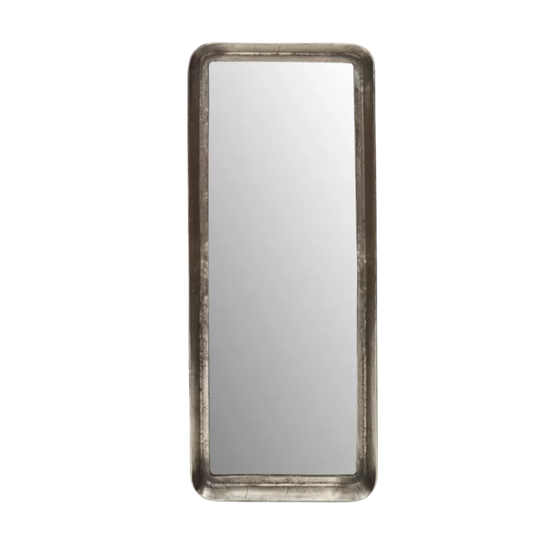
I’m always on the hunt for mirrors, and this natural wood-framed round mirror is such a find. It’s coastal but not too theme-y and works almost anywhere. This coral-inspired photo frame is another one of those timeless but elevated gifts—or something special for your own space with a memory tucked inside. We just sourced them for a styling project in the works, and I can’t wait to use them on our client’s bookshelves.
For an easy styling moment, try decorative objects like this Moroccan quartz geode. This is another piece I bought for our client install, and it adds just the right sparkle to a shelf or tabletop.
***
Everything in this month’s edit was chosen to help you reset in small but impactful ways. Whether you’re hosting, traveling, or just trying to make the everyday a little more beautiful—this list is for you.
Let me know which piece you love most!


