How to make a small kitchen feel bigger
Oh my gosh … the kitchen at the High Desert Tumalo project is proving to be one of the more difficult ones for me in terms of making decisions! I just want it to be really really good — for us, and then eventually for the future homebuyers. When you’re trying to make small spaces look and feel bigger, it’s really tricky because you have to consider every nook and cranny. Every space needs to work really efficiently, but still look pretty. It’s challenging to make it feel bigger but still look clean!
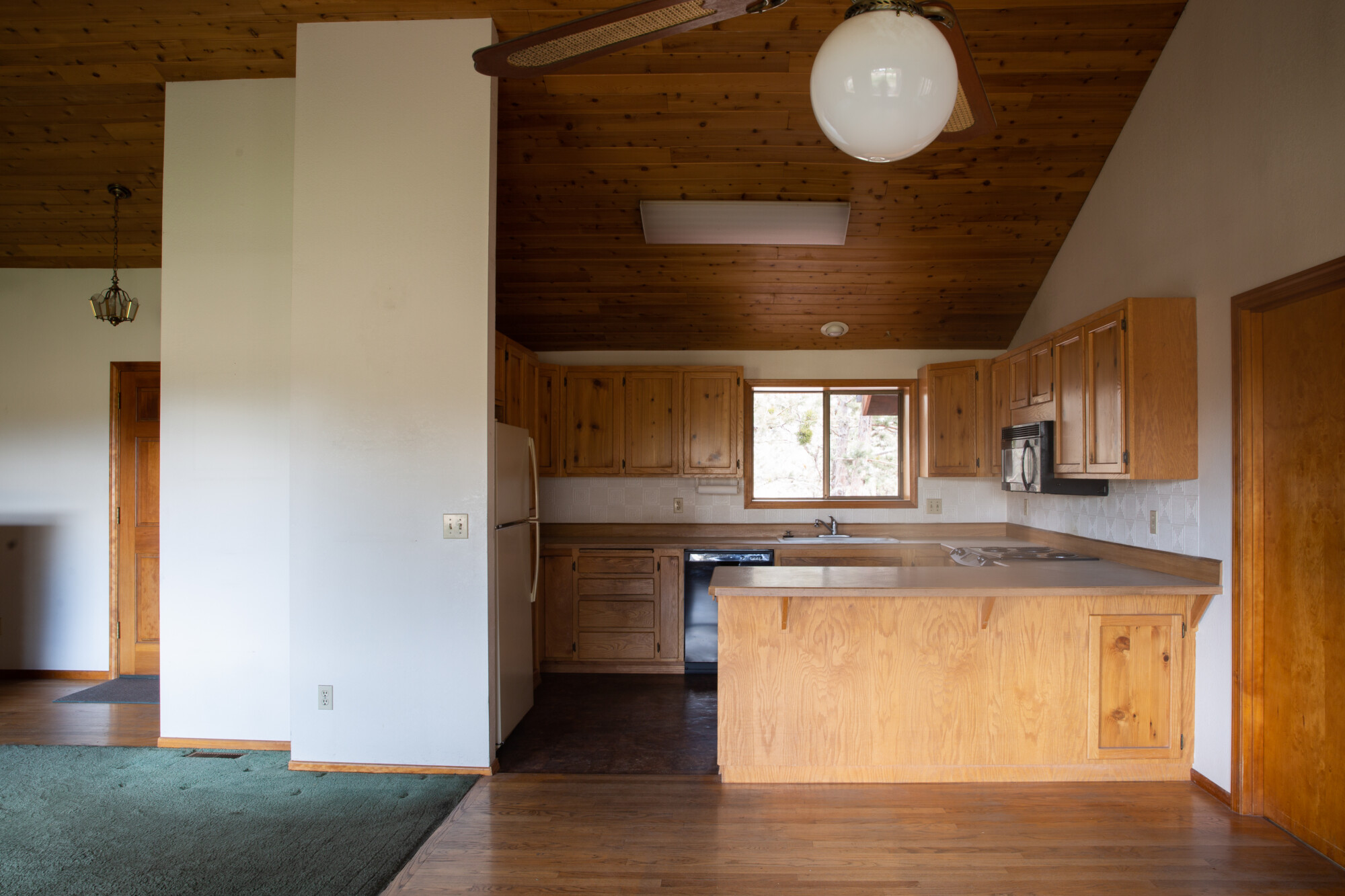
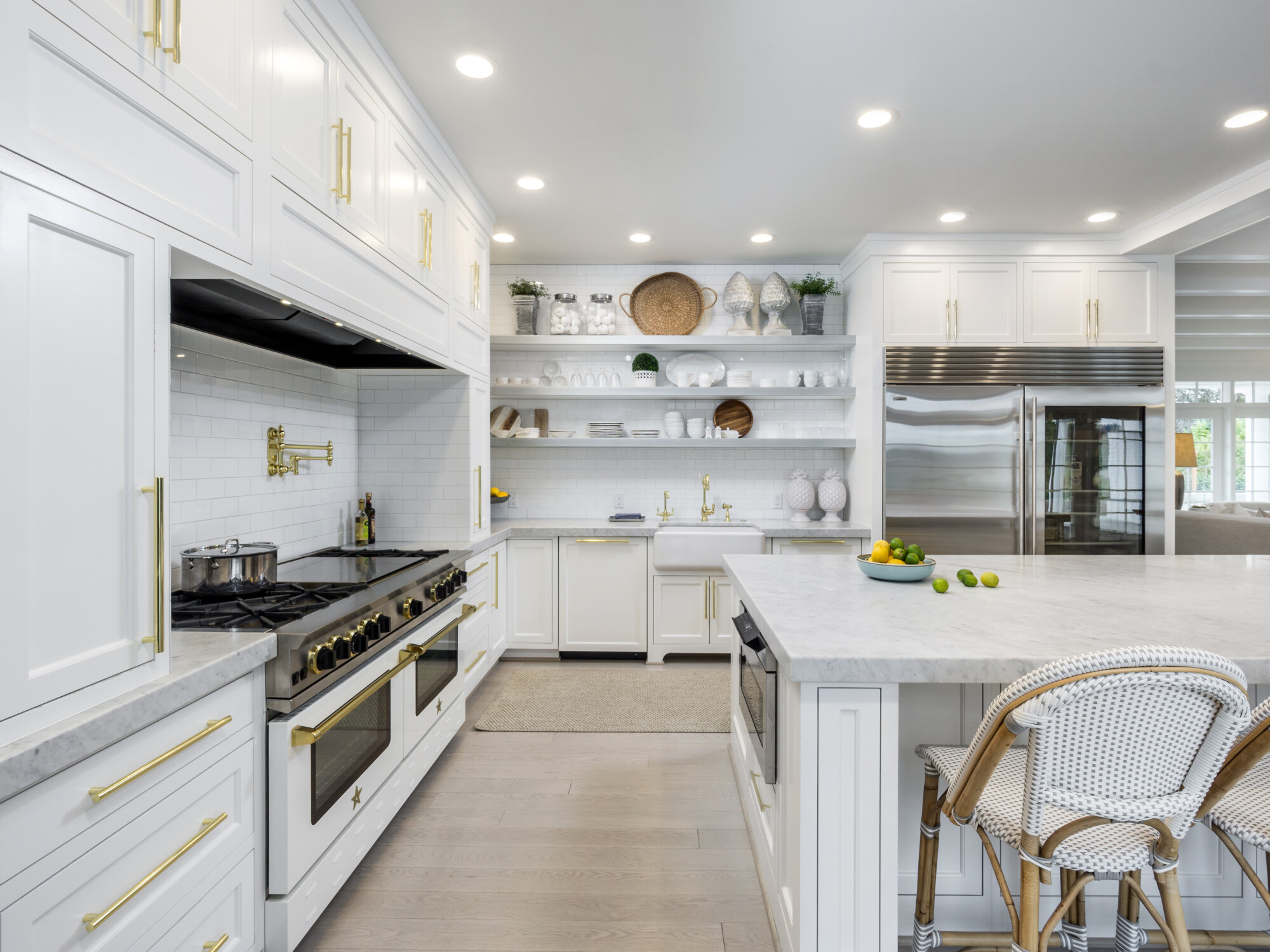
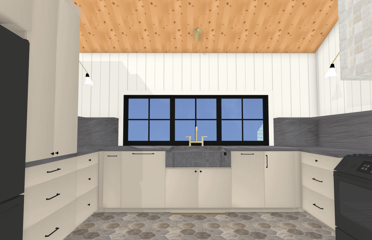
Looking back at the inspiration from the Old Scholls Ferry kitchen, I’m amazed at how spacious and functional that kitchen was. We’re now faced with the challenge of creating the same feeling at our High Desert Tumalo project, where space is limited. Here are some key points we’re taking away from the Old Scholls Ferry kitchen, along with our first round of 3D renderings. These clearly show the concepts we’re considering.
01. Keeping the upper cabinets minimal will make the space feel bigger
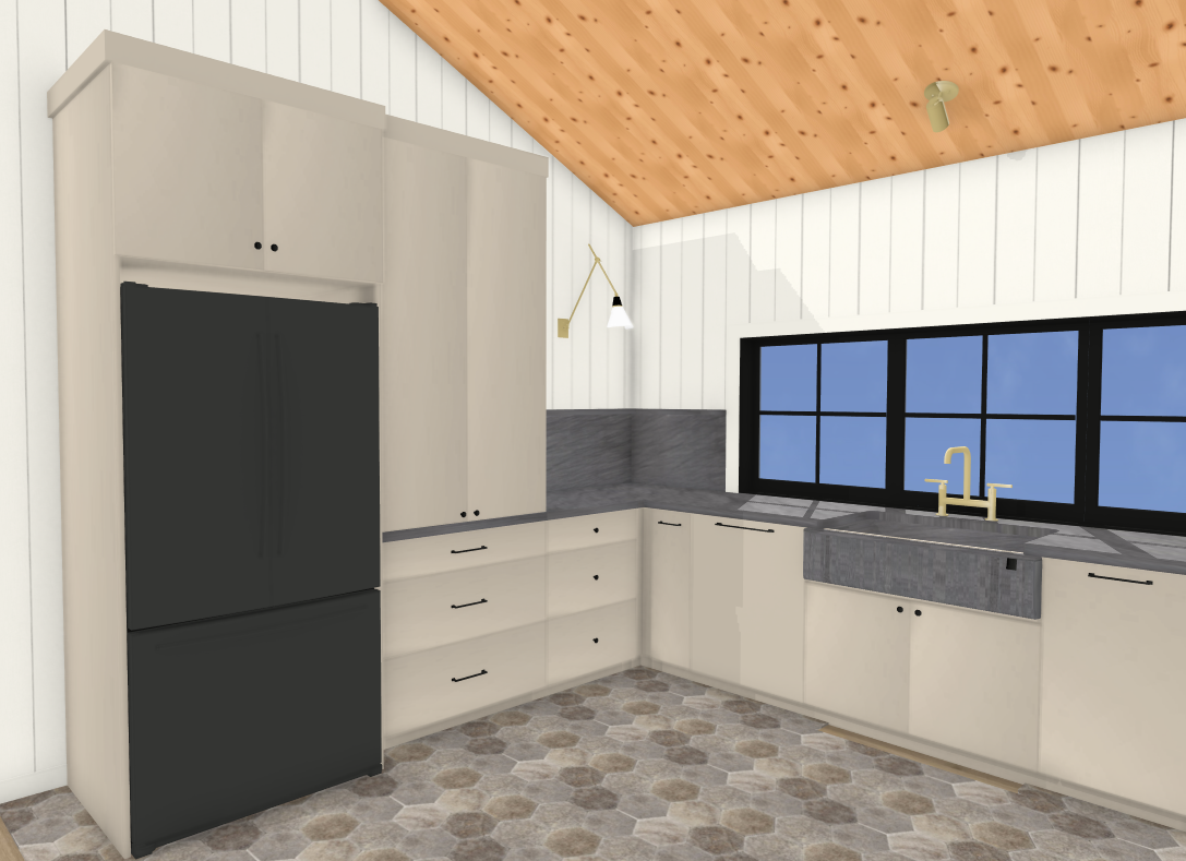
One unique way to open up the space is by eliminating upper cabinets. We’re embracing this design choice (with exception of one hard-working countertop cabinet) and finding creative storage solutions elsewhere. We’ll be adding a full-height cabinet that’ll store all of our smaller appliances, like the espresso machine, toaster, blender, mixer, etc. Below we will have deep drawers for all our favorite treats and snacks. Plus, we are incorporating a walk-in pantry right off the kitchen (it used to be the laundry room) to store all the other essentials. You might be asking, where do you store all your plates and glassware? Well, we intend to design the drawers to hold them! Read on to see other solutions ?
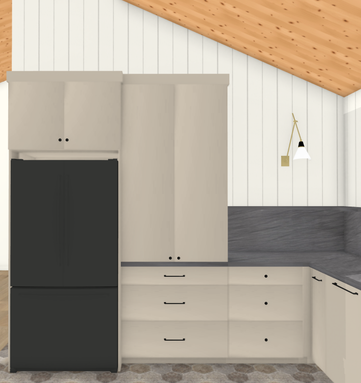
Here’s our rendering of the fridge wall. The cabinet to the right of the fridge/freezer is the cabinet I mentioned where we will house all of our small appliances. I plan to have our cabinet maker build doors that can retract inwards, so when we’re using the coffee maker, etc. they won’t be in the way. The deep drawers below will be our snack drawers for easy grabbing. The rest of our food will be stored in the walk-in pantry.
02. Tall slab backsplash
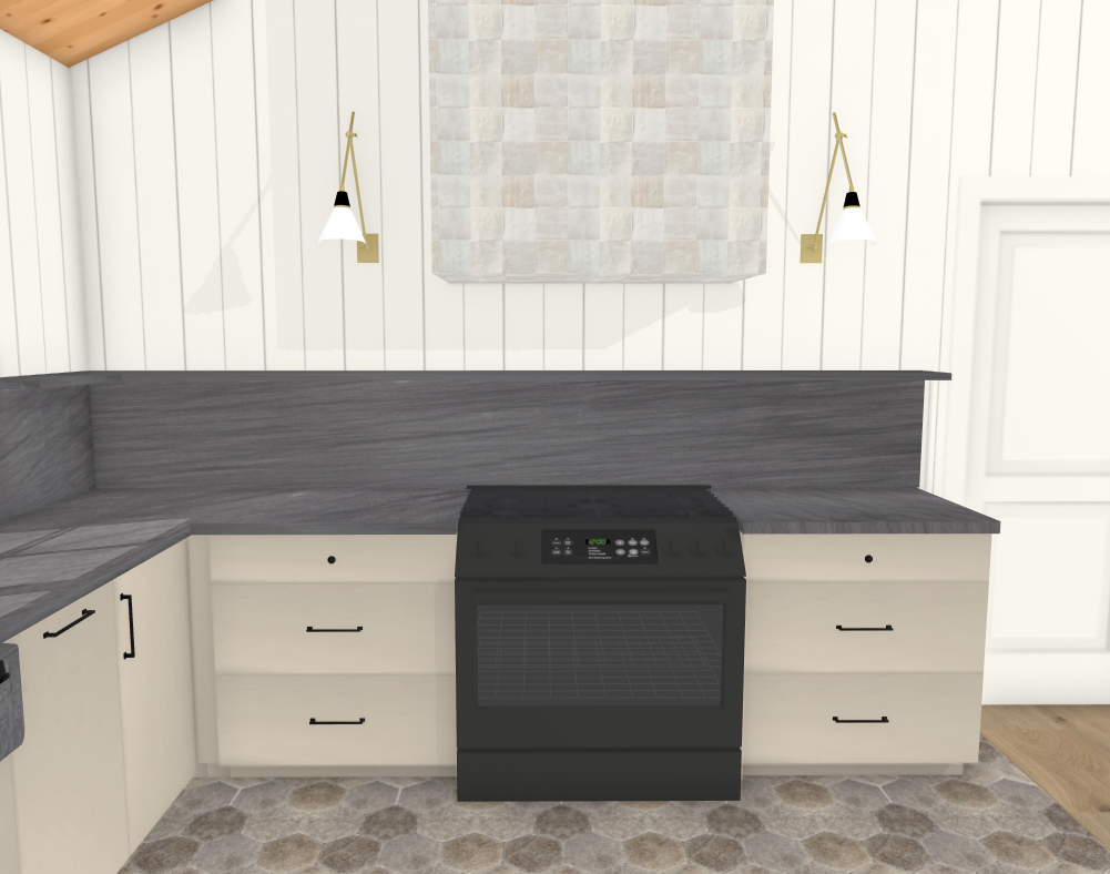
Another way to create the illusion of a wider space is to add height to the backsplash. Drawing your eye upwards makes ceilings appear taller and, if you do this in your kitchen, it will make it feel bigger. I love the simplicity of this design, and am even thinking of adding a functional shelf at the top of the backsplash (approx. 10-11” deep) to hold everyday plates, bowls, and cups. We’ve taken inspiration from Athena Calderone’s kitchen, where she uses a similar shelf for both styling and practical purposes. I’ve made sure to measure everything carefully to ensure that the shelf is functional and not just a “pretty” ledge. While I’ve been enjoying this concept recently, many seem to only have enough room to prop up artwork or small décor. This isn’t ideal for a small space with little storage.
At the Scholls project, we tiled from countertop to ceiling behind the open shelves. But, this time around, I’d like to create the same effect with a taller than normal backsplash. I’d use the same slab material as the countertops to create a super cohesive and minimal feel.
03. Stick with a monochromatic palette
Additionally, to keep things feeling open and airy, stick with a monochromatic palette. By using a limited color range of similar shades and textures, the eye can relax and fully take in the bigger space without feeling overwhelmed. While I love mixing materials, in this case, I want to keep things very easy on the eye with minimal distractions. Of course, I turn to Lauren Liess for inspiration, and I’m obsessed! I’ve been analyzing every detail in her most recent home, “Horse Country Modern.” I love the simplicity and, as she coined it, “unfussy” aesthetic.
As much as I love the natural color of her beautiful oak cabinetry, it’s just not in our budget for this project. So, we are going to keep all cabinetry painted. I’ve been ordering sample after sample of the perfect greigy or putty or taupe … whatever you want to call a very neutral, warm-with-depth color. Help us out if you know of one that is perfect!
![]() CLOUZ HOUZ TIP: Paint grade wood is much more economical than natural stained wood! If you want to save, incorporate natural stain grade woods in special spots only.
CLOUZ HOUZ TIP: Paint grade wood is much more economical than natural stained wood! If you want to save, incorporate natural stain grade woods in special spots only.
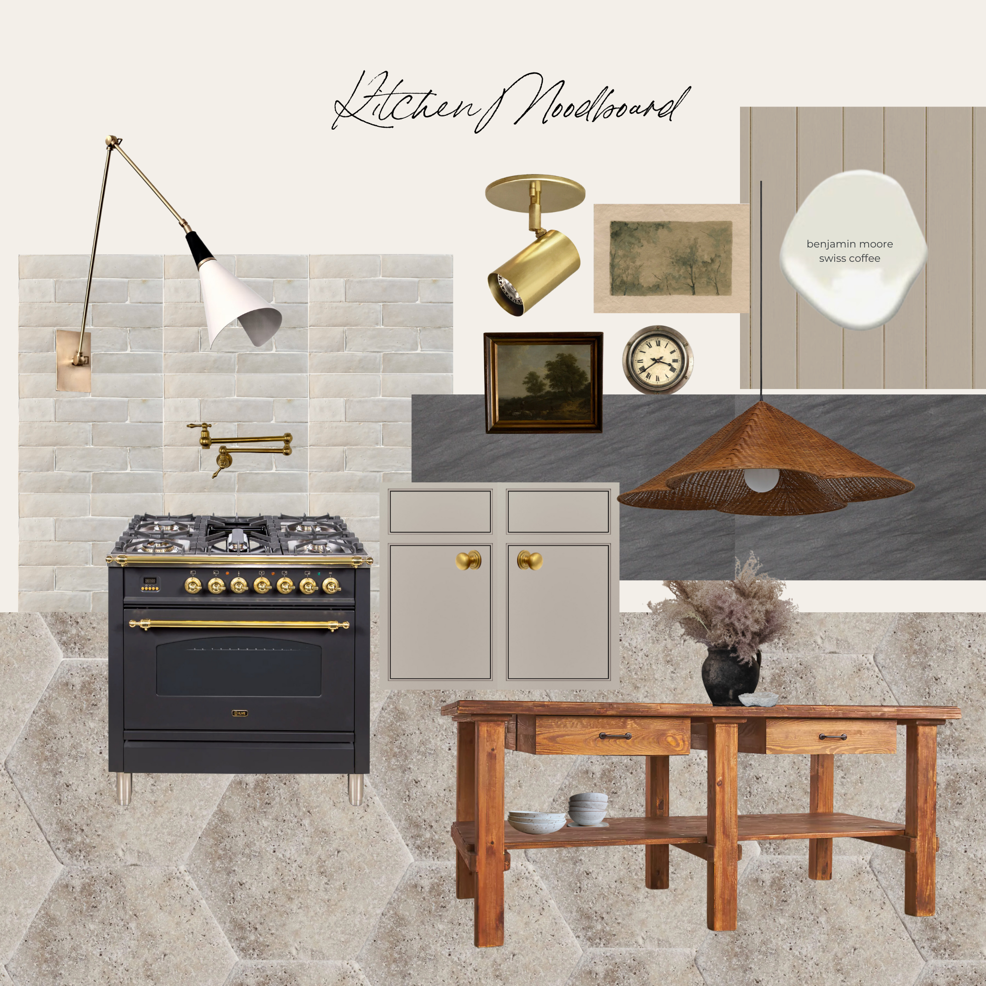
Here’s a mood board of the materials and finishes
Tile
We’re opting for a unique, textured floor with these beautiful pavers … a natural material that oozes texture and earthy vibes. I love the idea of breaking up the flooring in the kitchen to give another layer to the space, although some may say it breaks up the space. We like the idea of defining the kitchen workspace with a different floor material to make it feel intentional. Plus, by keeping the rest of the dining/living area as hardwood flooring, we’re creating a seamless transition while also adding some visual interest to the kitchen area.
Countertops
At the heart of the kitchen, we’re going with a Black Vermont Granite countertop, which we ultimately chose over soapstone. We love the subtle veining details and the softness of the color, which will also be a nice compliment to the textured floors and black windows.
Paint
As for cabinet color, we’re still deciding, but we are leaning towards Benjamin Moore’s “Stone Hearth.” I’ve been inspired by the Stoffer Home’s use of Brinkley Taupe for their cabinetry, and heard that Stone Hearth is a close match. While nothing is set in stone (pun intended), we’re loving this color and think it will add a cozy and inviting touch to the space! What do you think? For the walls, we are sticking with one of our favorite warm whites: Benjamin Moore’s “Swiss Coffee” which I love — so why mess with a good thing??
04. Sconces … because light can make a space look and feel bigger
Lighting is a crucial aspect of any kitchen design, and we have to get creative with our options. While we don’t have the ability to add overhead lighting, we are opting for sconces over the shelf to provide extra countertop lighting. We’ve found some beautiful sconces on Etsy that I’m absolutely in love with. Adding these sconces will not only add some much-needed lighting, but also incorporate a design element to help add character to the space. More light can also make a space look bigger, so this is an added benefit.
05. Hood Design
I always try and keep the hood on a large wall that will become a focal point of any kitchen. At the Old Scholls Ferry project, we built cabinetry to frame the hood and camouflage the insert. It was beautiful, but we don’t have the space to create something this substantial.
Simplicity is key when it comes to good design. If you haven’t already gathered, I’m all about keeping things simple but still being impactful. One of the subtle features we’re adding is a beautiful Zellige tile by Riad for wrapping the hood. This will still create a bigger focal point without being distracting or overwhelming for the space. Design doesn’t always have to be complicated. This detail will add interest and texture to the space. It’s all about finding the right balance between simplicity and detail to create a space that feels intentional and well-designed.
So, there you have it! Our first round of renderings along with some ideas to create the feeling of a bigger kitchen when space is tight. We can’t wait to keep sharing more spaces, and our vision for each one. Hope you all have a great week! Thanks for following along on this adventure. It’s sure to be a wild one, so hold on! ?


