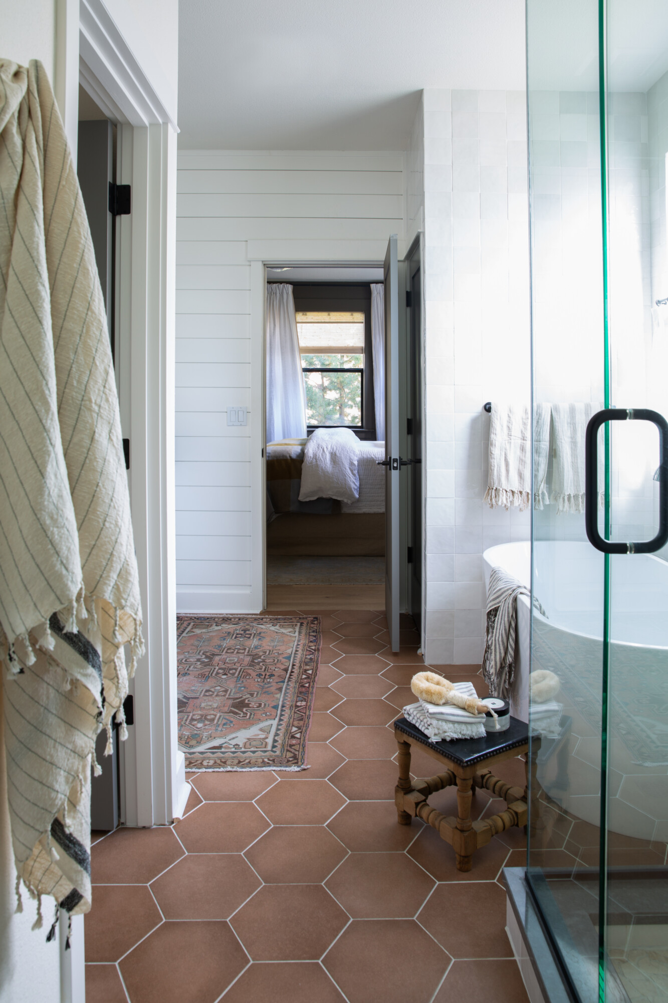
Planning a tile project can be an exciting yet daunting endeavor, especially when you’re aiming to revamp your space. We’re going to dive into the world of tile design, and guide you through the process of creating a stunning tiled space. Drawing inspiration from our most recent project, Tumalo Ranch, we’ll share our insights on the types of tiles that are currently stealing the spotlight We’ll also explain how to master the art of tile layout, and even help you choose the perfect grout to bring it all together. Whether you’re a seasoned DIY enthusiast or a first-time planner, we’ll give you tips and tricks to turn your vision into reality!
When starting your tile project, finding the inspiration first can set the tone for the entire endeavor. It’s like discovering the cornerstone of your design vision. Whether it’s a vibrant color that caught your eye or an intricate pattern that speaks to your aesthetic, this initial tile becomes the creative spark that ignites the whole project. From there, the magic lies in selecting the complimentary tiles that harmonize with this focal piece, forming a cohesive design scheme.
The key to a successful tile project often revolves around the balance between inspirational tile and the patterns you choose. If your starting tile is bold and complex, you may want to opt for a more straightforward layout. Simplicity in the layout can enhance the impact of that striking tile. On the other hand, when working with simpler styles (like classic subway), the options for creativity increase. The possibilities for captivating patterns are limitless, allowing you to create intricate designs that turn even the most basic tiles into works of art. So remember: the inspirational tile is your guide, and the patterns you select are the elements that complete your masterpiece.
Innovative Tile Layouts
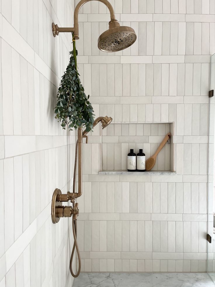
Lately, I’ve been really enjoying the various ways people are getting creative with tile layouts to make simple ones feel more special. One cool trend I’ve come across is the alternating vertical and horizontal pattern, which is especially popular in shower designs. It’s a straightforward idea: instead of placing all the tiles in a row either vertically or horizontally, you alternate them. For example, you put a row of vertical tiles, then a row of horizontal ones, and so on. This simple change adds a visually interesting dynamic to the space.
We’ve found many examples of this pattern on Pinterest, which is always a great source of inspiration. It’s surprising how this small tweak in arrangement can make a big difference, turning your project into something not just practical but also visually striking. So, if you want to give your space a unique touch, these creative layouts are definitely worth considering in your next renovation project.
The Power of Grout in Tile Design
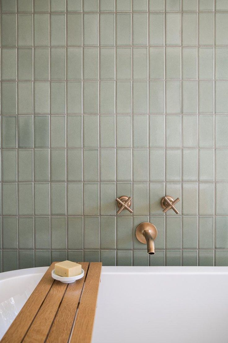
One often underestimated but incredibly influential aspect of tile projects is the choice of grout. The grout color you select can drastically alter the overall look of your tiled surface. It’s the finishing touch that can make your pattern either pop or blend seamlessly into the background.
If your goal is to make the pattern more noticeable and integral to your design, a contrasting grout is the way to go. This approach creates a striking contrast between the tiles and the grout lines, making the pattern standout. On the other hand, if you prefer a more subdued, less busy look, opting for a grout that closely matches the tile color is the key. This tonal choice allows the tiles to flow together, creating a more tranquil and cohesive look.
When working with bold colors, the grout choice becomes especially important. You wouldn’t typically match a deep red tile with a deep red grout, as it might be overwhelming. Instead, you’d want to find a grout color that compliments the tile. For instance, a charcoal or gray grout could provide a balanced backdrop, allowing the bold tile to shine without overpowering the space. The grout isn’t just the glue that holds your tiles together; it’s an essential part of the design puzzle.
![]() Clouz Houz tip: To ensure safety and prevent slipping in the shower, it’s recommended to opt for smaller format tiles for the floor. Whether it’s a mosaic pattern or a tile that’s under four inches, this choice has its advantages. Smaller tiles inherently mean more grout lines, and in a shower, that’s essential for traction. Grout lines provide additional grip. So, remember that smaller tiles not only contribute to aesthetics but also play a crucial role in keeping your shower safe and functional. It’s a small but significant detail that can make a big difference in your everyday use and enjoyment of the space.
Clouz Houz tip: To ensure safety and prevent slipping in the shower, it’s recommended to opt for smaller format tiles for the floor. Whether it’s a mosaic pattern or a tile that’s under four inches, this choice has its advantages. Smaller tiles inherently mean more grout lines, and in a shower, that’s essential for traction. Grout lines provide additional grip. So, remember that smaller tiles not only contribute to aesthetics but also play a crucial role in keeping your shower safe and functional. It’s a small but significant detail that can make a big difference in your everyday use and enjoyment of the space.
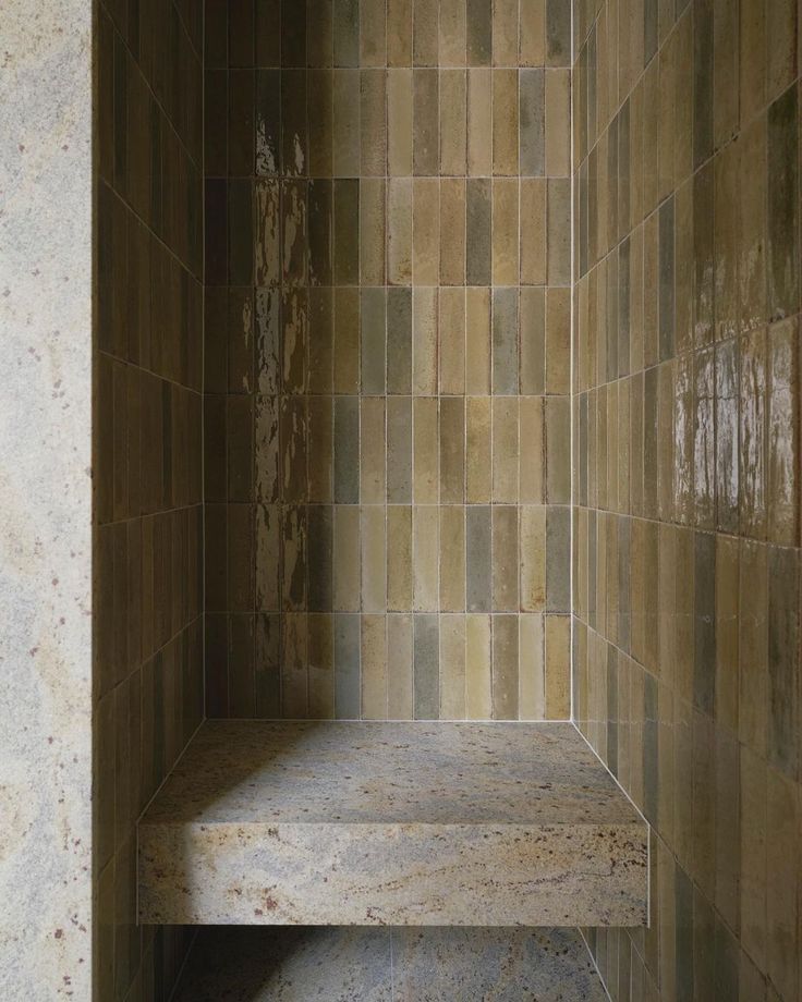
The Allure of Dry Stacked Zellige Tiles
In contemporary tile design, a cool trend has hit the spotlight: the dry stacking of Zellige tiles. This technique essentially minimizes grout joints to create a seamless surface. Unlike traditional tile installations that involve small spacers, dry stacking involves setting the tiles directly on top of one another. The result? A striking, grout-free aesthetic that allows the tiles to take center stage. It’s the perfect choice when you want the focus to be solely on the tile itself, without any distracting grout lines. I’ve found this approach particularly appealing, especially when working with Zellige tiles, as it accentuates their unique handmade character and texture.
However, when working with Zellige or similar delicate tiles, it’s essential to plan for a more significant tile overage than you would with standard ones. While a 15% overage is generally recommended for regular tiles, try aiming for 20% to 25% when working with Zellige. These tiles can be fragile and prone to breaking during transit, so having extra on hand is a smart precaution.
Embracing the Allure of Natural stone Tiles
Lately, my tile projects have been increasingly drawn to the timeless beauty of natural stone tiles. They exude a certain elegance and warmth that’s hard to replicate with porcelain or ceramic alternatives. The organic, earthy vibe they bring to a space is something I find truly beautiful. While natural stone tiles are stunning, they can come with a heftier price tag compared to their porcelain or ceramic counterparts.
However, you don’t have to go all-in on natural stone if you’re on a budget. Mixing in some porcelain or ceramic tiles with your natural stone can yield a striking and cost-effective result. This allows you to enjoy the best of both worlds, combining the aesthetic appeal of natural stone with the affordability of porcelain or ceramic tiles. The contrast between these materials can add depth and character to your design, creating a unique and visually pleasing effect. So, when contemplating your tile project, remember there’s no need to compromise. The blend of natural and synthetic can be your key to a beautifully balanced design.
As we’ve explored the creative potential behind the tile layouts, it’s clear that every detail contributes to a unique and personalized design. The impact of grout selection, the safety considerations of shower tiles and the allure of natural stone all play a part. With a bit of inspiration and careful planning, your tile project can truly become a work of art. Unleash your creativity, and let your tile reflect your unique personality and style!
For more bathroom inspiration you can follow us on Pinterest here!

