These are some of the items I’m using for holiday décor this year — they’re my faves. Hopefully you can also find something for decking your halls! This year, I kept things simple. In fact, if you’re anything like me, you’ll probably only use a third of your décor. After all, it’s the little things that make the biggest statement when decorating your home for the holidays. Of course, your tree is the star … so make that fabulous! I found the most beautiful glass balls (see below) to add to our tree, and along with special family ornaments, they nicely compliment the beaded garland and pinecones.
Once you’ve set the stage with your tree, you can add other festive touches here and there. Bowls of pinecones, small “tabletop” faux trees, accents of vintage ribbon tied around vases or candles, beautiful wrapping paper for presents under the tree, new hand towels at the ready for bar clean up … you get the idea. Switch out a few things and your home will feel ready!
Clouz Houz Tip: One of the easiest things you can do to make your home feel festive is use cut fresh greenery. Mix it in with faux stems for arrangements all around the house. This helps the faux look more real, AND you don’t have to worry about the entire arrangement drying out and looking horrible by Christmas!
Next week on the blog, I’ll be sharing more tips and pics for the holidays, as well as ways you can bring little festive touches to your home this holiday season.
1
8' Faux Tree
This is our first year with a faux tree, and we must admit, it's pretty nice! No debating about the tree being too small or too big, or straightening it in the stand, or untangling and adding lights, etc. What a major production! This year, it took me all of 30 minutes to assemble and fluff the branches -- gotta love that. We purchased this pre-lit, 8' King Noble Fir and it's very realistic. I do miss the smell of a fresh tree, but we added plenty of fresh cut cedar throughout the house ... and besides, that's what candles are for!
2
Faux Wreath with rope
This wreath is soooooo good for the price! I added a few clippings of real cedar and pine to each one to fill it out a bit, but otherwise it's realistic and cute. Hang it in a window, over a bed, or in a bathroom for a festive touch.
3
Buffalo Check Wrapping Paper
I'm all about wrapping pretty packages! I typically try to find a color palette that I also want to use for under the tree. This year, I went with navy and white buffalo check paper from the Amber Interiors Collection for Etsy. I also used mustard yellow velvet ribbon, and brown butcher paper with navy velvet ribbon. And, I found the cutest little green pine sprays from Amazon to add to each package's bow.
4
Iridescent Glass Ornaments
These ornaments are the perfect addition to our Winter Wonderland-vibe tree!I wanted something that was subtle but pretty with the white lights. This set comes in varying shades of white, light brown and the prettiest blush color. I ordered two sets, and they really don't disappoint.
5
Tabletop Tree with Lights
This tree is the perfect size for tabletop. We installed it on the table in our office/dining room, and it's so pretty when lit up! It also looks great in a basket with nothing else. It's all about simple greens and white lights in this case.
6
Tree Collar
In years past, we have wrapped the base of our tree in a blanket or tree skirt. But, this year, we finally decided to try a tree collar. This one is simple yet gorgeous, and we're really happy with it.
7
Kitchen Dish Towel
I bought a couple of these kitchen dish towels to have on hand at our bar and sink area. They come in handy, and don't feel so holiday-ish that you couldn't extend their use beyond the holidays. I could see also using them for wrapping a bottle of champagne as a holiday party hostess gift!
8
Mohair Throw Blanket
This blanket is super soft and cozy. It comes in a beautiful green as well, but I chose the charcoal grey since I knew it would go the distance beyond the holidays. These blankets are the perfect accompaniment for curling in by the fire and watching a good Christmas movie.
I used this ribbon everywhere, from wrapping packages to tying bows on wreaths. It's the perfect weight, and easy to tie. And, I LOVE choosing a color that is a bit out of the "norm." Although this reads somewhat gold, it gives a more current look to an old time, traditional holiday color.
10
Beaded Garland
We love the natural quality this garland added to our tree! It would also look equally beautiful strung on a mantle with garland. I used the natural color (which is now sold out), but the brown color is really pretty as well. In fact, I may have to snag some to add to the garland I strung on our living room fireplace.
Like you’re not just dressing for the weather—you’re styling for the mood? That’s what this month’s picks are all about. Allison pulled together her July Edit and it’s giving cozy outdoor dinners, textural layers, and a slow-living summer glow in the best way.
Comment ‘JULY’ and we’ll DM you the links to shop these fabulous finds—plus a few bonus picks we didn’t post. You can grab the rest anytime on our LTK shop too!
We’re leaning into texture this month-woven pieces, soft linens, effortless tabletop details that feel unfussy but still elevated. Whether you’re hosting friends, refreshing a corner of your home, or just looking for one new thing to feel inspired again, this edit is here to help you tap into that lived-in summer ease.
We’re settling into summer here in Bend, and honestly-this town just thrives this time of year. Long sun-drenched days, the scent of sunscreen and juniper in the air, bikes everywhere, and backyard dinners that somehow always end with s’mores. We’ve already found ourselves dipping into the river on a whim and soaking up every golden hour moment we can.
I grew up spending summers in Sunriver, so Bend has always held a special place in my heart. But now that we live here, we’ve uncovered even more of the good stuff-local gems, quiet spots, and the kind of everyday magic that makes this place feel like home.
With summer in full swing (and because I’ll take any excuse to play tour guide), I thought l’d share my summer guide to Bend. A love letter to my favorite little mountain town and a round-up of everything that makes summer here feel like its own kind of celebration.
I’m probably forgetting a few gems, so if you have a go-to, drop it my way! And make sure to save for your next visit!
Introducing Sun Valley Saddle House — a western-spirited, layered renovation tucked in the Idaho mountains. We’re working on everything from entryway to bunkroom, reimagining this home with a fresh lens on rustic elegance and casual utility.
Pendleton patterns, copper accents, and a layered mix of leather, plaid, floral, and stone. It’s textural, rooted, nostalgic. There’s nothing “trendy” about this one — just timeless design choices that feel collected and connected to the land.
Are you drawn to this look? Would you live in a space like this? Is this your dream palette? We’d love to hear your thoughts.
We have a few project spots open if you’re craving a fresh start this fall. Whether you’re dreaming of a total refresh or simply want to finally make your space feel pulled together, we can help.
📍Sun Valley, ID
Let us know if you want to work together — we’d love to bring this kind of lived-in beauty to your home, too.
After years of designing for others, I created something to help you design for yourself.
Real talk, if you’ve been here a while, you’ve probably heard me mention our Design Guides. But today I want to share the WHY behind them.
Over the years, Derrick and I have poured our hearts into creating homes that feel beautiful not just aesthetically, but personally. Spaces that tell our story.
And that’s exactly what I wanted to help you do, too. These guides are more than just pretty moodboards-—they’re tools to help you figure out what makes you feel at home.
Because defining your style? That’s the first step to creating a space that actually feels like you.
And while we love working 1:1 with clients, I also know that not everyone wants—or needs—a full service designer. So though: what if l could hand over the same roadmap I use everyday.
That’s what these guides are.
Think of it as a designer in your back pocket-without the price tag or the long timeline. Each guide includes: • Shoppable moodboards • Paint recommendations • Furniture & material suggestions • Style direction you can stick to • Visual examples to take out the guesswork
It’s a shortcut to a pulled-together, elevated home-with soul.
Want to see more? Comment STYLE below and I’ll send you the link to explore all five guides!
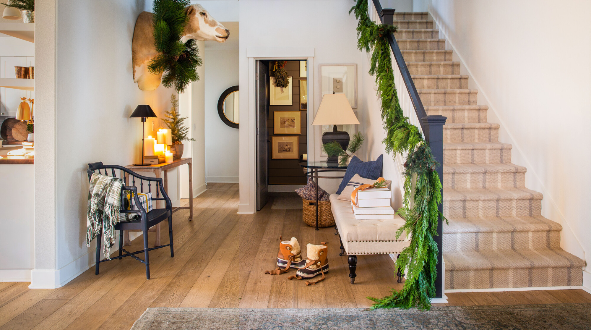
 Clouz Houz Tip: One of the easiest things you can do to make your home feel festive is use cut fresh greenery. Mix it in with faux stems for arrangements all around the house. This helps the faux look more real, AND you don’t have to worry about the entire arrangement drying out and looking horrible by Christmas!
